Finding new music is easier than ever. Google and Spotify are full of instantly accessible, unexplored genres. There are myriad ways for artists to get music heard by fans — but a website is still one of the best. Here are 12 websites designed in Webflow to inspire endless creative directions and promote your music.
1. Best Albums of 2017

You may remember Drew Roper’s favorite albums website from our Top 10 Webflow sites of 2017. Hoog Design was also a fan and was inspired to create their own Best Albums of 2017. A love for both music and design comes together in this top 20 (with bonus honorable mentions).
The music website is a single-page design, navigated by way of color-coded bands vertically arranged down each side of the screen. It makes for a quick, interesting way to flip through their top albums of the year. Want to make your own website sharing the albums you’re into? Check out how Hoog Design did it.
Not only is this a clean layout, but Hoog has woven in some neat interactive effects. For each featured album, the background shade changes with a swipe of the cursor. It also takes advantage of Webflow’s Interactions 2.0. A click on pulsing circles on either side of the album art brings up insightful quotes from each artist about their work.
Select songs are available via Google Play. There’s enough content about each album to satisfy even the nerdiest of music fans (myself included).
2. Trenchwerk

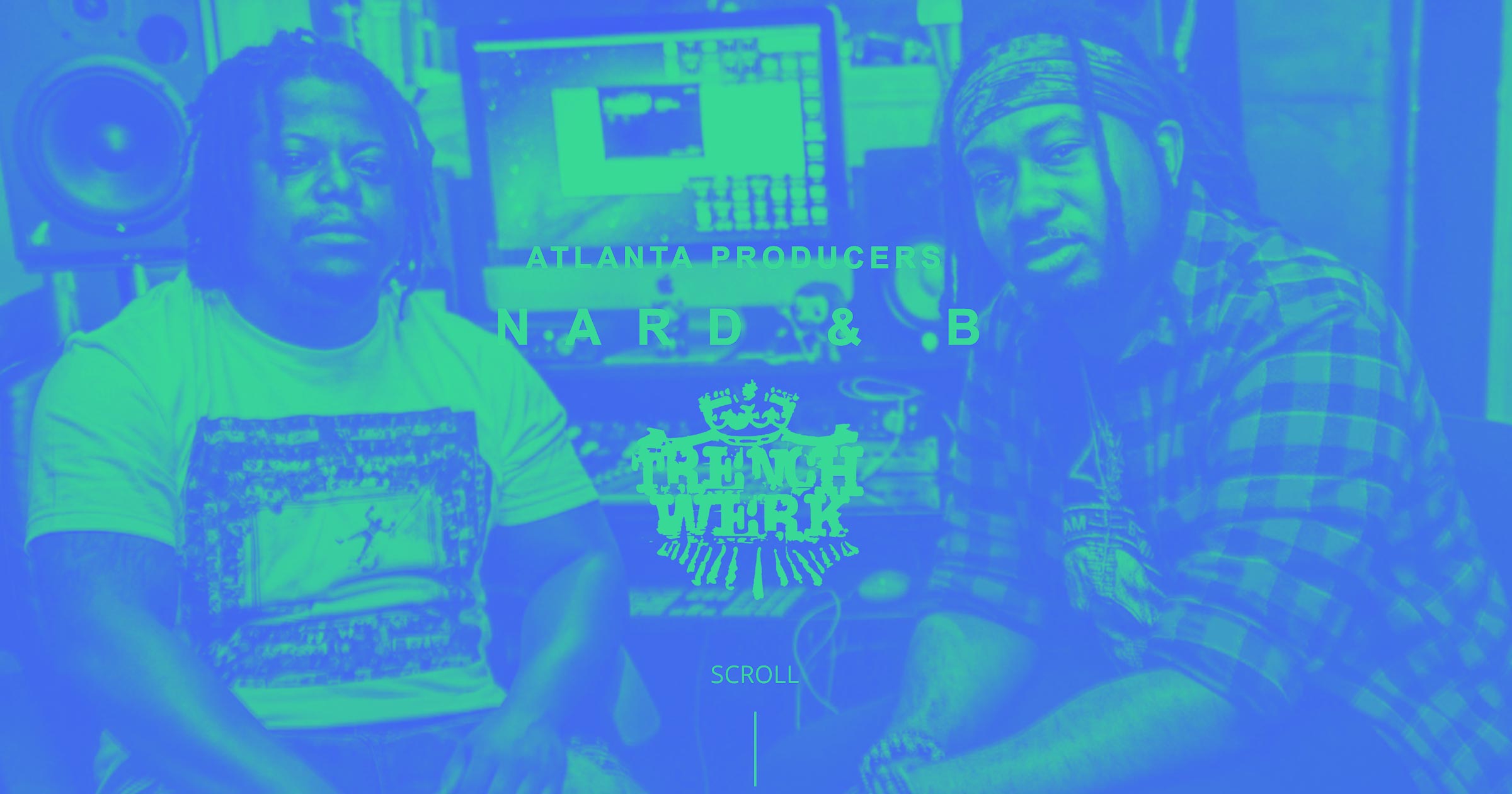
If you're a hip hop production duo who’s made beats for Migos and T.I. — do you even need a website? For the Atlanta-based team of producers Nard and B, the answer is yes. And there's as much attention given to the details of the design as there is to the music they produce.
One super cool visual effect is the hero image of the duo that shifts and distorts like it's being hit with the booming sound of a bass from an 808 drum machine. It's a great nod to their window-rattling, low-end production work.
They say they “prefer the studio to the limelight,” and this design is free from the glitzy trappings so many hip hop artists revel in. This design is all about Nard and B’s artistic authenticity.
Do you have a studio or do your own production work? See how the Nard & B website was put together in Webflow and create a website of your own.
3. Beyond The Valley 2018

You've probably seen these pop up in your social media feed — Coachella (or other music parody festival) lineup posts with a bunch of made-up names.
When I first landed on this page for Niika’s Beyond The Valley music fest, I thought it was satire. I mean — the Kooks? DJ Tennis? Winston Surfshirt? Surely these are fake.
But they’re real artists playing at an Australian music fest. And please cut me some slack for my ignorance — the last new music I bought was an Interpol album in 2002.
This layout looks like a concert flyer. Clicking each musical act in the lineup brings you to a page with more info about each performer and their music. It gives visitors a chance to check out artists before the show. Everything a concertgoer would like to know is available in a simple, easy-to-navigate layout.
If you’re putting together any sort of fest or cultural event, there’s a lot of inspiration to be gleaned from this design. Check out how it was made in Webflow.
4. Moonlands

Moonlands is a London-based indie band. This design has the same dreamy, laidback feel as their music, with dark blues and greens dominating the visuals. In fact, the band seems to be a huge fan of the color blue, with both an EP called "Paradise Blue" and a featured song titled "Out of the Blue."
This is a great example of using a color scheme that reflects the site’s subject. Moonland’s music is full of dreary London melancholy, but there are dashes of color in the darkness, much like the visuals of this design.
5. Mateus Gageiro

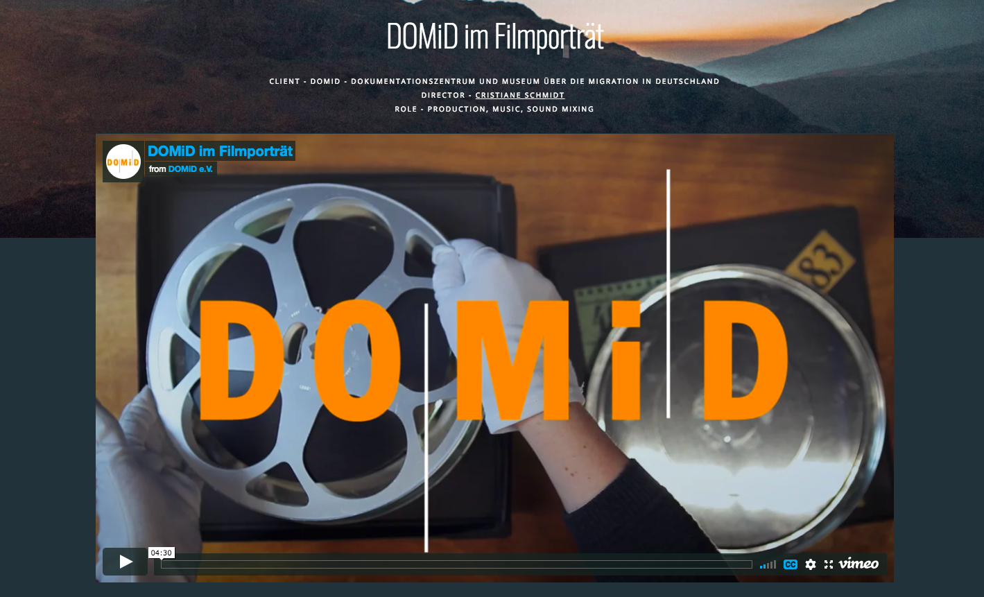
Mateus Gageiro is a composer, sound designer, and music producer. He's done everything from creating the bouncy background music for a car dealership commercial to the futuristic electro sounds of a fancy perfume ad.
Gageiro’s site provides an extensive portfolio of his work with links to the different categories of musical projects featured below his name. His music and production work is presented alongside the videos they feature in. It shows off Gageiro’s high-quality work and the clients he collaborates with.
Like this design? Check out how this cool, stylized page was created.


Design interactions and animations without code
Build complex interactions and animations without even looking at code.
6. Orchestral Manoeuvres in the Park
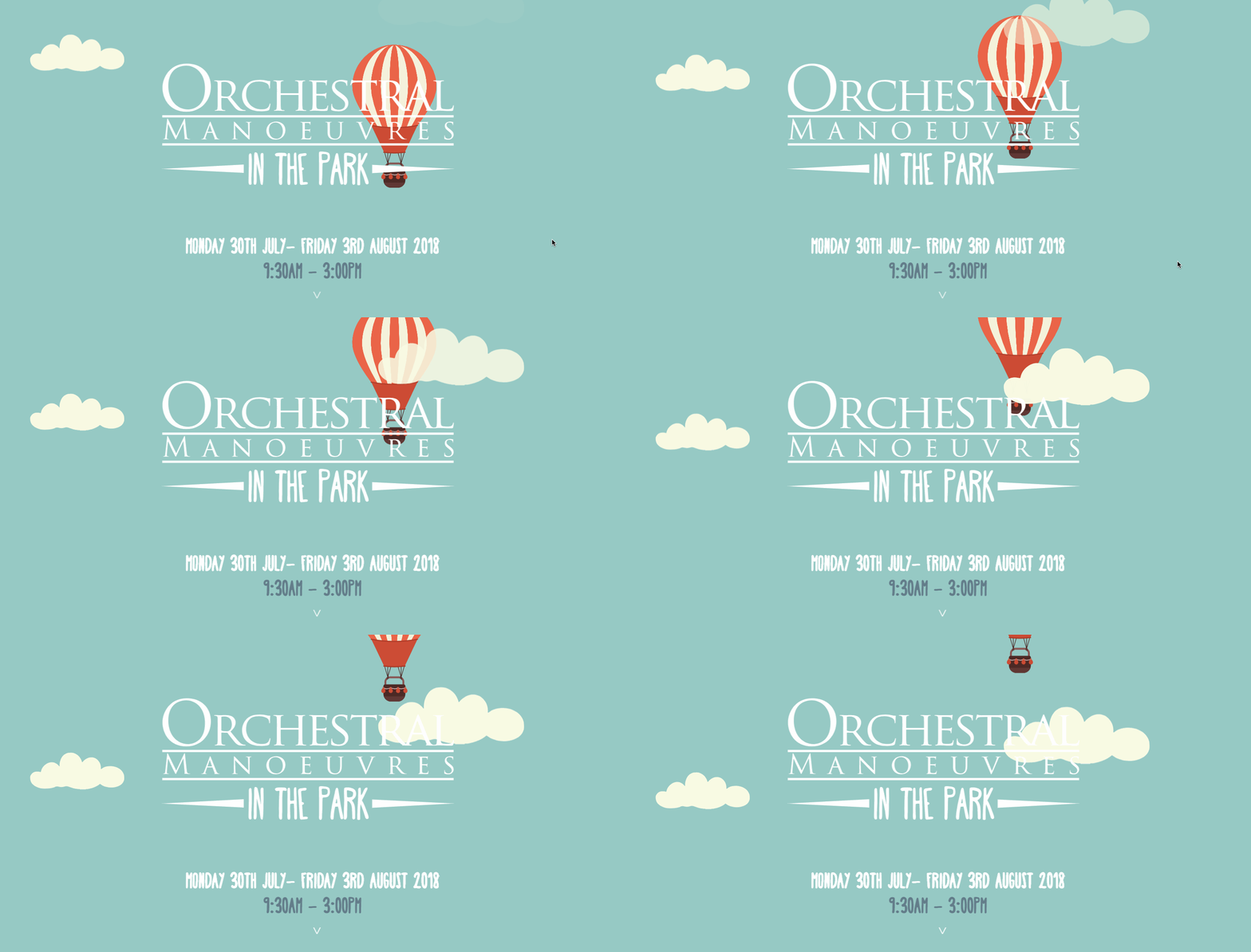
Orchestral Manoeuvres in the Park is a week-long experience where young people get to create new music with an orchestra. The site’s use of handwritten type and animations — like a floating hot air balloon and clouds — are very much in line with the youthful audience it hopes to reach. But along with this sense of playfulness you’ll find all the information a parent would want and need to know before enrolling their child. It strikes just the right balance between fun and serious.
This is a great example of simplicity combined with enough creativity to keep things engaging. To see how it was assembled, check out its showcase page on Webflow.
7. Francis Phan

Okay — how could we not include a UX designer who also happens to be a musician who designed his own website? Oh, and he also has degrees in electrical engineering and biomedical engineering? Francis Phan is the man!
His instrumental music is kind of an electro/post-rock hybrid, full of the snap of driving beats, atmospheric synth lines, and electric piano. He’s great at layering different musical textures and varying the dynamics, keeping his songs sounding fresh and free from monotony — which he also accomplishes visually with the design. There’s plenty of movement in this thoughtful layout and we get a sense that every element has been placed with precision.
Curious about how Francis put this great music/portfolio website together? Check out his page in Webflow.
8. emby music

It seems like so many electronic musicians and labels have great websites. Is it the digital version of the compositional process — fleshing out a song from a single beat gives musicians a solid reference point to structure a website? Or is their time better spent than rock bands since they don’t have to wait around for flaky bandmates who show up late to rehearsal?
Whatever it is, electronic music site are generally fantastic.
emby music is a Philly-based record label focused on house music. They put their social media block in front of their content to grab new fans, followed by an audio player with new releases visitors can check out.
There isn’t a lot of content, but they don’t need it — they’ve assembled only the essentials in this bold and creative space. And their use of a rotational parallax mouseover effect fills up what could have been a static screen space with odd shapes and motion.
Check out emby’s showcase page on Webflow.
9. Toast Recording Studio

Digital recording results in flawless songs. With the ability to control every component of an audio piece, mistakes can be erased and — with the magic of autotune — even the worst singers can be transformed into something passable. But all that control results in songs that can lack warmth and humanity.
Toast Recording has digital tools at their disposal, but at the core of their recording process is 2” analog tape, which produces a warmer, more lively recording. (Check out this clip of a ska band that recorded there).
The hero section features a video about the music producer behind this studio, Chris Hamilton. It’s a well-produced clip where Chris, in a voiceover, explains his analog recording philosophy. It’s great to hear him explain this in his own words accompanied by music and images from the studio. A more meaningful experience than reading a lengthy block of copy.
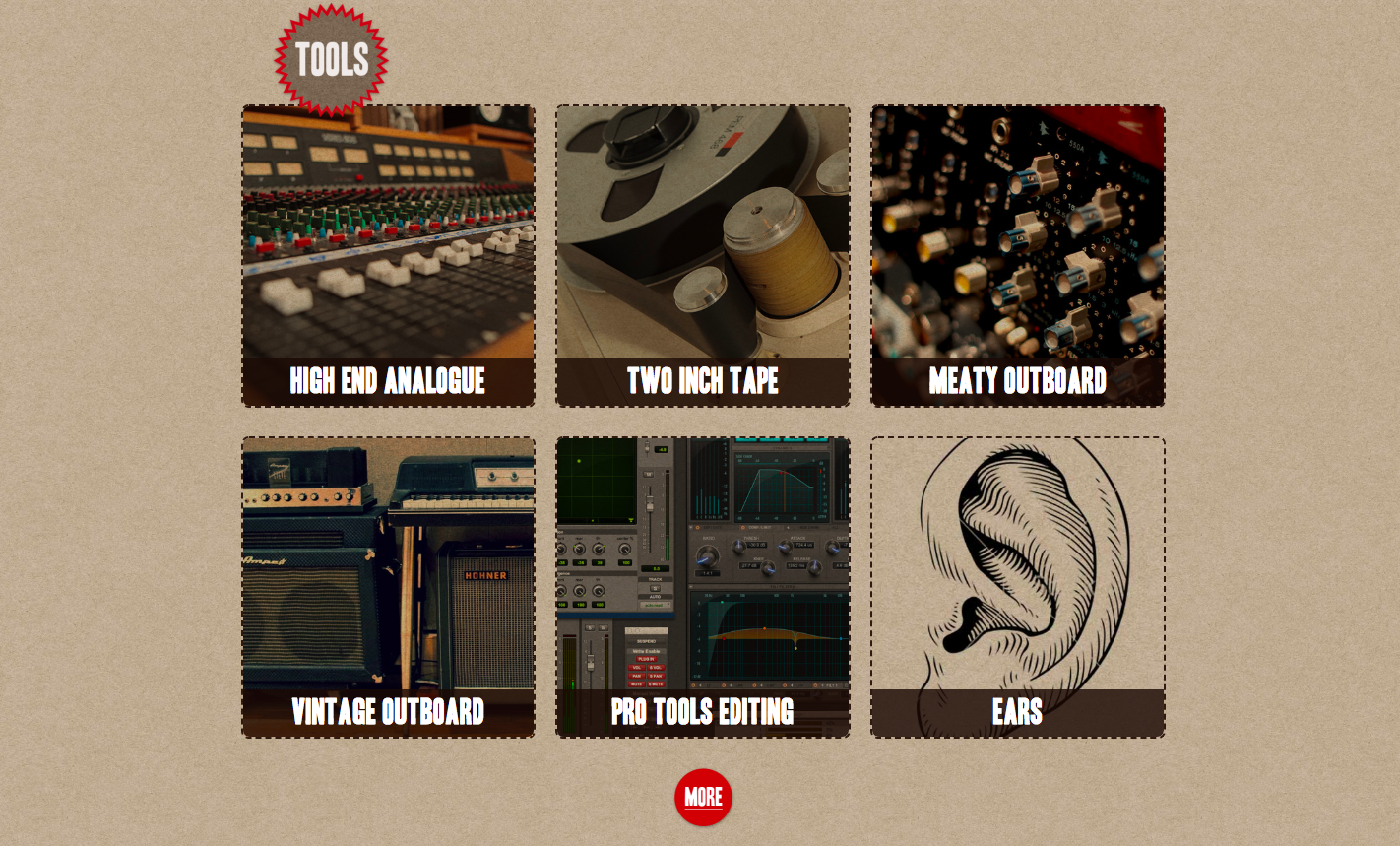
This design also complements the analog nature of the studio, with different textures of paper and a few doodle-like drawings used for the background. It’s these small touches that personalize the layout and keep it from feeling like flat blocks of pixels. Want to see how it was made? Open it in Webflow.
It looks like there’s some functionality that needs to be activated here, but this is a great design for a studio committed to capturing music in a more human, authentic way.
10. Mississauga Symphony Orchestra

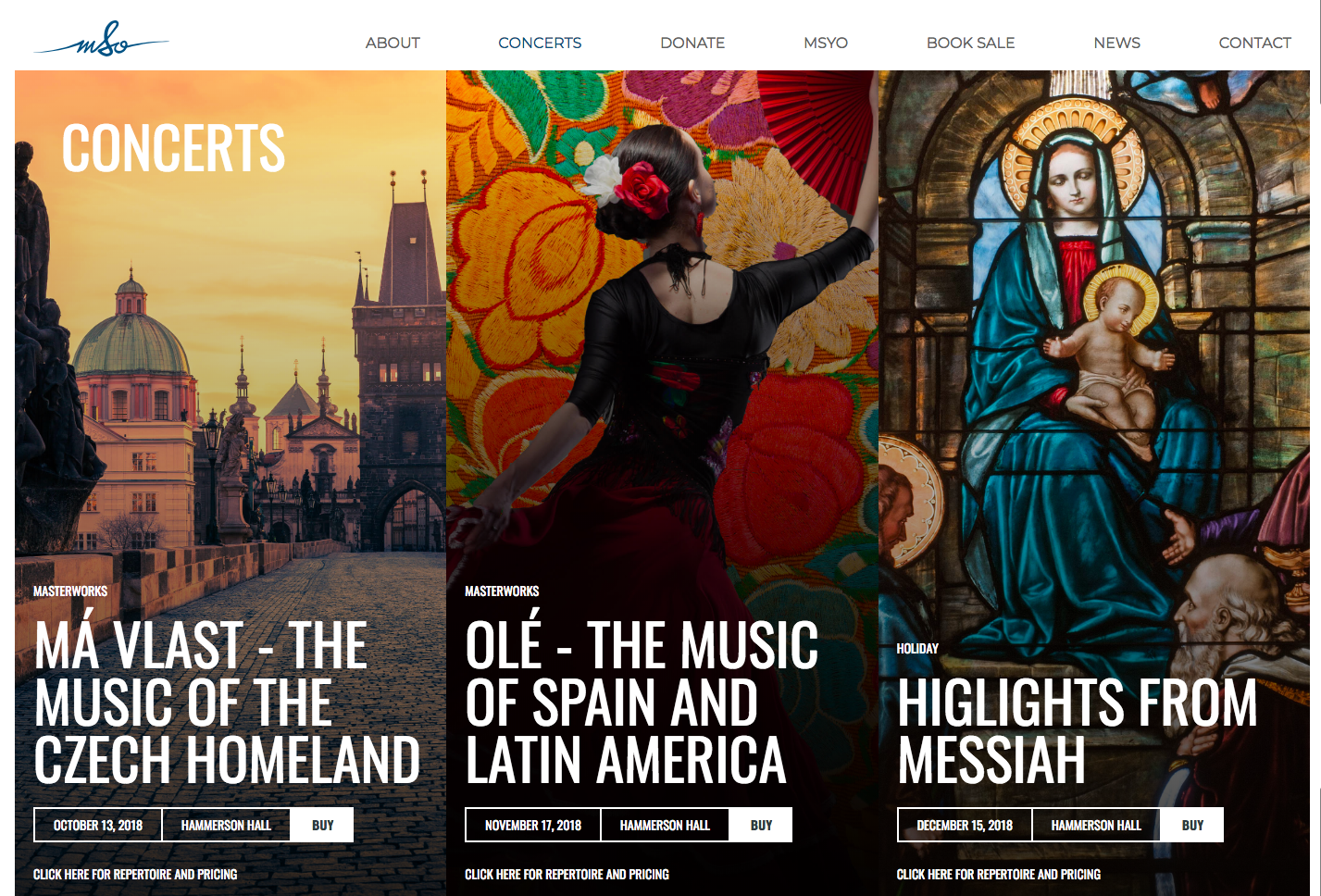
This design for the Mississauga Symphony Orchestra is full of vivid imagery that captures this symphony in action. There’s not even one bad shot in this image-heavy layout.
It’s an information-dense site that needs to be kept organized and updated. The designer makes good use of Webflows CMS for current orchestra news and a calendar of upcoming performances.
My only small critique is that there isn’t any readily available video of the orchestra. They update their Facebook page with concert footage, but the social media block is way down at the bottom of the page. It would be nice to see this content featured and easy to find. But their focus is spreading the word about upcoming concerts and making it easy to get tickets — which they do effectively.
Want to see how it was built? Take a look in Webflow to see how the CMS and other elements came together in this content-rich design.
11. Jane Bordeaux

This is a one-page design for the Israeli folk/country band Jane Bordeaux. The first thing you see is an autoplaying clip from an animated video, with a prominent play button. It’s a cool visual and it was a smart move to use this existing imagery on the landing page.
There’s a lot of wonderful media about the band included. There’s plenty of images, music videos, and other information that really gives visitors a good feel for the band and their music.
A neat feature is how they use Webflow CMS to make the chord progressions available for a few of their songs. It’s a nice touch that brings and audience closer and puts the band’s music at the fingertips of those who’d like to learn how to play it.
Open the site in Webflow to learn more about how it works.

12. RSU Summer Ball
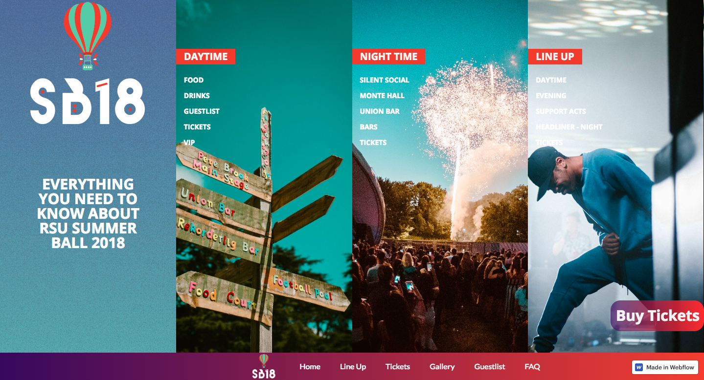
RSU Summer Ball is a music fest put on by the Roehampton Students’ Union of Roehampton University of London. And there’s so much going on with this festival — with DJs, performers, food, and even a mariachi band all playing a part.
This is a one-page layout, with navigation anchored at the bottom. There are profiles and song clips of all major artists playing at the festival. Visitors can find everything they’d want to know along with a strong call to action — “Buy Tickets” — fixed at the bottom right of the screen.
For a university music fest, this design rivals many larger, more established events.
Head over to its showcase page and find out how this page was assembled.

Get your music out there
Do you work on hip hop beats on a laptop over lunch? Or maybe you have a hard drive full of your singing over an acoustic guitar?
Whatever you’re into, the web has made it easy to make your music available. And having a website is one way to get people to listen. Don’t know where to start? Check out this Webflow band website template to get some direction.


