Back in the days of dial-up internet, 90s websites served up serious vibes with loud, colorful, and busy designs.
The 90s gave us the very first websites on the world wide web, launching us into a whole new age of the internet. In the span of a decade, web pages went from little more than glorified Word documents to boisterous sites full of vibrant colors, cheesy cursors, and excessive animation.
Step back into this era of experimentation and playfulness as we explore memorable 90s websites.
14 iconic 90s websites
1. World Wide Web
Tim Berners-Lee launched the world’s first website, World Wide Web, on August 6th, 1991. So yeah, we’d say that’s pretty iconic.

Tim created the website to share information about the World Wide Web project. Originally, the project was meant to streamline information sharing between scientists. But once Tim developed specifications for HTML, HTTP, and URLs, the project started to expand. The first website explained basics like what the world wide web was, what type of information was available, how to understand your browser, etc.
The site is still online today, but not all of the content is accessible.
2. Space Jam
Sing it with me now: “Everybody get up, it’s time to slam now. We got a real jam going now, welcome to the Space Jam. It’s your chance, do your dance — at the Space Jam.”

This gem from 1996 is burned into the memories of so many 90s kids. Space Jam wasn’t just a movie, it was an experience — and it started on the website that promoted the film. When this site came out, it was the pinnacle of web design. The starry tiled background with clip art planets, spaceships, and basketballs invited us to browse around and learn more about the Space Jam universe.
When clicked, the icons took us to interactive landing pages full of trivia games, coloring books, behind-the-scenes content, and even downloadable screensavers and posters. The Space Jam site is a textbook example of what web design in the 90s looked like — colorful, clunky, and full of mismatched backgrounds and unnecessary animations.
This iconic site is still live but hasn’t been updated since the 90s. So, if you’re looking for the equally iconic soundtrack, stream it on Spotify instead of trying to buy a CD or cassette from the Lunar Tunes page of the site.
3. Yahoo Games
Yahoo Games, a subsection of the main Yahoo! website, launched in 1998. The site hosted a large variety of Java applets and Flash games in categories like card games, board and tile games, word games, sports games, and more.

While the web design was pretty simple — lots of blue hyperlinks in greyscale columns — the games themselves were addicting and fun. Anyone who spent hours trying to line up gemstones in Bejeweled knows exactly why Candy Crush is such a popular game today.
All the games were free to play, as long as you could handle persistent pop-up ads and game limitations. You could also shell out the cash for “All Star” status, which got you some extra privileges. But even if you stuck to the free access, Yahoo Games had over 1,000 different games to choose from, making it a great place to hang out in the early days of the internet.
Yahoo Games had a good run, but shut down in 2016.
4. San Francisco FogCam
In 1994, The Department of Instructional Technologies at San Francisco State University created FogCam — a webcam that continuously monitors fog conditions on campus.

What started as a simple student project has become a piece of history — this webcam is still operating today, making it the world’s oldest and longest-running webcam. And considering how many times people have fought to keep this webcam running, it’s certainly one of the most beloved as well.
Although the site is regularly maintained and even has an accompanying Twitter, the design looks about the same as the day it launched. The webcam shows a low-resolution image that updates every 20 seconds as opposed to streaming in real time and the text looks like it’s typed directly into a Word document.
5. Hampster Dance
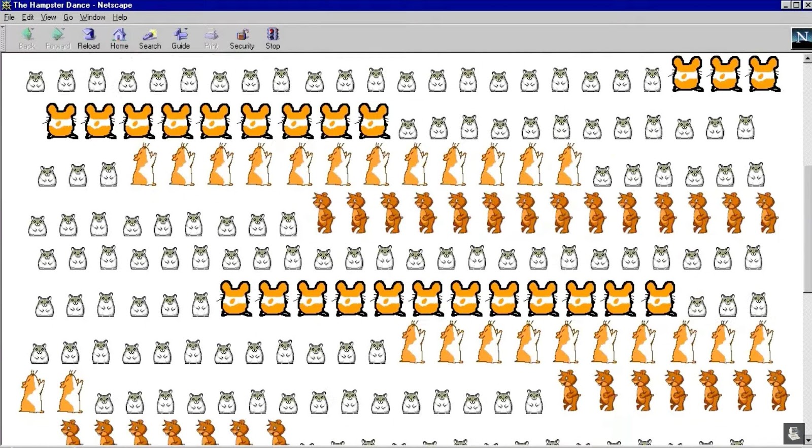
Hampster Dance encapsulates so much of early internet culture — a meme built on a Geocities site featuring rows of animated GIFs of hamsters, topped off with an auto-play ing song.

Hampster Dance went live in 1998, but didn’t start racking up visitors until early 1999.
Once the word had spread through forwarded emails, Hampster Dance became a sort of litmus test. If you recognized that never-ending “dodadidadodadodo” you were a young internet person — you had an ICQ or AIM screen name, frequented chat rooms, and maybe had your very own collection of GIFs hosted on a Geocities or Angelfire site. If you didn’t know the tune, you were not in with the internet crowd.
In addition to the variety of hamster GIFs, Hampster Dance had other key 90s website design traits. Elements like the visitor counter at the bottom of the page, a “guestbook” that visitors could sign, and the looped background music that couldn’t be turned off were all favorites of 90s web design standards.
6. AuctionWeb (eBay)
In 1995, auctions went virtual. AuctionBay — later changed to eBay — was a weekend coding project that turned into an internet staple.

Founder Pierre Omidyar made the first sale— a broken laser pointer — shortly after launching. Within a year, the site had facilitated the sale of $7.2 million dollars worth of items.
What makes early eBay so iconic is not its design, but rather its social impact. Collectors were no longer limited by geography. They could scour the internet for vintage ceramics, treasured toys from their childhood, or get in on the Beanie Baby craze.

By 1999, eBay’s homepage was a lot more colorful and chaotic than the original. The website showcased bright colors and mixed fonts. And with grainy clip art scattered throughout, the 1999 version of eBay fit comfortably into the 90s web design aesthetic.


Get started for free
Create custom, scalable websites — without writing code. Start building in Webflow.
7. CNN O.J. Simpson trial page
In 1995, NFL player O.J. Simpson made headlines when he was put on trial for the alleged murders of his ex-wife, Nicole Brown Simpson, and her friend, Ronald Goldman. The trial was so closely followed around the United States that CNN dedicated a section of their website to the trial and related news.

Visitors were greeted with what looked like a murder mystery game, complete with pixelated icons and blue hyperlinks to subpages like The Players and The Evidence. O.J.’s celebrity status and the complexity of the nine-month long trial made this a noteworthy 90s website.
And while the design may look basic and even a bit crass today, this website served as a go-to resource for anyone keeping tabs on the trial. The homepage offered a newsreel with links to related stories while the sub-pages hosted everything from evidence photos to trial transcripts.
The site is still live today, but many links and files no longer function.
8. Pitchfork
Online music magazine Pitchfork Media — later shortened to Pitchfork — launched in 1995. With weekly features, frequent record reviews, and a curated collection of indie music news — Pitchfork made a significant splash in music journalism.

Pitchfork’s website design mirrored many other late 90s sites like eBay and Yahoo Games, particularly on the homepage. The site used a newspaper-meets-encyclopedia style of navigation — columns separated different beats and each article included a sidebar with links to recent items, news, and related record reviews.
This combination is what made Pitchfork such a significant 90s website. It adapted two familiar mediums in a way that encouraged people to stay on the site and consume more content. Plus, the regular updates and in-depth reviews made Pitchfork a trusted resource for the latest in the music scene.
Many early indie bands have Pitchfork to thank for their break into the mainstream. For example, Broken Social Scene went from a relatively unknown band to selling out venues after Pitchfork rated their album,You Forgot it in People, a 9.2 out of 10.
Pitchfork’s site has gone through a few website redesigns since its initial launch and continues to publish music news, reviews, and more today.
9. PizzaNet
Long before DoorDash and GrubHub, there was PizzaNet. This experiment by Pizza Hut hit the world wide web in 1994.

While the grayscale site with Times New Roman font wasn’t much to look at, it marked the beginning of a new way to order pizza. The ordering process was rudimentary — visitors filled out a form with their information and pizza order, got a phone call to confirm, and paid in cash upon delivery.
But there was a lot more going on behind-the-scenes. PizzaNet form submissions were sent to a Pizza Hut server in Wichita, Kansas and then sent back to the Santa Cruz, California franchise that piloted the program. Eventually, tech company The Santa Cruz Operation connected point of sale systems to servers in Pizza Huts around the country.
The clunky PizzaNet site fizzled out and Pizza Hut didn’t introduce a more robust online ordering system until the 2000s. However, it’s clear that PizzaNet is a notable milestone in the evolution of online food ordering. In fact, PizzaHut still keeps a (non-functional) version of PizzaNet online.
10. NASA
The National Aeronautics and Space Administration (NASA) launched the first iteration of its site in 1994.

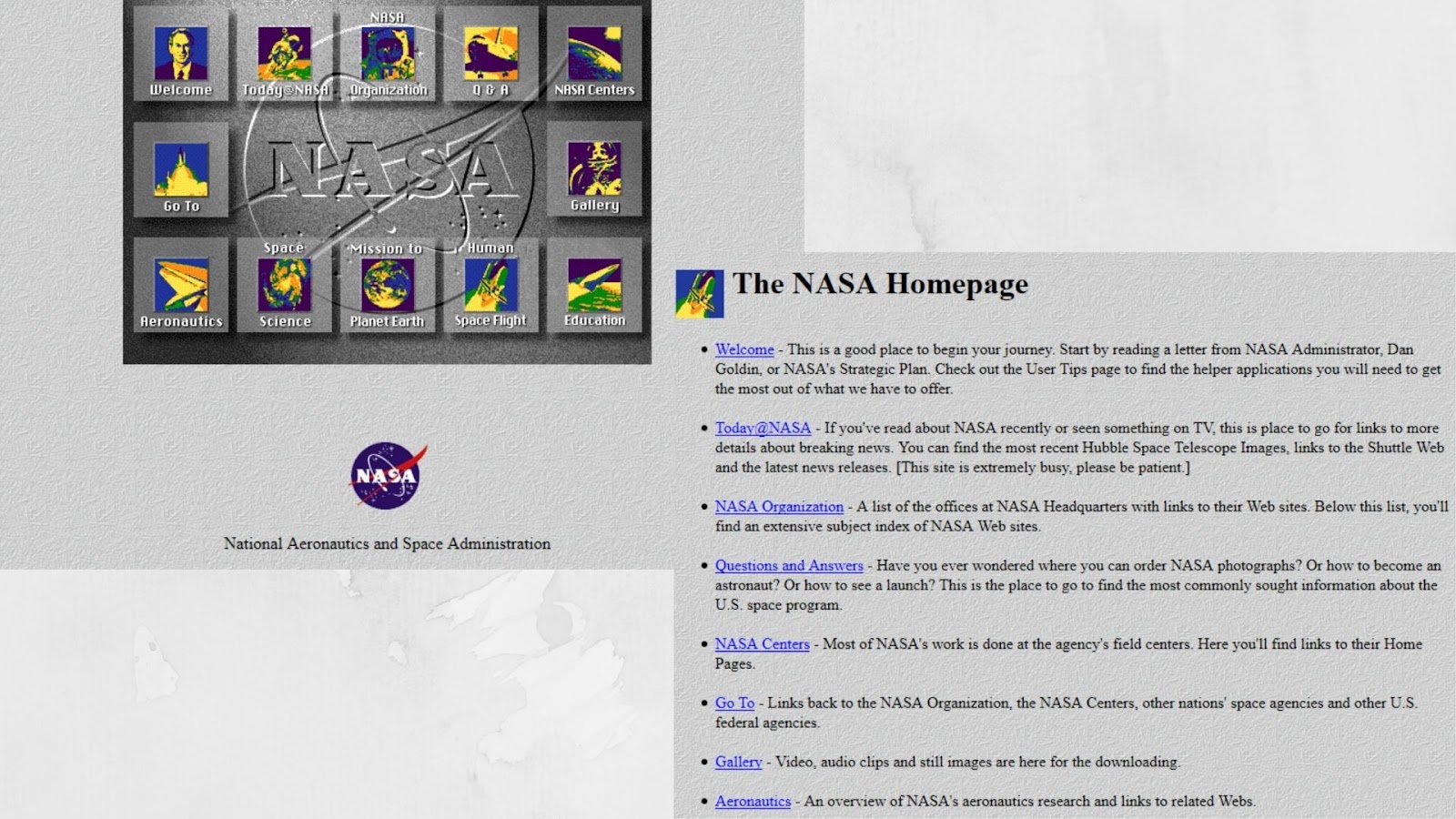
The homepage centered around the navigation — a grid of buttons with extremely grainy icons. Throughout the site you’d find key 90s web design markers like drop shadows behind text and a textured gray background.
Although the original site wasn’t very intuitive, it was the first time all things NASA were available in a central place. Scientists, educators, students, and space enthusiasts could find everything from the space image of the day to updates on the latest NASA launch.
Today, NASA’s site looks a lot different thanks to four major design overhauls, many of which asked for user feedback to make the site easier to navigate.
11. MapQuest
If you didn’t log onto the family computer, head to MapQuest.com, print out several pages of directions, and then try to read them while on the road — did you even drive in the 90s and early 00s?

When it launched in 1996, MapQuest offered travel guides, local neighborhood information, and travel tips. But its claim to fame was the driving directions or TripQuest feature. Long before car GPS devices and smartphones, MapQuest helped internet-savvy drivers map out routes, eventually including pit stops like gas stations and ATMs.
The original site had a classic 90s web design aesthetic. Back then, the patterned background, cartoonish images, and even early technological brags like “applet technology” made MapQuest a cutting edge site.
MapQuest is still around and while it can’t compete with Google Maps in popularity or user base, it will always hold an important place in internet and navigational technology history.
12. LEGO
LEGO has always known their audience — so it’s no surprise that their 1996 website catered to children first and everyone else second.

The homepage opened with low-resolution clip art images — some of which spun, danced, and moved — on a patterned background designed to look like a LEGO base.
While the site had plenty of clumsy 90s web design elements like the large Home and Go to Top icons, it also had some impressive functionality for the time period. For example, the Play section led to an on-site treasure hunt and a space mystery video game. Kids could also build their very own LEGO site by joining the LEGO Surfer Club.
LEGO’s site has continued to evolve both design and functionality-wise with updated site navigation, more robust LEGO membership options, online games, and ecommerce features.
13. Webaholics
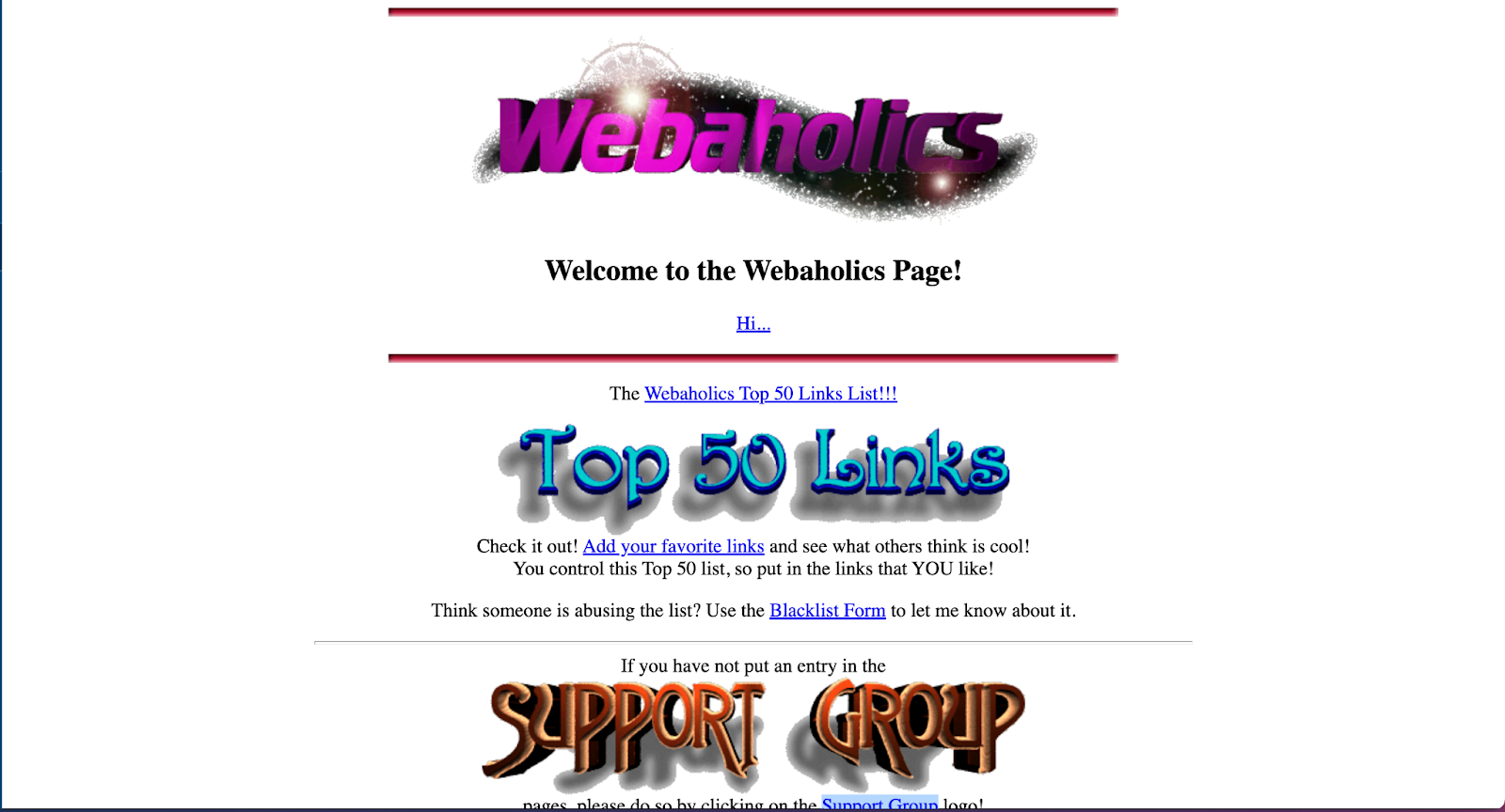
By 1994, both the number of websites available and people enjoying them were steadily rising. But early internet users couldn’t rely on search engines to discover new sites. And so, Webaholics — a directory site of top links — was born.

Oddly enough, the site also functioned as a support group forum for people who felt addicted to the internet. In fact, Rich Barrette created the site after two of his classmates dropped out of school due to spending too much time online. Stories from self-proclaimed Webaholics ranged from funny to serious, but the main draw of the site seemed to be the curated list of top links.
Webaholics really loved the 90s design trend of large, dramatic Word Art — those drop shadow text images that were so heavily favored in school projects. The site also featured award badge icons and links to press mentions of the Webaholics site.
Webaholics was a short-lived project and is no longer online.
14. Goosebumps
Scholastic’s best-selling book series and TV show, Goosebumps, got its own website in 1996.

The Goosebumps homepage featured a collection of clickable illustrations on a dark background. This illustrated navigation style was popular in the 90s, particularly for sites aimed at kids.
When clicked, the monster illustrations took you to different pages of the website — each with their own themed, patterned background, of course. The Goosebumps site also had some pretty iconic typography choices, featuring the classic Goosebumps font along with a mix of colorful Word Art images.
The site kept kids entertained with video clips of Goosebumps episodes, fan-submitted stories, and Boo-Grams — spooky e-greetings with virtual monster stamps that visitors could send to friends.
Scholastic now has a section of its main site dedicated to Goosebumps with videos, games, and book information.
Love it or hate it — 90s website design was certainly iconic
Many of these 90s websites may seem garish now, but retro trends have a way of coming back into style. While we don’t think any of these sites would win design awards today, aspects like the oversized typography, motion graphics, and collage illustrations would fit right into the predicted web design trends for 2022.
Did we miss any of your favorite 90s websites? Let us know in the comments!


