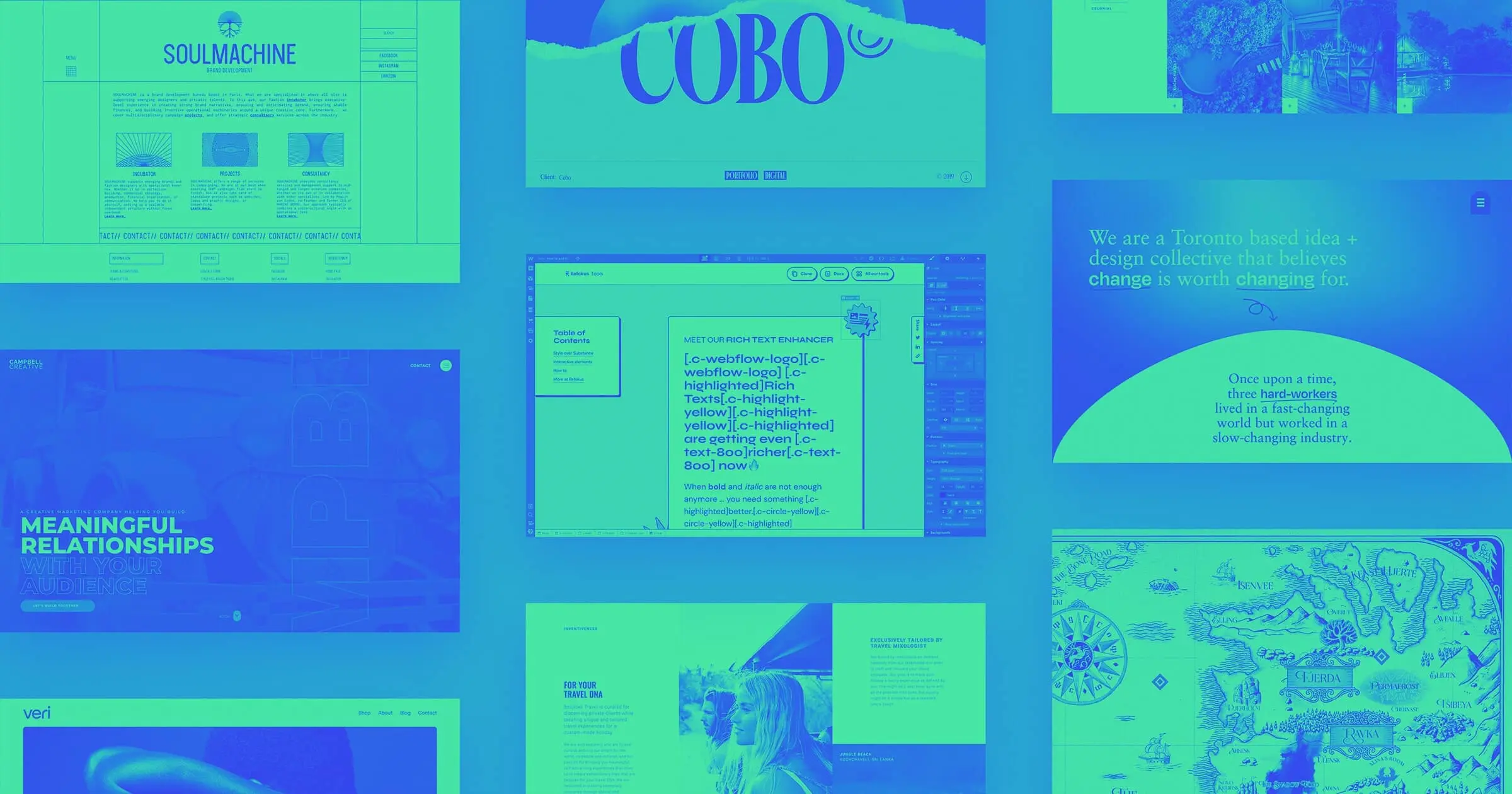
From newspaper-like portfolios, to luxury travel experiences, to interactive fantasy maps — the Webflow community has been pushing the boundaries of what it means to create a website.
We’ve loved seeing the creativity in the projects you’ve shared through Made in Webflow. Here are some that caught our attention in the month of October.
1. Niccolo Miranda
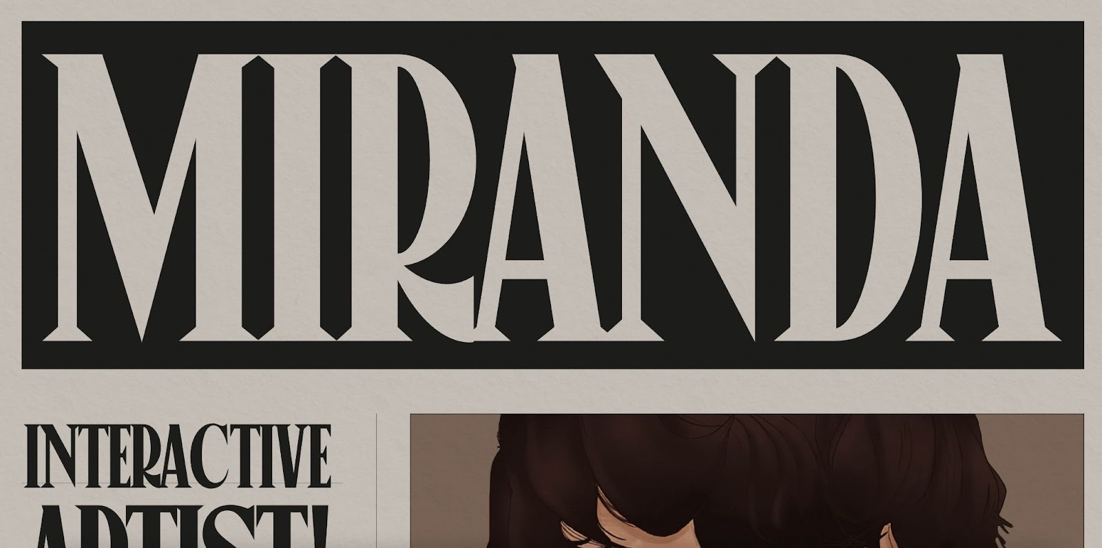
Topping the list for one of the most unique portfolios we’ve seen lately is Amsterdam-based designer Niccolo Miranda’s portfolio. Instead of your standard modernist site, Niccolo takes their portfolio to the next level by turning it into a interactive newspaper.
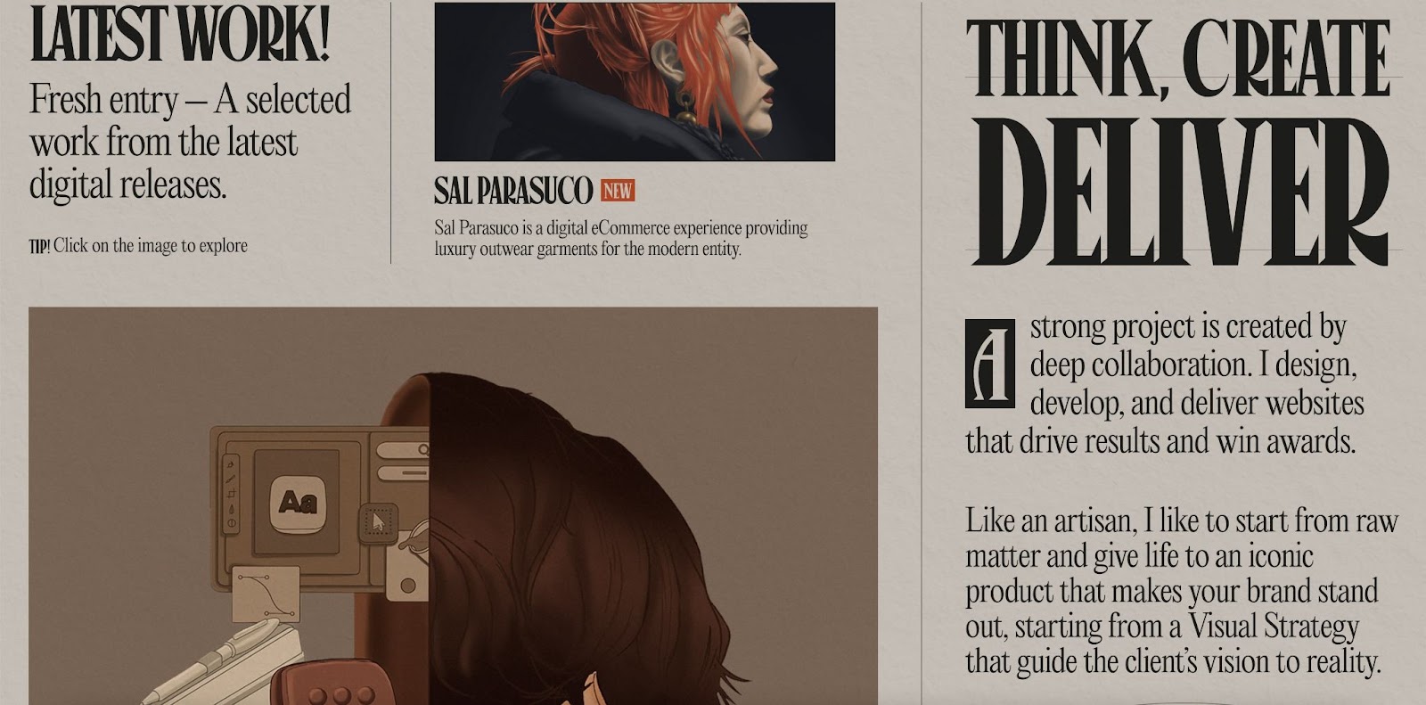
The breaking news is Niccolo’s latest work, and the headlines and articles show off their mission statement and skills. We especially love the small details that make the newspaper aesthetic come to life such as the stylized header and footers; gray, paper-like background; and spinning animation that reminds us of a vintage newsreel.
2. Tricks Interactive Map (Cloneable)
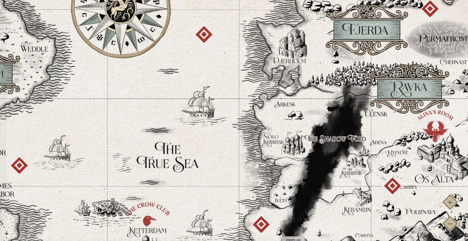
For all fans of fantasy and creating virtual experiences – Timothy Ricks’ cloneable, interactive map is a must-see. The map is scrollable with different clickable sections of the map — denoted by a red diamond.
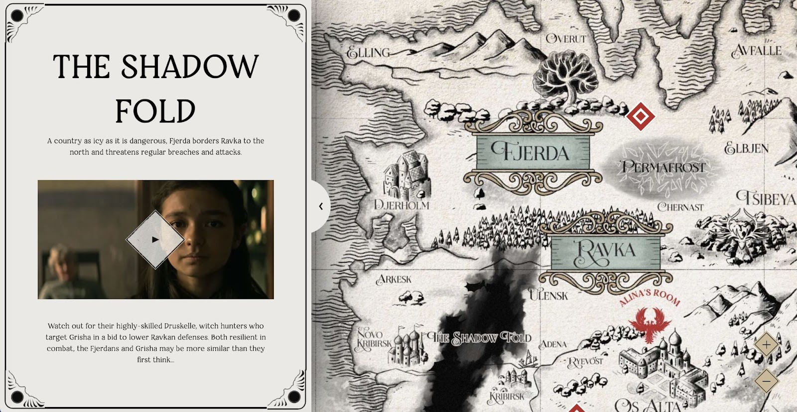
Upon click, information about that area pops up in a sidebar. Designers can use the sidebar to add an image or video along with written content. This map is a great example of the interactive experiences like scavenger hunts that are sweeping web design right now, and would be the perfect opening page for projects in that vein.
3. Hard Work Club
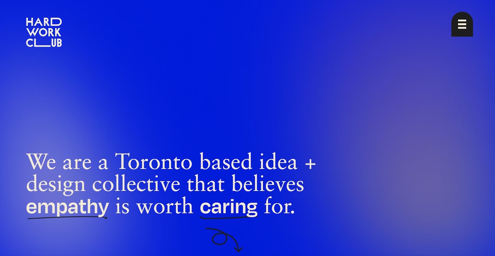
Toronto-based Hard Work Club is an agency that is dedicated to out-of-the-box ideas.They toss corporate jargon and typical 9-5s out the window — breaking traditional norms in order to foster creativity and innovation.
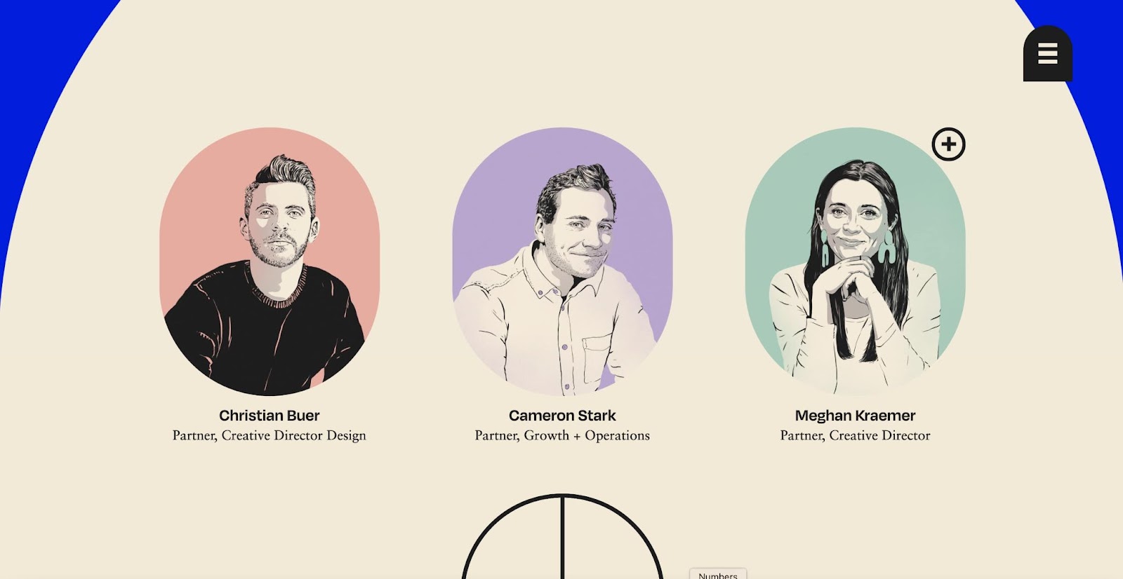
Their website reflects this ethos. Throughout the site, the Hard Work Club uses playful colors, contrasting typefaces, and fun animations to drive home their mission. Instead of doing a multi-page layout, the Hard Work Club website is a single-scroll, with separated sections. We especially like how they’ve organized the sections in a narrative — making it easy to tell their story and mission to prospective clients.
4. Elish
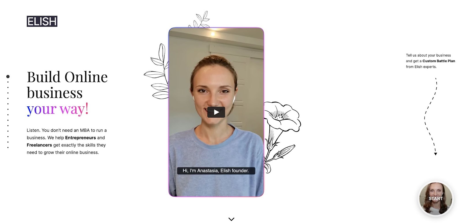
Looking for help and guidance when building your business? Elish has you covered. They are a business resource and counseling service that creates and tailors streamlined business plans to your specific needs.
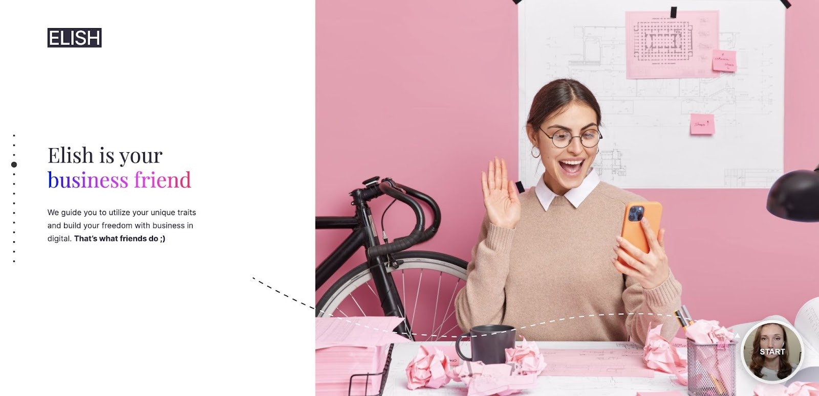
Elish’s website keeps it simple — using a single scroll navigation much like the Hard Work Club. By doing so, they’re able to clearly communicate who they are, what they do, and how they help their clients.
5. Campbell Creative
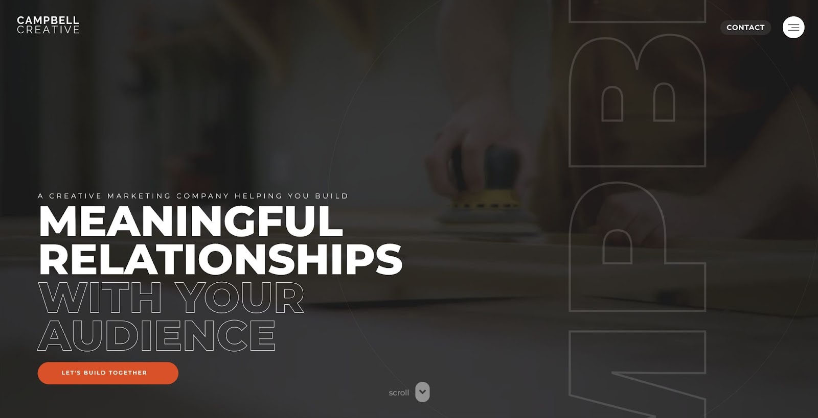
Campbell Creative is a marketing agency that helps businesses like Pillsbury, General Mills, Walmart, and Nintendo tell compelling and meaningful stories via video, websites, social media, photography, and creative projects.
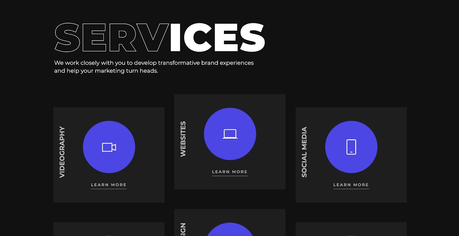
Instead of relying on imagery and flashy animation to get their message across, Campbell Creative leans into large typography. Through bold text and clear iconography, they explain who they are, who they’ve worked with, and what they can do for you. Websites don’t always have to be flashy to make an impact — Campbell Creative’s site is a great example of the effectiveness of using clear and concise messaging.


Get started for free
Create custom, scalable websites — without writing code. Start building in Webflow.
6. Rich Text Enhancer by Refokus
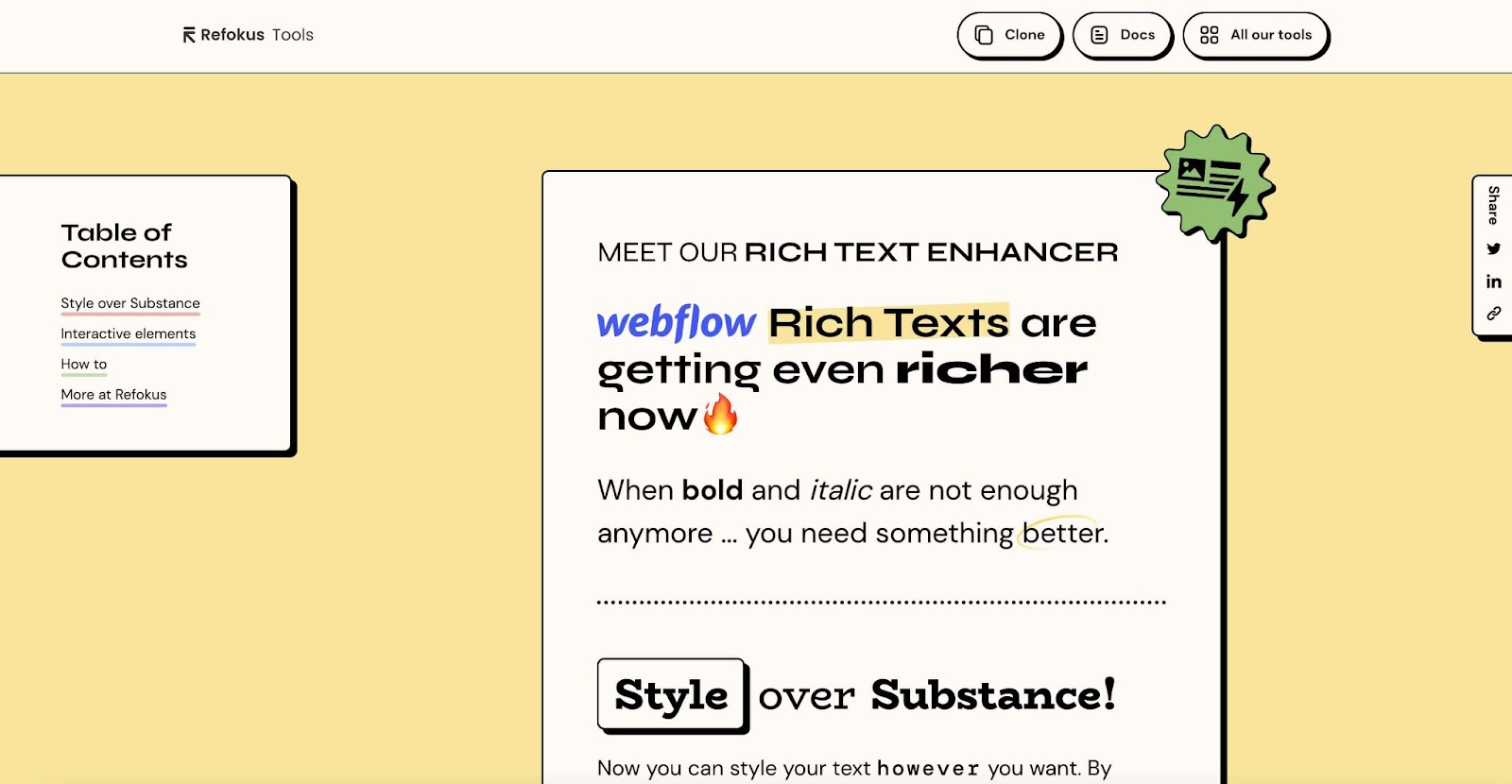
Webflow Partner Refokus recently created their public and free repository of Webflow tools. Within that toolbox is their Rich Text Enhancer, which allows designers to stylize text for their Webflow sites in unique and interesting ways.
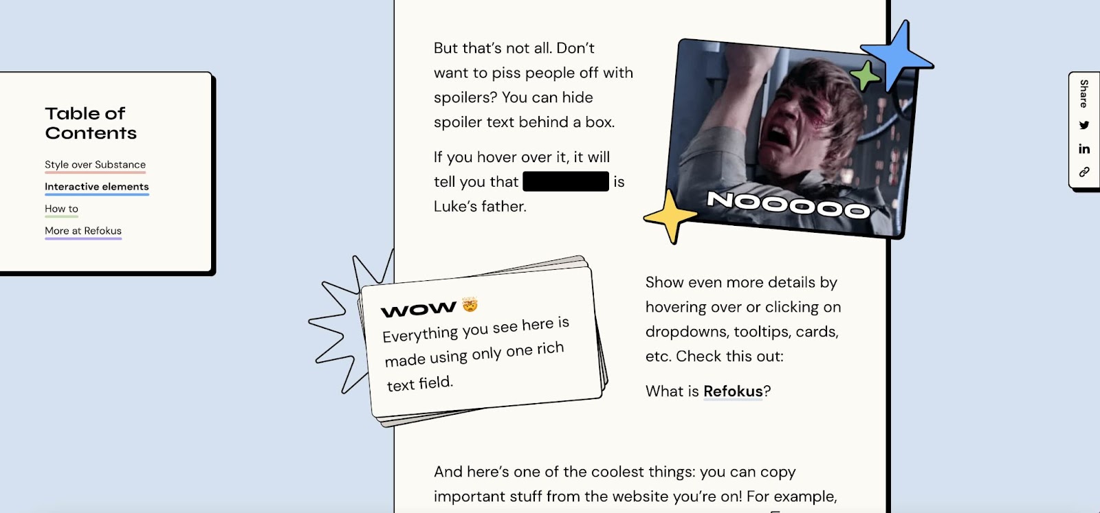
This tool’s section within the greater Refokus Tools site has been designed specifically to show off all you can do with the Rich Text Enhancer. We love the ever-changing fonts, funny graphics, and images that give this page personality.
7. Bespoke Luxury
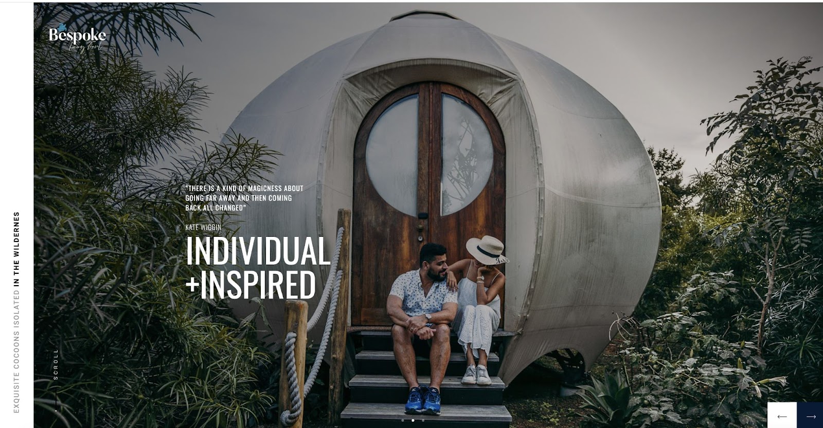
In the era of almost endless travel options, it’s important for companies to stand out. Bespoke Luxury — a Sri Lanka-based luxury travel agency — leans into showcasing the highly curated experience that they can offer to prospective travelers with their bold and eye-catching site.
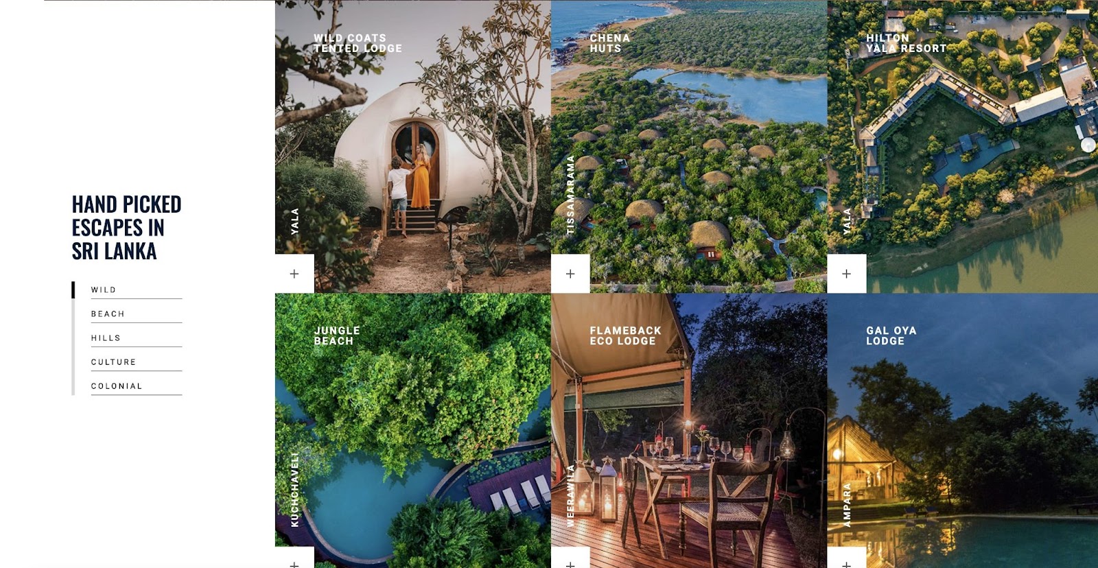
Rich imagery is so important when you’re selling experiences, and Bespoke Luxury does this better than anyone we’ve seen — showing off incredible images of their amenities, accommodations, and the beauty of Sri Lanka.
8. Soul Machine
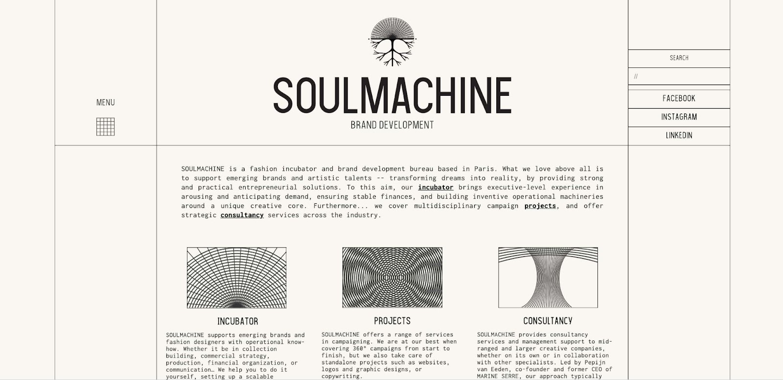
Paris-based Soul Machine is “a fashion incubator and brand development bureau” that is dedicated to supporting emerging brands and artists. They run different programs such as “Incubator,” which helps brands start, set-up and maintain their businesses. They also help small brands execute on marketing campaigns and provide larger brands with consultation on brand communication and fashion management.
For such a creative brand in a creative industry — we love that Soul Machine’s website leans into a subtle and muted theme. This isn’t to say that the design doesn’t have bold and captivating elements — Soul Machine keeps things interesting by using striking abstract graphics.
9. Josephine Heide
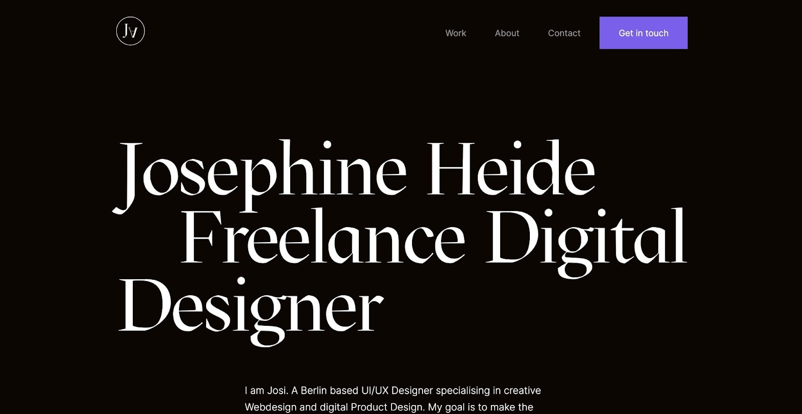
We can’t get enough of clean, minimalist portfolios — and Josephine Heide’s is no exception. Based in Berlin, Josephine is a UI/UX designer who focuses on research and analytical data to create projects for her clients.
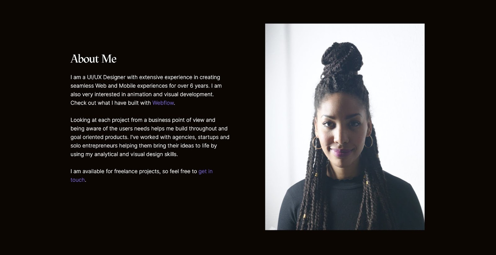
Josephine uses a straightforward design to showcase their skills, past work, and biography. What Josephine does particularly well is make all of the necessary information incredibly accessible to anyone browsing through the site. There’s no need to hunt and search for information — it’s all laid out in a beautiful and intuitive way.
10. Veri
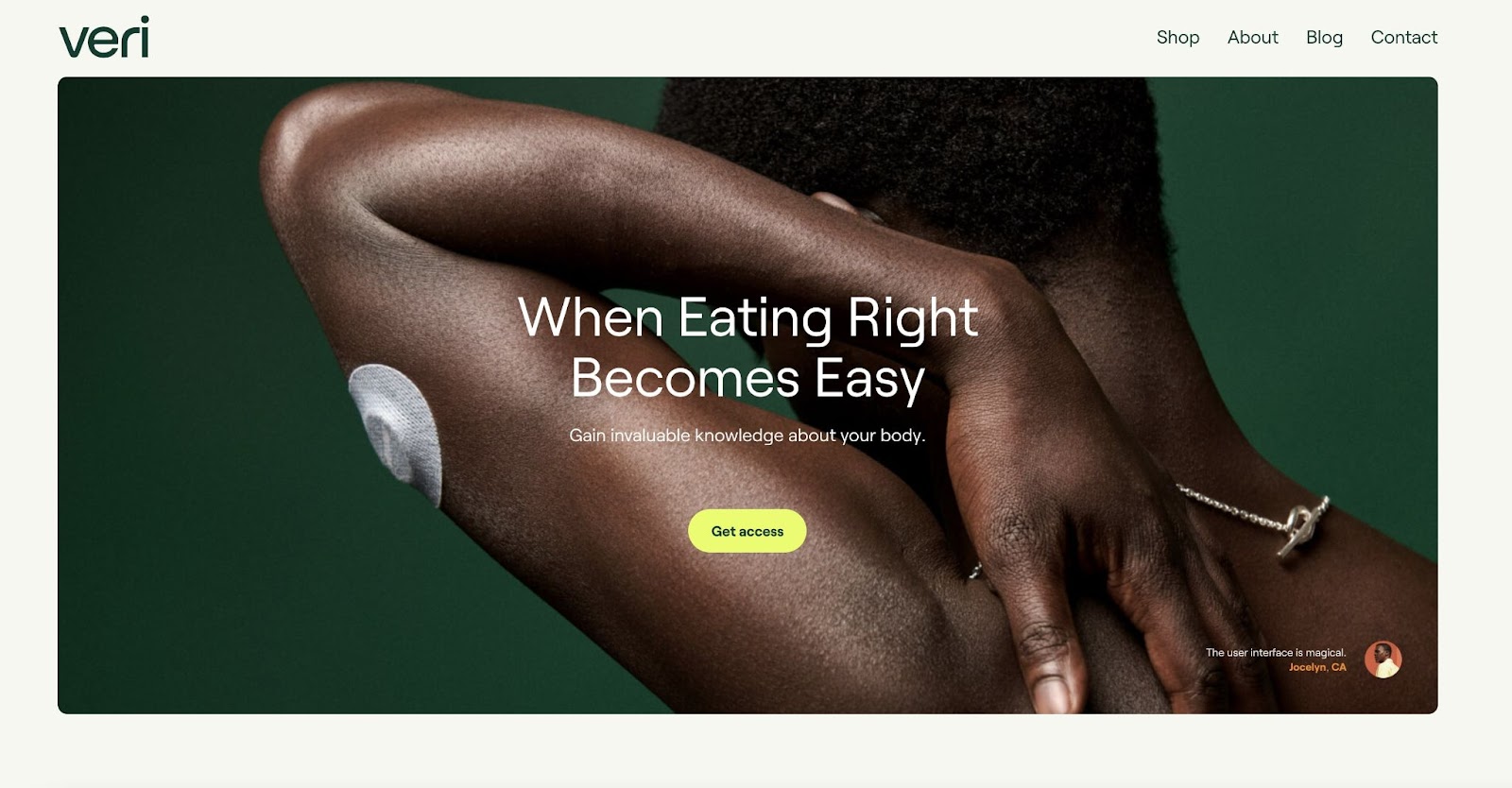
When it comes to your health, it can be difficult to understand what steps you need to take to support your unique body. Veri seeks to bridge this gap with their metabolic tool. It measures your glucose levels, how your body responds to certain foods, how you can best optimize your health every day, and more.
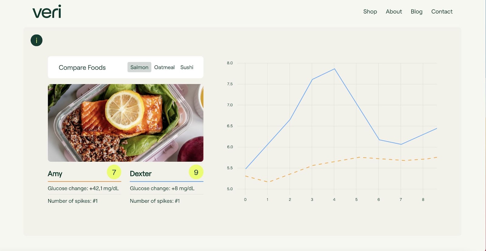
We like how Veri’s website uses graphics and images to show off what their product can do. Using graphic elements is often the best way to convey information about a product to potential buyers and investors. Veri does it particularly well — mixing example graphs and data to help buyers understand what information they’ll receive from Veri and what their experience using the product will be like.
Show us your great Webflow project
We love seeing what you all are creating with Webflow every month. For your chance to be featured in next month’s roundup, be sure to submit to Made in Webflow.


