A great graphic design portfolio introduces your style and makes a lasting impression on clients.
A great graphic design portfolio introduces your style and makes a lasting impression on clients.
Whether you’re an in-demand freelancer or a veteran art director, you need an online portfolio. By displaying your best design work and curating a seamless journey through it, you’ll attract the clients you need to advance or maintain your career.
The best graphic design portfolio websites combine engaging visuals with a hint of clever user experience (UX) design to make exploring them a delightful, memorable experience. Let the following tips and portfolio examples inspire you to get creative with your own site.
What’s a graphic design portfolio?
A graphic design portfolio is a curated collection of your best creative work presented in a way that highlights your technical skills and personality. It provides context at a glance, which helps potential clients gauge whether your talent and personal style match their needs.
A portfolio is also an important space for building credibility. Outlining real-world impacts like client reviews and success metrics shows readers that you care about driving results (and that you know how to).
Most portfolios today are online, making it easier for potential clients to explore your projects and understand how you approach design challenges. They show what you’ve created, how you think, and what your range is. With the right elements and structure, you can turn your projects into compelling narratives that convert.
What a good graphic design portfolio should include
Your graphic design portfolio website showcases samples of your work to help potential clients determine whether you’re a good fit for their project. Then, it directs them to your contact information so they can reach out about working with you. It should highlight what differentiates you from other graphic designers, but there are a few key elements every designer portfolio should include:
- Work samples. Provide a wide range of case studies of logo designs, animations, and illustrations you’ve made to demonstrate your range as a graphic designer.
- Client testimonials. Include testimonials from previous clients that mention how your designs engaged their customers.
- Design process. Describe what makes your approach to design work unique. Provide mockups and templates that show how you determine art direction, layout, and composition.
- Contact information. List your email, phone number, and social media handles on your contact page so potential clients know the best way to contact you. Mention your availability or average response times to set their expectations for how soon you’ll get back to them.
14 inspiring graphic design portfolios
These 14 inspirational design portfolio examples showcase their designers’ best work and are sure to get the attention of potential clients and hiring managers.
1. Purvaja Patel
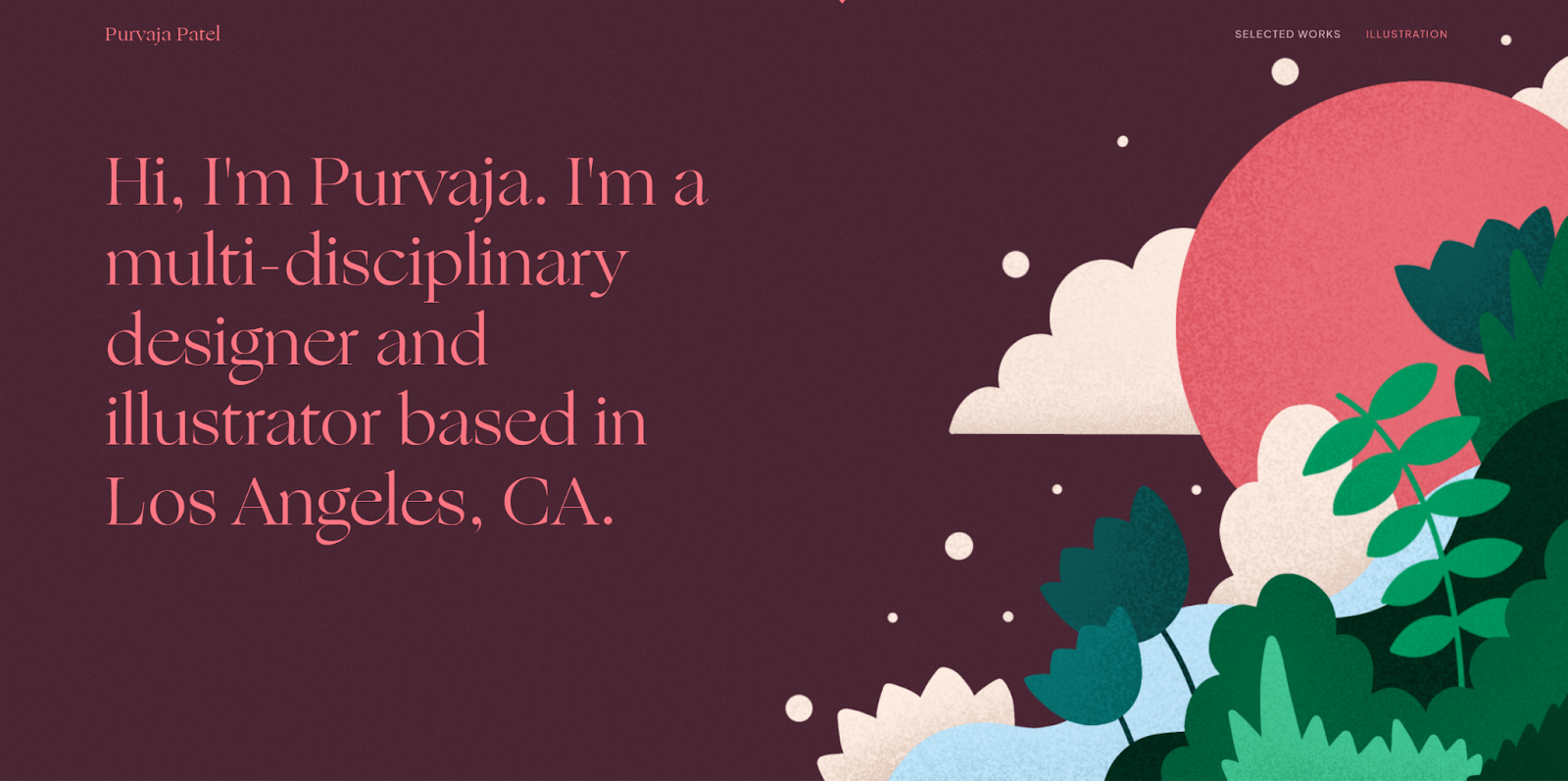
Purvaja Patel’s design portfolio uses simple shapes and contrasting colors to create playful, immersive visuals. This style is immediately evident in the hero image of her website, which features crisp lines, bold colors, and papery textures to depict a sunset over a flowing river lined with plants.
Purvaja’s gallery continues this theme while highlighting her experience with both fun, lighthearted projects — such as cookbooks and playing cards — and more serious work, including CQS reports and cryptocurrency websites. Despite the diversity in project types, her distinctive, playful style remains a constant, showing potential clients that she can bring a lighthearted touch to any project.
Follow her lead by finding ways to apply your style to your graphic design portfolio, making the site itself an interactive work sample.
2. Tony Mayer
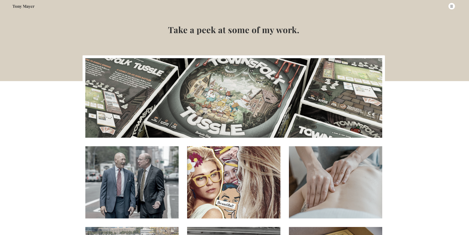
Tony Mayer’s professional portfolio website opens with a gallery view of past works so potential clients can start immediately exploring the designs without needing to click on another page. This is a strong technique because something might catch people’s eye before they bounce from the website.
When you open each case study, you’ll notice they follow a basic template that visually showcases the work that went into each graphic design project. The uniform layout makes exploring Tony’s portfolio that much more intuitive. Using portfolio templates is a great way to create consistency in your work.
3. Stans
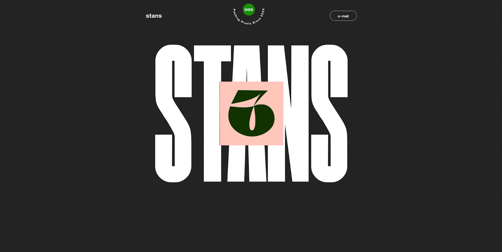
Stans is a studio run by Stijn Anseel, a graphic design teacher in Belgium. The website opens with the word “Stans” overlaid by an image of the number six, and as you scroll, three additional thumbnails spread out from behind the visual. This interactive feature encourages exploration while also showcasing Stijn’s past work, design style, and preferences.
Further down, a clean one-page overview presents a variety of Stijn’s designs, including record sleeves, app user interfaces, and cookbook layouts. This diverse selection highlights the design style and versatility, demonstrating Stijn’s ability to work across different types of projects. In your own portfolio, include a range of client work and project types to show potential clients that you’re equipped to handle any challenge.
4. Versal Graphic Design
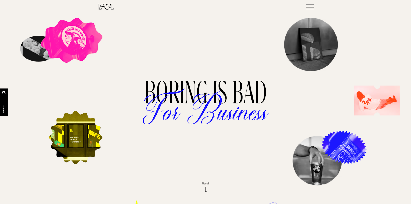
Diego Andrés Pérez Carrasco developed this portfolio website for Versal Graphic Design, a studio that believes “Boring is bad for business.” The homepage immediately reflects this ethos with the following elements:
- The tagline blends a bold serif font with a swirly, cursive-style script.
- Bright, contrasting colors like highlighter yellow and bubblegum pink pop throughout.
- Hovering over images reveals microinteractions — such as wiggling pictures and a “View more” cursor — to encourage further exploration.
These elements perfectly align with the tagline because all the interactive elements, phrases, and colors are anything but boring. Let this approach encourage you to push creative boundaries in your own work.
5. Alexandre Tal
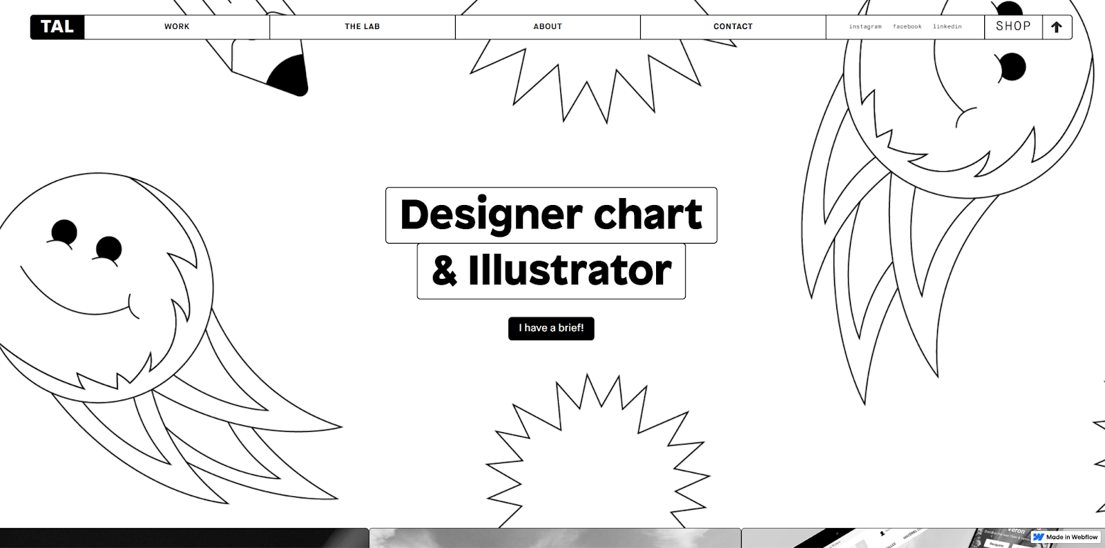
Freelancer Alexandre Tal created this delightfully monochromatic portfolio website. The gallery opens with playful line art featuring smiley faces, pencils, and multipointed stars, but the black-and-white color scheme keeps the page from feeling too busy or overwhelming.
Desaturated photos act as thumbnails for Alexandre’s other design projects, creating a cohesive feel alongside the minimal line art designs. But when you hover over the images, they colorize, revealing the full depth of Alexandre’s work.
This combination of unique designs and engaging interactions makes the site fun and intuitive to explore. Alexandre’s personal website provides an excellent template you can use as a starting point for your online portfolio.
6. David Klaus
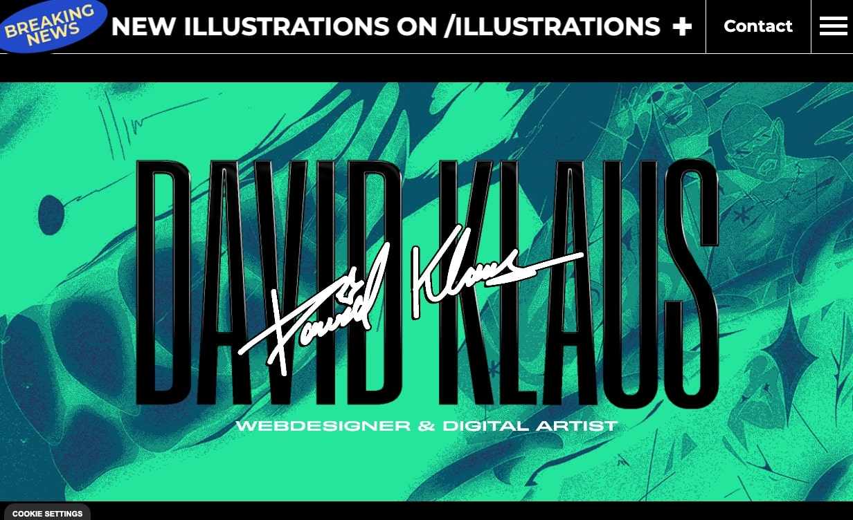
David Klaus’ designer portfolio opens with a rotating set of colorful images behind two versions of the designer’s name in contrasting fonts. The photos quickly flash across the screen in bright colors like lime green, dark red, and sunshine yellow. The name wiggles, and a scrolling banner at the top highlights David’s book recommendations. All of these dynamic elements combine to give the site an energetic feel.
Despite the unpredictability, the site maintains just enough order to keep you engaged, making you curious to see what’s next. This sense of surprise makes the site more memorable, which is likely to leave an impression on hiring managers and potential clients — just as you’d want for your own portfolio.
7. Be Kind Design
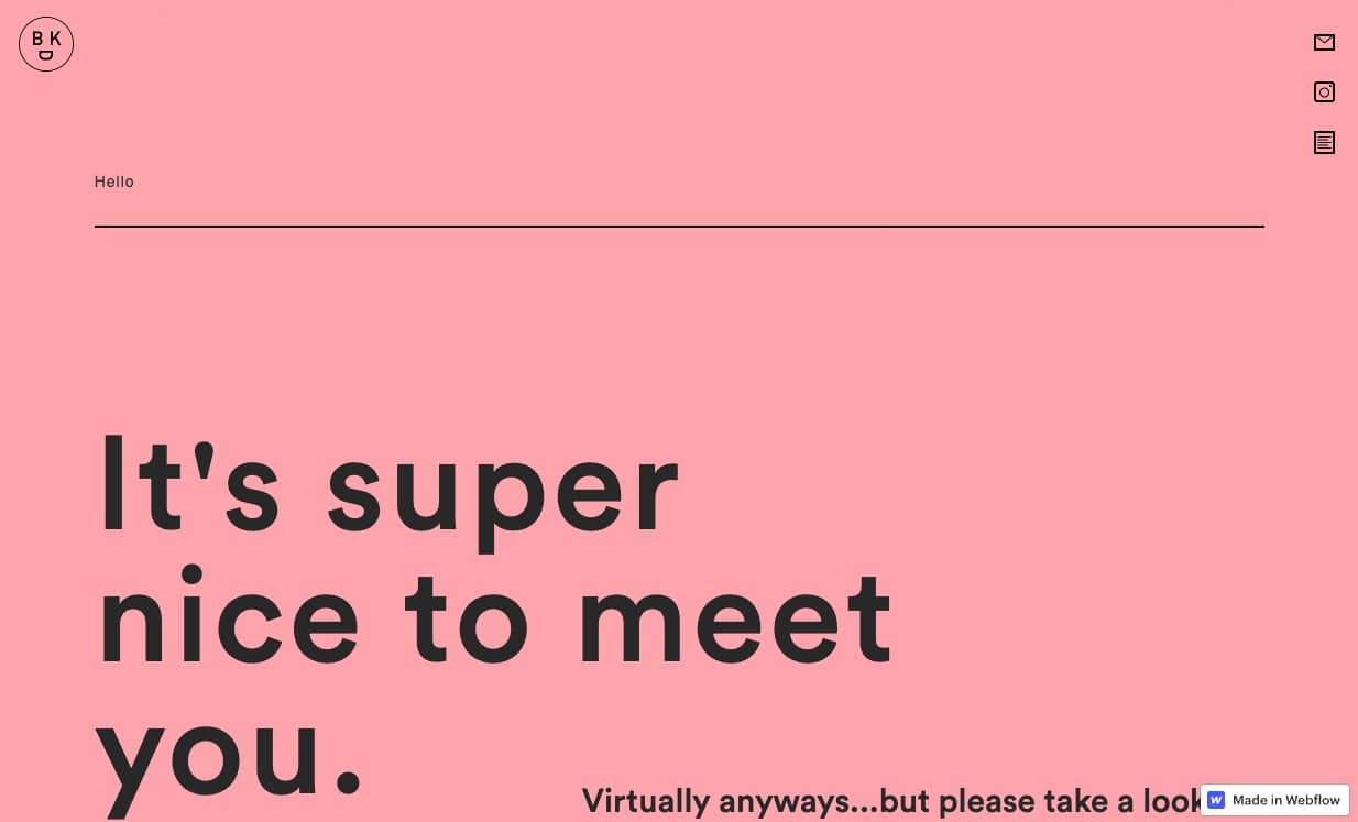
Chris Nguyen infused his graphic design portfolio with delightful authenticity and charm. The clean, minimal design feels fresh and engaging due to its light pink background, subtle scroll animations that expand portfolio images, and simple line art of smiley faces and mountains.
The copy complements this charming vibe with polite, endearing phrases like “It’s nice to meet you” and “Turning frowns upside down since 1986.” These phrases reflect Chris’s sunny, kind disposition, suggesting that working with this designer would be a pleasure. And Chris signals this all before you even open the page by titling the brand Be Kind Design.
By thoughtfully crafting your copy and portfolio design, you can convey your personality and attract potential clients.


Launch with Webflow Templates
Choose from hundreds of professionally designed website templates for any industry or style. Customize visually, launch instantly — no coding required.
8. Howsem Huang
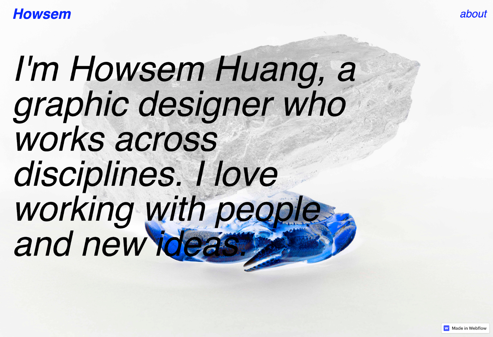
Howsem Huang’s design portfolio is best summarized by the title of his first work sample: “Bizarre, Surreal, Phantastic!” The hero image perfectly captures this style by featuring a crab with its colors inverted, turning an ordinary image into something intriguing and unexpected. This bright, thought-provoking approach is consistent throughout the rest of his portfolio.
Each work sample differs from the last, from a typeface Howsem made himself to an advertising campaign for a museum. Consider following this example by highlighting past work that shows a wide range of mediums but still fits together to create an immersive, memorable experience.
9. Alex Fisher
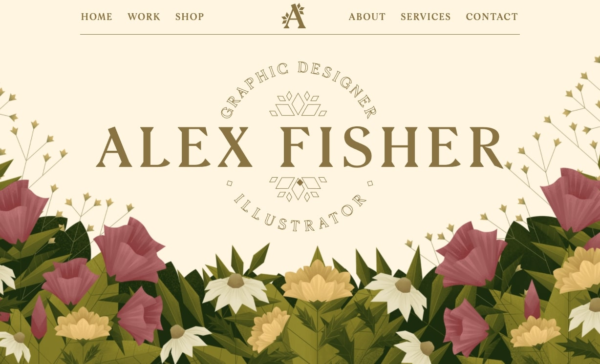
Alex Fisher is a graphic designer and illustrator, and her art takes center stage across her entire portfolio site. The hero image combines illustration with graphic design elements, featuring delicate flowers and greenery with a textured, paperlike style. Parallax effects make layers of the image disappear as you scroll, showcasing her graphic design and illustration skills before you even reach her past work examples.
Throughout the site, flowers from the hero image appear again, maintaining a consistent visual identity and reinforcing Alex’s creative abilities. The page concludes with a contact form reading “Let’s work together,” inviting viewers to reach out after experiencing her design approach.
Take inspiration from this example by embracing your style in a way that encourages visitors to explore your portfolio further.
10. Roos Beeldt
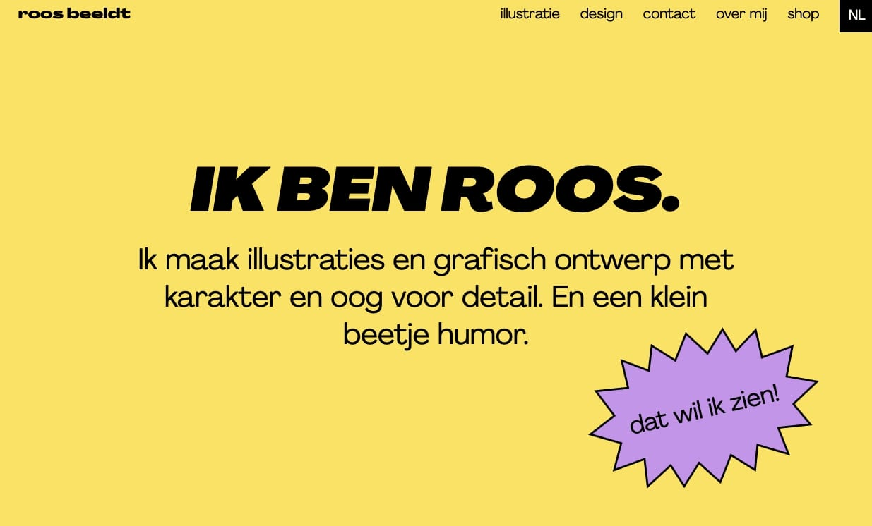
Roos de Bildt built a portfolio website showcasing her graphic design style with contrasting colors, snazzy interactions, and quirky visuals.
Her design work is characterized by clean lines and sharp shapes, which help create standout, memorable visuals. This cohesive style extends to the services page, where unique shapes filled with different colors highlight the various offerings.
The engaging elements go beyond the color scheme. For example, her contact form humorously mentions that her office makes excellent coffee, and the call-to-action (CTA) button reads “The coffee button.” This playful touch adds personality and stands out from the usual, more generic phrases like “Learn more” or “Contact me.”
The consistency in her design throughout the site ensures that potential clients know exactly what to expect from Roos if they choose to work with her. If you have a strong style like Roos, using your design portfolio to set clear expectations can be a powerful way to attract the right clients.
11. Cuántika Studio
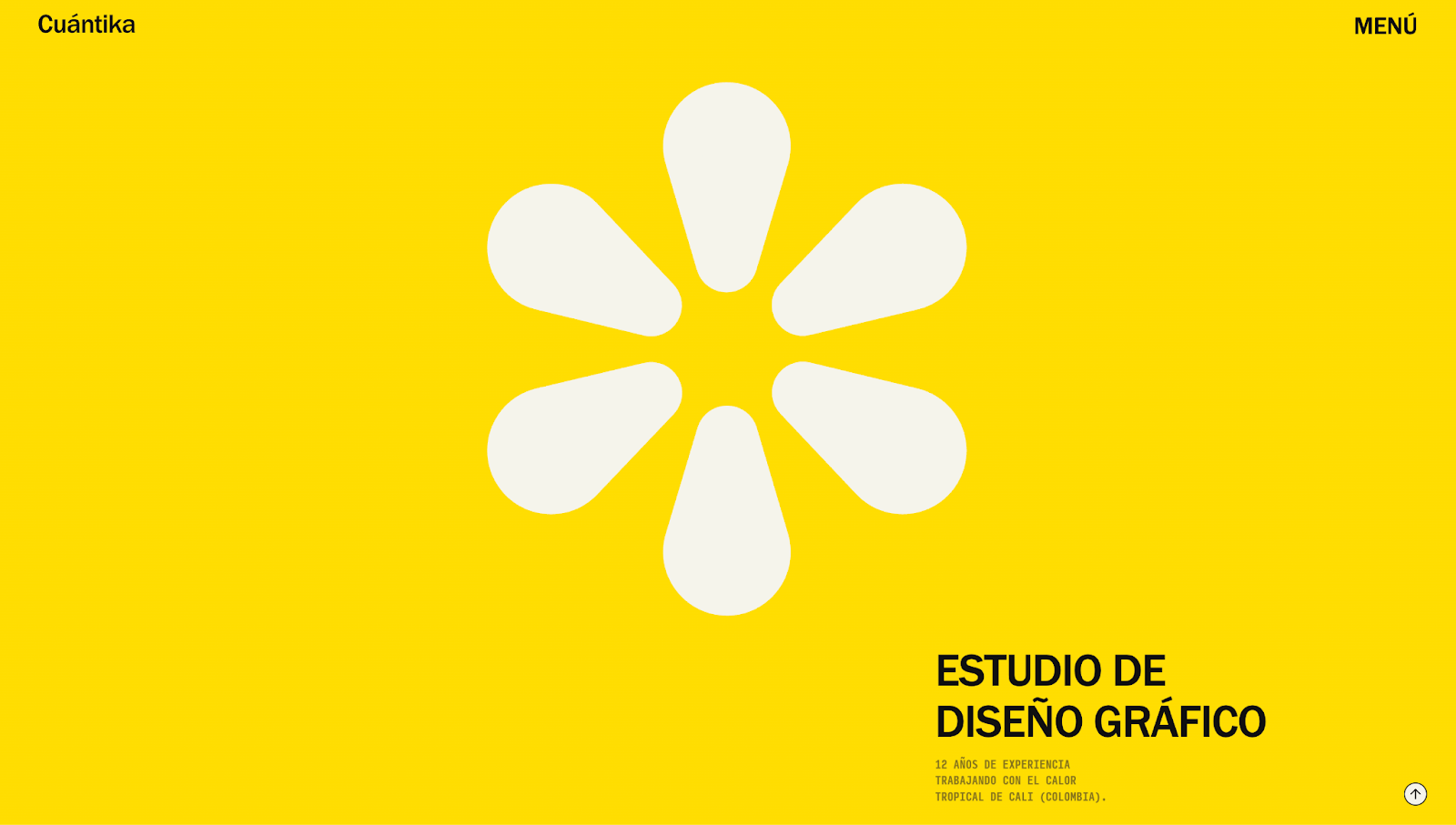
Cuántika Studio’s portfolio opens with a bright-yellow background and spinnable flower graphic, hinting at the colorful, playful projects you’ll find within. As you scroll, the elements moving off the page slowly blur and fade, subtly reflecting the brand’s specialization in cinematic media. The effect is reminiscent of filmmaking’s shallow depth of field technique, which draws focus to the center of the screen.
This is an especially effective way to showcase the project thumbnails because they stand out against the background. Past works feature a range of specialties — branding, book design, motion graphics — to highlight Cuántika Studio’s versatility. Juan Sebastián Martínez pairs these effects with a clean layout, consistent typography, and intuitive navigation so you can easily explore projects without distraction.
From a branding and marketing perspective, the site has a regional personality with text like “Made in Cali with heat” to resonate with local visitors and give the design an emotional sense of place. You can quickly access contact details through the menu or footer if you want to get in touch.
12. MONO Graphic Studio
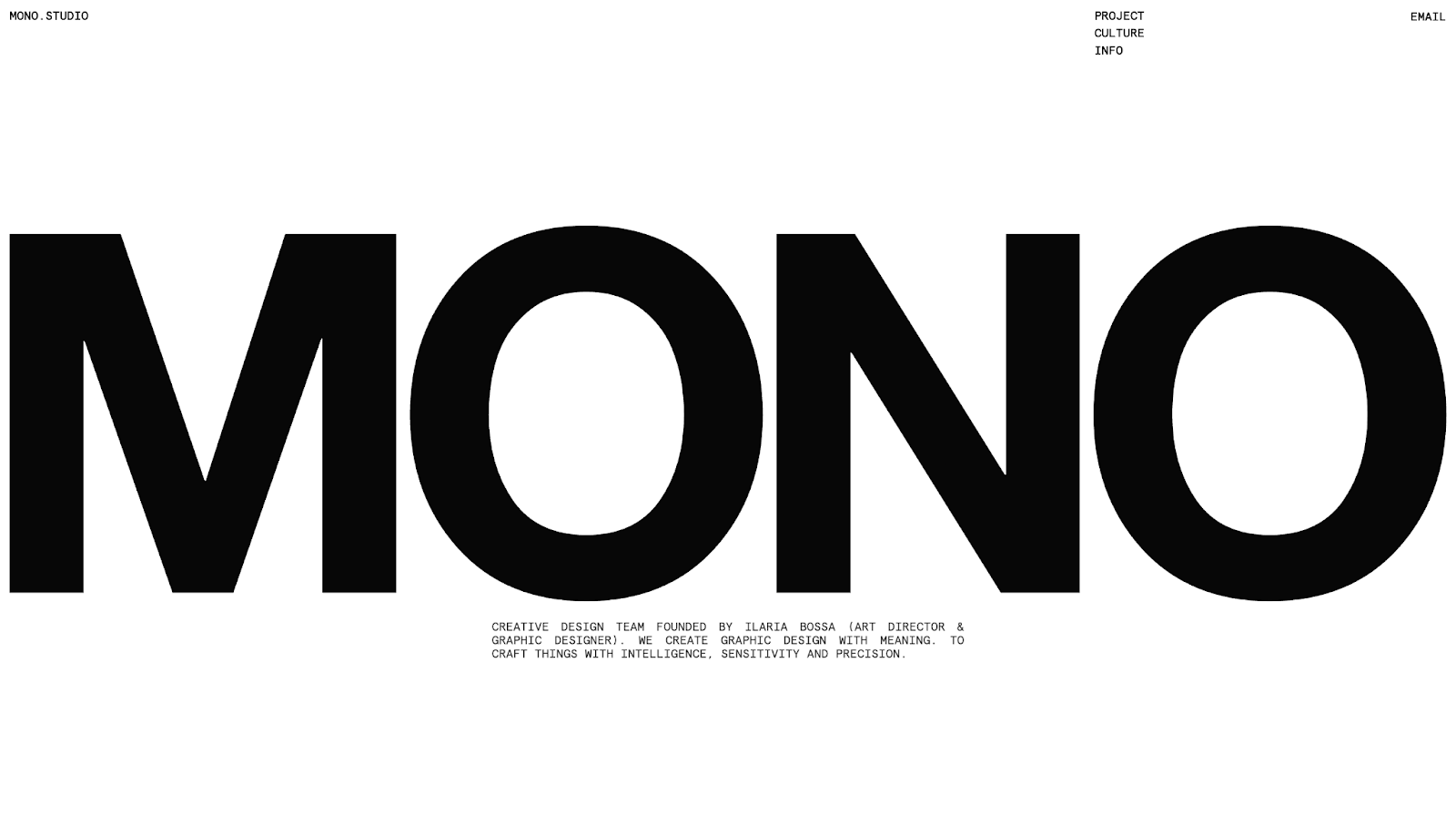
Paolo Baronio designed MONO Graphic Studio’s minimalist portfolio. Its splash page intro, “Extensive research for unique design solutions,” immediately tells visitors that the studio is thoughtful and intentional about work. To mirror that message, the site uses modern design trends like black-and-white color combinations, bold typography, and clean lines. These streamlined design choices give the impression that each page element was created with care.
But the projects and thumbnails prove that the studio has range beyond monochromatic simplicity, adding the occasional pop of color to keep the layout visually interesting. In addition to color, the site uses modern fonts to establish a professional identity and tell visitors that MONO approaches projects with precision and competence.
The portfolio is low on fluff: The layout isn’t too busy, and nothing distracts from the work. Each project’s name, industry, and image provide just enough information to encourage deeper exploration while keeping the aesthetic clean and true to MONO Graphic Studio’s branding.
13. Griffo House
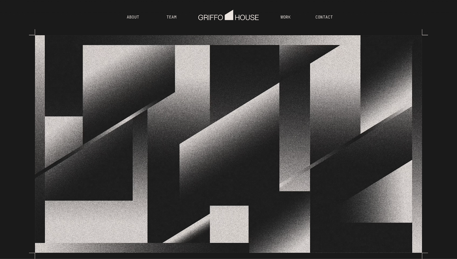
Griffo House’s design team uses strategic storytelling for their online portfolio. The homepage starts with the company’s mission statement: “Griffo House is a design and development studio that uses human creativity to bring visions into reality.” Right from the start, this tells you three things: what Griffo House is, how their team works, and what they can do for you.
After instilling this message, the site supports it by showcasing a news ticker-style carousel of satisfied clients, with names ranging from Universal Music Group to Chipotle. The diversity shows Griffo House’s range of skills, and real metrics like “$100M+ closed in client funding” and “200+ clients served globally” show how many brands trust them.
Design-wise, the layout is well-structured and organized. An easy-to-read, grid-like structure outlines their services, past work, and team. At a glance, you can see where Griffo House’s expertise lies and contact them using the sticky navbar at the top or the details in the footer.
14. AB/GD
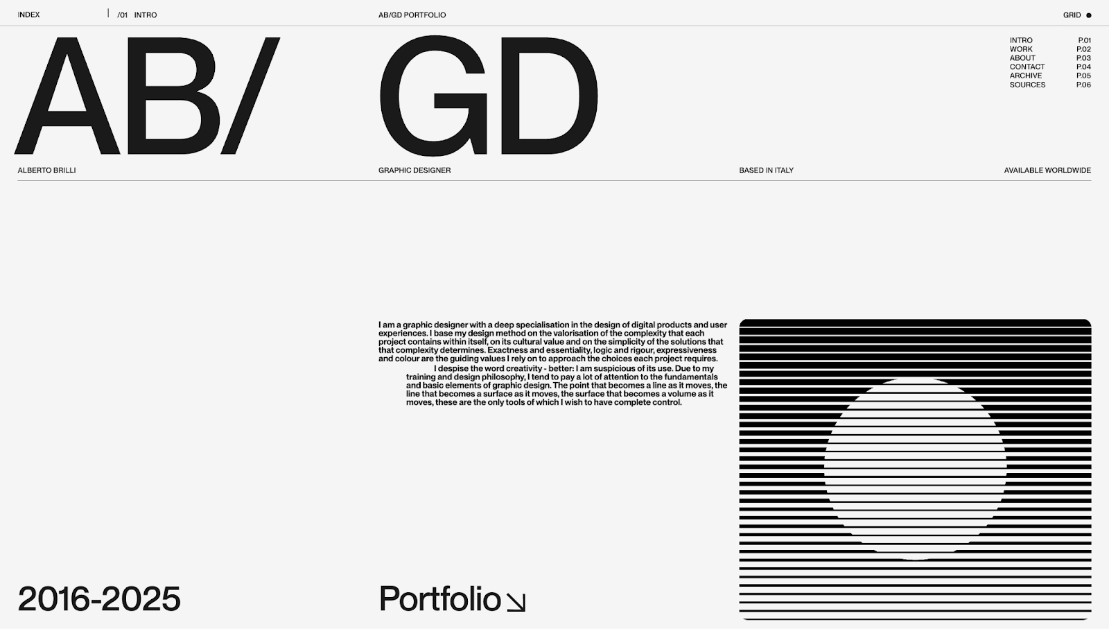
AB/GD’s website portfolio has a distinct design philosophy — traditional minimalism combined with abstract art. Chapter-like layouts make the website feel like an old physical portfolio, and pattern glare shapes showcase modern web design trends.
The monochrome aesthetic matches much of the past work’s branding, but the designer’s identity shines through statements like “Exactness and essentiality, logic and rigour, expressiveness and colour are the guiding values I rely on to approach the choices each project requires.” Messaging like this takes the portfolio beyond projects, showing what the human behind the site is like to work with.
5 tips for designing an attractive graphic design portfolio
Here are five tips from these portfolio website examples that you can apply to your own website.
1. Be consistent
Implement your design style throughout your site’s payouts and interactions so potential clients understand your approach. This consistency also means you showcase your style quickly so even readers who are skimming your site get a feel for your work right away.
2. Use portfolio templates
Pick a template from our Templates marketplace or make your own templates for case studies, homepage sections, and client testimonials. Whenever you need to add or update a webpage, you can quickly plug everything into a premade layout so it’ll fit seamlessly into your portfolio design.
3. Be unique
Hiring managers and potential clients are likely reviewing several online portfolios at once to identify the best graphic designer for their needs. To stand out, yours needs to be unique and memorable, so lean into what makes your design style distinct.
4. Use a portfolio builder
Use a website builder that offers everything you need to design and publish your portfolio online — like Webflow. While you could opt for platforms made specifically for portfolios, Webflow’s visual design system lets you create interactive, artistic experiences faster.
5. Vary your samples
Show off your range with varied work samples demonstrating your ability to deliver quality graphic designs for any medium. If you don’t have a wide range of examples, make a few mockups of what you could do in mediums you haven’t worked in professionally yet.
4 best portfolio-building website platforms to try
Your portfolio should live on a platform that shows your work in the best light. Here are four popular options for building a graphic design portfolio.
1. Webflow
Webflow is a visual design platform that gives you full creative control over your portfolio. Create new layouts, add animations, and ensure your site behaves responsively across all devices — with or without coding.
Unlike template-locked website builders, Webflow generates clean code in the background while you design on the canvas. But you can still enjoy thousands of ready-made templates or even clone an existing website and modify it to your liking.
Webflow also has a built-in content management system (CMS) for organizing and updating projects, case studies, and testimonials at any time. You can prioritize your portfolio designs instead of focusing on maintenance because Webflow comes with search engine optimization (SEO), security, and hosting features.
2. Behance
Behance, Adobe’s online creative community, works as a portfolio hosting service and discovery platform. With it, you can explore other designers’ sites and showcase your own work. Employers and potential clients often explore Behance to scout talent, so it’s a good place to market your brand and find opportunities.
Customization is limited, and portfolios look more like profile pages than fully branded websites. Behance is best for complementing a full-fledged website since it offers less control over design and presentation.
3. Squarespace
If you’re looking to build a portfolio quickly, you can use one of Squarespace’s premade templates. Squarespace offers hosting and analytics features to help you launch and monitor your site. Plus, artificial intelligence (AI) tools make design recommendations and populate pages with content.
But customization is restrictive, especially if you want to layer in advanced animations or experiment with your layouts.
4. Wix
Like Squarespace, Wix is an option for designers who want simplicity. It has a drag-and-drop builder with a template library to get started. Wix also has AI-powered assistants to help create websites from scratch or add basic animations.
While Wix can help nontechnical users, graphic designers with more expertise might find it challenging to scale. If you want to add more projects and host a content-heavy website, options like Webflow will serve you better in the long term.
Your ideal graphic design portfolio is just a click away
These portfolio examples offer inspiration for anyone thinking of creating a graphic design portfolio, whether you’re a freelance graphic designer or in-house illustrator. Put your own spin on these layouts by searching for similar templates or cloning them in Webflow. The site will load inside the Webflow designer so you can tailor it to your needs.
Discover how Webflow’s visual website builder can help you craft a visually stunning professional portfolio that wins clients. Get started with Webflow today.

Show off your work.
Choose from fully customizable portfolio templates built for creatives. With Webflow, you can design, refine, and publish a standout portfolio — without writing a single line of code.


