

Summer’s coming to a close, but the websites we’ve seen in the past month have been nothing short of hot.
From art collectives to youth soccer teams to a (cloneable!) style guide — here‘s a comprehensive rundown of the Webflow projects that have delighted, inspired, and excited us in the month of August.
Let’s get started.
1. The Circle and the Square
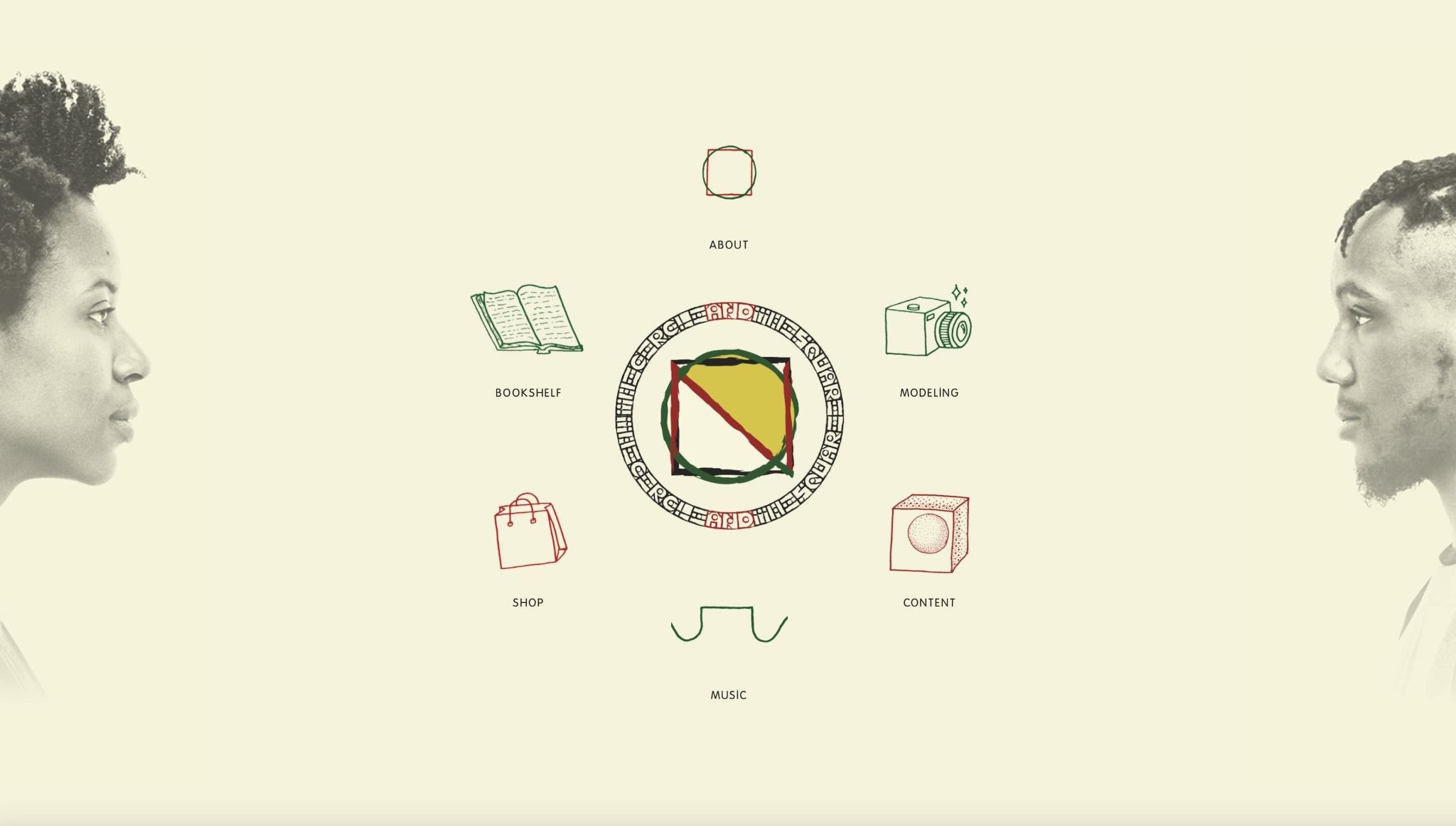
The Circle and the Square is an artistic partnership between Nyamekye Smith — a dancer, model, and artist — and DeQuan Russ — a graphic designer, photographer, creative director, and creative consultant. Together, Nyamekye and DeQuan create everything from music, to graphic design, to choreography and much more.
The artists of The Circle and the Square find purpose in the joy of creating “miscellaneous everythings” in order to “inspire people to embrace new ways of seeing things, doing things and thinking about things in hopes to increase the ability to understand and empathize.”
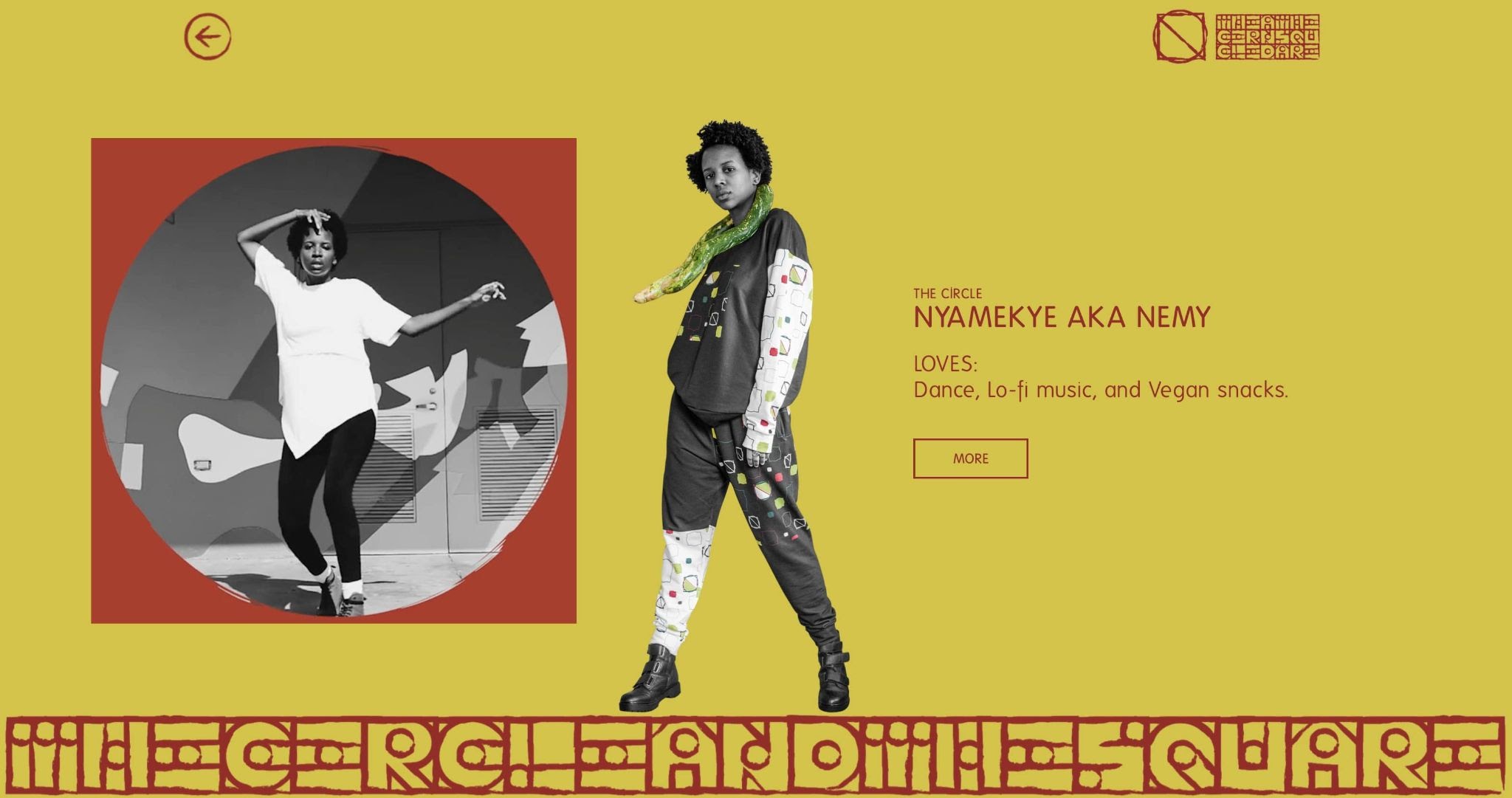
Their website reflects their mission and the art that they create. From the home page, we see an image of Nyamekye and DeQuan facing each other with a circular navigation where users can navigate through their site. The duo uses video, cut-out photos, and a strong use of color and graphics to showcase their work, abilities, and overall energy.
We especially love how Nyamekye and DeQuan use video instead of still photographs in their “About” sections. Using video in this way brings their creative personalities to life virtually for site visitors.
2. Juventus Academy DC Metro
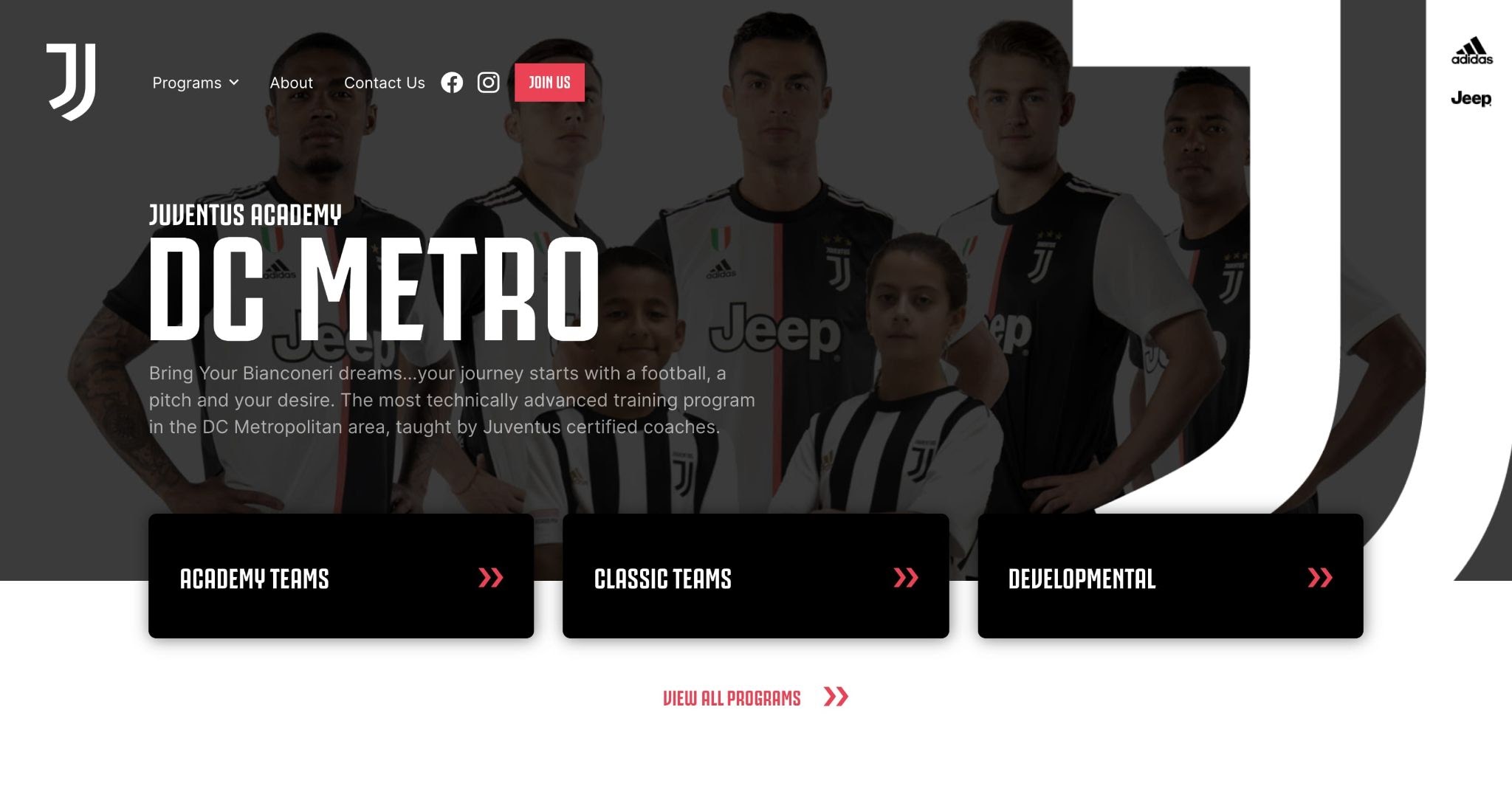
Juventus Academy DC Metro is an offshoot of Serie A soccer club Juventus F.C. At the soccer academy, children from 5-18 learn, train, and compete in the methodology of the overall Juventus Academy philosophy and participate in everything from travel teams, to competitions, to camps.
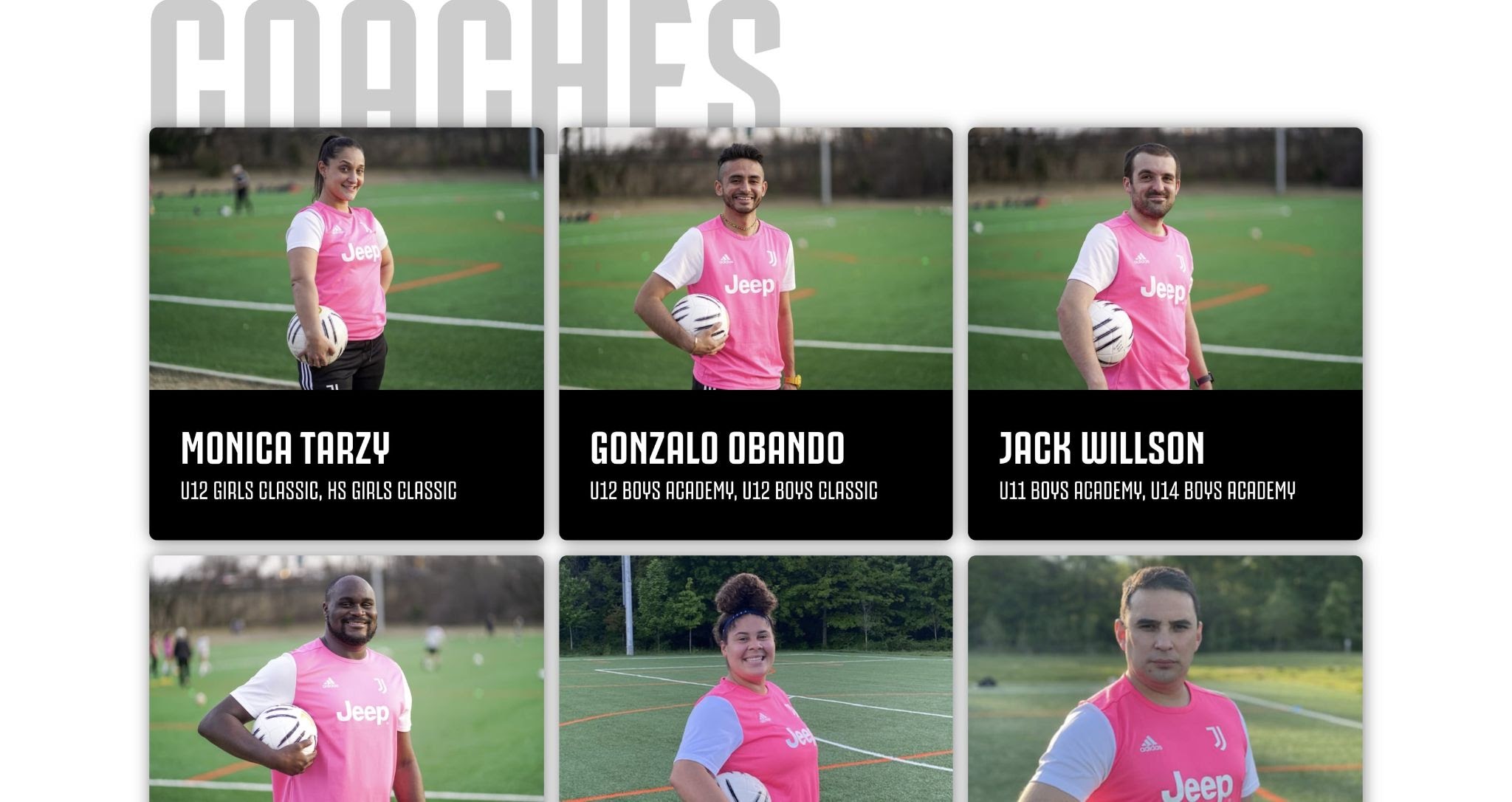
For their recently launched academy website, Juventus Academy DC Metro takes design and branding cues from Juventus F.C but puts their own twist on it for their needs such as recruiting team members and advertising their programming.
Their navigation and clean design, in particular, makes it easy for users and potential new members to navigate the site and apply to the program that best suits them.
3. Grace Potter
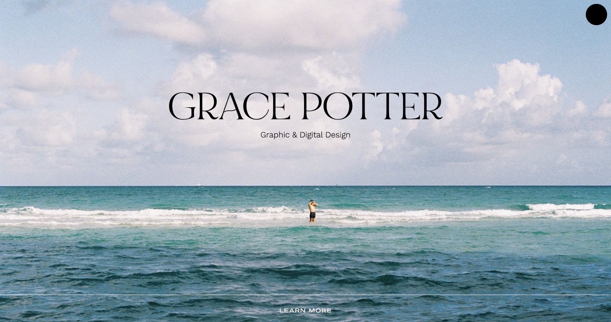
Fitting for an August website roundup — Grace Potter’s site feels like the embodiment of summer. No, she’s not using gimmicky sun and palm tree graphics — instead, she anchors the site with a single photo of a person at a beach.
Paired with a simple typeface and a deep chocolate brown, the site oozes calm, and showcases Grace’s thoughtful design approach. We like how Grace keeps her design and layout fairly streamlined. A concise homepage highlights her background and services. The straightforward secondary page showcases and explains some of her previous work.
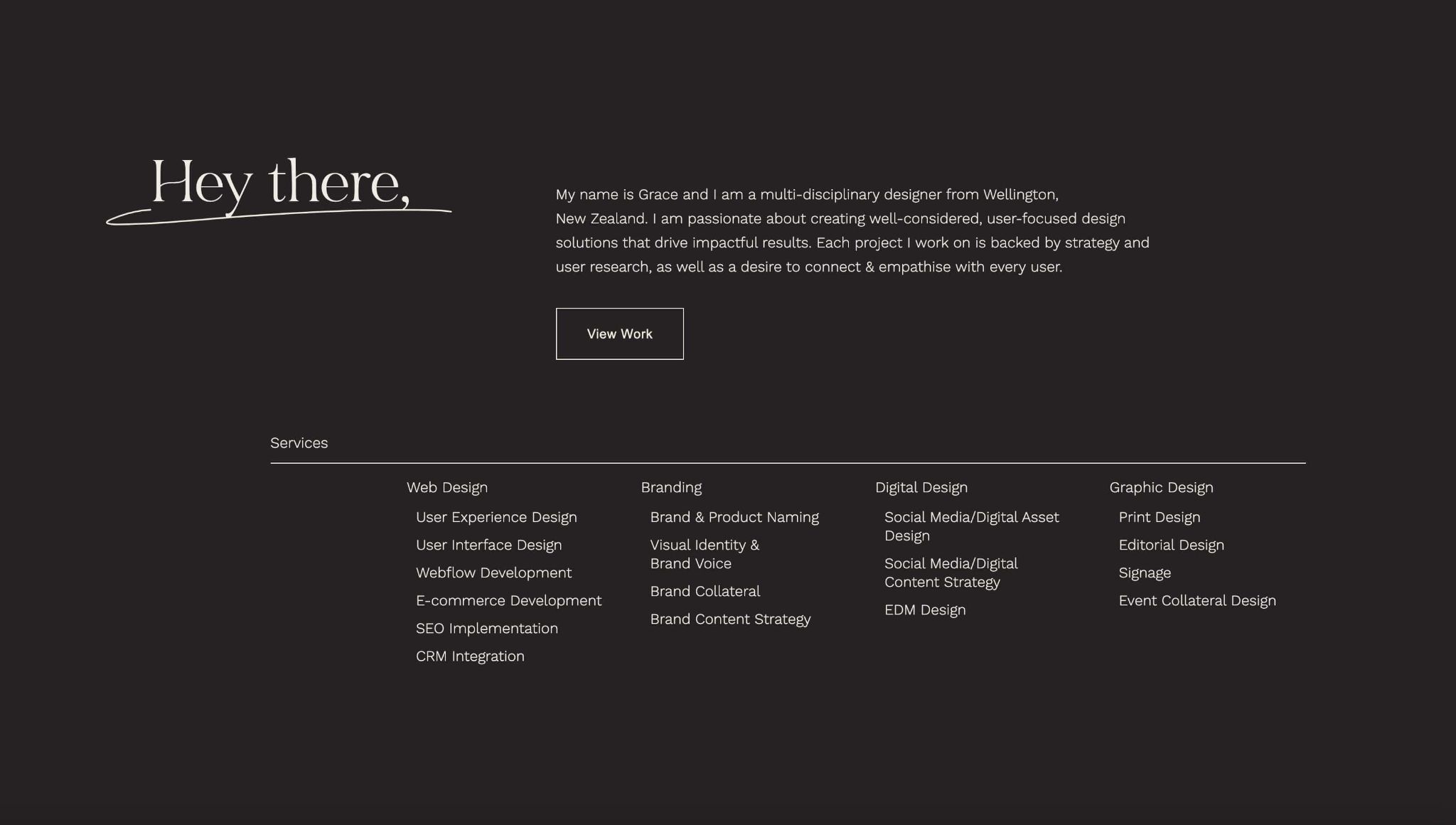
When creating your own portfolio site, sometimes simple is best. Key information — like contact information and previous work — should be easy for potential clients to find.
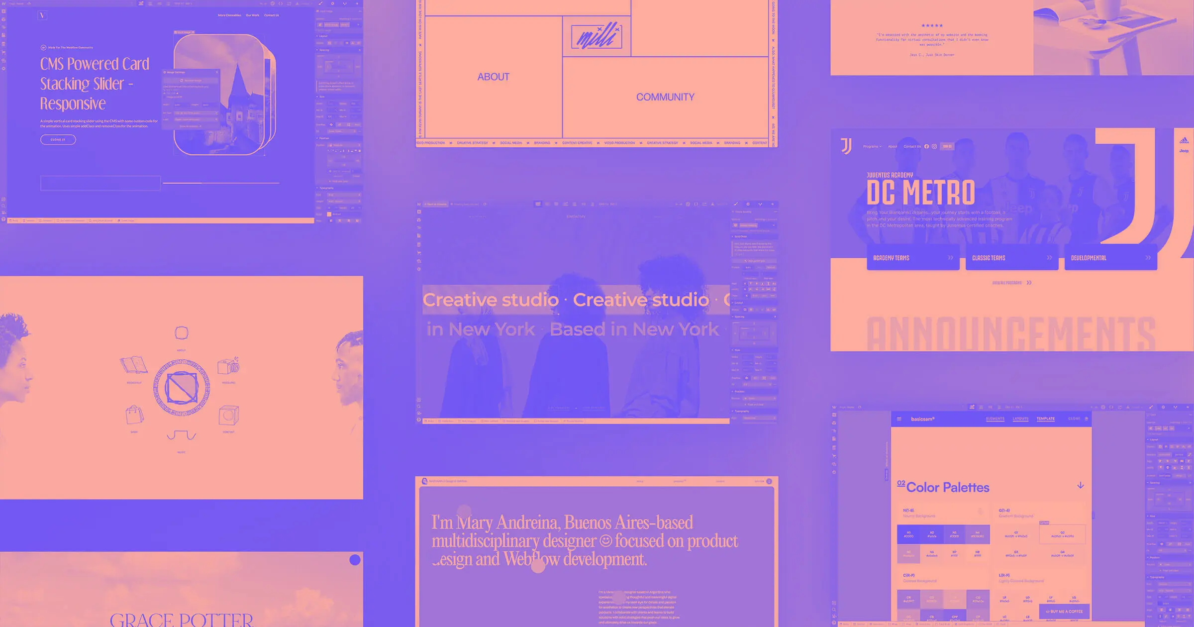
4. EMPATHY (cloneable)
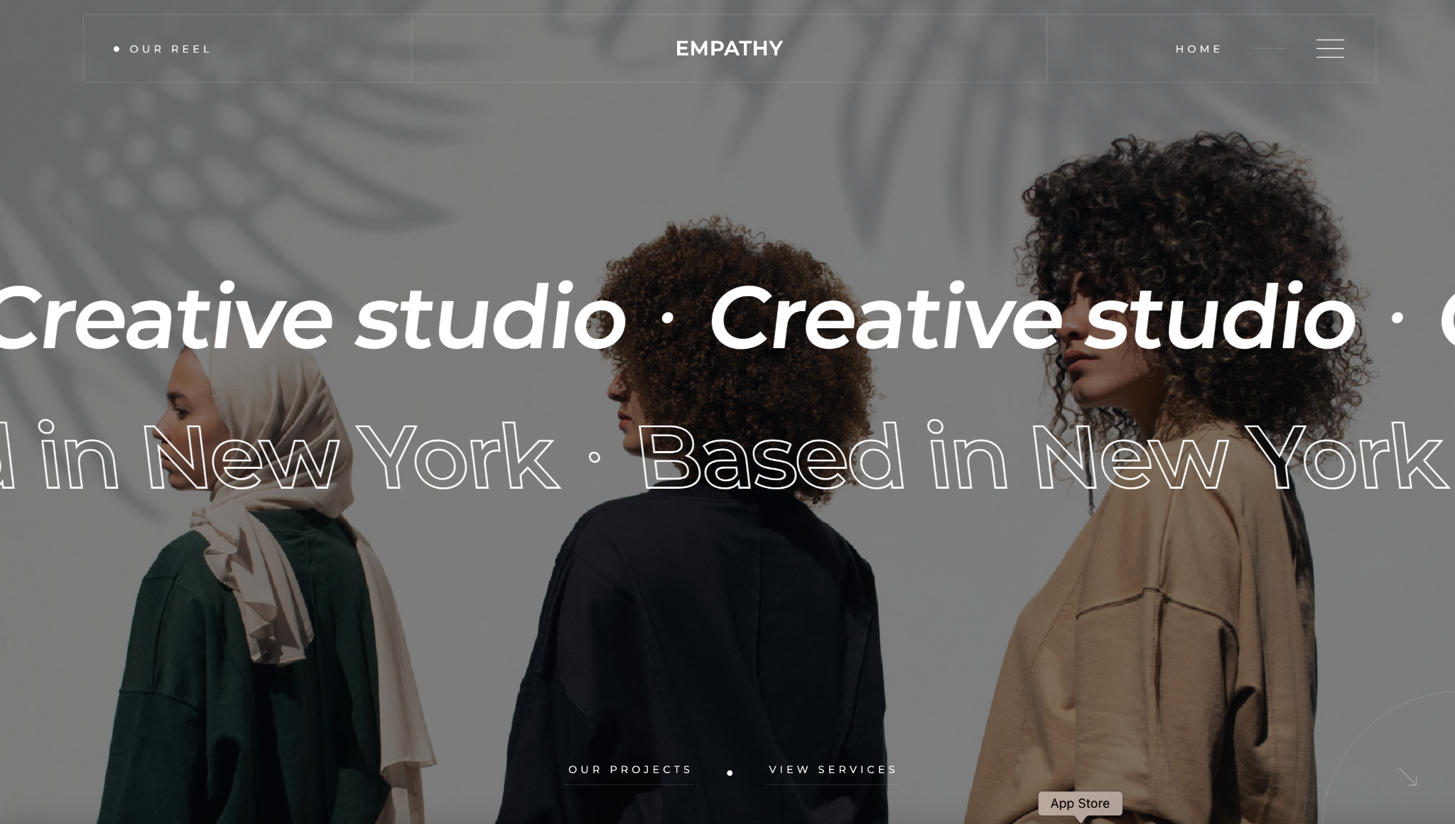
We love this free cloneable from Tyler Hughey. Empathy is a love letter to minimalist design and maximalist animation. From the scrolling text that welcomes you on the homepage to hover animations, to animated cursors — you won’t run out of visual animations that will surprise and delight.
It’s geared towards creative agencies but can be customized for any purpose. We think that this project could be great for a portfolio website.
5. Milli Agency
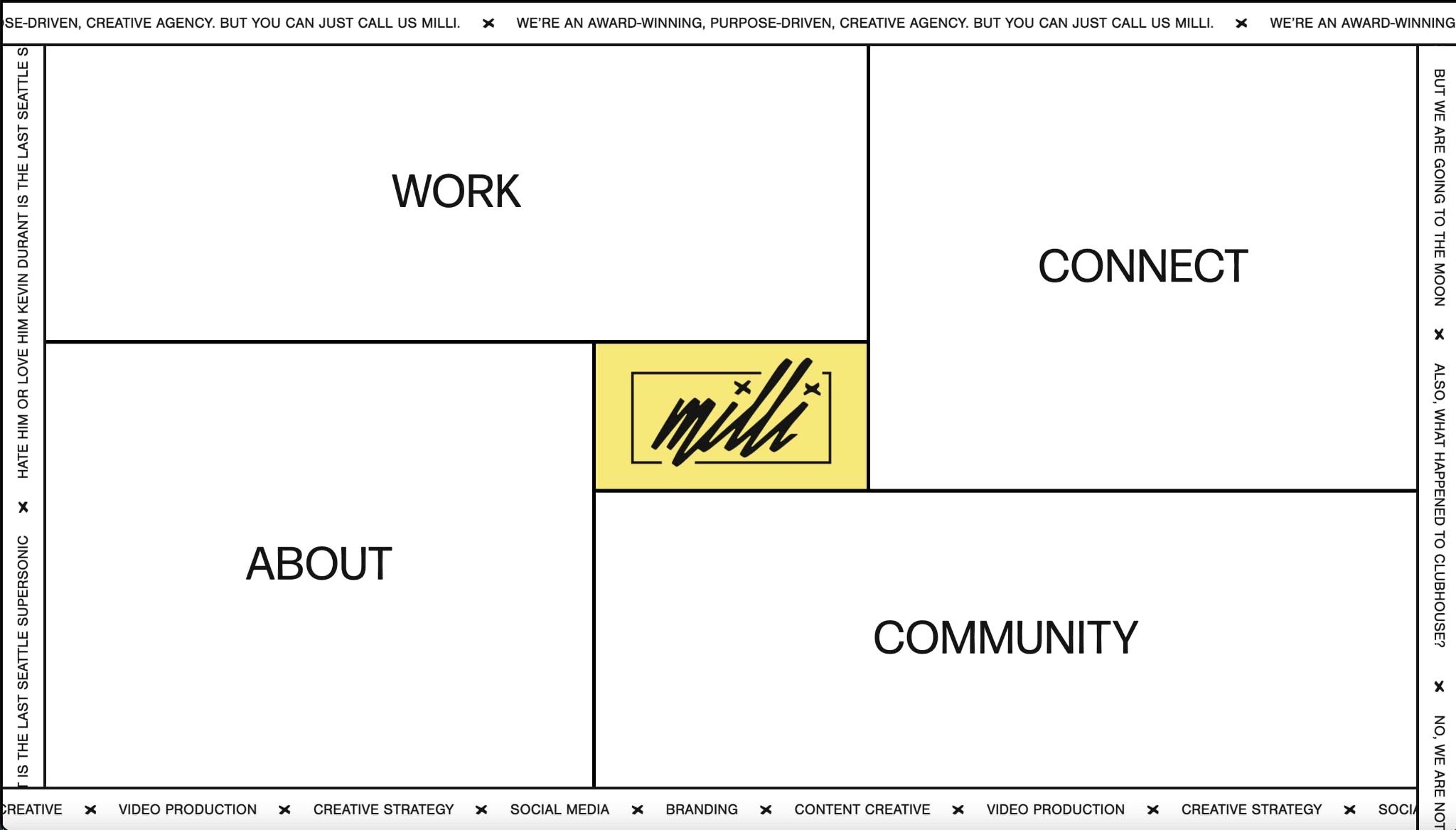
Milli Agency is an award-winning creative agency based in Seattle. Founded in 2014, Milli Agency helps companies and organizations build up their brand strategy, content, and social media presence.
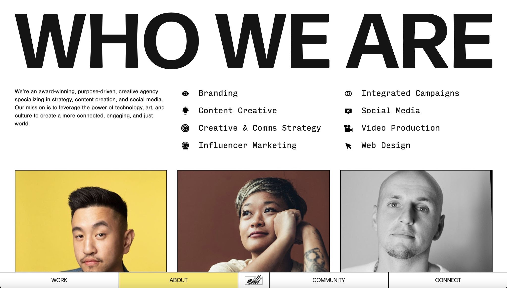
For their site, Milli Agency embraces the concept of the grid in different forms, using it for their animated home page navigation, highlighting their team members in their “About” section, and showing off their work.
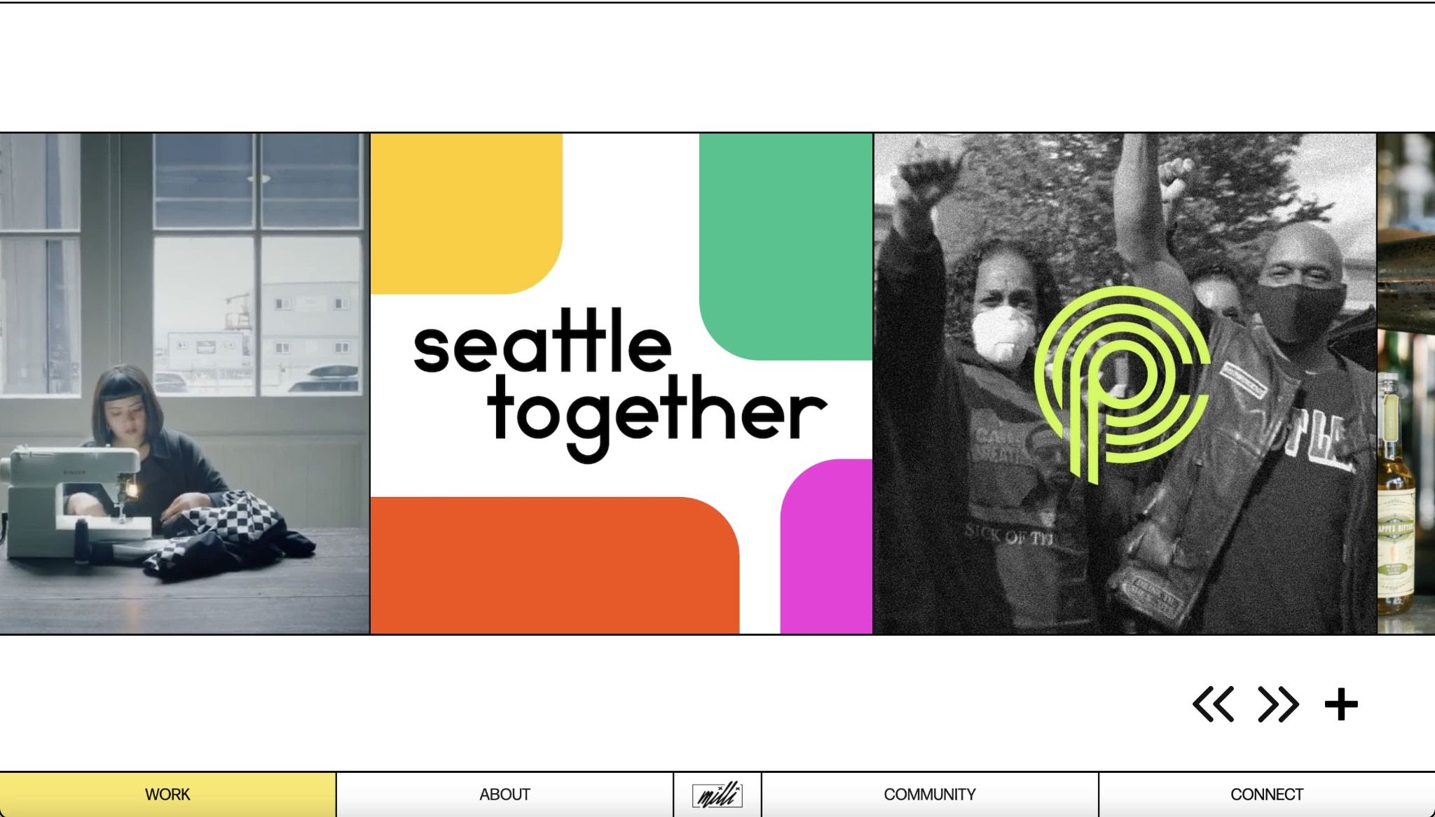
Though the idea of a grid feels very stagnant and absolute — Milli Agency reinterprets the grid and flips it on it’s head with a horizontal scroll, a hover animation that moves the lines of the grid around, and bold color choices.


Get started for free
Create custom, scalable websites — without writing code. Start building in Webflow.
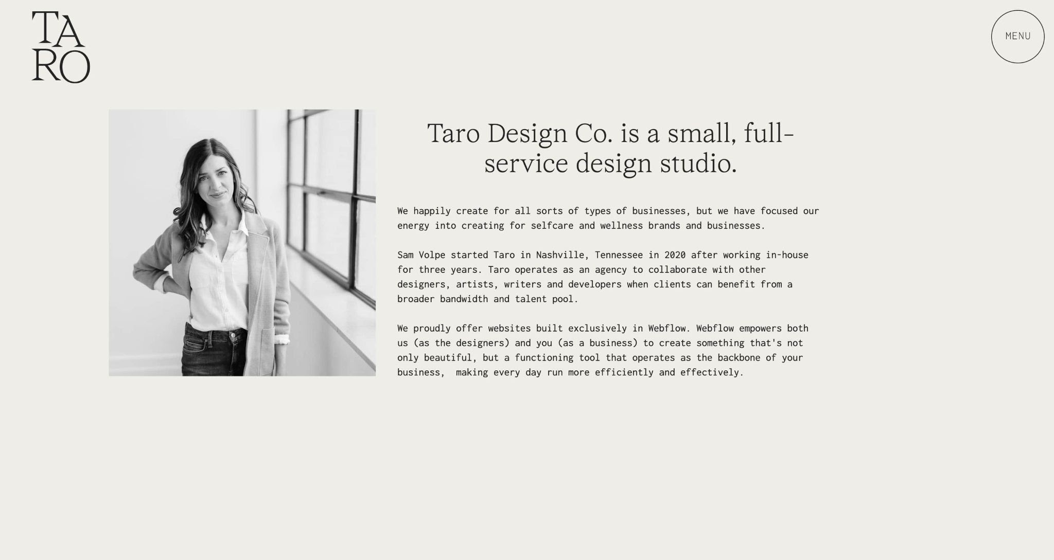
6. Taro Design Co.
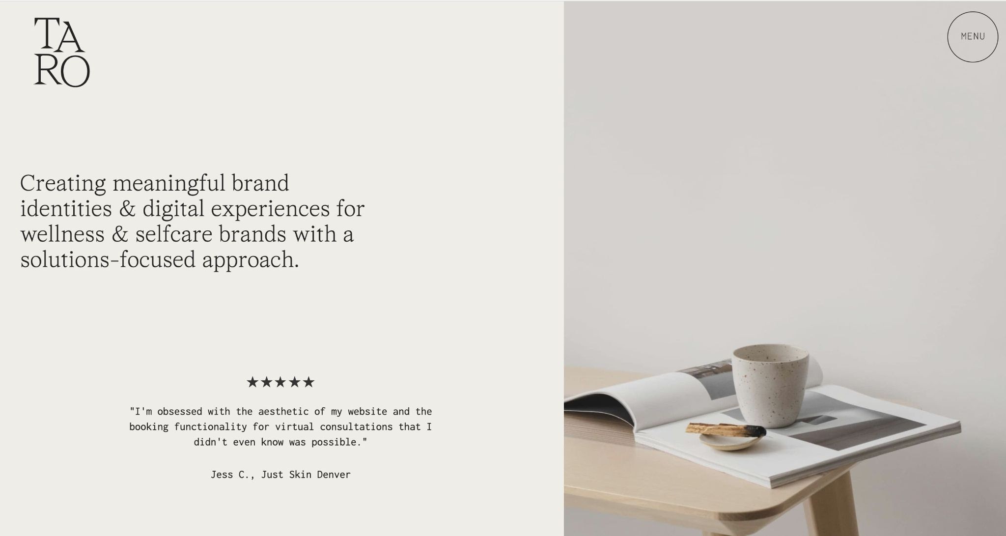
Taro Design Co. is a boutique design studio based in Nashville, Tennessee that builds websites exclusively in Webflow.
For their studio’s website, Taro Design Co, embraces a minimalist approach that is anything but boring. From a quietly playful logo, to a subtly animated scroll — the Taro Design Co. website shows that playfulness sometimes works best as a whisper, not a shout.
7. Mary Andreina
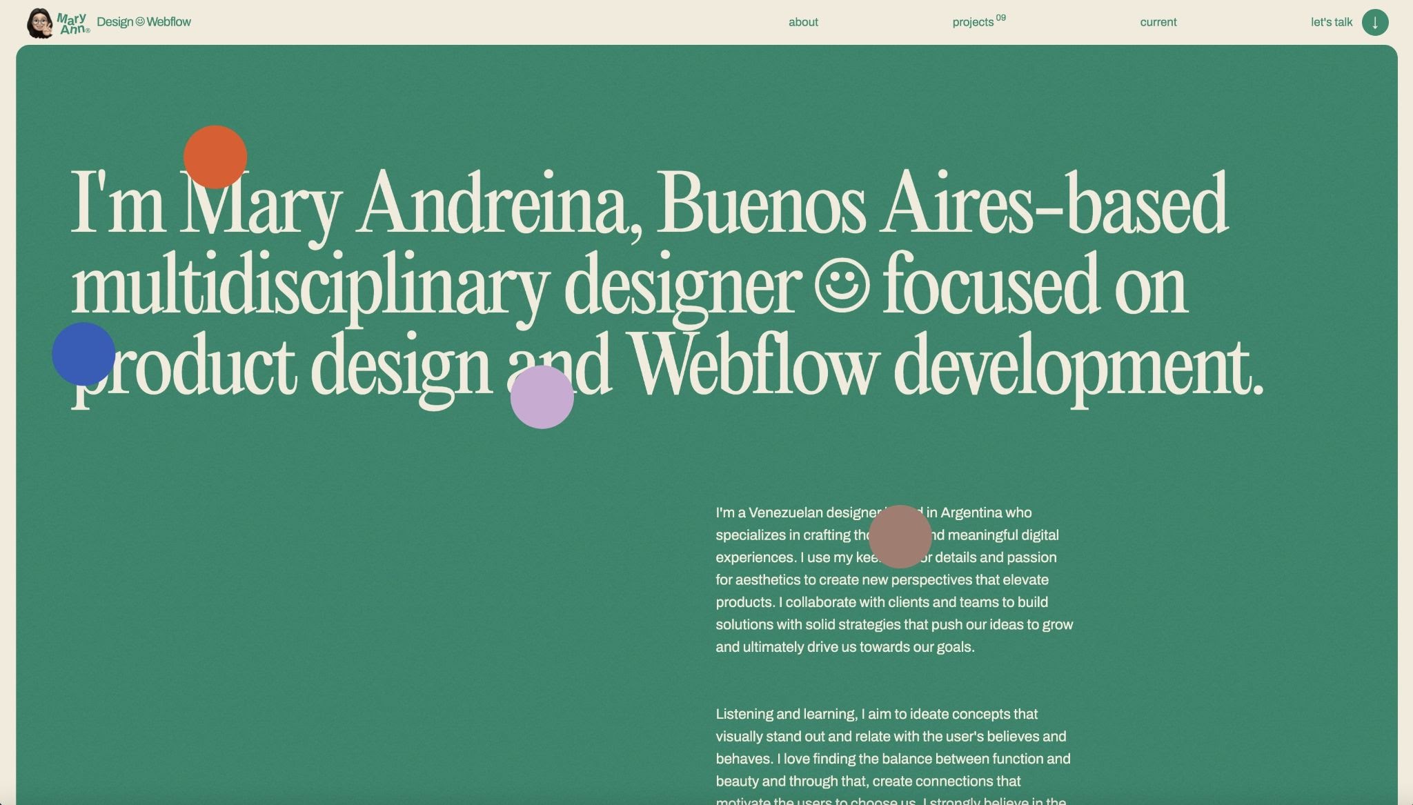
Adding on to the theme of projects that feel like summer — Mary Andreina’s portfolio brings us back to sleepaway summer camp, with a vintage typeface, faded color blocking, and an almost paper-like quality to the entire site — reminiscent of old camp brochures that used to come in through the mail.
However, you won’t find lake pictures and camp itineraries here. Instead, you’ll see a streamlined layout of Mary’s projects, things that have been inspiring her, and a short brief about who she is, along with her design philosophy.
Rather than using photos of herself, we love that Mary uses her Memoji throughout — adding a playful, but personal touch to her portfolio site.
8. Style Guide (cloneable)
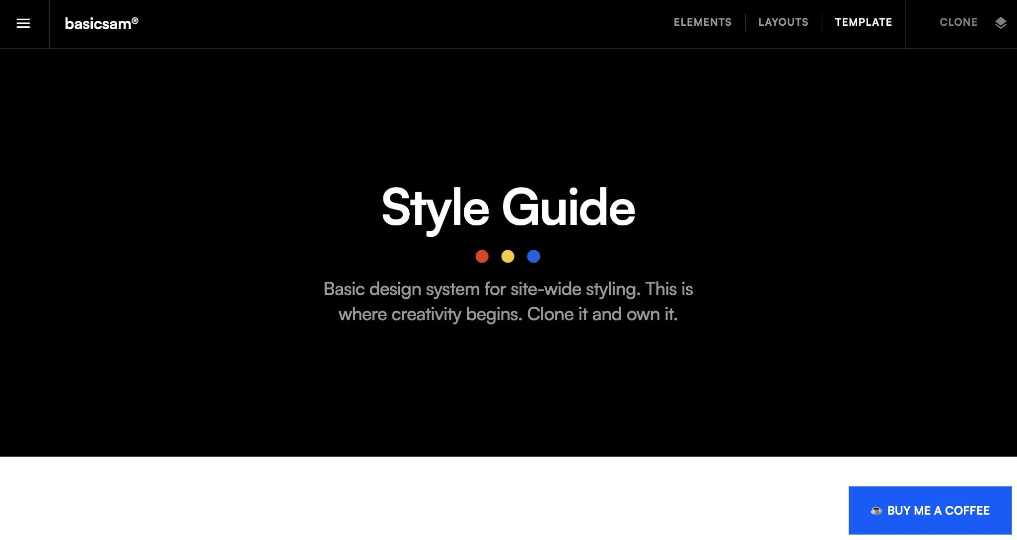
At Webflow, our style guide is an important resource for our teams across the company. From defining our color palettes to how we utilize text — it helps ensure that everything that we produce is aligned and on-brand.
As you grow your own company’s web presence, having a style guide is great for defining your brand and having a source of identity that is available for your team. We especially love this cloneable style guide from Samuel Hoang.
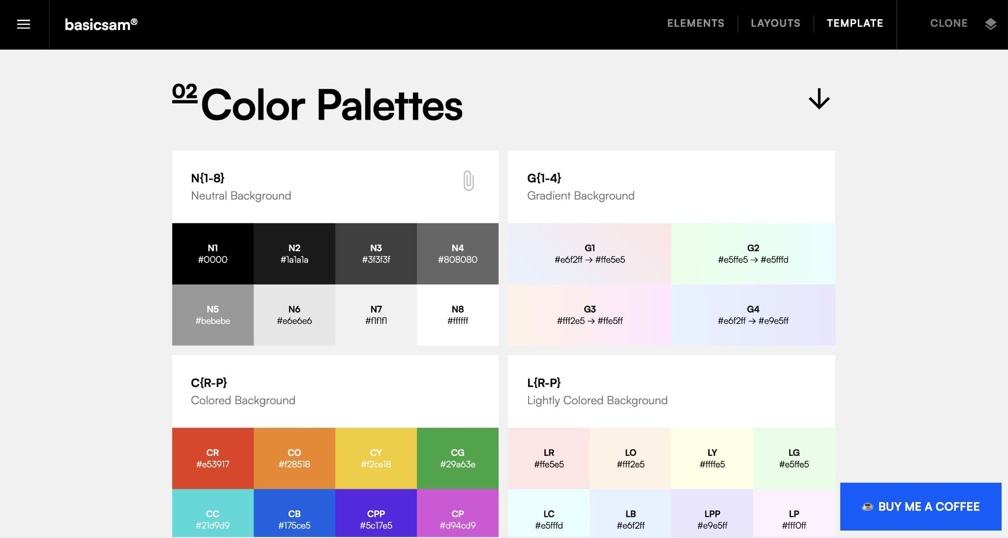
Not only is the design sleek and modern, it’s easily adaptable to your brand. It includes everything you need to get up and running such as typeface guidelines, color palettes, heading guidelines, and much more.
9. Hochkant Film (*motion warning*)
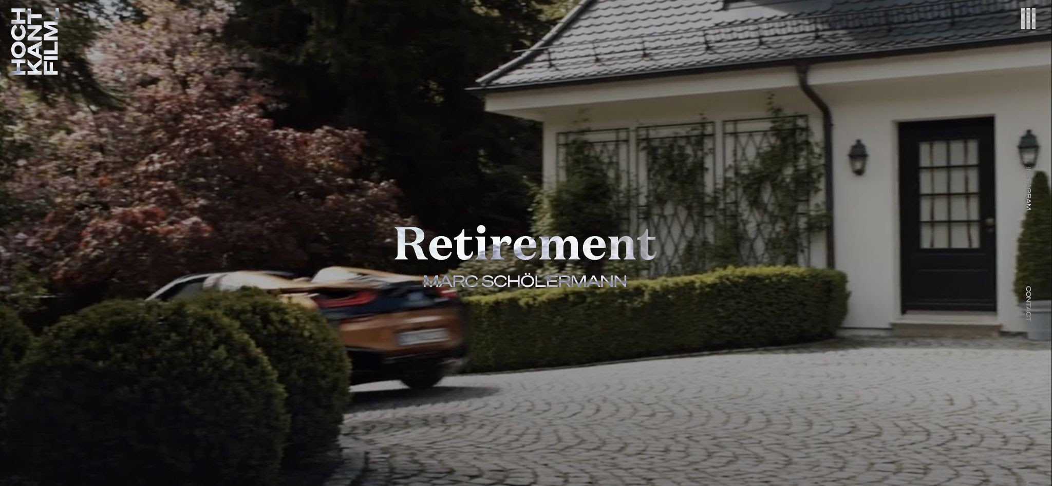
Hochkant Film is a Munich-based film agency that creates films for corporate organizations around the world. Founded in 1999, their client list encompasses some major global corporations such as BMW, Roche, and Siemens.
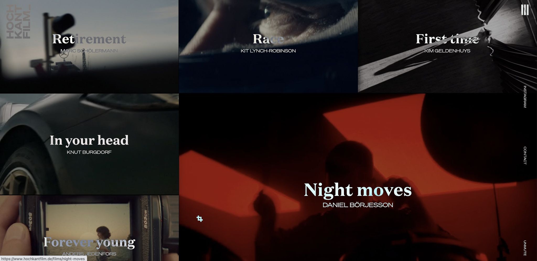
For their site, Hochkant Film puts their product front and center. As you enter the home page, one of their featured films plays — giving site visitors a feel for the moody video style that Hochkant is known for.
We like that Hochkant makes their site focus all about their films, especially on their home page. It removes any extraneous distractions and lets the work speak for itself. This ensures that by the time the potential client reaches their “contact” page, they have a good feel for what the potential outcome will look like, so they’ll know if Hochkant is the right agency for their project.
10. Stacked CMS Slider (cloneable)
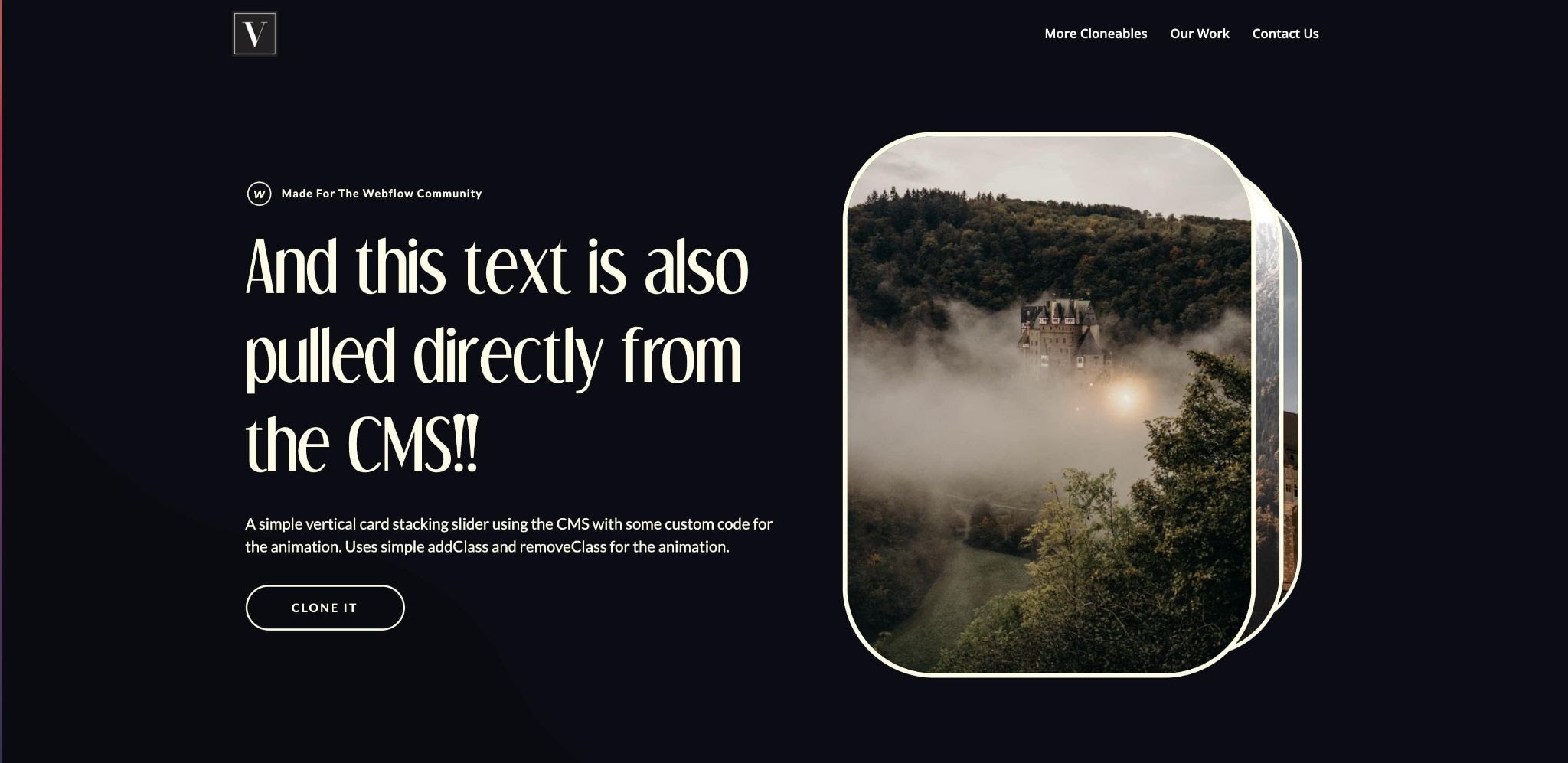
Looking for a great slider? Vimalan Vijayasekaran, a London-based designer and founder of VI Designs has created a fun animated CMS slider that you can clone for your own projects.
We love how clean and crisp the animated transitions are — making it perfect for graphic-heavy elements like photo slideshows. It’s easy to get started, just click the link above to clone.
Show us what you’re working on
Working on your own awesome Webflow project? Be sure to post it on the Webflow Showcase. It’s a great place to show off what you’ve been working on, connect with the Webflow community, and get a chance to be featured in next month’s roundup.
So what are you waiting for? Get started today.