November may be the darkest month of the year, but the websites we’ve seen have been nothing but bright.
From design agencies, to personal portfolios, to a nail care site from a YouTuber — the sites in November were some of the most colorful, whimsical, and unique we’ve seen all year.
Here’s a rundown of our favorite sites from the past month.
1. Jomor Design

Jomor Design is a Montreal-based design agency that specializes in building unique and high-end digital experiences — and their website is no exception. Built in Webflow, Jomor Design’s site uses scroll animations to showcase their site and create a story around their company and brand.
The small details turn sites into full experiences — and the Jomor Design team understands this better than anyone. We especially love the use of animation throughout the site and details like a “night mode” toggle.
2. Everything is Bad (Frank Myles portfolio)

Frank Myles may have titled their portfolio site “Everything is bad,” but the site design is anything but. Throughout the site, Frank uses mismatched fonts, quirky animation, and quippy copy to showcase their personality and the kind of work they do.
Though the site is quite simple — spanning only about three pages — it has the unique ability to bring playfulness to site visitors in a small and curated package.
3. LAPS
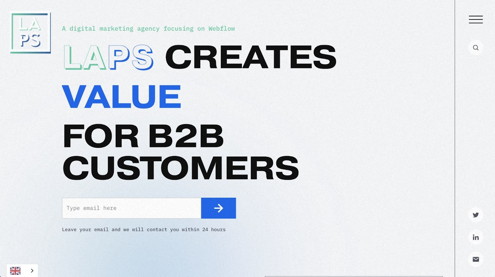
LAPS is a Webflow-focused digital marketing agency based in Malmö, Sweden. The LAPS team specializes in app development, web design, and advertising.
Some of our favorite parts of their site include their use of bold text — something we’re expecting to see more of in 2022 — along with fun gradients and subtle animations. We also like that LAPS puts a small “contact us” form at the top of the home page so potential customers don’t have to hunt around if they’re ready to reach out with a project request.
4. Vectary Studio
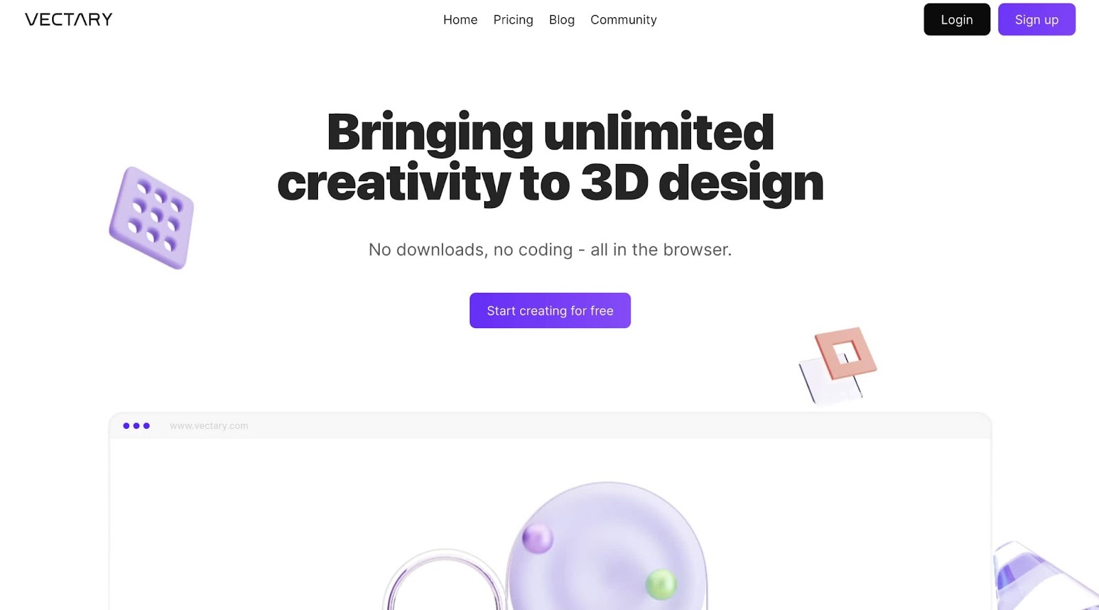
At first glance, Vectary Studio’s site appears simple. With a ton of white space and crisp typography, minimalism seems like the name of the game. But then the animations and graphics come into play. As you scroll, Vectary’s 3D graphics seem to almost pop out of your screen. The graphics are subtly animated and further the illusion that what you’re seeing is a real-life object — not just an image on a screen.
When graphics are the key visual element on a page — as they are on Vectary’s site — you want to make sure the rest of your design doesn’t distract from them. Vectary’s site has a clear focus that showcases their 3D design expertise.


Discover inspiring design work from the Webflow community
Made in Webflow is the place to browse, clone, and customize the latest websites built by the Webflow community.
5. Nails by ToeBro
ToeBro — also known as Jonathan Tomines — is a Toronto-based foot health specialist. ToeBro documents his work on his incredibly popular YouTube channel, which as of the writing of this blog post has 1.27 million subscribers.
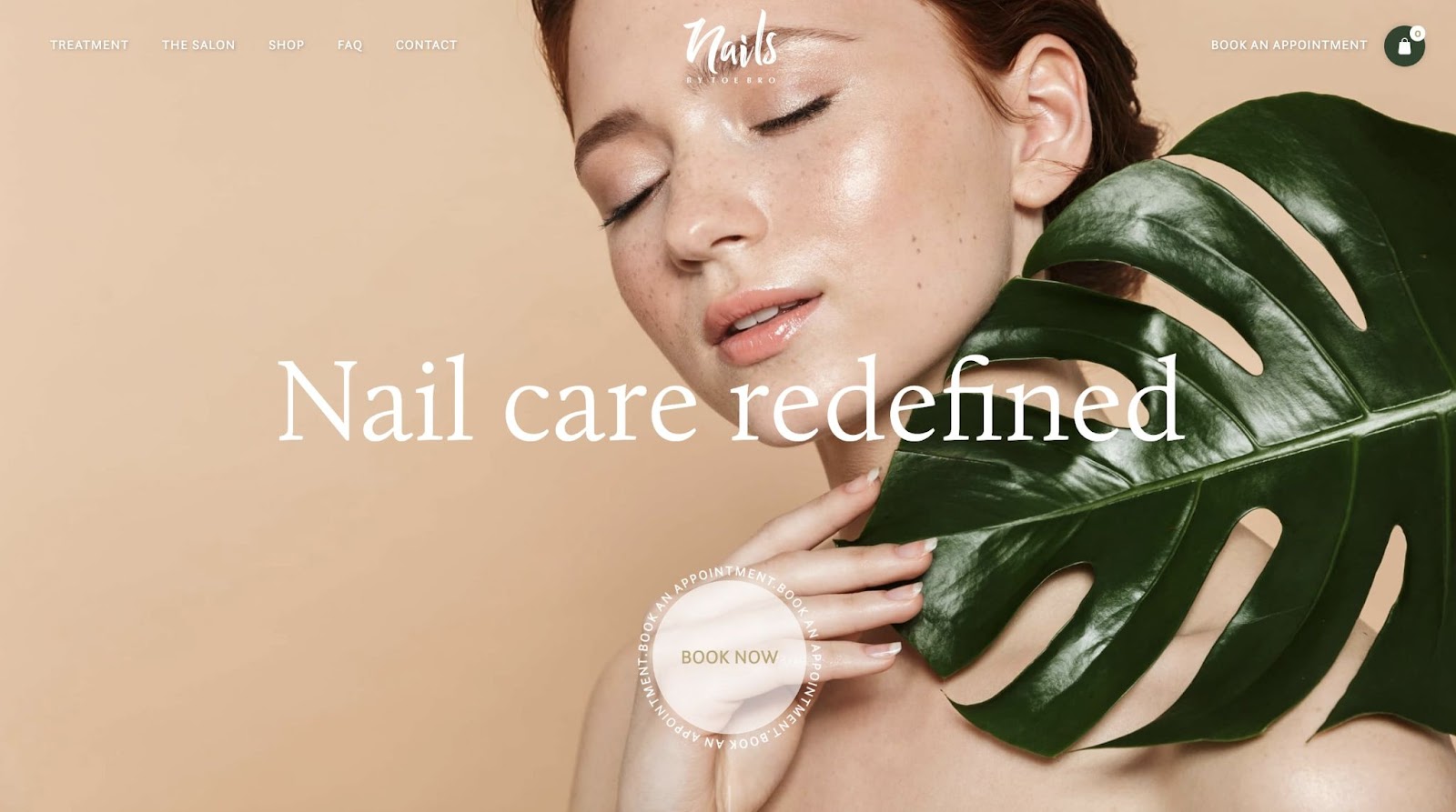
The Nails by ToeBro site combines Jonathan’s real life work with his YouTube channel. The site integrates his in-person appointments and treatments under his ToeBro brand with a shoppable store — set to launch in the near future. We love the clean and calming design of the whole site, which uses different design elements like large photography, overlaid text, and polished colors to set the tone of what the ToeBro brand is all about.
6. The Oval, Harrogate

In real estate, single-property sites are a popular way to advertise new homes on the market. 2 The Oval advertises a new development of 1, 2, and 3 bedroom apartments in Harrogate, England.
Color is key in determining mood, and what you want visitors to feel when they browse your site. Our favorite part of this site is how it uses a dark navy blue and distressed gold text to create a lux color combination. The site for this property is simple, but the use of color and imagery conveys the exclusivity of this stunning location.
7. Learning Cubs
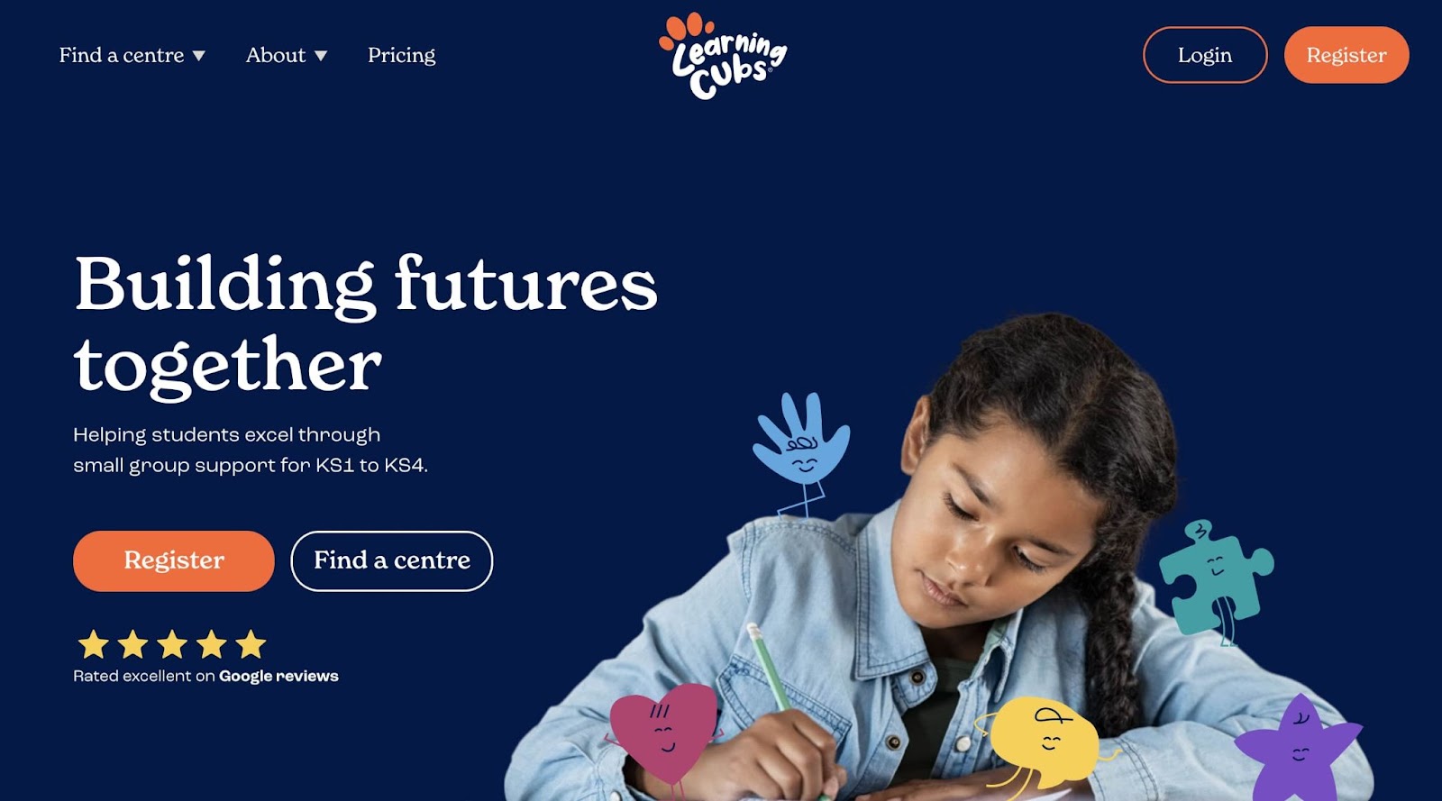
Learning Cubs is a collection of after-school tutoring and learning centers based out of the UK. Unlike many traditional tutoring and learning center sites, Learning Cubs shows off their modern, friendly, and student-focused approach through their use of cute characters, whimsical typography, and focus on different student testimonials.
We love that Learning Cubs keeps the site navigation clear and intuitive while still covering a large amount of information.
8. Smudgge newsletter website (cloneable template)
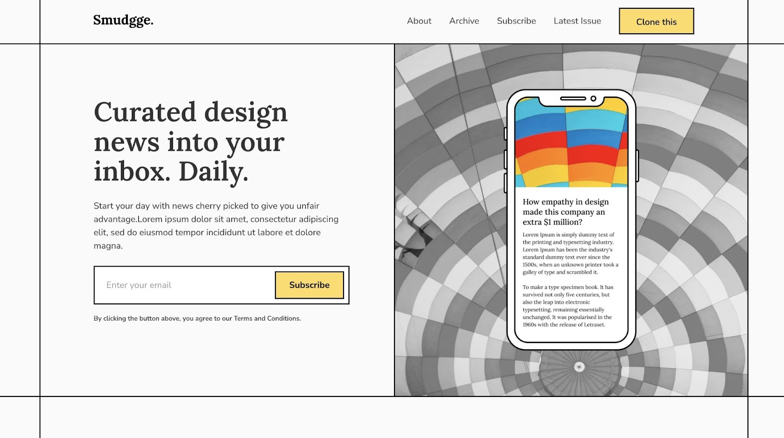
To cap-off our November projects round-up, we’ve got one of our favorite cloneables from the past month. Smudgge, created by Ajay Kumar, is a newsletter site with CMS capabilities where you can have readers sign up for your site, read testimonials, check out archival newsletters, and much more.
Unlike stodgy newsletter sign-up pages, Smudgge has a more casual feel with light pastel colors, clean lines and small animated elements. Want to use Smudgge for your next project? You can get started by cloning it.
Show us your latest and greatest project
To be featured in next month’s roundup, be sure to submit your project to Made in Webflow — we can’t wait to see what you create.


