.png)


Original, interactive, and downright memorable—that about sums up April's featured Webflow projects.
These sites ditched static pages for dynamic, moving elements that add to the user experience (rather than distract from it).
Without further ado, here's our favorite Made in Webflow websites this past month:
1. Nursegrid
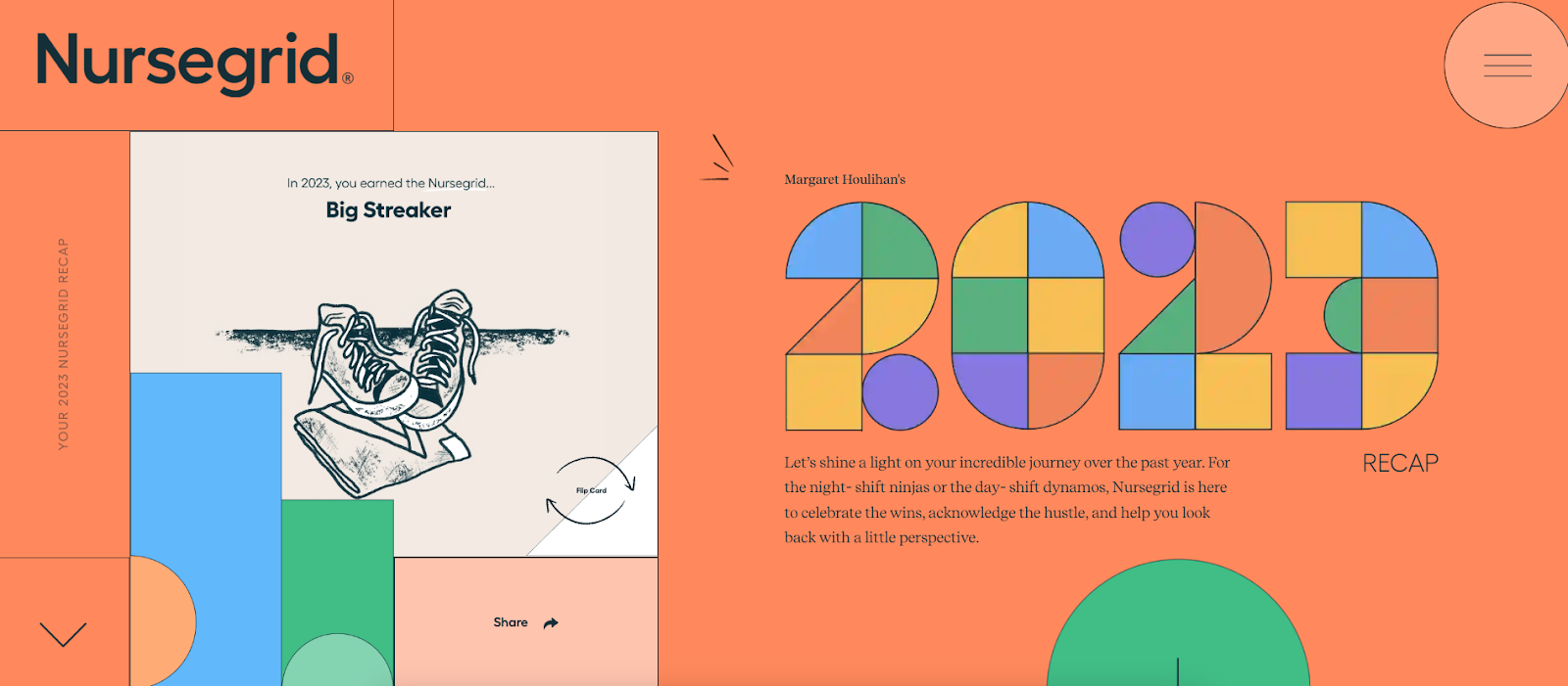
Nursegrid's personalized year-in-review page shows what an annual recap page should look like. It's jam-packed with unique insights, shareable graphics, and interactive elements.
Everything from the self-rearranging "2023" and the parallax-spinning clock gives the page an immersive, responsive feel. It's something you want to share.
And, yet, it's not too much. Going overboard on interactivity can sometimes make a website feel like a video game—and that's not always the vibe you want. Nursegrid gets the balance perfect here with a Goldilocks-approved level of playfulness.
2. Origin

Parallax scrolling can be overwhelming when overused, but Origin gets it perfect with its above-the-fold entrance. The logo gently disappears behind the arms of the windmill while birds take to the sky—and then it ends.
That's how to do parallax right. Wow the visitor, and then feed them information in a more digestible format (which usually isn't through non-stop moving elements).
Origin's page leans heavily on white space (dark blue, in this case) with modest use of graphics to break up the text. The rest of the fade-in elements feel organic and expected, adding to the user experience rather than being interactive for interactive's sake.
It all feels organic and intentional. The way it should be.
3. TEDx Blumenau Democracia
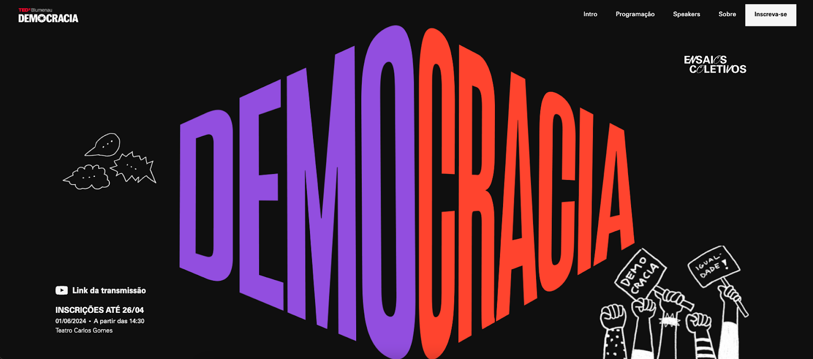
Parallax scrolling, hover-over effects, fade-in text—at first glance, TEDx Blumenau Democracia seems relatively simple, but it's anything but. It uses bold, contrasting colors to draw the scroller's eyes and make skimming simple rather than a chore.
Words have weight, and that's what the page focuses on. It uses large font sizes with easy-to-read styling to make headlines and short sentences pop.
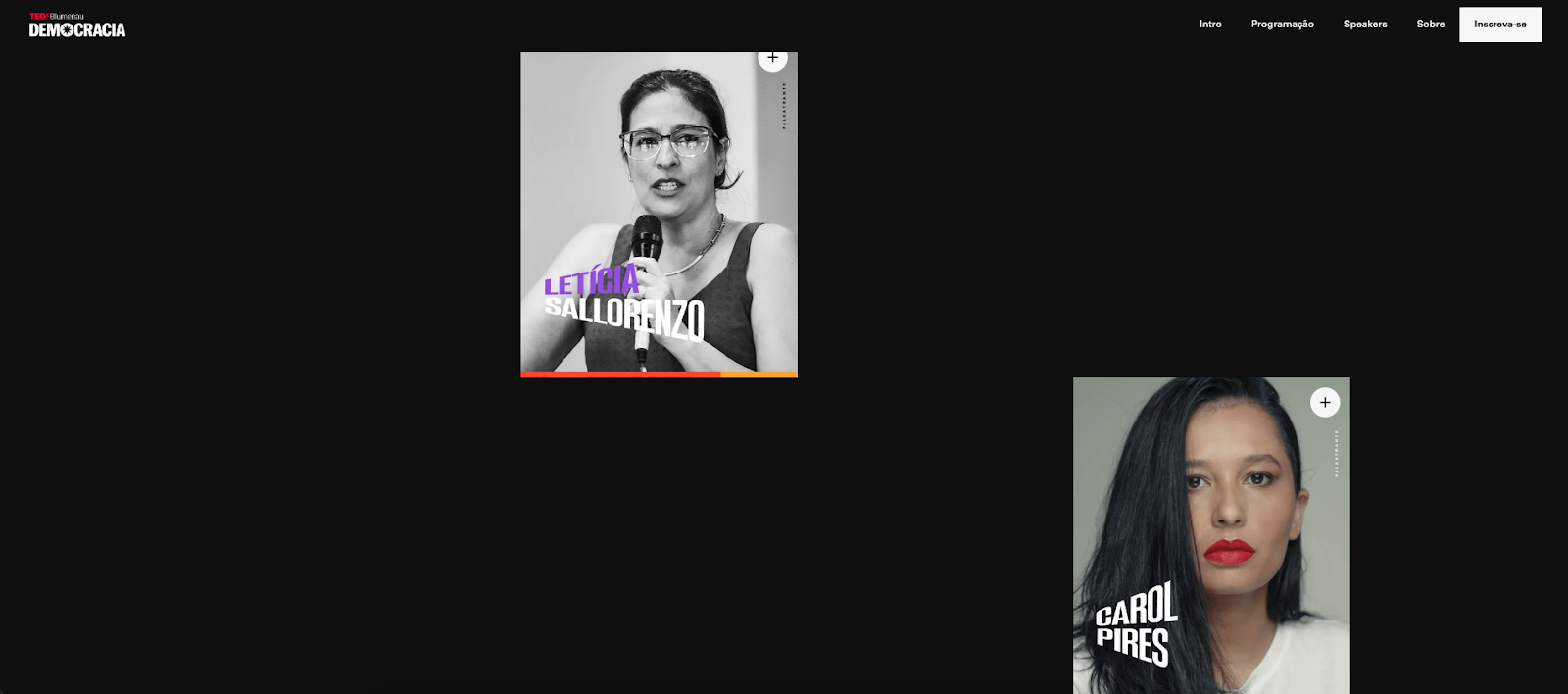
Like a good novel, this page draws you in slowly before sweeping you off your feet. Interactivity grows as you scroll down the page. It starts with gently fading text but soon moves on to come-to-life hover-over effects for the speaker profiles.
Scrolling down further, you start to get more of the parallax scrolling effects. Each scroll feels like peeling back a layer, revealing more content, more depth, and more engagement.
4. Yesterday

Yesterday is moving—always moving. From the get-go, a full-on blue screen with the Yesterday logo disappears off the screen to be replaced by a white page with big chunky text. It's easy on the eyes, and the rotating "Explore Prints" call out in the corner gives it that special je ne sais quoi.
Scroll down, and let the parallax begin. While the animation is intense, the focus is simple—you're zooming out on a complete frame of historical black-and-white New Zealand prints. Keep scrolling, and you'll get to take a look at three different photos.

Lastly, the page ends with a constant stream of text moving in and off the screen. But when you hover over the text, it freezes, giving you a chance to click the links you're interested in.
Yesterday's website transforms static, black-and-white memories into a vibrant, interactive experience. It's an ironic yet beautifully fitting tribute to the past, using modern web design to celebrate and preserve the richness of historical moments in a fun, new-world setting.
5. The Wild Geese
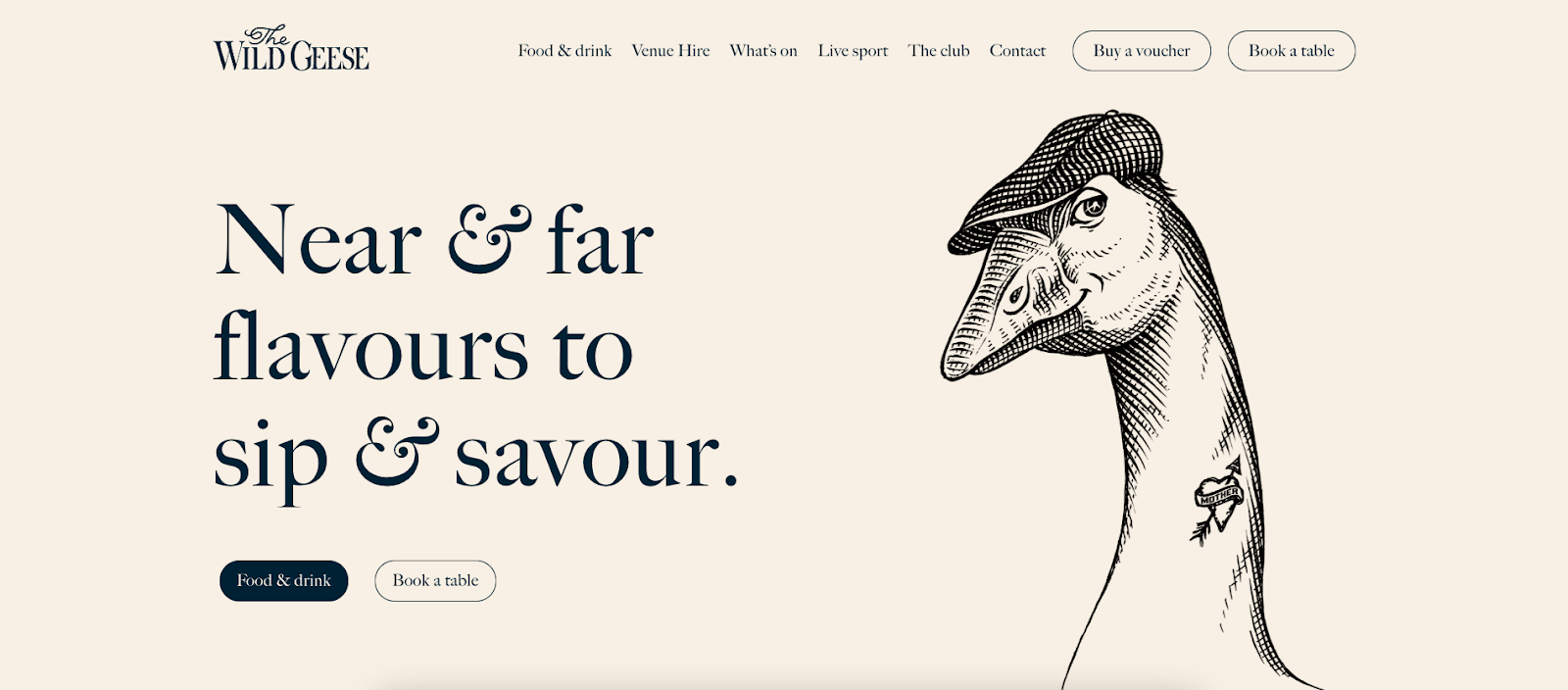
Unlike the other featured sites on this list, The Wild Geese keeps things as simple and fresh as its Irish-inspired icon. This page is all about clean design and easy-to-read text. The only interactive element is a moving gallery of three pictures—the rest is static.
And it works. Sometimes, less is more, and that's the balance The Wild Geese finds. This minimalist strategy isn't about lacking—it's about focusing. The page doesn't want you to stick around and enjoy the experience—it wants you to find what you're looking for quickly and move on with your day.
For those who just want to book a table and move on with their day, they tip their hats to you, Mr. Goose.
6. Mash Studio
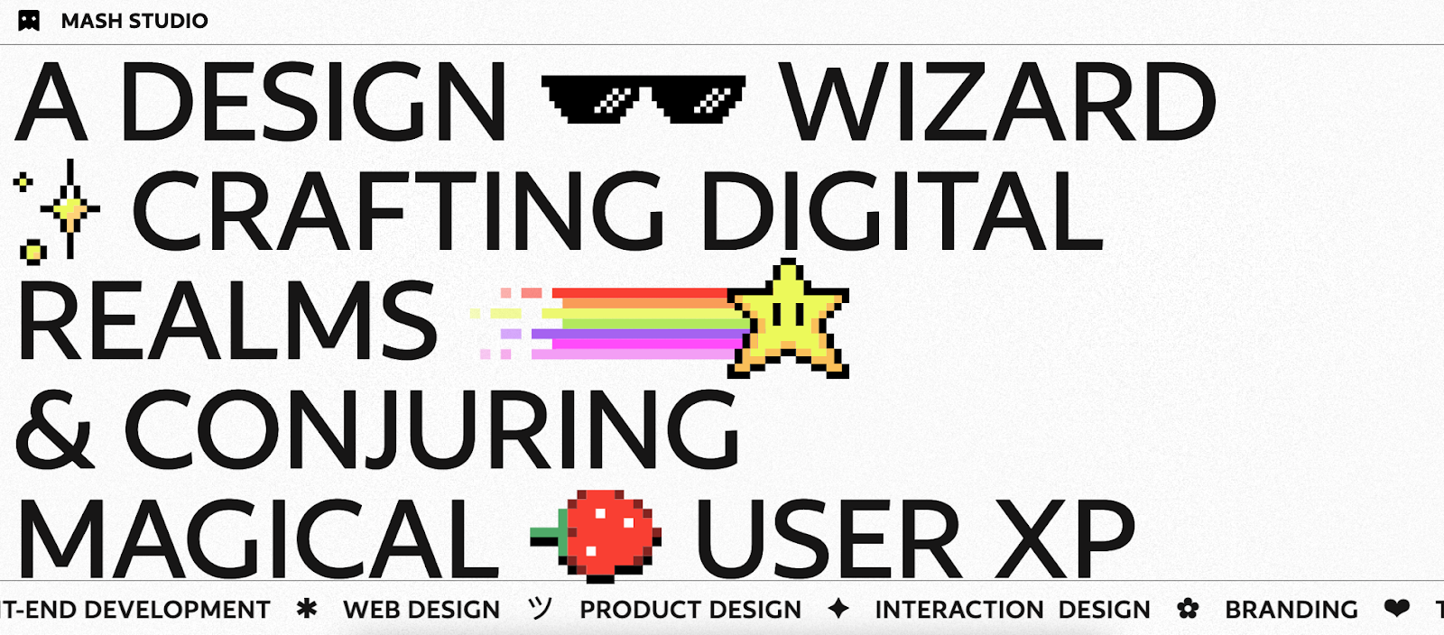
If The Wild Geese is the epitome of minimalism, Mash Studio is the pinnacle of eclecticism. Emojis, moving text, icons, colored cursors, parallax scrolling, rotating elements—this page has it all.
Despite the complexity and the potential for sensory overload, Mash Studio's design works. It's fun, engaging, and keeps you wanting more. It's not just a hodgepodge of creative pixels—it's a portfolio of a Webflow designer's capabilities. It pushes the creative boundaries and invites potential clients to imagine the possibilities.

Each element serves a purpose, showcasing different aspects of interactive design and animation that can be achieved through the platform. Mash Studio's page is a masterclass in maximalist web design, showing that with the right touch, more can be more.
What will you build?
The digital world is your oyster—what will you build next? Submit your project to Made in Webflow for a chance to be featured in next month's roundup.