Our community continually inspires by showing us what's possible with Webflow. Here's a roundup of our favorite #MadeInWebflow projects — with categories like eye candy, portfolio, and ecommerce, there's a little something to inspire everyone from our summer picks.
Eye candy
Project Turntable
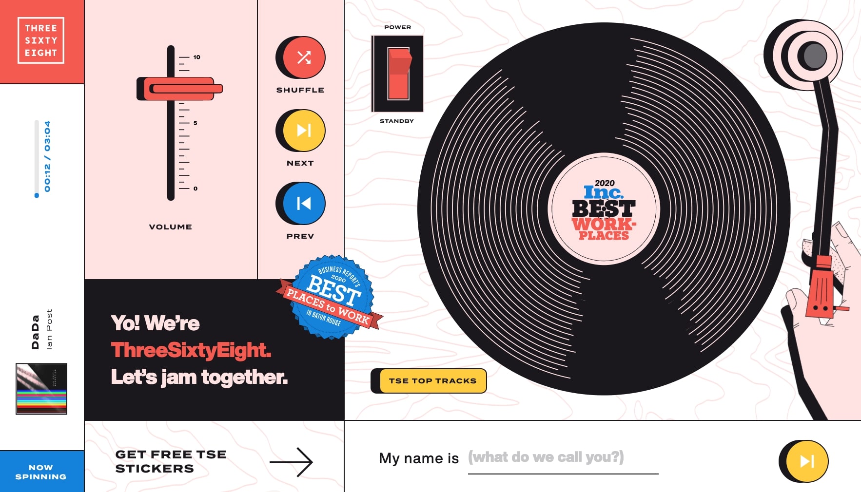
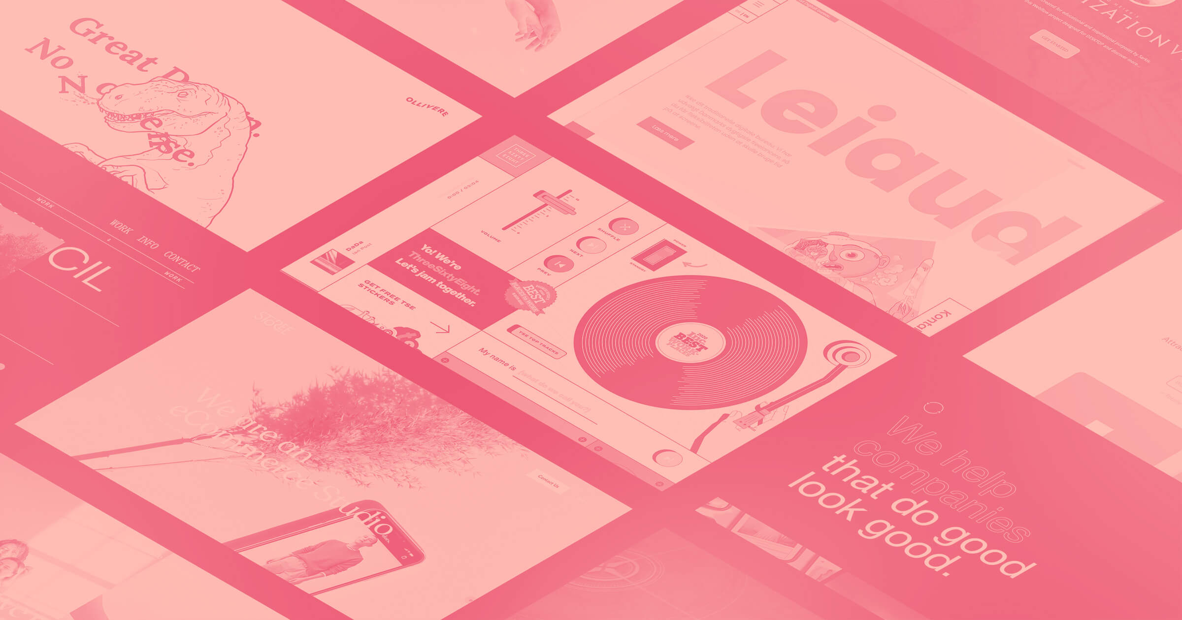
It’s not every day (or ever) you get to see a fully *interactive* turntable on the web. In this experimental site (built by ThreeSixtyEight), you can control the volume, shuffle or skip tracks, and even download stickers!
Civilization VI (Rebuild)
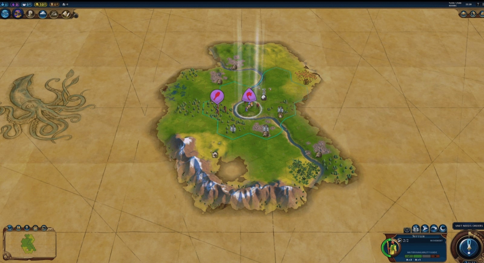
It took 12,400 elements, 1800 styles, 1200 assets, and 400 interactions to build a mock-up of ... an *entire game*. Likely one of the largest projects ever built in Webflow, Civilization VI is a true testament to no code's power and what's possible.
Casa Futura
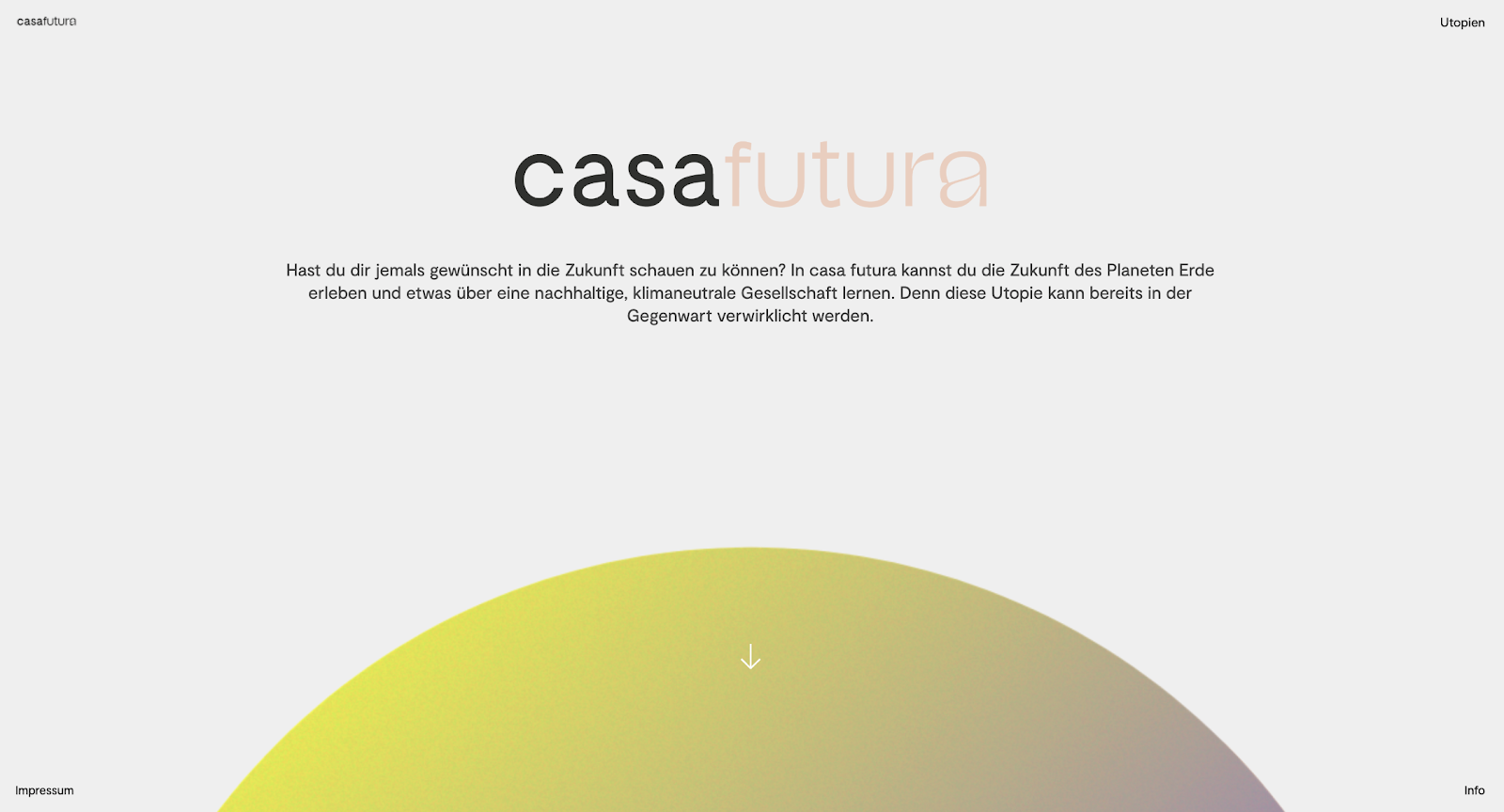
In casa futura, you can experience planet earth's future and learn about a sustainable, climate-neutral society, using four thematic areas. Not only can you visit the future, but you can do it while looking good — from the beautiful scroll-triggered animations to the custom illustrations, this website doesn't skimp on the eye candy.
Portfolios
Harry Moses
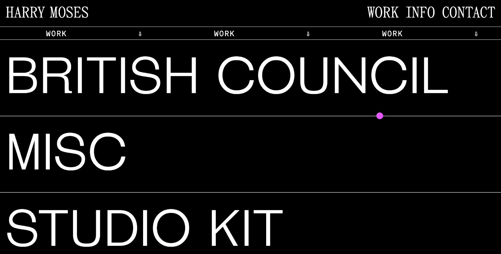
Brutalist fans rejoice – this portfolio is filled with a variety of fonts, large typography, and just the right amount of color (chefs kiss). Our favorite part? The on-hover interactions on the homepage, giving you a quick sneak-peek into each project.
Restu Septian Dwi
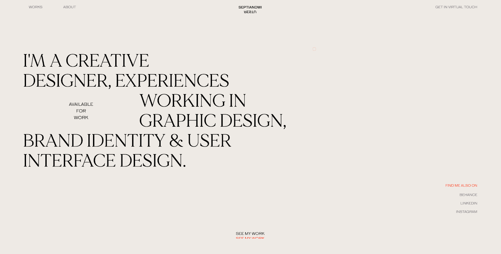
Restu features his work on the homepage with pops of color against a neutral background — keeping things clear and concise. The case study pages are also a delight, with a mixture of beautiful full screen photography and just the right amount of copy.
Ollivere
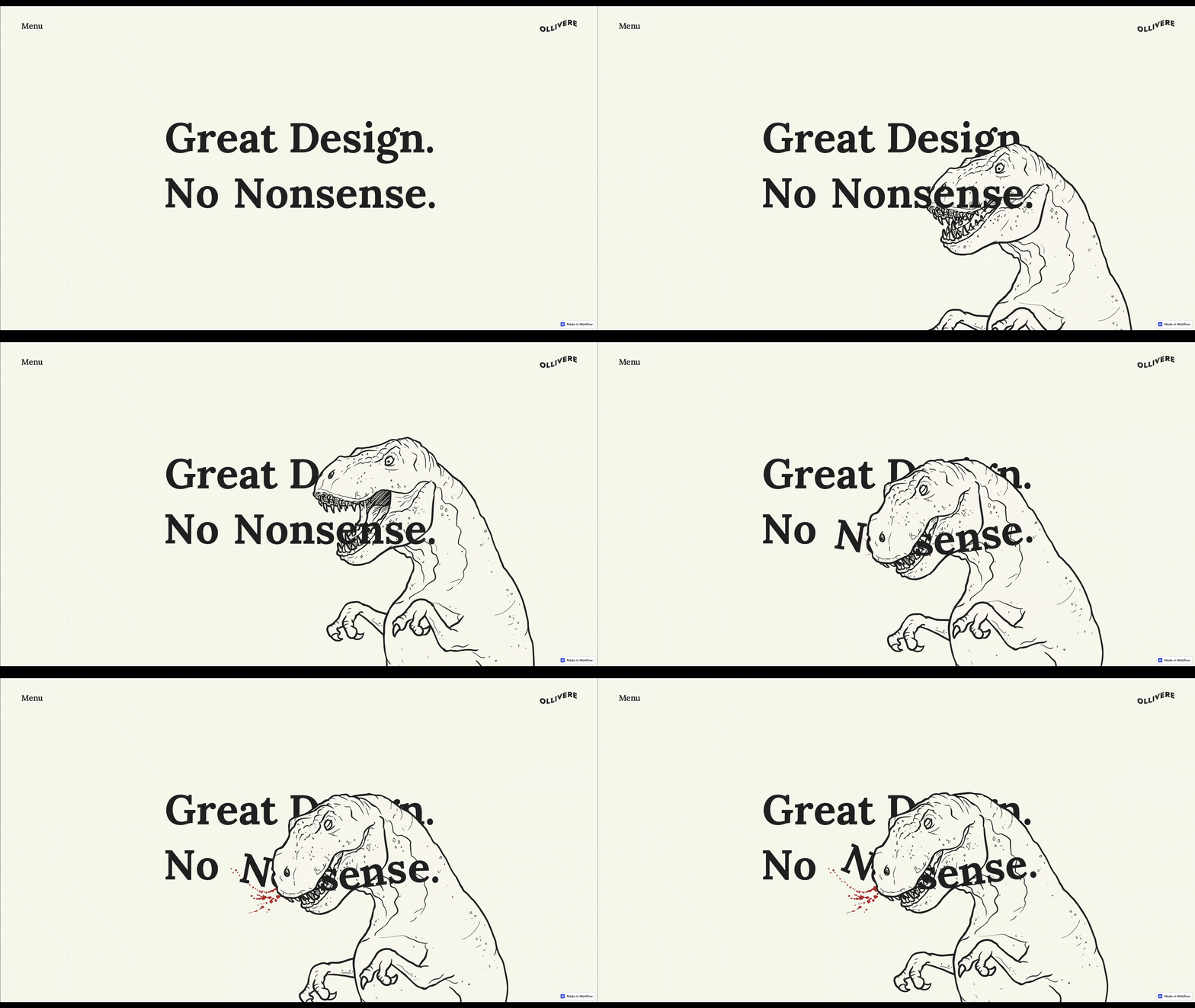
This nonsense-free portfolio has some of the best (and fun) scroll-based animations we’ve seen. It also uses negative space very effectively that makes all of the content easy to read, and keeps things visually dynamic.
Enterprise
Stripe mega menu (cloneable)
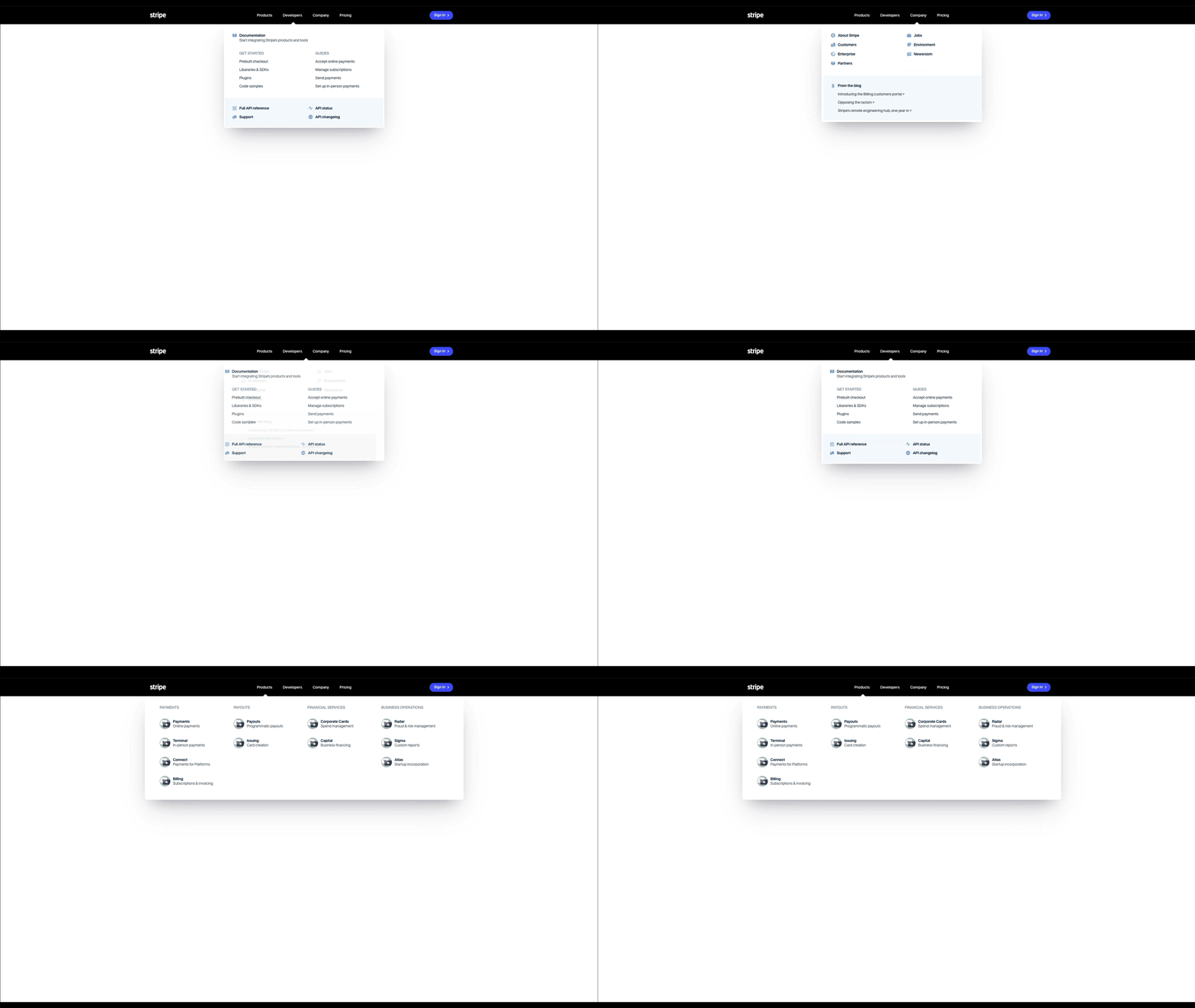
Most of us are familiar with and love Stripe’s mega menu, but now we can also have it on our sites, thanks to Kamran. The menu is especially helpful for startups or enterprise teams trying to filter a variety of information under specific categories on the homepage navigation bar.
Homerun
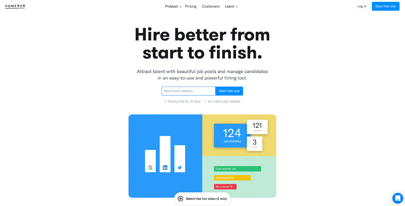
Boring career pages and job postings are a thing of the past, thanks to Homerun. Their site has plenty of well-organized, in-depth information about their product, and the layout builds trust that their platform is as easy to use as they promise.
Agencies
Storee Studio
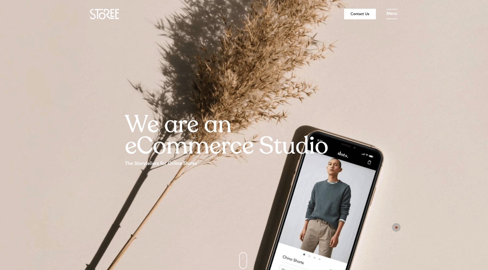
You know you’re in for a treat when you’re welcomed with a loading animation, and Storee’s site lives up to the hype. The minimal site is packed with subtle scroll animations and beautiful typography. The full-screen menu is also a delight, and we especially love the case study page — fading gradients just never get old.
Leiaud
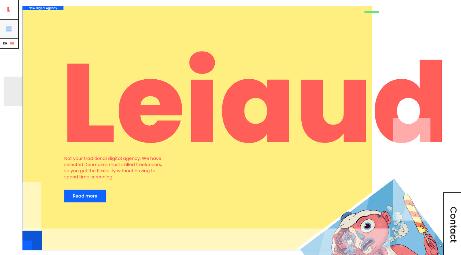
As they boldly state in their header, Leiaud is not your traditional digital agency — and neither is their site. Everything from the funky illustrations to the grid-based layout makes for an enjoyable scrolling experience.
Vovi
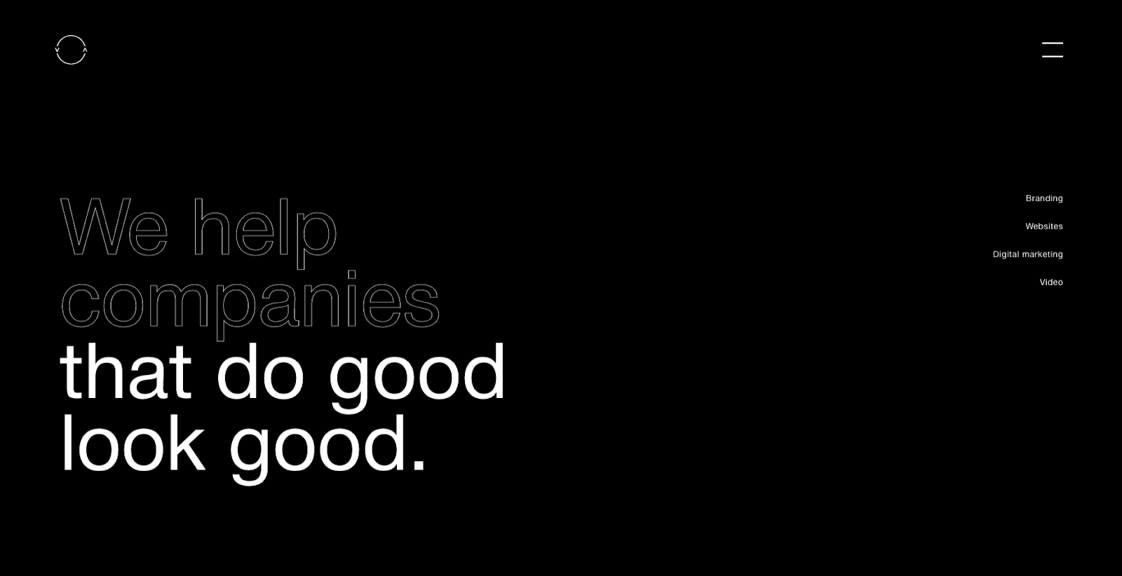
Vovi does an excellent job of showcasing their work by putting it front and center — right after the bold (and catchy) header. Their design isn’t overwhelmed by a grid of thumbnails listing every project they’ve ever worked on. Instead, they feature a few examples of their most recent work. Also, the rotating-logo-on-scroll is a *nice* touch!


Get started for free
Create custom, scalable websites — without writing code. Start building in Webflow.
Ecommerce
The Noire Collective
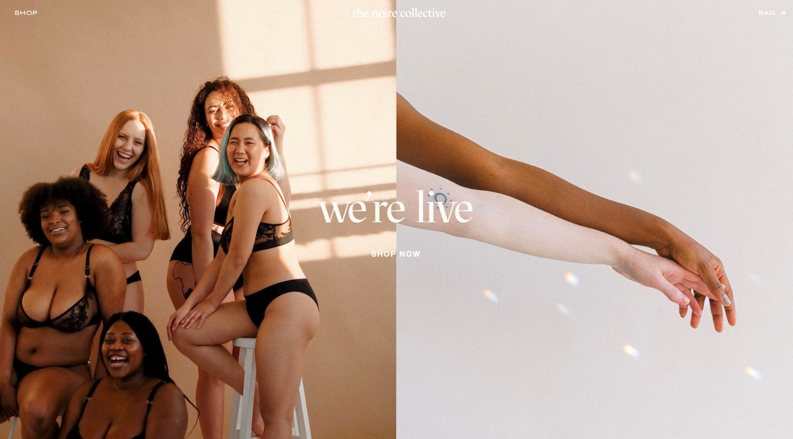
The Noire Collective is a sustainable lingerie brand. Designed and manufactured in the UK with ethically sourced materials.
Their header sets the tone with simple yet striking lifestyle photography while the rest of the site features excellent use of negative space and beautiful font selection. The product pages are also a delight with detailed product shots and just the right amount of descriptions.
All Eyes On Us
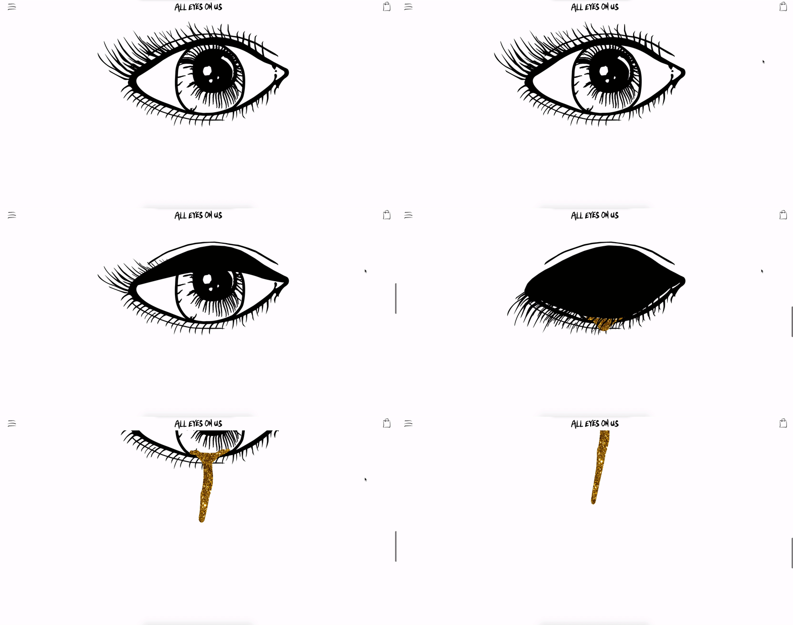
What makes this site special is the slick scroll-triggered animations, which take up the full screen as you make your way to the shop section. There’s a sense of mystery throughout the site, and the font selection, along with the unusual on-hover interactions add to this sense of ambiguity.
Ebook landing page (free cloneable)
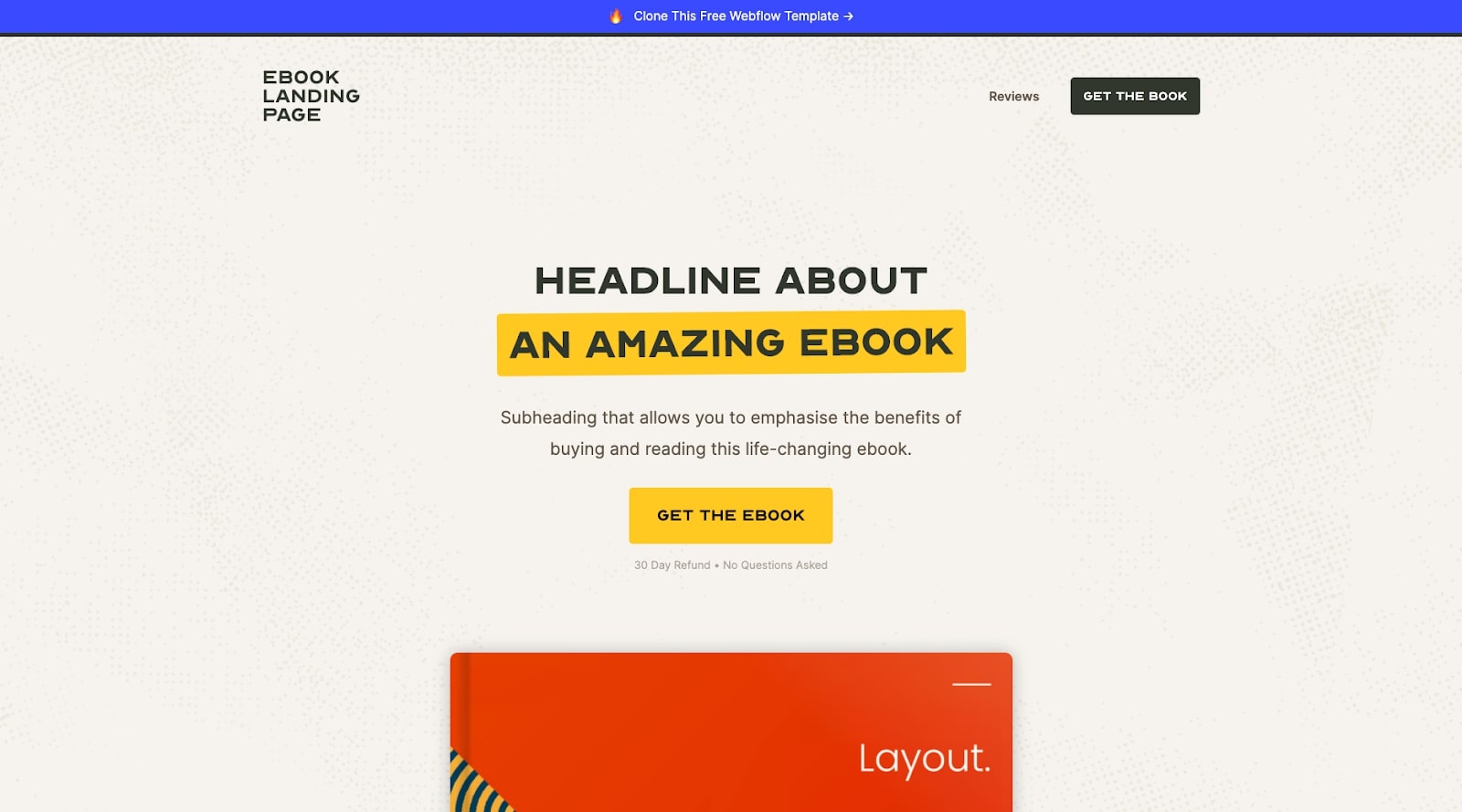
It seems like once you finish writing a book, countless tasks are waiting for you on the other side. Thanks to Youssef, the website is one less thing you’ll have to worry about. His *free* cloneable template features a well-structured landing page with testimonials and pricing sections.
Bonus
90s Webflow
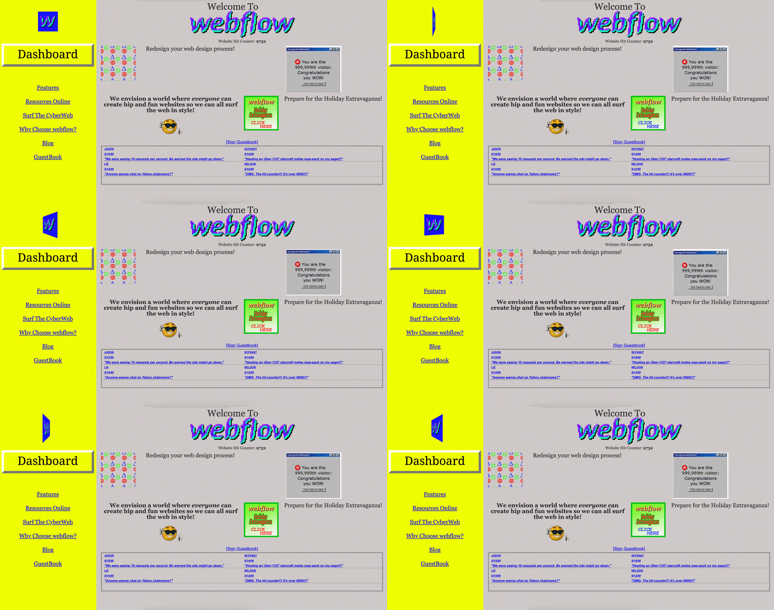
Remember website hit counters? We almost forgot those too, until Saita rebuilt Webflow’s homepage — for the 90s! Yes, it has all the things you loved (or hated) about the 90s: Yahoo chat rooms, super annoying pop-ups, and plain-text 404 pages.
Feeling inspired? Start designing!
We look forward to more design goodness from our Webflow community. So if you’ve got something you’d like us to see, be sure to use the #MadeInWebflow hashtag when sharing your site on Instagram, Twitter, or Facebook.
For more inspiration and other design resources, check out our Showcase, tutorials, and community forum.


