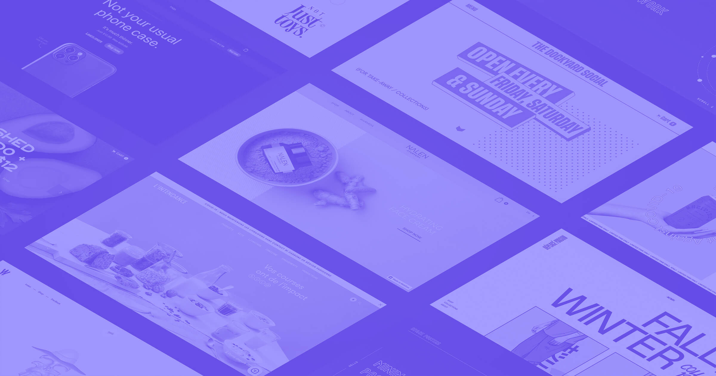
Are you sitting down, Webflow fans? Here’s our newest installment of monthly faves #MadeInWebflow from February. Watching you use Webflow makes us jump for joy. We hope you see something in these 14 sites that makes you excited too.
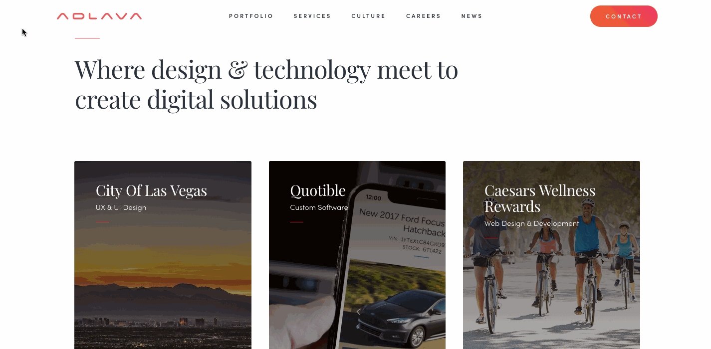
1. Adlava

Adlava is a marketing agency based in Las Vegas. The video on their homepage captures their creatives in action, snapping photos, designing, and otherwise absorbed in projects. There are plenty of quick cuts that keep the video moving for a nice first impression of what their agency is all about.
Along with their excellent video work, they use other engaging visuals throughout the design, like animated transitions and lively hover effects. Despite there being quite a bit of movement, their calls to action don’t get lost.
Good design means making sure your audience has enough visual cues to explore your content — Adlava does a good job of making it obvious what is and isn’t clickable.
2. NOPE Creative

kGently falling snow drifts down a yellow website background with bold letters pushed to the outer edges of the page. It's an unorthodox layout, communicating that NOPE Creative is an agency willing to take chances. They describes themselves as, “A bunch of tech-savvy designers who are thriven by everything modern yet functional.” Their agency site embodies just that — and they’re not afraid to use use a made-up word like thriven.
The layout is full of variety, including transitions with changing background colors from one block of content to the next, microinteractions, grids, and even side-scrolling. It's a nice, cohesive mix of visual elements that don’t feel forced.

3.Timothy Maurer

Timothy Maurer, a digital creative director, describes this website as a placeholder. (But it’s probably the most beautiful placeholder we’ve seen lately!) It’s an index of his work while he’s putting together a new, more permanent design for his portfolio. Some might wonder what the point of building something temporary could be when you could just throw up the words “Coming Soon” on a blank screen, a few external links to past projects, and some contact information.
But Timothy goes beyond what could have been a slapdash design.
The animated typing effect (captured below) reminds us that the site is a work in progress. You can almost imagine Timothy typing these words in real time. Among the practical skills he lists, like strategy and design, he also tells us he’s a fan of bad jokes. It’s a nice moment where he reveals a bit of who he is as a person, injecting his personality into the more straightforward elements of his design.

Instead of half-heartedly tossing something up with little effort, Timothy has given us a placeholder that’s thoughtful and useful. This sends a great message to clients that he’s invested in making something worthwhile, no matter the project’s scope.
4. Alex Dram

When a website like Alex Dram's comes along, it certainly challenges the theory that there’s no such thing as a new idea. Alex is a UX/UI product designer whose portfolio proves that there are still new ways to be creative. This design is both artful and inspiring.
His use of animation is dazzling — geometric shapes explode and coalesce as we scroll. There's a very subtle filter covering the shapes and the background with a small amount of static. This break from straight lines and flat color adds interest and gives the visual elements an analog feel. The design is highly stylized and the scroll-triggered, morphing shapes continue throughout the site, bringing a touch of the surreal through motion and color.
5.User Interviews
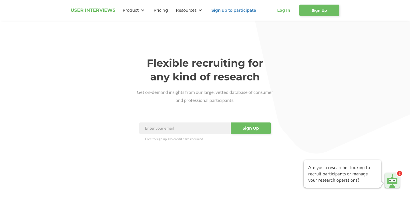
One of the neat things about checking out websites built with Webflow is discovering businesses you didn’t know existed. User Interviews screens and filters people to participate in UX and market research projects and product testing. We can only assume mad scientists are excluded from being clients. Sorry, Dr. Frankensteins.

With a simple green and white color palette that reflects their tech roots, the design features plenty of screenshots from their app showing how it works and the type of demographic information they have on potential research participants.
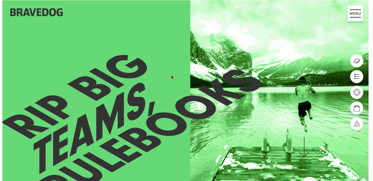
6. Bravedog

Bravedog is a design agency that’s not afraid to take a different approach. Their landing page — instead of a long scroll — offers a tidy introduction that serves as a jumping-off point to learning more about who they are.
Clicking the top right menu gives you options to navigate deeper into the design. Each section of the website feels distinct yet cohesive, with layouts full of variety and animated eye candy, not to mention beautifully transformed headlines, that never feels redundant.
7.OnCorps
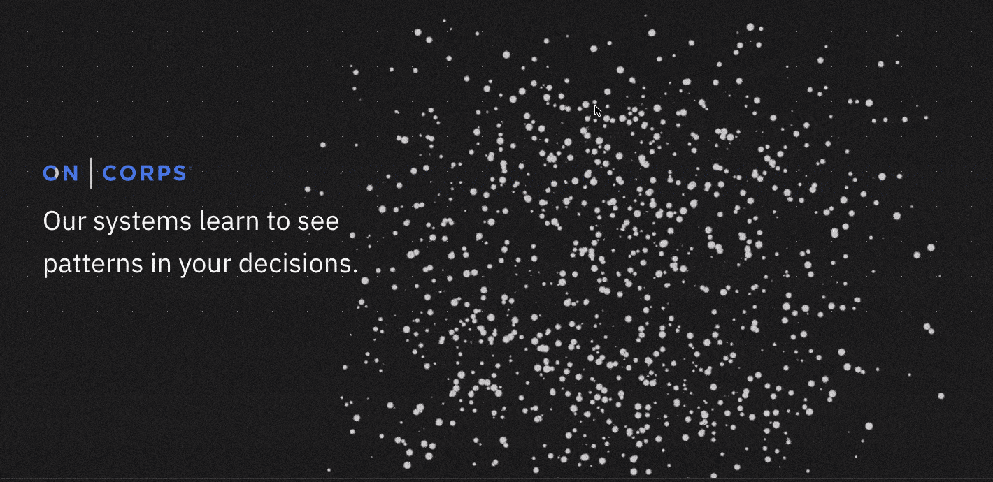
OnCorps is a software solution that uses “machine learning, behavioral science, and user-centered design, [to] help organizations collect better data and make better decisions.”
Interpreting large data sets may not be the most sexy of pursuits, but OnCorps showcases their area of expertise with a design that's lively and engaging.
Their opening line, “Our systems learn to see patterns in your decisions” pairs with an animation where tiny particles scatter — like so many data points — and resolve out chaos into a recognizable shape. It’s a powerful metaphor for how they help businesses.
Throughout the design we see shapes morph and move as we scroll. Along with stylized imagery, we see screenshots of their customized data-collecting apps and content that showcases their ability to collect and analyze data. This design proves that even highly technical topics can be presented in an expressive, creative, and most importantly, accessible package.


Design interactions and animations without code
Build complex interactions and animations without even looking at code.
8. Bold Web Design - Font Combinations for Web Designers

Tons of tools let you preview font combinations, but Font Combinations for Web Designers, from Australian agency Bold Design, stands out with its easy-to-use interface.
The landing page starts with the gentle call to action, “It begins...with a font.” From here you pick your font from a dro-down menu. Next, you're brought to a mock layout that pairs the font you chose with other typefaces. Hovering over each content block brings up the name of each font.
It’s a simple-to-use, helpful tool for any designer wanting to play with font combinations.

9. SYKE

Jamie Syke is a designer who’s worked with huge brands like Porsche, Samsung, and Facebook. His portfolio website includes a section dedicated to landing page designs specifically for startups. And we’re so happy to see him using Webflow as part of his process.
Jamie used a simple layout that features three projects. Each project tells us he knows how to use color, whitespace, and brand-appropriate typography to deliver a clean landing page. The scroll-triggered scorpion icon that spins as you navigate down the page is a nice touch and speaks to his penchant for using quirky elements to make a design stand out.
10. Alex Lakas
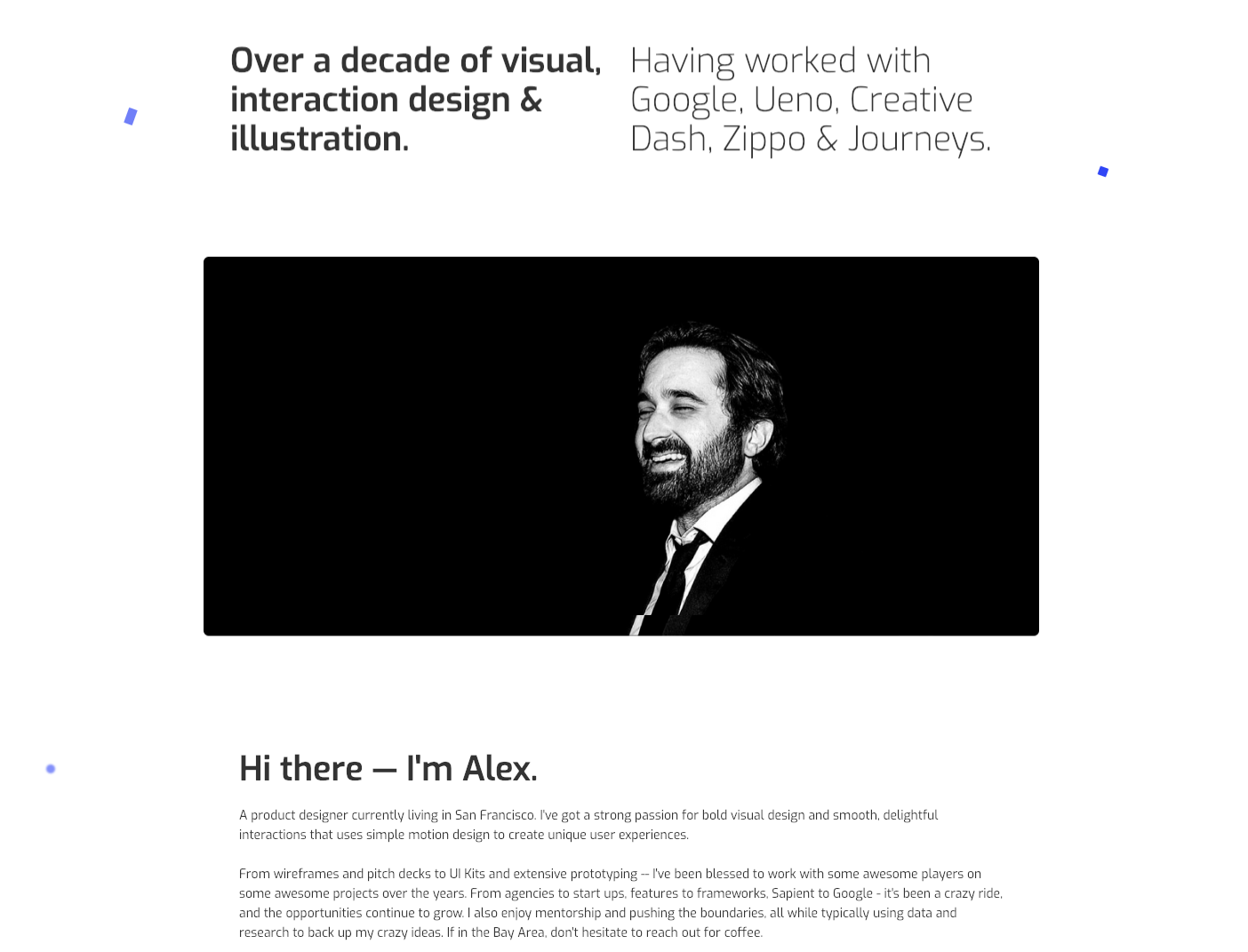
Alex Lakas’s site is a nice portfolio that encompasses all that drives his creative pursuits, including digital design, photography, and illustration. There’s nothing about this design or content that’s confusing — every visual element and word has been placed with precision.
Alex describes himself as having, “a strong passion for bold visual design and smooth, delightful interactions that use simple motion design to create unique user experiences.” This portfolio is the culmination of his design sensibilities.

11. Under 30

Under 30 offers travel packages geared at those who are … under the age of 30. It’s an interesting niche, because people on the other side of this age divide most likely have different expectations of an adventure, not to mention very different bedtimes.
Their landing page asks, “Where are you going in 2019?” with two calls to action — one to search by trip and another by date.
Clicking a trip brings you to a page that lists the major details — enough for some to make a decision. For those who need more details, they can keep scrolling.
The use of green in this design reflects lush destinations like New Zealand, Thailand, and Costa Rica. The design feels very fresh and alive.

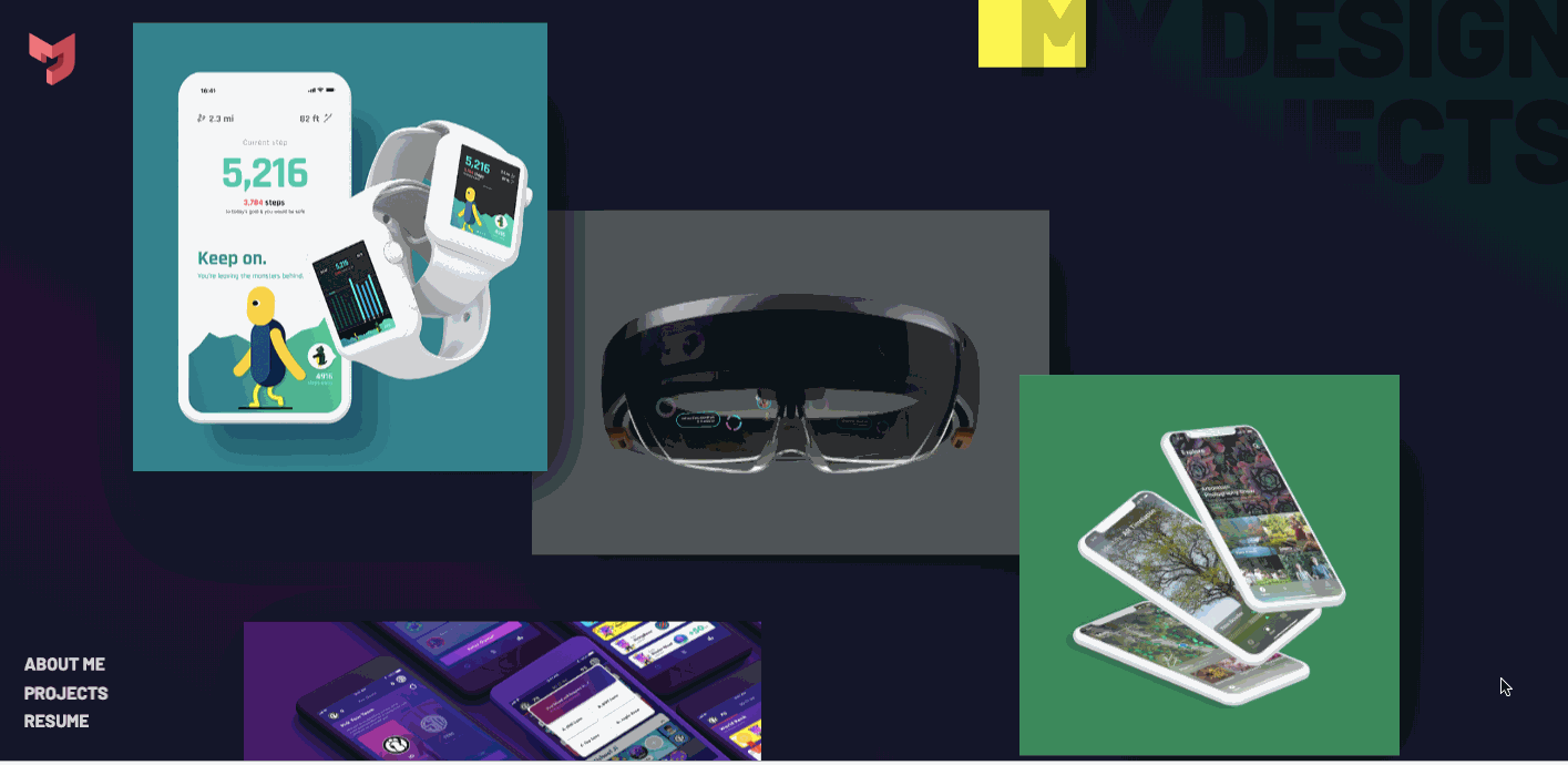
12. Michael Ji
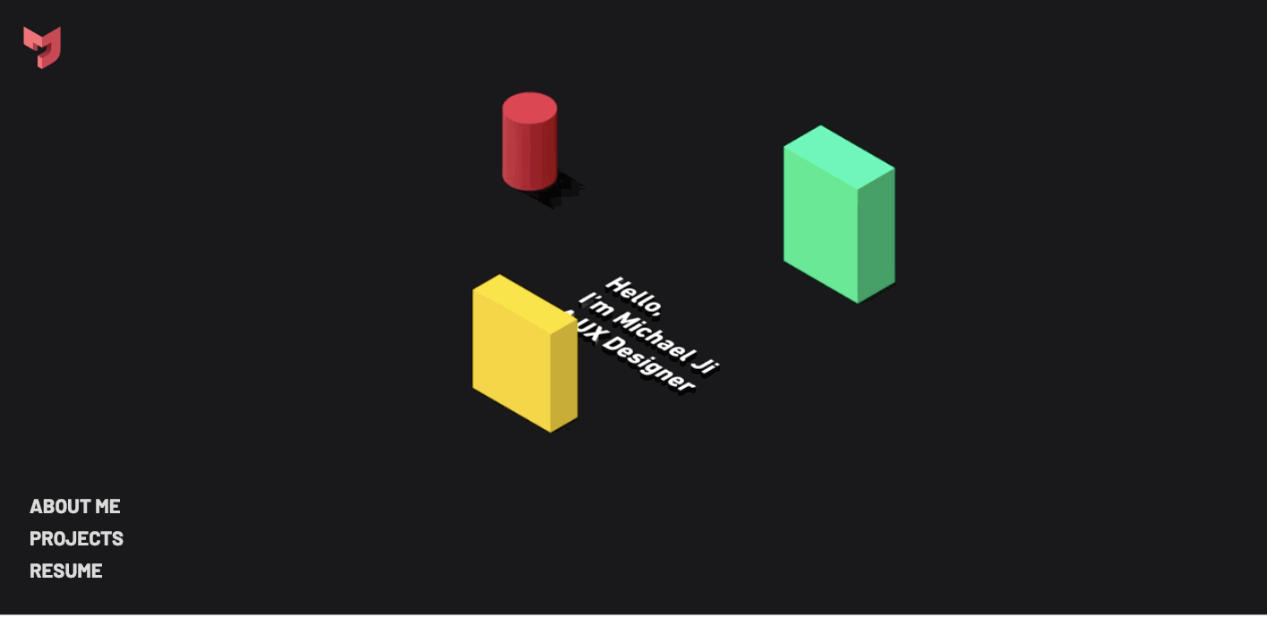
Wow — here's another portfolio that transcends expectations. This is more than a list of skills and a collection of projects. It’s an exercise in creativity. From the moment we see the revolving, morphing ring of shapes, we know this site is going to be unique.
Michael Ji is a UX designer and student at the University of Washington in Seattle. This website is such a great introduction to him as a person and a designer. There’s a well-crafted smoothness to his design that touches everything from the microinteractions to the words he uses to describe himself.
13. By Alice Lee

This site is a must-see for anyone interested in illustration and/or the process of developing a visual brand identity. Alice Lee uses words and drawings to tell the story of how she created illustrations for Slack that became a vital part of their visual branding — and have now become a web-wide trend.
Alice shares her trials and errors in coming up with a visual identity for Slack. Even those whose illustration skills don’t go beyond crude stick figures will enjoy reading about her challenges and creative process. Whatever your creative discipline, her story is a relatable one.

14.Nathan Dennis Design
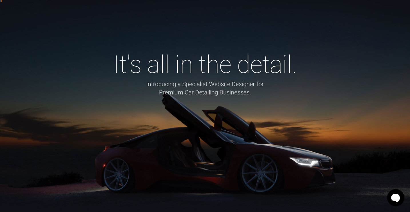
Marketing yourself as a design specialist in a particular niche can really set you apart. Nathan Dennis focuses on building websites for car-detailing businesses. With a lot of these businesses all needing a website, this is a smart move — why not hire someone who knows car detailing and web design to create a web presence for your niche business?
With its bright, shiny car and dark colors, Nathan’s design has an elegant aesthetic. Just like a freshly detailed car, there’s nothing muddying up the layout.
Nathan even includes examples of what he can include in a layout. There are mockups of pricing and car-detailing packages. Instead of lorem ipsum, he’s used actual content to show he knows what he’s talking about.

What are you designing?
We love seeing so many different types of designs coming from Webflow creators. Have you finished any new projects lately? Maybe you just launched a site with Webflow Ecommerce or created your first portfolio — whatever you’re working on, we’d love to see what you’re up to in our showcase.
For more inspiration and design resources, check out our community forums, tutorials, cloneable designs, and workshops.