When our team set out to bring Apps into the Webflow Designer, we were picking up a problem that had been picked up and put down several times over the last few years.
We wanted to prioritize the needs of the growing community of developers and entrepreneurs surrounding Webflow. Many of them were finding creative ways to work around our existing API limitations in order to launch powerful products for the broader Webflow community and we knew we needed to provide the community with a better way to build on top of the Webflow platform.
We set out as a small group with one core focus: “How do we build a strong, reliable and extensible foundation for developers to bring amazing App experiences directly into Webflow’s Designer, in a way that Webflow can support and scale?”
Our approach
To get started, we gathered all the Webflow Chrome extensions we could find, and dug up all the usage stats that we could get our hands on.
With the research in-hand, we were able to map out the entire developer journey and shine a spotlight on use cases like localization, design workflows, and component creation that were enabled by these third-party Chrome extensions. We then connected the dots to showcase the developer's POV, laying out their pain points, opportunities, and the workarounds they currently used to create tools that extended Webflow’s Designer.
As we began to explore potential product solutions, we quickly turned to prototyping to help streamline our exploration and improve decision-making for our team. The prototypes allowed us to move from abstract ideas to productive conversations and feedback cycles on something much more tangible. During this process, it became clear that when people have something concrete to react to — discussions are able to gain momentum and propel teams forward in the process of building great products.
Our prototyping process
As we dove into rapid prototyping, the range of ideas were broad. Some ideas were gold and, to be honest, a few went straight to the trash. For us, it was important to solidify the concept of in-Designer extensibility so we could have discussions framed around real-life use cases.
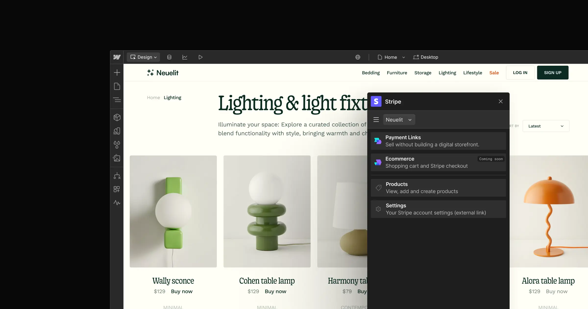
So, we focused our prototyping on building out concrete use-cases, ranging from AI text generation to SVG injection and style management. This gave birth to the idea of a Digital Asset Manager, which essentially separated the App layer into its own window.
The Digital Asset Manager prototype was an ‘aha’ moment for our team. It made it clear that there needed to be a dedicated, customizable space that could seamlessly interact with the Designer canvas. With it, users now had the freedom to build workflows and configure settings directly within an App window.
It also meant that users could move the window around, allowing them to shift the App out of the way and focus on their current task. Creating this flexible space benefited developers and customers alike.
Once the prototypes were complete, the engineering team took the prototypes and started building a functional proof of concept for us to test internally. This proof of concept became the foundation for the Designer Extensions Javascript APIs, which allowed us to create a floating window that could interact with the Webflow canvas through an API bridge. We started on a smaller scale by first prioritizing the ability to select and read canvas nodes, and then moved onto manipulation and creation experiences.
While the engineers were busy with building the proof of concept, we —the product and design teams — continued prototyping concepts to broaden our use cases and pinpoint technical needs and constraints for discussion.
Some concepts, like a link validator, sparked engaging discussions on the extent of power we should grant to the Designer Extension API and the level of access an App should have within the Designer. These explorations helped us solidify our principle that a Designer Extension should extend anything a designer could do within the Designer’s canvas. However, for more global events, leveraging our REST APIs would be necessary to enable an additional layer of authorization.
Feedback and iteration
Once we felt confident in our direction, we rolled out a beta to a select group of customers and developers. This step proved invaluable in shedding light on limitations in our API capabilities and user experience. We received a lot of great feedback, including one critical piece of feedback that we needed to offer more flexibility around the size of the App window size.
To address this, we started prototyping concepts allowing users to resize the App window to address window size concerns. With additional customer and developer research, giving developers control over the window size proved to be the best path to improve the overall experience. We wanted to empower developers to create the optimal user experience for their App, and wanted to recognize that some Apps required minimal surface area while others needed a larger, focused window.
We identified the benefits of introducing constraints and settled on letting developers set their default window size from three predefined options. This was so we could strike a balance between developer flexibility and user predictability when using a tool like Webflow.
We also recognized the importance of providing escape hatches for focused workflows. While an App might function well with a small window for the majority of its tasks, there were valid reasons to expand it midway for specific steps in a flow. With this in mind, we then built an API allowing developers to dynamically increase the size of an App at any point for an even better user experience.
How our community responded
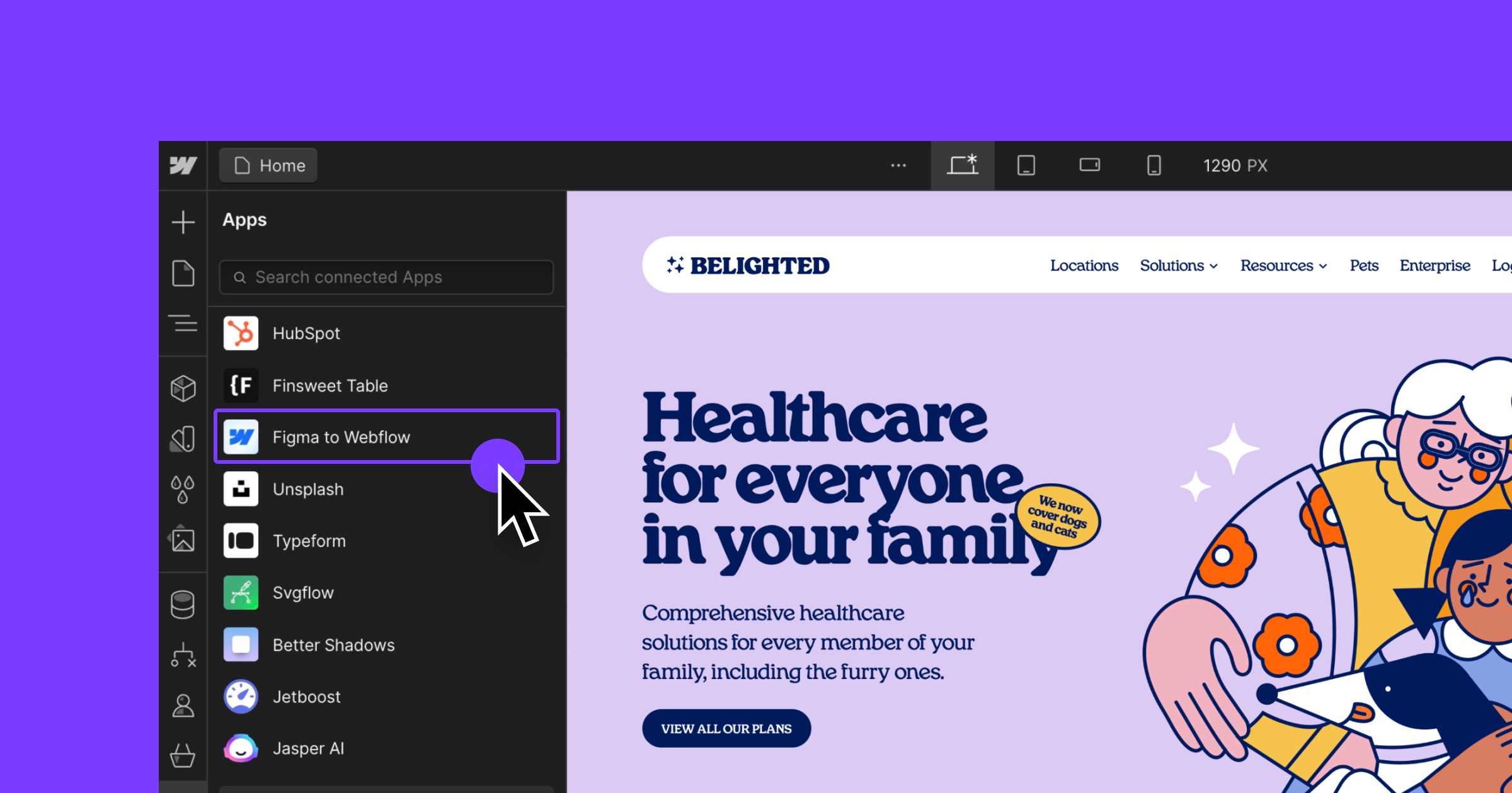
Since launching our new Designer Extension APIs with our revamped developer platform we have almost doubled the number of Apps in our Marketplace, seen thousands of App downloads, witnessed Webflow Experts build new revenue streams with Apps, and added multiple partner SASS Apps to our Marketplace.
Best of all, our community is absolutely thrilled:
Webflow Apps is the most impactful update to @webflow in the company's history.
— Joe Krug (@joekrug) August 29, 2023
What's next? Live stream Wednesday 9 PT
- How Webflow Apps will impact the ecosystem
- @thatsfinsweet roadmap and apps launching in 2-4 weeks
- Special message from @leinwand, CTO at Webflow
Link 👇
Webflow apps are expanding the super powers @webflow users have! 🔥⚡️
— Chris Laupama (@chrislaupama) October 28, 2023
Love seeing what the community comes up with! 🤍 https://t.co/HVB4Wioq65
This is a new era for @webflow !
— 🟠 Théo R. (@rolandtheo_) August 29, 2023
With the power of Apps, the talented Developers & the amazing Community, Webflow will grow to the next level !
A lot of love for my already favorites Apps : @thatsfinsweet @Slater_App https://t.co/ZqMILRlHfs
For those who have previously styled Hubspot forms — or at least attempted to — witnessing the integration of the Hubspot app within Webflow, which delivers a ready-to-style native form with just a click, is truly an emotional experience.
— Vincent Bidaux (@vinchubang) October 10, 2023
💙 pic.twitter.com/gghkE7qOe1
To learn more and check out all that Webflow Apps have to offer, click here.


.jpeg)


