

When it comes to legal firm websites, as a designer, your goal is to create something that reassures visitors they’re in good hands.
People dealing with divorce, custody battles, or bankruptcy have a lot at stake, like their house, their business, or time with their children. It’s unsurprising that most clients shop around online to choose a lawyer. Even people who ask for referrals from friends and family check a lawyer’s website before deciding. If you’re designing for a lawyer, your web design must express your client’s trusting, caring, and capable nature.
7 tips for great lawyer website designs
How do you communicate trustworthiness, competence, and compassion through design? Here are a few tips to help set your website up for success.
1. Think of your client’s clients
People seeking legal assistance often deal with complex, complicated, life-changing situations — adopting a child or estate planning, for example. They also might be contacting a lawyer for the first time and don’t know what to expect, which can further overwhelm them.
The best law firm websites use intuitive navigation, walk people through relevant legal processes, and contain all the information a prospective client needs at a glance, like contact details and pricing. Such organization beats sites that make visitors dig around for information.
Content for lawyer websites should also communicate empathy. Try to understand how clients are feeling by putting yourself in their shoes. If you’ve ever experienced a legal matter requiring a lawyer, you may know how overwhelming it may feel and how daunting approaching action might be. Offer a way to solve their problem so they can feel better. That’s the key to converting visitors into clients — be the comfort and reassurance they’re looking for.
2. Include multiple contact channels
Visitors should be able to get in touch from anywhere on the site. Offer several contact options, including a phone number, email address, and contact form to cater to a wide audience.
Tell your client that monitoring these channels is crucial. One study found that 42% of law firms take three or more days to respond to customer voicemails and emails, so replying quickly to clients might provide a leg up on the competition.
3. Regularly update the site
Around 35% of small law firms with websites haven’t updated their sites in at least three years. But firms that add new content to their sites (typically via a blog) get 400% more traffic than firms that let their sites stagnate.
Blogging actively can also double the number of backlinks to your site (the number of external sites that link to your content). Backlinks build domain authority, which helps your site rank in search results and leads to better site visibility and traffic.
If you’re creating or updating a site with a blog, check your local ethics guidelines regarding legal advertising so your client doesn’t breach any requirements. Using real names when sharing success stories, for example, is likely off-limits.
4. Pay attention to SEO
Search engine optimization (SEO) helps a website rank in search results, driving organic traffic. Increased organic traffic means more visitors are finding your site, leading to more conversions and improved site authority.
The easiest way to improve your SEO is to pay attention to keyword use. Research keywords for your client's target audience using an external SEO tool and add them to your site using the SEO tools available in Webflow.
5. Spotlight testimonials and reviews
Reviews matter: 98% of people say they’d read a lawyer’s reviews before hiring them. Social proof is crucial for lawyers because prospective clients will have to trust information regarding highly important parts of their lives, like relationships, businesses, and childcare, to their lawyer. So they’ll want to hear from past clients about their experiences.
Express this social proof by highlighting client testimonials on the site, perhaps with a Google Reviews widget that follows scrollers or a menu tab titled “5-star reviews” that leads visitors to a page filled with kind words and positive experiences.
6. Balance professionalism with originality
If the website is too lively or unpredictable, prospective clients may worry the firm’s behavior will match. That’s why the firm needs to stand apart from the competition and use its website to showcase its unique qualities.
Chat with your client about how they’d like to express their brand. Then, experiment with different font and color combinations to find the right balance of expertise and originality, asking for your client’s input throughout the process. Instead of generic stock photography of models in suits, consider using professional portraits of the firm’s team to help its new clients feel familiar with who they’ll be working with even before the first consultation. Think about including testimonials from satisfied customers to build newcomers’ confidence.
7. Display virtual consultation and meeting options
Before the pandemic, only 23% of legal clients considered holding virtual consultations, but now 79% actively seek law firms that offer them. If the firm provides virtual consults, ensure visitors know about it immediately by putting it on the homepage.
And if the firm offers free consultations to encourage people to use its legal services, highlight this as well. Since customers shop around, they’ll appreciate the opportunity to try out a lawyer before emptying their wallets.


Get started for free
Create custom, scalable websites — without writing code. Start building in Webflow.
5 great lawyer site examples
Here are some of the best lawyer website examples and why they’re so effective.
Hughes Law

The Hughes Law landing page has a strong black, red, and white color scheme that makes the multiple call-to-action (CTA) buttons hard to miss. Three of Ryan’s homepage CTA buttons go to the same place, the contact form, but he varies their phrasing to appeal to the different preferences that prospective clients might have: Get in Touch, Free Consult, and E-Mail Ryan. The site also allows interested visitors to call him directly to schedule an appointment.
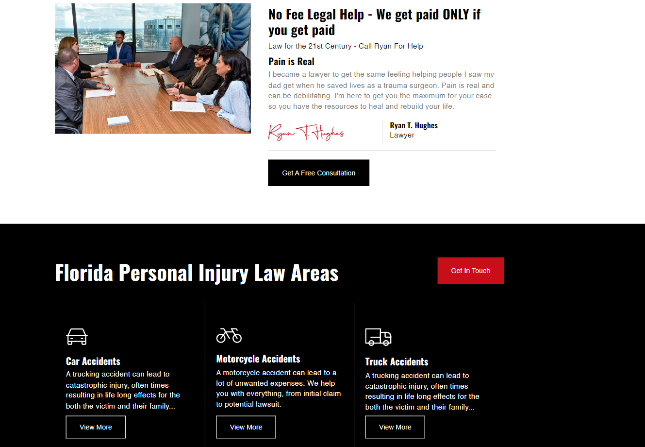
Ryan’s site shares why he got into personal injury law: his father was a trauma surgeon, which inspired him to work with injured people. This expression of altruism and compassion shows prospective clients he’ll be sympathetic to their needs.
The site also includes extended articles on 12 different types of personal injury cases, each with a clear icon for visual support. These articles showcase the depth of his knowledge of personal injury law, as well as providing useful information to visitors who want to know more about how the legal system works before hiring him.
Daniel Greene Law
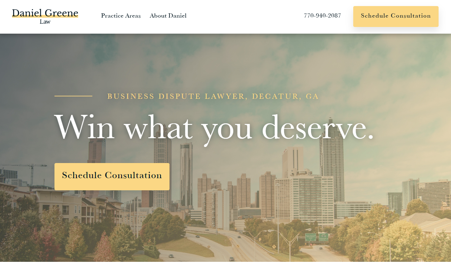
Daniel Greene’s business law website is uncluttered, making it easy for visitors to find information like what Daniel specializes in and how to get in touch. This simplicity also makes the two CTA buttons expressing “Schedule Consultation” the page’s focal point, encouraging visitors to take the one action that stands out — booking a consult with Daniel.
The central motto “Win what you deserve” speaks directly to clients who feel they’ve been wronged in business disputes. The phrase simultaneously empathizes with prospective clients’ needs and promises a solution to their problems and a better future.
This site excels at balancing professionalism with originality. The designer uses modern photography to showcase the city where the lawyer is based and thoughtful copywriting on the landing page to stand out while keeping the design tactful enough to express the lawyer’s competence.
Fintax Andorra
![A dog-eared white page sits atop a photo of a green mountainside at sunset, both situated on a light-blue background. The headline on the white page is “Key benefits of the Tax Residency in Andorra and its tax system.”]](https://cdn.prod.website-files.com/687e8d1b96312cc631cafec7/68c4954ffba4501e53ecaf3b_64af17b3e793e2c578a9e425_64ad9f6374181e0e92af2b52_VbQqQ3czEPUTrWD4SOaxNGau9ibSZgE0I5wes499hjV0KGTt6gyBf-jZZbIV-qbtq5vUSjTJnlIOUV92b7B1nlgQedzadvWBZjJ7YpZtBsy7yW5cLqEWQCkW_SCi8jAVAgTy0qweg2-tTZmv4hal9ig.png)
Fintax Andorra specializes in corporate and individual tax law. The website features lush photos of the Andorran countryside, appealing to a target audience either living in Andorra or considering moving there.
This website has a beautifully presented and frequently updated blog with content on living in Andorra, the Andorran tax system, and broader European tax news. These site content choices draw organic traffic from people searching for relevant terms — an audience likely to benefit from the firm’s services.
A central piece of information visitors want to find is a firm’s services, and the homepage prioritizes that information via several buttons and headers titled “Our Services.” Once a visitor reads through brief yet valuable paragraphs of the firm’s offering, a “Book a Virtual Consultation” header appears with a button prompting them to take action and book. The word choice here is particularly effective since 79% of visitors hope for virtual consults.
The Fastman Law Group

The New York City-based Fastman Law Group specializes in accidental personal injury. Visitors who scroll down the homepage soon reach quantified evidence of the firm’s previous successes grouped into three categories.
Each category has an icon (e.g., a gavel in “Fighting for accident victims’ rights”), text explaining what the firm does in that area, and a number to quantify past successes. Coupling icon, text, and figures is a clean, unique, and compelling way of presenting information quickly while including enough details to communicate authority.
This site also features a “Results” section containing short summaries of past successes. These summaries, which include “$500,000 for injured passenger who sustained neck, shoulder, and knee injuries as a result of a motor vehicle accident” and “$2,100,000 settlement for a child injured when a school bus ran over his foot,” entice visitors who also want to be awarded big sums for their injuries. They provide the social proof necessary to encourage people to book a consultation.
David W. Olson Criminal Defense Attorney

David W. Olson’s site takes a novel approach to social proof: As well as reviews from satisfied clients, he also includes attorney endorsements and commendations by public officials — evidence that his professional peers, who visitors will see as experts in the field, hold him in high regard.
The site provides a phone number, a 24-hour hotline, and an “emergency contact” button that opens directly in the client’s phone from the mobile site. The number of contact options and the guarantee of immediate service tells prospective clients that his firm responds quickly to their needs, they’re in good hands, and he cares about their communication preferences.
Build your website in Webflow
Creating a professional law firm website that captures the unique spirit of a practice is tricky. You must instill trust from visitors and land a top spot in search engine results, all while differentiating the site from competitors. Webflow provides business templates that capture this balance — get started today.