


Today, we’re releasing a massive update and series of improvements to grid layout that will make designing responsive, CSS grid-powered layouts easier than ever.
Context: CSS grid 1.0
The launch of CSS grid back in October 2018 took layout in Webflow a dramatic step forward. But it also introduced two issues:
- Clunky responsive design workflows. Manually positioned grid children needed to be adjusted for each breakpoint, and changes to the grid itself across breakpoints required further repositioning of items to fit within the new set of rows and columns.
- No collection list support. Without a governing logic about how to distribute children within the parent grid, there was no way to support a CMS-driven collection list, ecommerce product list, or search result list.
Thankfully, today’s release resolves both of these issues — and introduces a ton more power to CSS grid layout in Webflow.
Grid 2.0: Making responsive design even easier
There’s a lot included in today’s release, and nearly all of it makes designing responsive, grid-powered layouts substantially easier. Let’s take a look at each new feature, exploring some of the new layouts and possibilities each unlocks.
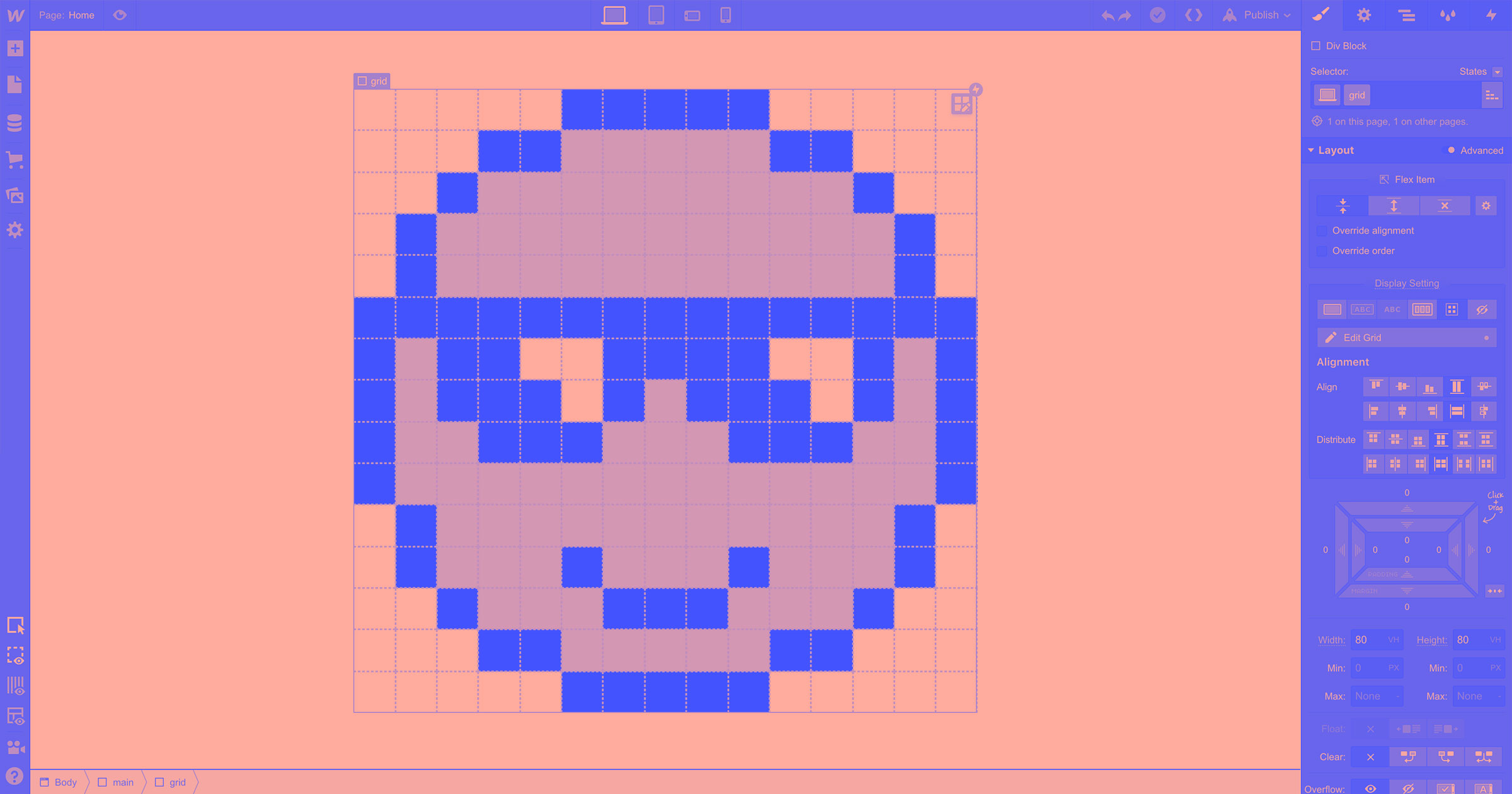
Autoflow positioning: a new default
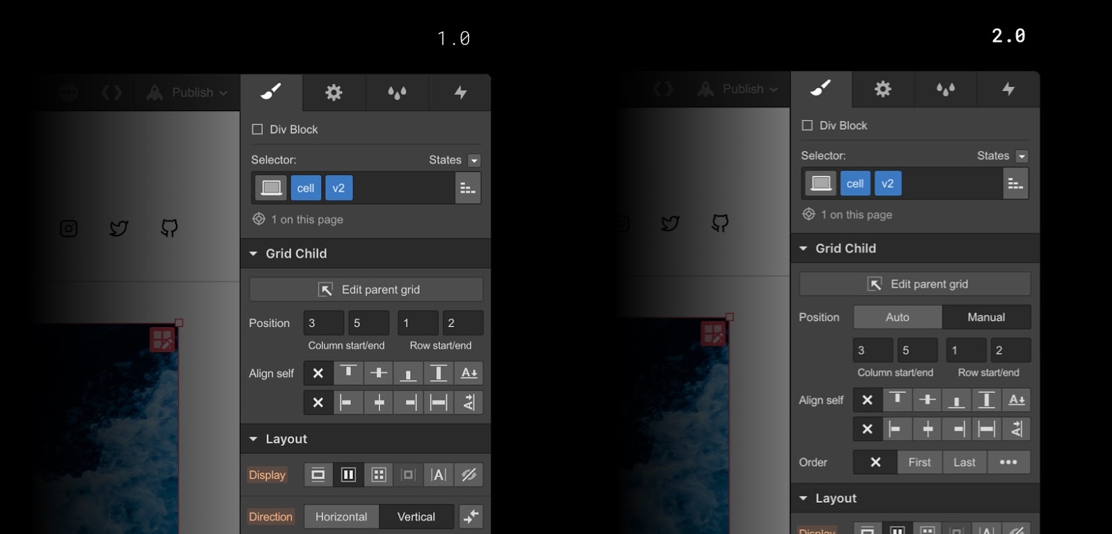
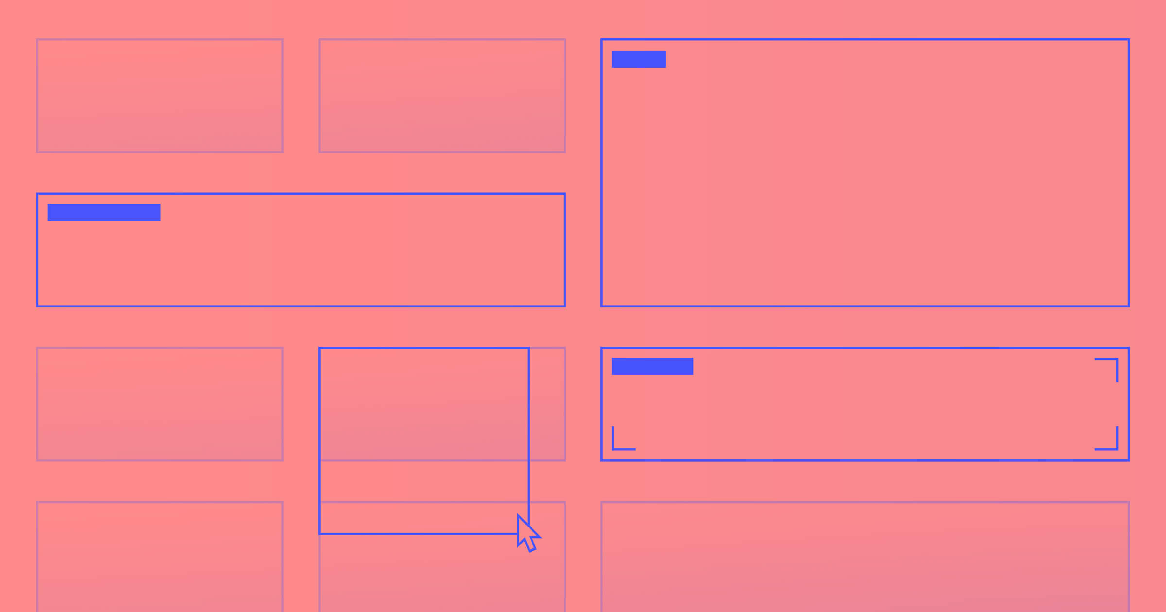
Most notably, today’s release introduces a new, default mode for grid child positioning: autoflow. When a grid child is set to autoflow positioning, it will automatically be placed into the next available grid cell when added to a grid. (Manual positioning, which lets you “pin” grid children in a specific, fixed position in the grid, can still be applied by holding Shift as you drag elements into the grid, or by toggling the grid child’s settings in the style panel.)

Autoflow positioning is particularly helpful when adjusting your design for smaller devices, since you can simply remove columns and watch grid children simply bump down to the next available cell — no adjustments per-device needed.
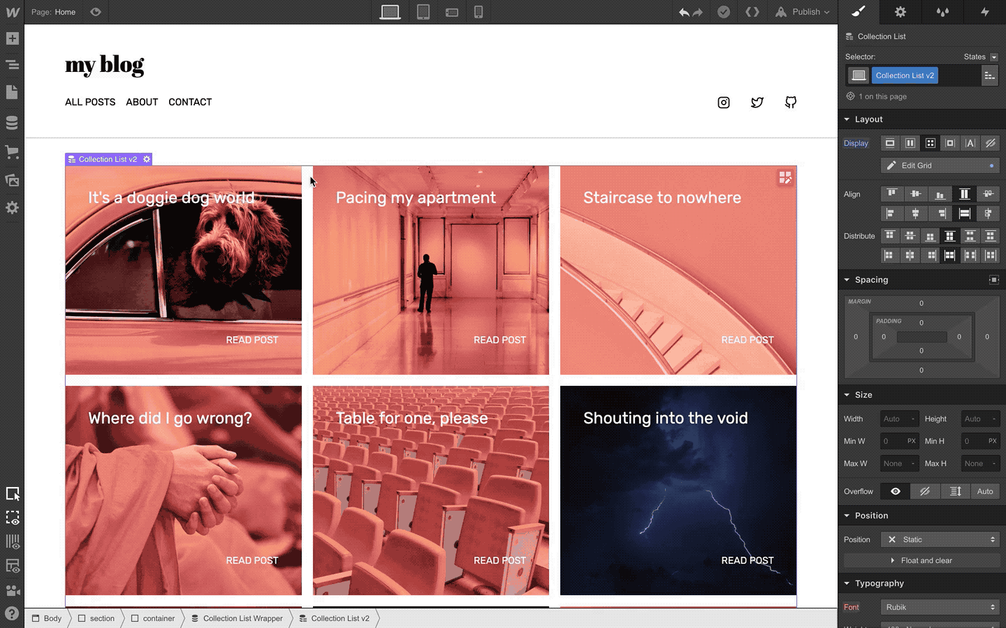
Collection and ecommerce product list support
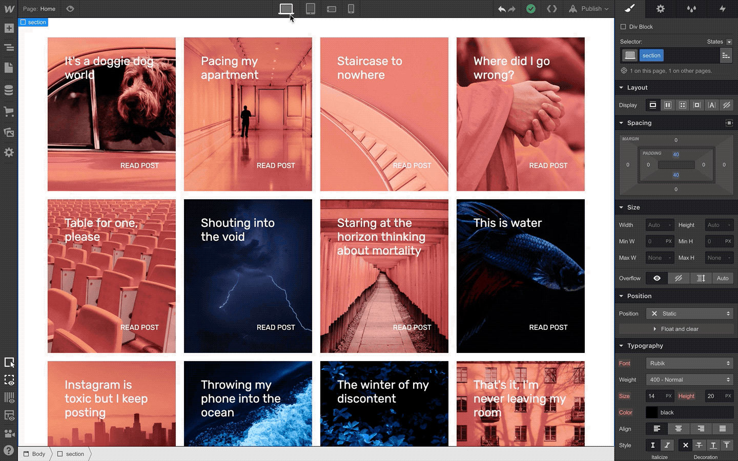
Autoflow positioning now makes it easy to create grids of dynamic, content-driven lists like CMS collection and ecommerce product list, as well as search result pages and grids of static content.

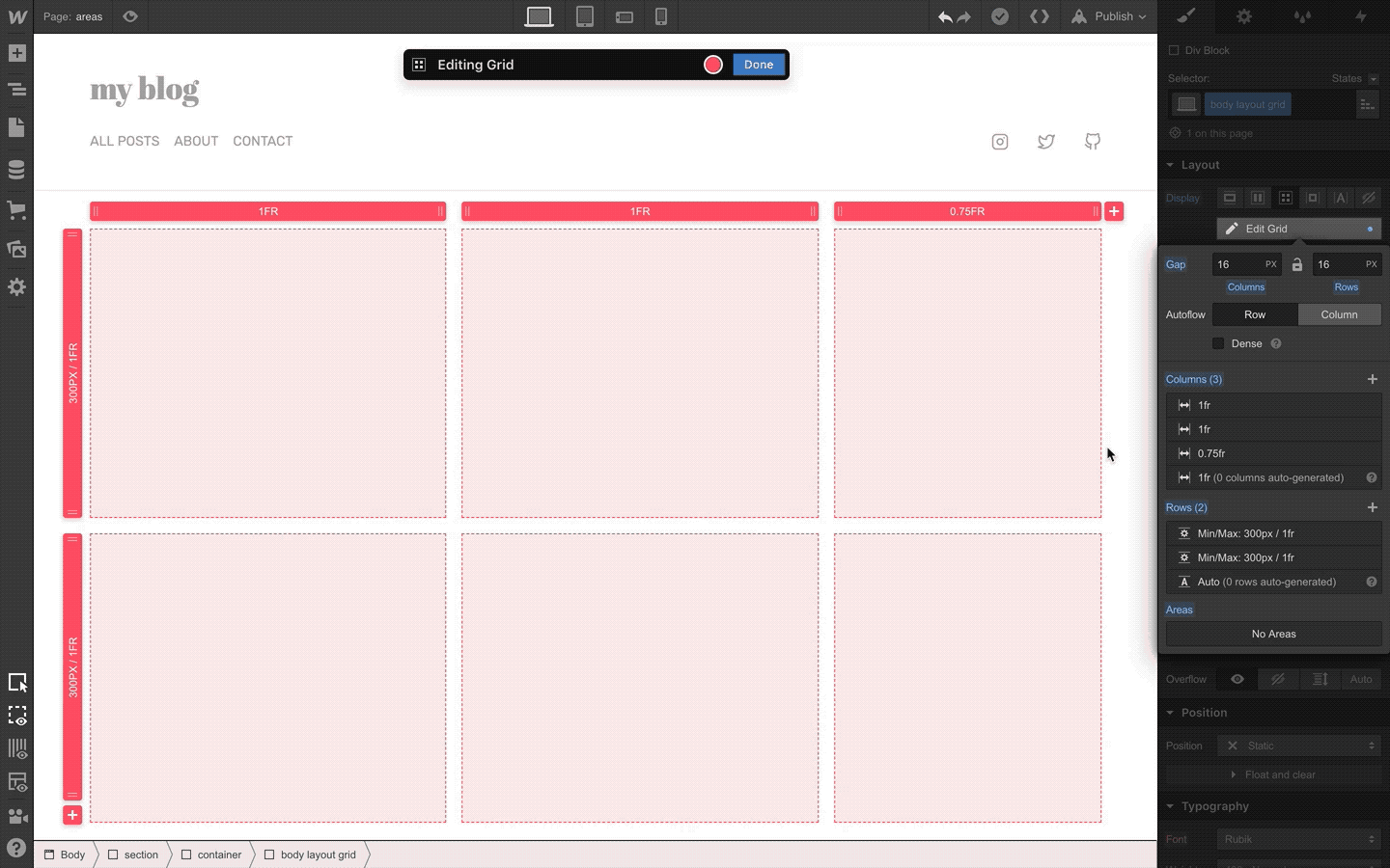
Auto-fit (also known as “responsive magic”)
Along with the introduction of autoflow positioning for grid items comes support for auto-fit, which allows you to set minimum and maximum dimensions for rows and columns, then have the grid automatically generate rows and columns as needed to follow those rules and distribute content. This makes it possible to build a layout that works across every single screen size — no per-breakpoint adjustments needed.
Dense
While autoflow positioning and auto-fit make it easier to create responsive layouts that work across all devices, the “automatic” nature of how they create rows and columns can create awkward gaps when spanned grid items don’t fit perfectly into the grid.

Enabling the “dense” option on your grid will attempt to fill these gaps by redistributing elements to empty cells. This is a particularly useful option when you’ve got a grid that mixes autoflow and manually positioned items, as dense can fill in spaces created as the autoflow elements attempt to flow around a manually positioned item.
A note on accessibility
While using dense can be a handy option to ensure your layout doesn’t look too funky at any particular screen width, it should be noted that dense can create accessibility problems for people who use screen readers, since it often arranges content in an order that doesn’t match your source HTML.


Build CSS grid layouts — visually
Experience the unprecedented ease, speed, and power of CSS grid layout in Webflow — with all-new on-canvas controls.
Where to learn grid
If you still haven’t played around with grid, or you’re looking to get up to speed on the latest updates that come with this 2.0 release, the best place to go is our newly updated grid course on Webflow University.

We’ve also got a series of cloneable, grid-powered layouts that you can grab from our showcase page — some that are brand new and come with tutorial rebuild videos, and others that showcase the manual positioning features from our initial release.
What’s coming next
Today’s release completes our major work on adding CSS grid support to Webflow, but we’ve still got a few pieces still in development: most notably, support for grid areas.
Defining grid areas will allow you to build your layout before adding content, and then once you’ve added content, will make it easier to rearrange large groups of elements on different breakpoints. We’re still in the final development and testing phase for areas, but be on the lookout for more on that soon.
What are you going to build with these new features? To join the conversation about this release, chime in on our forum post or leave a comment below.