


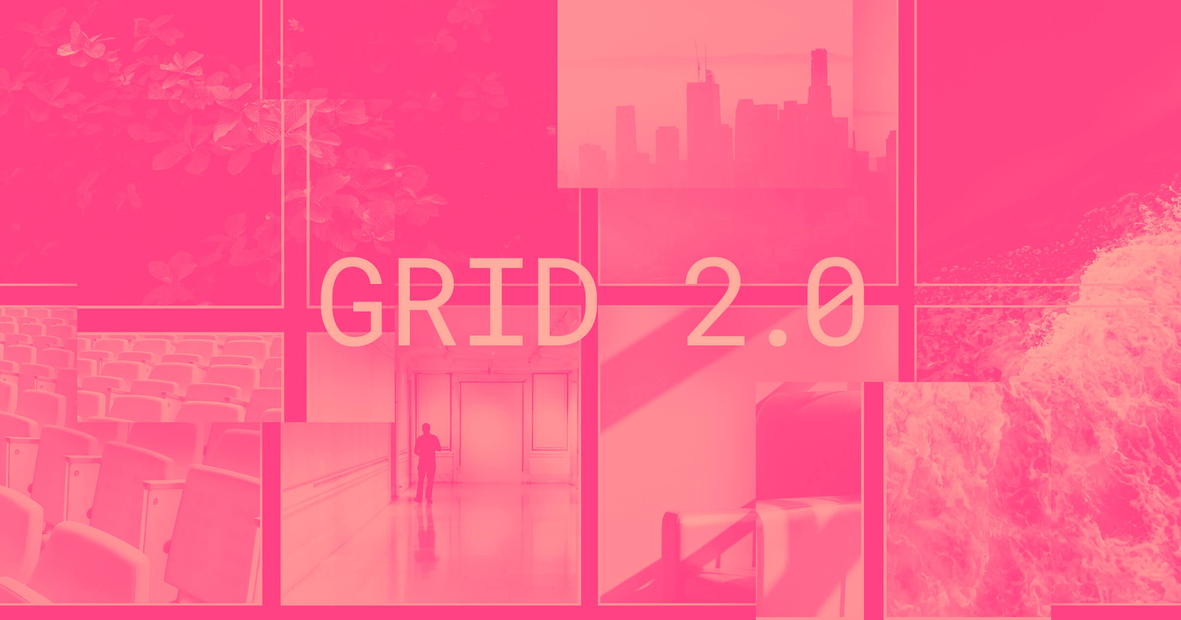
Sometimes, the best way to learn how something’s built is to take it apart. So we built four different single-page layouts using grid and made them cloneable, so you can dissect them to your heart’s content.
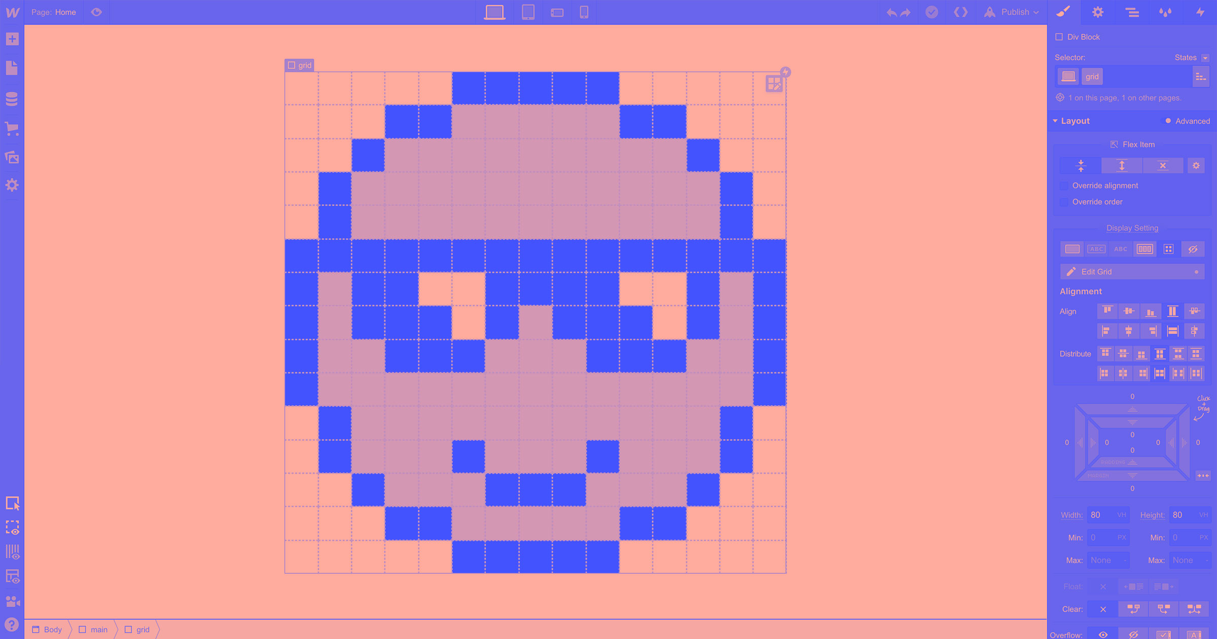
Whitespace grid
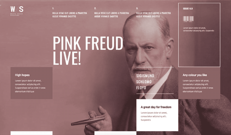
This example showcases how easy it is to build layouts with significant whitespace — a feat that usually requires an inordinate number of elements when using layout tools like flexbox. It also shows how easy it is to reorder content across breakpoints.
Newspaper grid
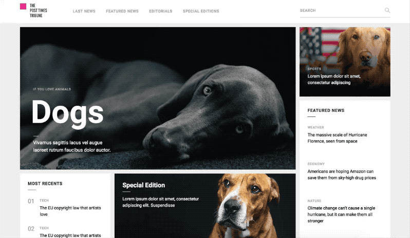
A more “practical” application for grid is designing something like a news or blog homepage, which you often see designed on a grid.


Design interactions and animations without code
Build complex interactions and animations without even looking at code.
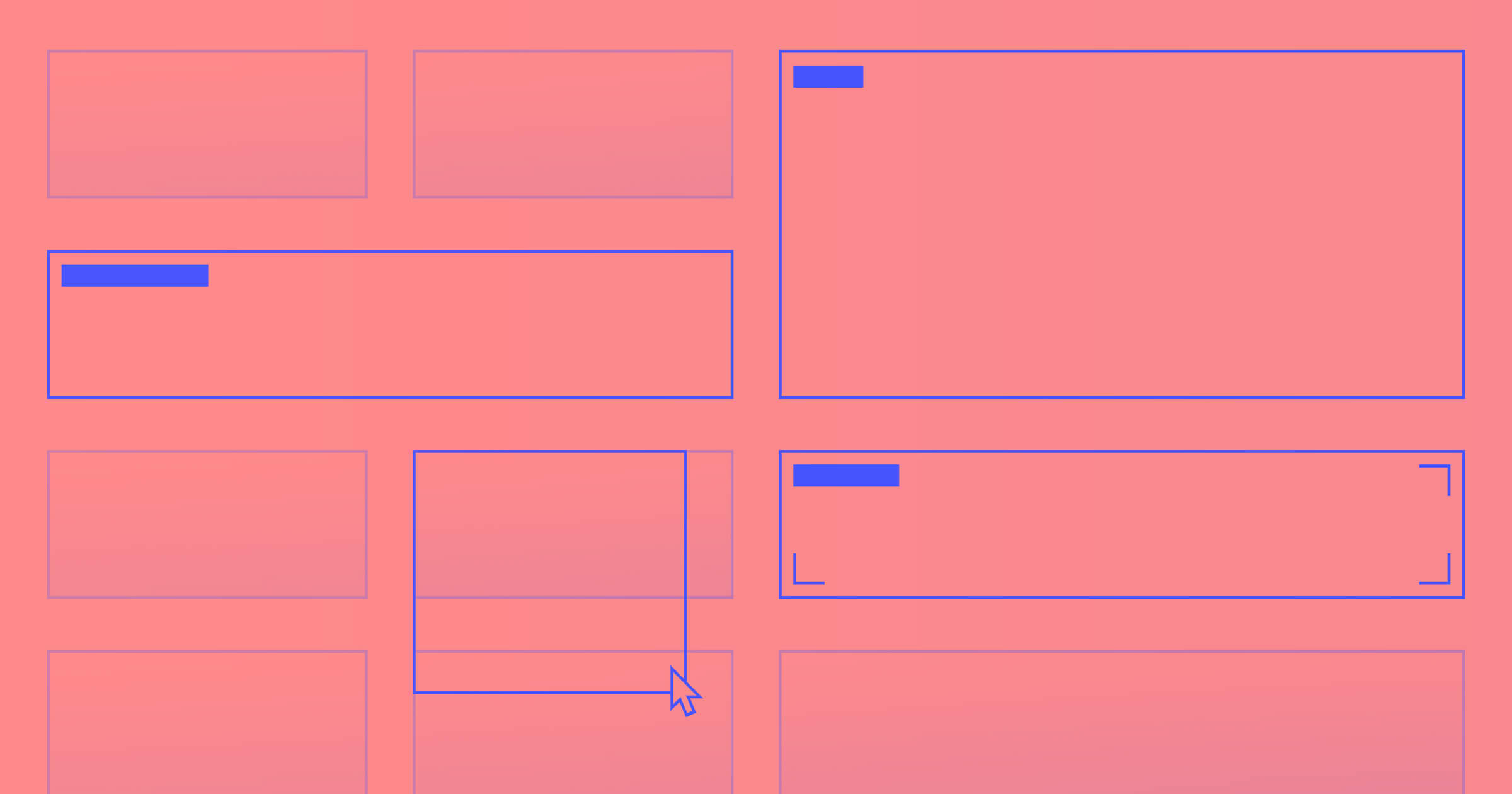
Overlapping grid
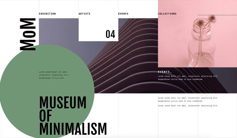
This page highlights how easy it is to create a broken, overlapping grid layout in Webflow. Perhaps most significantly though, as the page resize you can see how easy it is to reconfigure the layout as you change breakpoints.
Pricing grid

Have you built a pricing grid before? It’s generally not very fun. So many elements, so much content — don’t even get me started on how it all shakes out on mobile. But good news: all these problems and more get easier when you build with grid.
Get your grid on
Enjoy picking these designs apart — and using elements of them in your own work! If you make something great with one or more of these layouts, we’d love to see it, so be sure to share it on Twitter with the #WebflowGrid hashtag.