

Unlock the full potential of your web design by excelling in the art of UI icons.
User interface (UI) design puts the adage “a picture is worth a thousand words” into practice by outlining functionality and features with design elements and layouts. At the core of this strategy are icons — graphical elements representing specific functions that guide users through digital spaces.
Serving as navigational beacons and informational signposts, UI icons distill complex information into straightforward visuals to provide an intuitive and streamlined experience for users. Beyond functionality, icons for web design establish a visual language that enhances a brand’s identity, creating a cohesive digital environment. They also deepen the connection between a brand and its audience, allowing audiences to quickly identify with the brand’s distinct style and messaging.
Here’s how using the right icons can transform your projects, plus six icon sets worth incorporating into your designs.
6 types of icons for UI you should consider
Icons come in matching thematic sets that provide users a cohesive and consistent visual experience. Here are the most common icon set types and what sets each apart.
1. Resemblance icons
Resemblance icons strongly resemble real-world objects and ideas, imitating their appearance and functionality. One example is a microphone icon on a video calling application that you tap to turn audio on or off. Another example is using the magnifying glass icon — which represents looking for details — to indicate search functionality.
Incorporating resemblance icons might seem intuitive initially, but they require careful consideration. While a printer icon communicates a print function for most people familiar with it, it could confuse users unfamiliar with the icon. Consider the web design’s target audience and their level of familiarity with certain resemblance icons before using them in your design — you can also make sure the audience gets the icon through user testing.
2. Reference icons
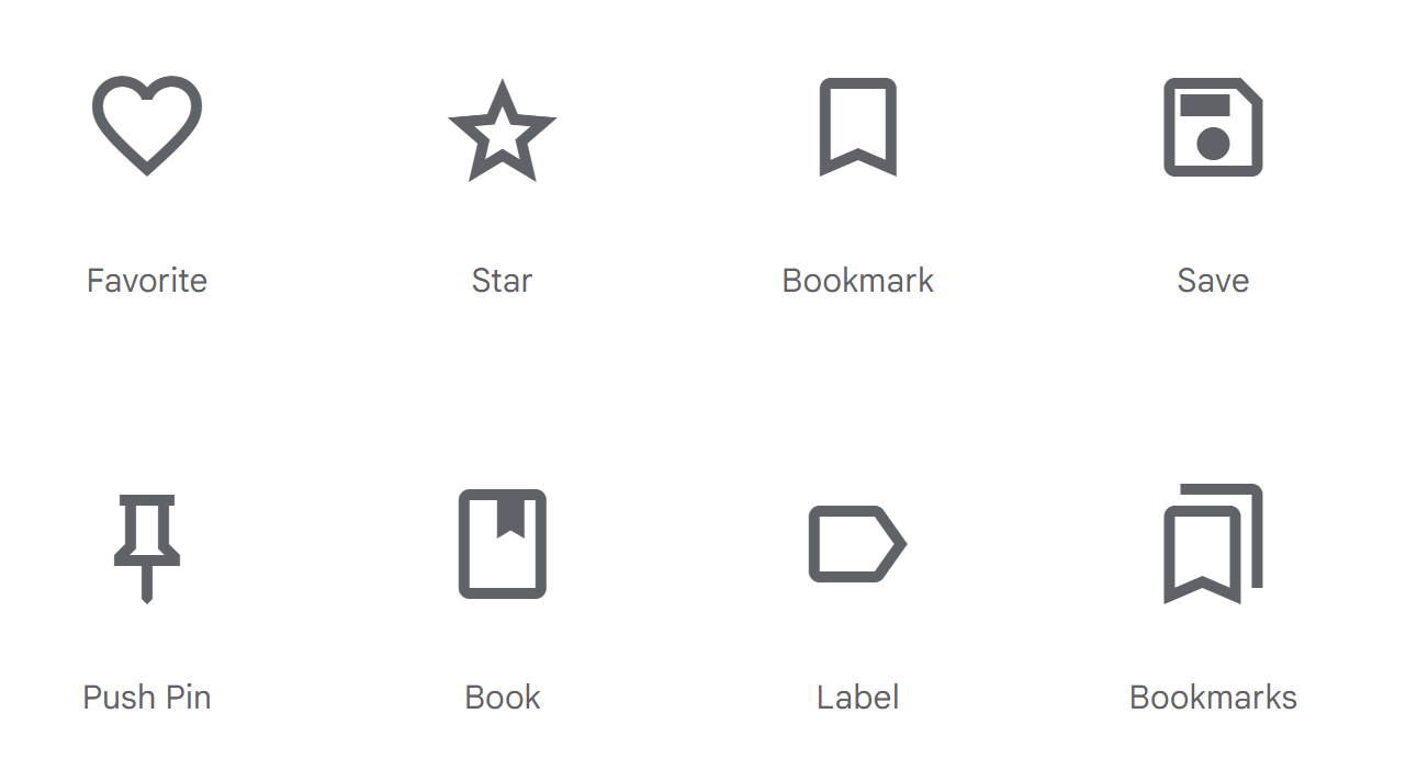
These icons use analogies or concepts familiar to users to convey meaning, often leaning on societal understanding cultivated over time. However, these references won’t be recognizable if they’re not yet widespread or familiar in the collective consciousness.
For example, the broken wine glass symbol didn’t originally signal “fragility,” but its consistent use now communicates careful handling. A file folder for storing and organizing digital documents and a floppy disk to represent saving files are more commonplace examples of reference icons we often see and use today.
But creating universally recognizable symbols isn’t straightforward. Think about how three arrows in a triangle shape represent “recyclable.” The symbol references reusing but could confuse those who’ve never seen it before.
3. Arbitrary icons
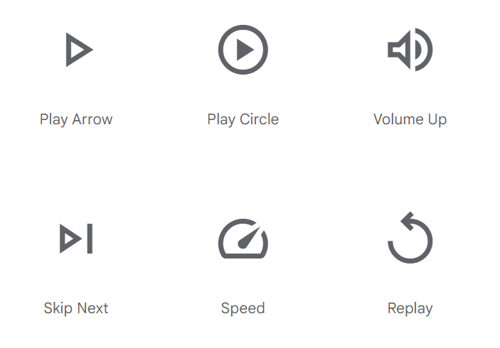
UX/UI designers create arbitrary icons to fulfill specific functions instead of mirroring real-world objects. For example, media players’ play and pause buttons — a triangle and two vertical lines — don’t replicate any tangible object or concept. Still, they signify starting or stopping media due to their widespread and consistent use.
4. Flat and semiflat icons
Flat and semiflat icons use minimalist designs and feature a two-dimensional appearance. Characterized by sleek lines and generous white space, this icon style emphasizes clarity and usability, sometimes employing shadows to create illusions of depth. Its crisp, uncluttered appearance is useful in modern digital interfaces and facilitates quick user comprehension and fluid navigation.
5. Skeuomorphic icons
Characterized by their ornamental and detailed three-dimensional appearance, skeuomorphic icons once dominated the UI design landscape, most notably in the original iOS icons for early iPhones and iPods. These icons emulate real-world objects with rich depth, offering elements of realism distinct from today’s prevailing minimalist trends.
As design preferences evolved, skeuomorphic designs fell out of favor. Despite their diminished popularity, they have niche appeal for designers aiming to create unique, thematic user interfaces.
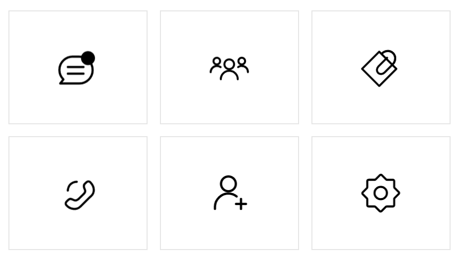
6. Glyph icons
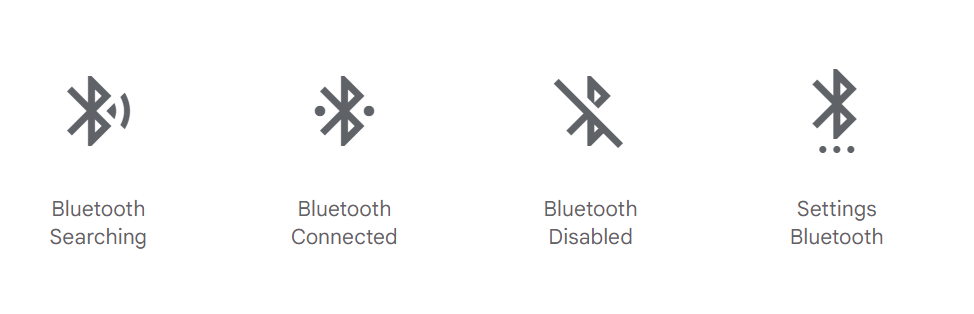
Glyph icons represent objects and concepts using geometric shapes and symbols, favoring simple forms over detailed designs to ensure clear and direct communication. For example, the “i” symbol indicates detailed information about a topic, while the Bluetooth glyph triggers a device’s wireless Bluetooth functionality.


Get started for free
Create custom, scalable websites — without writing code. Start building in Webflow.
The benefits of using icon sets
Icon sets streamline your web and app development projects by providing cohesive symbols and graphics unified by a common design aesthetic. Here are some practical benefits of using them in your designs:
- Save time. Icon sets spare you the time of crafting new icons from scratch by offering ready-to-use collections that facilitate accelerated design and development workflows. With so many options available, you can enhance your visual uniformity and improve the user experience without significant time investment.
- Provide visual harmony. Using icon sets guarantees a consistent and aesthetically pleasing appearance throughout your interface design. By maintaining the same theme, proportions, and color schemes, icon sets ensure a consistent and coherent display across all platforms and devices.
- Deliver intuitive user experiences. Designers craft icon sets with user understanding at the center, featuring recognizable and universally accepted symbols to foster intuitive and seamless interactions. This ensures users quickly recognize and effectively interact with each icon, facilitating smooth and efficient navigation.
Tips to consider when looking for icon sets
When exploring your options, keep in mind how icon sets align with your website, app, or the brand’s identity. Remember the following pointers to select an icon set that aligns with your platform’s aesthetics and enhances the user experience.
Opt for sets with solid and line versions
Solid icons, characterized by shapes infused with color, inherently draw more attention, making them excellent choices for emphasizing headers. On the other hand, line icons present outlines of these shapes, integrating seamlessly with minimalist design and subtly guiding users without cluttering the visual space and overwhelming them.
Opting for icon sets that provide both solid and line versions empowers you to make strategic design choices and tailor the visual language to the specific context of your digital product or design. This approach enhances the overall user experience by aligning your platform with varied user preferences and industry standards.
Choose colors carefully
Selecting colors that resonate with your website or app’s color scheme creates a visually cohesive appearance, fostering a natural flow that guides the user’s eye through different sections. This visual harmony prevents cognitive overload and enables users to quickly process information.
We recommend sticking to a single-color set for icons to maintain consistency and prevent distractions. However, incorporating multiple colors or gradients can also enhance the interface’s value and usability. For example, if you have an all-white icon set contrasted against a dark background, shifting the icon set to a vivid red upon hover emphasizes its presence and offers real-time user interaction feedback. This tactic streamlines navigation and makes the user experience more intuitive.
Use simple and relatable icons
Avoid overly intricate elements, such as animated icons, as these can cause confusion or distraction. Instead, focus on icons that resonate with users instantly and foster seamless understanding.
Select icon sets that quickly and clearly convey their purpose through recognizable symbols, such as a magnifying glass for search functions, a shopping cart for ecommerce baskets, or a hamburger menu for accessing different website sections. These icons leverage common associations, offering immediate clues about functionality to deliver a more intuitive and efficient user experience.
Ensure scalability and responsiveness
Responsive and scalable icons maintain consistent sizing to guarantee visibility and usability across screen sizes and devices. Each icon must preserve its proportions within its interface to deliver clear and recognizable visuals.
Opt for Scalable Vector Graphics (SVG) formats to maintain quality across different image dimensions. Unlike their pixel-based JPEG and PNG counterparts, web vector icons enable size adjustments without sacrificing quality, making them ideal for responsive design.
Focus on accessibility
Similarly to scalability, ensure icon designs are large enough and legible without monopolizing screen space, enabling users to focus on content without overwhelming them. For mobile apps, allocate ample space around icons’ touch targets to allow users to tap slightly off-center and still trigger a response.
Incorporating labels and alt text alongside icons is equally crucial, as it assists users relying on screen readers. This integration creates a more inclusive digital space by delivering additional context and information alongside icons, embracing a wider audience. For example, pairing the word “search” with a magnifying glass icon makes a search bar’s function clear, guiding users who might not recognize the symbol initially.
The power of universal icons
Icons transcend language barriers. Fostering quick comprehension, they create comfortable and familiar environments for users, encouraging them to engage more interactively and deeply. While creative designs undeniably add allure, icons’ instant recognizability is their standout feature because it ensures users grasp meaning without hesitation.
You can find an abundance of free and premium icons online to use on your website, app, or platform. If nothing you see fits your project perfectly, you can always design your own. With info about all-in-one UI/UX kits and contemporary design tools, the Webflow blog covers everything you need to build full-scale websites, including visually appealing and functional icons. If you want to start designing your bespoke icon set right away, visit Webflow University to learn more about our browser-based Designer tool.