Every year, designers use Webflow to build websites that consistently blow us away, and inspire us anew. Here’s 10 of the most popular websites community members built in 2016!
A quick word on my not-so-scientific method
In order to build this list of popular sites, I took a look through the “most liked” sites in our Discover area’s Popular section and identified the 10 top-performing sites in terms of “likes.” The list then obviously excludes the many amazing sites that weren’t showcased this year — but don’t worry, I’ve got a few posts brewing to showcase many of those!
If you’d like to be in the running for a top website of 2017, be sure to showcase your site, and share it on Twitter with the hashtag #MadeInWebflow. That’s the best way to make sure it gets our attention.
So, without further ado, let’s take a look at 2016’s most popular websites #MadeInWebflow!
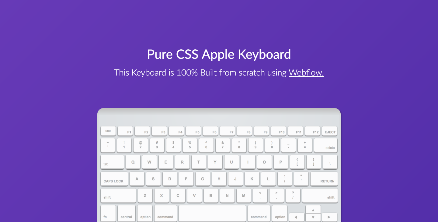
10. Sidney Ottelohe’s Pure CSS Apple Keyboard
Prolific Belgian designer Sidney Ottelohe has built a bevy of beautiful Webflow sites, many of which push the platform’s boundaries in unique and innovative ways. His projects range from the super-useful, CMS-powered Web Design Proposal Generator to the educational (and beautiful) Dynamic Slider.
But none of his projects garnered more attention in 2016 than his lovely, pure-CSS-and-HTML Apple keyboard. It’s a powerful testament to the flexibility of HTML and CSS in creating interactive graphics, and you’re welcome to clone it!
9. Vincent Bidaux’s Jé-Rôm Edit
Vincent Bidaux is a prolific, boundary-pushing French designer who’s always ready to help out the community with an insightful tip, whether here on the Webflow blog or on his own superb blog, inb4.webflow.
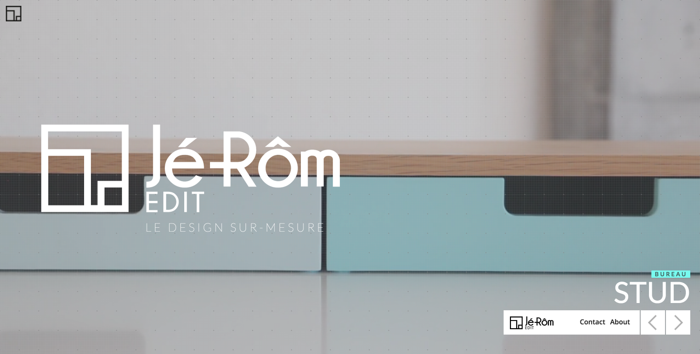
When he’s not busy blogging about Webflow, Vincent builds websites that inevitably bear his own indelible design flair, yet never fail to put their content front and center. And the gorgeous Jé-Rôm Edit provides a stellar example of this unfailing focus on content. The furniture design firm’s ultramodern work is always front and center, so it’s easy to imagine sitting down at their Morpho desk or slotting your favorite design texts in the M bookcase.
And while you can’t clone this bespoke design, Jé-Rôm Edit sure does warrant your “like.”
8. Alex Manyeki’s Endless Safaris
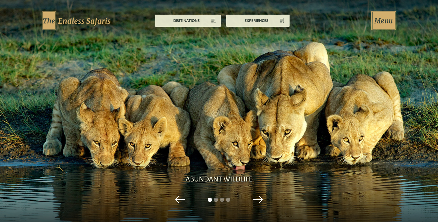
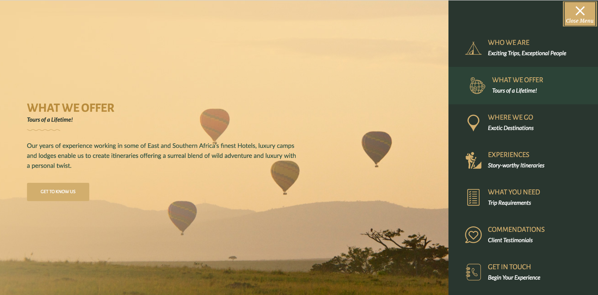
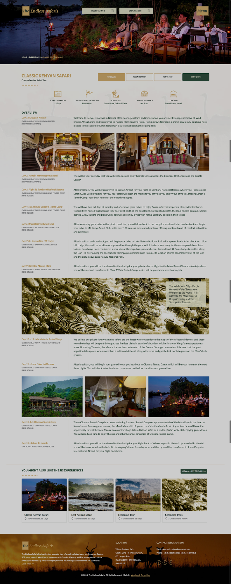
If you’re looking to take a safari in eastern Africa in 2017, you’re definitely going to want to check out Alex Manyeki’s amazing Endless Safaris. Besides being packed with awe-inspiring photography, it offers delightfully detailed itineraries for each of the company’s “experiences,” and one of the coolest full-screen menu designs I’ve ever seen.
This is another non-cloneable one, but I’m sure Alex would appreciate another “like” for Endless Safaris!
7. Carlos Lagrange’s HyperDrive
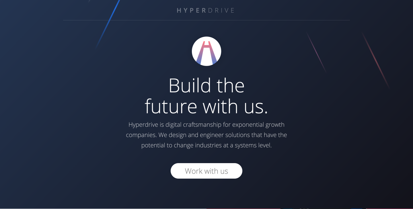
According to their site’s copy, “Hyperdrive is digital craftsmanship for exponential growth companies,” and their website certainly lives up to that definition with its beautiful crafted layout and interactions. Which is hardly a surprise, given that it’s the work of London-based founder/designer Carlos Lagrange (who you may remember from the equally lovely Akdemia and Code Cards websites).
6. JT Helms’ Heco
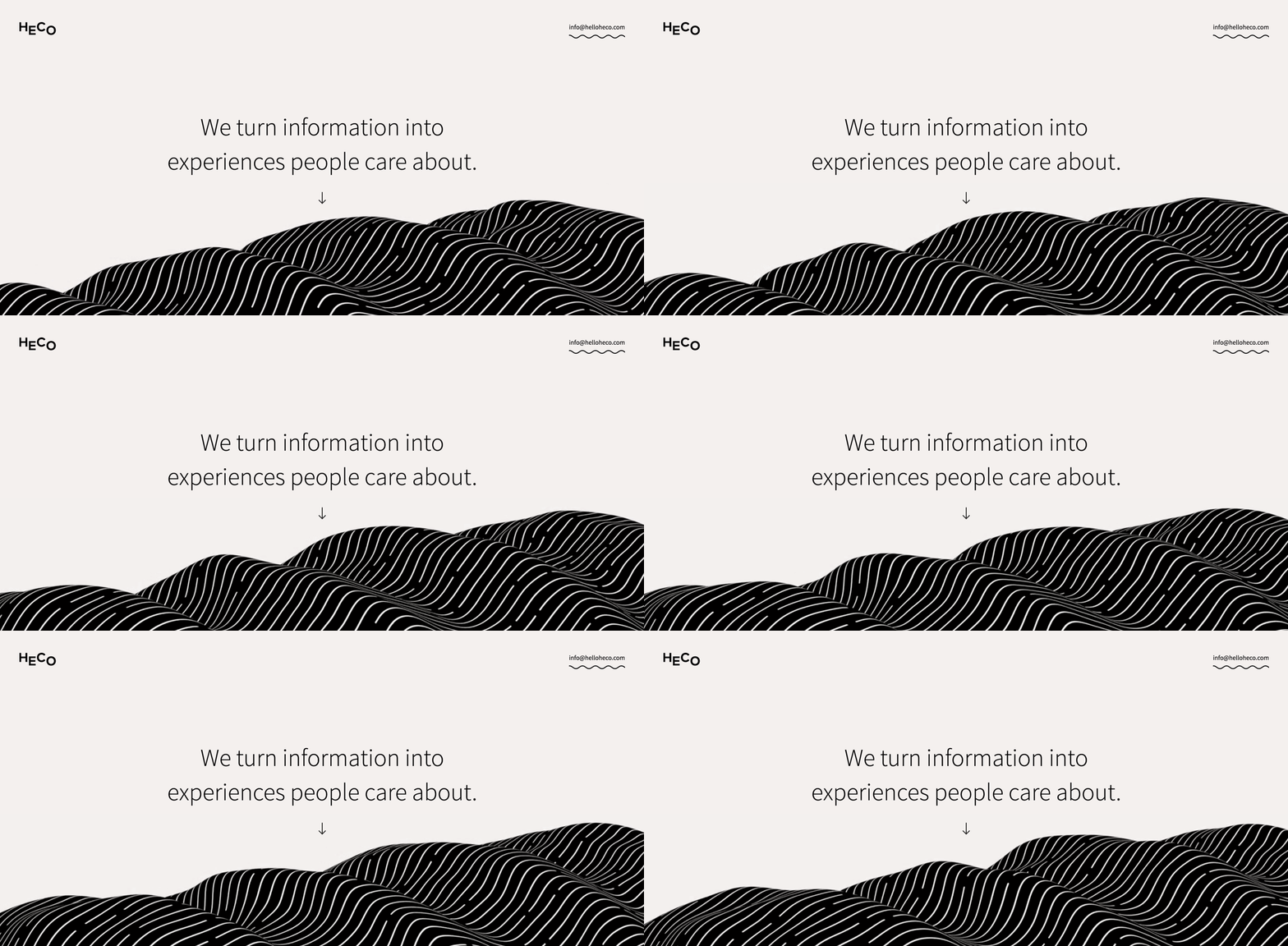
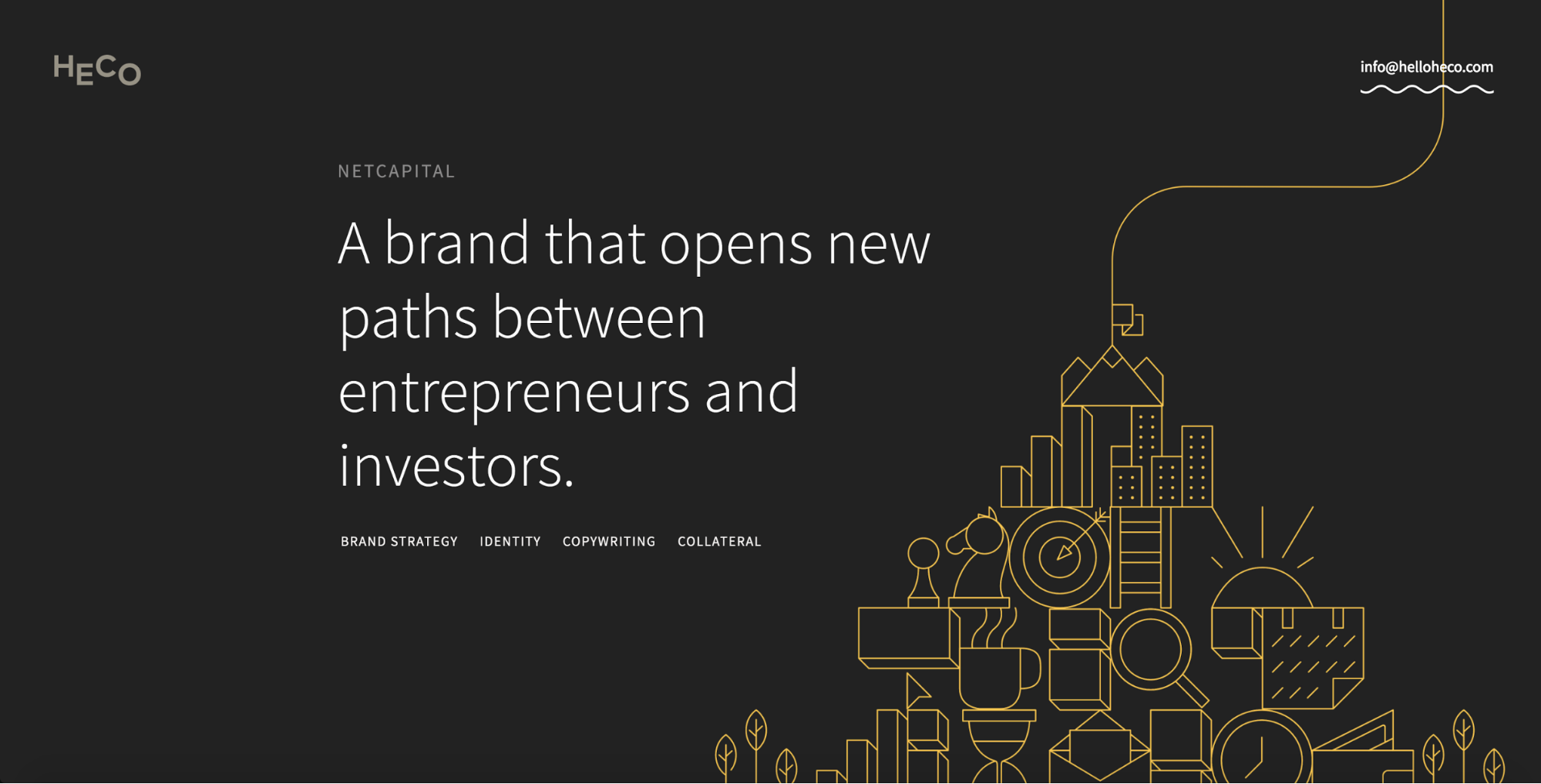
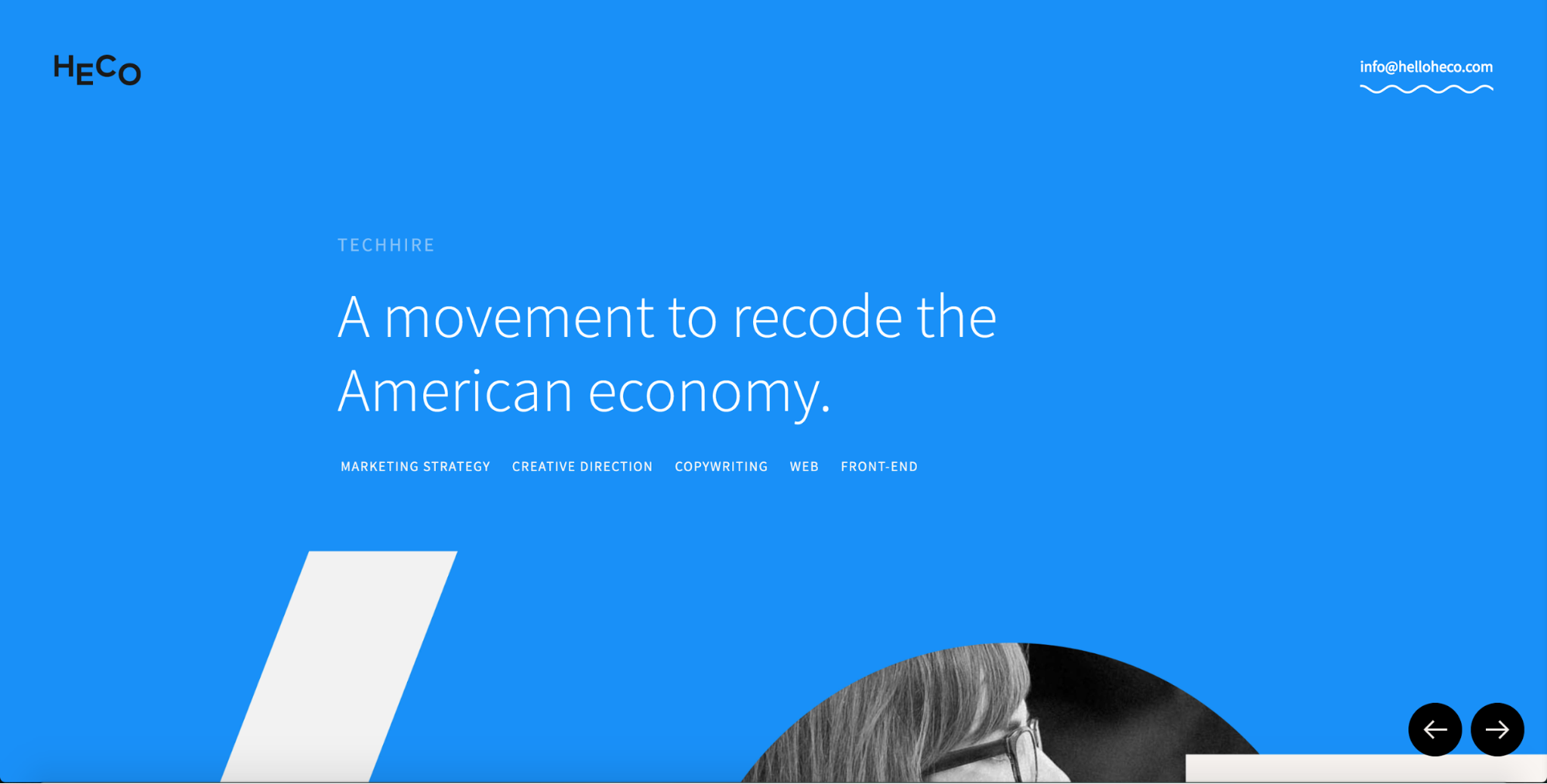
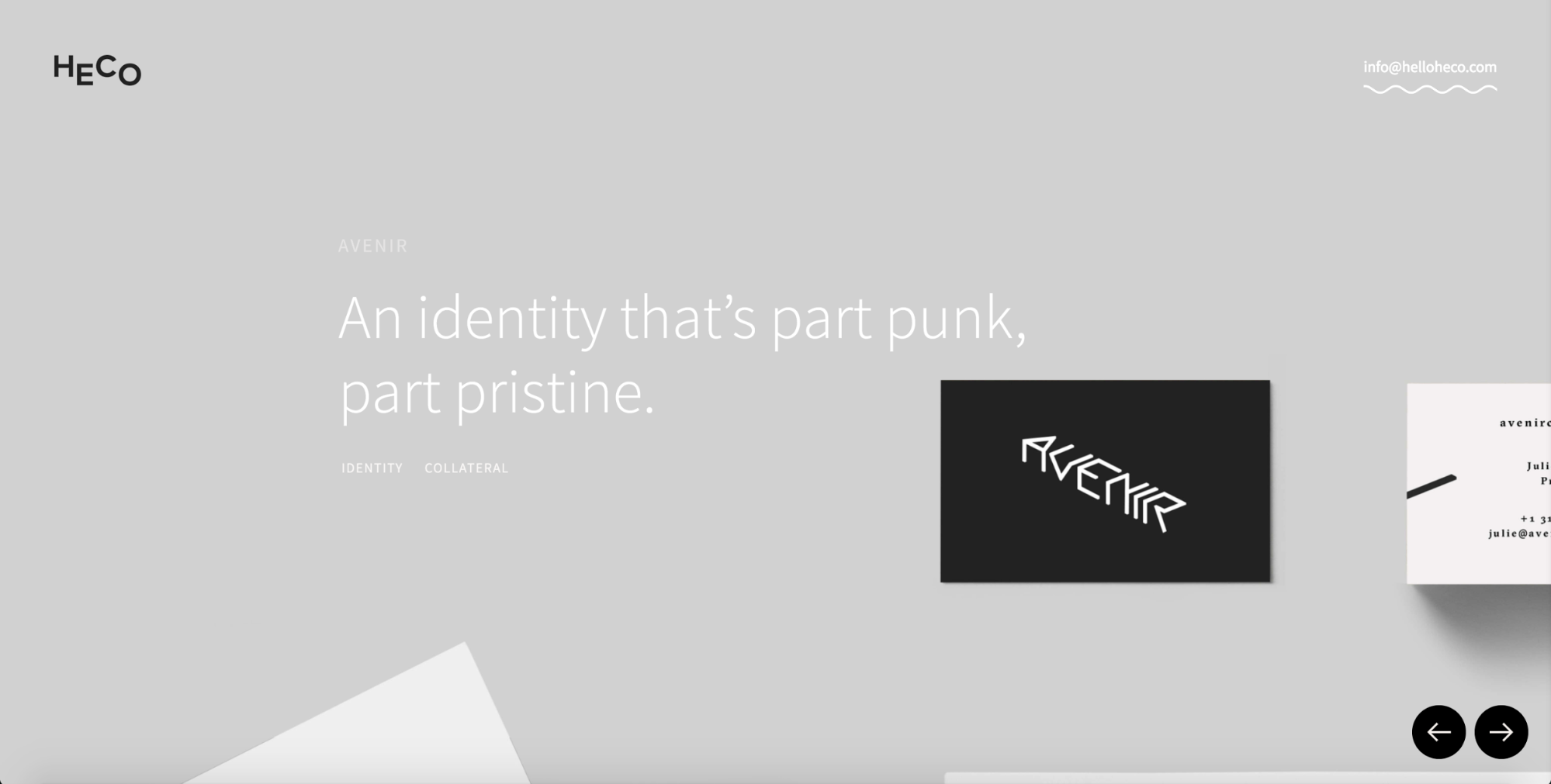
If you haunt popular design watering holes like Designer News or Awwwards, or read the Webflow blog, chances are you’ve already stumbled across Heco Partner’s absolutely gorgeous agency website. Designer JT Helms absolutely knocked this one out of the park, all the way from the clear and enticing hero section to the lovingly designed project pages, which cleverly employ the color field and to create unique looks for each project — despite their CMS-driven template. I highly recommend you open the site in Webflow and check out the Projects Collection to see how JT did it.


The modern web design process
Discover the processes and tools behind high-performing websites in this free ebook.
5. JP Texeira’s Cavs
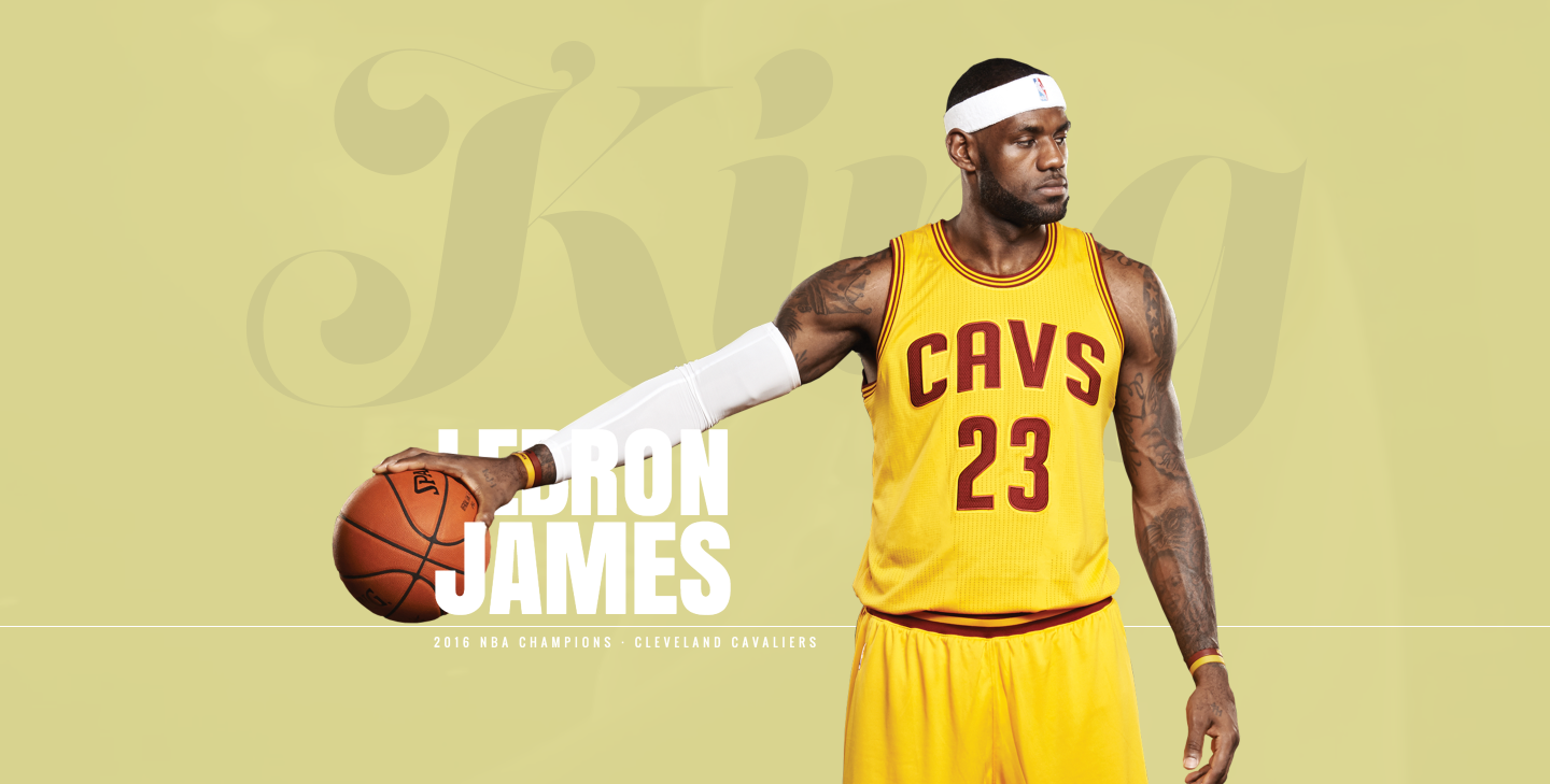
Whether you’ve drooled over JP’s portfolio site or been wowed by his redesign concept for IMDB, chances are, this probably isn’t the first time you’ve read the name JP Texeira. But if you’re new to this Webflow master, his celebration of Lebron James and the Cleveland Cavaliers is a superb place to start. It’s got all the editorial-design-inspired panache of most of JP’s sites, along with some very delightful interactions. And while you can’t clone it, you can open it in Webflow to see how he did it!
4. Norman Durkee’s Windows 95
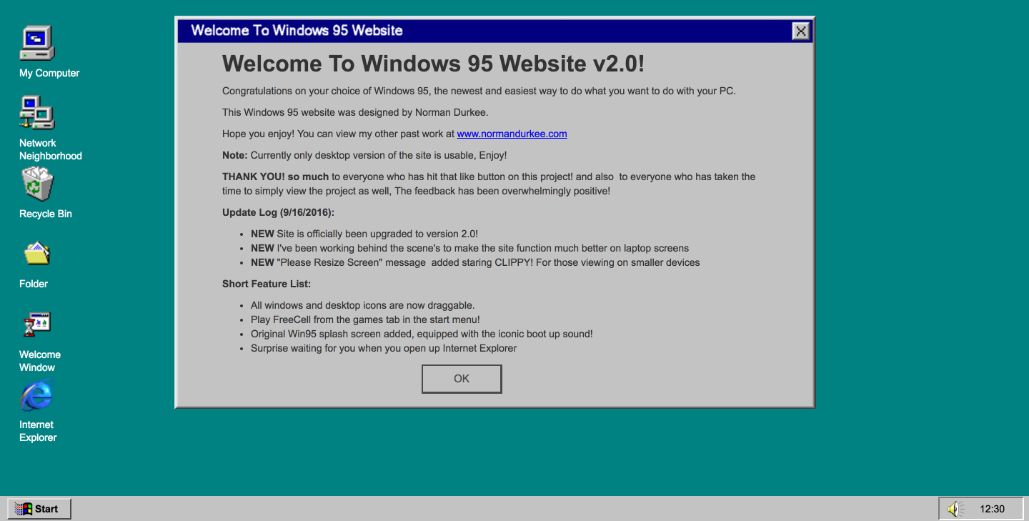
When you’re looking for popular website designs from 2016, a recreation of Windows 95 probably isn’t something you’re expecting to see. But for anyone interested in digital design — especially those of us who actually remember using Windows 95 once upon a time — Norman Durkee’s detailed HMTL-and-CSS clone of the classic operating system is more than worth your while.
3. Overton Graphics’ Concrete Platform
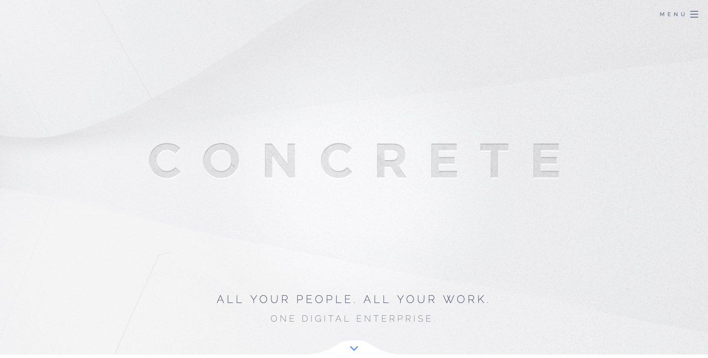
Josh Overton ranked #2 in last year’s most popular websites with his agency site, and he kept up the good work in 2016 with this stunning website for enterprise collaboration platform Concrete. The overall aesthetic’s clearly inspired by the name, but doesn’t ever overdo it. Once you’re past the textured hero section of the homepage, it’s all clean typography and a nice balance of artful editorial photos and product screenshots. It’s another great one to open in Webflow.
2. Leah Quinn’s Quaint Inc.
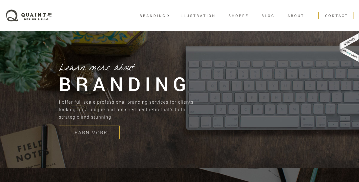
Leah Quinn’s Quaint Inc., built in collaboration with our own Waldo Broodryk, provides a great example of a single website performing a whole bunch of different functions — but doing it all with style and panache.
Leah’s freelance branding and illustration offerings are front-and-center, but the site also provides easy access to her personal ecommerce site, as well as an inspiring and resource-rich blog.
It’s also a great site to open in Webflow, whether you want to reproduce the panes of the homepage or just enjoy its really clean structure and smart use of symbols.
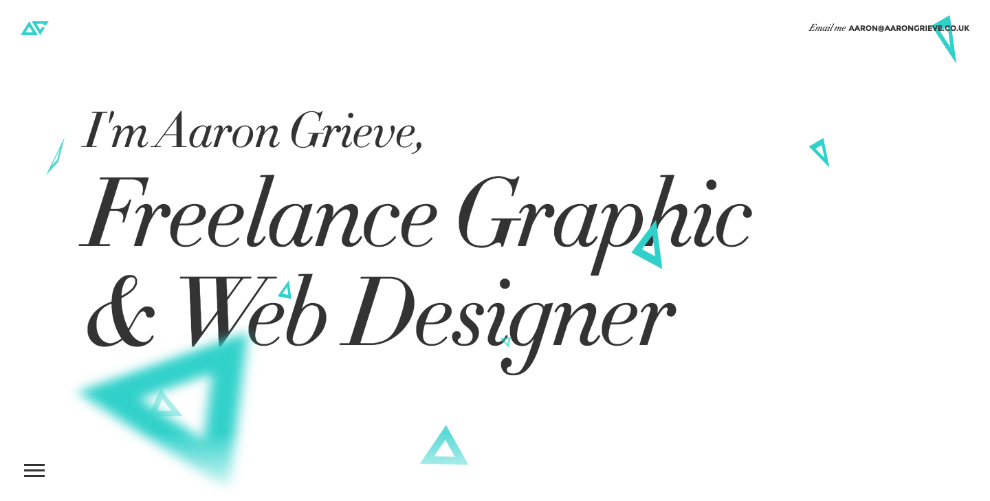
1. Aaron Grieve’s portfolio
Aaron Grieve’s portfolio first came to our attention when writing “10 cool website designs by popular Webflow designers,” and it’s only gotten better since then. The site features tons of delightful elements, from the floating triangles that echo Aaron’s personal logo to the consistently refined typography — not to mention a host of engaging animations. I’m a particular fan of the navigation, which, fixed to the site’s bottom, provides a very one-hand-friendly mobile experience.
Definitely a worthy one to open in Webflow if you’re looking to hone your interactions, animations, and 3D transforms!
We can’t wait to see what you build in 2017!
So be sure to showcase your best work, share your work in the Show & Tell section of our forum, and most of all, share it on your social networks with the #MadeInWebflow hashtag!
And if you’ve seen some amazing Webflow sites that didn’t make the list, be sure to share them in the comments!


