In the world of design, Black creators and their work have historically been shut out, devalued, and ignored. Even for those who were able to break ceilings and make it in the industry, the design environment remains unsupportive and unwelcoming of Black designers and developers.
At Webflow, we believe design is for everyone. We challenge the status quo, and we’re dedicated to making the design and development space accessible, available, and supportive of people of all backgrounds, races, and identities.
One of our efforts includes highlighting and amplifying the work of Black creators. We believe that these efforts should not begin and end in the month of February — Black History Month — but that it should be an integral part of everything we produce.
Here’s a rundown of recent sites and templates by Black creators that have inspired us, and we hope they’ll inspire you too.
Aurelia Studio
Aurelia Durand and Granyon
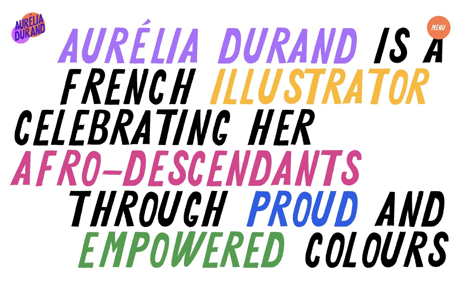
Illustrator Aurelia Durand teamed up with Granyon, a Copenhagen-based design agency to create her personal portfolio and website. Featuring Aurelia’s hand drawn illustrations, her website is a dreamy kaleidoscope of color and whimsy.
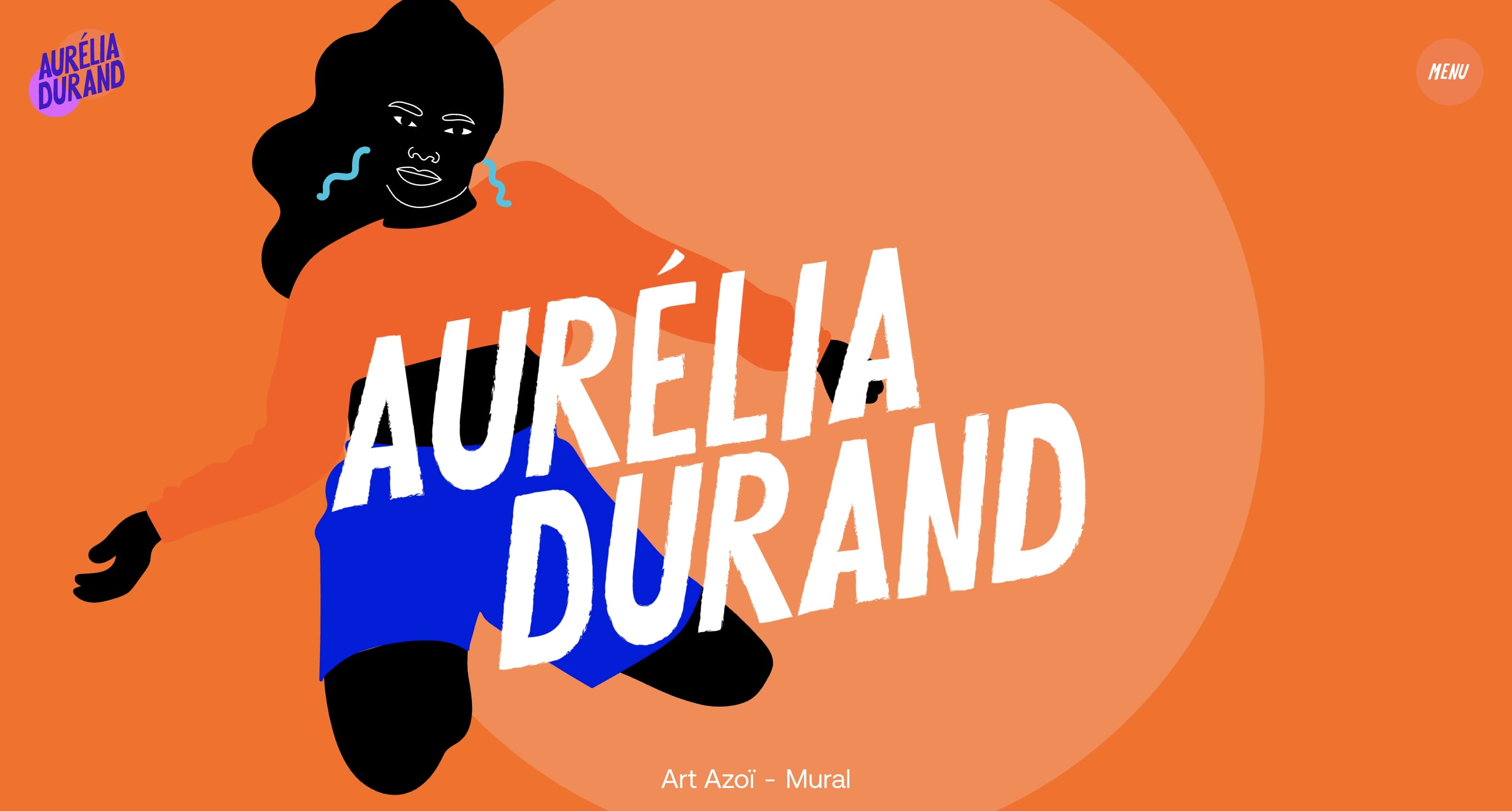
We love how Aurelia and Granyon turned the website into its own piece of art with interactive animations and custom interstitials. The unique features not only highlight Aurelia’s capabilities as an illustrator, but they capture her love of the bold and the bright.
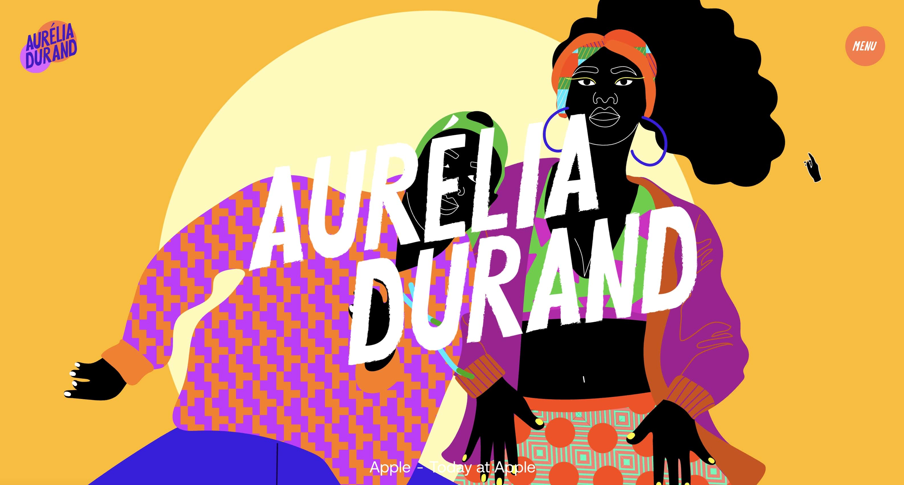
This is the perfect example of how creators can turn websites into an experience and exemplify their work through the design of the website.
The Black Yearbook
Adraint Bereal and Michael Johnston Jr.
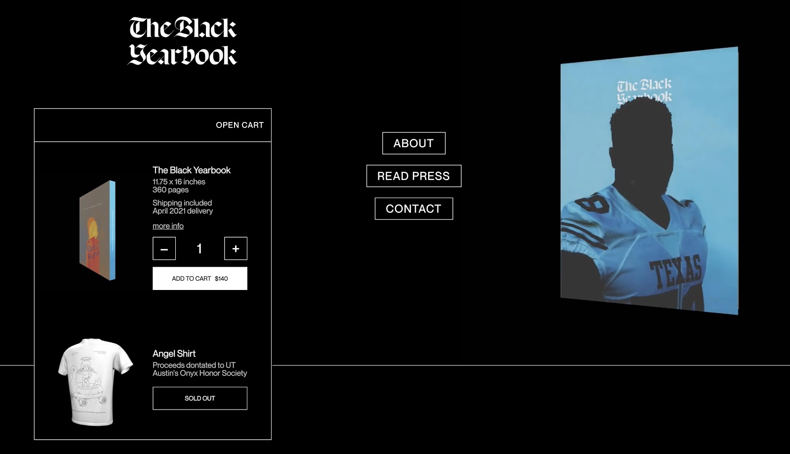
While a senior at the University of Texas, Austin, Adraint Bereal’s senior design capstone project was a fine art book featuring Black undergraduates at the university. On a campus where Black students only make up 4.9% of the undergraduate population, Adraint took to his project to highlight their often overlooked perspectives and experiences.
The website, which highlights the photography inside the yearbook, was designed by Michael Johnston Jr.. With a stark black background and interspersed video, Michael and Adraint set the site’s focal point on the imagery of The Black Yearbook, and bring to life the people, places and multitude of experiences of what it means to be Black on an overwhelmingly white campus.
John D. Saunders
John D. Saunders

John D. Saunders is a Florida-based designer working for the design firm 5four. John has worked for prominent brands and organizations such as Land Rover, Audi, and The National Association for the Advancement of Colored People (NAACP).
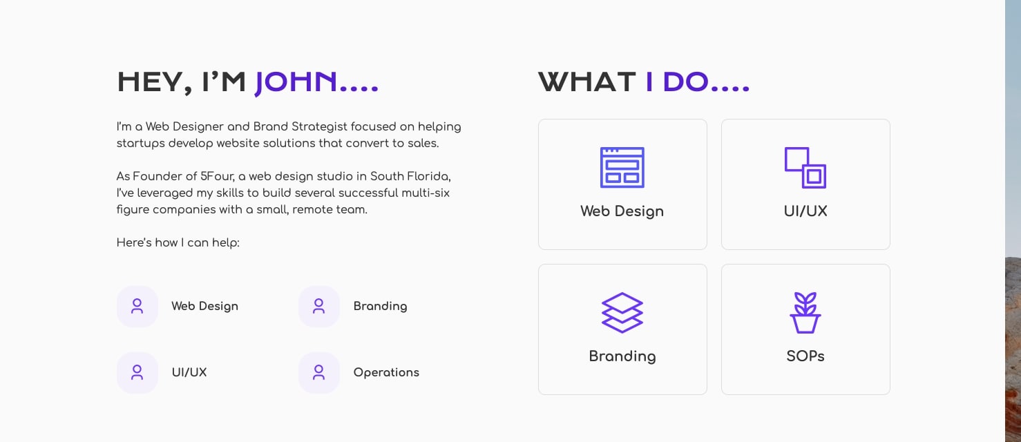
For his personal website, John utilizes a user-friendly interface to highlight his previous work, detail the design services he provides, and showcase his design process with video how-to’s.
ENVSN
Omamerhi Etefia
Raised and based in London, Omamerhi Etefia is the head of the boutique web agency, ENVSN. Omamerhi’s designs revolve around simplicity, calm, and ease — and her agency’s website is the perfect showcase for that design philosophy.
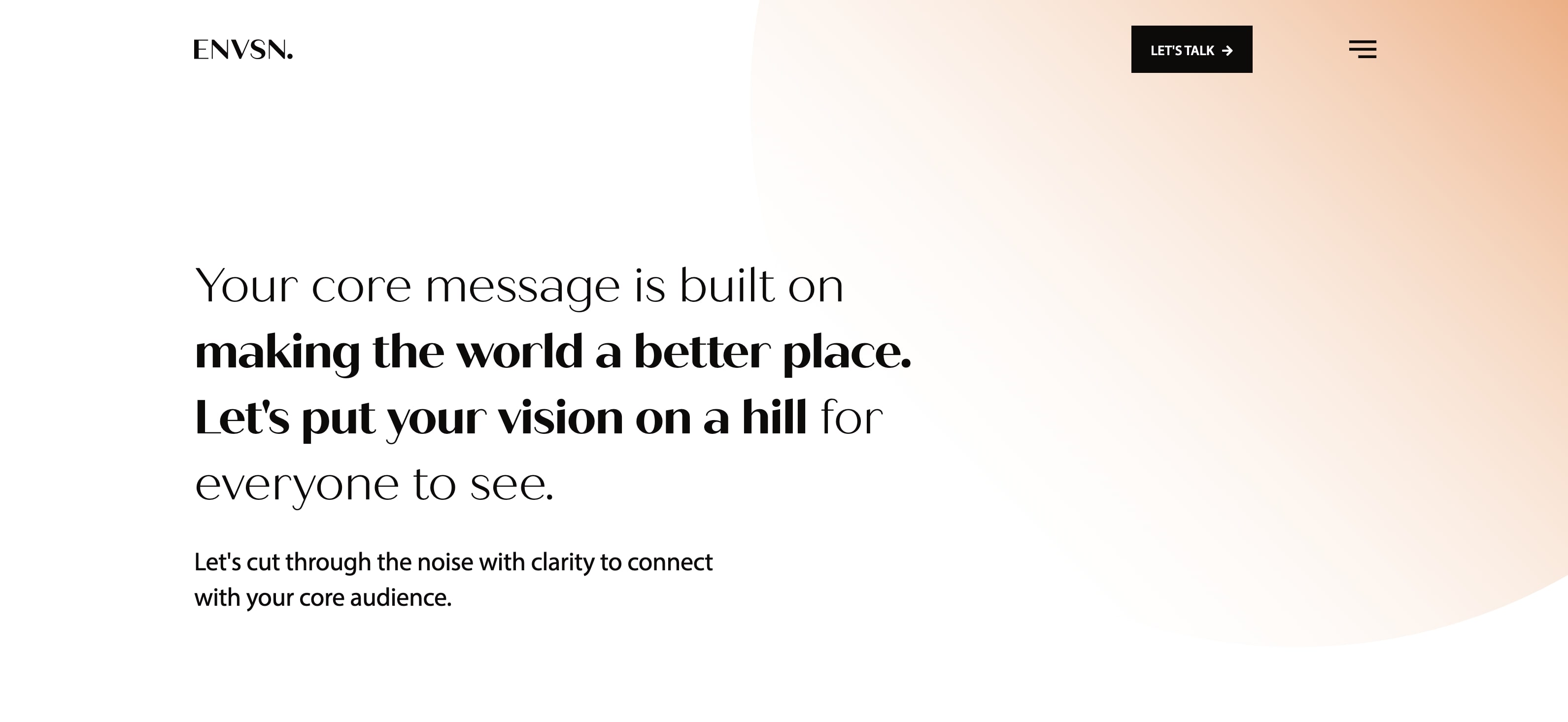
Beginning with a statement-making animation of the ENVSN logo, the brand tone is immediately set for potential clients. ENVSN makes it clear that they specialize in simple and beautiful websites, much like their own.
We’re particularly inspired by the ease of navigation, making it simple to understand the core messaging, see a portfolio of previous work, and get started on working with ENVSN.
Horace Boston III
Horace Boston III
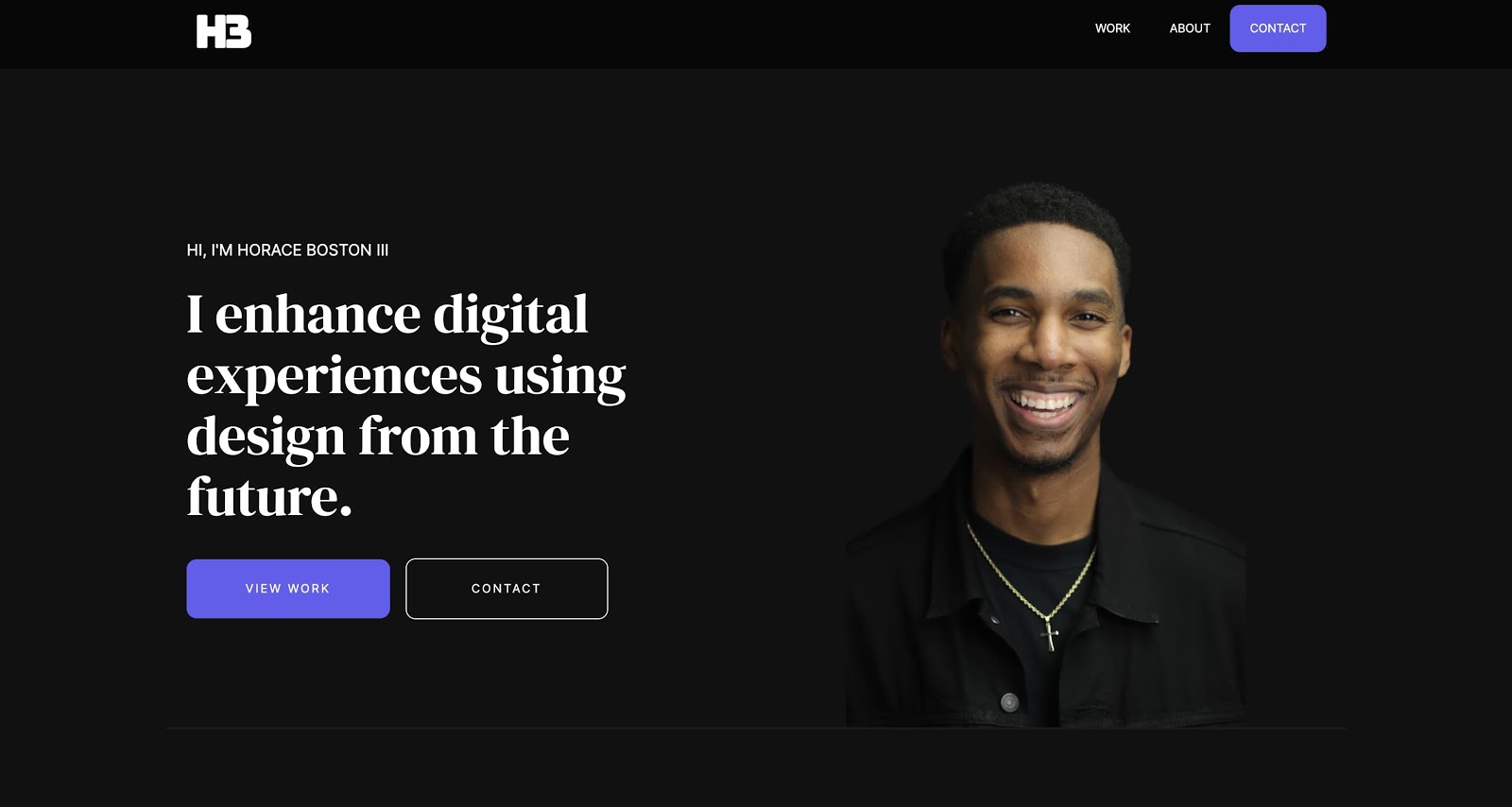
Horace Boston III is a freelance UI/UX designer based in Texas who designs custom and responsive sites through Webflow.
For Horace’s site, he embraces a minimal and clean look to feature his design viewpoint, his previous work, and an easy-to-use contact form. We especially like how Horace seamlessly incorporates his headshot within the context of the homepage.
Grand Standard
Greg Washington
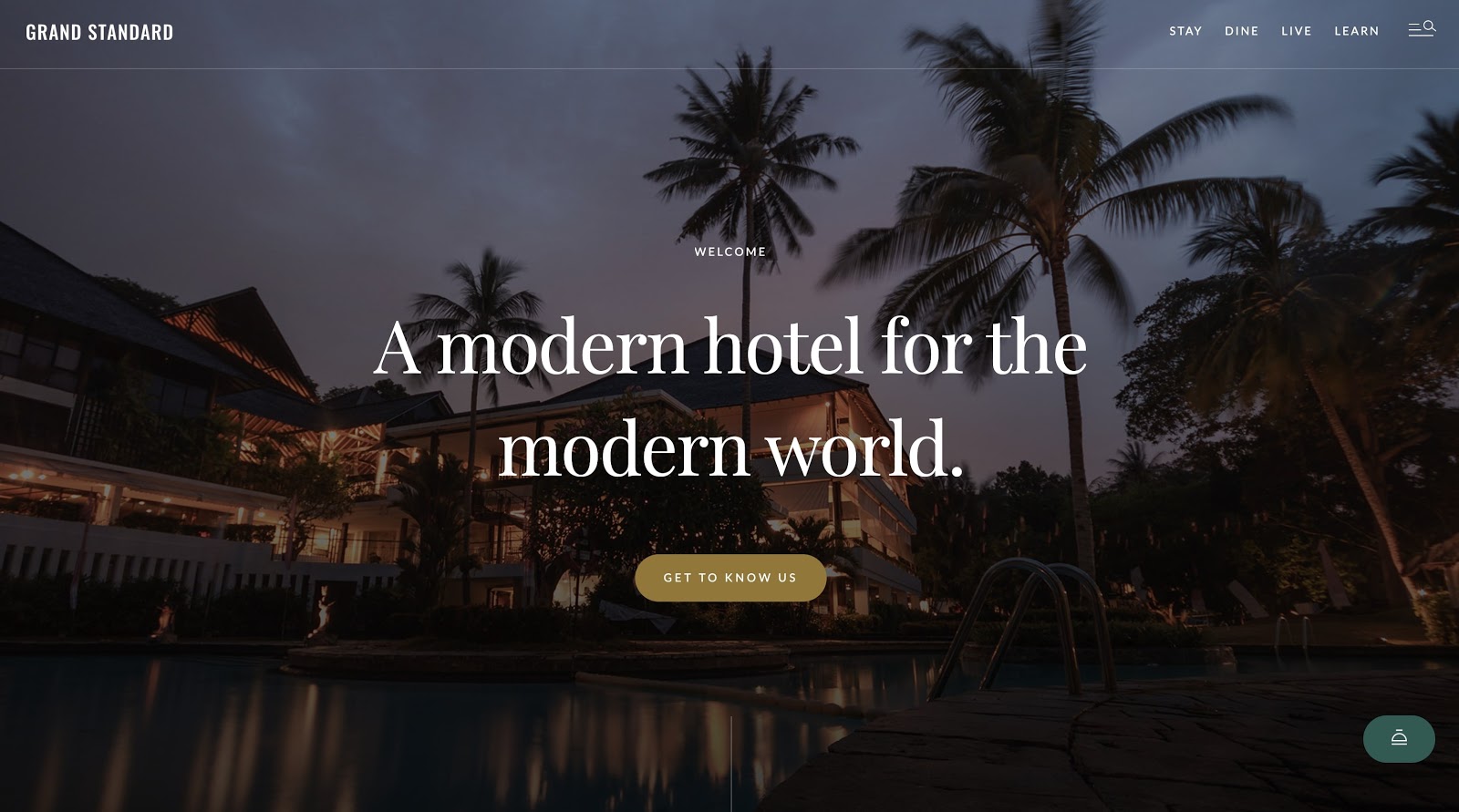
Grand Standard is a template by Greg Washington that’s geared toward hotel businesses who are looking for an affordable and responsive website.
With subtle animations, Greg created a template that is both useful and experiential. In his own words, Greg says, “instead of focusing on selling and transacting, our focus is more holistic, because choosing somewhere to stay (whether it's for one night or seven) is always about more than just the room.”


Free ebook: Web design 101
Master the fundamental concepts of web design, including typography, color theory, visual design, and so much more.
Obencci
Obencci
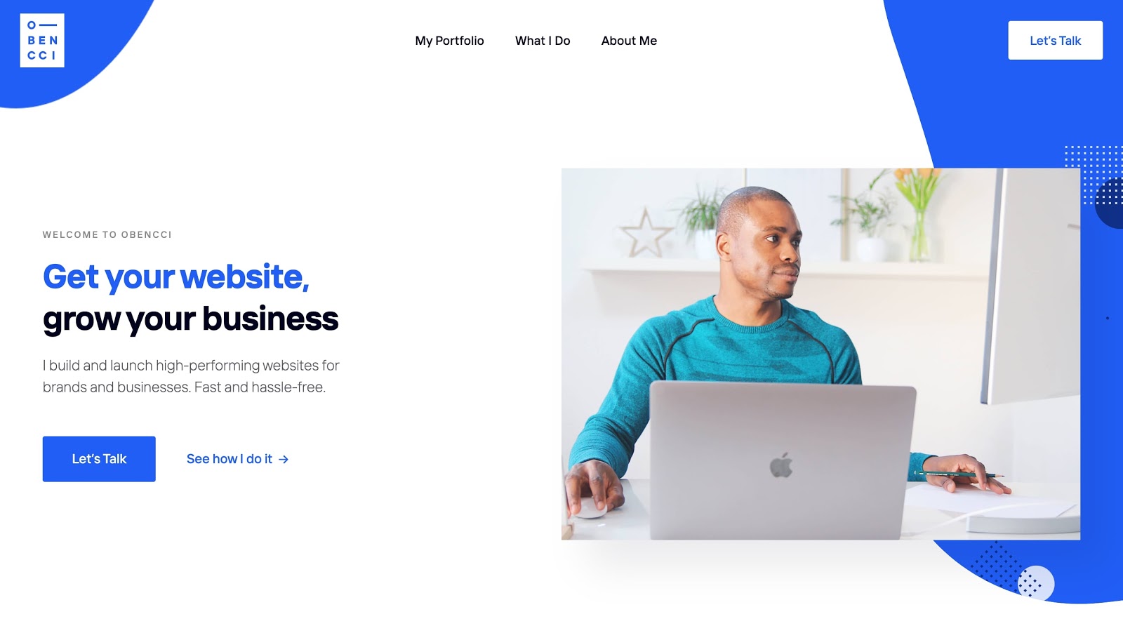
Obencci is a full-stack developer based in Poland. For his website, he utilizes minimalism with playful blue accents to showcase his work, design philosophy, and offerings.
We loved how Obencci created a site with a sense of fun while remaining true to his key purpose of helping businesses launch high-performing websites.
Bite-sized fun cards
Mubarak Marafa
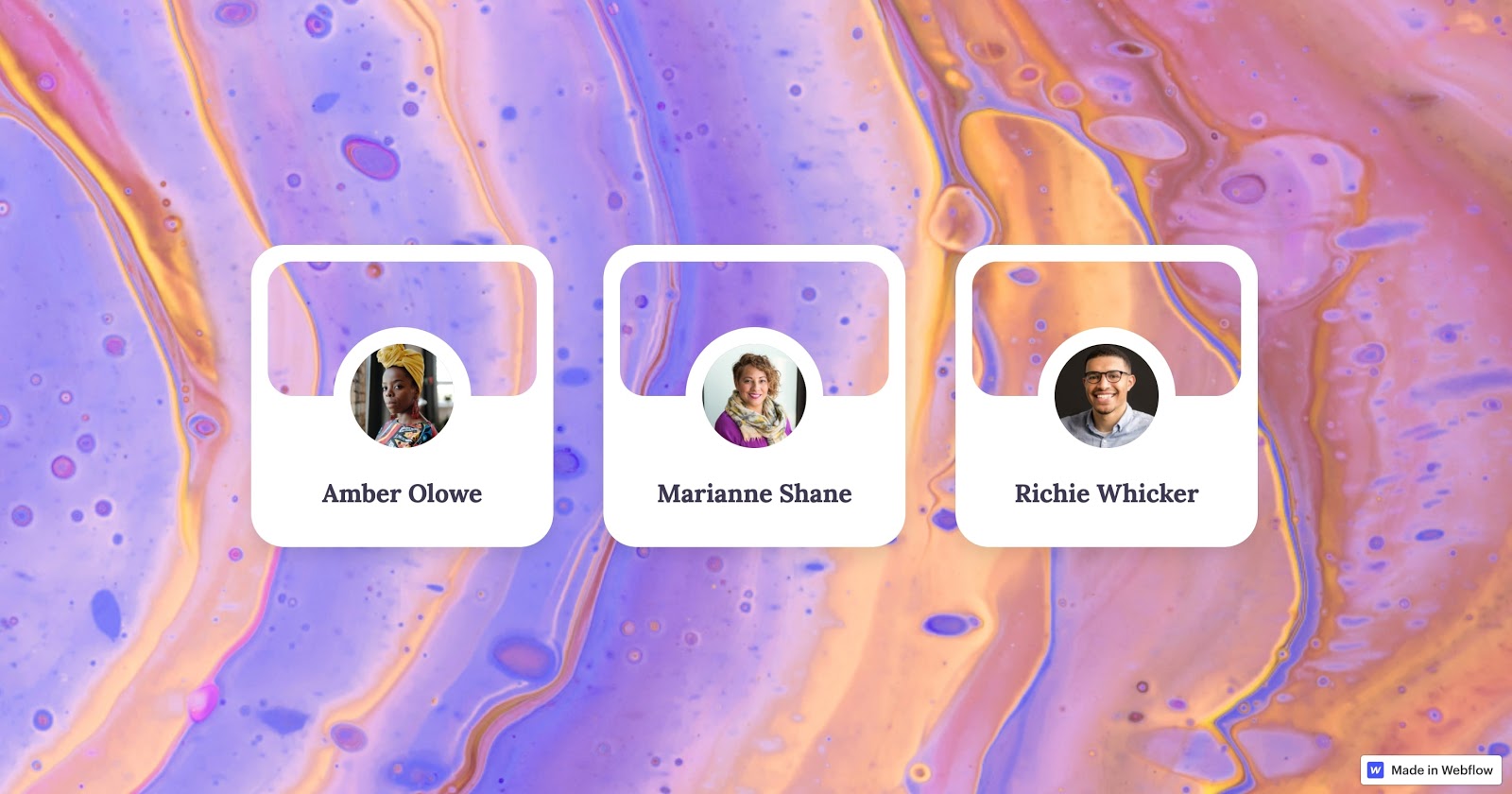
Mubarak Marafa, a multi-disciplinary product designer based out of Hong Kong, created animated bite-sized “fun cards”— or a small interactive content block — for anyone on Webflow to use.
We love how these fun cards are simple and intuitive to use for the site audience. They also provide a perfect space for small pieces of content such as product features, a bio and picture for employees, or customer testimonials. According to Mubarak, he approached building these cards like their own “mini websites,” which made building them just as fun as the visual outcome.
Alex Beige
Alex Beige
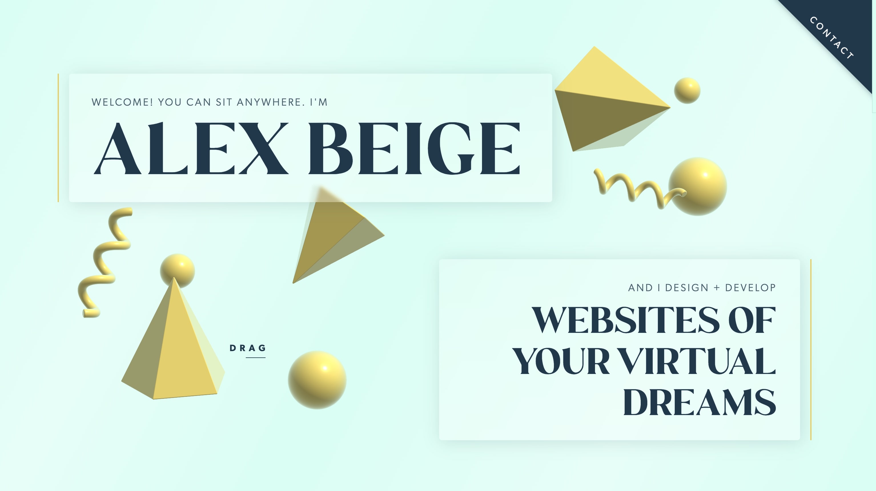
Alex Beige, designs websites of his client’s “virtual dreams.” That idea is the basis for everything he does as a designer, and his personal website showcases that idea perfectly.
Fun, whimsy, and interactive, Alex’s website includes custom animations that set the tone for who he is as a designer. They’re also a clever way for Alex to show off his animation abilities to prospective clients.
Hot Cider
Michael Johnston Jr.
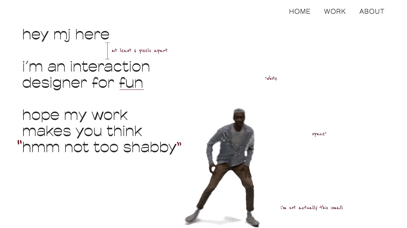
Michael Johnston Jr’s hotcider.com is a playful portfolio that embraces animations and fun copy to demonstrate his personality.
Our favorite part of the site is the small animation of Michael dancing wherever you scroll. This portfolio is a great example of how to include personality in your portfolio while still showcasing your work and abilities.


.jpeg)


.png)
