In need of some design inspiration? These great websites will ignite creativity and help you create visually stunning web designs.
In the rapidly evolving world of web design, staying ahead of the game requires fresh ideas that fuel strong design inspiration.
Thankfully for creatives, the internet is teeming with a plethora of beautiful websites certain to drum up some design inspiration to help fuel that creative fire.
That said, whether designing a new website or looking to stay up-to-date on the latest design trends, these 16 websites are some of the best websites for design inspiration.
Why design inspiration matters
Design inspiration sparks fresh ideas, helps teams innovate UI/UX design, and refines project goals. It ensures everyone’s work aligns with modern design standards while keeping creativity at the forefront.
1. SVZ Design
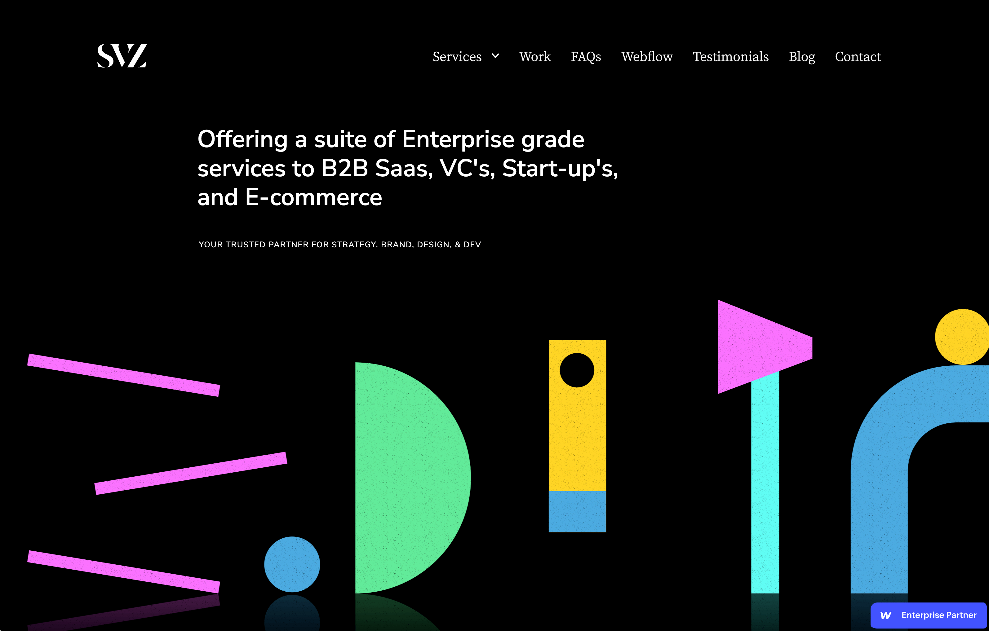
SVZ Design seamlessly aligns its agency’s process and brand through simplistically animated motifs, transitions, and visuals. This pleases the user’s eye and exhibits the brand’s design expertise.
SVZ Design’s end-to-end project page visually asserts their UX and product design skills. In addition, it beautifully demonstrates and validates their claim of carefully crafting meaningful experiences.
SVZ offers practical design inspiration for agencies or freelancers looking to refine their brand identity and showcase meaningful experiences.
- Simple, animated motifs and transitions that highlight brand expertise
- UX-focused layout emphasizing user journey and interactions
These details align with modern design trends, keeping the site fresh and engaging.
2. Wayside Studio

A 2022 Webflow Awards finalist, Wayside Studio by Curry Hackett is a monochromatic dream.
A green background dominates this website design, but it’s far from visually dull. Mixed font pairings, fun scroll-based navigation, and high-quality photography make this site a delight to explore. Surprise hover interactions and engaging copy really shine in this design — making it a striking source of design inspiration.
That said, if you love it, clone it and add your own flair.
- Monochromatic color scheme that highlights brand identity
- Scroll-based navigation with subtle UI/UX elements
These details reflect modern design trends and captivate users.
3. VOUS Church

VOUS Church delivers powerful design inspiration, especially for non-profit organizations. It clearly communicates the church’s mission and goals, and the design packs a punch. It almost feels like a social media platform for its audience.
With subtle choices in layout, content, copy, and a hearty media and blog page, VOUS Church’s website aligns brilliantly with its messaging and core identity, a modern community centered around Jesus and the people.
- Vibrant, community-centered layout with bold visual storytelling
- Engaging multimedia and blog content that resonates with modern audiences
These creative choices mirror modern design trends and keep visitors connected.
4. Ready
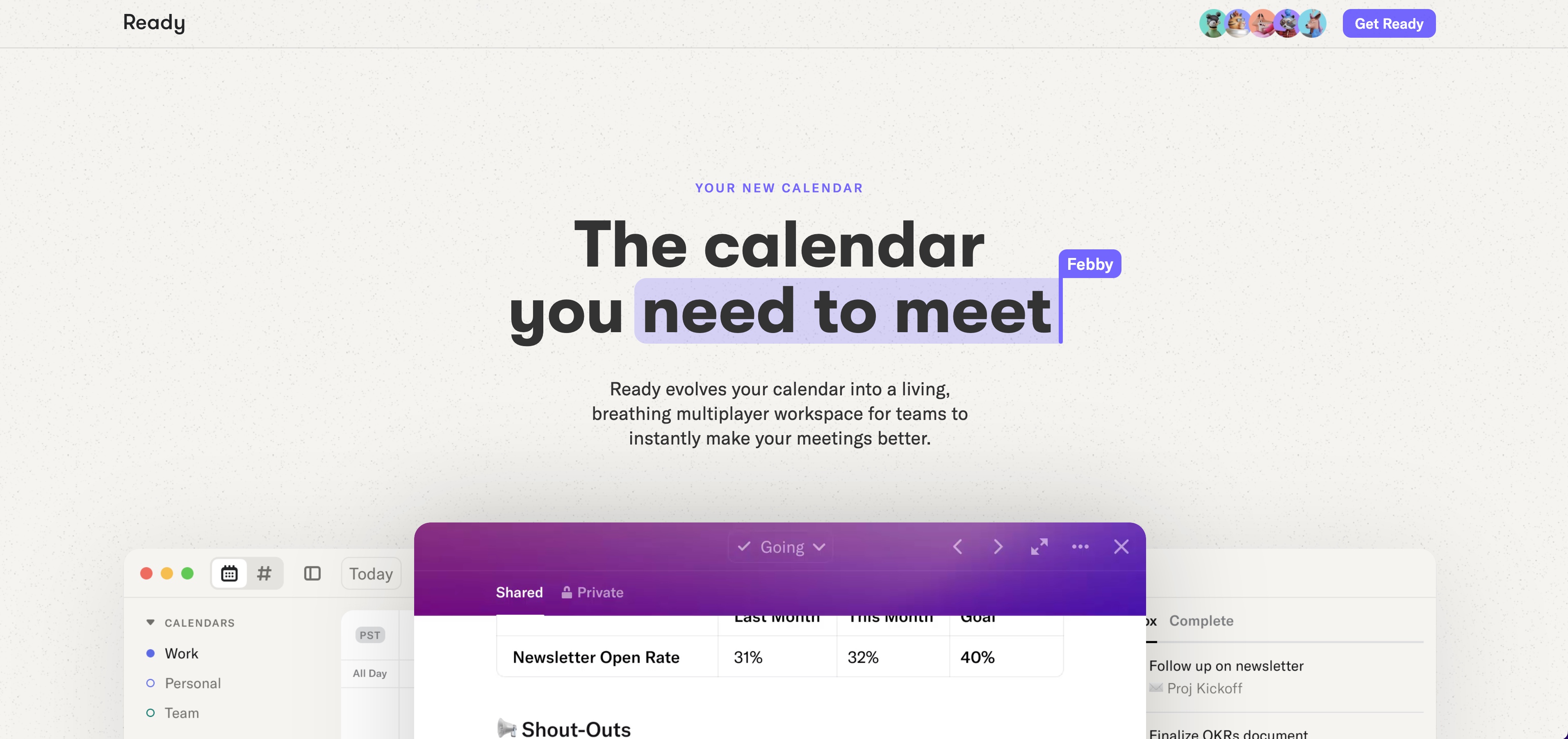
Ready embraces the “less is more” philosophy by consolidating all the essential elements of its product on a single landing page with a clear call to action — “get ready.” This simplified design is a prime example of function meets form.
Through their innovative use of a homepage with minimal copy, memorable imagery, a pleasant color scheme, and playful highlighting of essential information, Ready achieves what many competitors drop the ball on — marketable usability.
- Concise layout focused on guiding users toward the main CTA
- Minimalistic copy that reinforces a clean UI/UX design approach
These strategies align with modern design trends and offer strong design inspiration for streamlined sites.
5. April Ford
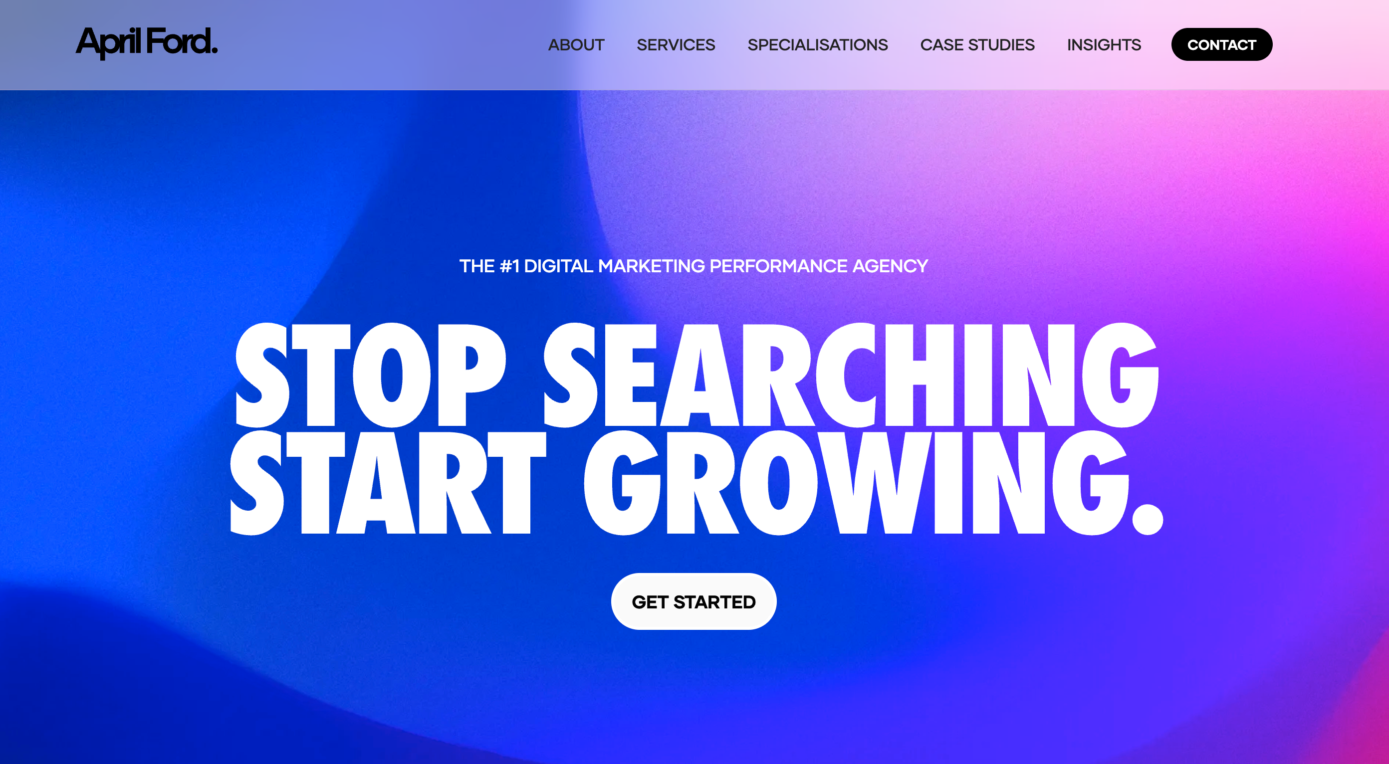
April Ford’s website puts performance front and center. A bold “Stop searching. Start growing.” headline sits on electric blue-to-magenta gradients, while oversized, pill-shaped modules guide you through services, industry specializations, and proof of results. Confident microcopy — “Everything you need. Nothing you don’t.” — and repeated calls to action make it easy to request a proposal and keep moving.
- Vivid blue–magenta gradients and smooth, rounded modules create momentum and draw the eye to CTAs
- Clear information architecture: service stack, specialist verticals, client logos, and a results gallery
- Conversion-ready details (sticky CTAs and an in-page proposal form) reduce friction for high-intent visitors
Use April Ford as a model when you need a modern look that’s confident, focused, and designed to convert without extra fluff.
6. Chiara Luzzana

Art director and developer brought artistry and creativity to Chiara Luzzana’s eloquent web design. Chiara Luzzana’s website is a high-quality, interactive user experience that lyrically intertwines the sonar and visual mediums — a sublime rejection of normative web design principles.
Typography and font are used as the core design elements to make up the layout and space, and vertical scrolling in place of horizontal. Charming auditory additions subtly further the brand’s messaging and fluid animations enhance the soundscape.
This site is one of the most unique designs we’ve seen — it offers a truly artistic approach to design inspiration, and it's something no template could achieve.
- Creative typography as a core layout element
- Immersive audio-visual experience that merges UI/UX design with art
These features reflect modern design trends, proving creativity and technical expertise can coexist.
7. Pierre-Louis Labonne

Creative freelancer Pierre-Louis Labonne immediately pulls you into his website with a big button encouraging you to click.
Pierre-Louis’s site demonstrates several different web design trends — a loading screen, nostalgia-inspired design, a customizable viewing experience, and plenty of “just for fun” interactions.
Once you enter the site, you can customize the cartoon character’s face and click through different locked areas of the screen to see Pierre-Louis’s work. This Webflow Awards Technical Achievement finalist is a top-tier source of design inspiration, showcasing clever interactions and graphic design.
- Nostalgia-driven visuals that engage users in a playful experience
- Interactive elements that highlight unique UI/UX design dynamics
These tactics align with modern design trends, encouraging exploration and curiosity.
8. Superlist

When you land on the Superlist website, you’re greeted with a slider that lets you switch between color schemes and use cases. On the black screen, you’ll see the CTA “get things done with your team” followed by a carousel of to-do lists for projects like press releases and recruiting. The red screen swaps the word “team” for “squad” and displays to-do lists for activities like soccer club and a home renovation project.
The simple but clever slider makes it a highly versatile source of design inspiration, accommodating any use case — from small businesses launching an e-commerce site to families juggling busy schedules.
- Interactive color scheme swaps that offer different content perspectives
- User-friendly approach blending personal and professional tasks
These flexible design elements tap into modern design trends that adapt to various audiences.
9. Michael Kors Collection
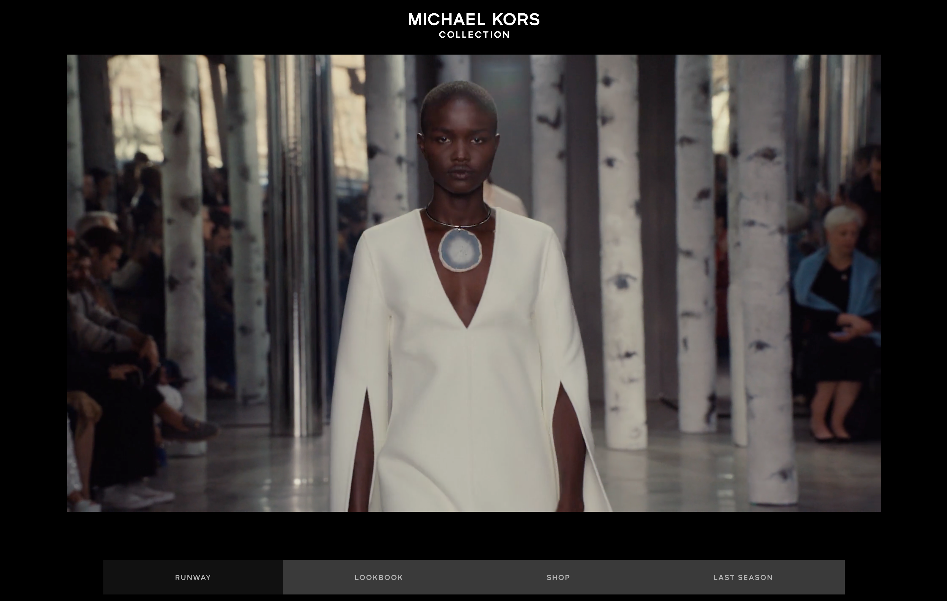
The design team behind the Michael Kors Collection website captures the timeless glamour of New York fashion in a spellbinding way.
The website invites visitors into the mind of famed designer Michael Kors, drawing inspiration from muses of the 1970s. The layout and monochromatic UI truly exemplify and embody his sleek Fall and Winter 2023 Collection.
Let this platform serve as a prime source of design inspiration for your next blogger or high-fashion project’s website design.
- Monochrome palette underscoring a timeless, luxe aesthetic
- High-end photography that immerses viewers in the runway experience
These refined choices mirror modern design trends and elevate brand storytelling.
10. Slite

The copy and typography are ‘the stars’ of Slite’s web design. Slite’s header – “Your team’s go-to for instant answers” – and their site’s crisp design and concise copy back up that claim. The intentional web design demonstrates the clarity customers can gain using Slite.
Slite’s attention to detail makes its site a prime destination for design inspiration, especially for enterprise clients.
- Concise content strategy that underscores the product’s core value
- Strong typography and visual hierarchy tailored to business audiences
These approaches embrace modern design trends, creating clarity and efficiency.
11. The Goonies
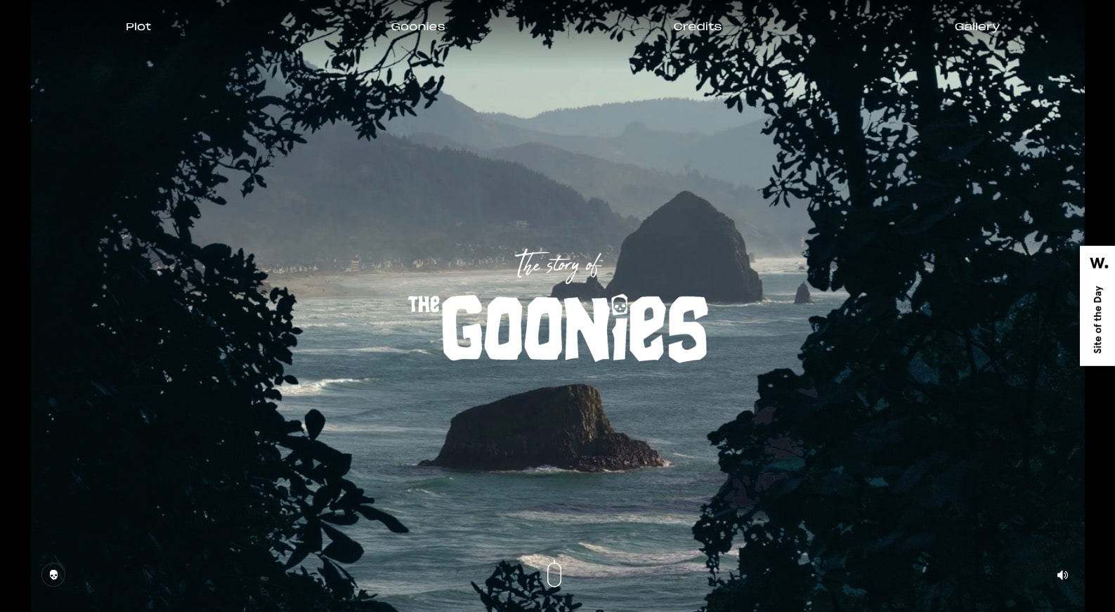
What do you get when you have a stellar design team, a high-quality web builder platform, a Hollywood budget, and the nostalgia of the 1980s? Why, this gem of a digital time capsule created by the team behind The Goonies, of course.
This is more than a website — it's an experience built in Webflow without CSS or JavaScript.
Simply by the flick of a finger, you’re transported into the immersive world and production behind this beloved classic movie. The power of the scroll is evident here — when done appropriately, it functions as the driving force behind a successful web design.
Using the scroll to move the story along with the user’s gestures is genius and expertly executed. It invokes the spirit of the 1980s — sweet innocence and hot afternoons spent in a movie theater during the summer of 1985. Do yourself a favor and check out this Awwwards site of the day winner, especially if you’re reading on a mobile device. And if you’re a child of the 80s, you’re welcome.
- Scrolling narrative that immerses visitors in a movie-inspired storyline
- Retro design cues tapping into nostalgia for compelling UI/UX design
These nostalgic elements embrace modern design trends, offering memorable design inspiration.
12. DONÜTS

We’re serving you something hot and sweet with this next web design.
Brought to you by Will Robinson, the incredibly talented Toronto-based Webflow web designer, DONÜTS is a bold, pop art-inspired beauty. This single-page cloneable is cheeky and wonderfully gaudy, with a vibrant play on layout, transitions, typography, and visuals. Robinson uses the simplistic power of the scroll to take visitors along an illuminatingly informative journey through the website. DONÜTS holds up to its namesake, a true visual treat!
DONÜTS delivers playful design inspiration for any project or client needing a bold, original brand presence.
- Vibrant pop art style that captivates users and highlights brand personality
- Scroll-driven storytelling that showcases a unique UI/UX approach
These vivid choices reflect modern design trends that push creative boundaries.
13. Digital China University
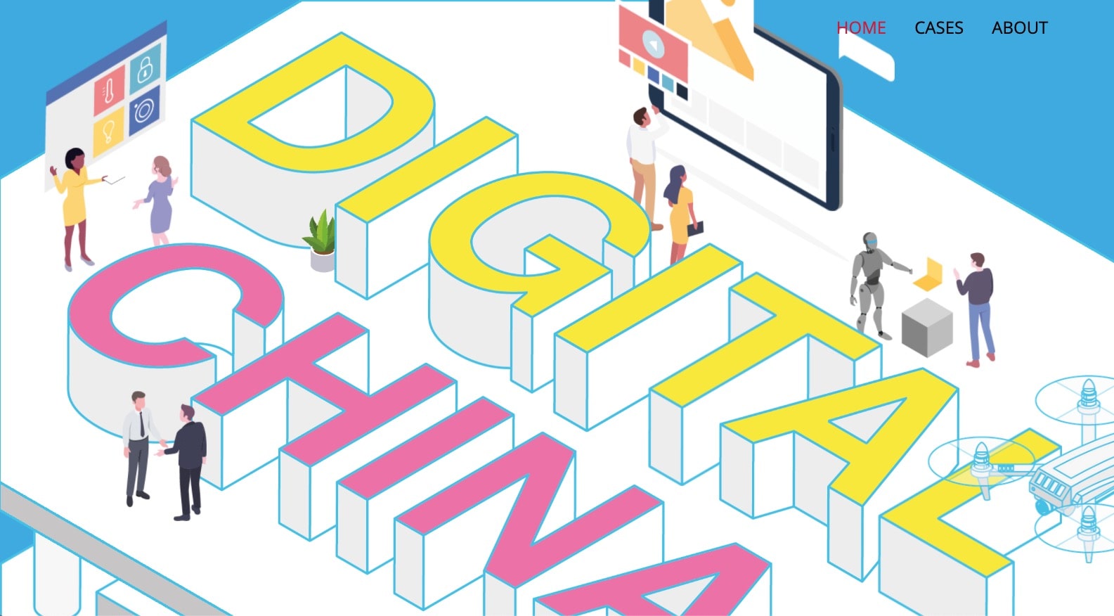
The design team behind Xtudio’s Digital China University uses Webflow to take web design to the next level. As a result, it’s a remarkable source of design inspiration, boasting an impressive aesthetic, UI, UX, and market value.
By transforming the graphic design from a brochure illustration into an engaging web design, Xtudio demonstrates its creative ingenuity and imaginative charm. The design team behind Digital China University’s website shows web designers that any design is possible with the proper CMS and web builder, with no need for code.
- Illustrative design that translates print concepts into dynamic web experiences
- Smooth navigation highlighting the site's educational focus
These choices incorporate modern design trends, proving code-free creativity is limitless.
14. Monograph Communications
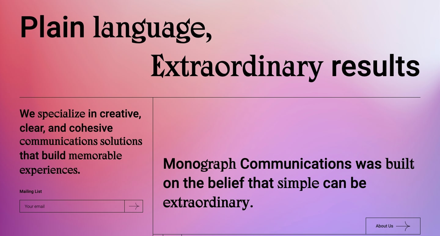
Next in line for fresh design inspiration is another cloneable by Vancouver-based designer Gary Colwell.
Colwell wonderfully captures the tonality and identity of the communications solutions brand Monograph Communications. In their own words, “[It] features a contrast typography design with the sans-serif (Roboto) representing the corporate professional side of the business, and the serif (Zangezi designed by Daria Petrova) representing an appreciation for the history of the written word.”
Centering the site’s design around both type font and typography demonstrates his ingenuity, and it shows how situational and brand awareness can make a brand stand out through seemingly simple design. The Monograph Communications web design proves that intentionality is what makes good design.
- Contrasting serif and sans-serif fonts that capture both corporate and creative tones
- Subtle color gradients that reinforce the brand's unique identity
These design elements reflect modern design trends, elevating an otherwise minimal layout.
15. Moon UltraLight
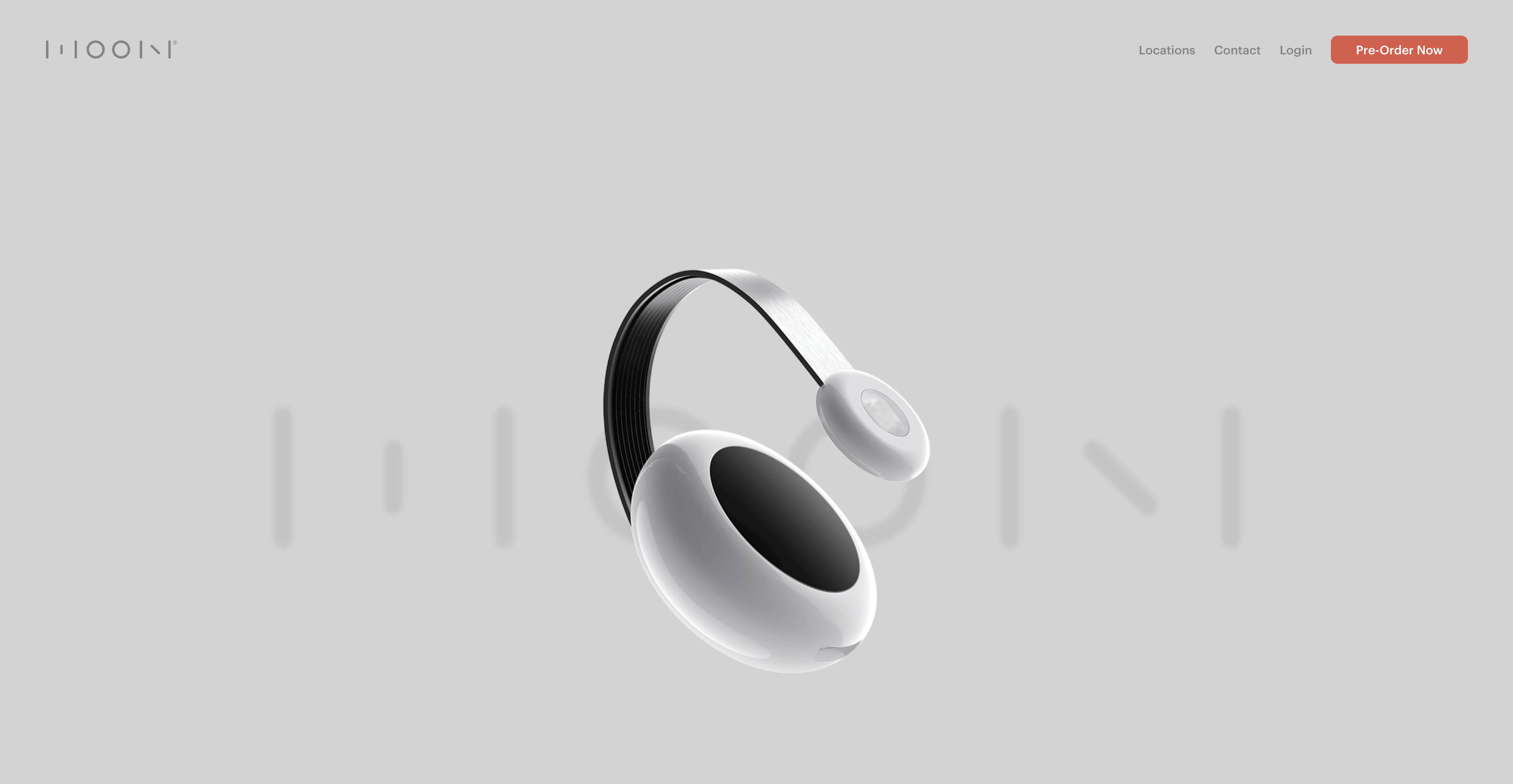
Drawing inspiration from Apple’s iconic web design, Joseph Berry’s Moon UltraLight is stunning.
This site is a treat for the eye. Berry’s use of interactive animations and parallax scroll elevate the minimalist design elements and perfectly emphasize the product’s message and imagery. With sleek transitions and mesmerizing visuals, Moon UltraLight provides superb design inspiration on Webflow.
- Minimalist color scheme focused on product-centric storytelling
- Immersive parallax effects enhancing the UI/UX experience
These techniques align with modern design trends, showcasing elegance and innovation.
16. Hsu McCullough

Hsu McCullough's architecture studio site by Dunclyde is a clean, minimalist delight. Its use of whitespace places a gorgeous emphasis on the site’s imagery, while the crisp sans serif type further establishes balance and form throughout the design.
This weaving of aesthetic form meets function makes Hsu McCullough's site a compelling source of design inspiration, notably for the ‘New York City blogger’ archetype.
- Open layout that showcases architectural photography in a clean UI
- Subtle design accents highlighting the studio's refined aesthetic
These understated details align with modern design trends, emphasizing simplicity and sophistication.


Explore the data behind how web teams are navigating AI, collaboration, and technology shifts
1,000 marketing and technology leaders reveal the biggest challenges — and most exciting opportunities — facing their websites.
How to use these design inspiration examples
Now that you’ve seen diverse and inspiring websites, you can adapt their techniques to your own projects. Focus on elements like layout, color scheme, and UI/UX design to create memorable experiences.
Tips for applying design inspiration
- Identify the core elements that stand out in each example, like typography or animation.
- Experiment with color palettes and layouts while maintaining consistency with your brand.
- Prototype ideas quickly to see how they affect user experience before finalizing.
Find design inspiration with Webflow
So, there you have it, 16 inspiring websites to help ignite your creative fire. We hope these examples have sparked a few ideas for your upcoming design project.
To find more visually stunning websites, check Made in Webflow for more design ideas, and create your next web design today.
Build with Webflow
Webflow Enterprise gives your teams the power to build, ship, and manage sites collaboratively at scale.


