

Your website is the online equivalent of a firm handshake.
A personal website is an opportunity to define your own story. It creates a space outside of social media for visitors to congregate, view your content, and learn about your brand. For first-time viewers, a personal website establishes who you are and why your work matters. For those who are familiar with your work, it can be an official channel for your marketing content or storefront, giving everyone new ways to connect.
By optimizing your site for search engines and following design best practices, such as using templates from web design platforms like Webflow, you can build a site that efficiently engages and converts. Read on to see eight personal websites that excel at clever, memorable web design to build their subjects’ brand.
Benefits of having a personal website
A personal website showcases your skills and achievements to grow your audience. Building a website means understanding what makes your brand special and leaning into it. A personalized site offers several benefits:
- Distinguishes your personal brand: Your website is a dedicated space for you to showcase your brand and distinguish it from competitors.
- A memorable first impression: Since personal websites are often the first thing those interested in your brand see, a strong website design builds your brand’s professional credibility.
- Direct-to-consumer marketing and sales: Your website offers a direct channel between you and visitors without the need for third-party online retailers, even if you need to sell tickets and merch or artwork and content writing services.
- Easier to update: You can add whatever you need to your site when you have something new to share. Brand overhauls won’t require taking down and remaking hours of content like social media does. A website builder like Webflow can streamline your process even further with professional website templates.
8 unique personal website and portfolio examples
Imagining what your website will look like is the first step toward creating a successful online portfolio. Here are eight excellent personal website examples that can provide some inspiration for your creative web design.
1. Jey Austen

Jey Austen designed an impressive personal website with clean visuals, unique fonts, and a direct visual flow. Their website reflects a minimalist design, with lots of negative space and a high-contrast color scheme. The minimalist design allows them to add more personality with a few unique graphics (like a moth peeking over their portfolio).
This website is a great example of an online portfolio that provides a more personal reflection of one’s work rather than relying on case studies and testimonials. Jey includes blog articles they’ve written and links to additional content, making this site a central place for readers, fans, and potential clients of all kinds. That level of versatility makes this website concept ideal for multidisciplinary professionals and content creators.
2. David Kushner

David Kushner is a musician with an avant-garde style, and this personal website showcases different dimensions of his musical personality. Every row on the homepage shows off a different aspect of his persona, from dark and moody portraits to vintage color schemes and script-like fonts. Viewers have access to different facets of what makes David unique via the website’s design.
If you have a similarly multi-faceted brand persona, you might break your site into thick scrolling rows to give your audience a rounded-out depiction of you and your brand.
3. Sophia Amoruso

The personal website made for Sophia Amoruso by Rare Days showcases her professional personality and drive. The editorial-inspired visuals and bold, clean fonts bring a sense of professional confidence to readers. Meanwhile, captivating animations appear while you scroll, keeping viewers engaged. This combination results in an interactive website where Sophia’s story literally moves with you.
There are plenty of details you can lift from this complex site to add to a compelling resume website or online portfolio. The asymmetrical layout and scrolling animations, for example, can easily be recreated using a visual-first website builder like Webflow for flexible, intricate website design.
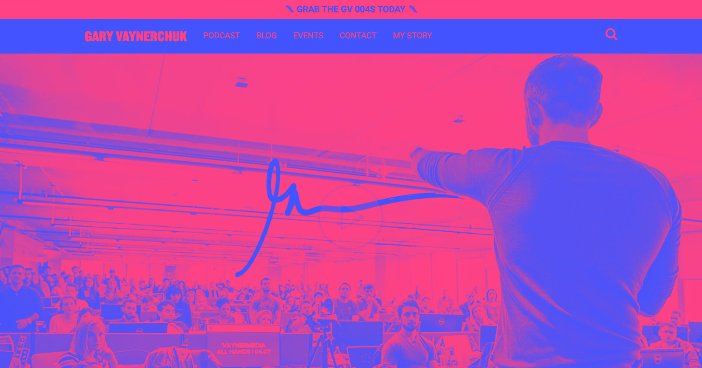
4. Marlon Wayans

Marlon Wayans’ personal website highlights his professional career as a stand-up comedian. The site features a full-screen demo reel and several callbacks to his most popular appearances. The navigation menu includes extensive highlights of his stand-up alongside a long list of ways to explore his work.
If you have several videos and visuals to show off in your website design, this is a great layout option to consider. It commits large swaths of the screen to clips, so your work can speak for you.
5. Mark Clennon
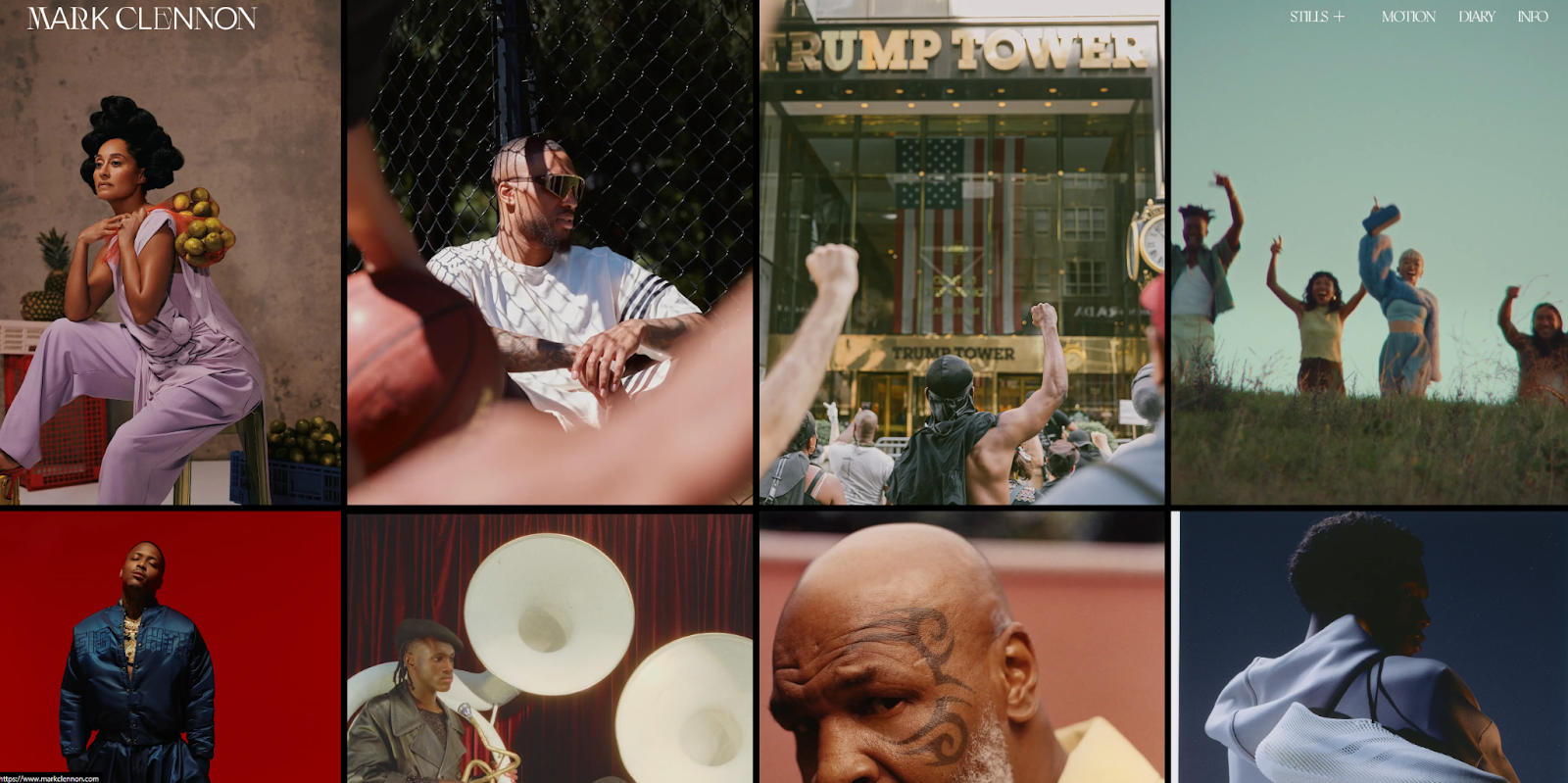
Mark Clennon’s personal website by Blackpepper Studio is another image-heavy design that’s perfect for visual artists wanting to showcase their medium. The only words on the landing page are Mark’s name and a list of navigation buttons to a few subpages. Otherwise, this personal site is an infinitely scrolling gallery of some of Mark’s work. Clicking any of his highlights leads you to a brief summary of his career that’s mostly free of text (aside from brief titles and credits).
The photos and videos are animated to move in every direction. While this makes navigation slightly less intuitive, it’s a trade-off for this unique web design. If you’re trying to subvert viewers’ expectations with an interactive and visual-heavy website, this design is the one for you.


Launch with Webflow Templates
Choose from hundreds of professionally designed website templates for any industry or style. Customize visually, launch instantly — no coding required.
6. Colin Moy
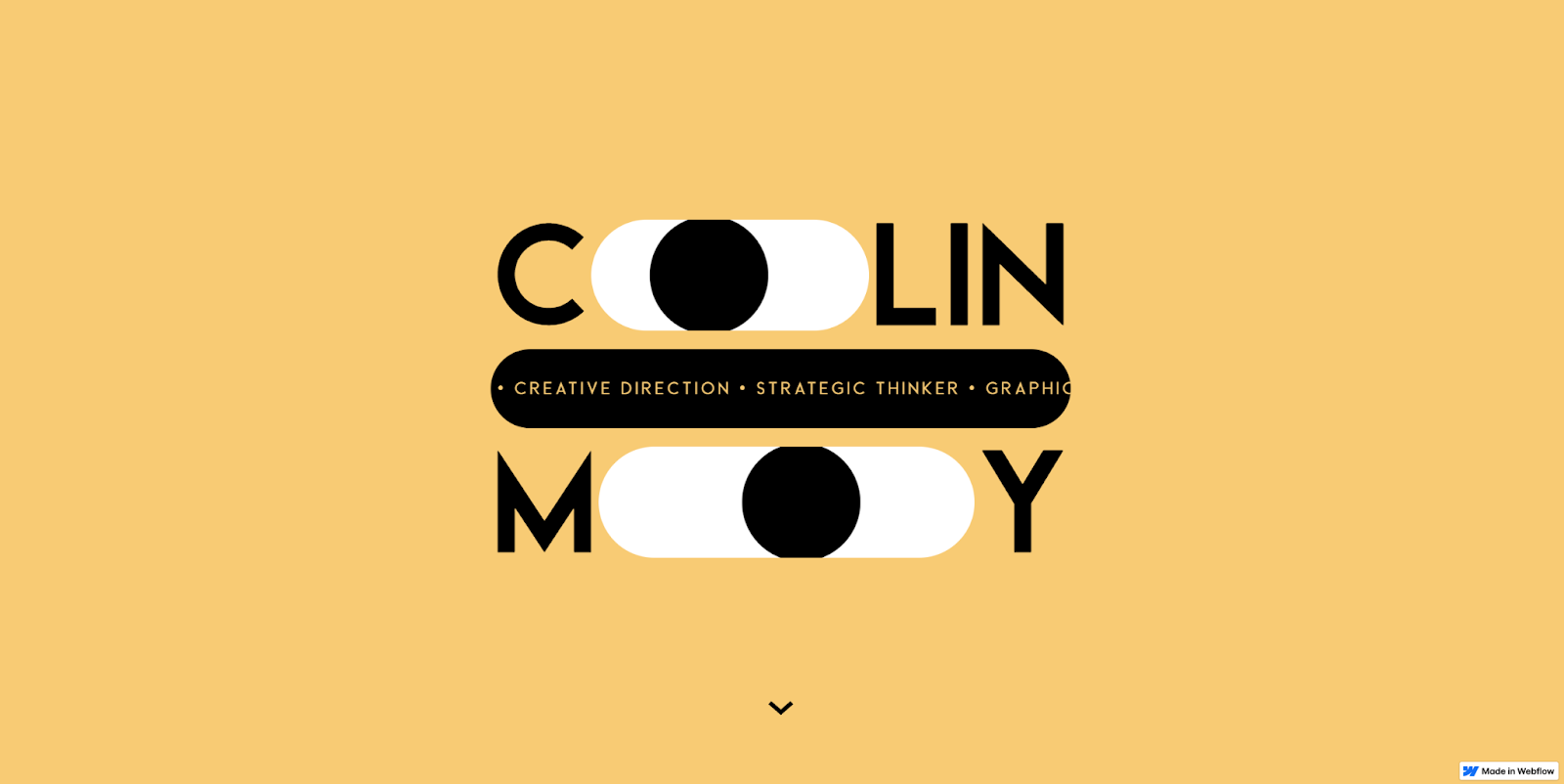
Colin Moy’s personal website is distinctive from the get-go. His simple use of circles as a visual motif engages readers by blowing up text, revealing portfolio samples, and directing potential new clients toward his contact information. The layout results in a very simple, clean website that’s easy to navigate.
This website takes full advantage of everything the Webflow website builder offers. You can close it to use as your own website template, which gives you access to all the preconfigured visuals and animations Colin used to make this such an immersive personal website.
7. Nick Velten
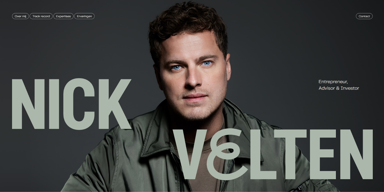
The personal website made for Nick Velten by Dennis Snellenberg showcases his professionalism and versatility. The one-page website design features intuitive navigation and a simple but color theory-forward palette that adds visual flair with mixed fonts.
Nick’s site focuses on specific achievements that highlight his career success. He separates his areas of expertise, track record, and testimonials in separate bold sections to back up his qualifications as readers scroll. If you’re looking to convince potential clients you’re the right fit from minute one, this might be the perfect personal website example to follow.
8. Alice Lee
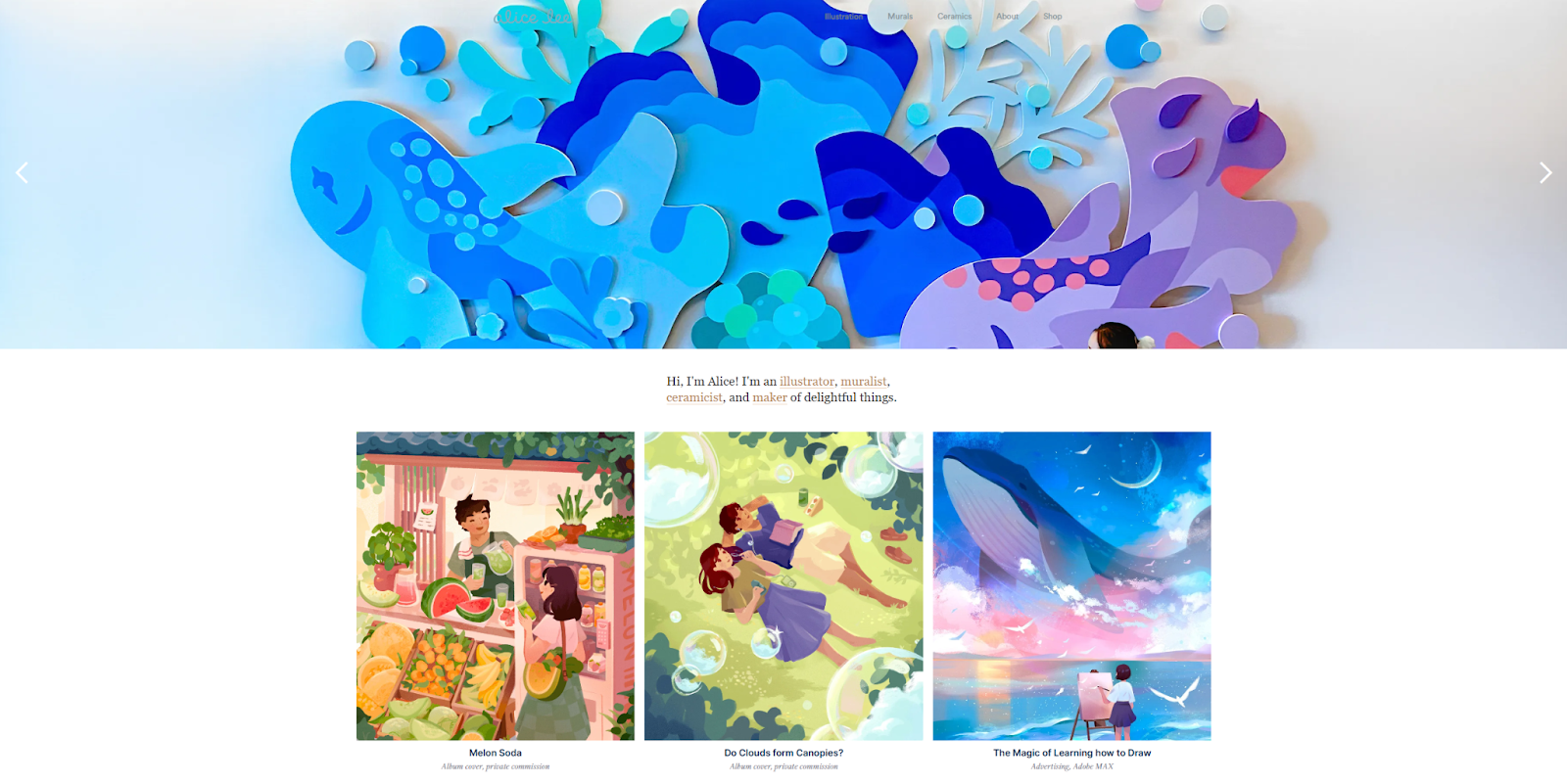
Alice Lee’s self-designed personal website puts the focus on her distinctive art style. The homepage is an extensive gallery of her best work, and each piece is paired with the story of its creation. The breadth of her impressive portfolio is enhanced by the care she put into each deep dive.
The website itself is straightforward and easy to replicate, but Alice’s thoughtful analysis of her work is what makes it unique. Adding a little extra effort to creating your website, whether that’s in case studies or reflective storytelling, is good for search engine optimization (SEO) and your audience.
How to design a compelling personal website in 5 steps
Whether you prefer an intricate animated website or a simple one-page design, there are a few key features that make personal websites stand out. When it’s time to build your site, follow these five steps to set yourself up for success:
- Define the purpose. Identify what you want visitors to do when they get to your website: buy tickets, follow you on social media, contact you about a new project, etc. Every design decision you make when building your personal website should intentionally help visitors accomplish your chosen goals.
- Choose a platform. Pick a website builder that excels at the tools that support your goals best. For example, if you want to sell merch, a platform with Shopify integration will make things easier.
- Design a layout. Use the website builder you chose to create a unique layout. If you’re using a website template, take some time to personalize it. Your site should look and feel like it was made just for you.
- Fill it with engaging content. Add portfolio samples, your CV, and all the content you need to achieve your website’s purpose. Then, optimize your site for search engines to drive plenty of traffic. This might involve adding alt text to images, indexing your content, or breaking long paragraphs of text into smaller bites, among other SEO strategies.
- Publish and monitor analytics. After you publish your new website, watch your site analytics to determine what’s working and what isn’t. Use a testing tool like Webflow Optimize to experiment with different designs and learn which ones maximize engagement.
Grow your personal brand with Webflow
Your personal brand is just that: personal. A standard website won’t showcase your unique personality as an artist, content creator, or designer. If you want to make a truly grand first impression, you need a website builder that’s flexible enough to support your creativity. Webflow provides all the tools you need to amaze, including a visual-first canvas and a large marketplace of customizable templates.
Get started with Webflow to build your online personal brand.
Show off your work.
Choose from fully customizable portfolio templates built for creatives. With Webflow, you can design, refine, and publish a standout portfolio — without writing a single line of code.