Website design trends posts are like art directors — practically guiding your hands on the mouse. This year, we’re doing trends different, by focusing on what actually matters. From accessibility to truth, no code to role, these are the top web design trends to focus on if your definition of beauty includes functionality, accessibility, and psychological safety.
Check out our latest post: 11 engaging web design trends for 2023.
Top web design trends for 2020
- Designing truth
- Accessibility is (finally) key
- Content gets its due in web and UX design
- Inclusivity is key
- The no code revolution has arrived
- The rise of the visual developer
- Design has its seat at the table. Now what?
- Role is not identity
- Okay, one visual trend: Marquee is back, baby!
Each year, I share my take on the latest web design trends that will shape the coming year, often incorporating the opinions of my fellow designers at Webflow, as well as those of well-known names in the broader design community. I’ve always included a mix of concrete design details and interaction models as well as higher-level concepts, which helped fill out my self-imposed constraint of adding one more trend than the number of the year (20 web design trends for 2019, for example).
This year, I’m breaking the mold.
Because 2020 is going to be a different year for design, to my mind. A year when we’re all going to focus a little less on typography, white space, design elements, this layout, that color scheme, and whichever nifty animation mode caught our eye last week, and instead consider the deeper underlying concerns of design.
So I’m ditching the same ole design specifics we see year after year (broken grids, anyone?!) to focus on the bigger picture. To ask far more significant questions like:
- How do we design to make information clear, while still making it easily consumable?
- How do we make design universal, ensuring that no one feels excluded or erased by our decisions?
- And, perhaps most significantly, how will a new generation of tools, built upon a paradigm that’s simultaneously brand-new, yet old as spreadsheets, change not only the way we work, but also what we produce?
But more on that last point later.
Prefer to watch your trendy content? We've got you, with a short summary of this post from Charli Prangely:
Thanks, Charli!
9 web design trends for 2020
Now, let's dive into the 9 web design trends we'll see in 2020:
1. Designing truth
It’s no secret that we’ve entered what many are calling the “post-truth” era, with myriad instances of deepfakes, misinformation campaigns, and outright lies popping up, gaining viral traction, and ultimately shaping the decision-making of millions — all too often driven by prominent individuals who will here go unnamed.
The major social media platforms have each come out with policies — and in some cases, designs — to account for this new flourishing of untruths.
Facebook has decided that it simply won’t intervene with political untruths. To support its stance, the platform has cited everything from the First Amendment to the FCC’s similar stance on political advertising on the TV. Conveniently forgetting that it is neither a) the government (the one that’s actually restricted from censorship by freedom of speech) nor b) the increasingly anachronistic technology that is television.
Facebook’s been (apparently) trying to combat fake news on its platform since 2015, doing so in classic Silicon Valley iterative design style. It first tried to encourage individual users to flag content as “false news” — an odd half-borrowing from President Trump — then by marking some stories as “disputed” — which, according to what it called “academic” research, backfired by reinforcing some users’ belief in the content — then, most recently overlaying the content with a straightforward notice reading:
False Information
Checked by independent fact-checkers.

The overlay also provides a prominent CTA to view the fact-checkers’s findings — as well as a secondary button to go ahead and view the false content.
At present, there’s still no plan to flag paid political posts as false.
One interesting thing to note is that Facebook started trying to remedy sharing of false information only after it was shared — the original poster was given no alerts to the fact that the content they wanted to share was disputed. They’ve amended this in subsequent designs to be more proactive in alerting the original sharer — but it’s still intriguing that the notifications focus on the fact that there’s “additional reporting” on the content.
This strategy focuses on encouraging what we call “curiosity clicks.” This encourages engagement with the information, but that’s also its flaw: you have to care enough that there’s “additional reporting” to click through. As a content designer, I have to wonder if it wouldn’t be more effective to name the fact checkers and pull a significant quote on the content. Snopes, for example, does a great job of highlighting what the specific claim is and giving it a straightforward “true” or “false” (with a range of fuzziness between) rating.

Twitter has taken a rather more straightforward (and cheerworthy) stance of simply disallowing political advertising on its platform. Though as many people have commented, it’s just not that easy. All kinds of misinformation “earns” its way into our feeds daily, a reality that Twitter seems to have done little to nothing to address.
In the end, what really matters here is not so much what the major platforms are doing to bring clarity and trustworthiness to their platforms, but what you might do to bring more of that into your own work.
Here are a few thoughts on doing that:
Label more prominently and clearly

In a 2016 report on a Stanford study of students’ ability to determine the veracity of information found online, the Wall Street Journal stated:
Some 82% of middle-schoolers couldn’t distinguish between an ad labeled “sponsored content” and a real news story on a website, according to a Stanford University study of 7,804 students from middle school through college.
Much of the “optimization” of ad formats like “sponsored content” has gone into … well, hiding the fact that they’re ads. Just look at the name: “sponsored content.” On a content-driven site, that simply implies that the content was “sponsored” by someone, much as race car drivers are sponsored by various corporations.
The reality, of course, is that these are ads, even if they’re not as direct as banners. And we should label them as such.
And it’s not just our language that could be clearer. Our design work could use some improvements too. Just look at the screenshot above (taken on Dec 3, 2019). Every single story in that shot is a piece of sponsored content, hosted on a different website, but seamlessly integrated into Slate’s own homepage.

The title font for the native news articles and the sponsored stories is the same. But note what’s quite different: the font size and location of the “author.” In the native stories, the author’s name is set reasonably large, above the title. You definitely still see the title first, but the author name cries out for your attention in these real stories.
The sponsored posts, on the other hand? The “author” — or brand, actually — is set much smaller. The fact that the “author” is listed as a brand, rather than as an individual writing for the brand, is telling as well: While we have someone to follow up with (or blame or praise) for real reporting, the sponsored stories are attributed to faceless brands.
Perhaps even more significantly: note that the real articles are practically emblazoned with a category title (e.g., News & Politics). The sponsored stories? Oddly lacking that prominent header.
Make sources more obvious
In the world of journalism, you’ll often hear the mantra:
Consider the source.
Which is not something most students do these days, according to the study:
Many students judged the credibility of newsy tweets based on how much detail they contained or whether a large photo was attached, rather than on the source.
And while that maxim is stressed to young and aspiring journos as a core practice, it could also help us designers help the rest of the world out. What if, for example, every organization’s Twitter profile included a link to their Wikipedia page, or a Google search of their name? What if publications featured an about page that clarified their political stance, history, management, and funding sources? One better: what if they linked to independent commentators on the publication?
These, of course, are just ideas — if nothing else, prompts to consider more deeply how we might encourage readers to act more like journalists and consider their sources in a more objective manner.
But we can also consider carefully the criteria young students are using to evaluate credibility, and encourage our social media teams to make updates information-dense, and pair them with large, engaging graphics.
Finally, and to bring this closer to home for web designers crafting publishing experiences (that is, any designer who works on a site with a blog, case studies, etc.): consider making your authors and their credentials much more obvious in your content-driven experiences. This can not only boost your site’s credibility and give readers a point of contact, but also arm readers to better evaluate your authors’ content. A thoughtfully curated list of contributors then becomes a marketing asset, akin to the list of blurbs on every mass-market book cover.
Use “related content” to provide context and contrast
Related content — a familiar content pattern often appearing in the middle or at the end of blog posts and news articles, often under a heading like “You might also like…” — gives designers a powerful tool for adding easily accessible nuance to a reader’s understanding of a topic.
How? By ensuring two things:
- That opinion pieces are contextualized by the stories they comment on, or by contrasting opinions
- That news stories get additional color through the opinion pieces through the pieces that comment on them
Using related content to provide extra context on fact- and opinion-based pieces helps work against our age’s increasingly obvious preference for “bite-sized” information. Bite-sized data helps us quickly get a basic understanding of issues in a world fraught with issues — but it also means that we often lack a nuanced understanding of said issues.
When we rely solely on our favorite “influencers’” hot-takes on Twitter, we start to look a lot like a pitchfork-and-torch wielding mob, all too ready to take one charismatic voice for the font of truth. But the more that content creators and designers can point readers to extra information and contrasting opinions, the more we can encourage nuanced understandings that rely more on information and reason than on emotion.
To sum up:
- Label your content types clearly to help readers create a mental model of your content and better distinguish between organic and promotional materials
- Contextualize and promote your sources so readers know where your content comes from and can better evaluate its credibility
- Use related content to add context and promote nuanced understandings of topics
All the above said, it’s worth remembering that misinformation isn’t a fixed target, a fact captured beautifully by Tom Rosenstiel, director of the American Press Institute and senior fellow at the Brookings Institution:
Whatever changes platform companies make, and whatever innovations fact checkers and other journalists put in place, those who want to deceive will adapt to them. Misinformation is not like a plumbing problem you fix. It is a social condition, like crime, that you must constantly monitor and adjust to. Since as far back as the era of radio and before, as Winston Churchill said, ‘A lie can go around the world before the truth gets its pants on.’
Which is to say: if you want to play a role in fighting misinformation in 2020, prepare for the long haul, and be ready to update your strategies and tactics as the information landscape continues to change.
2. Accessibility is (finally) key
Before I dive in here, I have to offer a confession on behalf of Webflow: We did not build Webflow with accessibility in mind. But we've recently hired two accessibility specialists and formed a team around the effort to make accessibility a first-class citizen in Webflow. Stay tuned for more on that.
Web accessibility — the practice of ensuring that websites and web applications are usable by everyone, regardless of their abilities — has long been a vital part of the web design and development process in mature organizations. Particularly in governmental and publicly funded institutions, where Americans with Disabilities Act (ADA) compliance has long been a legal requirement.
But with high-profile cases like the Domino’s lawsuit and others gaining broad notice, the writing is on the wall: soon, all websites will be required to meet ADA requirements — making accessibility a compliance issue, not just a “nice to have.”
And while I don’t want to overplay the impact this will have on our profession — as numerous relatively minor interventions in our processes and skillsets will have significant impact on the accessibility of our products — I don’t think we can afford to underplay this fact either. Because while relatively small efforts will have significant impact, the changes required of us to make more accessible sites will affect literally every step of the design process, and the workflows of every participant in that process.
Don’t believe me? Check out Vox’s accessibility checklist, which outlines the ways every web professional, from designers to QAs to editors, can contribute to building more accessible websites and applications.
But the work of accessibility requires far more than checklists and automated checks via browser plugins. Because much of the work of accessible website design can’t be checked via software. And because web design, outside of web app development, is essentially all about publishing, accessible web design means reconsidering the ways we publish too. If we create videos for the web, we need to consider captioning, transcripts, and other non-visual equivalents we can offer. If we host podcasts, we’ll need to think about how we can make our content available to those with low or non-existent hearing. If we publish infographics and charts, we’ll need to think about how we can make the content of these mediums available to those who can’t see them.
And designers, long used to relying on visual formats and low-contrast aesthetics to do their work, will have to stretch to account for this more inclusive paradigm. We’ll have to think long and hard about the limitations of visual formats not only for the differently abled, but for those for whom visuals aren’t nearly as transparently legible as they are to designers (myself included!).
Blind spots abound in the design process, and these holes are often based on our disciplines. As a writer, I often find it difficult to account for those with a less broad vocabulary, as well as those who prefer visual formats. (Even the turn of phrase I opened this paragraph with could be seen as ableist.) Designers, similarly, tend to overlook the value and power of a single sentence, especially when paired with an equally powerful visual.
The reality is: we learned our skills in a context that assumed there was such a thing as a “normal.” That you could apply your skills to communicate to “everyone” in your preferred format because “most people” can process your preferred format just fine.

But the fact is that is much as 26% of the United States' population experiences some form of disability, according to the Centers for Disease Control and Prevention (CDC). And as Microsoft has so eloquently communicated via their inclusive design content, 100% of the population may experience temporary or situational disabilities. And the fact is that none of us are getting any younger, and the older we get, the higher the chance we’ll experience a more or less permanent disability becomes.
There is no health; physicians say that we
At best enjoy but a neutrality.
–John Donne, “An Anatomy of the World,” 1611
The world (and its advertising) may turn around the healthy and young, but we can no longer afford to design solely for them.
3. Content gets its due in web and UX design
I’ve been a content professional working on the web since 2006, and in those (almost) 14 years, one debate has defined my experience of the profession:
Does design or content come first?
This so-called debate has never failed to flummox me, for several reasons. And it’s incredibly relieving to me to see that designers are increasingly coming to understand what has always seemed obvious to me: that the “content,” or rather, the “message,” has to come before the design. Because, otherwise, there’s literally nothing to design.
On the other hand, this debate is confusing and frustrating because, in reality, it’s not even the real question. Neither content nor design come first. Because you really can’t create content or design till you have a strategy. And you can’t have a strategy until you have a goal: a purpose that the thing you want to publish should fulfill.
To clarify this, I like to point back to web design and publishing’s predecessor: print publishing. Before you can design a book, you need a book to design. And before you can write a book, you need a point: an idea or truth that you wish to convey to your audience.
It’s important to point out here that a website is not, in fact, a book. Its material expression, functionality, and distribution are vastly different than a book. But in terms of purpose, a book and a website are very much the same: they both exist to convey information to an audience. (No, I’m not talking about web apps here.*)
The core difference is that the website hopes to gather some information from its audience in exchange for the information (or functionality) it offers: typically, an email, that uniquely modern key to an individual’s identity, and to communication with that person.
But to get, you have to give. You need to offer some value, and even the teams behind the world’s most popular digital products realize that quality content makes for an incredible source of value, allowing you to draw the attention of even those your product (isn’t yet) for.
Of course, content isn’t just blog posts. (Nor is it just words, but that’s a whole other post.) Content also plays a key role in your product’s overall user experience, and increasingly, platforms are feeling the pain of getting content wrong.
Here’s an example I ran across just the other day, on LinkedIn (where I once worked, for transparency):

Notice anything? I sure do! And I could go on and on about the flaws of this interface, but I’ll restrict myself to the single most important one:
What the heck do I do if that’s not my “correct” or “active” email address?
I’m being asked to take action on this information if necessary, but there’s no obvious way for me to do anything but “remove” my phone number! The content and the interface are completely misaligned, ensuring that — at best — LinkedIn might get an accurate, current phone number from me.
But, ironically, what this UI does best for me, the user, is to remind me that LinkedIn has my phone number (why tho?!) and, better yet, give me a chance to dissociate it from my profile. (I originally wrote “delete it from their database,” but a colleague rightly pointed out … it almost certainly doesn’t do that.)
I’m just going to guess that wasn’t their goal.
But I’m not here to complain about LinkedIn’s content. I’m here to stress the centrality of content to the overall user experience of any digital environment. Hopefully the above does the trick, but to reinforce my point, here are a few content-related highs and lows from 2019:
I don’t, personally, share Alicia’s praise here.
Most telling, perhaps, is the increasing prominence of content strategy and UX writing in the brands of some of today’s most recognizable brands. Just look to the design publications and publicly-shared design systems of brands like Facebook, Dropbox, Google, and Shopify and you’ll see the word content — and its dedicated creators — getting their fair share of name drops.
4. Inclusivity is key


*But a content-first viewpoint still has dramatic effects on web apps: Just look at Twitter, where a single content decision — limiting character count — has done everything to define both the glory and horror of that platform.
We designers, for all our focus on empathy, remain human beings. We aim relentlessly to take others’ views and experiences into account through user research, critique sessions, A/B testing, and myriad other methods. But at the end of the day, we’re all subject to a very human propensity: an unconscious assumption that what works for us will work for everyone else.
Just look at the language we use every day: Reach out. I see that. We hear you.
We assume these phrases are universal — equally meaningful to everyone who hears or reads them. We blithely conflate the concrete, sensory basis of these phrases with their emotional register and intent.
But it’s a faulty assumption. The blind cannot see that. The deaf do not hear you. Those with cerebral palsy may struggle to reach out.
Of course, inclusivity is about far more than accounting for disability. It’s about accounting for difference. It means that we can’t limit ourselves to “male” and “female” when we ask someone’s gender in a form. It means realizing that a “happy Father’s day!” email won’t mean the same thing to the child of a deadbeat dad as it does to one who grew up in a “normal” nuclear family. Hell, it means realizing that even the one from the “normal” family might have a bad relationship with their father — or have, not a father and a mother, but two mothers.
To enjoy and find value in a product, an individual needs to see themselves reflected within it. Without that glimpse of themselves, what a person sees instead is a refusal. The message is: you don’t belong here.
Designing for inclusivity — and ultimately, for UX — then means making space for our audience within the products we build.
I want to expand on that link between inclusive design and user experience design. Because I think that inclusivity — which is ultimately the idea that we should treat “others” not as others, but as part of us — is built right into the very notion of user experience design, and I want to take a moment to explain why.
Let’s start by looking at Peter Morville’s “user experience honeycomb”:

The honeycomb aims to depict the interlinked characteristics that form a user experience — good or bad. The overall user experience is a gestalt — a sum total — of all these facets, arrived at via a kind of mental math we perform automatically and without deep consideration of the individual values we might assign to one or the other.
Note that each is a characteristic in the eye of the beholder. And who the beholder is, whether “us” or “other,” isn’t part of the graph. That is: the honeycomb doesn’t say who the product is credible, valuable, accessible, etc. for.
We can, of course, assume that the beholder is “our audience”: the group of people we most want to appeal to and turn into paying customers.*
Now, audiences may seem homogenous insofar as, for, say, a web design platform, all members of the audience are interested in designing websites. But that’s one, relatively minor, characteristic when we look at the whole of what makes up a human being.
Within that seemingly homogeneous crowd there’s a multitude of identities. Different races, creeds, religions, gender identities, gender expressions, socioeconomic classes, family backgrounds, cultures, and dozens of other facets of selfhood — they all want to build, manage, and grow websites.
Therefore, excluding people exhibiting any one particular flavor of any of those backgrounds poses a threat to the overall user experience. Which translates directly to a business risk — especially in the modern day, when a single tweet can mobilize massive numbers of people to either lionize or villainize a company. (Or, let’s face it: both.)
Exclusionary design, then, has a direct impact on not only the user experience, but also the bottom line.
Of course, you could argue that being inclusive poses its own business risk, in that it might alienate your more conservative users. But when you look at the size and prominence of companies that are now more than happy to take “progressive,” inclusive stances on any number of issues — from LGBTQ+ pride to toxic masculinity, it’s pretty easy to see the writing on the wall: These businesses have done the math, and they’ve come to the conclusion that the reward of inclusivity far outweighs the risk.
I would, then, posit that the definition of user experience design should be:
The practice of designing experiences to be as useful, usable, findable, credible, accessible, desirable, and valuable as possible for any user, regardless of their identity.
When we set out to design for others, we often end up designing for ourselves. (Especially when we do so without the constraints of a framework or design system.) We can, of course, make assumptions about who we’re designing for, and more specifically, who we want to design for — but our biases still lead the way.
It’s important to note that this isn’t a recrimination. We can’t avoid biased thinking because it’s been built into us from day 1 and become largely unconscious. What we can do is to work to consciously limit or overcome our biases. That’s what makes user research so fundamental. Without exploring the differing viewpoints, cognitive habits, and identities of our audiences, we end up designing to fit our expectations — and for every web professional, that’s a weakness.
Writers will tend to assume that written content is the most likely to be effective. Designers will lean heavily on the visual and/or interactive. And devs and engineers … well, my biases prevent me from easily filling in that blank.
Point is: when we stretch beyond our boundaries and defaults to incorporate others’ perspectives, we strengthen our work, making it more accessible and comprehensible to others. Which makes it that much more likely to work well for everyone.
*Because, of course, UX design is, as most commonly practiced, a capitalist discipline. Capitalism being, of course, a political philosophy.
5. The no code revolution has arrived
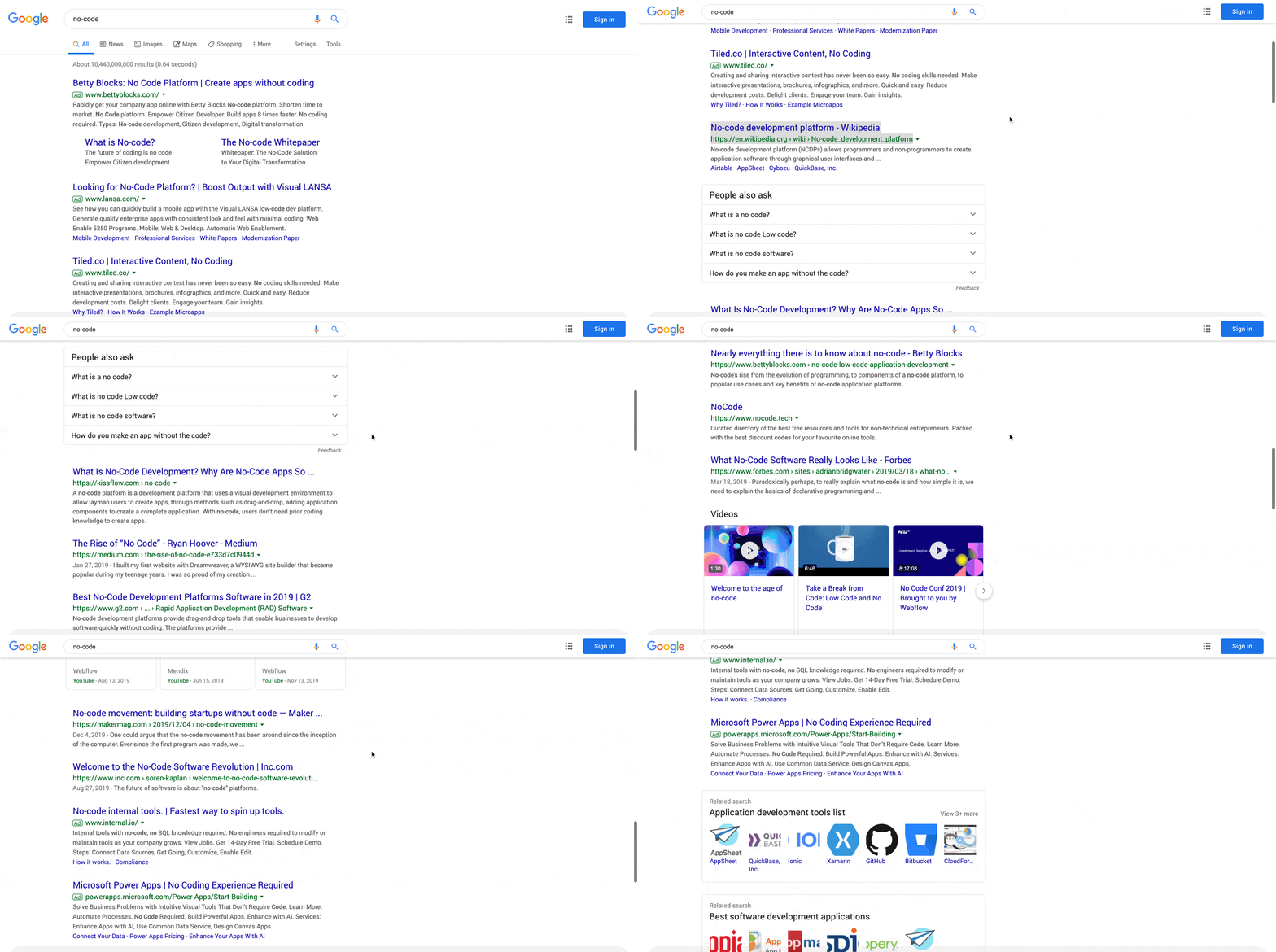
No big deal. Just over 10 billion results.
When it comes to democratizing the power of software, it's hard to think of an industry making more of an impact.
— Caleb Kaiser, Growth at AngelList
If you’re at all aware of Webflow, you know that we’re all-in on no code, a new way of thinking about web and software development that’s ditching the traditional coding paradigm, in which code can only “properly” be produced in a text editor, written by hand, in favor of a new visual modality.
The reasons for our enthusiasm for no code are many, but they’re ultimately driven by a desire to make coding accessible. Not simply so that “everyone can code,” of course, but so that everyone can enjoy the power to bring their ideas to life.
Instead of taking the coding bootcamp or early-childhood coding education route, we’re redesigning the very way that code is made.
In other words, we believe it’s time to refactor coding itself.
You don’t have to look far back in history to find analogous transformations. Just look back to the first graphical user interface (GUI) itself.
Before the first GUI, computing was keyboard-driven. The primary user interface (UI) was the terminal — a primitive text editor where computer users literally “told” the computer what to do through an arcane language of commands and responses. This interface model required a great deal of knowledge of its users, meaning that truly savvy computer users were few and far between. (And yes, those of you just returning from the Thanksgiving onslaught of IT support requests from computer-illiterate family members: it was worse back then.)
This also limited computers’ applicability to real-world problems. Sure, they sprang up in all sorts of high-knowledge environments, but they were anything but the ubiquitous engines of knowledge work they’ve become today.
Then came the mouse (along with almost a dozen other game-changing technologies), introduced in what’s now known as the “Mother of All Demos.”
As the demo’s Wikipedia web page puts it, this demo sparked the revolution that would transform computers from mere “number-crunching” tools into “communication and information retrieval” hubs. And while it would take years for this demo to turn into a functional reality, that reality is what made computers sufficiently accessible to a sufficiently large population to make them the definitive technology of the 20th (and now 21st) century.
No code now aims to take that sea-change a step further by empowering an even broader swath of people to not only use computers, but to build the software that makes computers so powerful, without coding it.
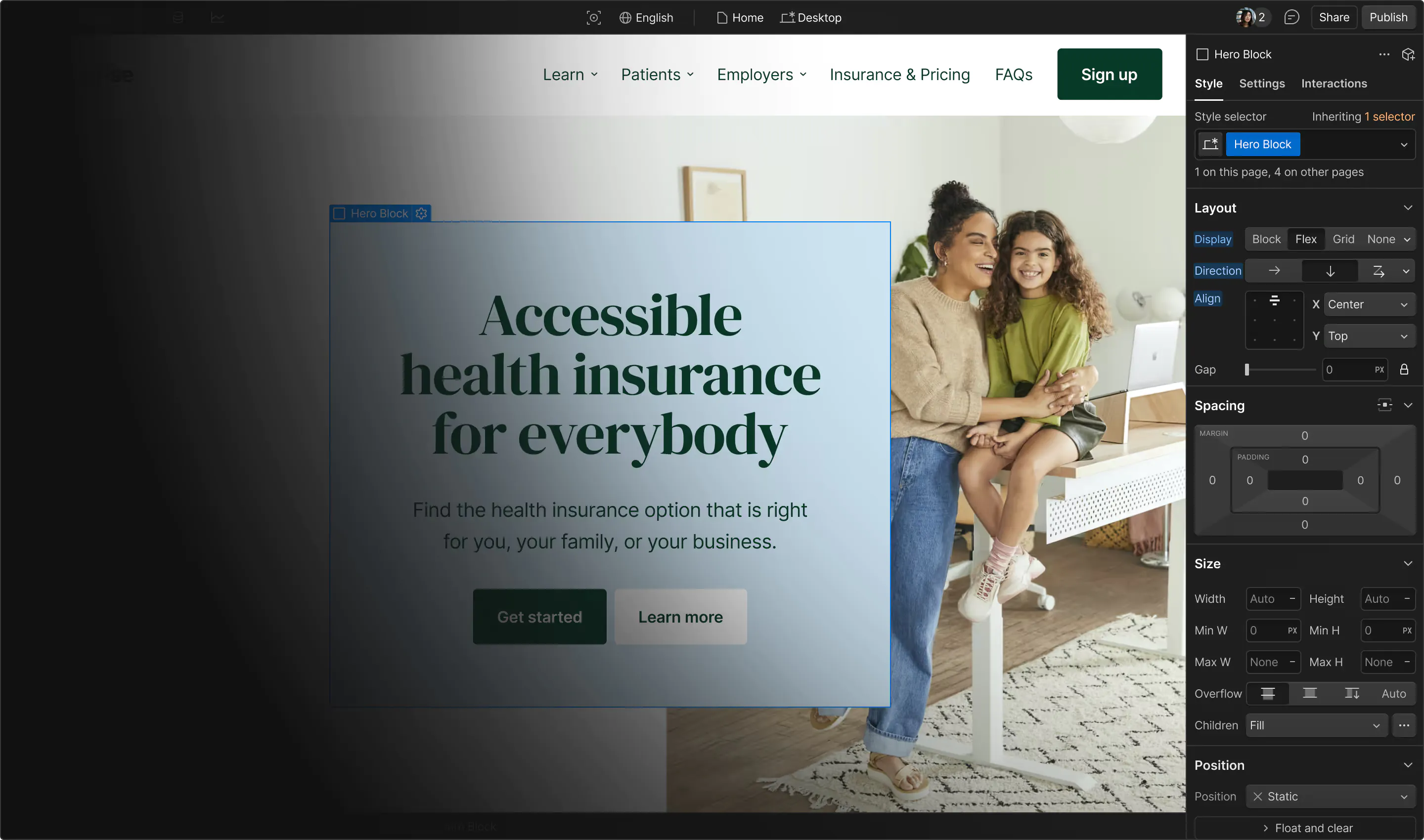
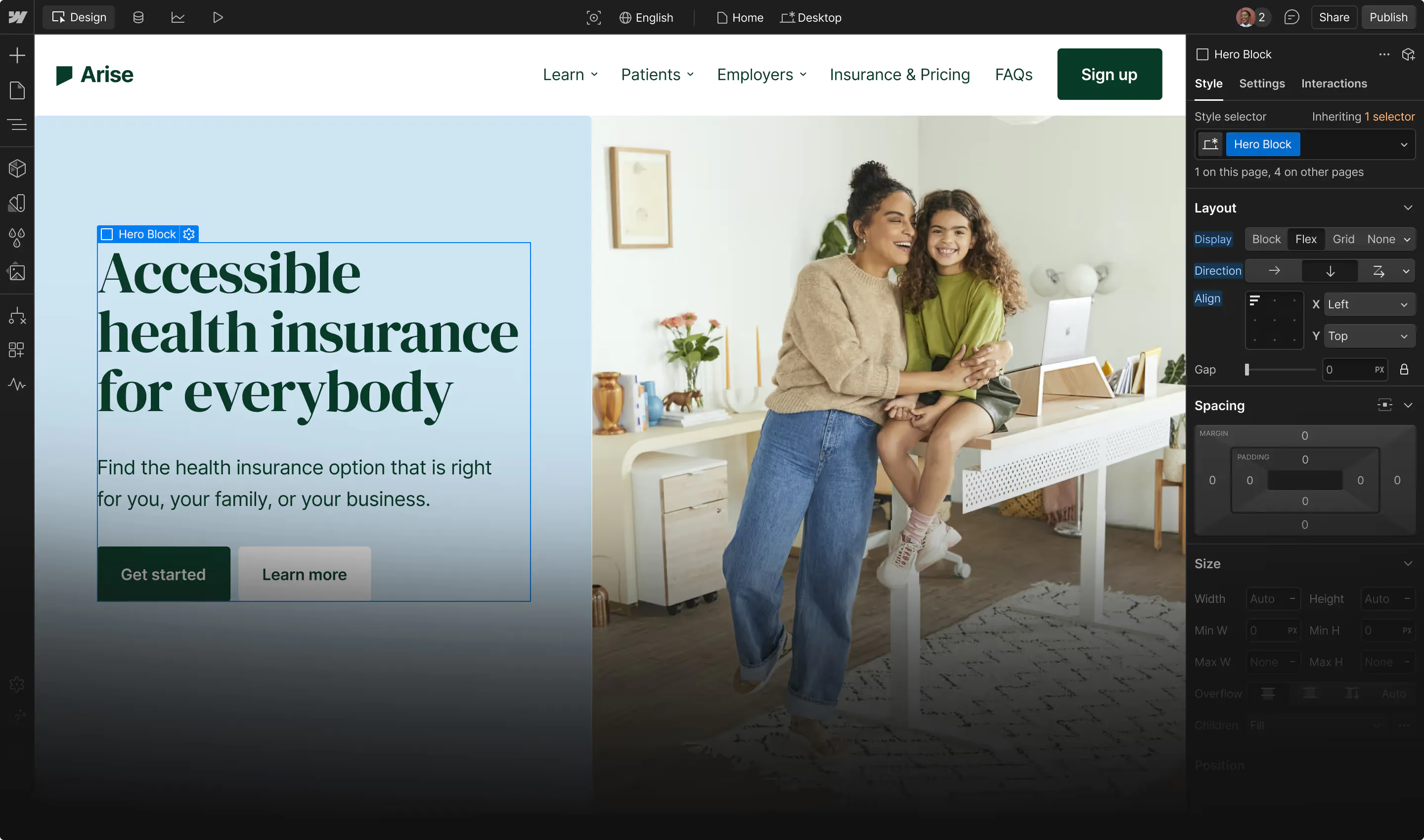
Today, Webflow occupies a particular niche of the no code movement, which we call “visual web development.” Since 2013, we’ve been relentlessly focused on making the primary tools of front-end web development — HTML, CSS, and JavaScript — dramatically more accessible to dramatically more people. And we’re proud to say that, here in late 2019, we’ve enabled thousands upon thousands of folks who would never have thought of themselves as web developers to build beautiful, powerful websites using technologies like CSS grid, JavaScript-controlled Lottie files, and semantic HTML5.
In 2015, we began to take that mission a step further with the launch of Webflow CMS, a GraphQL-powered database and publishing tool that gives designers and developers the power to create custom schema — then design around those data fields — visually.
Here in 2019, database management and publishing tools like Webflow CMS have become the core of all kinds of powerful web-based applications, and we couldn’t be more excited to lend our voice to the continued revolution that is no code.
Of course, we’re far from the only no code tool out there.






Design interactions and animations without code
Build complex interactions and animations without even looking at code.
6. The rise of the visual developer
Of course, technologies mean little without the human beings who use them.
And so, to parallel the wave of no code tooling comes the rise of the no code tool user, or, "visual developer."
Just as the desktop publishers who used tools like Microsoft Word/Publisher, Adobe InDesign, and other tools may have known little to everything about picas and PostScript, visual developers may be anything from code experts to pure novices — but they’ve learned to master the machines of translation that turn design decisions into functional code.

At the time of writing (December 16, 2019 — a slow time in hiring), 135 jobs mention Webflow. And we’re just one visual web development tool!
In doing so, they act as force multipliers to the traditionally trained coders who have built websites and apps for decades, and continue to do so. They automate tasks that used to take tedious hours of manual work. They transform static wireframes and mockups into fully functional web experiences that not only present content to visitors, but then take in visitor’s data, pipe it into email service providers and customer databases, and nurture them into leads and, ultimately, paying customers.
And most concretely, in modern web design workflows, they enable brand, growth, and marketing teams to move much, much faster. In one dramatic example, they turn the website update cycle from an 8-year process into an 8-minute one, as car-sharing startup Getaround’s Camille Esposito told us in her No Code Conf talk, “Taking back your website.”
As the no code landscape becomes more and more mature and powerful, we expect to see “visual developer” becoming as common a sight in job postings as “web developer” and “web designer” are now — and in the latter case, we can honestly see “visual developer” taking their place entirely.
7. Design has its seat at the table. Now what?
Ever heard the phrase “careful what you wish for”?
Design has been pushing for a so-called “seat at the table” — that is, a voice in higher-level decision-making at companies — for years now. And increasingly, we’re seeing that happen. At least, according to the zeitgeist. Every day, more and more articles suggest that design is the key differentiator at [insert hot startup name here]. Design-focused content seems to be gaining more and more prominence in popular culture, with documentary series like Abstract popping up in watercooler conversations almost as often as [insert whatever the kids are watching these days here]. Every time I grab a seat in a cafe, the word “UX” resounds around the room at least half a dozen times every hour — granted, I live in the heart of UX country, but still.
And yet, how much traction has design really gained in the top echelons of businesses? The question wells up in me every time I see another Facebook scandal grabbing headlines, or hear the latest on the Domino's accessibility lawsuit. I wonder about it every time the question or Uber or Airbnb’s impact on communities pops back up in the Twittersphere.
The thing is: it’s a false question. Design has always and already been at every table in “The Business.”
They just don’t call themselves designers. Or, in some cases, value the things we’ve come to expect designers to value. They aren’t necessarily fighting for users, or even trying to balance user goals and experience with business value. In many cases, the business value — i.e., shareholder gains — is what’s truly paramount in their minds.
Now, this isn’t meant as an excoriation of these folks. Without wading into the morass of ethics, I get why they’re focused on shareholder value, and why evocations of “freedom of speech” tend to crop up in their arguments (misplaced as they are).
It’s merely intended as a corrective. “Design” as such doesn’t need a previously unassigned seat at the table. What we’re often arguing for is instead a different view of design. A principled and conscious approach to the design of systems (i.e., businesses) that takes into account the myriad other systems each business impacts, from the political landscape to the local housing market.
So, to return to Amy’s point above: the thing to focus on while you’re fighting for your seat at the table is the development of your strategy for making use of that seat. And to my mind, a key starting point for the development of that strategy is the acknowledgement that design is very much happening at that seat. It’s up to you to, in the words of Mad Men’s Don Draper, change the conversation about design that’s already happening there.
Because, like it or not, everyone truly is a designer. (Yep!) But more on that in the next section.
Or course, as Maxim Leyzerovich notes here:
Design’s gaining of a seat at the table isn’t purely a one-sided affair. Both brands that want to give design a seat at the table and the designers who want to give it one need to be thinking about how design will thrive within an organization if it wants to attract and keep talent.
And, in confirmation of design’s potential to positively influence “from the table,” each of these things aren’t design-specific — they’re necessities for any modern org, which will shape perception of a brand for any professional, but also for the broader public.
So, if you’ve been fighting for a seat at the table, it’s past time to be asking yourself: What are you going to do with that seat?
Speaking with the voice of experience here: org design is an incredible — and fun — challenge. Working in the media of identities and careers is far more dynamic than pixels.
8. Role is not identity
Is everyone a designer? Yes, just as everyone is a writer.
(Trust me: I’m a professional writer. And the more I try to deny others that role, the higher my stress levels and the harder my work gets. The more I include other writers’ perspectives, regardless of their individual skill levels, the better my work tends to get. Though it sure does make line edits more complicated.)
The difference between you, titled designer, and any other person who designs without the title, is not one of kind, but of degree. Writing and design are skills, not identities, so “being” a writer or designer is more like occupying a spot on a spectrum. (A lot like gender, ya know?).
The difference is in skill level, primarily, but also in education and context. Just because we all design doesn't mean we're all good at it.
The important thing to realize, however, is that your role is not your identity. Not who you are. The claim that a writer, lawyer, or product manager designs shouldn’t feel like a threat to your identity not only because it’s simply a skill, but because it’s not your identity.
The problem with overidentifying with a skill — with considering it a part of your identity — is that your identity can then be threatened by all sorts of small attacks. Whenever your work is criticized, you become the subject of that criticism. Whenever a “non-designer” (or non-whatever) applies their skill better than you did, you were outdone not in skill, but in identity.
9. Okay, one visual trend: Marquee is back, baby!

And I know we’re all excited by excited by excited by that.
A vision for web design we can all (hopefully) get behind
When I read back over this post, I for one can’t help but feel a stirring of hope. Because these 9 new trends in web design suggest a future for website design that I can’t help but love.
A web design devoted to helping people understand what’s true and what isn’t. A web design for all, regardless of ability, or identity. A web design that’s inclusive of creators who do things a little differently — that is, code visually.
None of this is going to be easy. There will be pushback. There will be those who don’t want to sacrifice numbers for the sake of making principled stands.
