


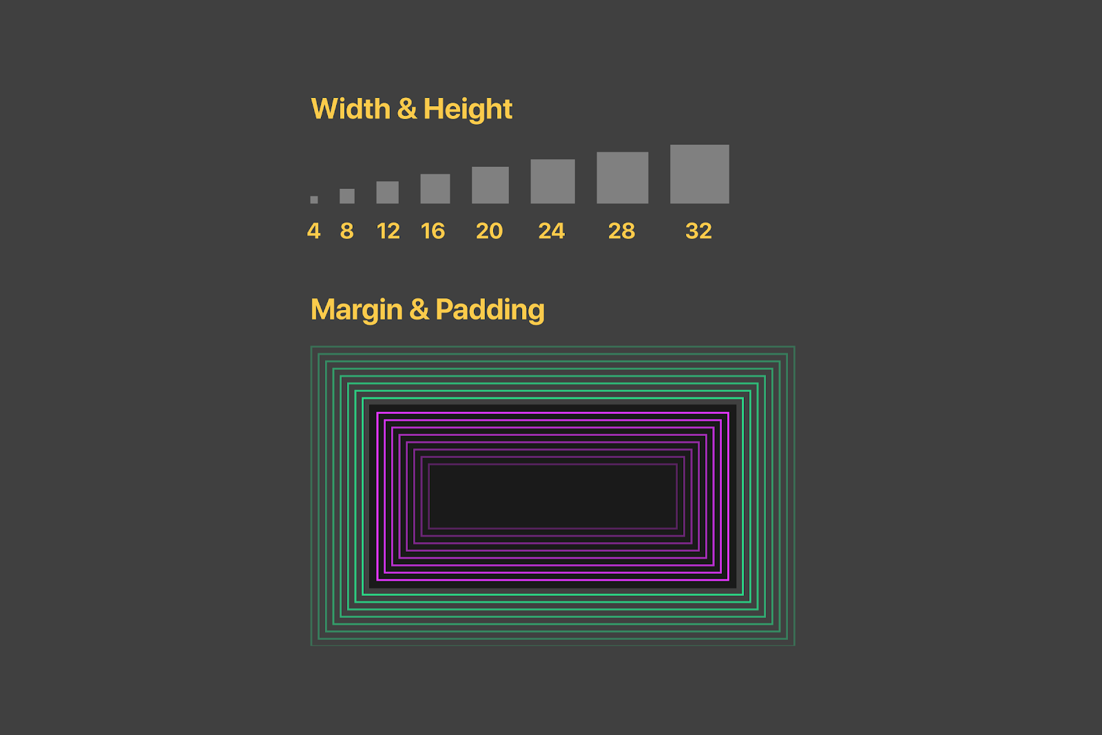
Over the last few quarters, the design and engineering teams at Webflow have been gradually adopting a more rigid layout grid based on a simple increment of 4. This has made our cross-team collaboration faster, simpler, and less error-prone.
At first glance, the 4pt grid sounds like a simple concept to implement: let’s just use values that can be divided by 4 everywhere!
In practice, adapting existing components is a complex, cross-team effort that takes planning and is anything but simple — especially when you’re also shipping new features.
Why 4pt? Spacing scales in the context of a design tool
As a designer working on websites and/or products, you’re probably familiar with the popular 8pt grid, so you might be asking: why 4?
Desktop design tools have fairly dense interfaces optimized for productivity and speed of use, and this is just as true for Webflow. With such a dense interface, an 8pt scale simply doesn’t provide enough granularity: even 4 is a value we use fairly often in the inspector.
We do use all values in the progression from 4 to 36, so our grid is definitely on the more granular end of the scale, especially compared to the 8pt grid you might see in many modern marketing websites, for example. Building denser interfaces requires the high level of fidelity provided by a more granular grid.
Choosing between pixel perfection and seamless cross-team work
Different teams implement layout grids in different ways. This tends to boil down to two types of teams, defined by what they value more: pixel perfection or seamless cross-team collaboration.
The first type aims to make their Sketch/Figma projects and the resulting front-end implementation be pixel-perfect duplicates. While we at Webflow value visual precision, we tend to pick our battles, favoring efficient collaboration over precision.
Borders and line height are two good examples of design elements that work differently between mediums. Do we calculate a 1px border as being within the 8px padding or not? Would the computed height be a multiple of 4? What ultimately matters for us is that both designers and developers use multiples of 4 in their respective tools and that everything looks good — without having to overlay production screenshots on top of the design team’s projects.
Going back to the original reason we decided to use a layout grid, our main goal has always been to establish a more flexible, less error-prone process for designing and building interfaces. If we had to account for 1px calculations everywhere we use borders to maintain optical consistency between mediums, the 4pt grid would no longer be an actual 4pt grid. We would have to use values like 7, 15, or 23, which is the opposite of intuitive.
Good designer experience + Good developer experience = Good UX
The goal for all of us at Webflow is to ship stellar tools without sacrificing polish, consistency, or speed. Every attempt to improve our internal experience must map directly to improvements for you.
In the case of the 4pt grid, it provides a better experience for our designers and developers, but also dramatically speeds things up at the intersection of those disciplines, bringing them closer together via a shared grid and scale. This allows us to ship new features faster, without compromising consistency. Instead, we’re reducing the complexity of our design system at the root level, leading to more consistent interfaces shipped without extra effort.
Aiming for consistent vertical rhythm across the whole box model
Using a layout grid is ultimately most useful when the values it provides are used across the box model. Every value should be divisible by 4, including margins, paddings, and line heights. The exceptions are font size and actual glyph size within icons, but those components are still contained within wrappers that match the grid.
As you might expect, when the whole interface is calculated using a single core value, things start to align auto-magically. The margins for a vertical misalignment are strongly limited due to the narrow set of variables we’re using. Another reason to use 4pt and 8pt grids is that most modern display and monitor resolutions are divisible by 4 or 8, both horizontally and vertically.


Design interactions and animations without code
Build complex interactions and animations without even looking at code.
Inspecting UI with the naked eye
Layout scales make UI decisions easier to understand visually without having to rely on additional tools like the browser’s inspector or a Figma project. This is even easier when using a less granular grid, but with time, both engineers and designers develop a better intuition about it. Building new components gets dramatically faster when everyone relies on shared values stored in the theme provider.
Communicating layout updates is also much faster. Say a certain margin looks too tight. We don’t have to know the actual values to leave feedback — we can just suggest trying the next value in our spacing scale.
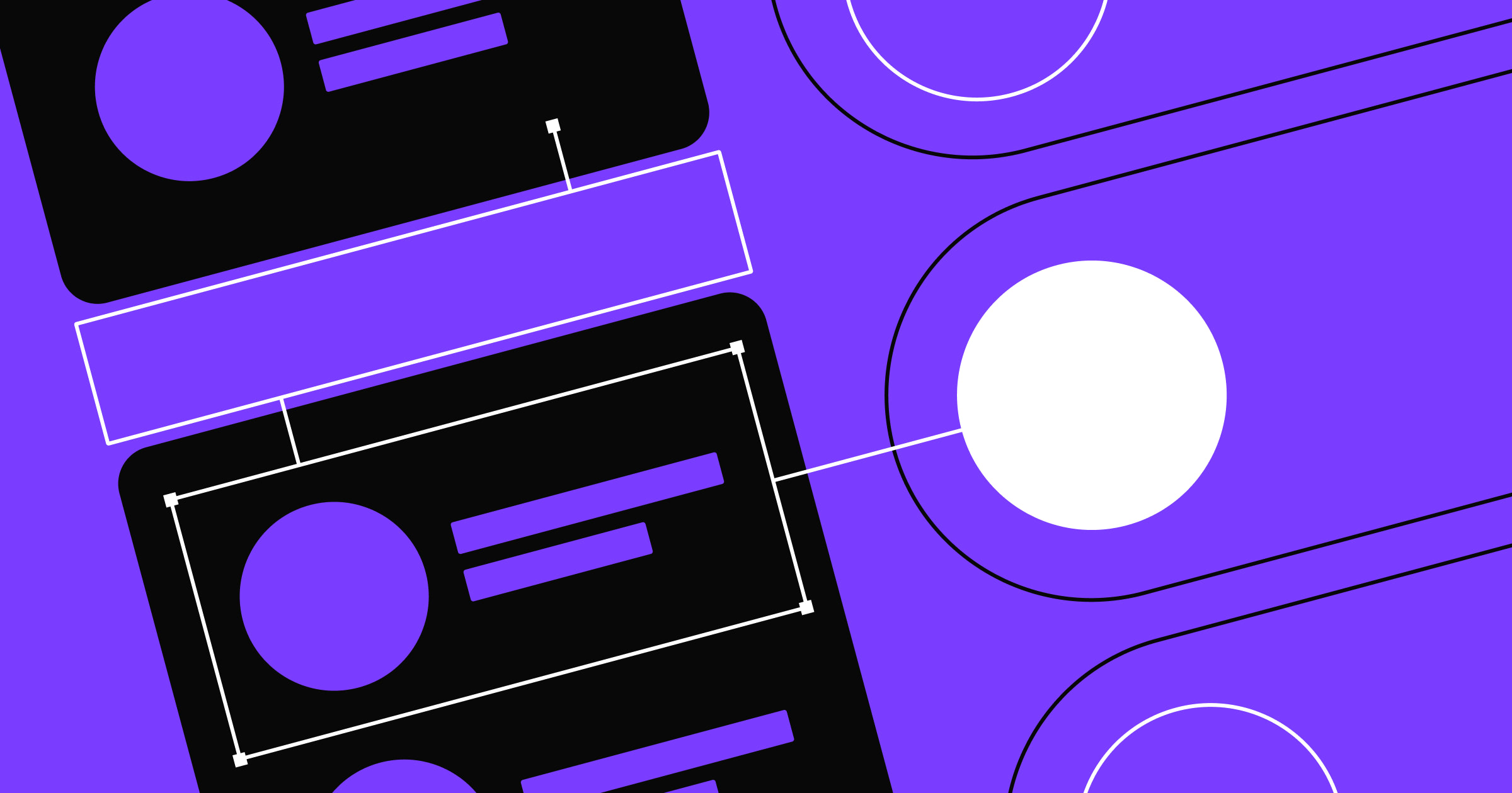
Appreciating the magic root value
.png)
At the heart of every layout grid is the core unit, used to calculate everything else. Having a design system that’s entirely based on the core unit allows for seamless scaling of the whole interface through theming.
In certain parts of the Editor, for instance, we’re reusing components from the Designer. But the Editor theme replaces the core variables with 6px, so the whole interface becomes larger and more spacious while maintaining the same relative values and relationship between components.
This architecture has numerous benefits, including the opportunity to build interfaces with variable font sizes. Those are specifically useful in the context of accessibility and something many native apps support, standing on the shoulders of OS-level accessibility frameworks.
Breaking the grid: when to do it
Like any other design principle, we should follow the grid religiously — until it stops helping and starts getting in the way. The overall number of exceptions in our latest interfaces is minimal. Centering elements vertically, for instance, could result in 6px gaps. We also use non-standard padding for pills to achieve a more natural shape.
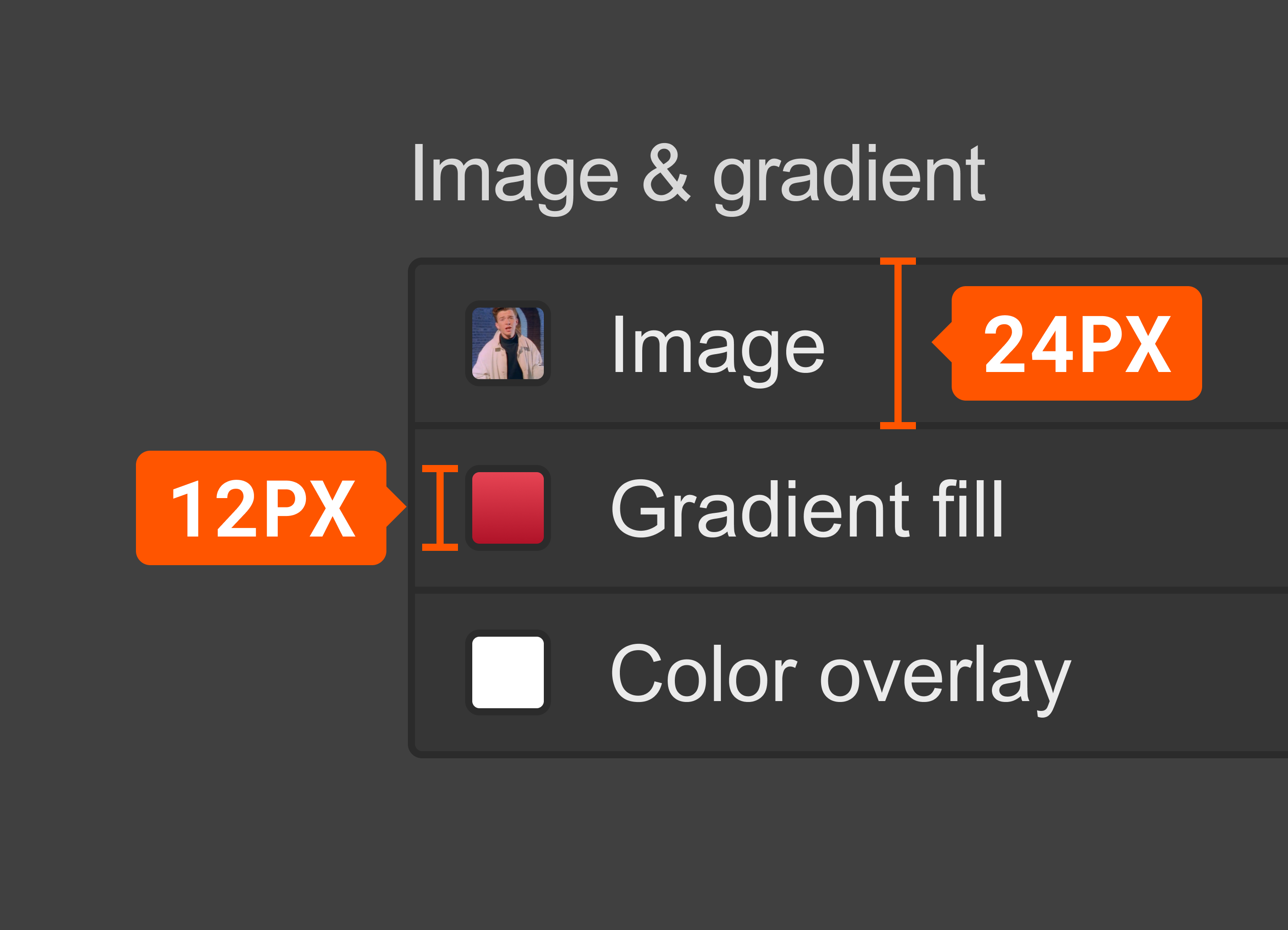
Here’s a more in-depth example: vertically aligning a 12px x 12px swatch and checkbox to a 24px property list item results in 6px spacing on the top and bottom. But this makes perfect sense and doesn’t break anything for either team members or users. Making exceptions like this is more than okay.
Moving forward
Instead of rebuilding our whole interface to match the new 4pt grid, we’re adapting and phasing out old components as we go. This proves to be a more realistic process that’s easier to manage and divide into smaller projects. The pilot project for the 4pt grid is the new style panel, but look forward for this trend to continue with Webflow Ecommerce and other exciting things we’re cooking up.