Small businesses are incredibly diverse — and this diversity reveals itself in their websites. These small business website examples will help you kick-start the design process.
Many small business owners start by publicizing their products and services through small social media campaigns or through a link in their Instagram bio. But when it comes to setting up a website, they often call in extra help to make it happen.
For most web designers, working with small business owners is incredibly rewarding. It can be a chance to exercise creative freedom, help a brand grow, and even develop new style guides and design systems. It’s also an opportunity to develop the business’s brand from the ground up and create a user experience completely tailored to the needs of the business and its clientele.
While some clients will know exactly what they want, others may not be very familiar with web design and may need you to explain the limitations you’re working with or raise possibilities they haven’t thought of. Aim to tailor your process, as well as your site design, to each client’s needs. You can use this list of 15 small business websites to spark inspiration or to show clients what’s possible for their site.
Why is website design for small business important?
A dedicated website gives small businesses an online home and serves as an important hub for marketing efforts. The benefits of a website include:
- Communicating better with existing and potential customers. A website allows businesses to gather important information in one place — it becomes a single point of contact where people can find out about the business’s location, opening hours, products or services, and contact options.
- Increasing reach and brand awareness. Offline and social media marketing campaigns only reach people who get the flyers in the mail or use the platforms the small business advertises on. A website opens the business to anyone in the area, or even the world, searching for that product or service. A website can also build brand recognition and awareness through content designed for search engine optimization (SEO). Most prospective customers don’t buy anything until they’ve already had several interactions with a brand, so creating content that appears high in people’s search results will push them one step closer to buying.
- Building credibility. Investing in a professional website builds credibility and fosters trust with potential customers. Sixty-two percent of people see the lack of an online presence as a warning sign and deliberately steer clear of businesses if they can’t find information about them online.
- Increasing independence. Advertising solely on social media platforms means that these platforms are essentially in control of the types of content a business can publish and the number of people who encounter it. Having a website creates an independent platform where small businesses can engage visitors in a way that’s tailored to the business’s needs rather than the needs of another platform.
- Selling products and services directly to online consumers. A simple ecommerce site allows a business to sell and ship nationally and internationally. Services like consulting, graphic design, teaching, and digital marketing are an excellent fit for online sales.
- Offering online booking and ordering capabilities. A website with an online booking system encourages more bookings by streamlining reservations, reducing reliance on calls or emails.
15 small business web design examples
Small business web design is rewarding and a lot of fun. You’ll build the website — and sometimes even the brand — from the ground up. Here are some of beautiful small business websites we’ve found online. We hope they’ll inspire your creativity to make a website for a small business.
1. The People vs. Coffee

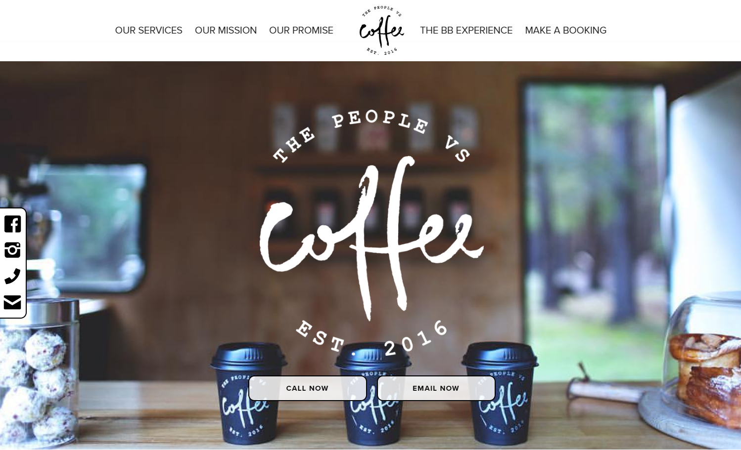
The People vs. Coffee is a mobile pop-up cafe in Adelaide, Australia. Designer Shaun Lonergan’s hero image of three to-go coffee cups and baked goods on a counter shows the cafe from the perspective of a customer waiting to order, immediately making visitors feel welcome. Small animations and interactions throughout this one-page site make for a fun user experience and reinforce the cafe’s casual vibe.
To keep the cafe’s social media and contact details at visitors’ fingertips as they scroll through the site, Shaun uses a sticky sidebar showing a black-and-white icon set that matches the site’s color scheme.
Shaun has made this page available to clone for free in Webflow, so you can use it as a starting point for any one-page small business site.
2. Surftwins Essaouira

Essaouira-based Moroccan Surftwins Mouhssin and Yassin offer surf lessons and holidays to international visitors. Designed by Marta Kawecka, their website shows how thoughtful attention to visuals can take a site to the next level. Marta highlights the beautiful location with a sun-kissed blue, gold, and white color palette that matches Essaouira’s water, sand, and whitecaps. Marta also chooses a background pattern based on traditional Moroccan tiles to further evoke the business’s stunning locale.
Marta’s attention to visuals also shows in rough hand-drawn icons and illustrations, plus a short video that shows clips of Essaouira’s vibrant Medina and the twins smiling as they run classes on the beach.
3. Bones Co.

Husband-and-wife design team Bones Co. have plenty of personality, and they’re not afraid to show it on their website. A play on the pair’s spooky business name runs throughout the site, including an illustration of them pretending to be ghosts and a tombstone-shaped favicon.
One of the best ways of marketing a service is by highlighting the people that make the business tick. That means about us pages are key. But Bones Co. takes theirs to the next level by talking about their clients and themselves. They say they want to learn about their clients’ stories, purpose, and beliefs, adding: “Together, we’ll find ways to create engagement and earn trust while always sticking to your truth.”
4. RISE Athlete

The RISE Athlete website — a fitness site designed by Catch Digital Inc. — packs a lot of information onto the landing page: a navigation bar with nine items, a background image of a personal trainer working with a client, all-caps hero text that reads “Your new home for functional fitness,” an intro to the business, and two CTA buttons. But clever use of negative space and typological choices favoring readability balances the page instead of cluttering it.
Paired CTA buttons throughout the website target visitors at different sales funnel stages: The white ones are for people with intent to purchase, while the dark ones are for those still in the discovery and evaluation stages.
5. Standard Bots

The Standard Bots website is a fantastic example of what professional photography can do for a small business page. This robotics startup’s site features stunning photos of the business’s core product, a robotic arm, against a collection of beautifully arranged black, white, and gray backgrounds. The dark orange CTAs match the thin copper-colored bands on the robot, which means the CTAs harmonize with the images while drawing attention through their contrast with the grayscale color scheme.
This site includes a table comparing the Standard Bots product to its closest competitors. This kind of table is an excellent idea for pricier products, especially new ones competing with more well-known alternatives.
6. Nomadic Road

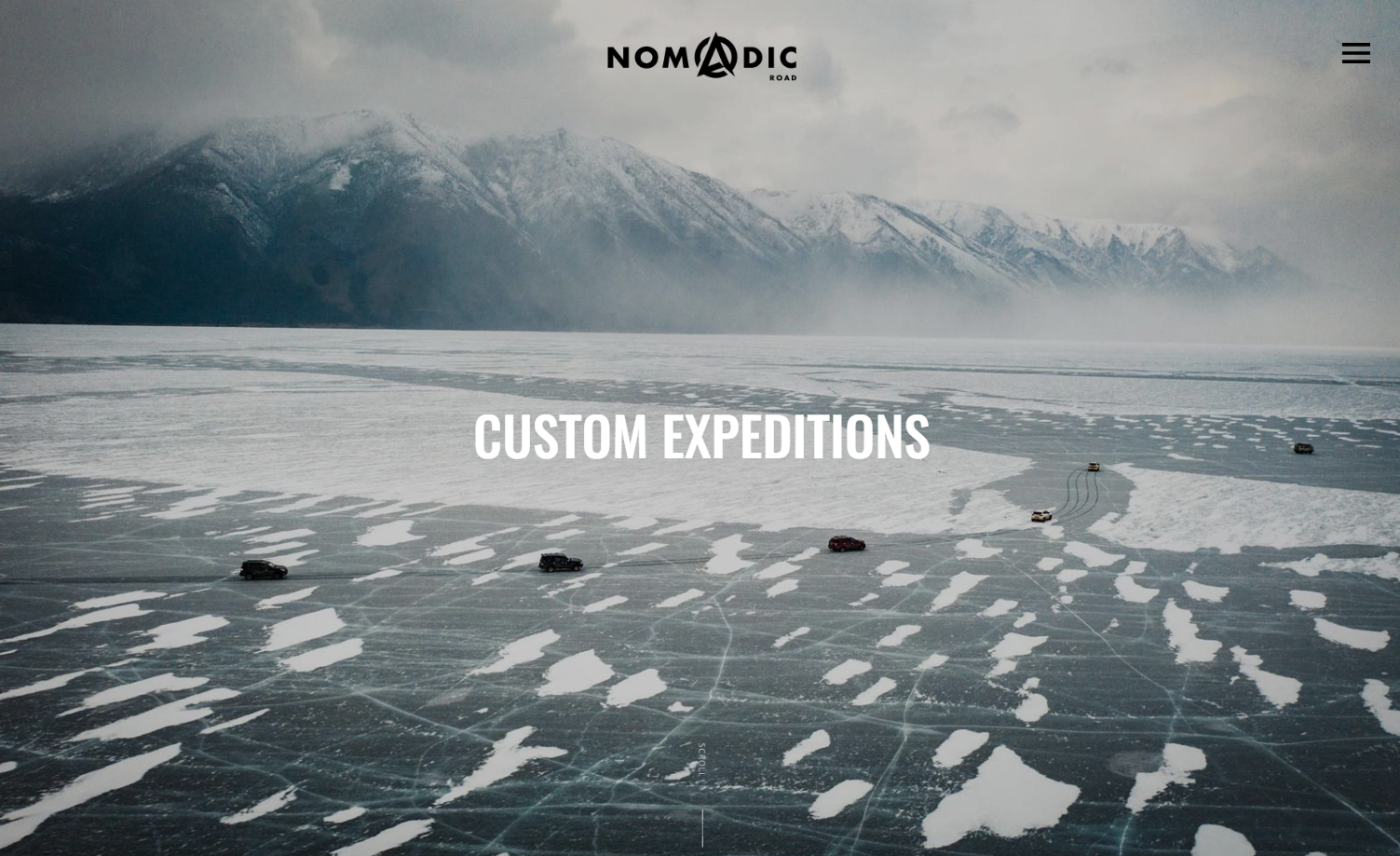
The Standard Bots site explored above uses high-quality photos to sell their product, and you can do the same to market a service. In this minimalist website for overland motoring adventure business Nomadic Road, designer Guillaume Brunon combines long shots of the offroad vehicles taken from the air and close-up pictures of desert tire changes and sand traps. This juxtaposition of majestic big-picture photos and breathtaking experiences perfectly aligns with the company’s ethos of crafting memorable narratives for their clients to share in the future.
7. Bring on Monday

New Zealand accounting firm Bring on Monday differentiates itself from other accounting firms by focusing on the human side of accounting. Bring on Monday’s casual, friendly branding shows up in different ways throughout this Made Studio site, resulting in a unique and internally coherent user experience.
Down-to-earth copy — like the “Say hey” microcopy on the contact form link — combines with bright colors, natural photos, and offbeat animations in this site to demonstrate what separates Bring on Monday from slick corporate accounting firms: their understanding of client relationships as friendships.


Launch with Webflow Templates
Choose from hundreds of professionally designed website templates for any industry or style. Customize visually, launch instantly — no coding required.
8. Serenity in Leadership

Small businesses that want to appear at the top of Google search results need a search engine optimization (SEO) strategy. One part of a strong SEO strategy is using keywords to show search engines what the site is about, and maintaining a regularly updated blog helps you do just that. Leadership consulting firm Serenity in Leadership’s page, designed by Jez Dant, includes a frequently updated blog informing potential clients about their offerings while improving the company’s search rankings.
9. Hair by Taylor Ross

On hairstylist Taylor Ross’s small business site, designer Raymmar Tirado uses a reveal-on-hover effect to showcase Taylor’s services in a compact space: Hovering over each description (or tapping, for mobile visitors) reveals a picture of the service and its price. This is an excellent space-saving idea for small businesses that offer a lot of services. As an extra benefit, it also makes the site more user-friendly, as visitors don’t have to click between different webpages as they browse their styling options.
10. Terlingua Real Estate

Design and marketing firm Teel Group welcomes visitors to West Texas and Terlingua Real Estate with a loading animation of a Lone Star and then a full-page background video showing an aerial view of rural West Texas. This opening evokes the vast feeling of the local landscape — which is especially effective for a real estate firm specializing in selling rural lots. The choice to leave a lot of negative space around the text and CTAs “above the fold” (visible to viewers without scrolling down the page) further reinforces the theme of wide-open spaces.
11. Good Garms

Sustainable clothing online store Good Garms offers a range of browsing options on its user-friendly ecommerce website. Potential customers can search by category, brand, material, gender, or sustainability type (fair-trade, organic, or recycled), giving them granular control over their shopping experience. The product pages include comprehensive information about each clothing item, including the fabric type, place of production, and reviews from other customers.
Designer Bryn Taylor gives site visitors a peek behind the scenes by including a style guide page complete with colors, button styles, and header tags — a great resource if you’re interested in creating a small business website that looks like this one.
12. Bar Forty-Five

Most small businesses have a lot of personality. Color choices and layout can communicate broad aspects of a business’s personality and style, but typography can communicate nuances in personality, industry, and style in a split second. While legibility should always be the priority in body text, feel free to experiment in headings with distinctive display fonts. For example, consider using an all-caps, handwriting, or graffiti font to represent an important theme, evoke a key era, or express the brand identity.
The typography speaks volumes on designer Janis Oppliger’s site for Bar Forty-Five, a restaurant and bar in Solothurn, Switzerland. Janis uses a contrasting font pair to give the site a classy retro look while prioritizing readability by combining Abril Fatface, a distinctive font inspired by 19th-century Europe, with the highly legible sans-serif Montserrat.
13. South Coast Canteen

Fergus Brown’s website for the South Coast Canteen is another example of creative typographic design. Fergus combines a ridged black background texture with the Pantograph font to create a digital version of an old-fashioned menu board. This adds a fun, nostalgic element to the site that builds an emotional connection with visitors.
14. Chicago CryoSpa

Prism Design Studio’s website for the Chicago CryoSpa combines a sharp high-tech look with ingenious and creative design choices. The site’s custom preloader mimics plummeting temperatures, counting down to -240 degrees Fahrenheit as the site loads. The homepage showcases the experience customers are curious about with a background image of a smiling person inside the cryogenic therapy chamber. Then a video layered over the top of the background image simulates the liquid nitrogen used in the spa’s therapy services.
This site’s homepage is a great example of conversion-centered design principles. The two CTAs are large and shown in contrasting colors, attracting attention. The billowing steam enters at the bottom right-hand corner of the screen and moves toward the headline and CTA buttons, drawing visitors’ eyes in this direction.
15. Custom Jewelry Design

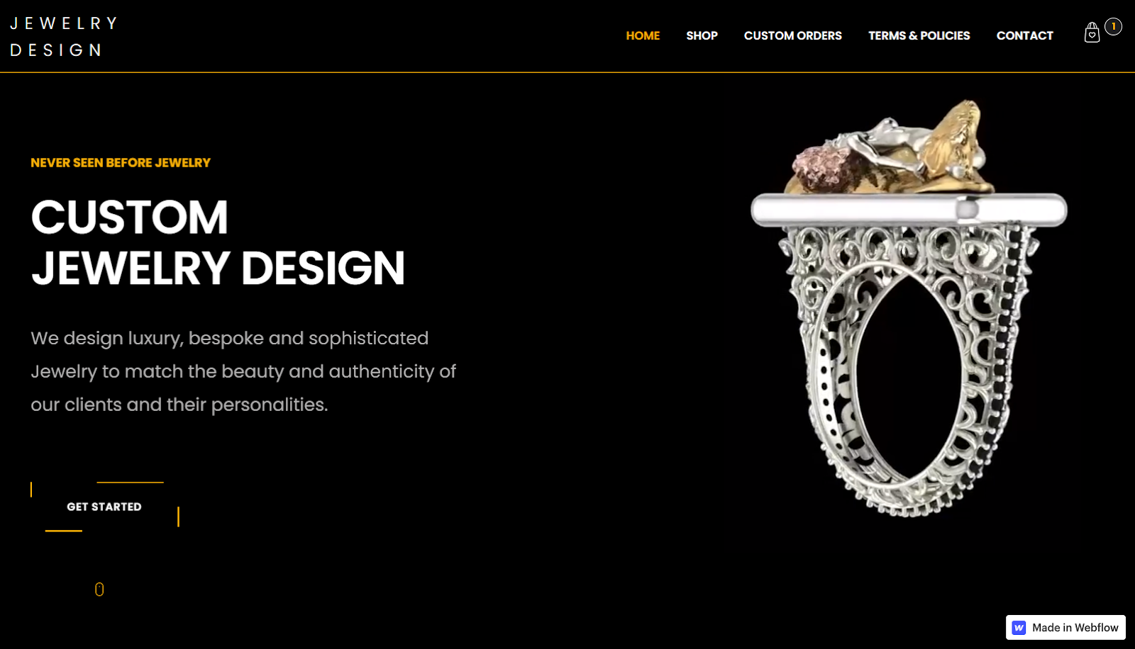
The white, black, and gold color scheme of Sasha B’s Custom Jewelry Design site shows off this small business’s distinctive offerings to perfection. Sasha allows site visitors to scrutinize the tiny details on key pieces of work through animations that show the piece revolving slowly against a black background. Prospective customers can scroll down to a photo gallery that shows a close-up of each available piece that’s linked to a product description page where they can find out more details and add the product to their shopping carts.
Help small businesses hit the big time with a Webflow website
Small business websites capture the unique personality of their business while usually following a fairly standard structure: landing page, about us page, product or service details, and contact details. When the website’s complete, the business owner can use it as a digital hub to market the small business.
Webflow can streamline the whole process and help you create a beautiful website without coding. And if you’re pressed for time or want to work with a pre-built site structure, browse our small business website templates to find designs that you can adapt to fit the project’s needs.
To find out more about how to use typography, color, and layout to communicate the business’s offerings, head over to Webflow University to explore our learning games, tutorials, and dedicated courses.

Get started for free
Create custom, scalable websites — without writing code. Start building in Webflow.


