When used effectively, background videos can grab site visitors’ attention and pull them into an immersive experience.
Background videos can be an engaging addition to a website design. But when executed poorly, they could frustrate visitors and cause them to leave the site.
Whether it’s a personal portfolio, an ecommerce store, or a blog, background videos can encourage visitors to engage with the website’s content. However, videos can also be distracting or even cause harm. When building motion into your design, it’s crucial to keep accessibility concerns in mind.
In this guide, we explore websites with some of the best examples of background videos and share tips and tricks to elevate the use of background videos in your designs.
4 examples of websites with background videos
The best websites with video backgrounds captivate viewers without detracting from the site's main content. Their primary function is to keep visitors engaged and present while complementing the site’s other elements.
A great way to learn how to use background videos to your advantage is to see this design element in action. Here are five examples of websites that use website video backgrounds to great effect.
Photosensitivity warning: The following websites use motion upon load.
1. OSCO Studios

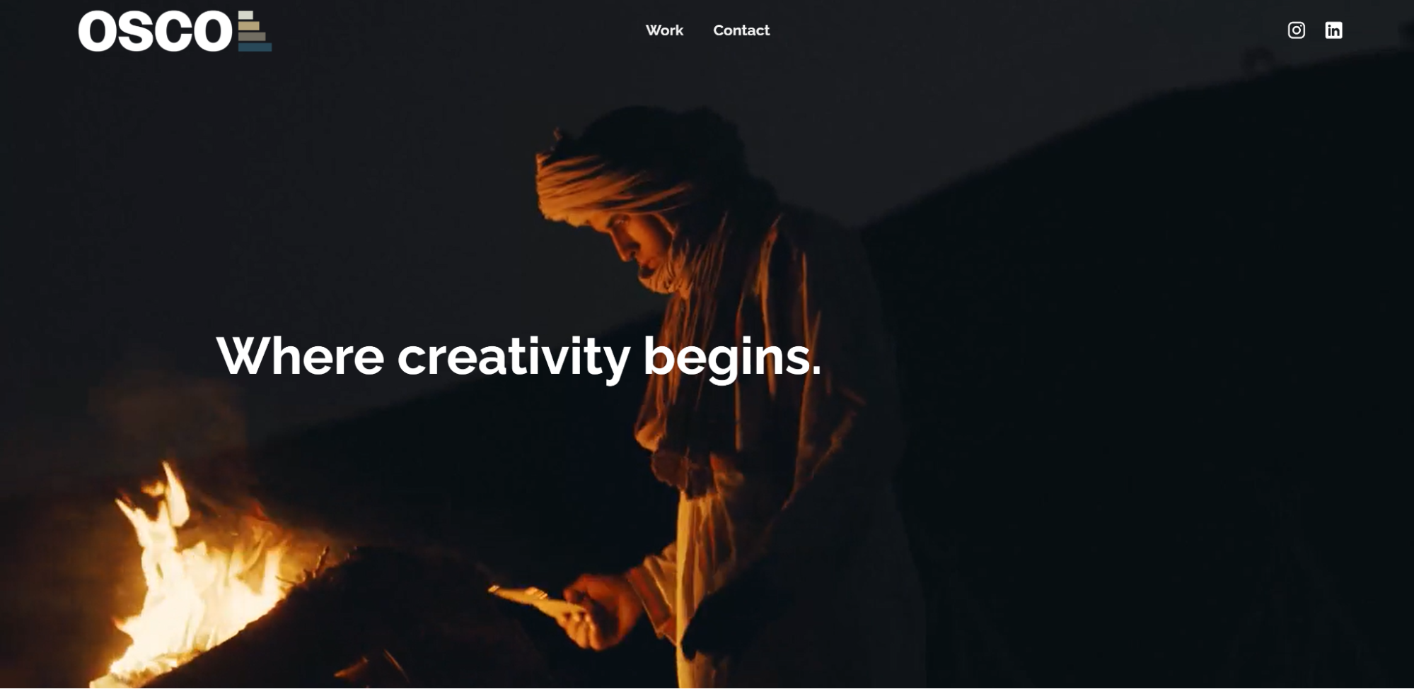
OSCO Studio is a creative agency specializing in content and strategy. The brand’s landing page is a fullscreen background video with minimal text and a transparent navigation bar at the top of the page.
The seamless video loop displays footage from the agency’s visual advertising work— a wide range of shots from beaches and blue skies to mountains and sportscars — behind previous client logos and calls-to-action (CTAs) like “get in touch.” OSCO Studio’s use of background video puts their versatility and ability to create world-leading video and photographic content on display so potential customers know they can expect stunning results.
2. The Royal by Seed Mobile

The Royal is a phone released by Seed Mobile, and this website showcases the product with background video clips of the device.
Site visitors are greeted by slow-motion, high-quality video of the phone and its features behind text reading “THE SEED ROYAL UNVEILED.” The video uses a black background with green accents to match Seed’s branding and plays on a seamless loop.
The background video’s graphics pique curiosity in the Royal without detracting from the site’s other elements, including a unique 3D interactive model of the product.
3. Milk Truck films

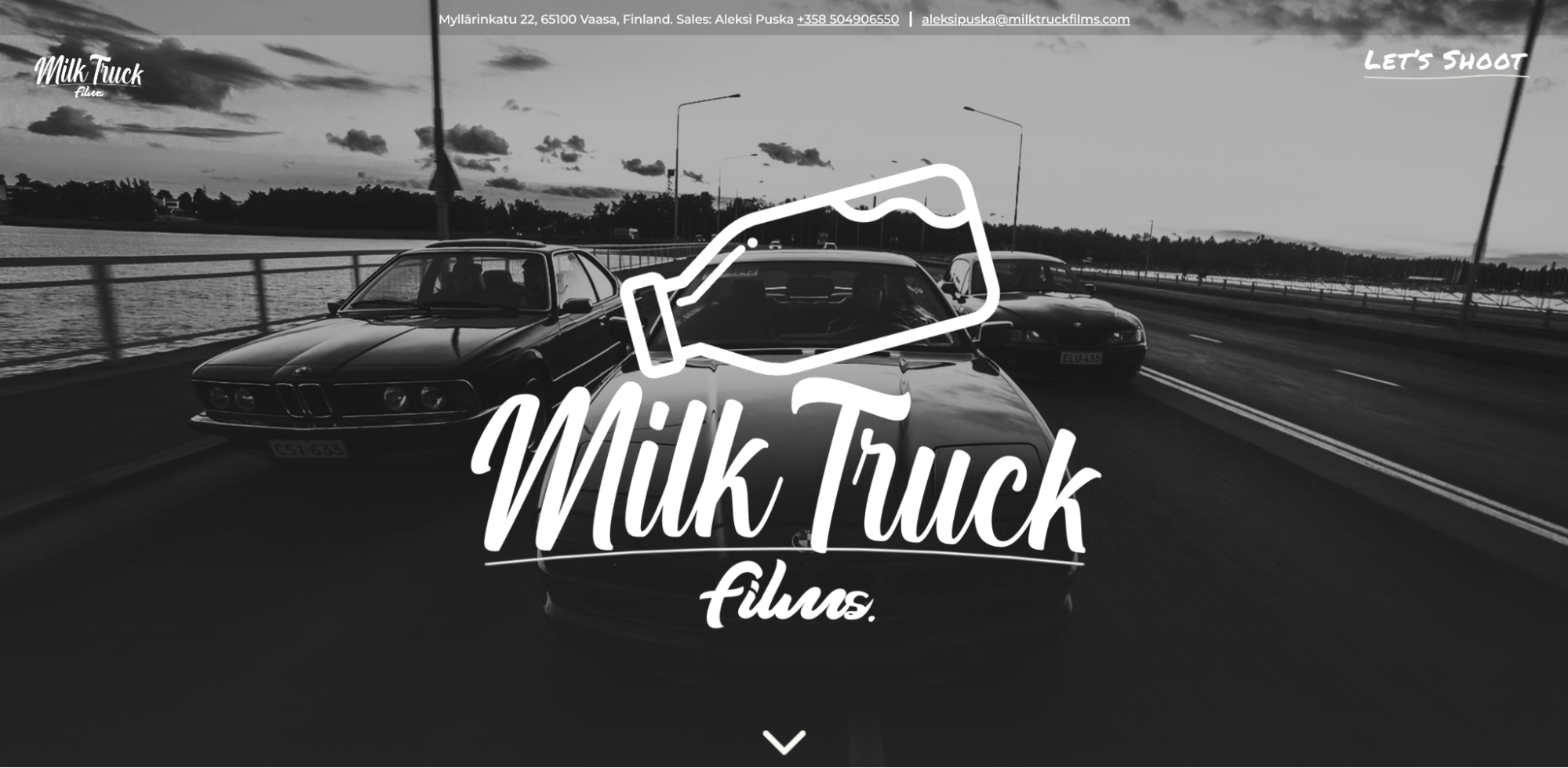
Milk Truck films is a Finland-based videography company created by Jacob Nordblad and Aleksi Puska. On the homepage, visitors are met with a static screen featuring the company name and an arrow pointing down, enticing you to scroll. As you move down the page, video clips from various projects play on a loop.
Milk Truck uses background video to show off their videography skills but also offers plenty of static content to avoid overwhelming site visitors.
4. Austin Gomez

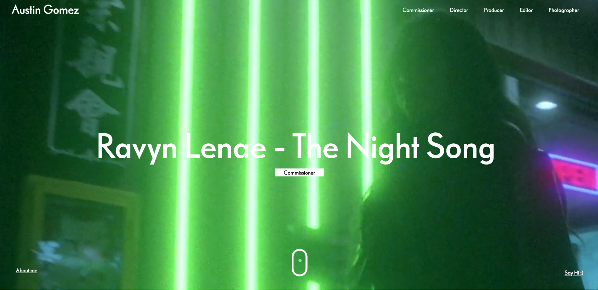
As soon as you land on Austin Gomez’s website, it’s clear that the site is all about music. Austin works with artists to create music videos and uses multiple background videos to show off his portfolio.
The immediate landing page uses a looping video, but scrolling further down reveals a grid of music videos with animated backgrounds and bright colors. Some videos use motion backgrounds to create a bokeh (blurry) effect, while others are sharp and detailed. Each video on the grid uses a black overlay to highlight the white text to mute the motion design and ensure the text is visible.
Austin’s website is an excellent example of a personal portfolio with background videos showing his signature style. Visitors can scroll through a digital resume while clips from his work show his portfolio in the background.


Get started for free
Create custom, scalable websites — without writing code. Start building in Webflow.
3 places to find free stock background videos
Given that background videos should function to complement a brand’s narrative and identity, a video tailor-made for your site will tell the most compelling story. However, custom videos aren’t always an option.
Production timelines and costs may make producing an original video out of the question. The good news is that a stock video can still send the right message — and plenty are available for free.
Here are a few places to find free background videos for your site:
- Coverr: Coverr offers a range of free stock videos. They add new videos every week, so the collection stays fresh. Categories include food, tech, animals, and nature.
- Vimeo: While Vimeo isn’t itself a vendor for background videos, many community members distribute free stock footage through the platform. It’ll take some searching to find just what you’re looking for, but you never know when you might strike gold.
- Pexels Videos: Pexels is a great platform for free stock photos, so it should come as no surprise that they offer a video collection. The most useful aspect of this resource is the granularity of categories to choose from: For example, instead of wading through all that “Nature” has to offer, you can skip straight to “Trees.”
Recommendations for your background videos
Adding a background video could elevate your site — but it’s important to make informed design choices. Here are some tips to guide you.
Provide options to pause videos. Excessive motion can be harmful to site visitors with vestibular disorders, epilepsy, photosensitivity, ADHD, and motion sickness. Include a play/pause button on videos so visitors who do not want excessive motion can still enjoy your website.
Minimize the file size. Videos with full HD or 4K quality make for large files that impact loading speeds. The larger the size, the slower your web page will load, which can drive visitors back to the search results to find a faster-loading page. To tackle this issue, use websites like Clipchamp and HandBrake to compress videos.
Use gifs for mobile. Gif stands for Graphics Interchange Format. They’re short, looping image files that primarily exist on social media, but you can use them for your website instead of videos to save on file space.
Gifs are also better optimized for mobile devices than videos. Some GIFs are quite large, so it’s best to use a dedicated compressor like Imgur, GIPHY, or Ezgif to reduce the file size before uploading.
Choose relevant videos. Don't use the first aesthetically pleasing video you find without considering its relevance.
Background videos must be appropriate for your website and tailored to the products and services. If you’re selling a specific product, it’s best to source custom footage from a videographer that highlights the exact branded item. However, if you don’t have the resources, you can choose tangential stock footage that complements your product. For example, a company selling camping equipment could use a video of a forest to create a sense of nature within the site. The same strategy can be applied to businesses that sell a service — footage of a forest could just as easily be applied to a site for guided tours of local trails.
Remember: videos of a product aren't always enough — they must be marketed in a way that sends a message to the visitor and entices them to make a purchase.
An interior designer's website doesn’t show videos of a house's renovation process with broken-down walls and scattered debris. Instead, background videos might cover a residence after renovation with footage of a family smiling and enjoying their new home, communicating to viewers that they too can find joy in the designer’s services.
Use shorter videos. Short videos reduce file sizes and improve loading speeds. Looping a short clip to create the impression of a longer video keeps graphics engaging without leading to buffering.
Don’t use distracting videos. Background videos aren’t meant to be the center of attention — they’re in the background for a reason. They should complement foreground images without distracting from the primary content.
Don’t use videos with sound. Avoid background videos that blast sound through a laptop or phone speaker the moment a visitor opens the site. A potential customer could immediately close the tab and head off to a competitor site with less jarring web design.
Skip the sound and articulate stories through visuals. If sound or music is an essential part of the user experience, ensure it’s on mute by default and include a button in the corner to let visitors switch background music on and off.
Find more inspiration with Webflow
Using the right themes, colors, and looping effects in background images can add life to a design. But keep in mind that autoplaying video without an easy-to-find option to pause is one of the top 10 reasons people leave a website. With Webflow, you can enable a play/pause button on all videos by default.
For more guidance on using background videos in your designs, check out the Webflow University background styles lesson.

Ultimate web design
From 101 to advanced, learn how to build sites in Webflow with over 100 lessons — including the basics of HTML and CSS.


