

Most of us love the shiny simplicity of the Apple Store, but imagine staff replaced by mimes and white walls splashed with contrasting paint colors. How fun and/or terrifying and would that be? Whatever it made you feel, you sure wouldn’t forget your visit. This is Brutalist design — it ignores conventions of standard design and strips things down to create a memorable experience. Brutalism is in the eye of the beholder, but we think these 10 sites are a nice departure from the norm.
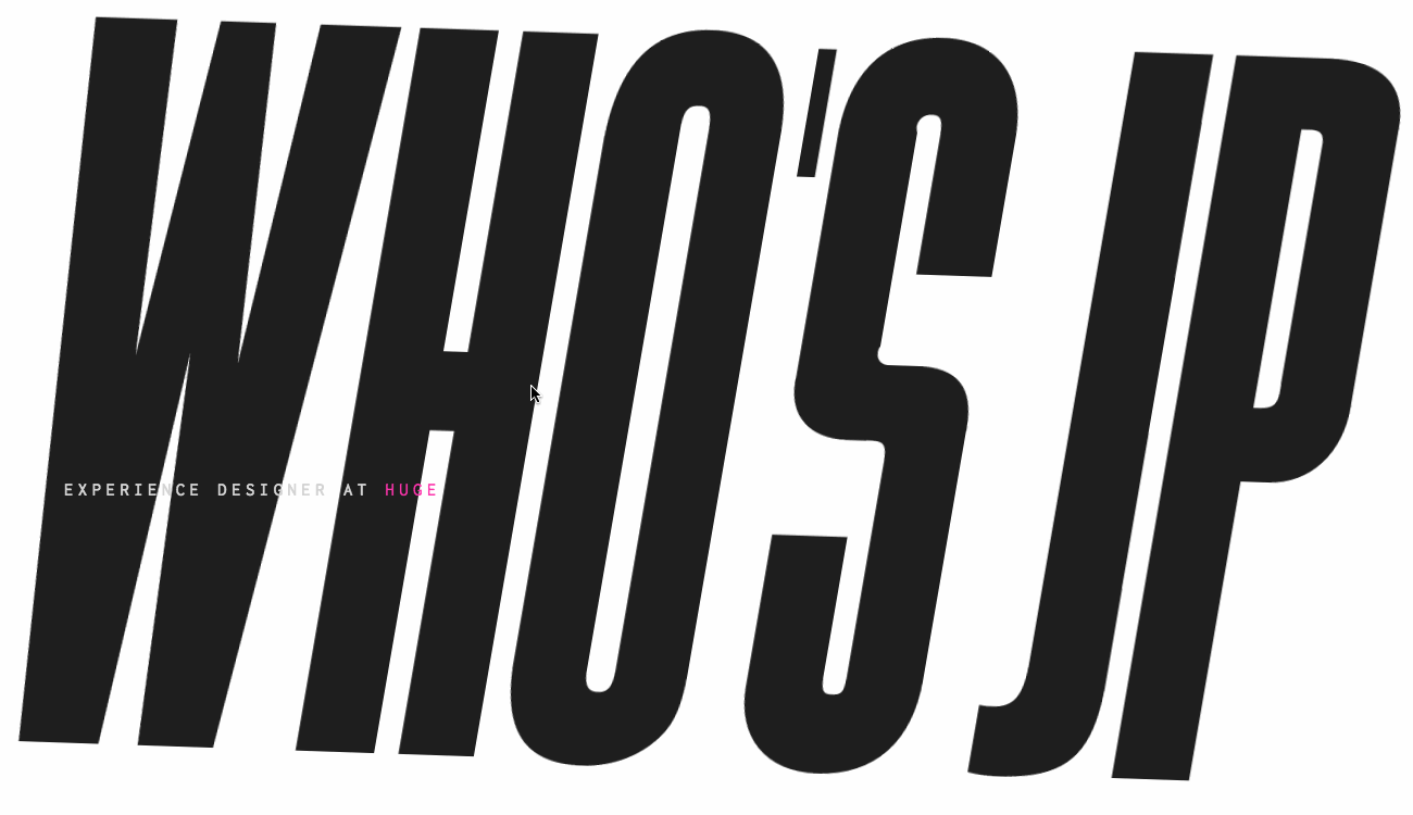
1. Site do João Paulo Teixeira da Silva

In large block letters, “WHO’S JP” dominates the landing page — no question mark! Designer João Paulo Teixeira da Silva makes a huge statement in a simple way with just two words.
His declaration isn’t static — the cursor turns to a plus sign that can be used to warp the words as you move across the screen. Instead of an obvious call to action, the design encourages us to play around. It’s a fun effect and falls outside the normal mode of UX navigation principles.
Clicking on WHO’S JP takes us to a page with a pixelated background Beavis and Butthead graphic, scrolling on repeat. It’s strangely hypnotic and doesn’t seem to fit the overall design scheme — because there isn’t any. That’s what brutalism is all about!
It looks like JP’s page is a work in progress, so it’ll be interesting to keep an eye on other unique design approaches he takes to showcase his work.
2. Bigsound Buzz

What’s old is new again. Bigsound Buzz is a music website featuring artists people are excited about on social media. The site’s design is steeped in nostalgia. Bigsound Buzz takes an old-school Macintosh aesthetic and combines it with a modern interface. This nod to retro technology and slick design makes Bigsound Buzz stand out from its competitor sites.
3. Props Paper Magazine
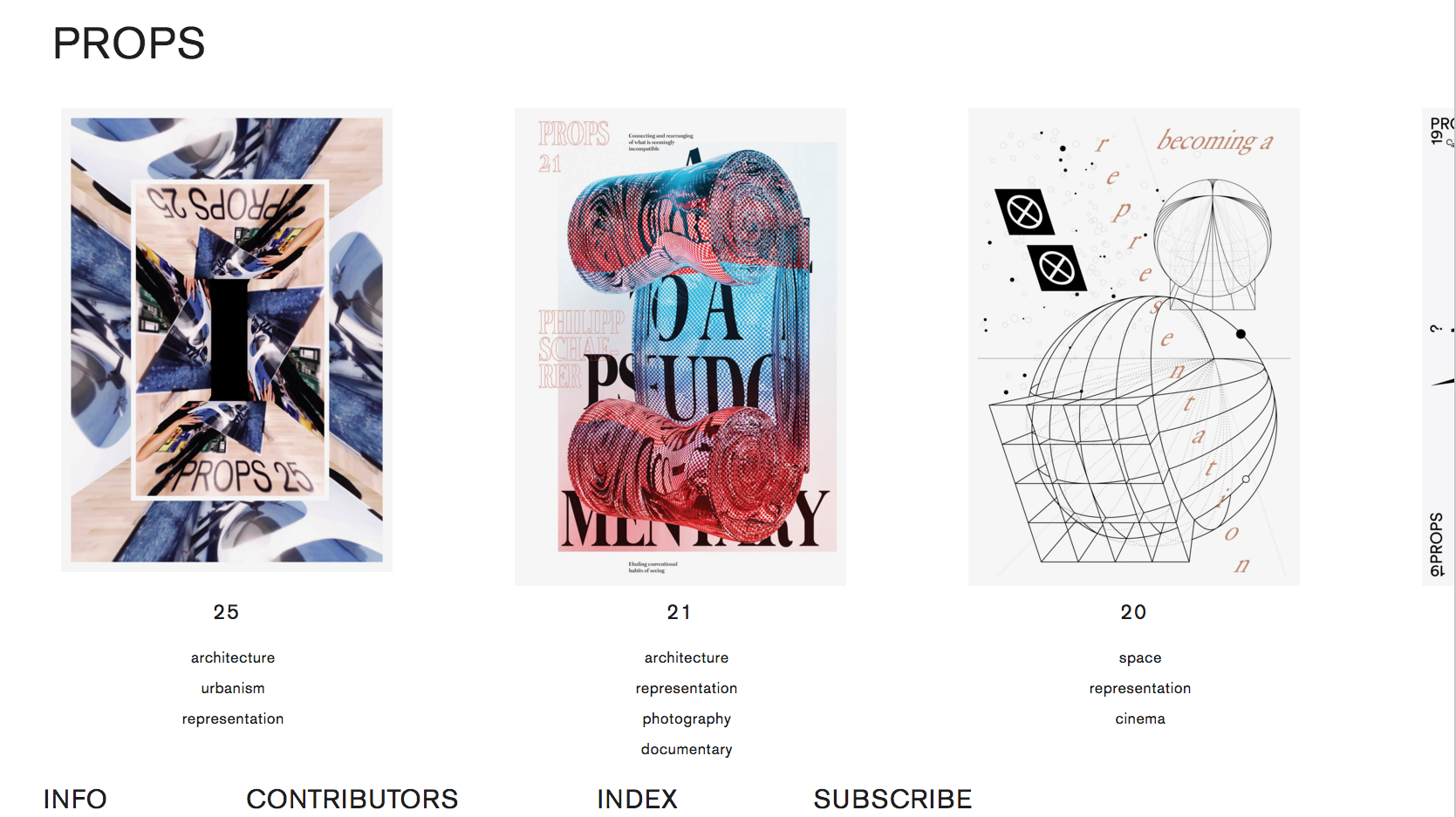
Three column layouts — we’re all tired of this overused design. But Props Magazine uses it in a way that doesn’t feel like a three-columned cliché. In a stark black and white design, each colorful cover of their publication becomes the focal point.
This minimalist design works because of each cover’s high level of artistry. The cursor transforms into a circle and there’s an unorthodox bottom navigation menu — all obvious markings of an effective brutalist design.
4. Emma

The minimalist art installation on the left and a simplistic layout are clues that Emma has ties to the visual arts. As we dig deeper, we discover it’s an art-related non-profit. This unorthodox layout wouldn’t work for an ice cream shop or a dentist’s office, but it’s perfect for an artistic organization like Emma.
And that right hand navigation — let’s talk about that! It’s weird.
Moving your mouse over EMMA changes everything in the list to EMMA. And the main block of navigational options is repeated multiple times. I’ve never seen a navigation setup like this before. But that’s what the brutalist approach to design wants to accomplish — new ways of doing old things.
Sometimes this type of experimentation doesn’t work, but for EMMA, it fits well with the rest of the design choices throughout the site.
5. W.A.S.T.E. Headquarters
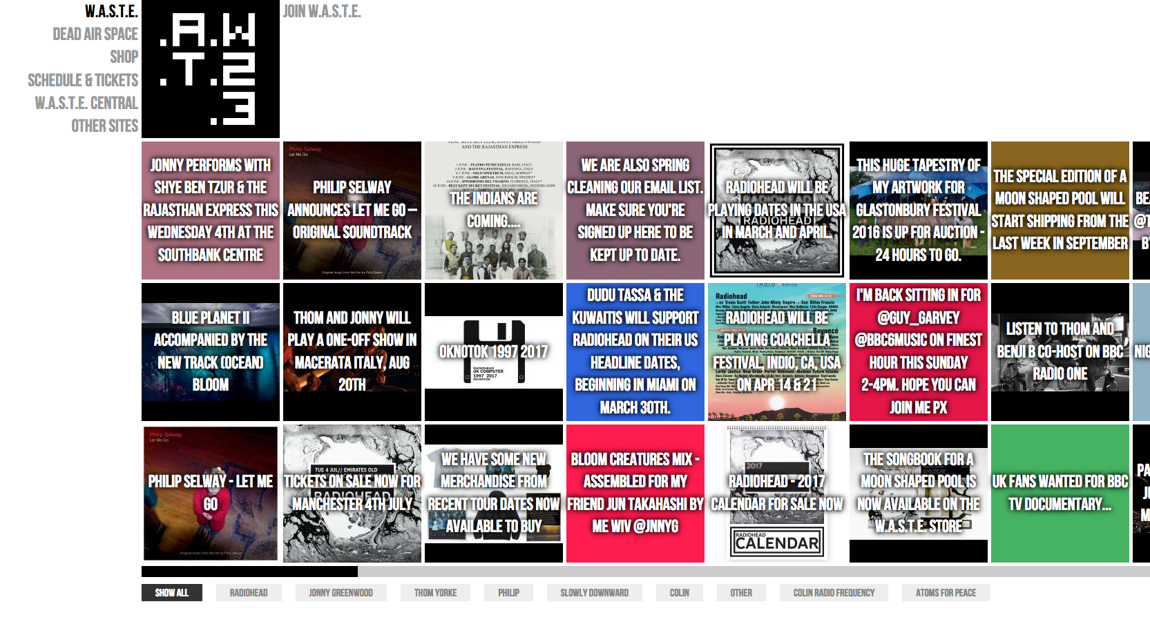
W.A.S.T.E. Headquarters is the official website for Radiohead. It’s weird in an unexpected way — much like their albums.
Easy-to-find tour dates and merchandise should be priority on a band’s site. Here, they’ve placed that information in the left-side navigation.
But that grid! Each block highlights a snippet of news without any semblance of organization! Much like the sprawling music of Radiohead, this design tests our patience. And, ultimately, keeps our attention. Bam! Brutalist.


Design interactions and animations without code
Build complex interactions and animations without even looking at code.
6. Ponto Design Studio
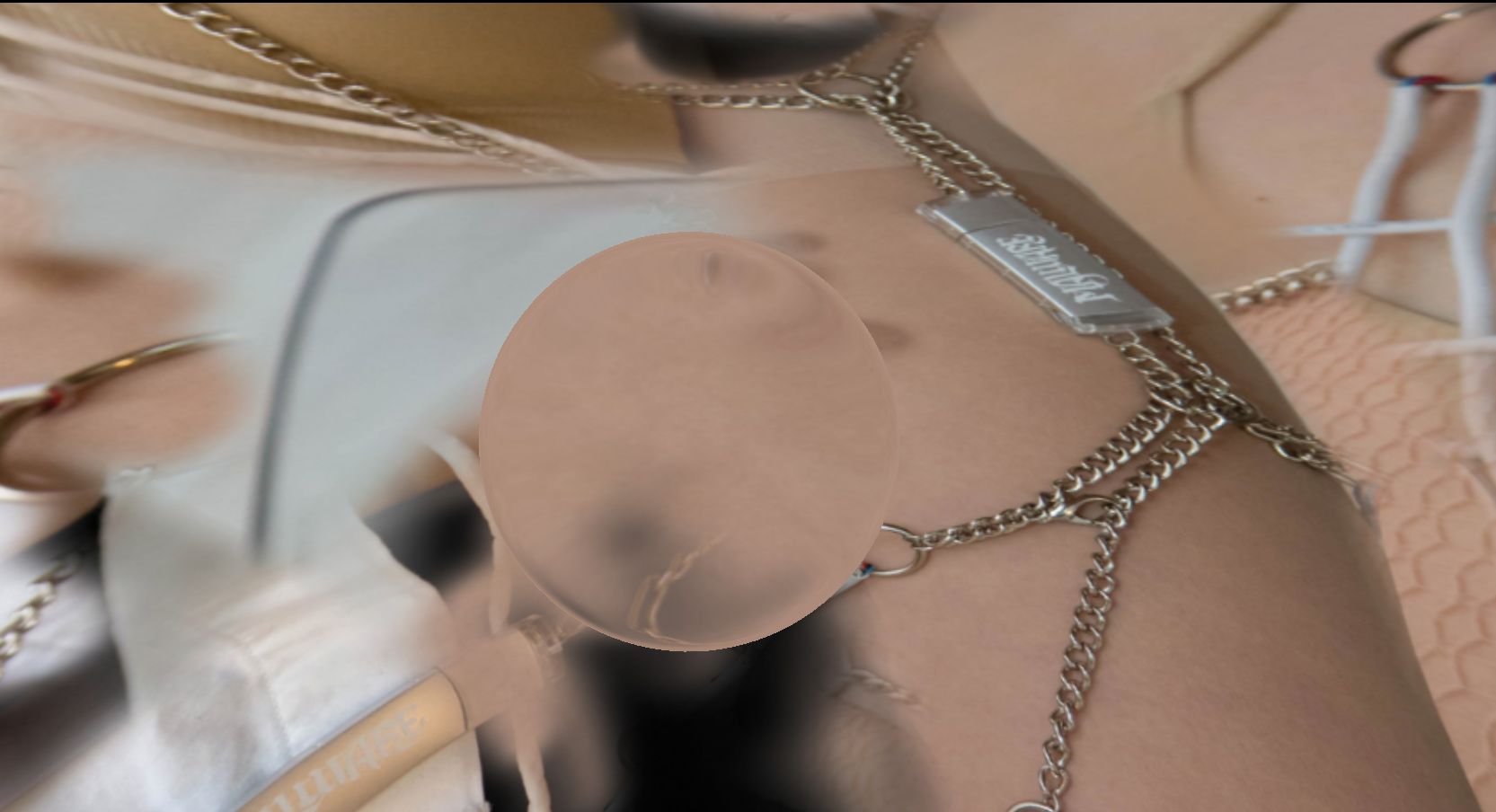
Some of the most intriguing visual art leaves us scratching our head. (That’s not just me, right?) Ponto Design Studio’s homepage, for example, has an amorphous background image. You can pan through the image with the geometrically-shaped cursor that can be transformed into a sphere, an X, and a cub, toggled with a single click.
The background image is magnified and refracted through each translucent shape. It’s absolutely pointless, but remarkable in its ingenuity! There’s nowhere to sign up for a newsletter because ... there is no call to action! It’s like one of those experimental video games without a point — it’s purely about the experience.
Scrolling down the rest of the page reveals a more straightforward design that’s almost inconsequential. Their initial visual hook is so captivating that it gives us complete faith in their skills as a creative and inventive design firm.
7. Yale University of Art
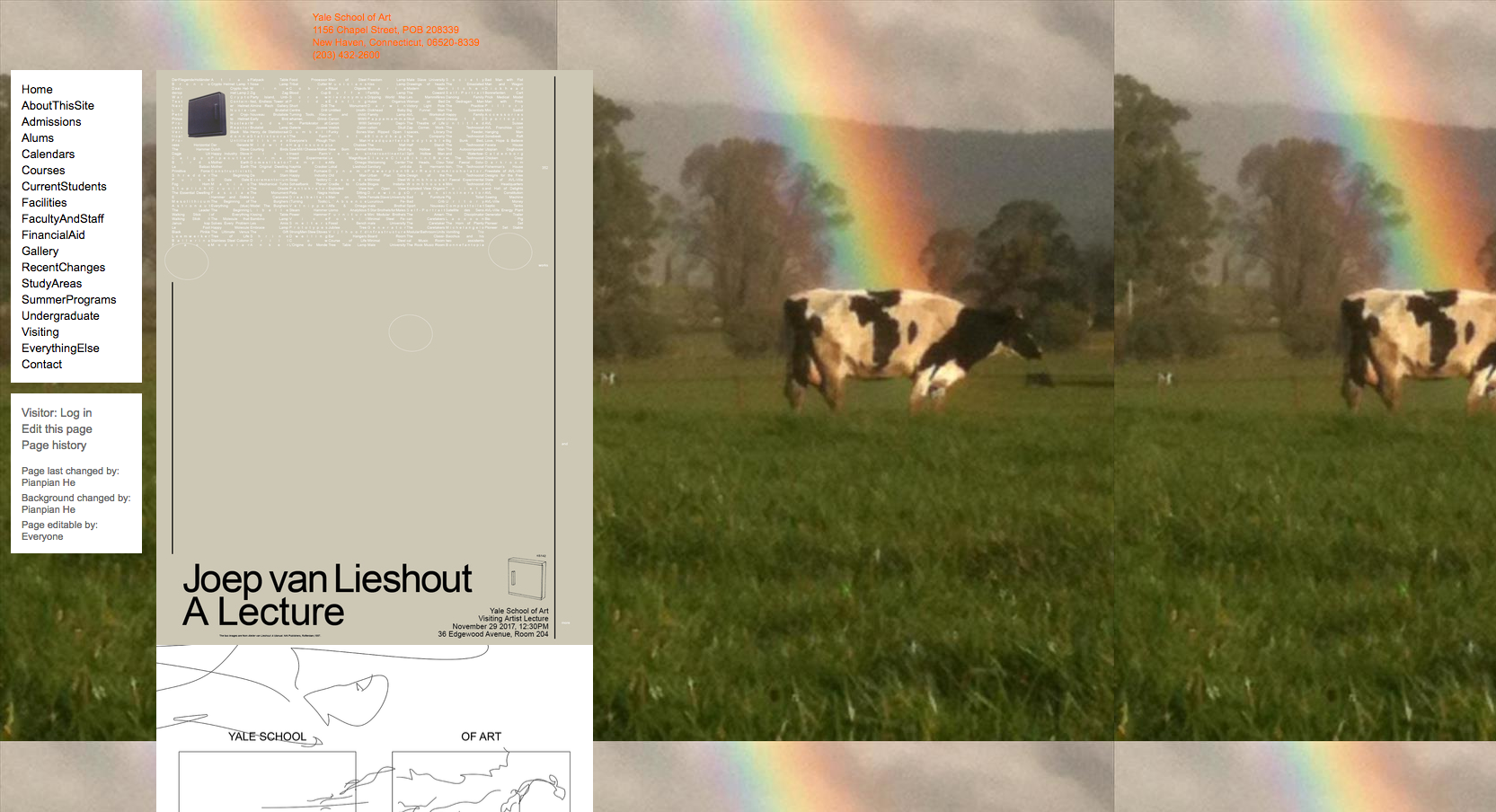
Academic websites aren’t known for their creative designs. Most are as boring as the quad architecture on any given college campus.
If you’re an art school, it’s important to communicate the programs you offer, as well as your creative spirit. The Yale University of Art makes it easy for students and potential students to find what they’re looking for. And they do it with a design that makes use of interesting images and fonts.
An art school is like any other brand — they’re selling a product: an arts education. Having a creative website shows us what they value and that they practice what they preach teach.
8. Paria Radikal

If you describe your design firm as “progressive and experimental,” you need to communicate this aesthetic. Paria Radikal does this with a design that looks like the wall of an avant-garde art museum.
Their landing page is captivating! It features random visuals and images that link to their projects. The dropping bratwurst/pastry animation is unsettling in a way that I’m not comfortable in going into here.
I agree: it’s a pretentious design. But it’s consistent with the brand that Paria Radikal projects. And I don’t think pretentiousness is a bad thing if the execution is done well. But hey, I’m a person who has more than a few free jazz albums in my music collection. Maybe I’m the wrong person to assess a little arty self-indulgence — who’s to say?
Paria Radikal uses experimentation and abstraction in a smart way that makes you want to see how they’ve used this approach in all their work.
9. Mary Gaudin Photography

Photographer portfolio websites aren’t usually that heavy on design. Showcasing the images — as long as there’s some logic to their organization — is what matters and doesn’t require anything fancy. But using a brutalist approach can make a portfolio stand out from a sea of photographers doing the same work.
Mary Gaudin is a fantastic photographer. And her page isn’t laid out like a typical portfolio. Instead, she’s uses a long scroll of asymmetrically organized photos of differing sizes. Normally a long scroll of photos would be a snore. But the way these images stagger keeps it interesting.
Attention to finer detail separates an amateur photographer from a professional. Mary Gaudin shows this professionalism through both her photos and the artistic design of her portfolio.
10. Benjamin Rethore
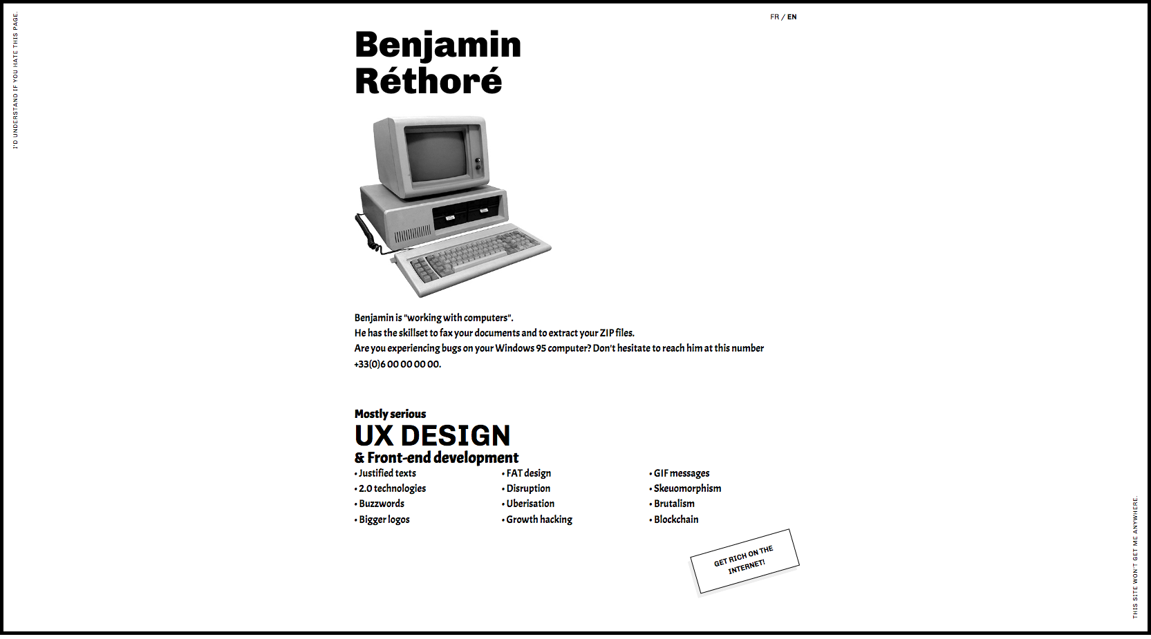
To make fun of something effectively, you have to have a deep understanding of the subject. Benjamin Rethore’s portfolio pokes fun at antiquated and overused design and technology clichés. His ability to satirize a design portfolio shows how much he knows about the subject. His bullet list of skills is full of overwrought buzzwords like “bigger logos,” “Uberisation,” and the self referential “Brutalism.” These are sure to make any designer both wince and laugh out loud.
Or, maybe I’m completely wrong! He could just be a dude in a studio apartment, surrounded by stacks of AOL installation CD-ROMs who wants to “fax your documents and extract your ZIP files.” Either way, this is a brutally hilarious website.
What are your favorite websites that break from from traditional design?
We love websites that break free from convention and retain functionality. What are some sites that have made an impression on you? Share in the comments — we’d love to check them out!