There are so many amazing designers sharing their creative work. And the websites that have risen to the top, have certainly earned their place. But with so many great designs, it's easy for gems to get buried. We pulled some deep cuts from the stacks to highlight interesting projects you may have otherwise missed.
The Webflow Showcase is an excellent place to find inspiration. Here are eight sites we think are jazz-hands worthy.
1. 365 Days of Character Design

365 days of creating original illustrated characters is an ambitious challenge to set oneself. And it looks like things do drop off here a bit. But hey, that's okay — we don’t judge. Sarah Kuehnle (Dribbble’s Head of Product!) has filled her calendar with weird and wonderful creatures that are bursting with her creative talents.
Clicking through these colorful and wonderfully creepy characters is easy. Each one is laid out on a calendar grid. Clicking on a character enlarges it and lets you scroll through each one — it’s intuitive and simple.
These characters all share a nonsensical silliness and inhabit the same strange world. We’re looking forward to seeing who else emerges from from the imagination of Sarah Kuehnle.

2. Umbo

It's right there in the URL: dot wtf. WTF is right — what are we even looking at here? Is this a website or a transmission from an alien planet?
But okay — after a bit of poking around — it turns out Umbo is a night club in Zurich. They lean towards the more … experimental side of the electro genre. Which makes sense — a lot of electronic music on the fringe is made of broken beats, blips, and bloops that, to the untrained ear, have no discernible resemblance to what mere mortals might consider music.
But for those with a bit more patience and curiosity, there is rhythm and melody within the chaos. Umbo’s website may look broken to those with a more conservative design mindset, but there’s a surreal absurdity that ties everything together.

3. Quo Stock

Quo Stock knows that buying iconography for your next creative project should be as easy as buying a book — purchasing their icons is easy peasy. They offer a huge library of their tastefully rendered icons for a variety of design projects.
It would be easy for a business like this to lean on the quality of their icons. Why worry about a user-friendly checkout when everything else looks good?
But Quo Stock surrounds their iconography with a lively design. And the process of adding things to your cart and checking out is simple and direct. They don’t skimp on any area of their design and it shows. Except for that typo in the search bar (which I’m sure will be gone soon — sorry to be that guy).
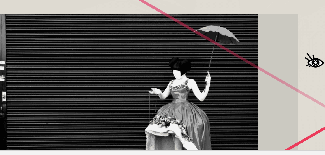
4. Milkshaken
Creating a design that complements the work of an artist can be tricky. A design needs to be consistent and not distract from the artistry and aesthetic.
Milkshaken is a costume design company. The costumes — like the site design — have a cool, modern sophistication. A lot can go wrong with this approach. You can bore someone with too much black, white, and grey and end up with a design as bland as a photocopy of a photocopy of a photocopy.
But Milkshaken makes use of strong lines, chic typography, and microinteractions to set it apart from so many trying to replicate this same sleek approach.
Colors burst from the black and white design through microinteractions initiated by the cursor, which is replaced by a stylized eye. The costume colors fade in with a glancing swipe. It’s a strong effect that brings the costumes to life.
There’s no stiff boundaries between the layout and the costumes. Everything blends together in a visually compelling user experience.


The modern web design process
Discover the processes and tools behind high-performing websites in this free ebook.
5. Dig Me Out podcast
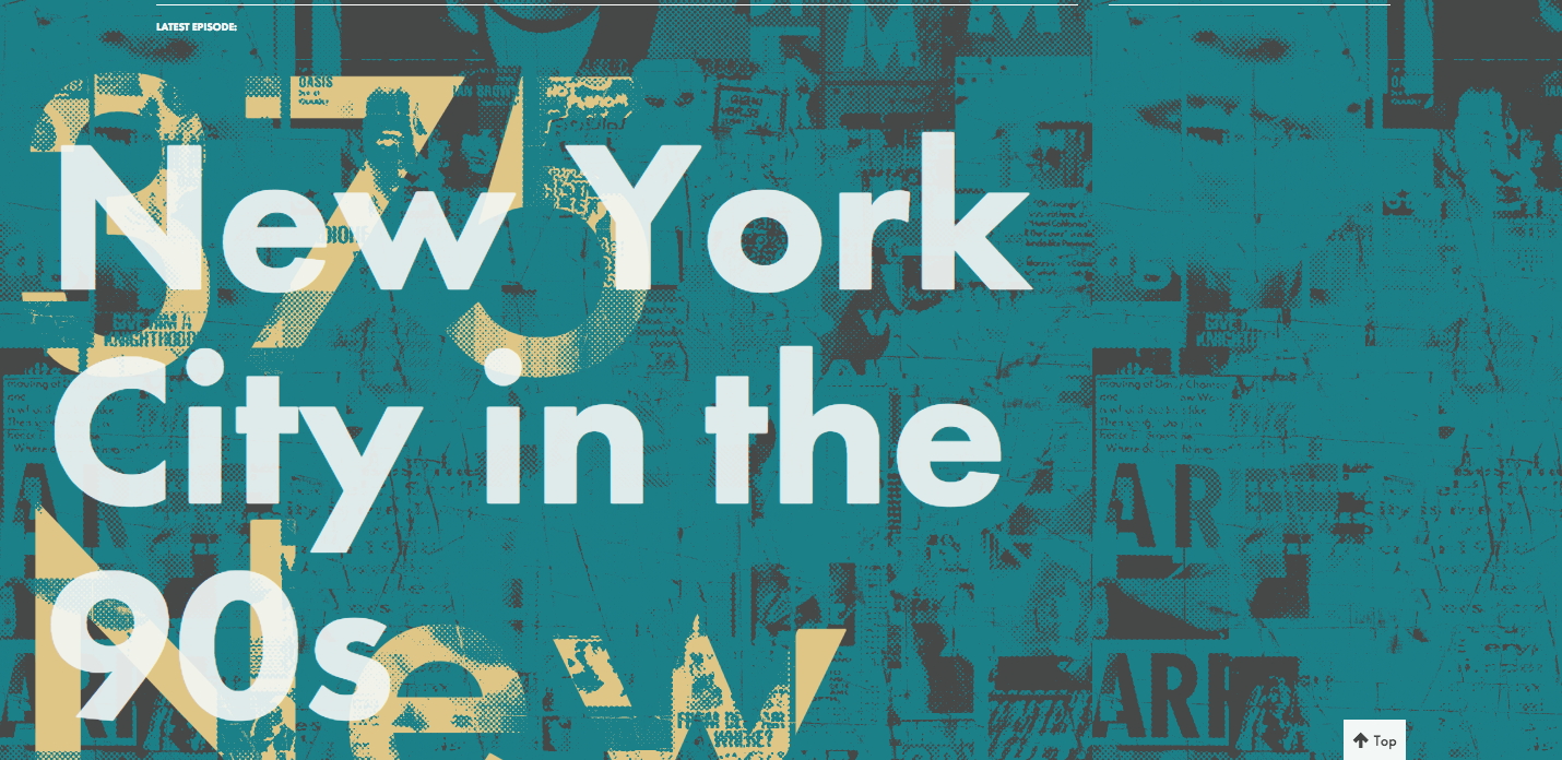
Music nerds will surely appreciate the name of the Dig Me Out podcast. Ever hear of a band called Sleater-Kinney? You know, the band Carrie Brownstein of Portlandia fame is in? Oh you don’t know? Please excuse me while I pour this unfiltered, locally sourced kombucha over your indie-rock-ignorant head.
Was that my outside voice? Sorry. Here’s a paper towel.
So why does a podcast even need a web presence? Shouldn’t their existence on iTunes and other podcast platforms give them enough exposure?
The hardest part of having a podcast is gaining an audience. All the podcasts with similar content, competing for listens, makes it hard to stand out in the podcast pack. A website can help people find you. It’s a place for show notes and photos and fun extras.
Dig Me Out’s design, heavy on half-toned style collages, brings to mind flyer art for rock shows. Music nerds landing on this page will know exactly what this podcast is about through the imagery alone. And I know it’s not that punk rock to ask for money, but placing the Patreon link in a more prominent page would probably go a long way.
So dust off those Doc Martens, wash that Mudhoney shirt, dye your hair with some Manic Panic, and enjoy the music of the 90s with Dig Me Out.
6. Audiosphinx
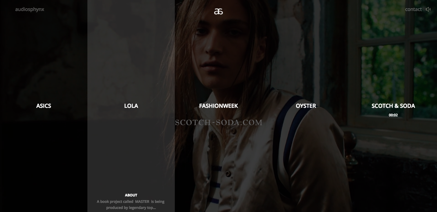
Audiosphinx is a composer who scores music for fashion shows and commercial clients like Asics. Hovering over each project brings up a vertical strip that highlights and loads the details. The design isn’t flexible enough to add new projects, but they’ve chosen such strong examples of their work that it doesn’t matter.
The connection of visuals to the music makes for an engaging experience. We’re not only compelled to watch, but to stay and listen.
Also, there’s plenty of beautiful models staring blankly into the void occupied by us mere mortals. And that’s okay — because the emotion and atmosphere of Audiosphinx’s compositions bring this website to life.
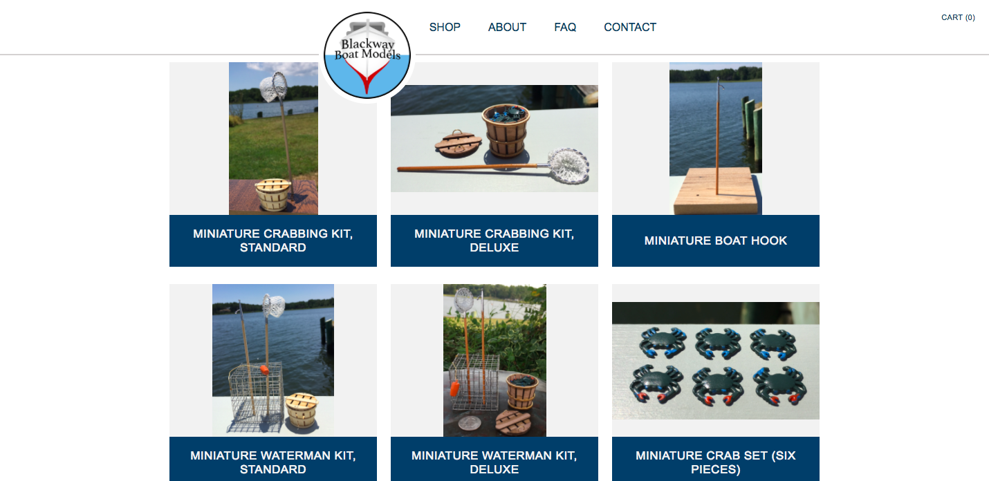
7. Blackway Boat Models

Come aboard dear readers, it’s time to put on a captain’s hat and navigate the world of model boats with Blackway Boat Models.
And thus was the most abrupt transition in the history of blogging made.
This model-boat website is an example of how any business can benefit from a solid web presence, no matter their area of expertise. With a lot of small businesses, especially niche businesses like this, the tendency is to just put up a clunky, quick website, just for the sake of having something out there.
This is not the case with Chesapeake Bay Workboat Models and Accessories. This design is not anchored to a template in the harbor of boring website builders — it’s creative and fun.
I love the graphic of a boat set against the gentle background video of the sea. The website has a clean layout and and a simple color palette that’s right in line with the craftsmanship of the model boats and accessories they make.
And did I mention the miniature crab traps and other tiny fishing equipment?
So tiny. So neat.
8. Marquis Health

Most healthcare websites are pretty boring. Anyone seeking a medical test probably doesn’t care about cool images and eye-catching typography.
And that’s why I like this page for Marquis Health. It’s way more stylized and visual than it needs to be. I mean, have you noticed that most health-related sites are as sterile and plain as an office bathroom?
The background video is of a twisting double helix, set against an interlaced vector of lines. It’s an interesting visual. The white, grey and blue color scheme gives it a modern, techy feel. There’s also a number of scroll triggered animations that slide text into place.
The sterile vibe is a trend on many health care sites. Marquis Health gets credit for using photos of people who look like actual medical professionals, instead of that same stock photo of the smiling fake doctor we’ve seen again and again.
But the site doesn’t have many pictures of people. Any industry that provides important services for a person’s health and well-being should humanize how they present themselves — connect with those seeking help.
Climb out of your design bubble
A community of designers sharing projects is inspiring for sure. But when all we do is look at the same type of work from similar types of designs, we're missing out on unique creative approaches.
I highly recommend digging a bit deeper to look for inspiration in places that you normally wouldn't. Are there any Webflow deep cuts that have lit your creative spark? We’d love to hear about them in the comments below.