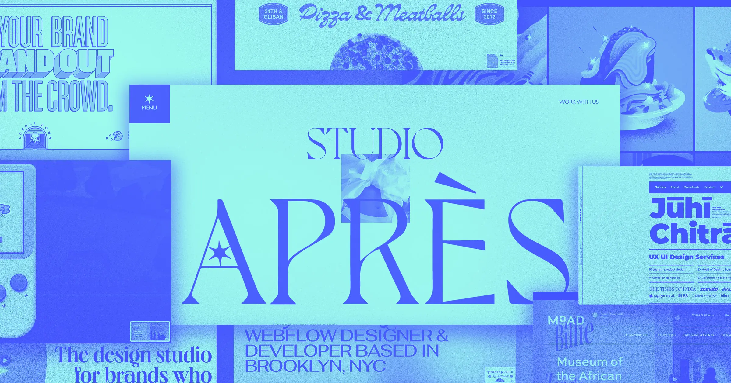
Maximalism has made a splash in the world of web design. We think it’s one of the most important design trends of 2018.
Maximalism emerges as a prominent web design trend in 2018 as designers are doing ... more.
Google Docs doesn’t think “maximalist” is a word, but that will not prevent its rise. At Webflow, we're excited about this semantic underdog. Maximalism is brilliant, elegant, and extravagant — it produces unforgettable juxtapositions of unlikely pairings that make websites wholly unique.
If it hurts your eyes, it's probably maximalism. Or a solar eclipse.
- Mariah Driver, Content Producer at Webflow.
Now, get inspired by these 10 maximalist designs we’re crushing on.
1. Glitché
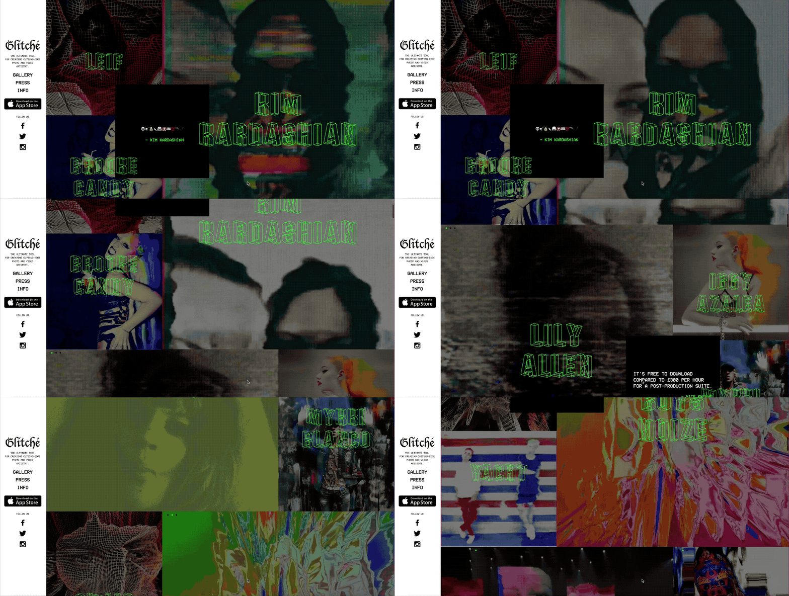
Glitché lets you edit photos and videos using over 50 effects, and to that effect, has a mesmerizingly maximalist website.
We'll be honest — this site is not for the faint of eye. A neon-green loading screen greets you before giving way to a series of pages layered with videos and images.
This maximalist design is a performance — it requires more from you than merely a scroll and glance. And it gives you an unforgettable experience in return.
2. TAPE
TAPE, a live music venue in Aarhus, Denmark, uses their site to rouse the explorer in you. The site gives viewers no reprieve with moving, flashing, and layered elements.

Together, these elements produce a unique, maximalist vibe that delights and entertains ... no ticket required.
3. PIN-UP magazine
PIN–UP magazine’s site layers its cutting-edge photography and artwork with an architectural spirit. It embraces maximalism with excess and redundancy to spark our curiosity.
Massive white text over the magazine’s cover reflects the publication’s bold themes, along with the diverse mix of genres that make up its architectural content. The repetition of words and images, a common practice in maximalist design, creates a mesmerizing effect.

4. One & All
One & All, a one-day festival for creatives, pays no heed to the restraint of minimalism.
The moving background, striped in neon green and white, produces a kaleidoscope effect that’s further complemented by minimal content. The colors speak loudly behind the bold, black text.
This site shows us that maximalism, when executed correctly, can be unique and functional.

5. A Day Out
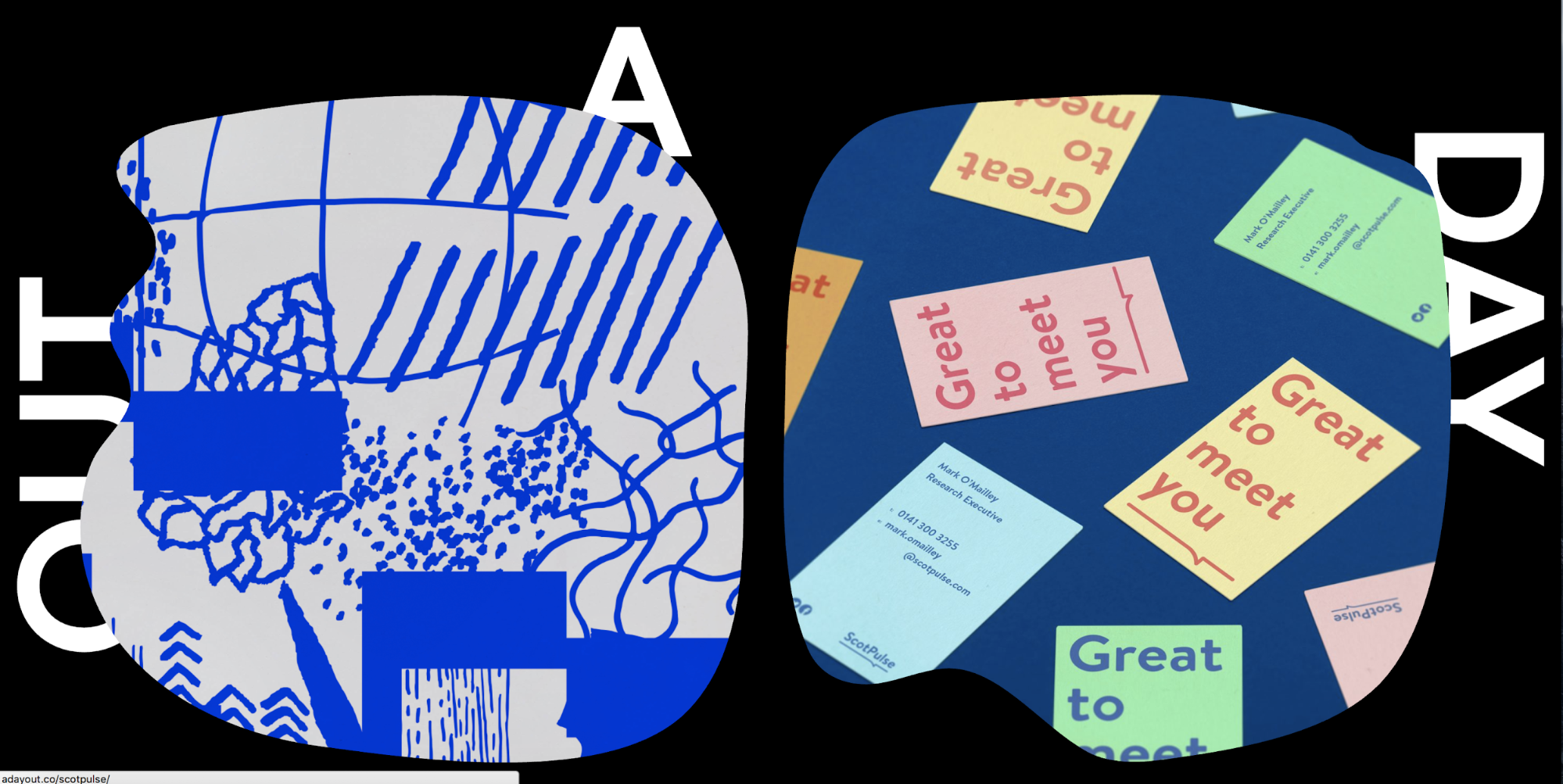
A Day Out calls attention to the studio’s artistry with a striking combination of colorful illustrations and a bold, black background.
The homepage is both outrageous and refined, abandoning simplicity completely. The layers of moving text, images, colors, and patterns work to communicate A Day Out’s daring and unique brand identity.


Design interactions and animations without code
Build complex interactions and animations without even looking at code.
6. Trinity College’s SOUND CHECK
Trinity College’s SOUND CHECK flexes a site as loud and boisterous as the music festival itself.
Hover over the text to trigger jarring sound effects even louder than the site’s saturated pinks and oranges (maximalist favorites).

7. Small Victories
The site for Small Victories is outfitted in bright, contrasting colors ... and totally pulls it off.
Combinations of geometric shapes, sans-serif fonts, and interactions surpass expectations and delight readers. This site's brave maximalist design is ... you know what's coming ... no small victory. *mic drop* 🎤🖐️

8. Alex Tade’s portfolio
Alex Tade, an artist, web designer, developer, painter, illustrator, sculptor, photographer, and writer is doing nearly as much with his personal site as he’s doing professionally.
Entering Alex Tade’s portfolio feels like playing an arcade game with responsive text, geometric shapes, and loud colors.

9. Kennard Lilly’s portfolio
Kennard Lilly’s portfolio is a vibrant representation of his experience as a designer and creative. Bold splashes of pattern and color are layered over photographs to produce an immersive experience.
The homepage transitions deliver unique illustrations and color combinations, highlighting the Kennard’s unique brand.

10. Hattie Stewart
Professional doodler, Hattie Stewart layers fragments of her vibrant creations, turning her site into a colorful, mind-bending collage.
The grid pieces invite you to rearrange them — a form of co-creation that would have been far from imaginable with a more minimalistic design. Scroll through Hattie’s work to see how her creative illustrations make for an eye-popping maximalist design.

What are your favorite websites that break from from traditional design?
We love websites — and the designers behind them — that fearlessly break free from convention in pursuit of a unique brand identity. What sites have made an impression on you? Or maybe hurt your eyes? Tell us in the comments. We’d love to check them out!





.png)
