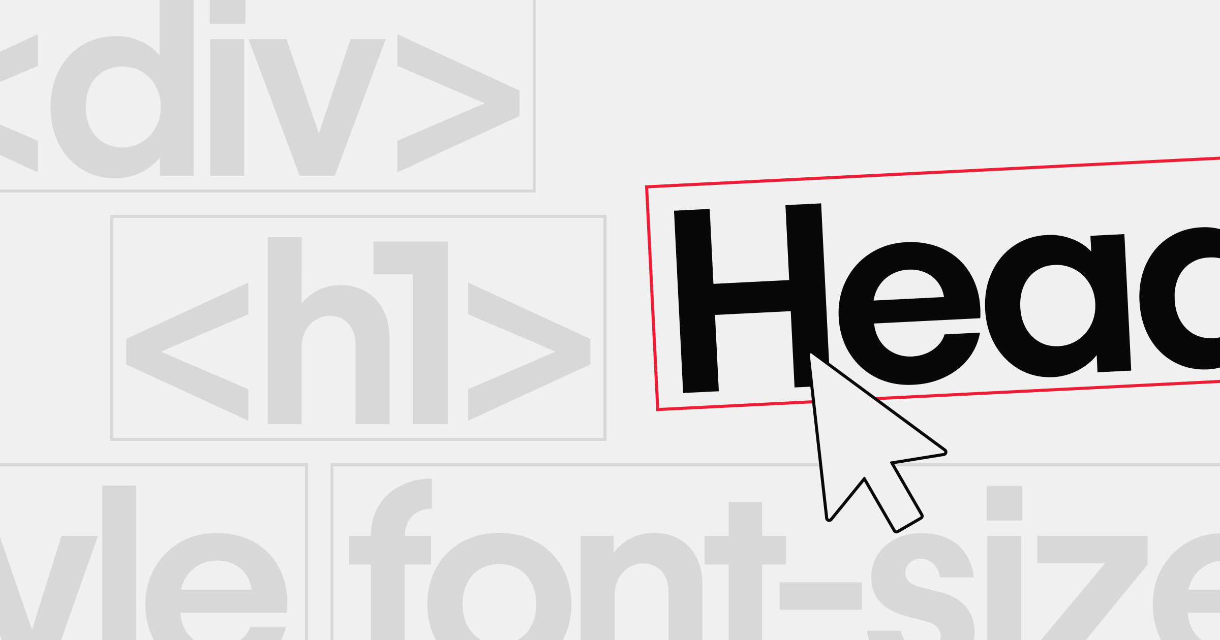


We’ve said it before, and we’ll say it again (promise): web design is 99% typography.
After all, if content is king, then the way you present that content becomes incredibly important. And when you do it right, you ensure that all that great content you publish isn’t just semantically powerful—it’s visually powerful too.
With that in mind, here’s a little showcase of websites #MadeInWebflow that set their type—and content—in just the right light.
Note: where possible, I’ve linked the typefaces used on these sites to their Google Fonts pages (which you can use on any Webflow plan). When that isn’t possible, I’ve linked to Typekit (available on Pro and higher). And when neither was possible, to MyFonts or the foundry site.
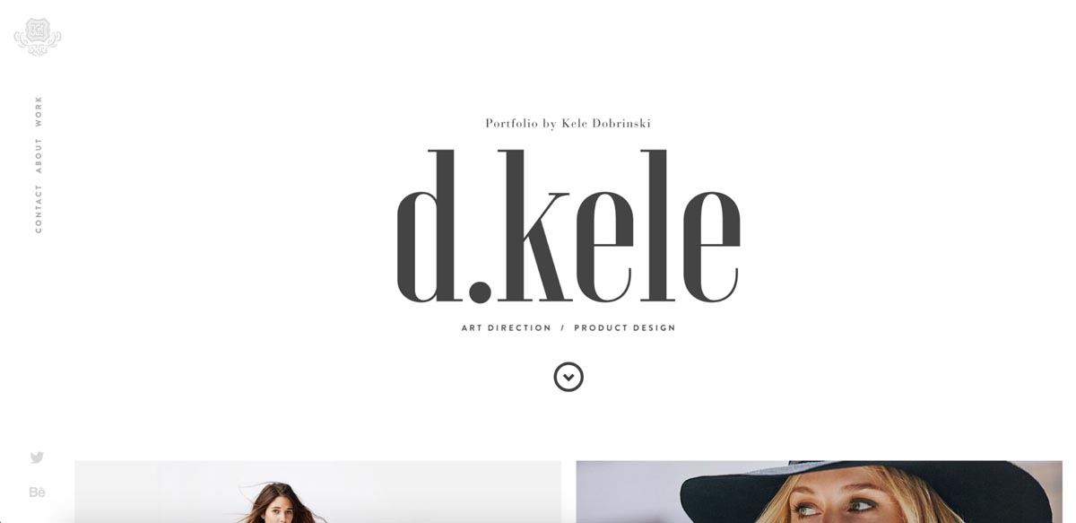
Kele Dobrinski’s portfolio
Typefaces: Voga and Brandon Grotesque
Refined, classy, but ultra-modern, Kele’s portfolio website combines the high-contrast, Bodoni-esque Voga with the super-modern sans, Brandon Grotesque to great effect.
It all begins with the site’s hero section, where the elegant Voga appears set in friendly lowercase letters, with Brandon set in all-caps to play a sort of metadata role.
Further down the page, Voga goes all-caps in bold page titles, with Brandon still all-capped below, followed by a thick, stylish rule. The elegant typefaces and ample whitespace reinforce the high-fashion feel of the photos beautifully.
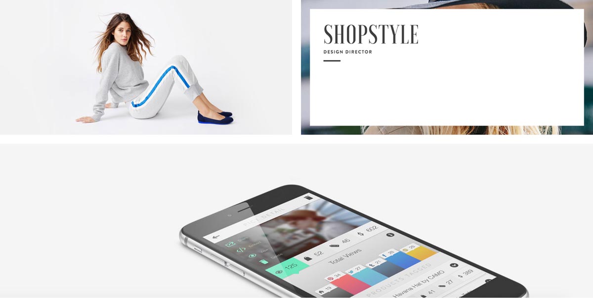
Individual portfolio entries retain the big bold Voga and understanded Brandon, but here Brandon takes on another role to serve as large-set, pale grey body copy. The grey is a touch light, but that really makes the links pop, so may have been intentional.

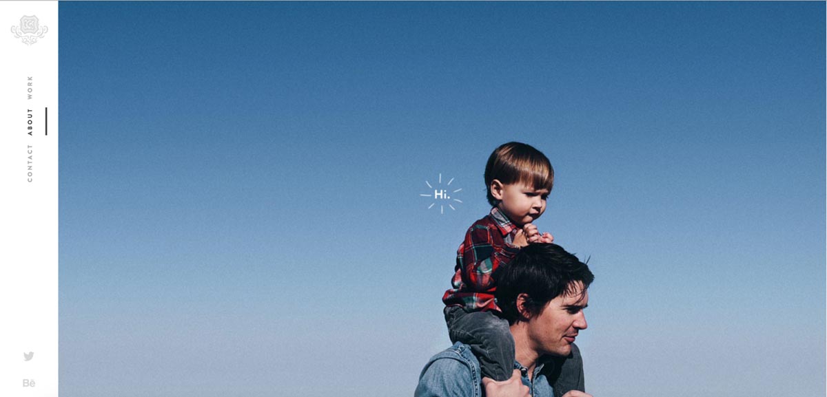
Kele rounds out the site with a touching photo that still makes beautiful use of type, with a humble “Hi.” practically popping with friendly energy.
Gaffa Creative Precinct
Typefaces used: Lato and Libre Baskerville
Gaffa Creative Precinct brings a unique Australian art space to the web in stunning form with ample whitespace, minimal body copy set in Libre Baskerville, and the popular Lato playing a variety of metadata and UI roles.
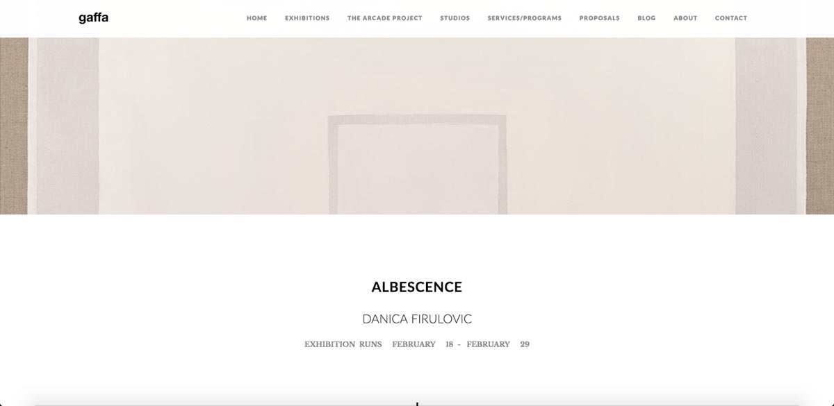
Despite Lato’s familiarity to anyone who works in tech—it is, after all, Slack’s brand font—the font retains an impressive flexibility and feeling of newness, especially when used in all caps (as on Gaffa) or in its beautiful italics. Looking at exhibition pages like “Albesence,” it’s easy to feel like Lato must be used for museum signage worldwide.
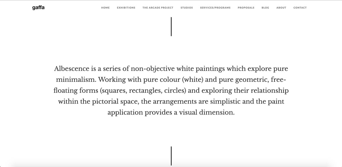
The switch to Libre Baskerville (one of many revamps of a classic face) adds a touch of respectability and classicism to the site, reminding us of the intellectual work art does.
Fully justified text rarely works on the web, but Jimmy Makes Things, the agency behind the Gaffa site, pulls it off with well-balanced columns and careful attention to font size.
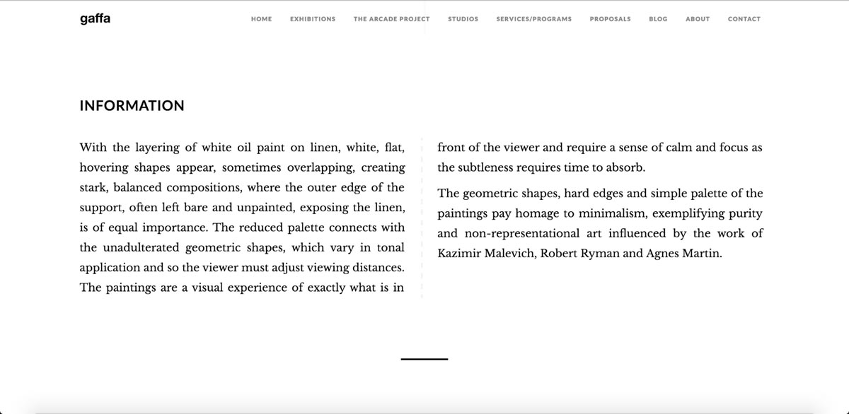
I don’t envy anyone trying to build a website for an art gallery. The art world’s always balancing on the narrow line between avant-garde progressiveness and upper-class refinement, and it can’t be easy to express that on the web. Thankfully, Gaffa does it in spades.
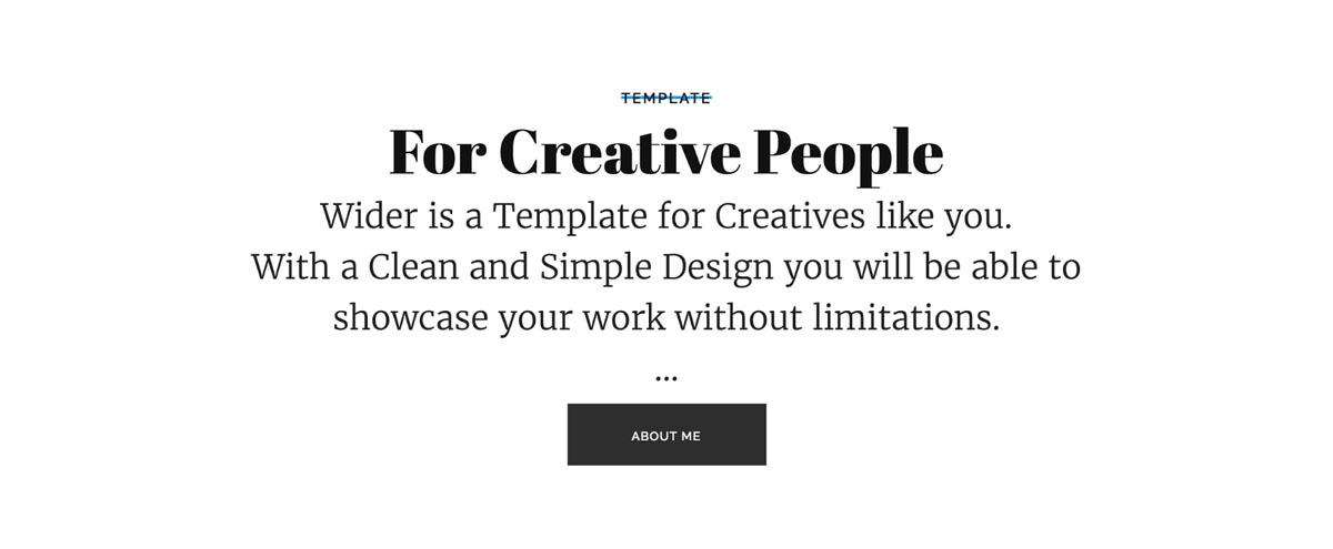
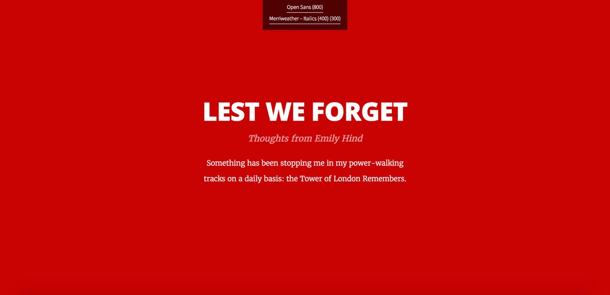
Wider CMS template
Typefaces: Raleway, Abril Fatface, Merriweather
Pablo Ramos’ Wider ranks among the most popular of our premium CMS templates, and it’s not hard to see why. The starkly filtered photos, dramatic headlines, and splashes of bright color against an otherwise monochromatic background make for a nearly hypnotic website.

And much of the credit has to go to the typographic choices here. With large headlines set in the bold, high-contrast Abril Fatface; metadata/UI labels in the lithe Raleway; and body copy in the easy-to-read yet stylish Merriweather, the template just screams: this was made by and for creative types!
The template also shakes things up a bit by occasionally switching to the sans-serif Raleway for body copy. It’s a nice way to add interest.
One thing to note: it can be tricky to pair two different faces of the same type (i.e., two sans or two serifs), and you could argue that Abril and Merriweather together is a bit risky.
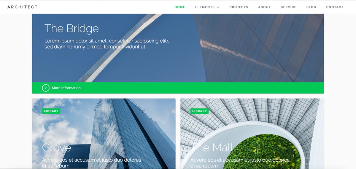
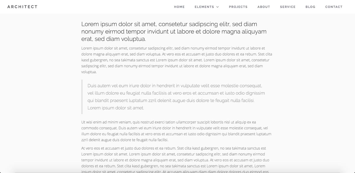
Architect template
Typefaces: Raleway, Open Sans
Nicolas Kayser’s stylish and flexible Architect pairs gorgeous photos of massive modern buildings with the quirky, thin-limbed Raleway, bringing in the similar but more neutral Open Sans for longer content.

Because Raleway’s so slender, it’s perfect for headlines and other large-set typographic elements like teasers, as seen below in the Projects cards.
For body copy, the template switches to the incredibly popular Open Sans, whose professional-yet-friendly feel works perfectly for the site’s overall aesthetic. Though, were I to use this template, I'd definitely bump the text size up a notch or two.
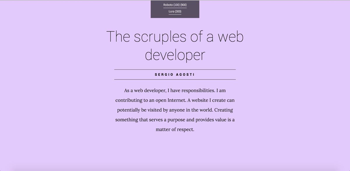
Google Webfont Combinations by Timothy Noah
Typefaces: various
If you ever find yourself stuck in your search for a fine font combination to drive your site’s content, you could do much worse than Timothy Noah’s Google Webfont Combinations website.
Inspired by several other popular sites, Noah’s work offers a fine showcase of what you can do with typography in Webflow using nothing but Google Fonts.
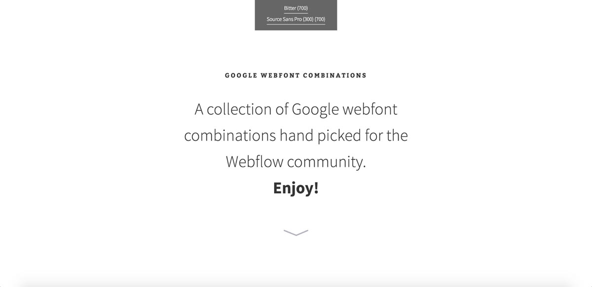
The site does a particularly brilliant job pairing modern serif and sans-serif faces, and adds a few ideas for typographic details like subheadings and rules. It’s a handy tool for any web designer, regardless of skill level, but will be particularly useful for those just starting out.


Get started for free
Create custom, scalable websites — without writing code. Start building in Webflow.
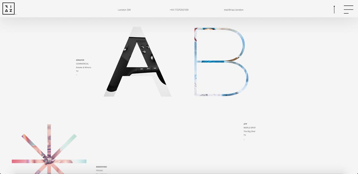
Riaz Farooq’s portfolio
Typefaces: Montserrat, Maisonneue
Built by Webflow Community Expert Arthur James, Riaz Farooq’s portfolio is extremely light on text, but still does some interesting work with type.
It all starts off with Farooq’s personal logo, consisting of a square of stylized letterforms set over various images of his work, and the man himself.
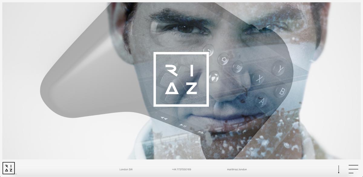
Contact info appears in a nav bar that starts out at the bottom of your screen, but sticks to the top as you scroll down …
And encounter some massive, and often delicately set, letterforms that serve as teasers for Farooq’s portfolio items. Each large-set letter gives you a tiny window into what lies behind, which then reveals itself a little more on hover, then even more on click. It’s a delightfully creative interaction model.
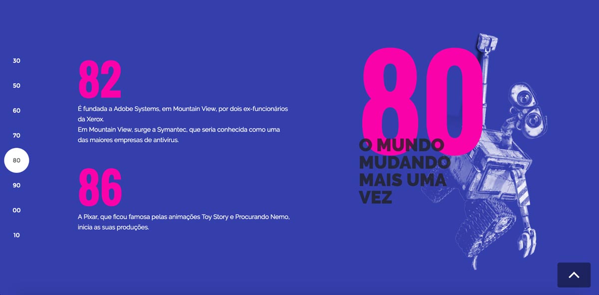
A history of Silicon Valley
Typefaces: Raleway, Oswald
When you’re knee-deep in the second wave of the tech revolution spearheaded by Silicon Valley (like I am), it can be easy to forget that this revolution is just the current expression of an unfolding history.
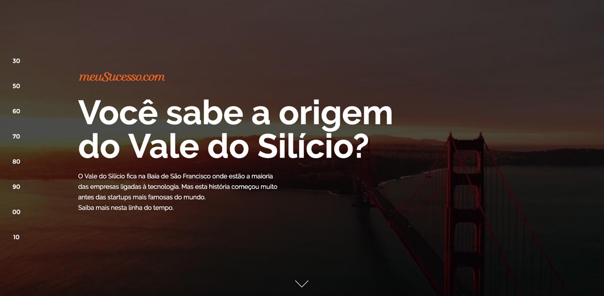
João Paulo Teixeira’s interactive timeline digs back into that history with a beautiful, editorial-inspired design that uses Raleway to great effect. Whereas Architect stresses the limber delicacy of Raleway’s lighter weights, this site uses the friendlier, more playful bold to add some real personality.
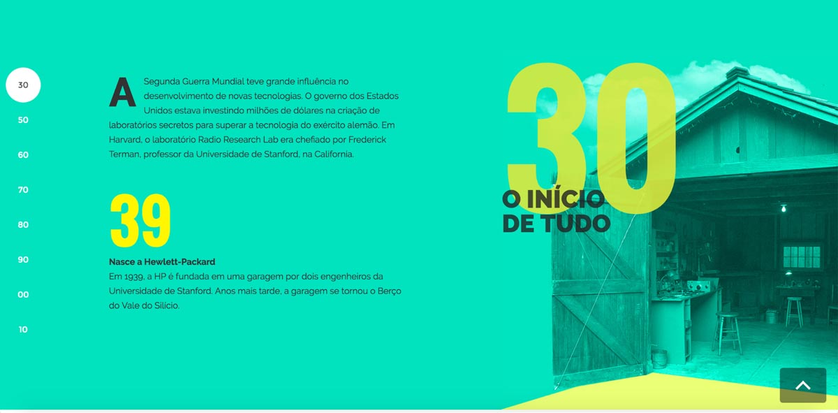
Texeira also puts the big, bold Oswald to great use in large-set and brightly colored numbers that contrast perfectly with the vivid backgrounds for each decade.
Justin Schueler’s portfolio
Typefaces: Proxima Nova, Livory
In an age when everybody’s wondering if web design has died for want of creativity, it’s so refreshing to discover something a little different. Like Justin Schueler’s gorgeous, simple, type-driven portfolio.
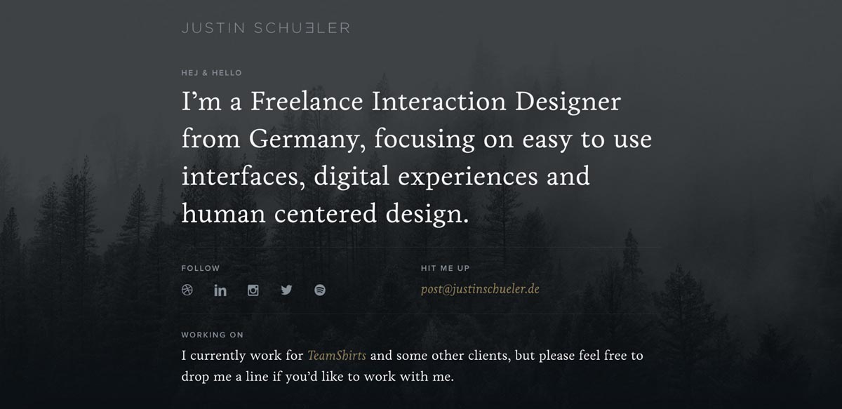
You’re probably used to seeing Proxima Nova’s friendly letters in Smashing Magazine’s body copy, but it gains a whole new feel when set all-caps, as in Justin’s various headings. Even the headings function a little differently here, not so much screaming out of the page as subtly structuring it.
The site leans most heavily on the beautiful Livory, a serif font from HVD, makers of Brandon Grotesque. When we’re so used to seeing portfolios full of gigantic, gorgeous imagery, it’s really refreshing to see a serif used to straightforwardly capture a designer’s expertise and experience.
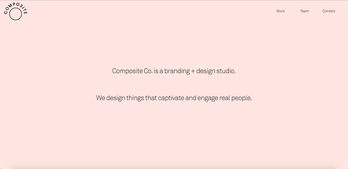
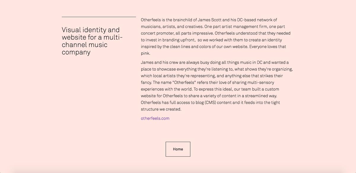
Composite Co. agency website
Typefaces: Akkurat Pro, Apercu Mono
Speaking of minimal portfolios—meet Composite Co. a web design agency that makes extensive use of Webflow in their client work.
This two-man team (Christian Dutilh and Jacob Weinzettel) clearly understands the power of simple, straightforward copy set with ample whitespace. Somehow, the combo makes phrases you’ve heard before, in one form or another—like “We design things that captivate and enagage real people”—suddenly feel meaningful again.
Like Jusin, Composite Co. also captures their skills and expertise in a simple text list, this time set in Apercu Mono. Very cool to see a font type usually relegated to coding and attempts to fake typewritten manuscripts playing such an important role on a site.

Speaking of refreshing: I love the outdented headlines on the individual project pages!
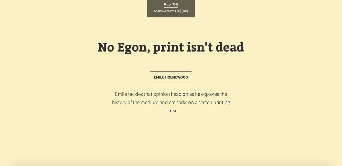
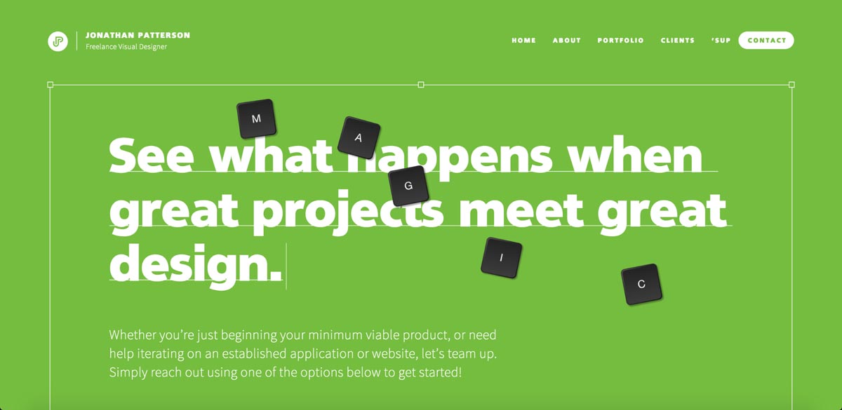
Jonathan Patterson’s portfolio
Typefaces: Quebec Serial, Source Sans Pro
There are all kinds of things to love about Jonathan Patterson’s standout portfolio, but today I’m going to fanboy a bit over the huge headlines you find on all the non-portfolio pages of his site.
Set in what looks like the Heavy or Black weight of Quebec Serial, underlined with a delicate rule, and full of Jonathan’s distinct voice, I can’t get enough of these headlines.
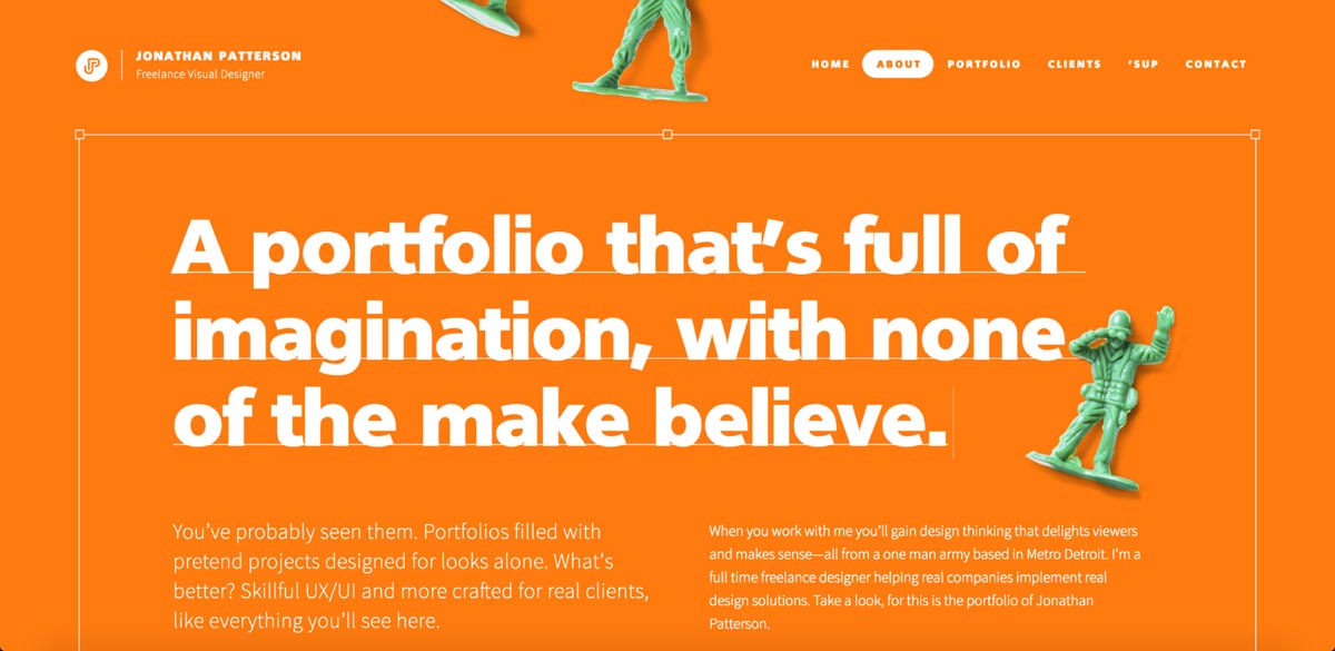
Especially when you add the various objects (toy soldiers, popcorn, Scrabble-style letter tiles) you can actually move around the page with your cursor. It’s a small, essentially meaningless interaction, but it adds a ton of delight.
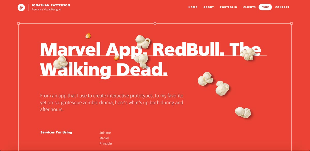
I also love Jonathan’s use of Adobe’s first open-source typeface family, Source Sans Pro. It’s an elegant sans filled with character, and pairs very well with the not-often-seen Quebec. And when you see two sans serifs so effectively paired, you know you’re looking at the work of a talented designer.
What inspiration do you want next?
We’re looking to make this kind of post a regular thing on the Webflow Blog, so if you’d like to be inspired by something in particular, let us know in the comments below!