


With so many design portfolios online, making one that stands out is challenging.
Thousands of design portfolios exist on the internet, each with a talented designer behind it looking to attract clients. To stand out, your portfolio must be unique, compelling, and skills-driven. You need to demonstrate what sets you apart and what it’s like working with you to ensure the client-designer match works well.
In this guide, you’ll find some of the best portfolio website examples for designers, developers, and marketers. Instead of limiting your portfolio to a simple gallery, read on to learn how to build a website that not only looks good but also converts visitors into clients.
6 proven design portfolio tips
While design portfolios vary widely depending on who creates them, some fundamental principles appear consistently in the strongest ones. Here are six best practices great designer portfolios tend to follow.
1. Curate diverse work
Select design projects from different mediums, like websites, apps, and advertisements. Even if potential clients are only interested in hiring you for one medium, sharing various examples demonstrates versatility and experience — highly sought-after characteristics.
2. Prioritize quality over quantity
Everything in your portfolio should represent your best work. Don’t use examples you aren’t proud of just to pad the site. You have limited control over what potential clients see first, so every addition should make an excellent impression.
3. Provide context and insights
While the work should speak for itself, it can benefit from added context. Use subtle text blocks to describe how you went about a design or the challenges you encountered while making it.
If you have experience with typical design obstacles, such as translation issues and complex design requirements, mention them to let potential clients know you can handle challenging projects.
Beyond the technical details, add storytelling to make each project more interesting. Explain the client’s problem, your approach and thought process, and how your solution made a positive impact. Storytelling helps potential clients see themselves in your past projects, making your work feel more relatable and relevant to their needs.
Share the journey behind each project, not just the final result, and you can build trust by showing people you’re skilled, collaborative, and empathetic in solving their problems.
4. Update regularly
Update your portfolio to include new projects as you complete them. While you’re at it, ensure you’re tagging every project with a date to indicate how recent the samples are. Viewers will naturally construct a timeline to understand how your designs have evolved over the years.
5. Demonstrate results and impact
Include text or infographics that show how your designs impacted key metrics like viewership, sales, and click-through rates (CTRs). This quantifiable proof encourages potential clients wanting to see the same improvements to get in touch.
Quantifiable outcomes turn your portfolio from a visual-only showcase into a results-driven story. While clients appreciate great designs, they want reassurance that your work delivers measurable impact and a return on their investment.
For example, you could mention how a redesigned homepage for Client A improved user engagement by 30% and increased CTRs on call-to-action (CTA) buttons by 40%. Embed visual elements like bar charts or infographics in your portfolio to highlight these numbers and make them more digestible.
6. Express your personality
While project quality might be your first priority, clients also want a cohesive working relationship — as do you. Express yourself in your portfolio so clients get an idea of your communication style, design preferences, and general attitude. This increases the chance it’s a good match for all involved.
23 design portfolio examples worth checking out
Each of the following examples stands out for the way creators execute design trends, showcase their work, and express their unique personality. Let these examples and creative portfolio design ideas inspire your next web design project.
1. Pierrick Calvez
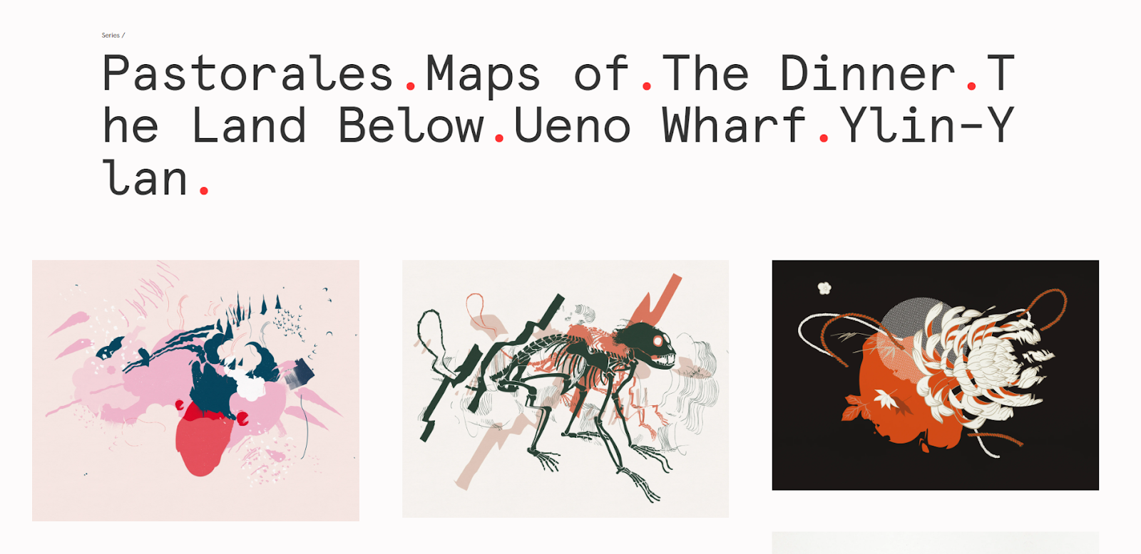
Pierrick Calvez is a painter and graphic designer whose portfolio focuses equally on both disciplines. This site is one of the most minimalist on this list, featuring artwork laid out against an off-white background that, once clicked, opens larger versions. The only items at the top are Pierrick’s name, buttons for selected works, Pierrick’s résumé, and contact information.
Pierrick’s artwork is so striking. It’s a treat that the web design hasn’t distracted from it with extraneous details.
2. Christina Kosik
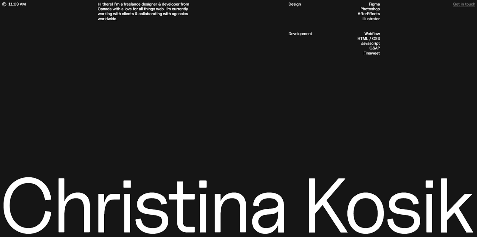
Christina Kosik is a user experience (UX) designer and web developer based in Vancouver, Canada. Her loading animation, which displays the percentage loading progress, lets you know the site is almost loaded so you don’t bounce.
In the works section, selecting a project gives you a peek at the assets she made for each one. Every case study also includes a link to the finished website so users can fully explore what she’s made. That way, visitors skimming her UX design portfolio site can get a quick idea of what Christina offers, while those needing more information can also find it.
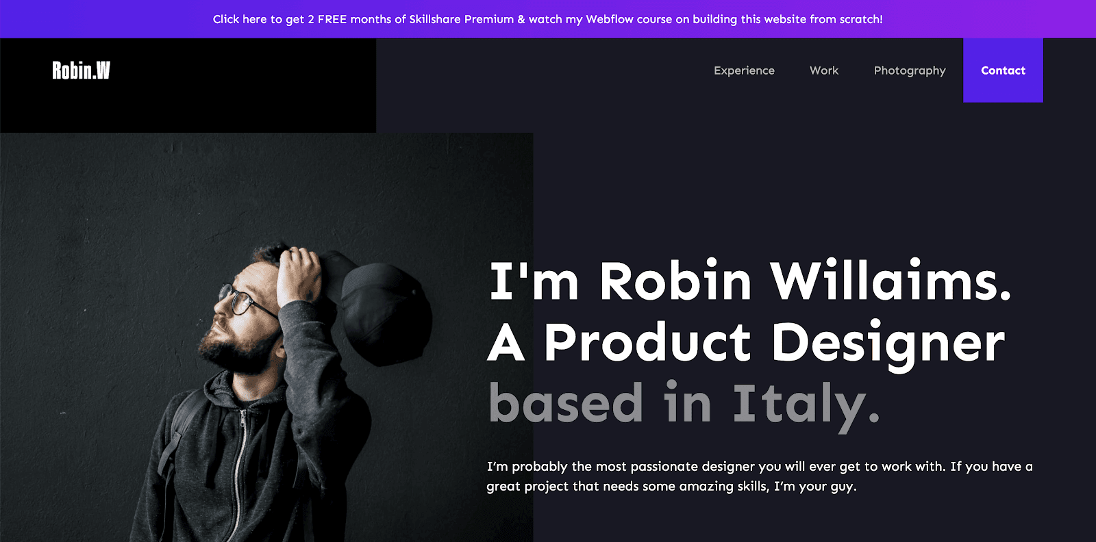
3. James Williams
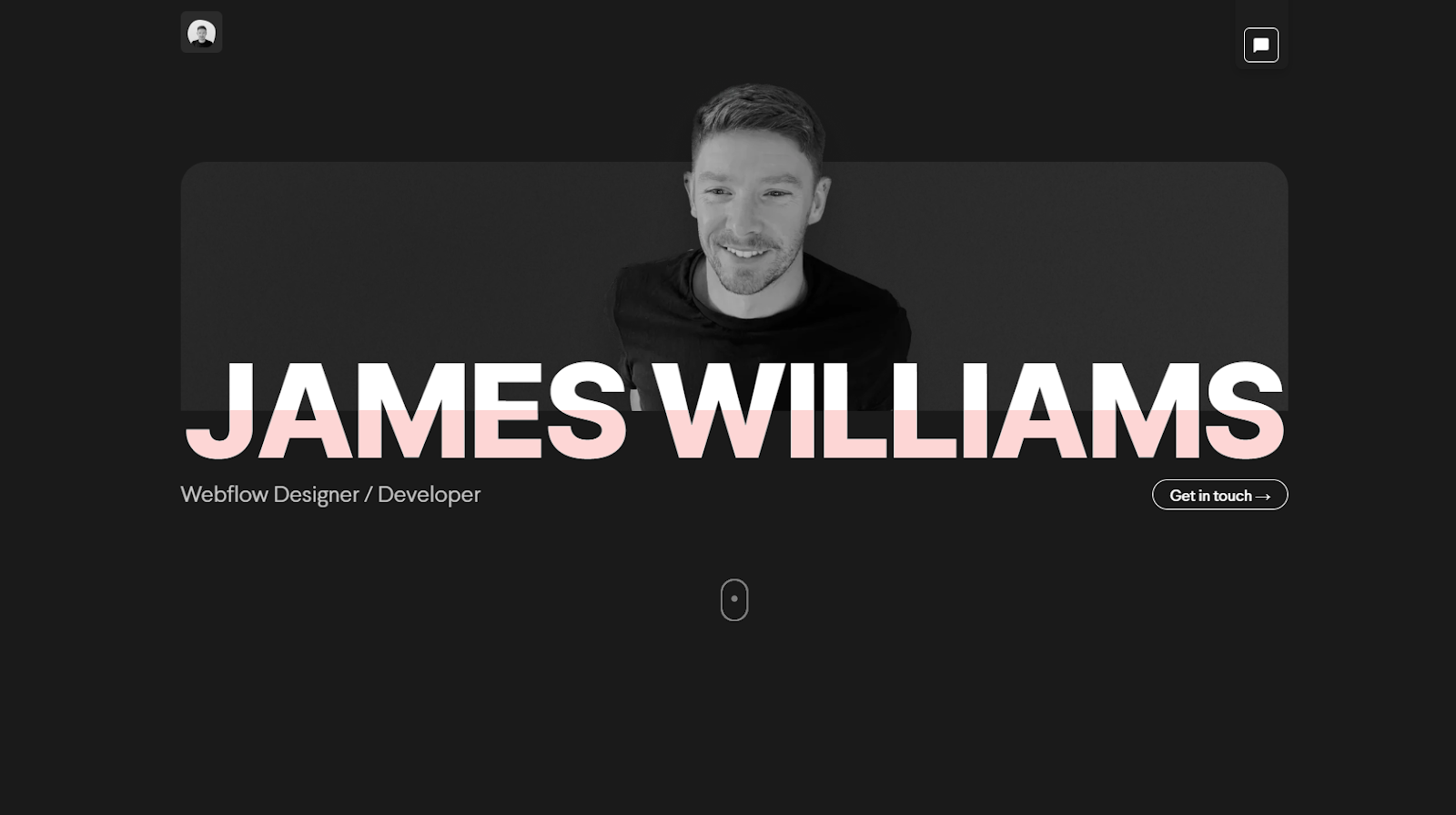
James Williams is a Webflow designer and developer, and this portfolio site succinctly portrays James’ experience in the field. The animated homepage guides visitors through James’ most recent work, with links to pages dedicated to each case study. A “Get in touch” button subtly exists in the header, and the homepage closes with a more prominent callout, encouraging visitors to reach out without overwhelming the site with CTA buttons.
4. Timothy Maurer
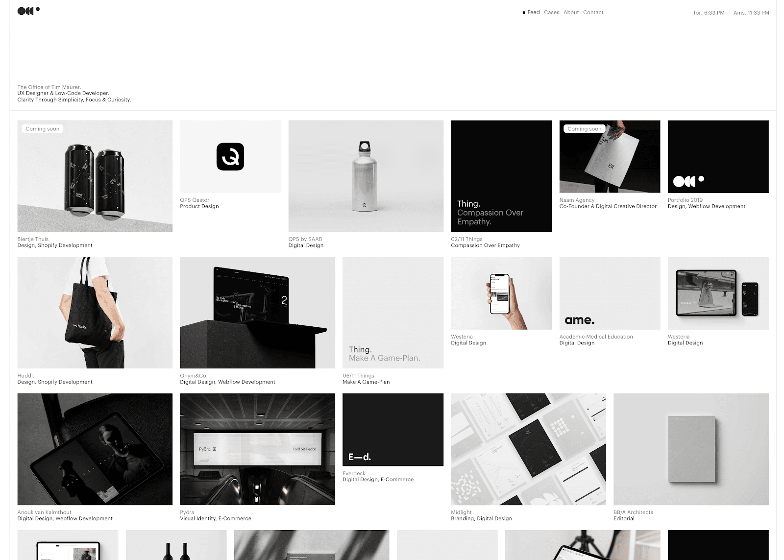
This site is an excellent example of a clean, uncomplicated, and project-focused portfolio. Timothy Maurer’s portfolio acts as a streamlined index for all his best work. The homepage presents an impressive feed of his projects, with projects speaking for themselves among a distraction-free UX design.
5. Artemii Lebedev
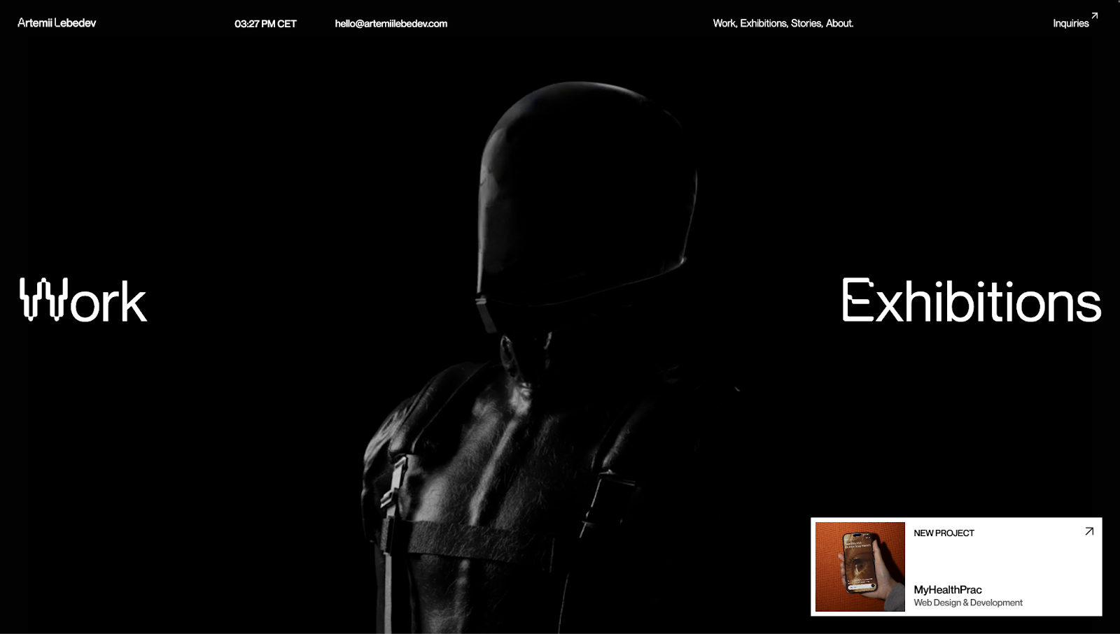
Artemii Lebedev’s portfolio opens with a looping animation of a silhouetted figure, adding a futuristic feel to the website. The strobe light and cursor tail boost the effect, instantly grabbing attention.
Scrolling reveals Artemii’s featured projects, key services, and even exhibitions. If you’re in a town where Artemii’s showcasing their work, this might encourage you to visit and say hi. It’s a nice touch that shows Artemii is approachable and eager to collaborate.
While the site’s background is monochromatic, project thumbnails and text shine with color, making them stand out on the page. Plus, a simple grid layout streamlines navigation and helps visitors quickly grasp Artemii’s multidisciplinary strength as a visual director.
6. Dan Machado
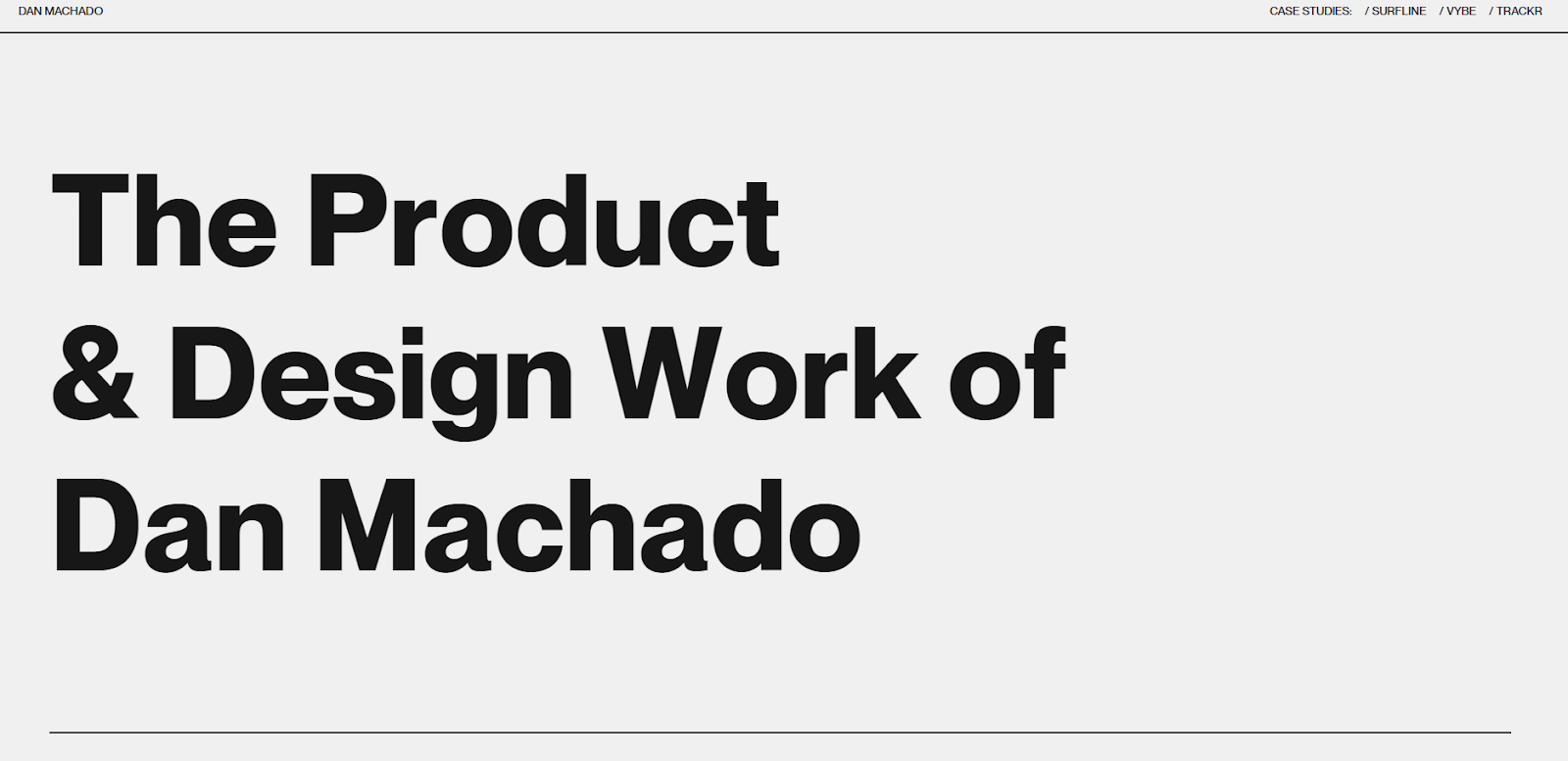
Dan Machado is a multidisciplinary designer who uses large, striking imagery to invite you to explore his case studies. Each case study balances copy with imagery so visitors with the time can thoroughly understand the work, while speedy scrollers can quickly discover what Dan is capable of.
Dan’s site is an excellent point of reference if you’re considering using a lot of imagery to complement your portfolio’s copy.
7. Jose Ocando
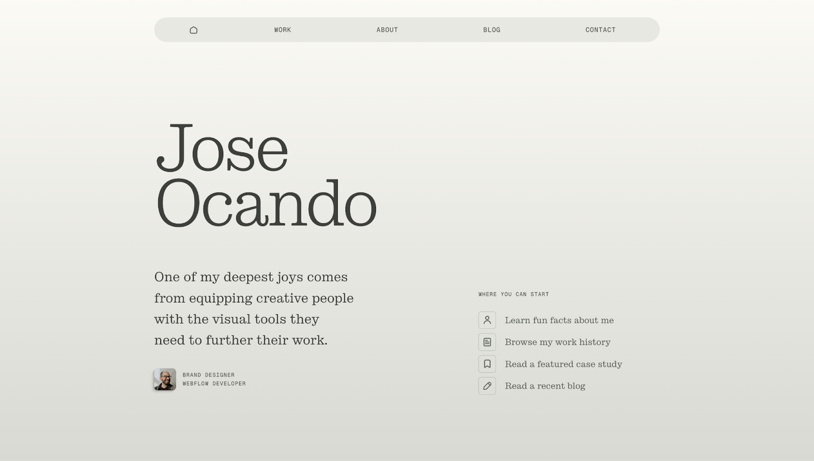
Jose Ocando’s portfolio greets you with a warm statement: “One of my deepest joys comes from equipping creative people with the visual tools they need to further their work.” Immediately, this makes Jose seem friendly, caring, and approachable. Next to this, a “Where you can start” section gives you a straightforward navigation point to kick off your journey.
If you choose to go down that route, you can learn fun facts about Jose or read a recent blog article. And if you continue scrolling, you’ll see edge-to-edge projects within large user interface (UI) cards. Each has a thumbnail, a brief description, and a standout CTA button to make readability easier.
Below this, a carousel encourages you to interact through back and next buttons so you can view all of Jose’s work. If something resonates with you, you can reach out through the contact or social media buttons and get in touch with Jose for a new project.
8. Kerem Suer
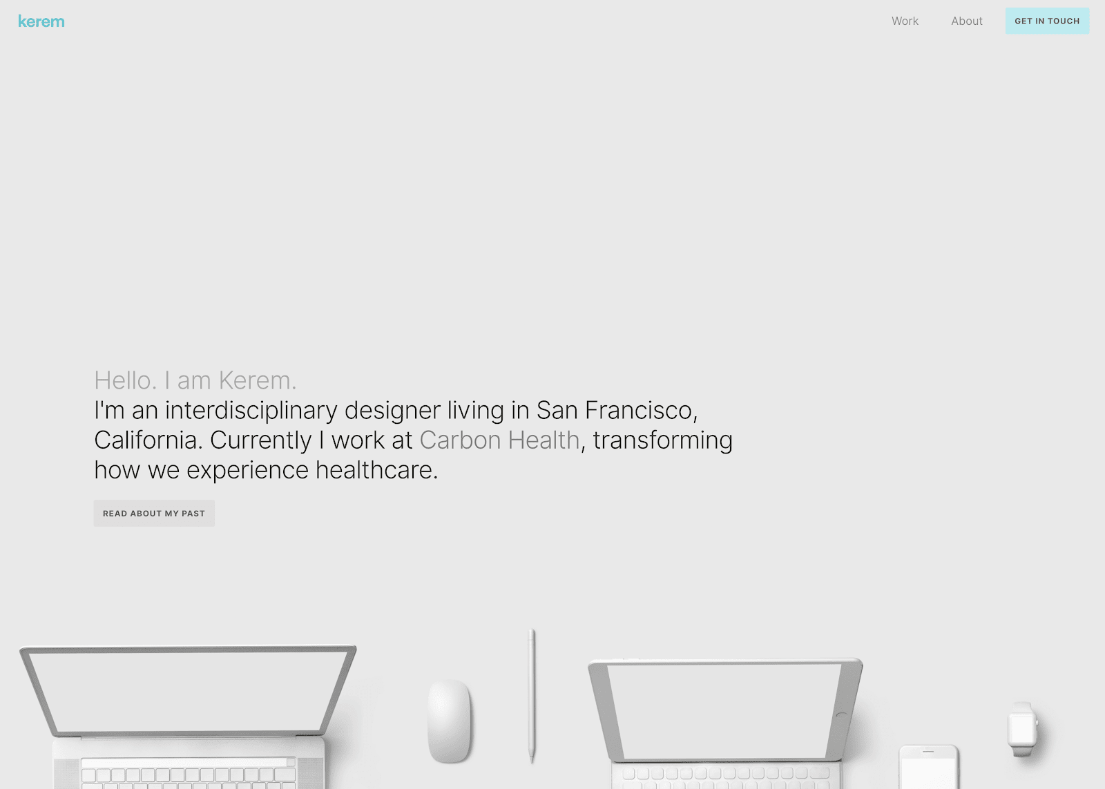
Kerem Suer is an interdisciplinary designer based in San Francisco. To effectively showcase all the arenas he excels in, Kerem added brief tags to each design showcase on the homepage, like “product,” “UI design,” and “brand.” He also gives a small peek into his design process by breaking elements of his work into various sizes and layouts.
9. Alex Beige
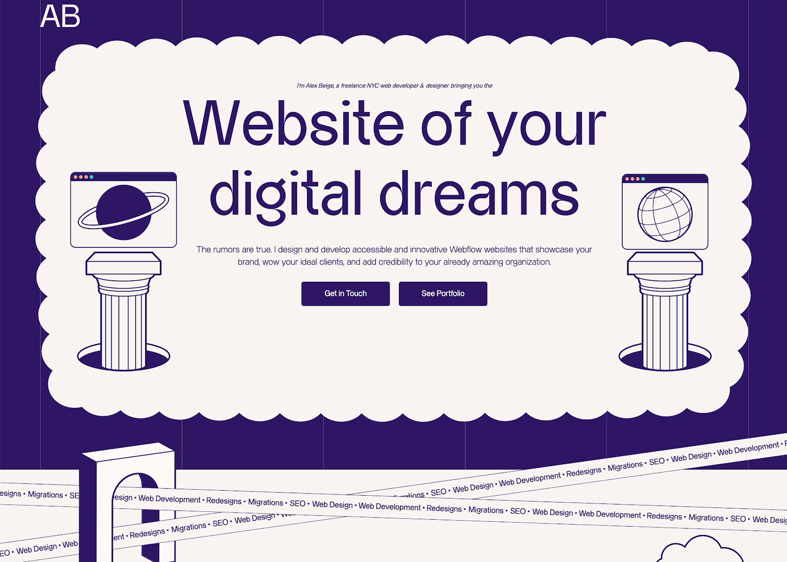
Alex Beige is a New York City-based web developer and designer whose portfolio site takes you on a journey that showcases Alex’s fun personality and stellar work. This one-page website walks you through their previous client work, the design and development process, a (hilarious) team page, and a CTA to get in touch. Playful imagery and subtle animations engage readers throughout.
10. Moritz Petersen
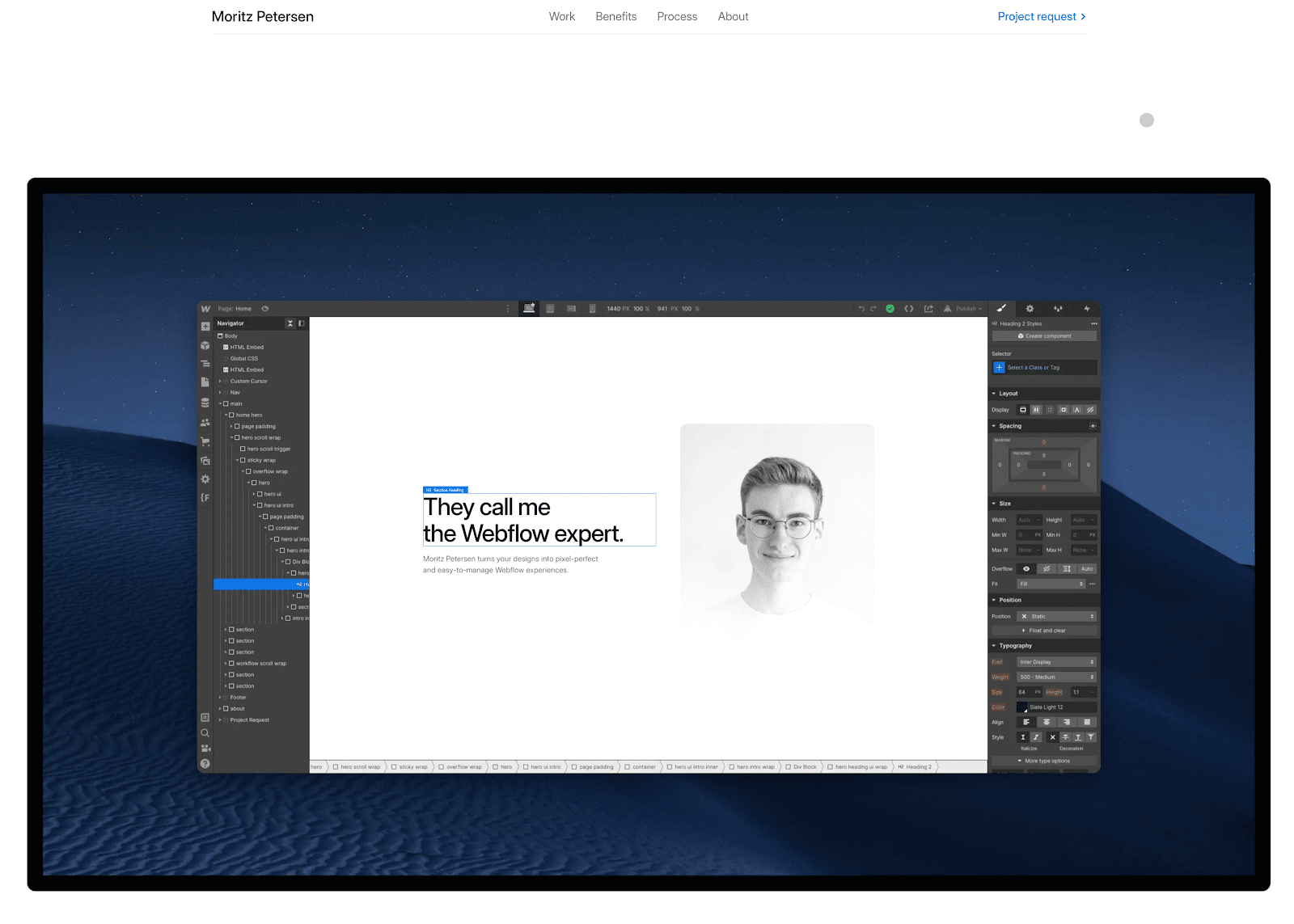
Moritz Petersen is a freelance web designer and developer who fully tailors sites to client needs. His online designer portfolio features a beautiful scrolling interaction through the Webflow Designer while showcasing the clients he’s worked with.
Toward the end of scrolling through Moritz’s homepage, visitors see a showcase of his workflow so future clients know what to expect when working with him. He also promotes Webflow as a web development platform to inspire clients to use him for Webflow-based services.


Launch with Webflow Templates
Choose from hundreds of professionally designed website templates for any industry or style. Customize visually, launch instantly — no coding required.
11. Colin Moy
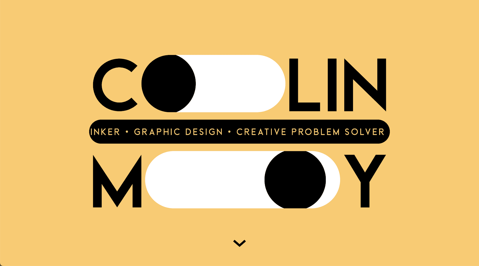
Colin Moy’s homepage is particularly eye-catching, with animated eyes representing the O’s in his name. He keeps the theme throughout the site, making the O’s in “About,” “Portfolio,” and “Contact” clickable elements that open a larger circle with more information. Clicking “Portfolio” triggers an accordion of vertical ovals, each with preview images or video and a project name.
It’s a playful design that encourages readers to explore the whole site to look for all the O’s, keeping them engaged. Clone this project to see whether this playful style suits your work.
12. Matthew P Munger
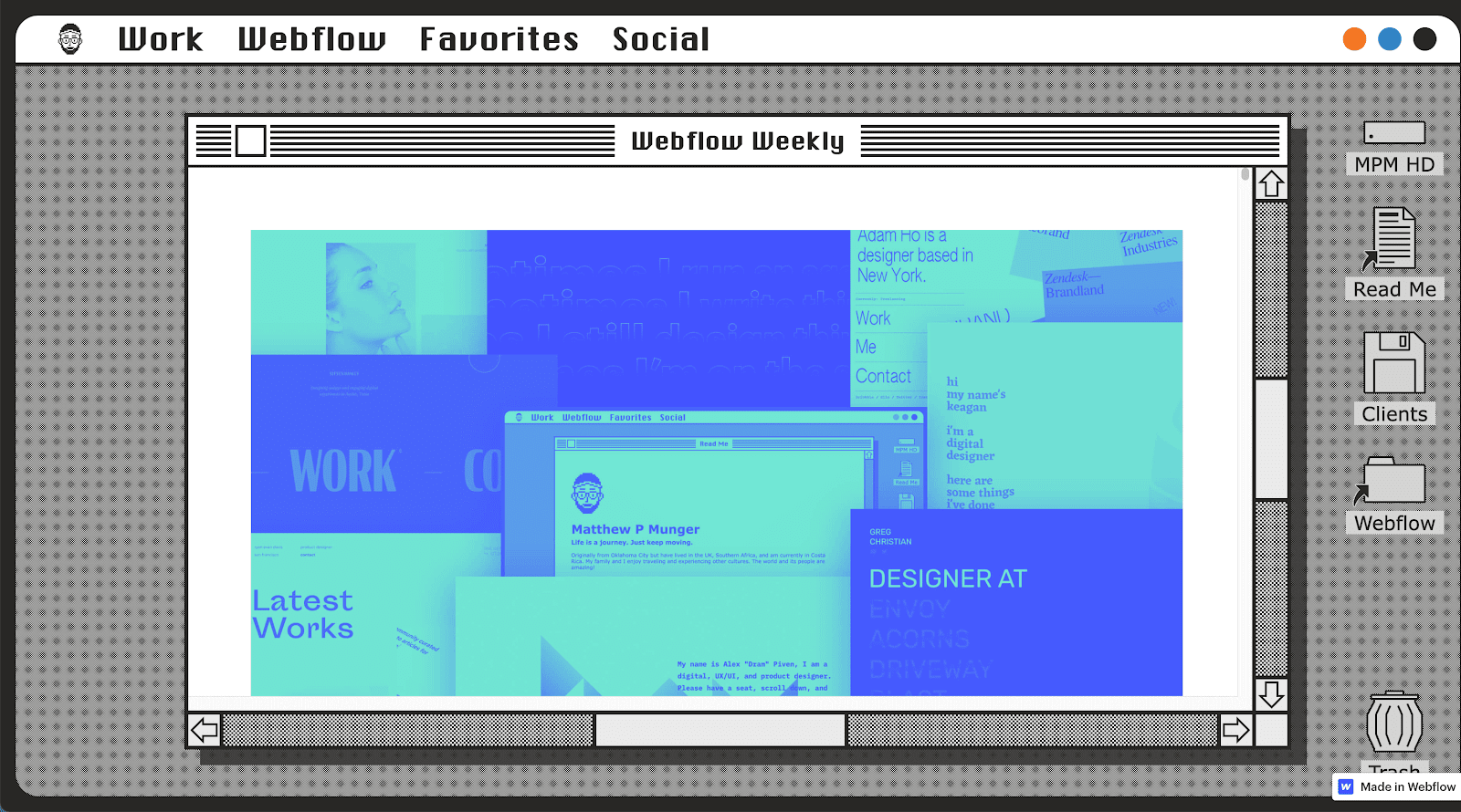
Matthew P Munger is a senior product expert at Webflow. This unique design portfolio is a throwback to the classic macOS. Matthew has created a unique UX, letting us browse a system that’s since been overtaken by a more modern design. The retro style of this portfolio sets Matthew apart and delights the audience.
13. Gev Design
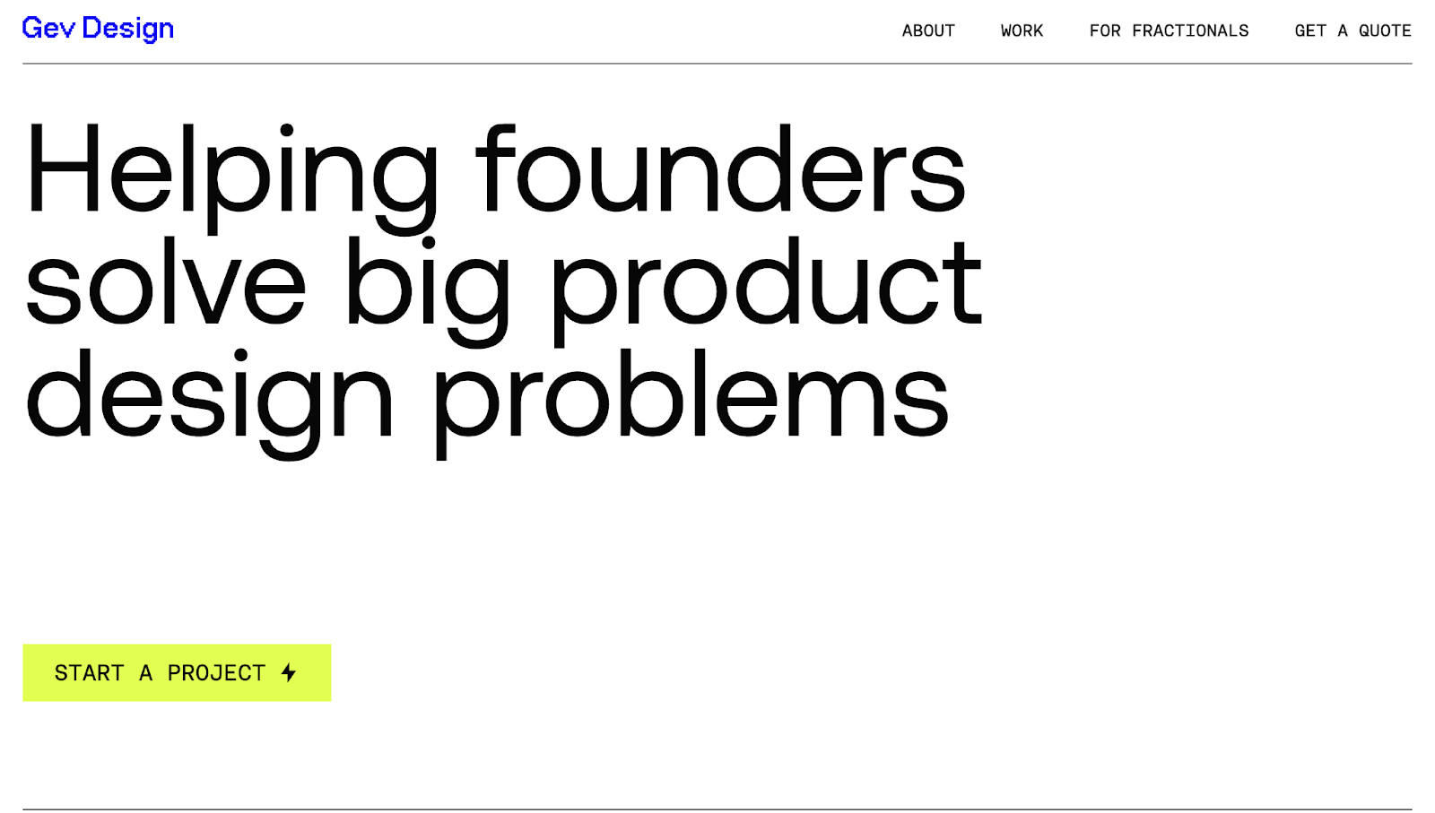
Gev Design’s portfolio has a tagline that instantly communicates who the target audience is and the value Gev Design delivers: “Helping founders solve big product design problems.” Following this, a lime CTA button prompts you to start a project. And right below this is a rotating list of high-profile founders Gev Design has worked with, encouraging you to click the CTA button.
In addition to standard sections like services and featured work, Gev Design adds quotes like “Not just a designer. I’m your partner.” to reassure everyone, from big company heads to startup founders, that any project will be a collaborative experience.
14. Brett Land
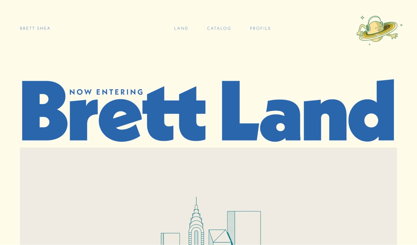
Brett Land is the portfolio of Brett Shea, a copywriter, designer, and creative director based in San Francisco. He sets himself apart with confident, quirky writing, such as “Now entering Brett Land” and “...why don’t you just click below to peep the type of work I’ve been known to make?”
The catalog page features high-profile projects for companies like Lyft and Airbnb to flex his expertise. Meanwhile, his “Stupidfest” page showcases his humor, with mock products like beer-flavored yogurt and hummus-flavored Gatorade.
Overall, Brett’s portfolio is unique, fun to explore, and memorable — all required to stand out.
15. Michael Ji
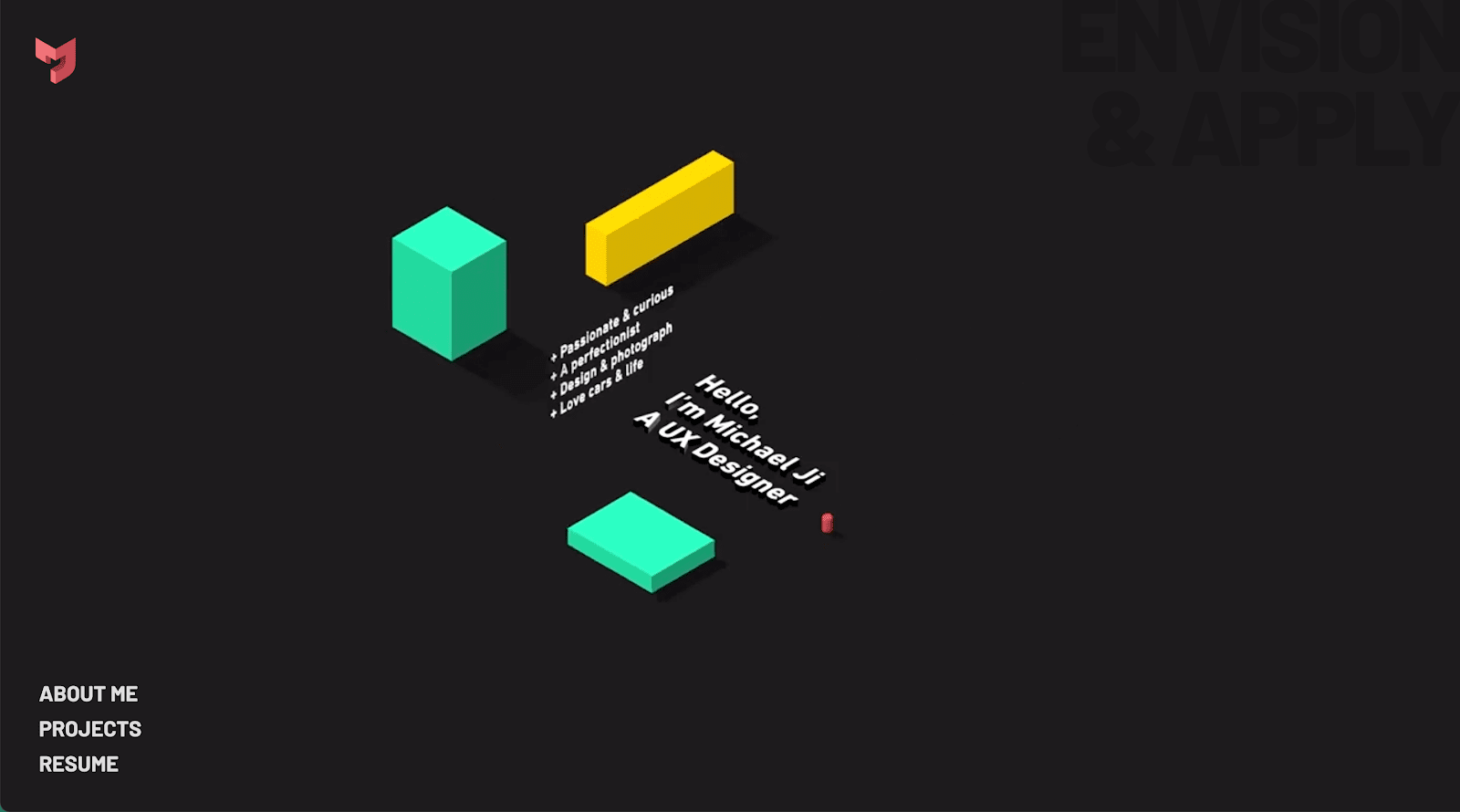
Michael Ji’s portfolio uses fun animations to showcase his work in a tightly curated way. From the moment you land on the site, various moving elements encourage you to view certain items, like core characteristics that make Michael who he is (including “Passionate and curious” and “A perfectionist”). As you scroll, projects move in and out of view to offer a more comprehensive look at his work. You can stop to explore each project, or continue scrolling to get a quick glimpse.
16. Hung Design Studio
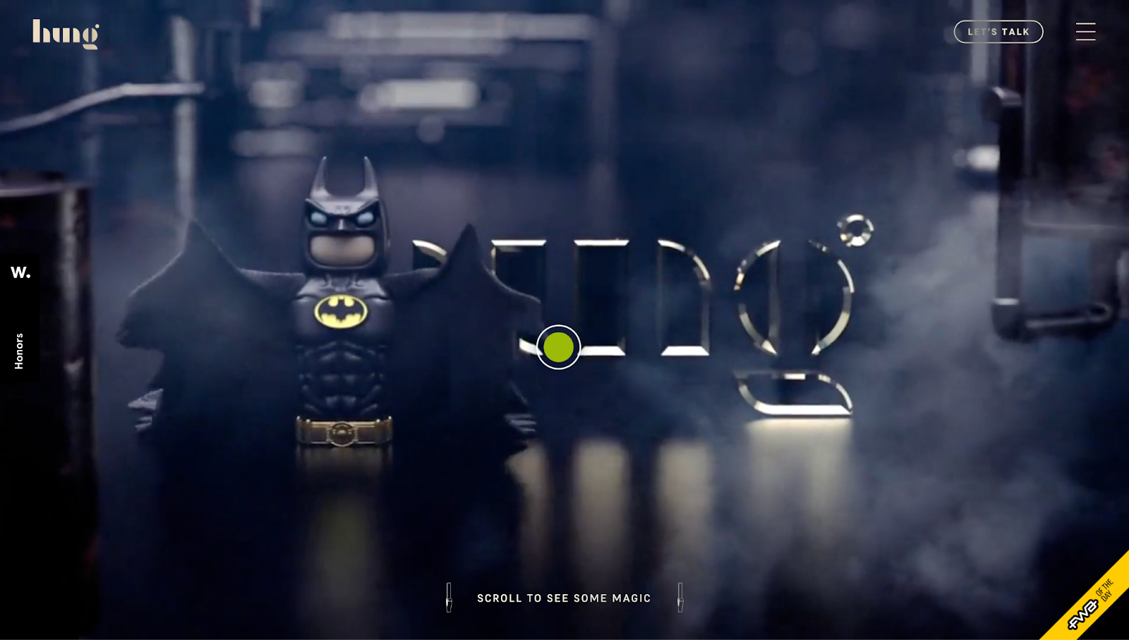
Hung Vinh’s website for Hung Design Studio begins with a high-energy montage of various animations, each designed around the studio’s logo. It instantly reinforces brand identity and shows Hung’s capabilities as a designer and animator.
Scrolling brings more attention-grabbing movement and color — text pops up, background colors change, and elements respond to your mouse’s actions. If you move from side to side, a UI card tilts accordingly. If you hover over a static thumbnail, it comes to life.
After scrolling through a visual spectacle of projects, Hung lists a thorough collection of clients. He lets the work do the talking and follows up with a list of satisfied customers and a form to help you reach out.
17. Adam Ho
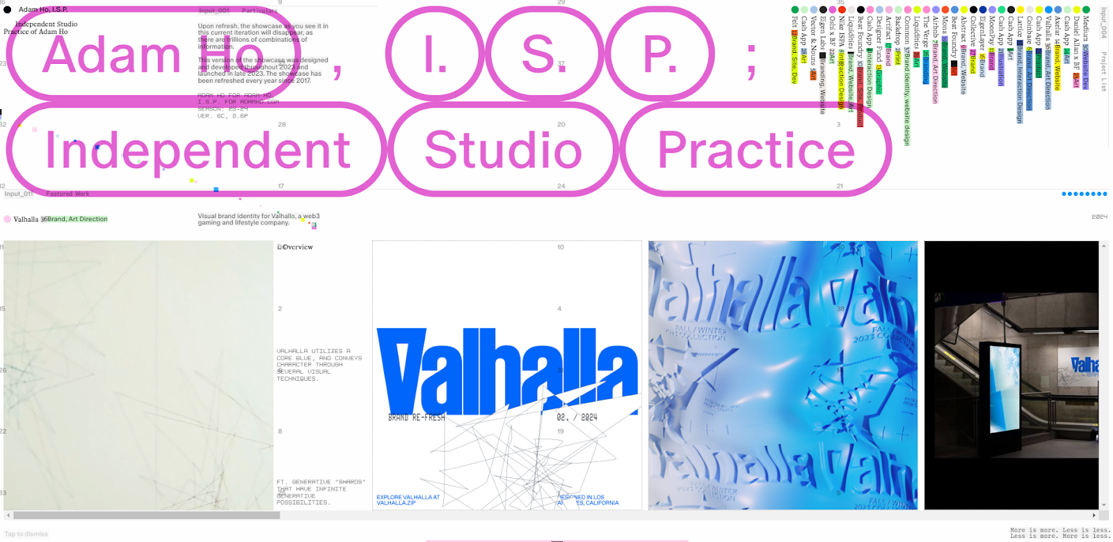
Adam Ho’s portfolio uses a busy design style that might be overwhelming at first but becomes fun to play with as you scroll and move your cursor around. The statement at the top of his site prepares you for a truly unique experience: “Upon refresh, the showcase as you see it in this current iteration will disappear, as there are trillions of combinations of information.”
While simplicity is often best to showcase project work, this site stands out for breaking all the rules.
18. Matt Jablonski

Matt Jablonski’s designer portfolio generously uses white space to highlight previous work. Every card on the homepage has a pale-colored overlay that stands out against the white — each notably different but adhering to a complementary color scheme. The pastel color palette brings all the elements together into a cohesive experience.
19. David McGillivray
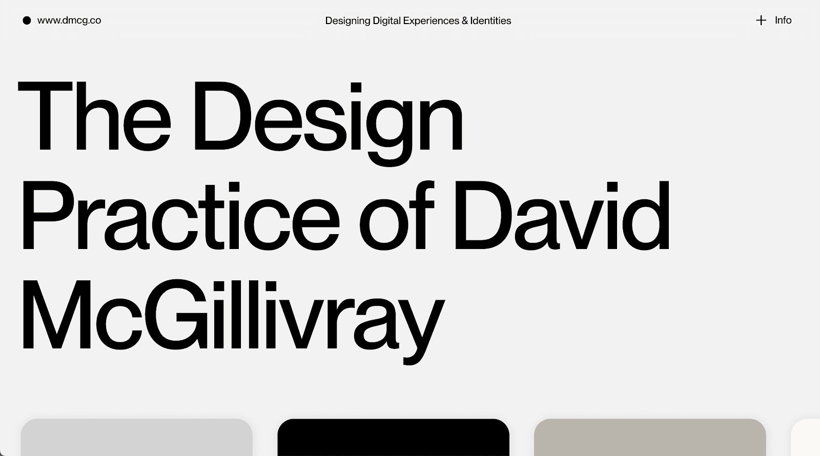
A seasoned creative director and designer, David McGillivray creates holistic design solutions, which this unique portfolio reflects. It’s evident that David is an experienced UX designer: the design balances copy with imagery excellently, pulling focus to project work with large images while also including enough information to satisfy visitor curiosity. Each image-heavy project page immerses us in David’s work, showcasing animations, microinteractions, and product design.
20. Dylan Brouwer
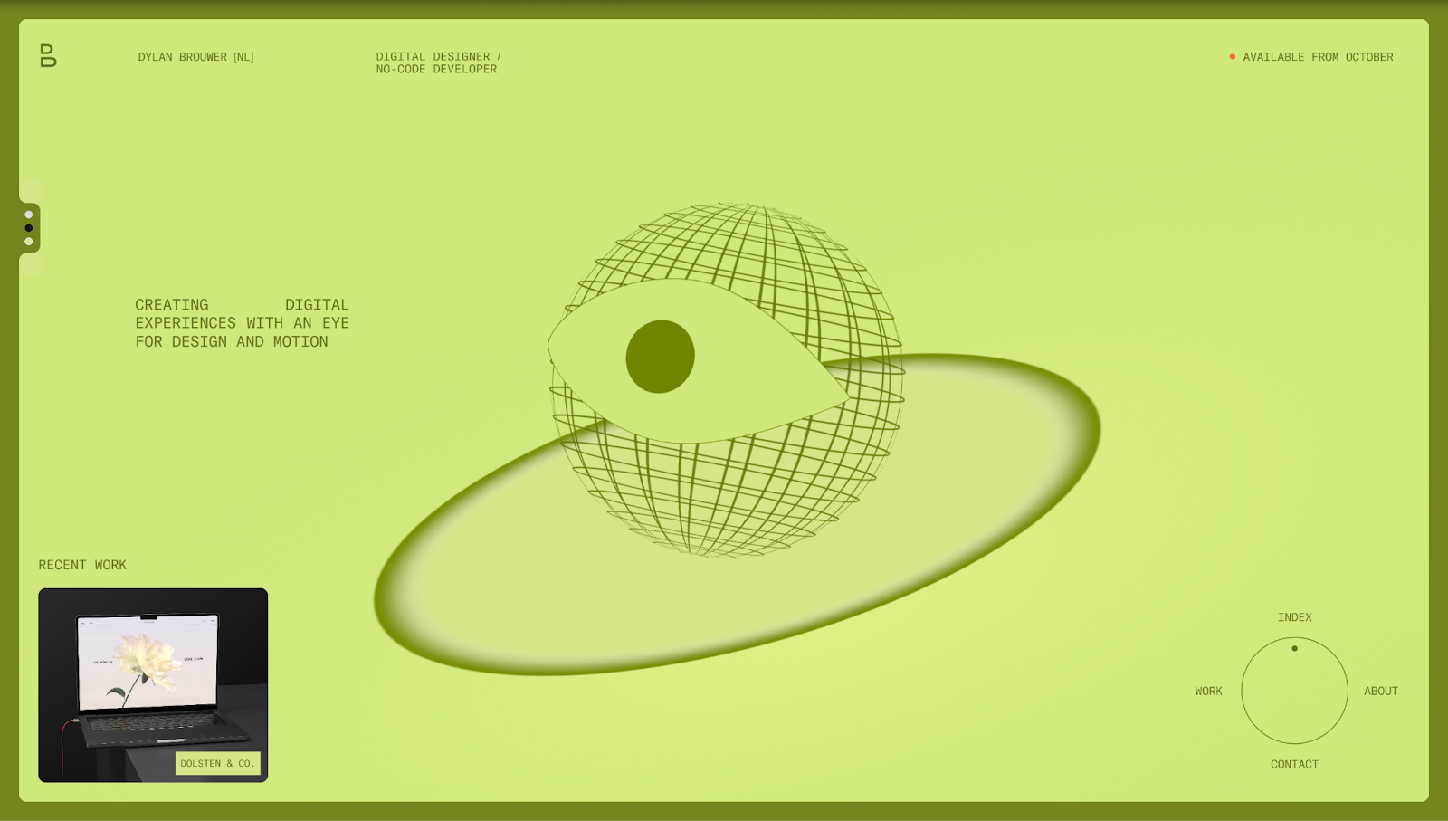
Dylan Brouwer’s designer portfolio opens with a splash page that lets you “set the mood” for your browsing experience. Before you enter, you can set the site to light, dark, or even spring mode. This is a subtle way to make the site more visually appealing, and it allows visitors to take control of the user experience in a way that makes it more accessible to every individual.
If you don’t like the mode, you can switch between the others with the three dots on the left. Instead of using scrolling to show you more details, the website is a single page, so everything from recent work to contact details sits in one, easy-to-see layout. In the middle, a globe-shaped eyeball follows your cursor around, making the experience fun and interactive.
21. Maria la Portuguesa
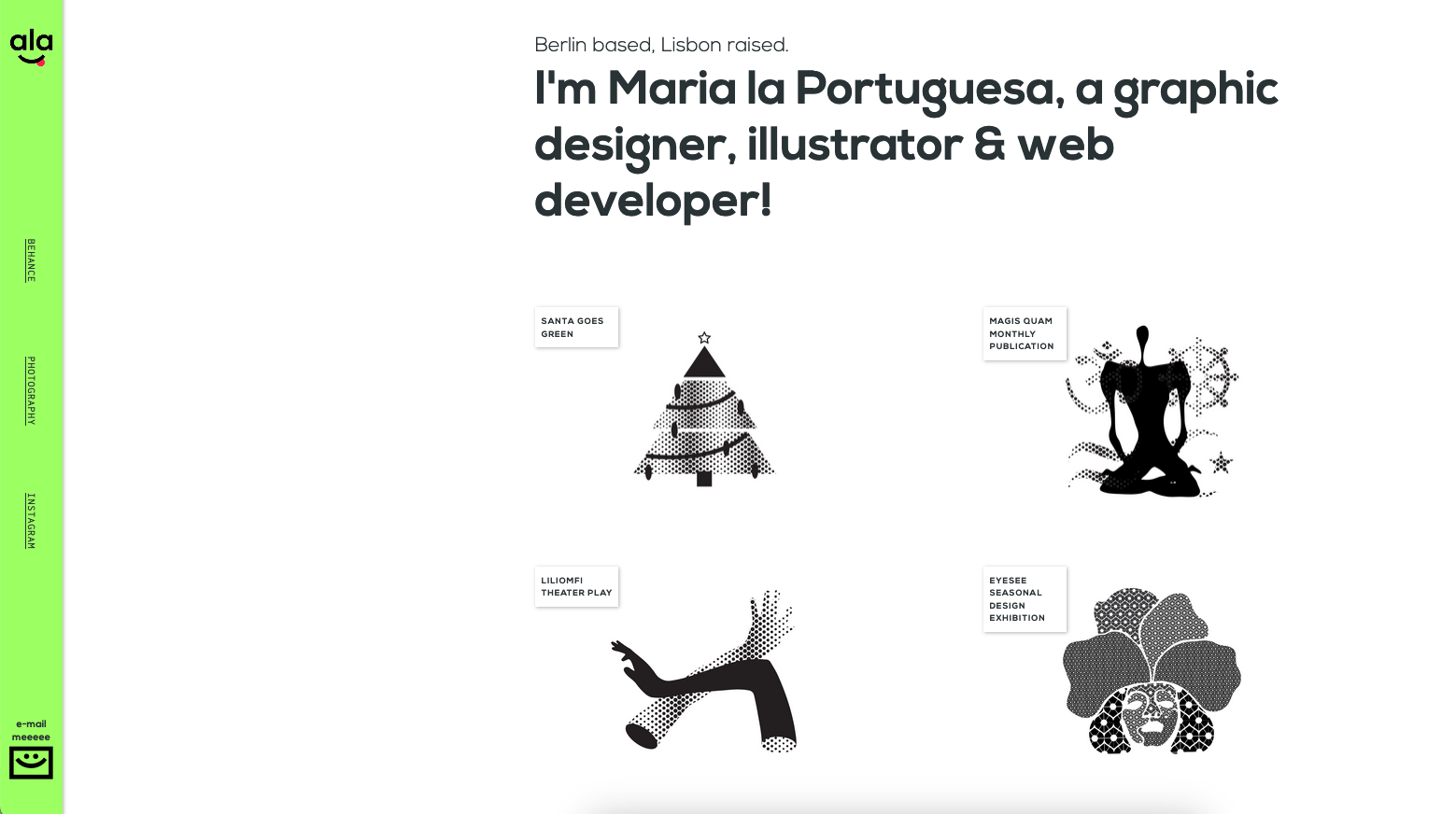
Maria la Portuguesa is a Berlin-based graphic designer who uses their site to show off their quirky graphic design skills, branding, and logo designs. This site perfectly balances showcasing one’s personality without distracting from project work. The homepage highlights 10 project work snippets that, once clicked on, open a webpage that discusses each more thoroughly.
22. DesignPilot’s portfolio website template
If you want to build a comprehensive one-page portfolio, this cloneable template by Chethan KVS at DesignPilot is a great start. The top menu gives the illusion of a multipage site, but clicking on the options simply jumps the page to the selected section.
This outline uses motion throughout, with text and images sliding into place as you scroll. It also includes placeholders for client testimonials, a contact form, and a footer section with social media icons and additional links.
23. Farzin Zaman Khan

Farzin Zaman Khan is a web designer and Webflow developer who uses white space to draw attention to his work while creating a fun navigation experience (circles along a timeline unite as you scroll and hit the next project) to keep visitors scrolling.
Farzin opens the site with a bold “Email me” CTA button for those who want to get in touch right away. And at the end, he places his contact information in a striking, user-friendly heading with clever animations that make the experience more exciting.
Web design portfolio trends for 2026
In web design, certain patterns emerge that go beyond aesthetics. If you want to market your brand to clients, the most important factor to consider is how they might experience your work and connect with you. These three design trends showcase what many potential clients appreciate in a web design portfolio — and they’ll likely continue to be popular in 2026.
Minimal navigation
Watered-down navigation without clunky or maximalist menus is becoming more popular in modern designs. By stripping menus to the essentials or replacing them with intuitive scroll-triggered lists, you can keep the focus on the work. Minimal navigation also means visitors are less likely to get lost or overwhelmed. You can also use one-page layouts to remove menus altogether, letting your projects remain the center of attention.
Bold typography
Oversized fonts, expressive typefaces, and simple backgrounds to let the text shine. Fonts are also a quick way to establish your personality, whether that’s playful, authoritative, or somewhere in between. With screen resolutions improving and people expecting distinct “voices” from brands, strong typographic choices will be a popular trend for portfolio designs.
Interactive storytelling
Static galleries are giving way to immersive, narrative-driven user experiences. Interactive storytelling, through animations, microinteractions, or in-depth case studies, lets visitors feel like they’re part of the design journey. Potential customers will appreciate this, as it gives them a taste of what it’s like to work with you and how results might turn out.
Now that you’ve gotten portfolio website tips and trends to inspire you, it’s time to choose a website platform.
What are the best platforms for building a portfolio?
Choosing the right website builder is just as important as the work you want to showcase. Each option has its pros and cons, and the best fit depends on your goals and the level of control you want over your online portfolio’s design and functionality. Here are the best options for building your portfolio website.
Webflow
Webflow offers complete visual control over your designs, with or without coding. You can create layouts, animations, and responsiveness within our visual canvas, while Webflow generates clean code in the background.
In addition to designing, you have built-in hosting, search engine optimization (SEO), content management system (CMS), and security features. Webflow’s all-around flexibility means you don’t have to rely on plugins or third-party tools, making it an excellent, cost-effective choice for portfolio-building.
WordPress
WordPress has a vast ecosystem of themes, plugins, and integrations. Such a library offers plenty of scalability for multifunctional sites. That means it can handle complex needs for portfolios, blogs, marketplaces, and other types of sites. However, it comes with a few trade-offs, like costs that can escalate quickly and plugin security concerns.
Squarespace
Squarespace has an intuitive drag-and-drop interface, making it accessible for beginners creating design portfolios. But customization beyond the existing template structures is limited. Hosting, templates, and analytics are all part of the package, so you don’t have to look for external features.
Build a project-winning portfolio with Webflow
With online portfolio inspiration and tips in hand, you’re ready to craft a portfolio site that’s engaging and effectively sells your unique offering. Start with Webflow, a visual development environment you can use no matter your coding expertise.
Explore the Made in Webflow marketplace for the perfect portfolio template, and check out Webflow University for courses, interactive lessons, and quick-start guides to help you get up to speed.
Show off your work.
Choose from fully customizable portfolio templates built for creatives. With Webflow, you can design, refine, and publish a standout portfolio — without writing a single line of code.