A strong portfolio is career-defining.
And in the modeling industry, your portfolio is often the first thing potential clients consider.
Sharing your portfolio on social media is a natural first step. It’s where potential clients learn more about your aesthetic and the environments you thrive in.
But a portfolio website is where they learn more about you. It’s the business-centric representation of you as a brand — beyond who you worked for in the past. A portfolio site shows your modeling work and attracts clients who want to work with you.
5 fantastic online modeling portfolio websites
An online portfolio represents who you are as a model. It should exude your personality and showcase your wide range of talents through photos, web design, and a short bio. Here are five of the best model portfolio websites to draw inspiration from.
1. Ira Pavlova

Russian model Ira Pavlova’s website is minimalist with clean lines and a black-and-white color scheme. Minimal design is great for modeling portfolios because it lets the photos stand out, and it’s working here: Ira’s snapshots are the focus of the homepage.
Ira’s pictures have just the right amount of white space to let them breathe. On the work page, the photos are sorted into categories. Any color on the website comes from the focal point — the images — which helps each photo stand out from the minimalist white background.
One other benefit of a minimalist website is that it helps with site speed. High-quality images are a drag on load times. That means a minimalist design that isn’t loading multiple elements in the background helps to balance speed while also maintaining a distraction-free viewing environment for visitors.
2. Shay Summerville

London-based model and stylist Shay Summerville expresses his style through vibrant colors and themed photo shoots. His portfolio website has a playful vibe and shows visitors exactly who he is.
Shay’s landing page combines muted and bright tones to prove his styles don’t lie in one niche. The collections page confirms his diverse body of work, displaying photo shoots with titles like “Double denim” and “Pink cowboy.” The color and cheeky titles entertain but don’t overwhelm — negative space and crisp text keep attention on his modeling.
Shay’s site uses multiple colors, fonts, and lighthearted written copy to mirror his fashion sense with functionality and fun.


Get started for free
Create custom, scalable websites — without writing code. Start building in Webflow.
3. Shaukia Alhassan

Shaukia Alhassan’s unique portfolio features dynamic animations, a unique cursor, and a hidden navigation bar. The site opens with a captivating animation of her name and initials to immediately tell visitors who she is. Leading with her name makes the website — and Shaukia — more memorable.
The animated cursor also sets Shaukia’s website apart. It’s a small circle that changes color and size, and the buttons have bouncy animations and movements. We love the subtle interactive elements here that express her creativity without taking away from the site’s content.
Shaukia’s website adopts a monochromatic approach with stylistic black-and-white images. Clicking on them reveals a new page with color versions of the photos. The transition from monochrome to color lets visitors explore without being overpowered by different colors and designs.
4. Anna McClean

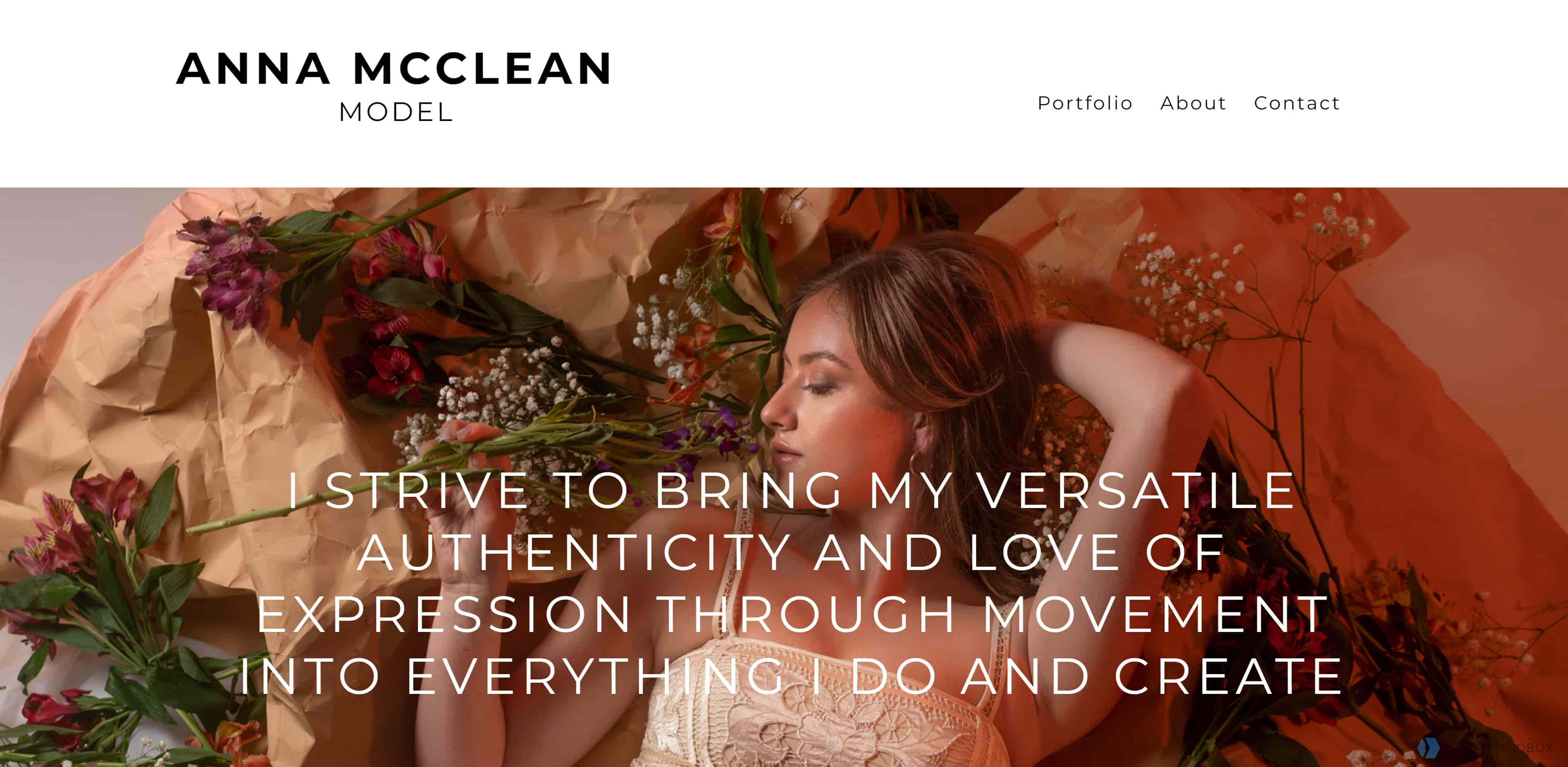
Anna McClean is an expressive fashion and commercial model. Similar to Ira Pavlova’s website above, Anna’s portfolio site has a minimalist design and bare navigation that draws users to Anna’s modeling work.
The homepage has only a header, short description, and contact information. Sans-serif fonts and white space add lightness to the design and let the background image — a photo of Anna lying down with flowers surrounding her — captivate visitors.
At the bottom of the homepage, Anna’s brief bio doubles as internal links to the about and portfolio sections of the site. This encourages visitors to naturally progress to new pages and learn more about Anna’s work.
The portfolio page has headshots, medium shots, and full-length portraits to offer variety and flaunt Anna’s skills in one continuous scrolling experience. The high-quality images retain their clarity when zoomed in so visitors can examine every detail before reaching out for booking.
5. Jessica Lee

Jessica Lee is a Los Angeles-based model, actress, and entertainer. Her portfolio’s many sections show off her talents and interests with colorful images and an organized navigation bar that’s both clean and striking.
What makes Jessica’s website different is the sheer amount of content. She divides her modeling portfolio into three pages: fashion and art, brand marketing, and media and entertainment. These separate collections allow clients across industries to find her experience in their desired niche. Portfolio websites are ultimately for clients, and Jessica’s web design tells them exactly what they need to know.
Jessica takes her site’s content further with links to a blog and an online store. Each link leads to an external website, opening a new window. Visitors can glimpse her life outside of modeling without the website feeling overwhelmed with non-portfolio content.
Your modeling career is more than the photos. Jessica’s website is a great reference point for beginners and pros who need to squeeze a lot of information into one portfolio.
Learn how to make a professional modeling website portfolio
A portfolio makes a world of difference in the modeling industry. Create a stunning website that represents your style and resonates with clients with Webflow. Plus, we have a library of templates and portfolios from other designers so you never run out of inspiration.


.jpeg)


.jpeg)


