Portfolio websites help you stand out to potential clients by showcasing your work in the best possible light.
Your web design portfolio shapes potential clients’ first impression of your work. A strong portfolio shows off your style, skills, experience, and professionalism — and ultimately helps potential clients decide whether you’re the right fit.
This isn’t just important for web designers. Graphic designers, UX writers, web developers, and content creators all benefit from a well-built online portfolio. Whether you’re a freelancer or part of an agency, publishing a portfolio can boost your brand and attract new clients.
In this article, we’ll explore 15 top-tier web design portfolio examples to inspire you. We’ll also dive into proven techniques for creating an effective portfolio site.
15 inspiring web design portfolio examples
These 15 portfolio website examples offer a structured, conversion-focused experience to potential clients. Each excels in a unique way and provides a potential framework for showcasing your own projects.
1. Hen3
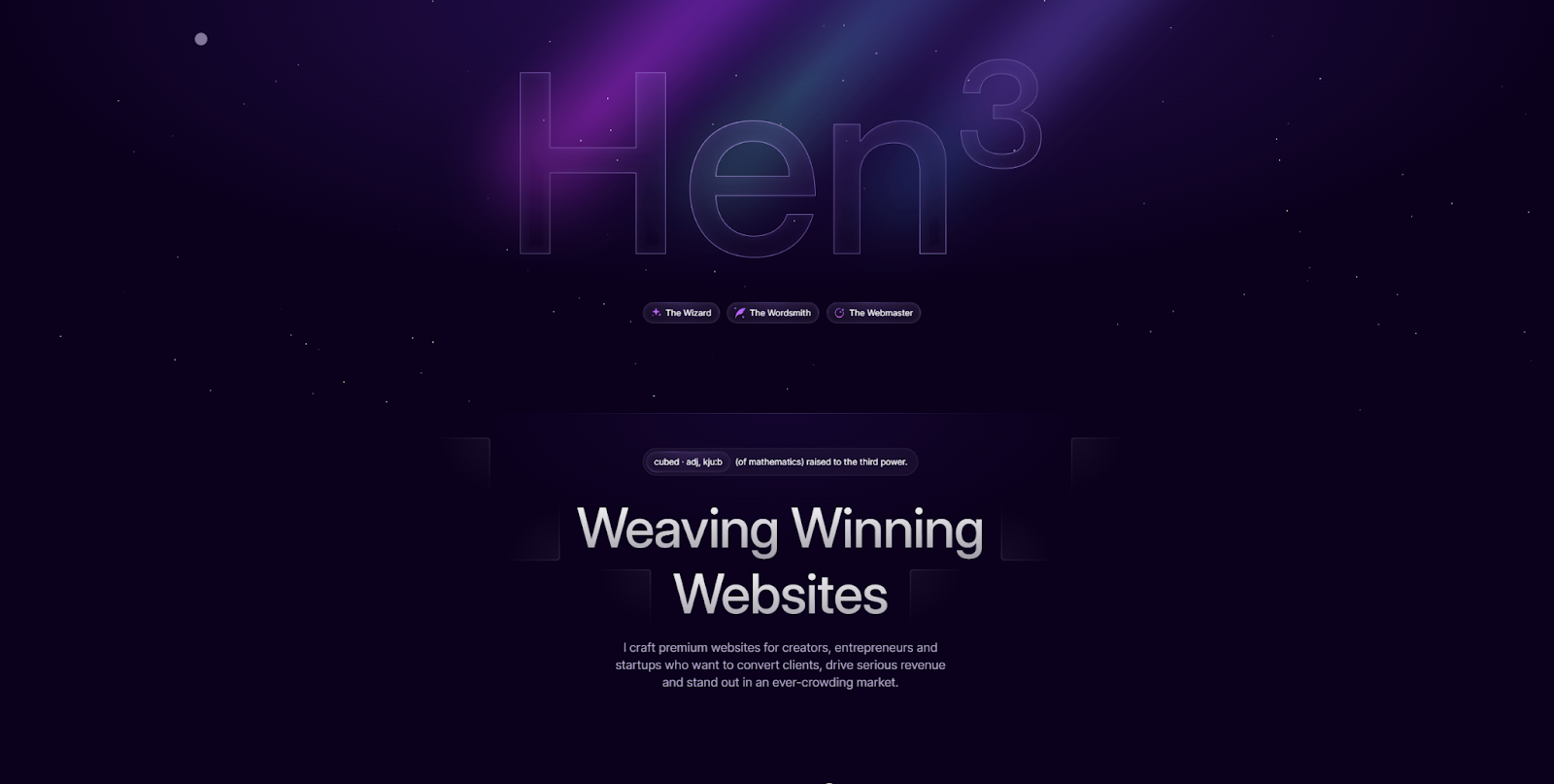
Hen3’s web design portfolio showcases their professional experience via a consistent color palette, authentic writing, and high-quality visuals. The bold typography choices and smooth animations draw the viewer’s eye without being too intrusive.
Most importantly, every case study provides just enough information without overwhelming the reader. Potential clients should notice this designer's respect for their time and ability to provide the most important details. You might follow this example if you want to strike a good balance between visuals and text.
2. Luke Netti
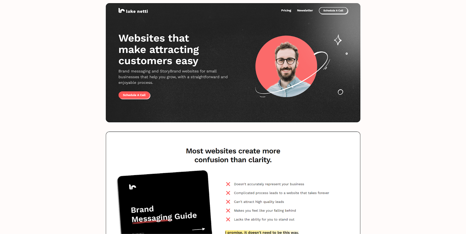
Luke Netti’s portfolio site uses a recognizable website template, but the designer makes it their own with animated buttons and simple visuals. The layout employs a Z-pattern, which mimics the way most people naturally scan a web page. This helps visitors understand the content at a glance, and draws the eye to the most important sections.
There’s no unnecessary fluff, just good storytelling, strong credentials, service details, and a transparent pricing page. This site also provides a strong example of social proof placement, with several badges and testimonials on the front page.
3. Greaterthan
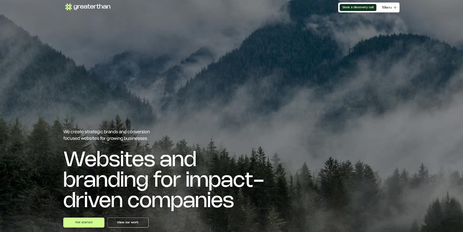
The Greaterthan design agency specializes in fast, client-centric redesigns that improve conversions. This layout showcases those skills through a structured, highly readable design and prominent calls to action that grab user attention with considered layout and phrasing.
There’s a prominent “Book a discovery call” CTA button at the top of the page, and several other invitations to take the next step. Each carefully curated section in this one-page website builds credibility and directs visitors to take action.
4. Colin Moy
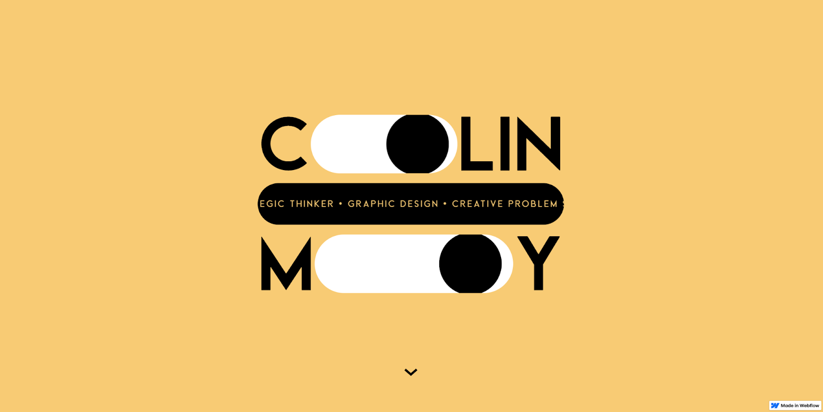
Colin Moy’s graphic design website is a long-time favorite, notable for its originality and clever styling. As a portfolio example, it highlights the level of detail you can get by using a visual-first website designer like Webflow.
On a portfolio site, style and substance are equally essential. From cursor-sensitive animations to smooth transitions, every step in this site’s user flow is a fun exploration into Colin’s style. And it’s all backed by detailed case studies demonstrating a keen design sense.
5. MN Studio
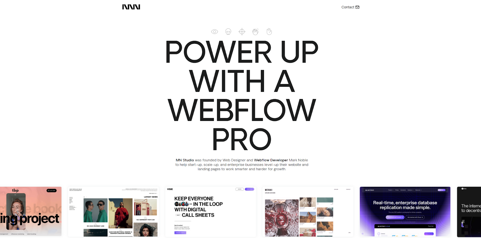
MN Studio is a design studio headed by Mark Noble with a long list of successful projects. That experience is the first thing you’ll notice when you visit this web design portfolio.
There’s a scrolling gallery of examples above the fold. Moving down, you’re presented with a list of recent projects, and you can hover over each to learn more. When you select a case study, you’ll find a wealth of visual examples, providing an excellent application of “show, don’t tell.”
6. Eduard Bodak
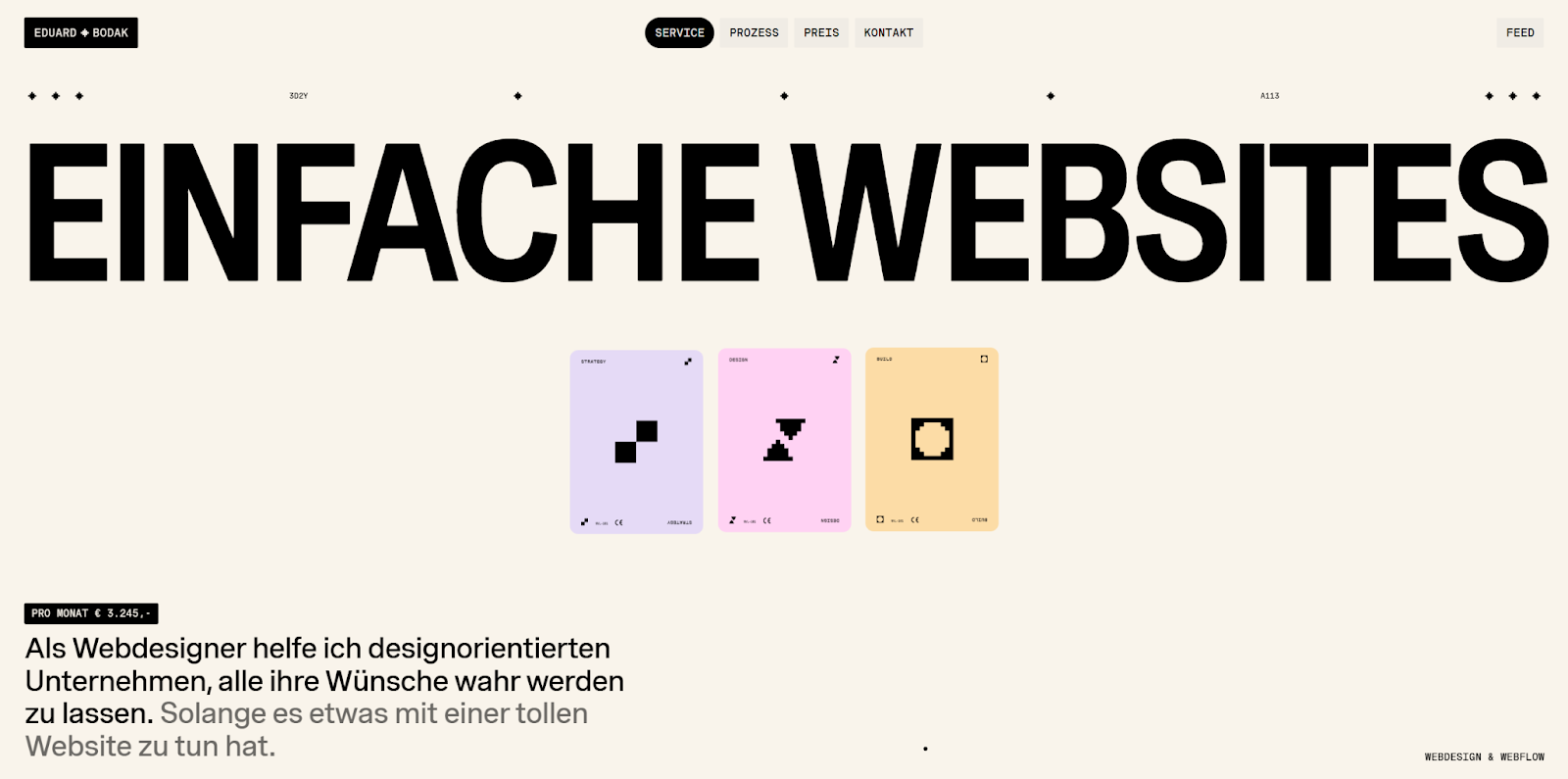
Eduard Bodak’s web design portfolio immediately highlights their strong visual style. Bold typography immediately grabs your attention, while the combination of smooth scrolling and playful animations compels you to explore the page.
Once you reach the bottom, you’re pointed toward the “Projects” and “Pricing” tabs to continue exploring. This curated user experience ends with the “Contact” page, creating a natural conclusion to a memorable journey.
7. Gillian Moran
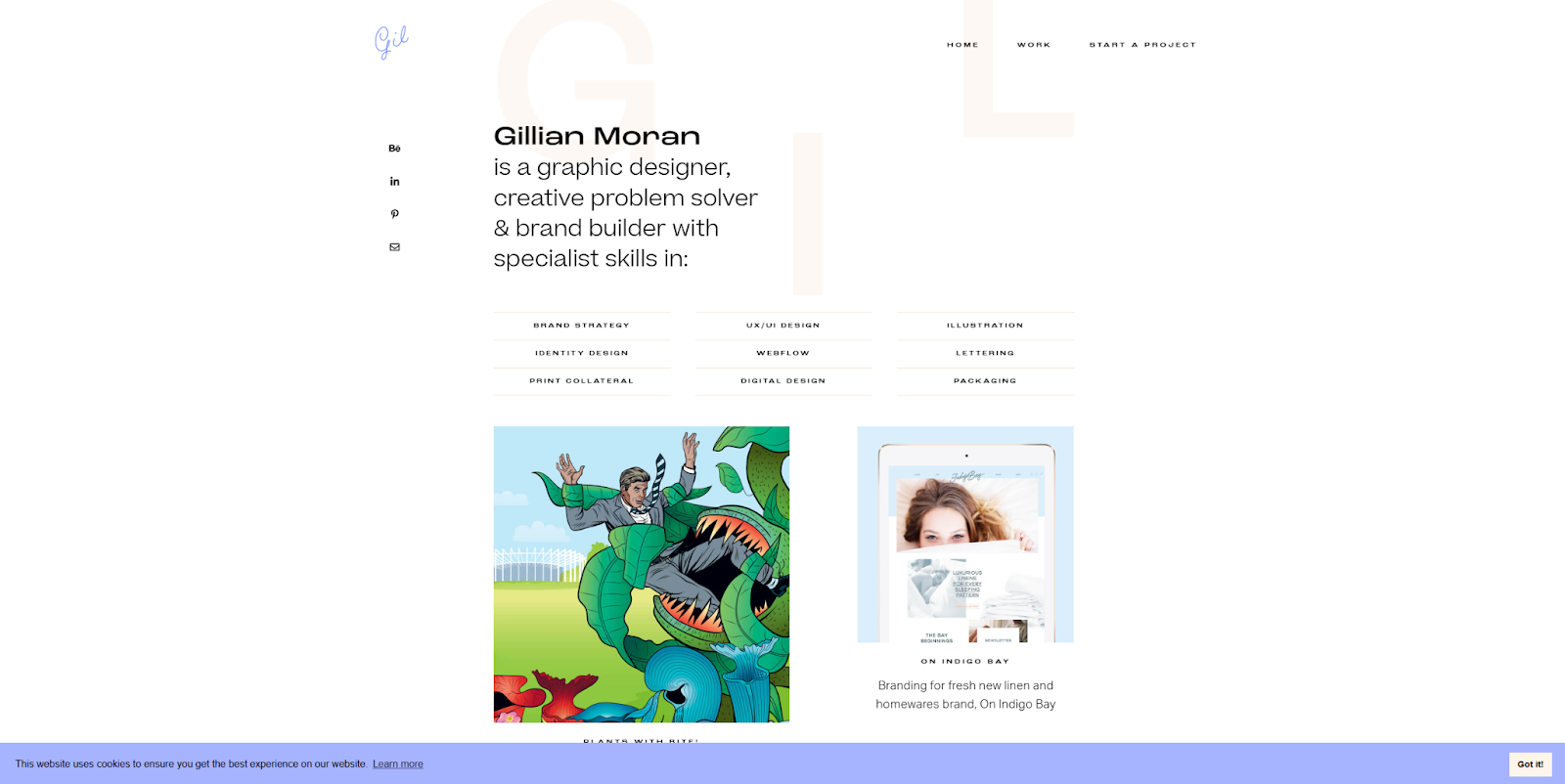
Gillian Moran’s graphic design portfolio showcases their versatility in skills, experience, and design styles. The site itself has a minimalist feel, with plenty of space for each image to stand out.
Case studies take center stage, with everything from branding projects and illustrations to UI redesigns. Casting a wide net like this lets potential clients know Gillian is a flexible designer who can tackle a range of projects.
8. Eve Kayser
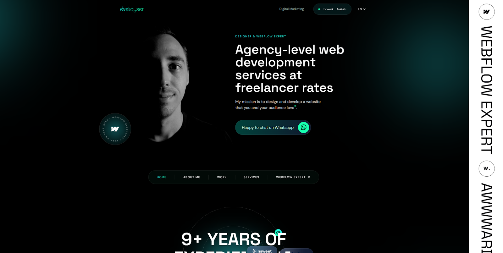
Eve Kayser’s designer portfolio uses a fairly traditional, professional layout and design elements. It may not be the most unique portfolio example on this list, but each element is purposeful and well-executed. The clear typography and accessible navigation menu promise a user-friendly experience, and everything that follows continues that trend.
One of the first things you’ll notice is that the homepage features a lot of faces, including Eve’s own and several partners they work with. Even some of the case studies feature headshots. This human-centric approach creates an air of authenticity that encourages trust in Eve and their collaborators.


Launch with Webflow Templates
Choose from hundreds of professionally designed website templates for any industry or style. Customize visually, launch instantly — no coding required.
9. Karlis Kah
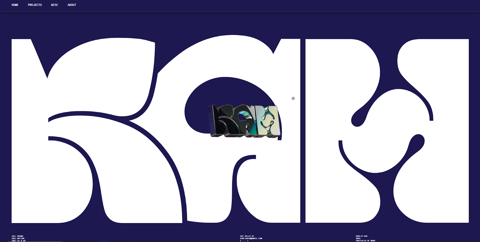
Karlis Kah’s online portfolio is playful and immersive, using bold visuals and clever animations to keep visitors guessing. Though this makes it less accessible, Karlis balances it with bold, professional fonts throughout the rest of their site.
For example, while the “Misc” tab is a little tricky to navigate, the case studies available from the homepage follow a more familiar template. It’s a solid example of how to take an unusual design path without alienating visitors.
10. Zig Zag Creative
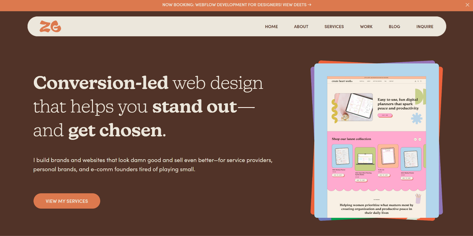
This Zig Zag Creative web design portfolio was created by Olivia Su, a self-professed “doodle-loving, color aficionado with a knack for defying creative expectations.” The warm color palette and bold visuals make every moment on the site memorable.
As for the text, it’s written with an entertaining attitude that’s equal parts edgy and professional: “I build brands and websites that look damn good and sell even better.” This is a portfolio example to follow if you want to avoid stuffy formality while still inspiring trust.
11. Digidop
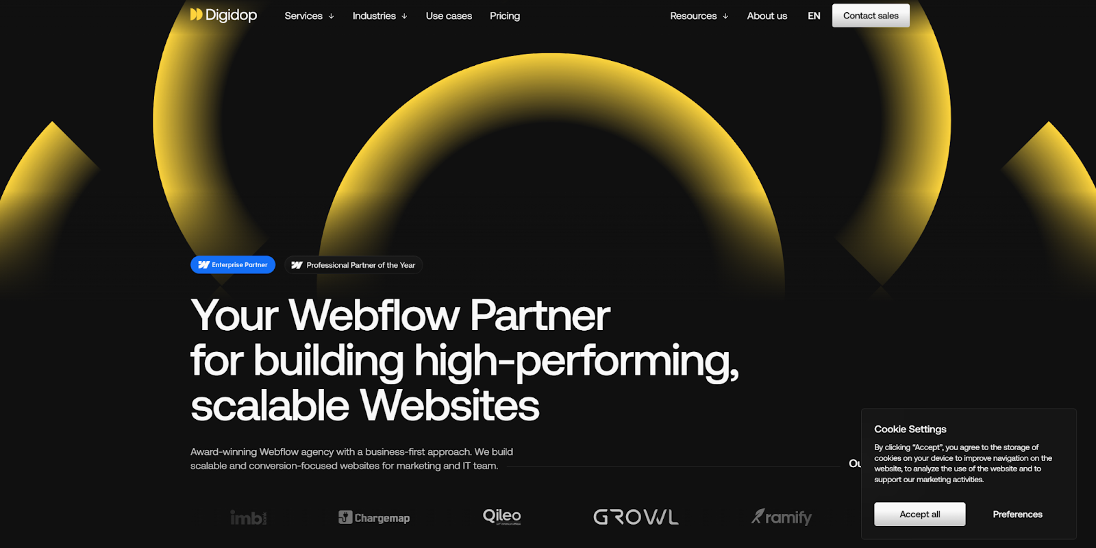
Digidop is a Webflow design agency with several accolades and an impressive portfolio of past work. They handle everything from web design to growth strategies and have worked with a wide variety of clients.
This portfolio’s layout relies heavily on social proof, emphasizing awards and high-profile clients. The language throughout is solution-oriented, with phrases like “We build scalable and conversion-focused websites for marketing and IT teams.” All of this conveys professionalism and encourages trust, which is especially important to an enterprise audience.
12. Dylan Brouwer
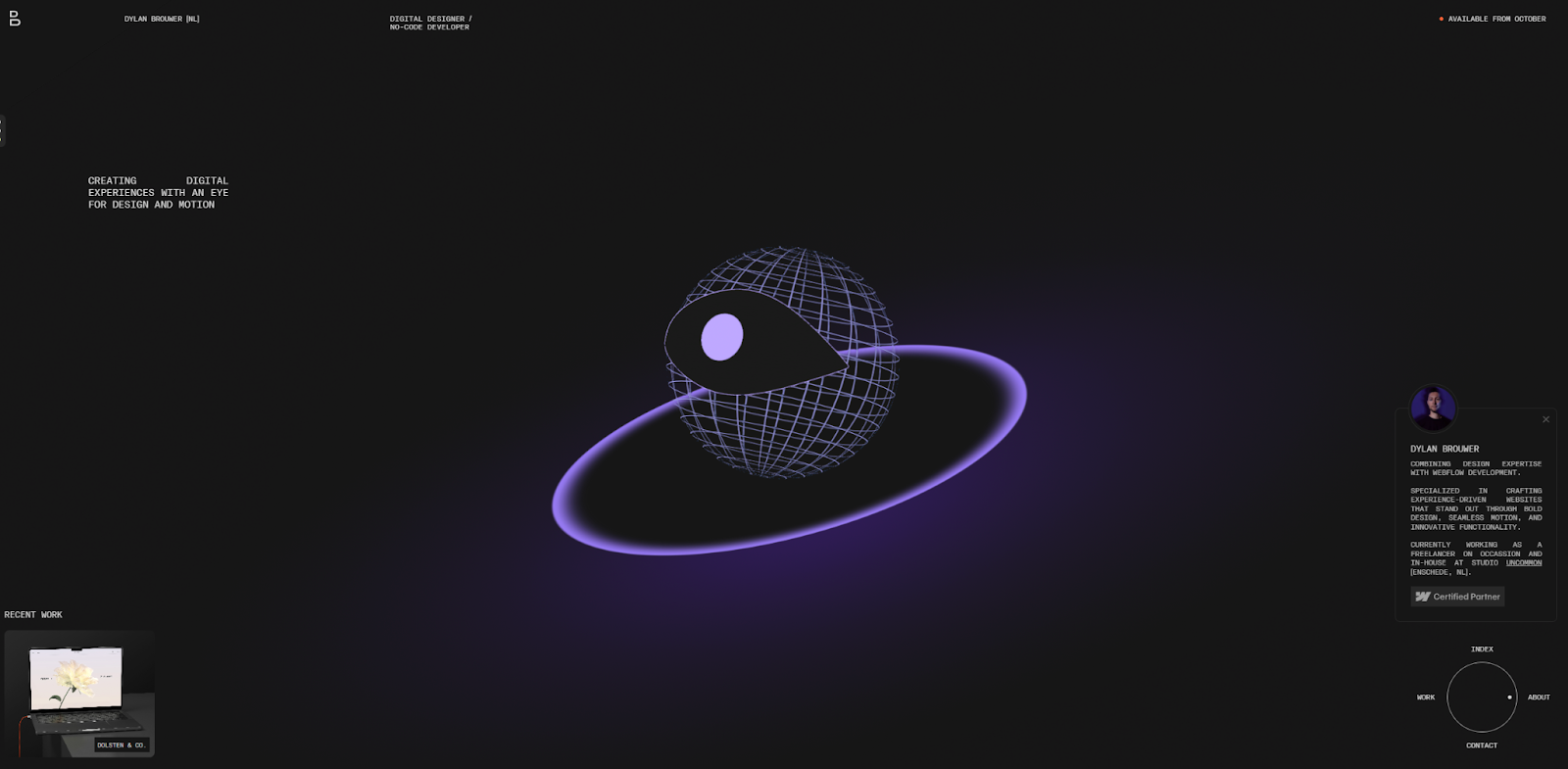
Dylan Brouwer’s portfolio website takes time to load, but it’s well worth the wait. It offers a customizable experience right from the start: The first thing you do is choose a “mood” that alters the site’s background color.
After that, the unconventional eyeball animation makes navigating this portfolio feel almost like playing a game. This design does hinder the website’s accessibility. But Dylan’s commitment to unique presentation creates a memorable experience — one that could be worth emulating if your clients want digital experiences that go beyond what a traditional website can provide.
13. Jerry Rodriguez
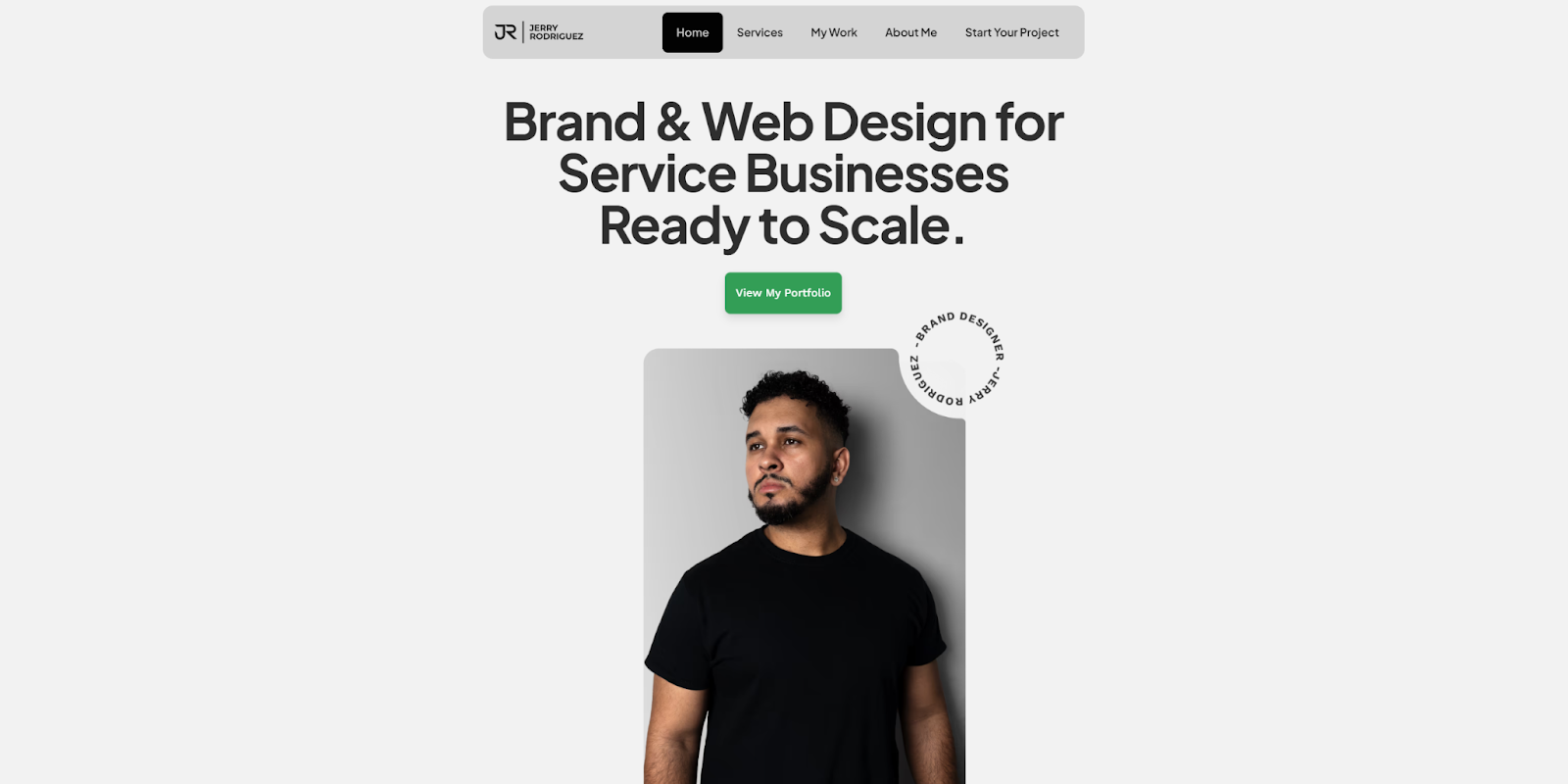
Jerry Rodriguez’s web design portfolio showcases a consistent design philosophy that features clean visuals, modern aesthetics, and a subtle color palette. A sticky navigation menu follows as you scroll, so you can find specific content, while regular CTAs guide you toward important information.
Meanwhile, the case studies highlight Jerry’s designs for a variety of industries. The signature style is recognizable in every project, and clients who resonate with it know exactly what they’ll get. If you have a similarly consistent design style, you might follow this example by putting that front and center.
14. Jordan Gilroy
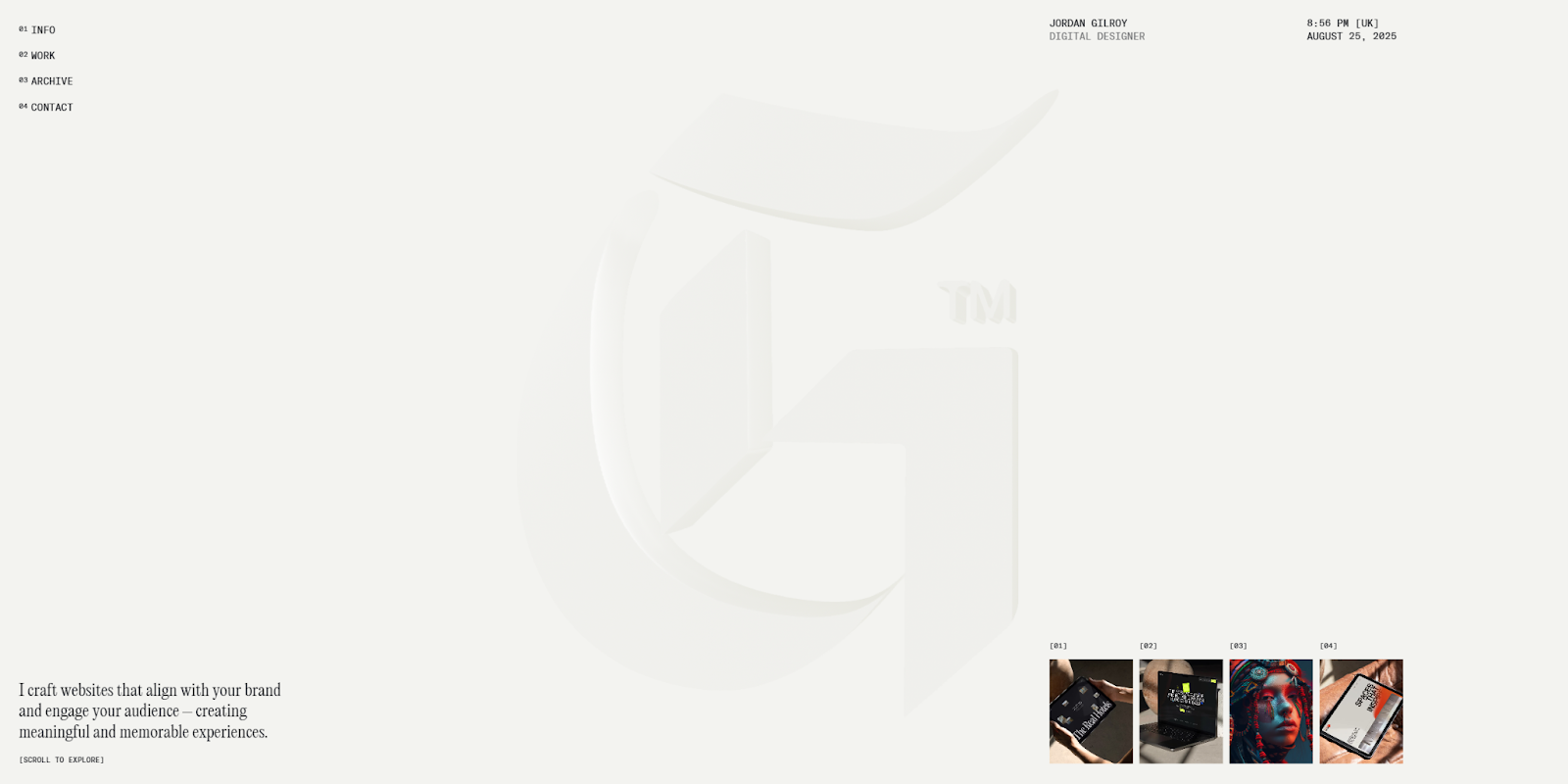
Jordan Gilroy showcases a talent for subverting expectations. This portfolio begins with a minimalist spinning logo design. Scrolling down unleashes parallax effects, several hover animations, and full-page, glassified visuals. Each element subverts the typical visitor’s expectations, helping make the site immediately distinctive.
Every scroll sends potential clients deeper down the rabbit hole until something catches their eye. Then they can click on it and learn more about a specific case study. This user experience creates a memorable way for the viewer to find what most interests them.
15. Aida Oliva Studio
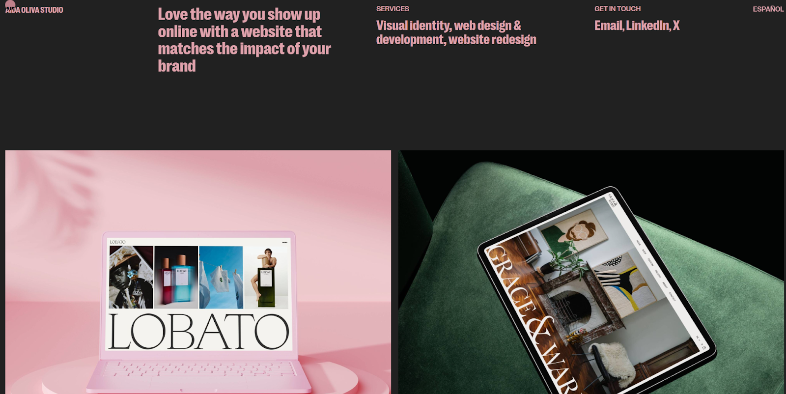
Aida Oliva’s portfolio website puts confident design at the forefront. The choice of large text size and unusual colors, combined with a few big visual elements, makes a bold statement. They show the visitor that this designer isn’t afraid to think outside the box.
This boldness extends to a generous use of whitespace. The page is dominated by a black background, while the case study images use whitespace in alternating colors. This makes each line of text and visual example stand out. Oliva’s website demonstrates how minimalism adds emphasis to key portfolio elements.
What to include in your design portfolio website
As the above examples demonstrate, portfolio design can say a lot about your unique style and skills. And that’s exactly what potential clients want to see as they look for graphic designers to create their websites. They want to know whether your creative vision aligns with their own, and whether you have the experience to see a project through.
To take you from inspiration to execution, here are elements every web design portfolio should include:
- Homepage: This sets the tone for everything else. It’s often best to start with a full-screen graphic or animation that showcases your creativity and visual style. Then provide an attractive overview of your skills and highlight key case studies and awards.
- About page: This should reiterate your skills and describe your background, passion, and how you developed your talents. Stay humble but don’t shy away from showcasing your accomplishments.
- Case studies: This should be the bulk of your design portfolio, with deep dives into your best projects. Choose a portfolio template with several case study page options. You can mix up the layouts and color combinations to differentiate each sample.
- Testimonials: These provide invaluable social proof. The homepage is a great place for a few general testimonials about your work ethic and reliability. In your case studies, you can provide testimonials that demonstrate how pleased past clients were with your work.
- Contact page: Your contact page should be visually engaging and straightforward to use. Include your email address and, if possible, a contact form to simplify the process. This is also a good place to link to your social media accounts.
- Blog: This surfaces your portfolio website in search results and engages visitors with useful content. Use an SEO tool like Ahrefs or Semrush to research topics potential clients might search for.
- Awards: If you’ve won any awards for your work, you’ve gained a valuable element for your portfolio website. Place these strategically throughout your site to ensure that every potential client can see them.
- Social media links: Place social media links in the navigation menu or on your About and Contact pages. Visitors may use these links to explore your most recent work, so be sure to post regularly on social media.
How to make your web design portfolio stand out
Many designers include common portfolio elements, so you’ll need to make sure your website stands out. Here’s how:
- Build your portfolio around your personality. Take every opportunity to showcase your creativity and personality. Visitors should be excited to work with you specifically.
- Don’t just give information, tell stories. While other designers might have similar visual styles and experience, your story will always be unique. Write genuinely about how you got into this field, and highlight story beats that set you apart from your peers.
- Offer clear navigation options. Unless you have a visual style that purposely subverts expectations, keep your site’s navigation straightforward. Some designers get away with weird navigation models, but they’re the exception to the rule.
- Optimize your site. Visitors often sift through dozens of online portfolios from a variety of locations and devices to find the right fit for their projects. When your pages load quickly and are optimized for mobile use, visitors get an impressive experience.
Create your own attention-grabbing portfolio site with Webflow
A strong portfolio reflects its designer. There should be no doubt that this website belongs to you, because every aspect is influenced by your unique style and story. More than anything else, this is what elevates you above your competitors.
When you’re ready to get your online portfolio up and running, explore Webflow, which is more than a website builder that's especially suited for designers and other visual artists.
Webflow is a visual-first platform that helps you create engaging, curated experiences. It requires little to no technical expertise and offers design tools for every skill level. All of the examples above were built with Webflow by designers with a wide variety of styles and professional experience.
See what’s possible on a free Starter account. With it, you can clone a template to get started quickly or build something unique from scratch. Create a portfolio that tells clients what you’re all about, using Webflow.

Show off your work.
Choose from fully customizable portfolio templates built for creatives. With Webflow, you can design, refine, and publish a standout portfolio — without writing a single line of code.


.jpeg)


