Thoughtful intranet design offers employees easy access to vital information and collaborative tools.
Great intranet design engages and retains employee attention. It transforms an internal tool into an interactive space for promoting company culture and makes everyday tasks more enjoyable.
Just because it’s an internal company resource doesn’t mean it has to be boring. In fact, your employees are an excellent audience for creative attempts to advocate for company culture. And there are few better places to do that than on an intranet homepage.
The best intranet designs balance aesthetics with functionality and invite employees into an intuitive and easy-to-navigate environment. This approach makes finding resources and connecting with colleagues enjoyable and straightforward, encouraging active participation in company life.
Why great intranet design is important
A well-designed intranet layout centralizes essential resources, such as an employee directory, company news, and digital workplace tools, in an engaging and navigable way. Beyond improving employee access, here’s how excellent intranet design impacts your organization.
Improves employee engagement
A dynamic intranet offers a vibrant space for employees to participate in digital events, access critical resources, and stay informed about company events. This engagement helps immerse employees in the company culture, fostering belonging and personal investment in the organization.
Promotes transparency
Traditional internal communication methods, like companywide emails, can lack personal touch and clarity. An intranet can revolutionize this by serving as a hub for transparent communication. It can host internal webinars, Q&A sessions with executives, and updates and provide a more personal and interactive way for leaders to communicate with the entire company.
Enhances collaboration
Beyond enabling efficient top-down communication, an effective intranet significantly improves peer-to-peer interactions. With features like forums, discussion boards, and comprehensive employee directories, an intranet encourages open idea exchange and relationship-building among employees. This deepens collaboration across different functions and departments and even helps prevent organizational silos from building up.
5 key elements an intranet homepage should have
The intranet should be a lively forum for discussions, idea sharing, and involvement in company events — not just a static information repository. Here are five elements you should include to make your intranet effective and engaging.
1. Company branding
Elevate your intranet’s homepage beyond just a digital workspace by highlighting your company’s culture and achievements. Instead of simply placing your logo at the top, consider creating an eye-catching banner that celebrates key milestones and honors employee efforts.
For instance, a banner proudly declaring, “Awarded Best Workplace of the Year” doesn’t just inform — it also inspires. It connects employees with the larger narrative of your company’s success, instilling belonging and pride. This approach helps employees feel more connected to the company because they understand that their daily efforts contribute to something larger and more impactful.
If you want your intranet to inspire pride and encourage engagement, take notes from old web designs that worked and learn how new ones are pushing the boundaries. By making company branding an integral part of your intranet design, you transform a simple utility into a powerful tool for reinforcing corporate identity and employee morale.
2. Intuitive design
Your intranet’s efficacy largely hinges on how effortlessly employees find what they need. A user-friendly navigation system guides users to essential resources without confusion or frustration, making intuitive design essential.
To make your intranet intuitive, reflect on the user journey within this hub and organize each section, resource, and tool logically for quick access. If your intranet houses various internal resources, such as human resources (HR) documents and project management tools, arrange them under clear categories, a menu, or a streamlined website structure. This clarity helps employees quickly find what they need, whether it’s company policies or team directories and project information. Adding a search function further simplifies finding specific content so employees don’t need to browse extensively.
3. Quick links
An efficient intranet homepage lets employees quickly access frequently used company resources and tools. Quick links are invaluable here. Display shortcuts to the most accessed pages to enhance the user experience (UX) and productivity. Think of it as creating a dashboard of convenience for your employees.
If your company regularly uses features like a time tracking tool, an HR portal, or a project management platform, quick links to these on the intranet homepage can save employees time and hassle. You could organize these links in a visually distinct section or sidebar, possibly with icons representing each tool for quick recognition. This approach streamlines navigation and demonstrates your commitment to making the intranet a practical and user-friendly tool. It removes barriers and improves operational efficiency by allowing employees to focus more on their core tasks.
4. Mixed media
Incorporating various media types adds dynamism and vibrancy to this team hub. Use mixed media like interactive infographics, short videos, and even audio snippets to create a more immersive and engaging experience.
For instance, you could feature a short video message from the CEO discussing recent achievements and upcoming events. Or integrate an animated infographic that visually represents company performance metrics and employee wellness statistics. And adding a GIF of the week could inject some fun into the site by showcasing company events and employee highlights.
5. Mobile visualization
Your employees may use smartphones and tablets for work, especially in roles requiring mobility and remote work, such as sales. By optimizing the intranet for mobile use, you accommodate these diverse needs and ensure all employees have equal access to company resources, updates, and tools.A mobile-optimized intranet homepage could feature a simplified menu with large, tappable icons. Homepage content, like company announcements and employee spotlights, should resize automatically to fit various screen sizes without compromising readability and visual appeal. You might also consider incorporating swipeable carousels and dropdown menus for quicker access to different sections.


Webflow Enterprise
Trusted by over 300,000 of the world’s leading brands, Webflow Enterprise empowers your team to visually build, manage, and optimize sophisticated web experiences at scale — all backed by enterprise-grade security.
7 intranet templates to get you started
Creating an intranet from scratch, especially one that meets all the above criteria, can be challenging. Fortunately, Webflow offers templates that cater to different intranet needs and can provide a solid foundation for your design. And they come equipped with essential elements you can customize to your company’s requirements.
Here are seven of our favorite intranet homepage examples and templates to jumpstart your design.
1. Flowitall
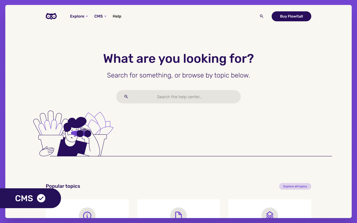
Ideal for a straightforward yet visually striking intranet, Flowitall (designed by Kevin Haag) comes with pre-designed layouts, symbols, and fonts that exude a professional help center aesthetic. Its prebuilt component library and content management system (CMS) templates make it a practical choice for centralizing company resources and fostering quick information access.
2. Sasdesk
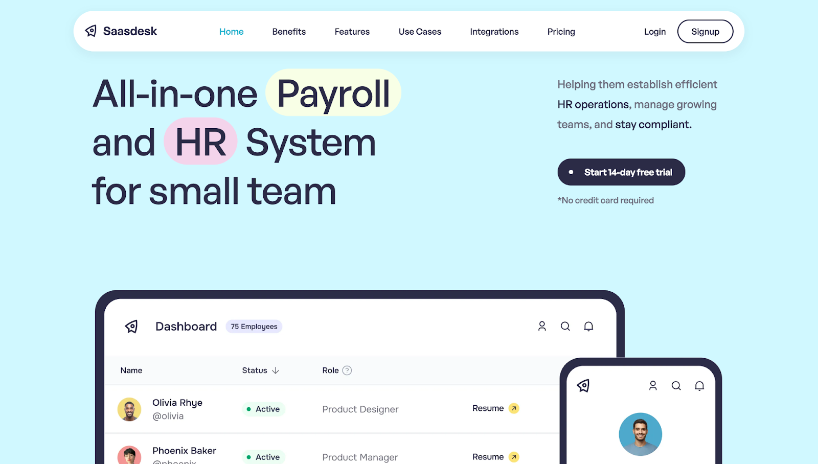
Sasdesk (designed by RNN Studio) is a payroll and HR template for small teams, but its scalability and customizability make it suitable for enterprises in any industry. It includes automated payroll processing, attendance tracking, and 100+ integrations with third-party applications. Plus, its minimal, block-style design allows for straightforward styling, so you can allot different sections to various departments or workflows. And the built-in responsive design makes it desktop and mobile-ready.
3. Crowdy
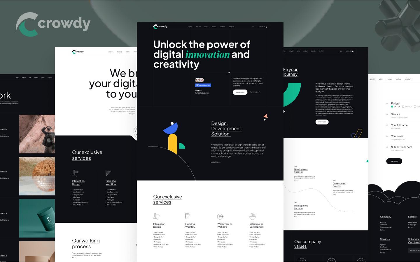
Merging quirky aesthetics with professionalism, CrowdyFlow’s Crowdy template is perfect for brands that want to showcase their unique personality. Plus, it offers 15+ inner pages (including dark and light), is 100% fluid responsive (fitting every device perfectly), and provides free updates.
4. Yedi
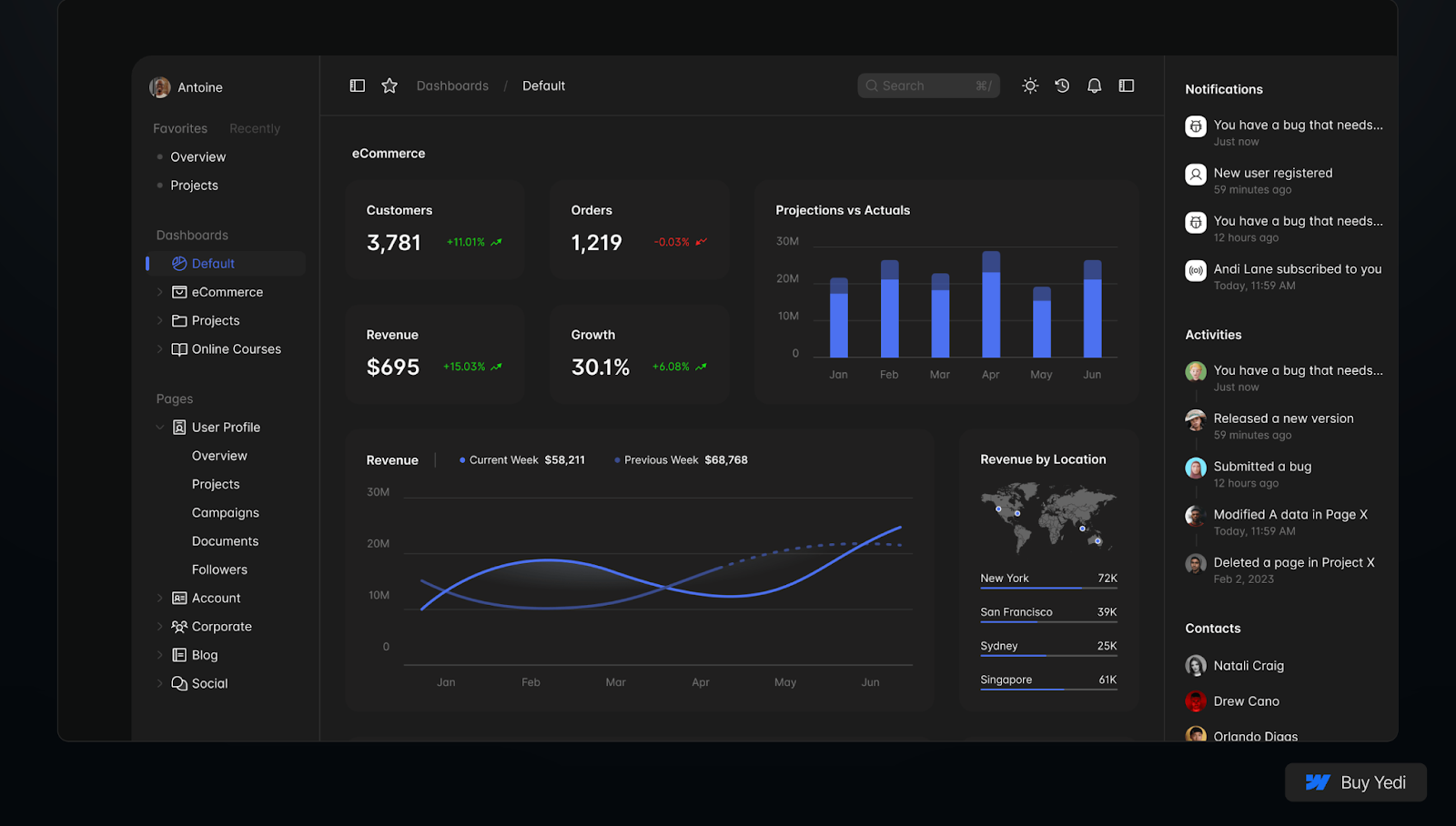
While primarily for AI-based startups, any organization can use the Yedi template (designed by Erudite) to automate workflows and view dashboards. These dashboards cover project work, online courses, and ecommerce insights, but you can adjust them for various business-related purposes. Each member receives a personalized notification hub with real-time updates from external apps that the template seamlessly integrates with.
5. DevKit
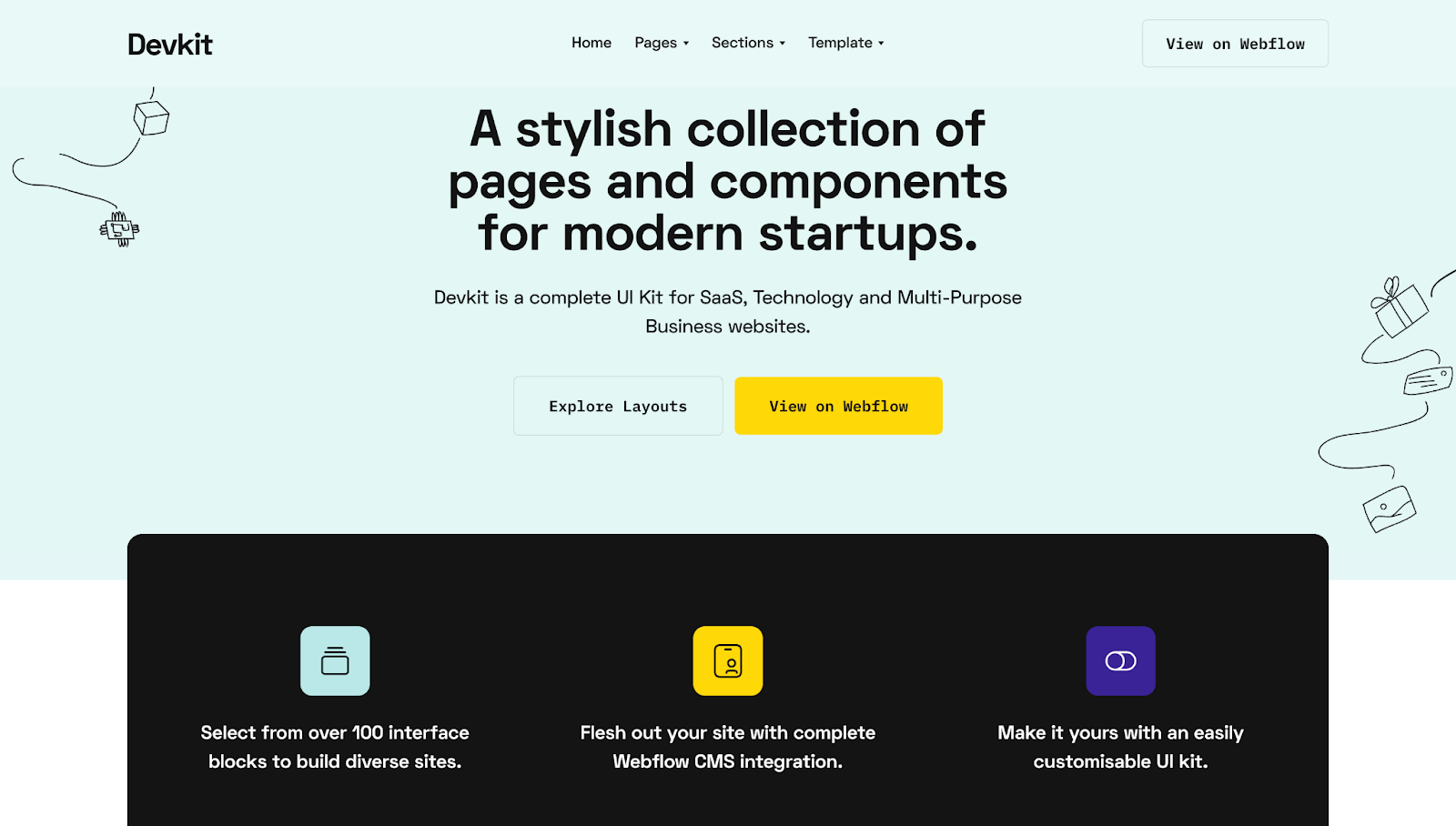
DevKit was designed by Medium Rare and is a complete collection of UI components and pages. Choose from over 100 interface blocks and map your site out with Webflow's CMS integration. With landing, company, pricing, and utility pages, you can customize your intranet design to suit in-house needs. A built-in help center assists employees during onboarding. And you can use blog page templates for company announcements.
6. Code
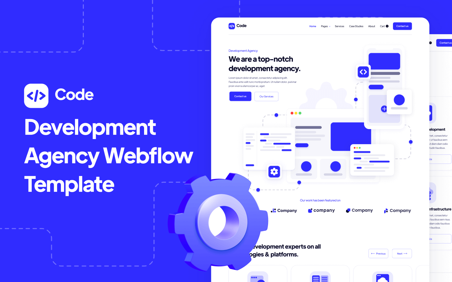
Tailored for tech companies, Code by BRIX templates offers a clean, modern design with fast loading times and enhanced readability. It includes an editable design source file that allows for more extensive customization, which is perfect for tech-savvy teams looking for a sleek and efficient intranet experience.
7. Buzz
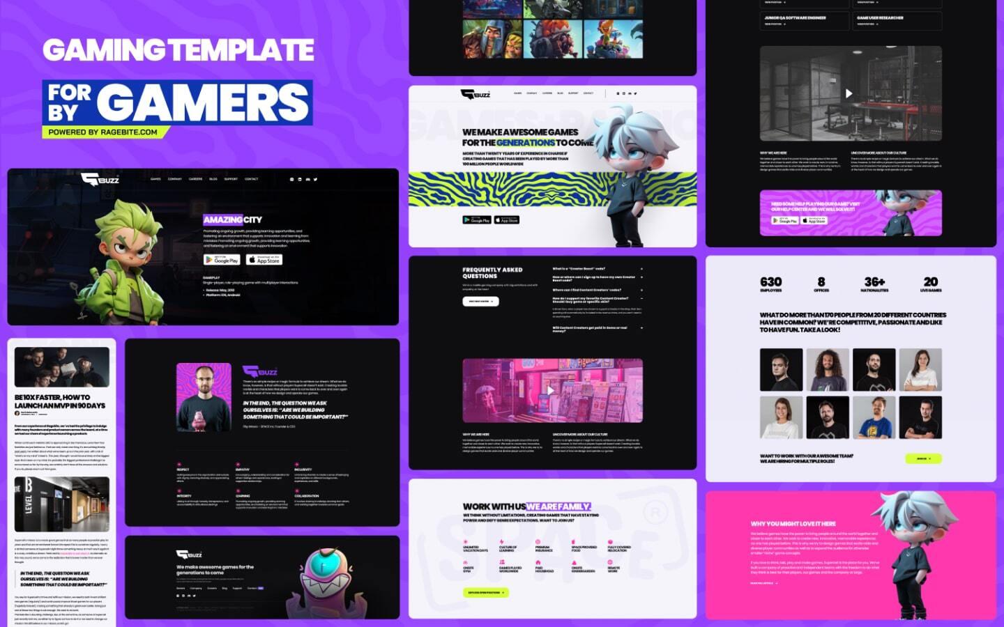
The Buzz template by Ragebite stands out with its colorful, versatile design and gaming aesthetic. It features interactive elements, a custom 404 page, and a responsive layout. Despite the gaming-focused design, the template provides preformatted elements you can use as is or customize to fit your brand’s style.
Design with confidence
From pre-built integrations to flexible UI components, these templates are an excellent starting point for creating functional intranet designs. But if you prefer to craft something highly customized for your team, consider designing your intranet with Webflow. Our visual development platform gives designers the freedom to create anything possible — with or without writing code.

Get started for free
Create custom, scalable websites — without writing code. Start building in Webflow.


