

Once again, the time has come for our monthly showcase of Webflow websites that caught our attention. With sci-fi inspired 3D animation, a socially conscious creative agency, and a software company — you’re sure to be inspired by this compilation of 15 websites, all designed in Webflow.
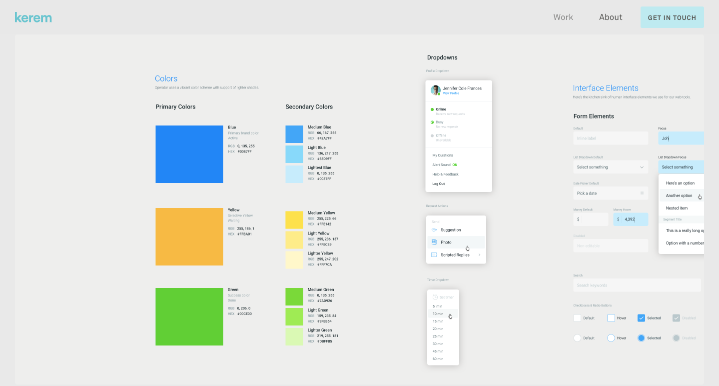
1.Kerem Suer
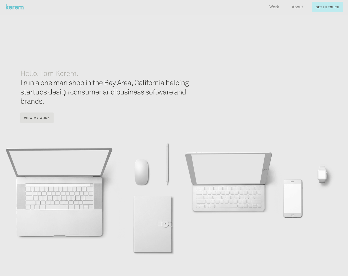
Kerem Suer is a San Francisco–based designer whose talents include software development, branding, and design. His approach is both pragmatic and artistic. He was the first UI and interaction designer at Fitbit and has since moved on to share his skills with many startups, including Spoke and Vault.
His work features high-resolution images that pop against a neutral, light-grey background. Among the finished examples of his work, he gives us a peek into his process with notes, color palettes, and iconography that show his refined, detail-driven design approach.
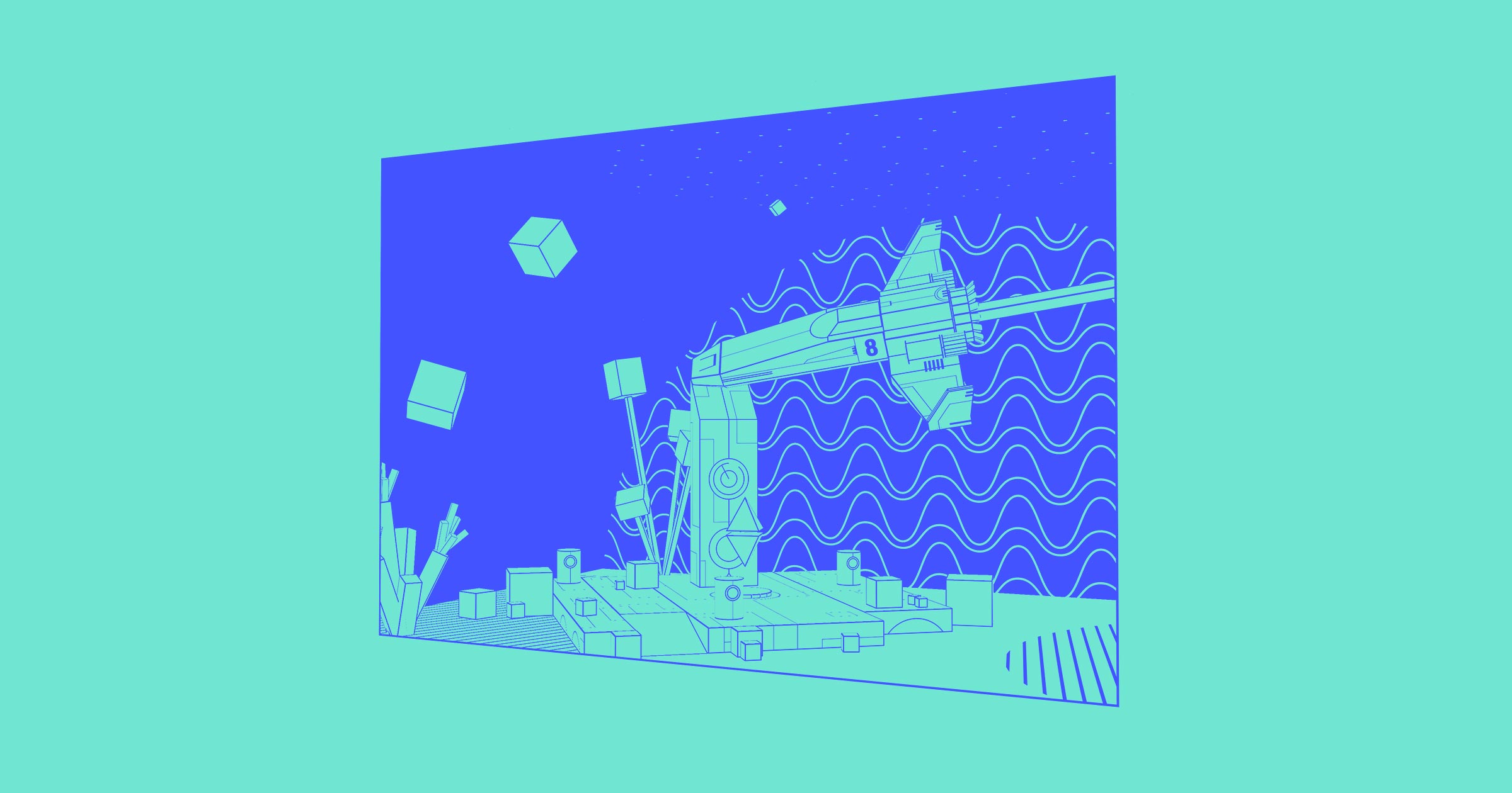
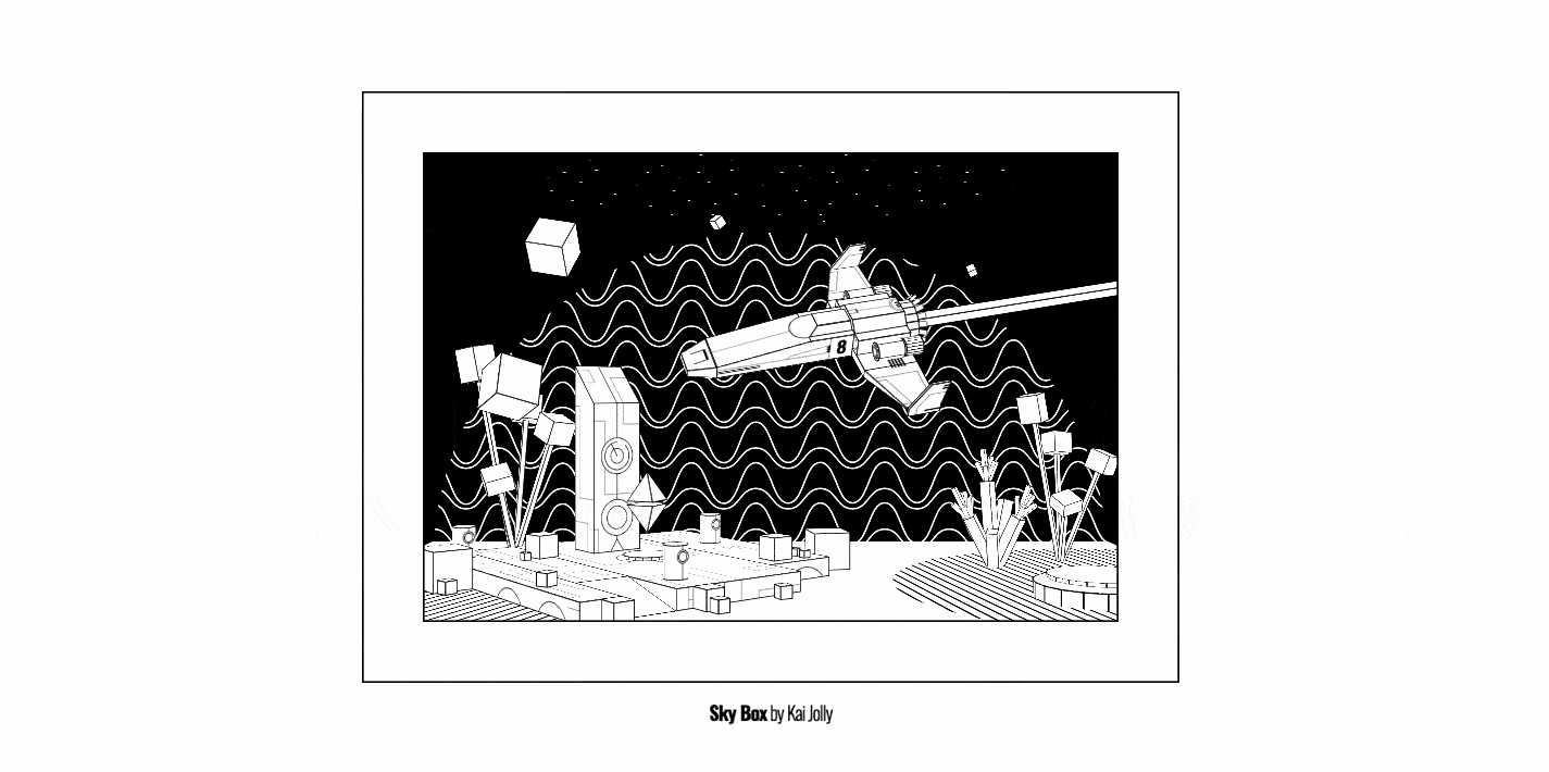
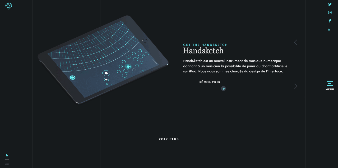
2. Sky Box
You may remember Keejo’s excellent Web Elements 3D design from 11 Interactions 2.0 examples that move in just the right way.
Sky Box is the latest creation from Keejo, demonstrating creativity and a mastery of Webflow. This 3D animation is hover and scroll triggered, bringing you closer into the spacescape as you move around the page. Want to see how it was done? Check it out in Webflow.
If you’d like to work your way up to creating something similar, take a look at our Intro to 3D tutorial for some basic skills to get started creating your own 3D effects.
3. EyeEm
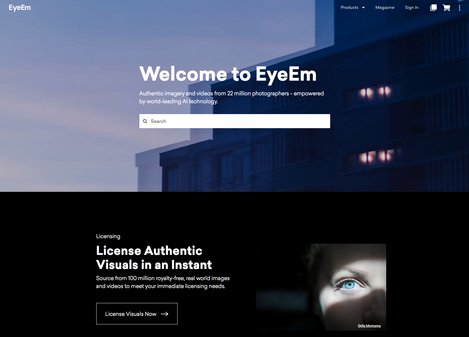
EyeEm is a photography marketplace with an aesthetic that’s equal parts photojournalism and artistry. This website features a wealth of content for photographers, but also acts as an image-licensing resource to help photographers make their own images available.
The photos they offer for public use and feature in articles are all high-quality. It’s a nice synergy between the informative articles and their photo-licensing services. Both have a level of professionalism that positions EyeEm as a trusted photography resource.
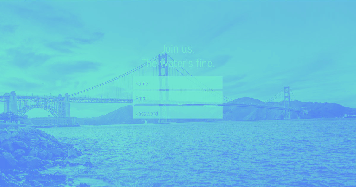
4. Pushapp
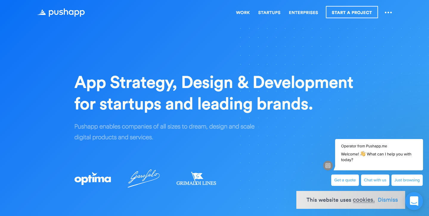
Pushapp, an app-development team, describes themselves as “a bunch of perfectionists who take pride in transforming early stage ideas into real products.” Their website reflects this spirit through custom illustrations, animated transitions, and microinteractions scattered throughout the site. The design shows thoughtful attention to the finer details.
Pushapp showcases some of their app work in a revolving block of content. It’s a nice touch, taking what could have been two-dimensional screen shots and giving them a real-world vibe.
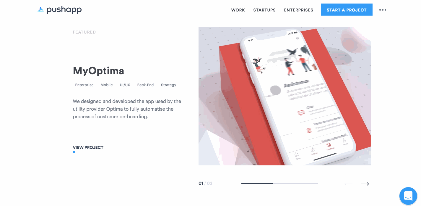
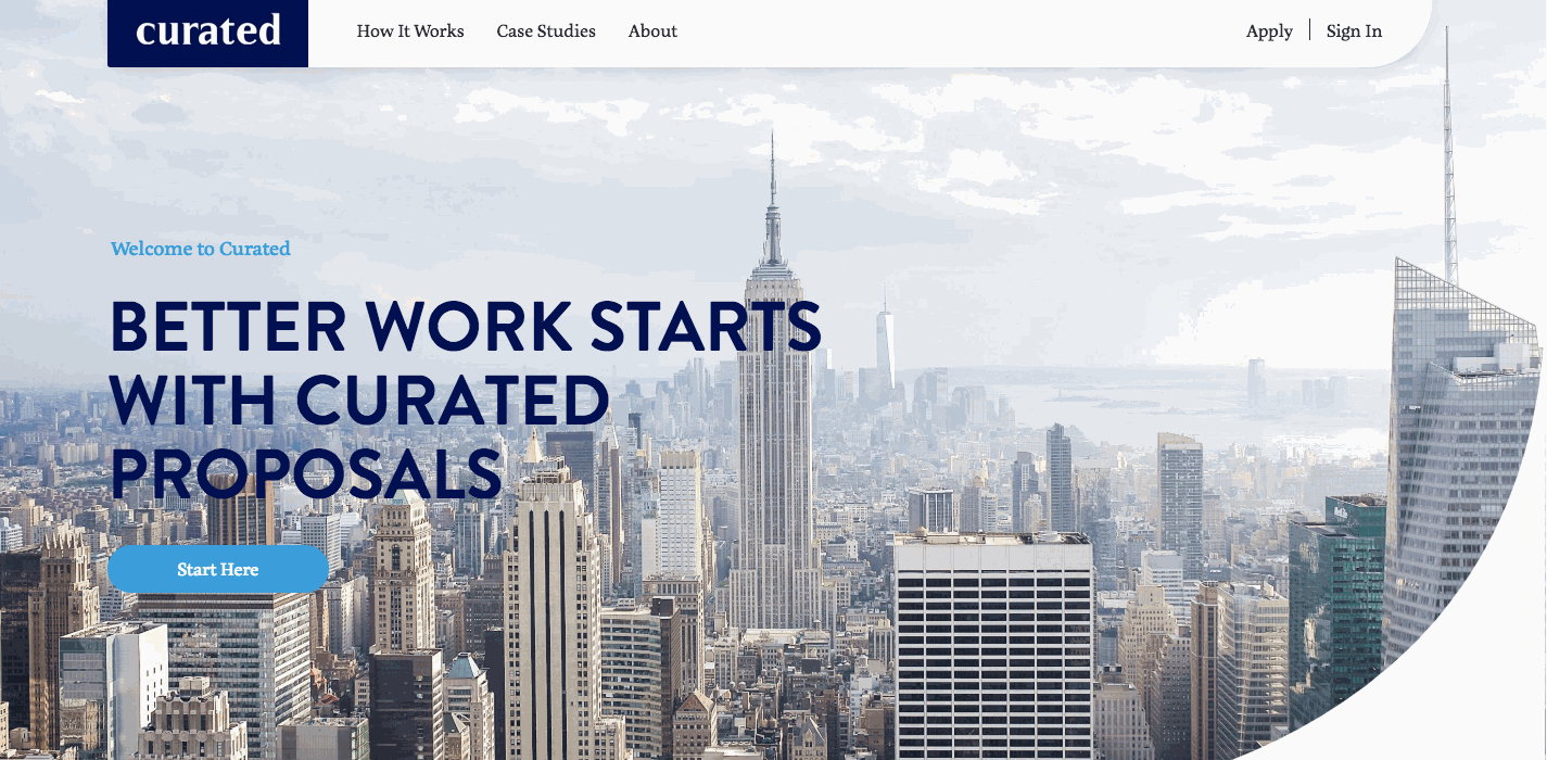
5. Curated
Curated hopes to improve the outsourcing of talent. There’s a lot of content on their landing page about what they do, but bold headlines and just the right amount of negative space effectively separate blocks of content.
This design uses layered elements and animations, with a downward scroll that flips content into place. The movement and transitions offer enough interesting visuals to keep our eyes happy.
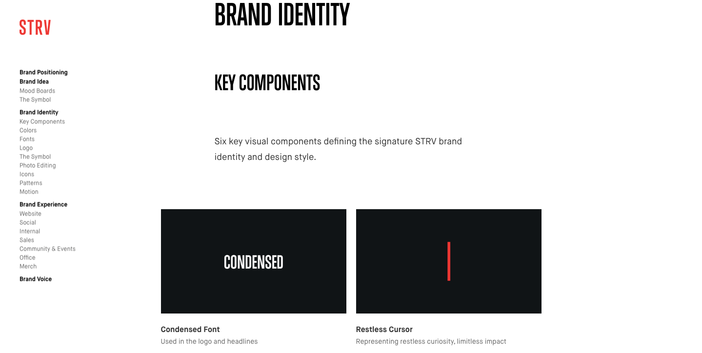
6. STRV Brand Guidelines
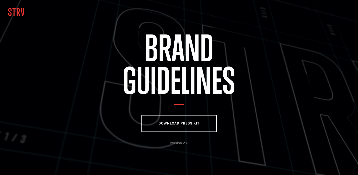
Whether you work with an in-house team or a roster of dependable freelancers, online brand guidelines offer a more accessible and up-to-date alternative to the old PDFs. STRV, a software design and engineering company, compiled this extensive list of their guidelines in a one-page design. Their documents are easy to find from their well-organized navigation.
If your brand guidelines exist only as a PDF — multiple versions floating about, making it easy for people to get confused — take a page from SRTV’s book and keep a current version online where everyone has access.
7. Luzcas

This is the portfolio of the designer, artist, and filmmaker Luzcas. It’s an unorthodox design reflecting his unique approach.
A split screen divides the page — accomplishments on the left and featured projects on the right. Hovering over a featured project brings up a full-color example. A click results in a quick, horizontal movement that takes you to a new page with more information and visuals. It’s not an ordinary design, but none of its eccentricities get in the way of its usability.
Check out more projects by Luzcas on his Webflow page.
8. Gil Huybrecht
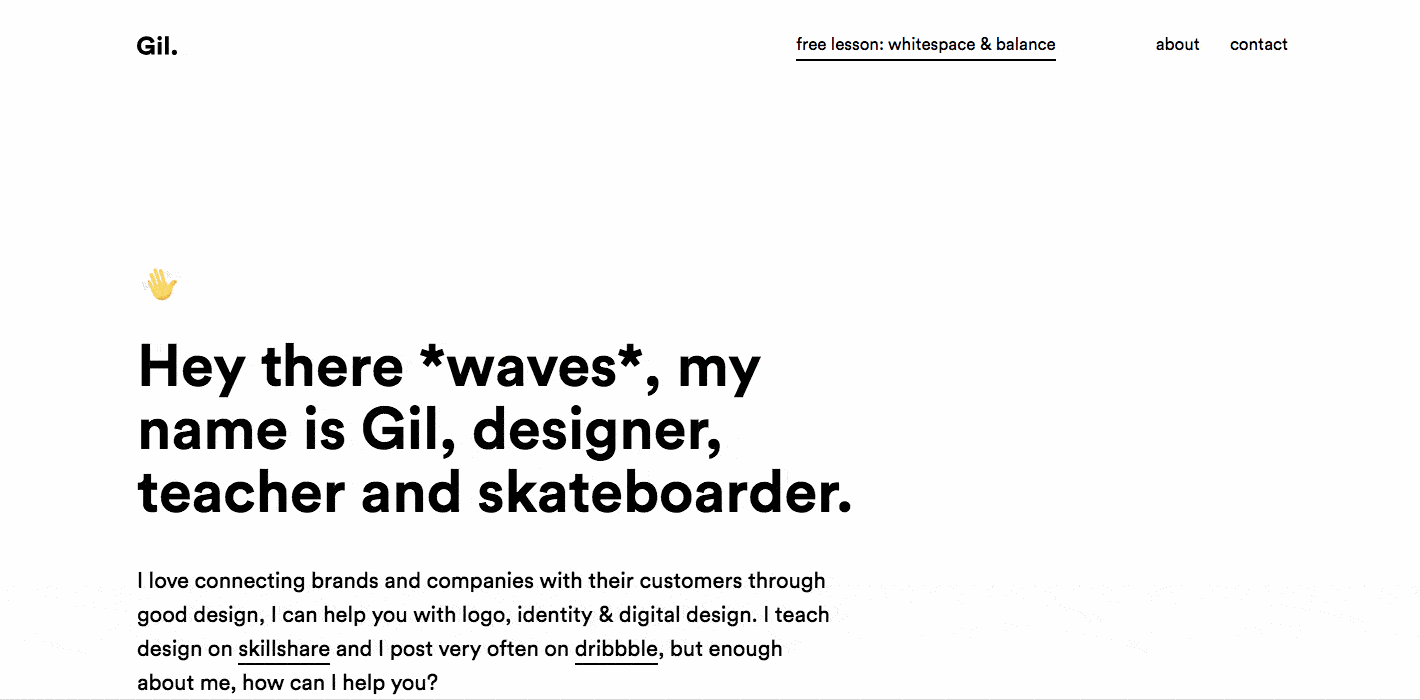
How many designers can create a website for a Belgian furniture company and pull off rad tricks on a skateboard?
Gil Huybrecht has skills to push pixels and a skateboard. His site features a collection of fantastic design work with links to his Behance and Dribble pages. Along with examples of his work, we get a deeper look into who he is as a person — something many designers don’t include. A personal touch goes a long way toward marketing yourself to potential clients.


Get started for free
Create custom, scalable websites — without writing code. Start building in Webflow.
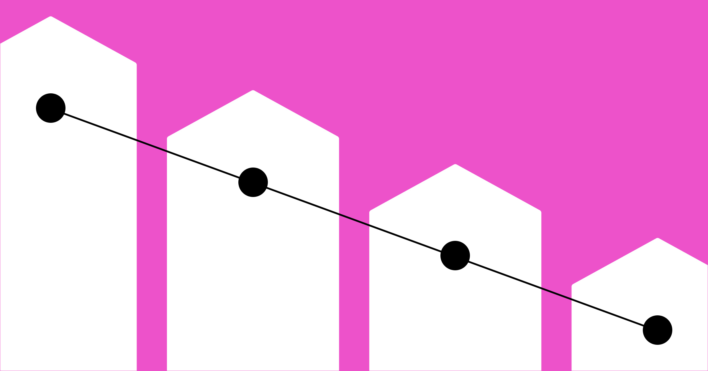
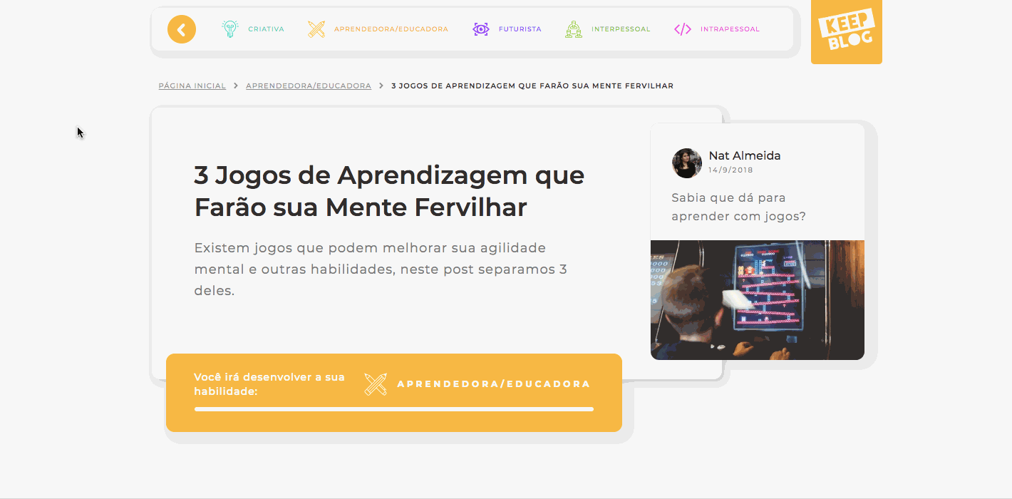
9. Keep Learning School
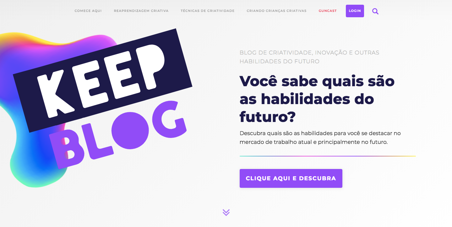
Keep Learning School is a blog dedicated to education focused on creativity and cultivating marketable skills.
The use of overlapping elements adds interest and functionality to this design. Each blog post listed has a card layered with an interesting pullquote. It’s a great way to tease content and get readers curious.
Other overlapping graphics, like the child’s face that slides into place (below), add a bit of visual excitement to the design.
10. Walden
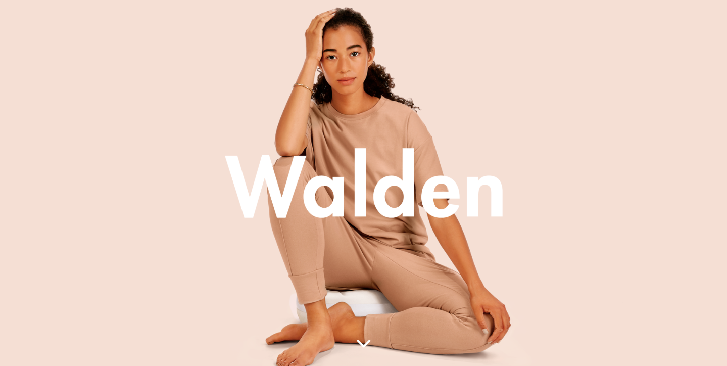
I’m envious of anyone who can calm their mind enough to meditate. I mean, how can I silence important thoughts about grocery lists or that embarrassing thing I said that one time in 1998?
Walden sells cushions to make your journey towards zen more comfortable. This is a clean design full of muted colors and whitespace. Its aesthetic fits perfectly with the meditation vibe.
Their products lists are minimal with only the most important details included. A simple, blue Buy button floats in an expanse of white to maintain the tranquility of the design.

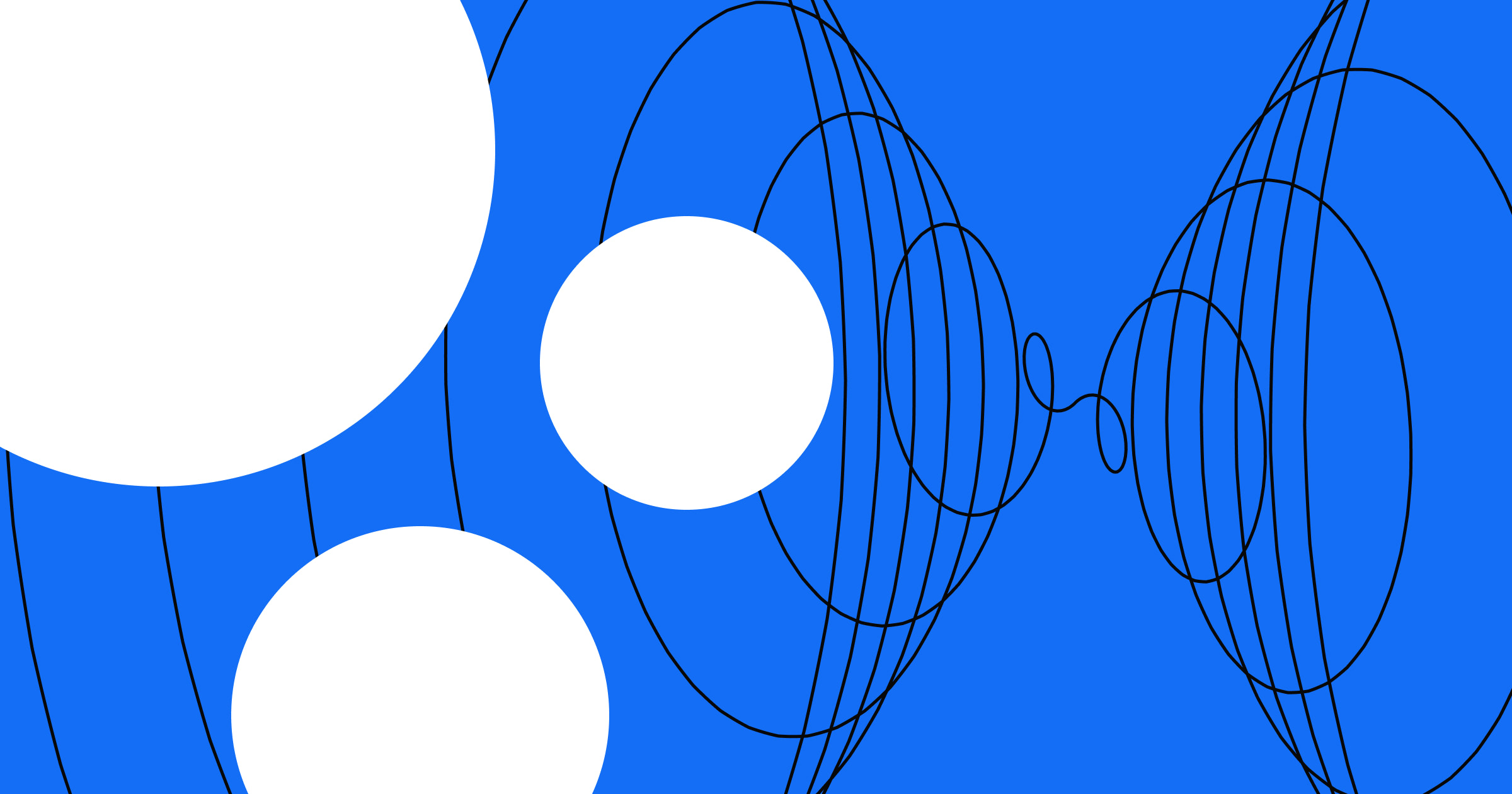
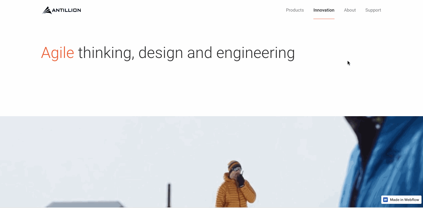
11. Antillion
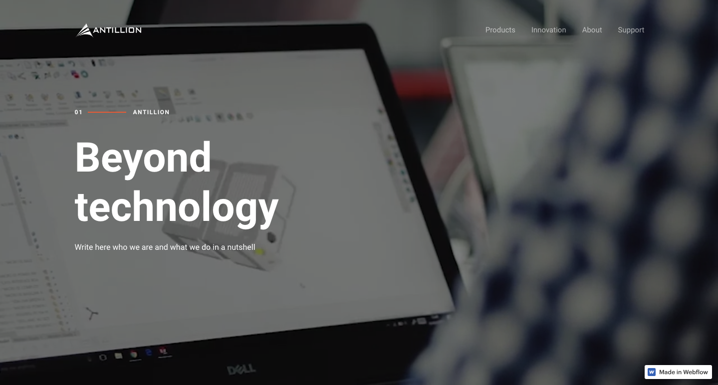
Antillion is a hardware design consulting company. With a number of placeholders for more content, the site seems to be a work in progress. We look forward to the final design.
Even with their technical focus, Antillion doesn’t forsake the design in favor of a flat expanses of dull color and bullet points of specifications. A mix of photos and video showcase their products and design process. It’s a layout that relies equally on images and words to communicate who they are and what they do.
Touches of movement are interspersed throughout the design, like the animated text below:
Check out how this design came together on Webflow.
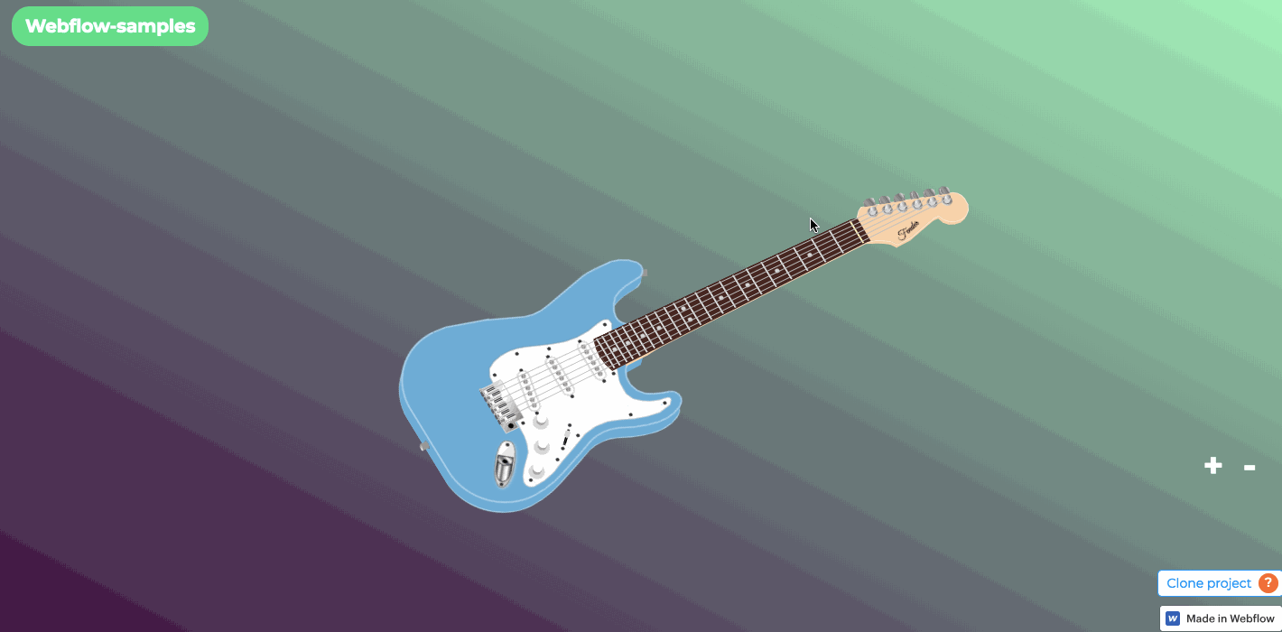
12. Webflow-samples
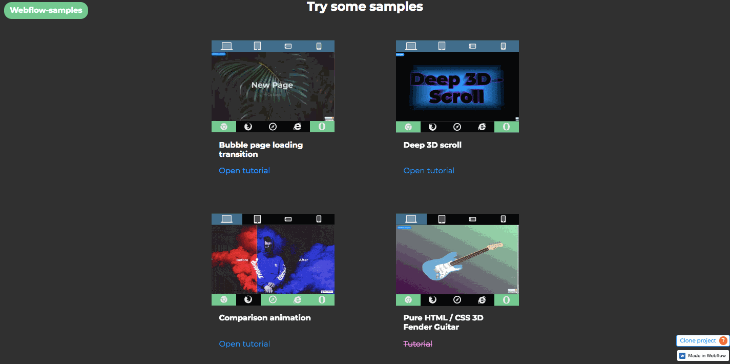
Webflow-samples. It’s a simple name, but the site features some of the sophisticated animation work that’s possible on Webflow’s design platform.
Looking for a tutorial on creating a CMS-driven slider? Or how to create an interactive 3D animation using CSS? The site includes such a great variety of Webflow lessons — regardless of what you’re designing, you’ll likely find something useful.
Check out how the site — and its many amazing animations — was put together.
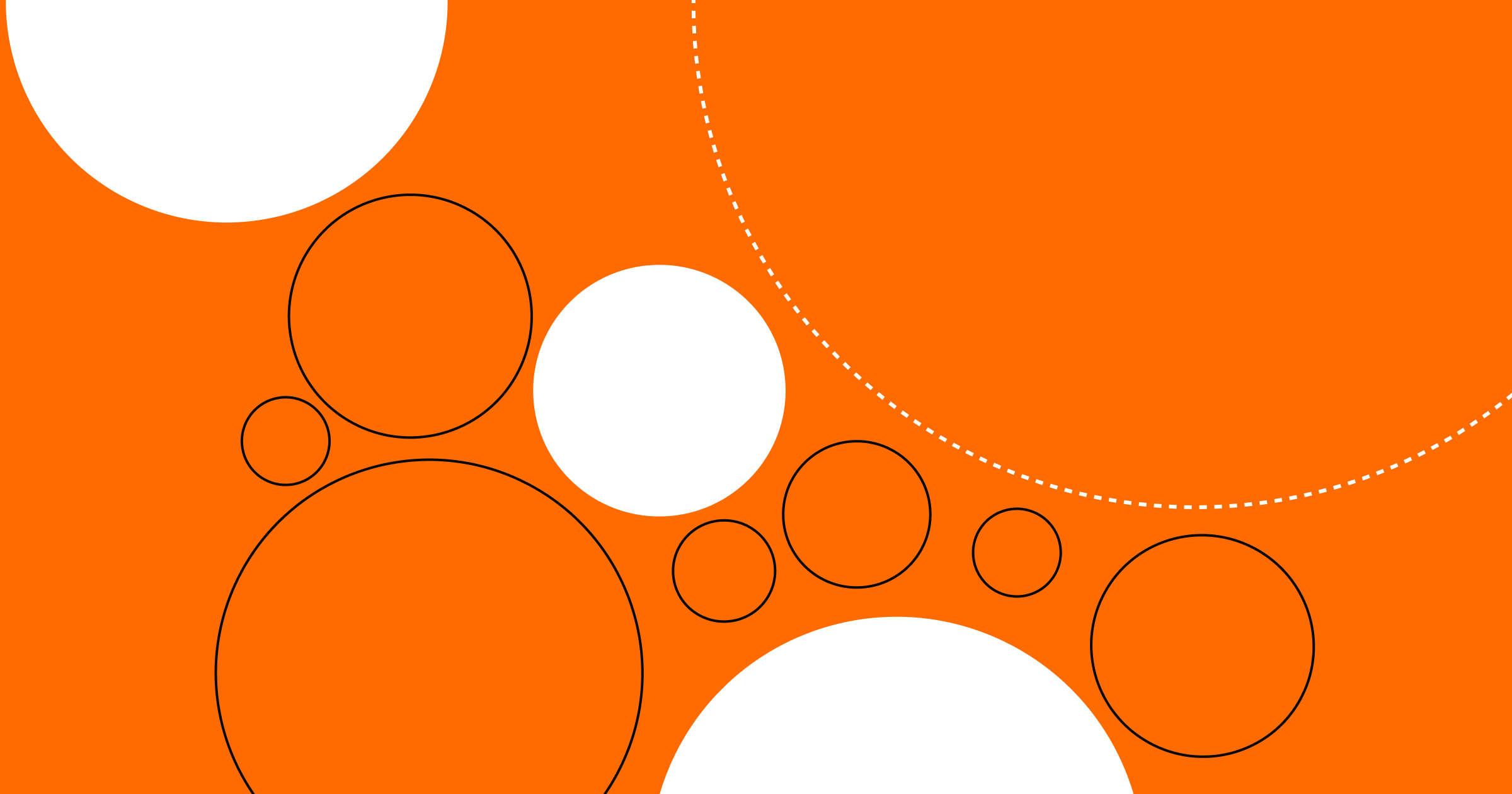
13. DiploStudios
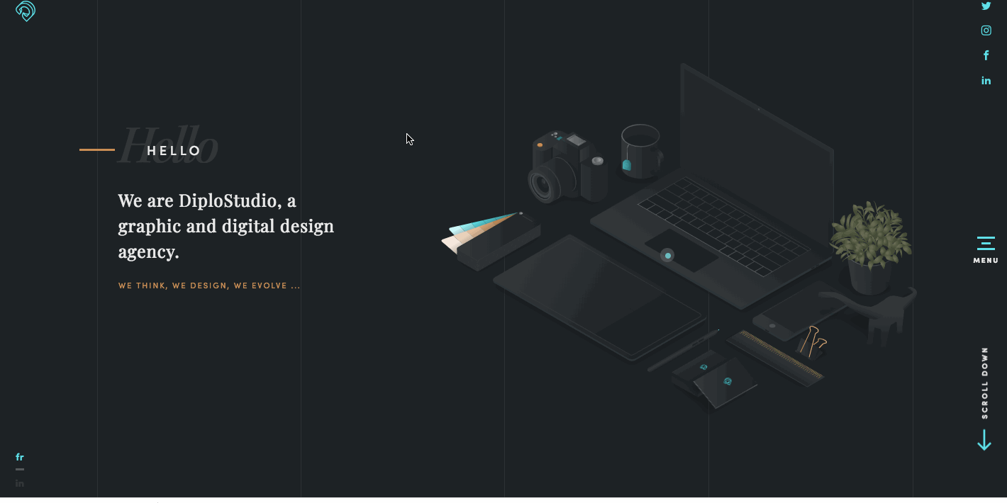
This site by DiploStudios shows off their sense of humor (see the interactive brontosaurus toy in the graphic above) — and their inventive, modern design approach.
The design brings to mind the type of grids possible with CSS, a strong feature that unifies the design. They use animated elements in an visually interesting layout to feature some of their best work.
14. Benjamin Issenmann
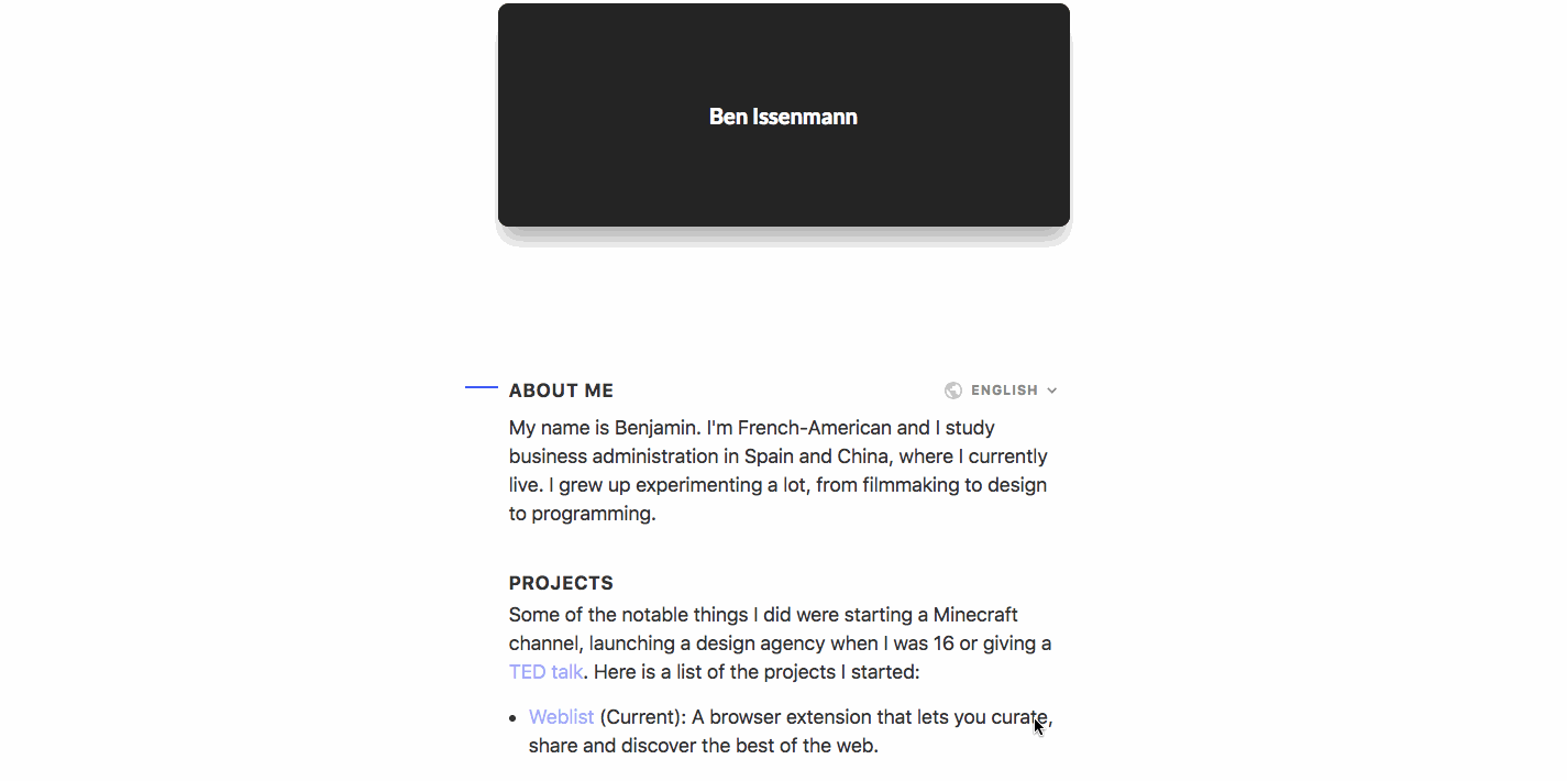
Benjamin Issenmann has accomplished a lot in a short amount of time, including launching a design agency at age 16 and giving a TEDx talk. And he showcases his accomplishments on this simple, one-page site.
Benjamin’s bare-bones site communicates the quality of his work and captures his youthful, entrepreneurial spirit. He shows us not every portfolio needs to be packed with fancy features.
Have a peek at Benjamin Issenmann's Webflow page and see what else he’s up to.
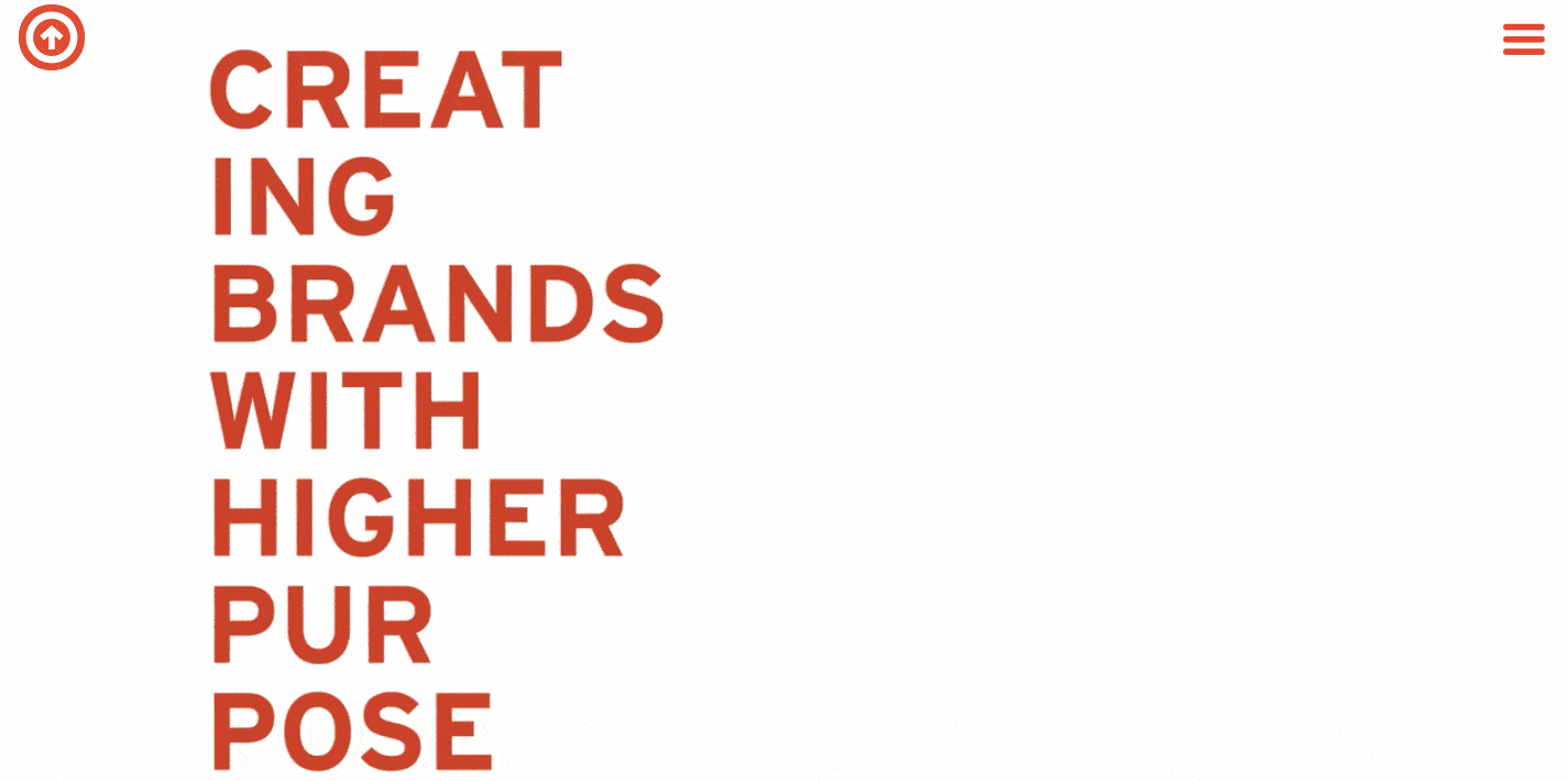
15. Oberland
This video-heavy landing page leads with a quirky collection of images.
Oberland is a creative agency with a socially conscious bent. They “believe in the outlandish power of conscious capitalism and collaborate with like-minded marketing leaders to help them thrive.”
Their portfolio includes projects with the Leukemia and Lymphoma Society, The Nature Conservancy, and the National Alliance of Mental Illness. Their strong mission statement has clearly led to a more unified roster of clients.
A strong sense of branding, design, and content, combined with Oberland’s dedication to socially minded clients positions them as the go-to agency for those who care about saving the world.
Use Webflow to bring your ideas to life
It’s always fun putting together these lists and seeing the multitude of ways you’re using Webflow. Community forums, tutorials, cloneable designs, and more make Webflow a great resource for any aspiring designer.
Tell us how you’re using Webflow in the comments below.