


This month, there were so many great designs shared in Slack that we had trouble deciding — and we still have a whopping 19 sites to share! Check out the impressive skills of our very own Webflow community.
1. The Startup Cemetery
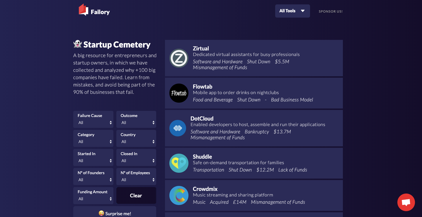
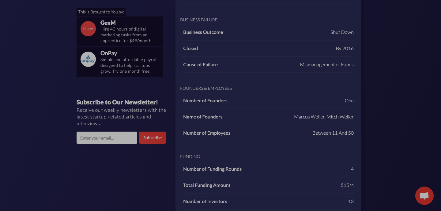
The Startup Cemetery invokes the spirit of Henry Ford’s thinking that, “Failure is simply the opportunity to try again, this time more intelligently.”
The site is a tomb haunted by the 100+ phantoms of companies that could have been. But the real value lies in the fact that Failory’s team also analyzes why these startups failed, so that entrepreneurial spirits (like yourselves) can avoid the same missteps.
A mobile app for ordering drinks at a bar and an augmented reality motorcycle helmet are among the many ideas that didn't quite make it. With an orderly layout and an uncomplicated navigation, there's plenty of case studies to learn from to avoid the mistakes that led to their demise. The cases are a fascinating read for anyone interested in tech and business.
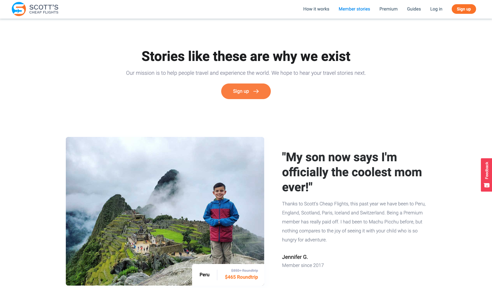
2. Scott’s Cheap Flights
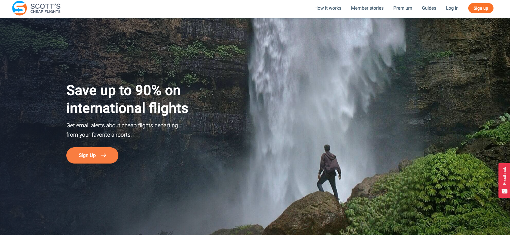
Scott's Cheap Flights invites you to sign up for alerts on cheap flights and "leave the deal hunting to Scott and [their] team of Flight Experts."
The site's recent redesign brought testimonials from satisfied customers front and center — a nice touch of authenticity since we know reviews play an important part in building a brand’s reputation.
3. Austin Knight’s portfolio
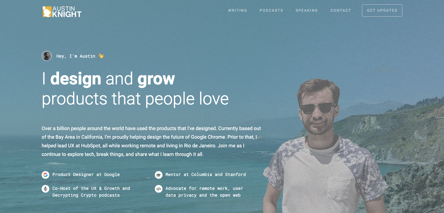
Austin Knight has an impressive list of accomplishments — he had a hand in shaping Google Chrome and contributed his UX expertise at HubSpot.
With so many accomplishments behind him, one might think Austin would be ready to take it easy. But he’s clearly a creator at heart. His website offers up a collection of his design-related essays and his UX and Growth Podcast episodes where he and guests explore design in an authentic, conversational way.
Austin is an ambassador and leader when it comes to UX and we’re so lucky he shares his expertise with us.
4. Lemonstreet Brewing Co.
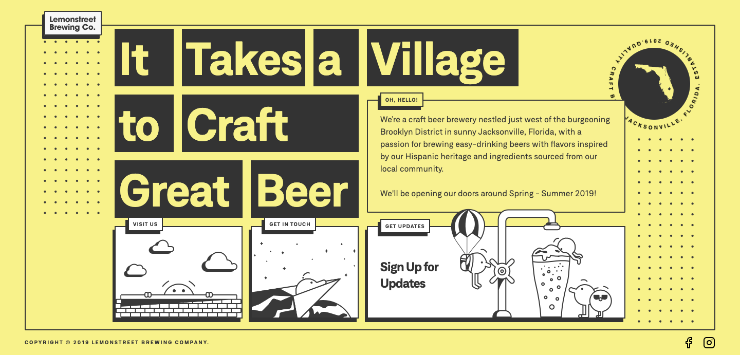
It seems like many craft beer websites all have a similar look — dark brown themes, photos of men with beards, and lots of tattoos. This design for Lemonstreet Brewing Co. is a refreshing change in visuals.
Their one-page design encourages people to visit, contact, or sign up for their newsletter. That’s it! It’s proof you don’t need a lavish website to have a solid web presence. This simple design’s yellow, black, and white palette and cartoon illustrations give it a uniquely playful and hip feel — without all the beards.
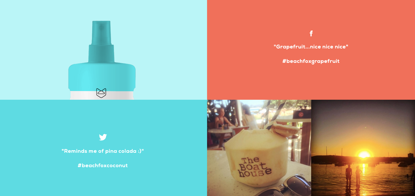
5. Beachfox
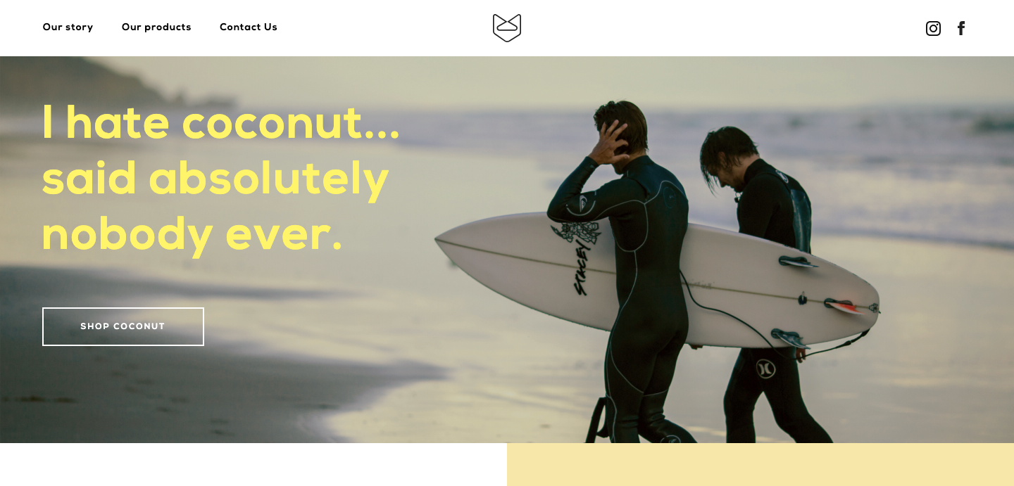
Beachfox is a sunscreen company whose site design uses muted visuals as a metaphor for what their product does.
The outdoor photos and colors are all softened. The way suntan lotion dampens the harsh rays of the sun, this color palette exudes the same sense of coolness. It’s a great example of creating the right tone through design choices that mirror a product’s purpose.
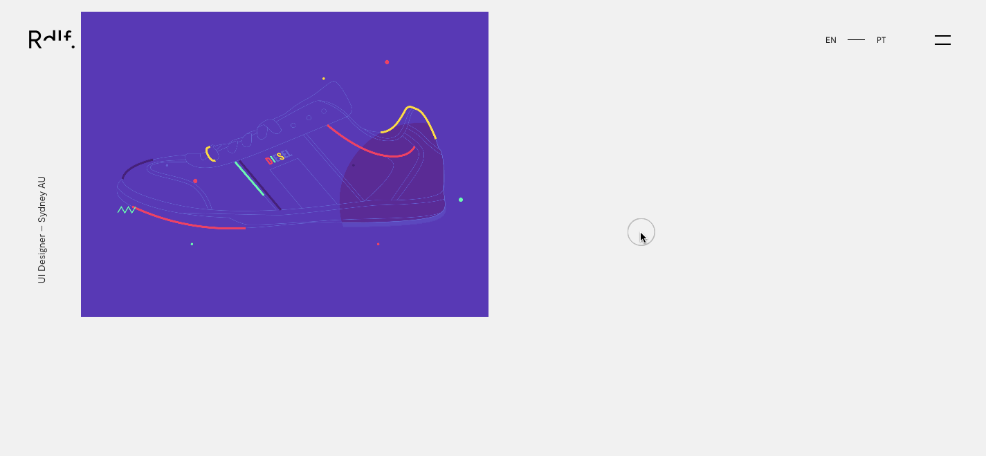
6. Rodolfo Sarno
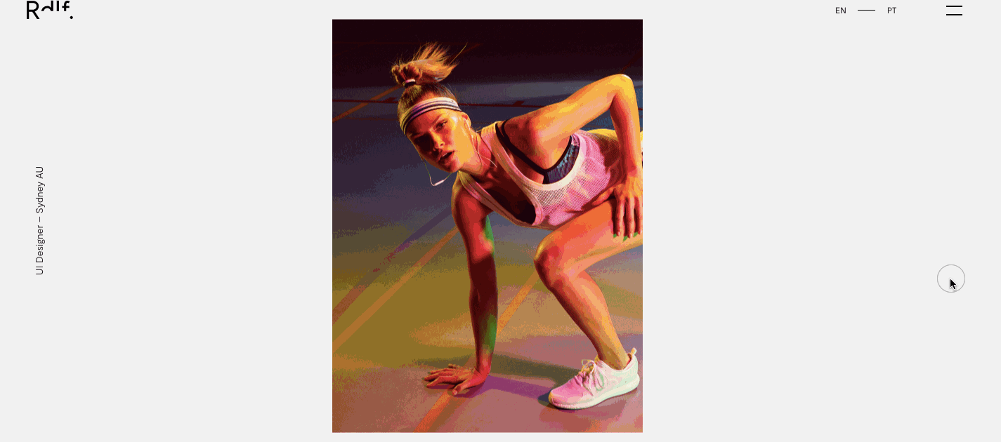
Rodolfo Sarno is a user interface designer whose portfolio is more than just a collection of projects — it’s a showcase of swirling, surreal animations. A bouncing orb cursor leads you through his site, with a hover animation shaking the surface of each project like a marble dropped in water.
This burst of animation shows off Rodolfo’s chops and makes for a fun scroll through his work.
7. Boho Studio
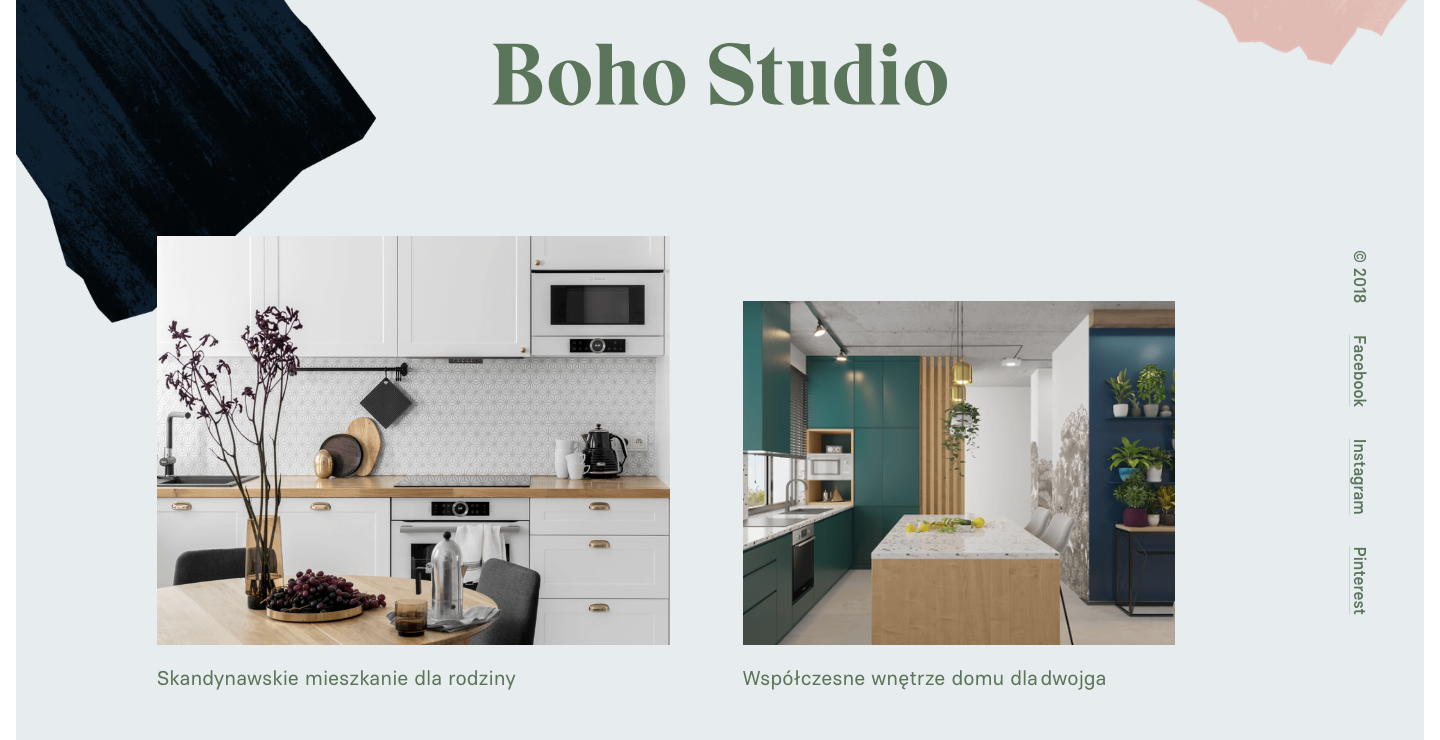
Boho Studio, an interior design company, has a website that reflects their style — classy and organized. With a soft and cool color palette, the site projects a sense of calm.
They make great use of Instagram, embedding photos of their work and inviting visitors to follow the Boho Studio account. Directing people to a digital platform with current content is a lot easier than manually updating a design with new photos — although it does take visitors away from their site.
8. Latch
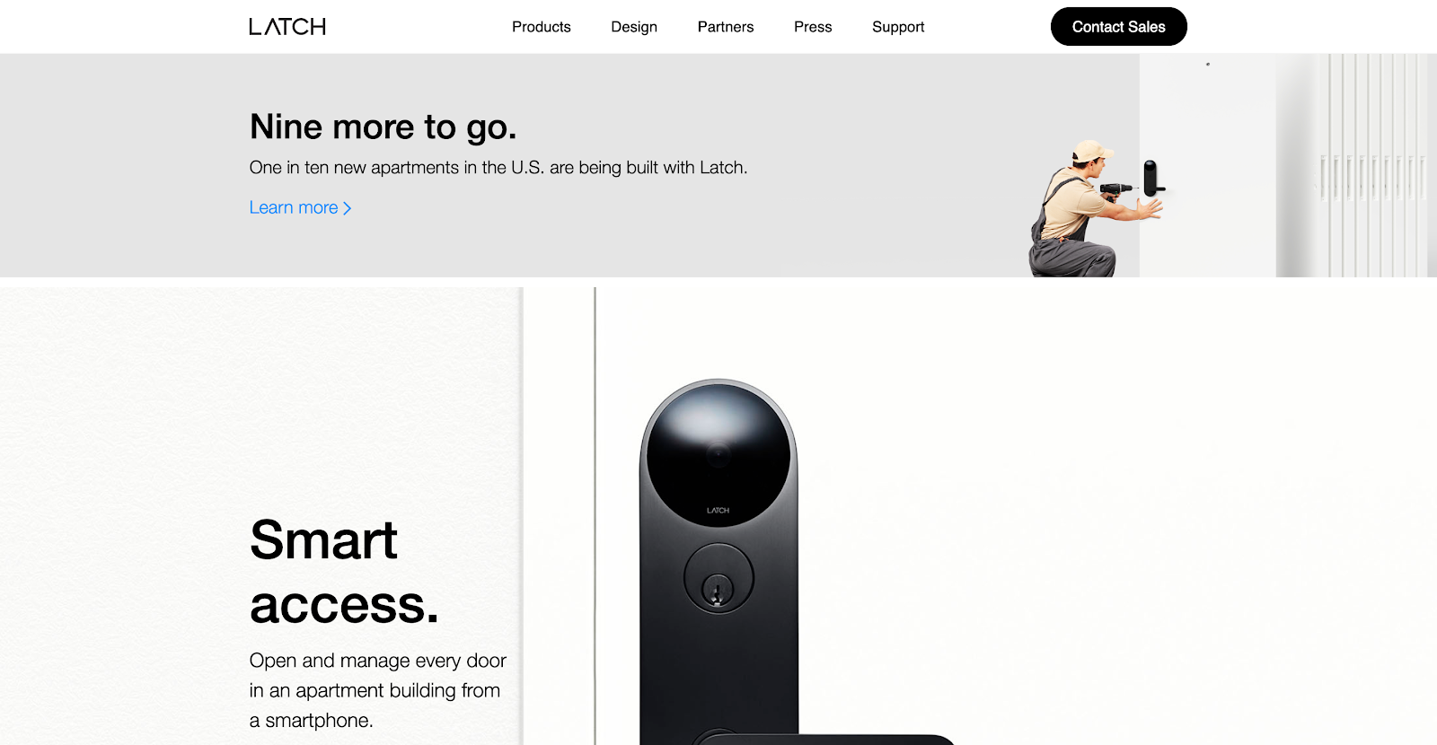
Latch lets you lock and unlock any door in your home right from your phone.
The content and visuals complement each other well. Each headline is concise and each image clear and defined. The clarity of the site combined with its animated transitions and other dynamic elements make for a fantastic, engaging design.

9.DPL Guru
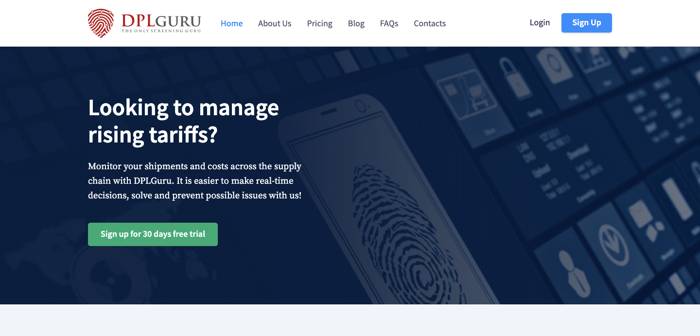
DPL Guru is a service for those in the supply chain looking for ways to manage materials easier and more cost-effective.
Specialized companies offering a technical product often have websites that suffer from information overload. DPL Guru’s content is organized and easy to digest. Their calls to action and benefits are clear — making it simple for stakeholders outside the supply chain to understand how DPL Guru works.
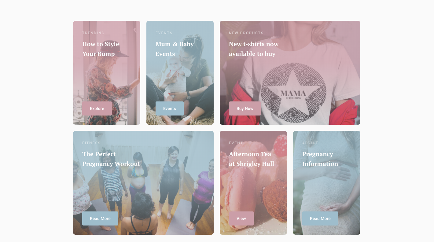
10. Mumtobe
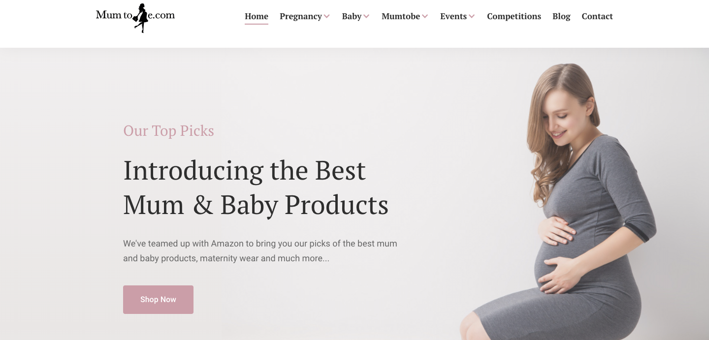
Mumtobe sells baby-related products like maternity wear and baby clothing. The site has a comforting feel with its use of soft greys and gentle reds.
This design also uses Jan Losert’s Cards UI Kit — available for free in Webflow. Card layouts make for a smart way to organize content, and Mumtobe’s site is a great example of making a free resource fit your own needs.


The modern web design process
Discover the processes and tools behind high-performing websites in this free ebook.
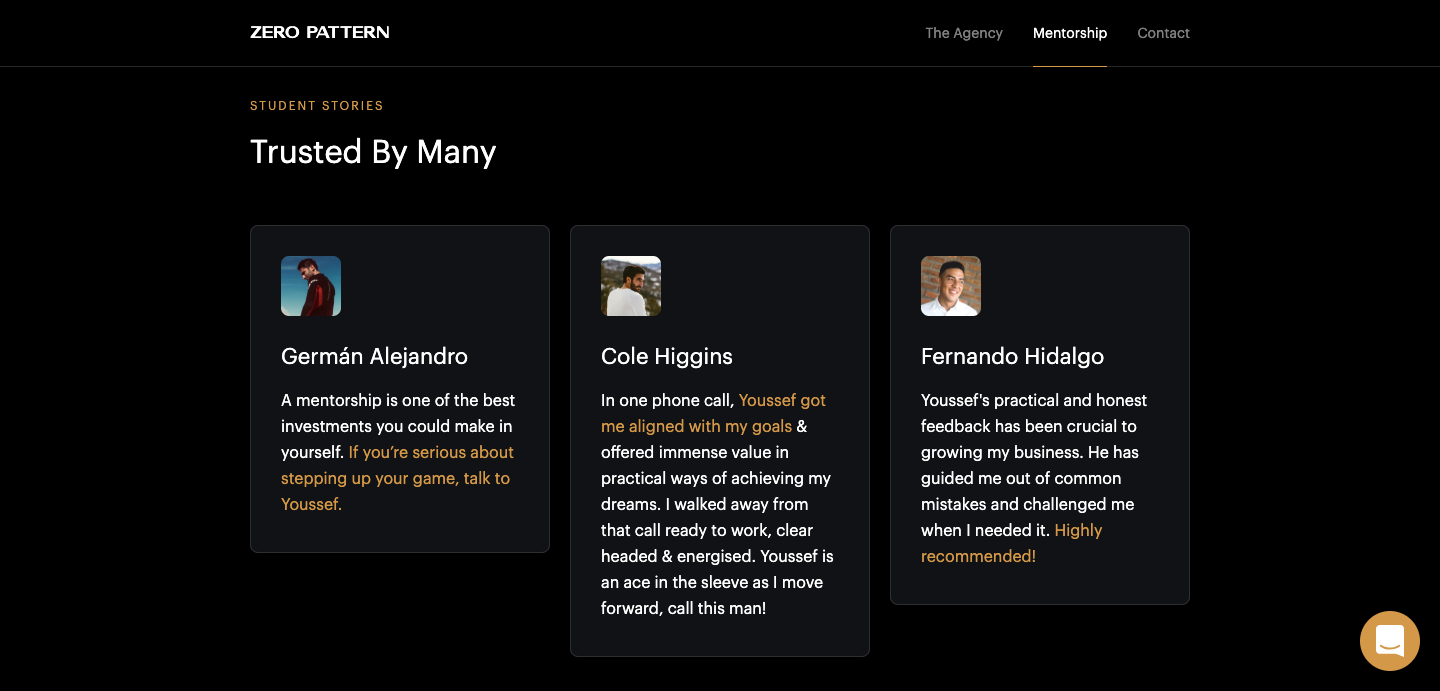
11. ZERO PATTERN

ZERO PATTERN is a business with two distinct parts — a design agency and a web design mentorship program. The site design, with its blacks and golden yellows, almost feels like a luxury brand. And for both sides of this business, it’s an aesthetic that’s bold and builds trust.
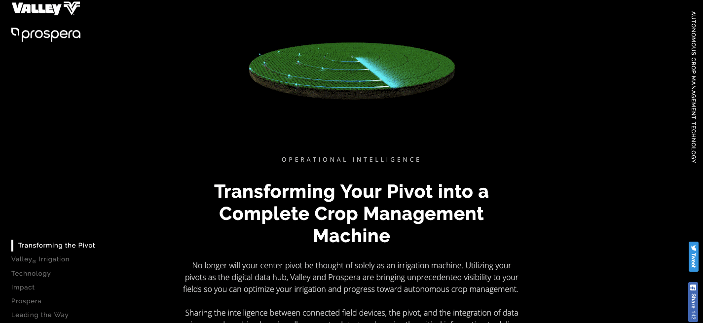
12. Valley Prospera
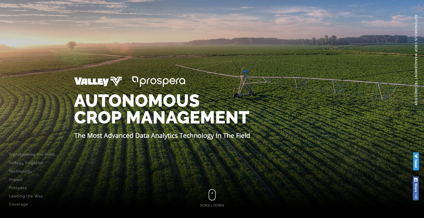
Advances in technology have touched every industry, even eons-old practices like agriculture. Artificial intelligence, data analysis, and automation are all being used to help farmers improve the way they grow crops.
The agricultural tech company Valley Prospera is a good example of this. They have a focus on reinventing how irrigation works.
Their site design is a nice reflection of agriculture and tech with images of orderly rows of green crops and irrigation equipment. Even their content reflects the more advanced technical side of what they do with data, satellite imagery, and graphics that demonstrate computer vision algorithms.
The design is the perfect mix of organic and digital.
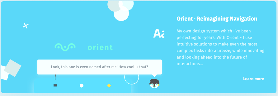
13. Roman Volkov
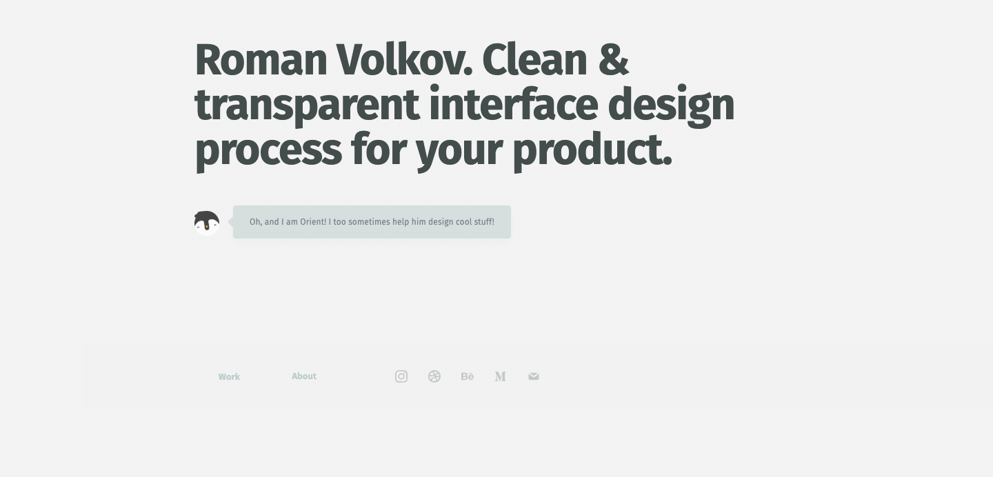
Roman Volkov is a multi-talented designer whose portfolio promises, “clean and transparent interface design for your product.” The design uses a streamlined layout and a grey background that helps the colored blocks that feature his projects stand out.
It looks like this is a fairly new website, as there’s a couple tiny things that still need to be worked out. But it’s a fantastic start!
Roman has also included a tiny chatbot character who adds snippets of commentary throughout the design. It’s a small touch that has just the right amount of personality.
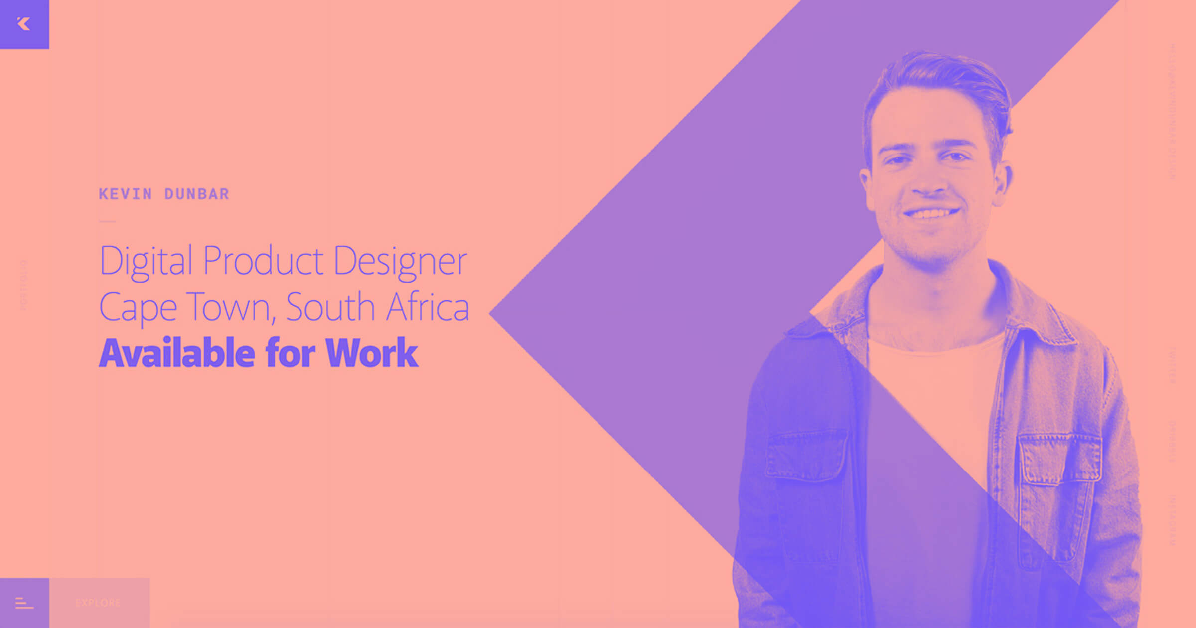
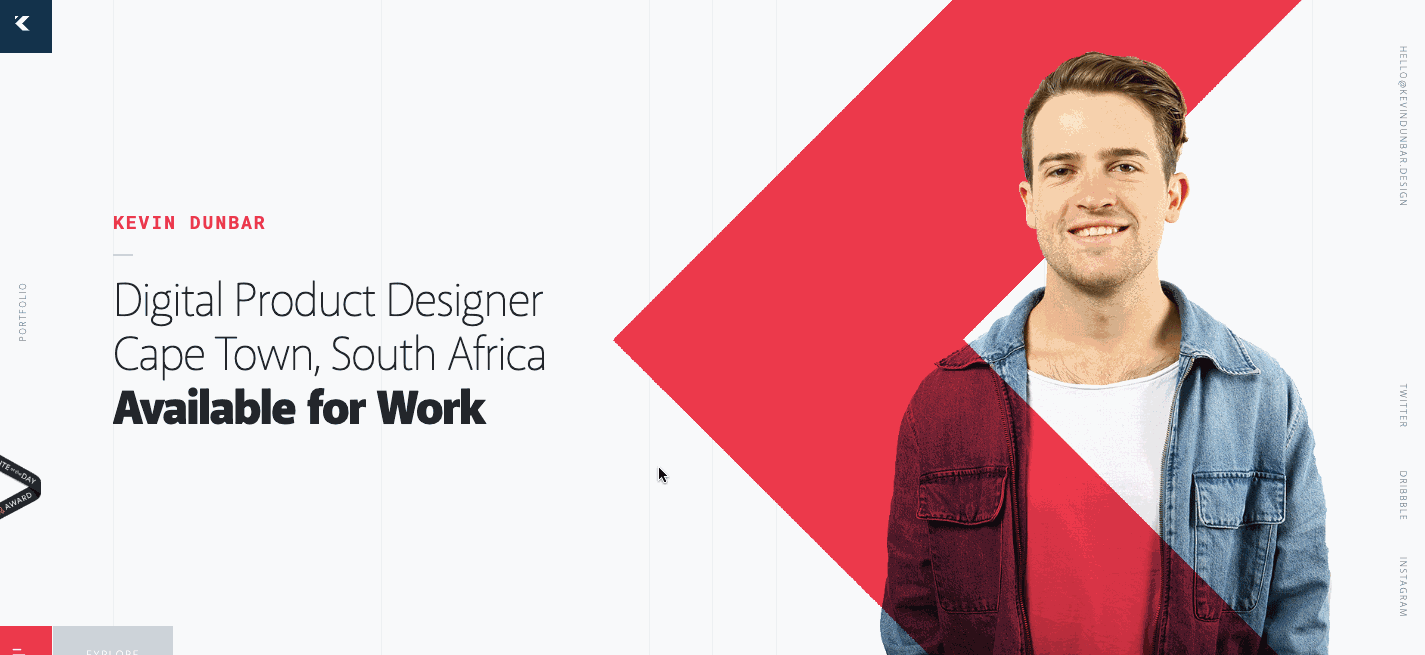
14. Kevin Dunbar
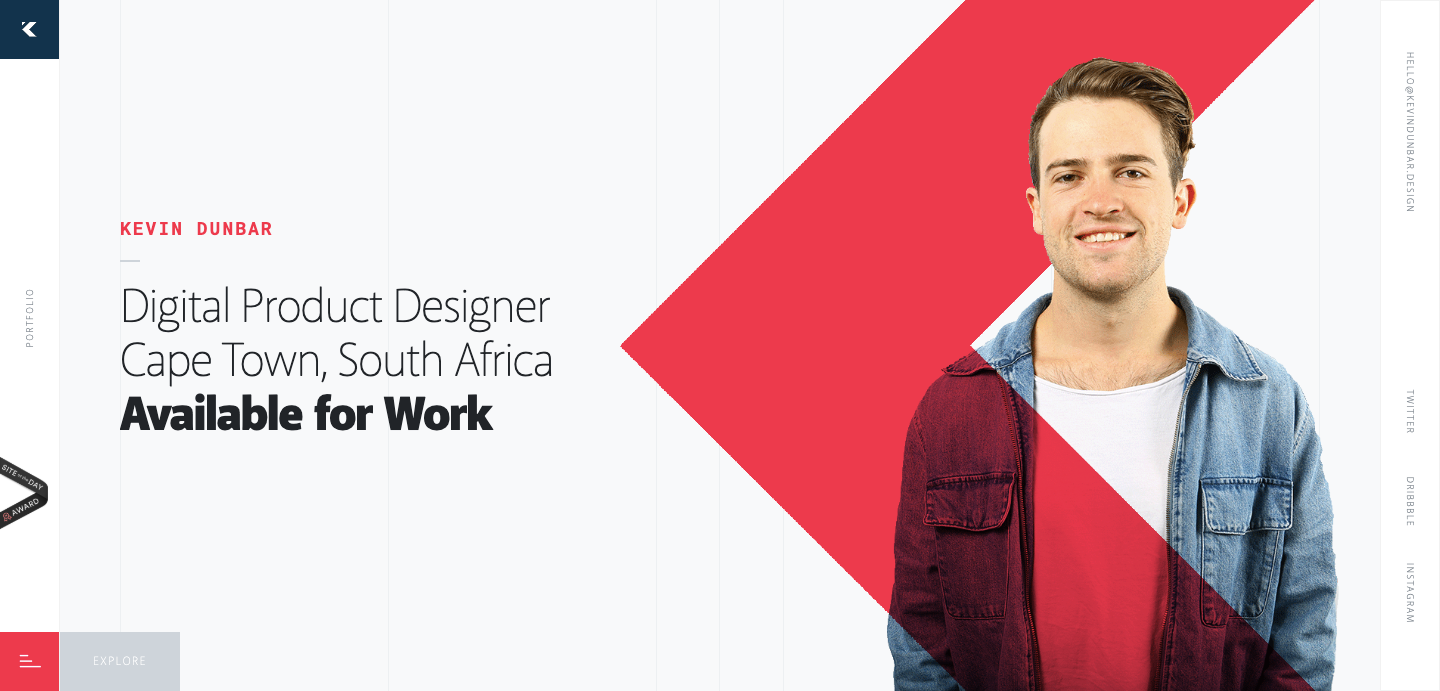
Kevin Dunbar has a fantastic portfolio — it earned a Site of the Day award from CSS Design Awards. And we can see why!
All the visual elements have just the right balance. The landing page has crisp, sharp angles that aren’t overused. Scrolling reveals a nice variety of visuals and interactions. A scroll-triggered list of Kevin’s skills float horizontally in big, bold letters.
Scrolling further reveals more of Kevin’s projects transposed onto mobile screens. Though there’s a variety of visuals, it still feels cohesive in communicating his design skills.
15. BlackBird
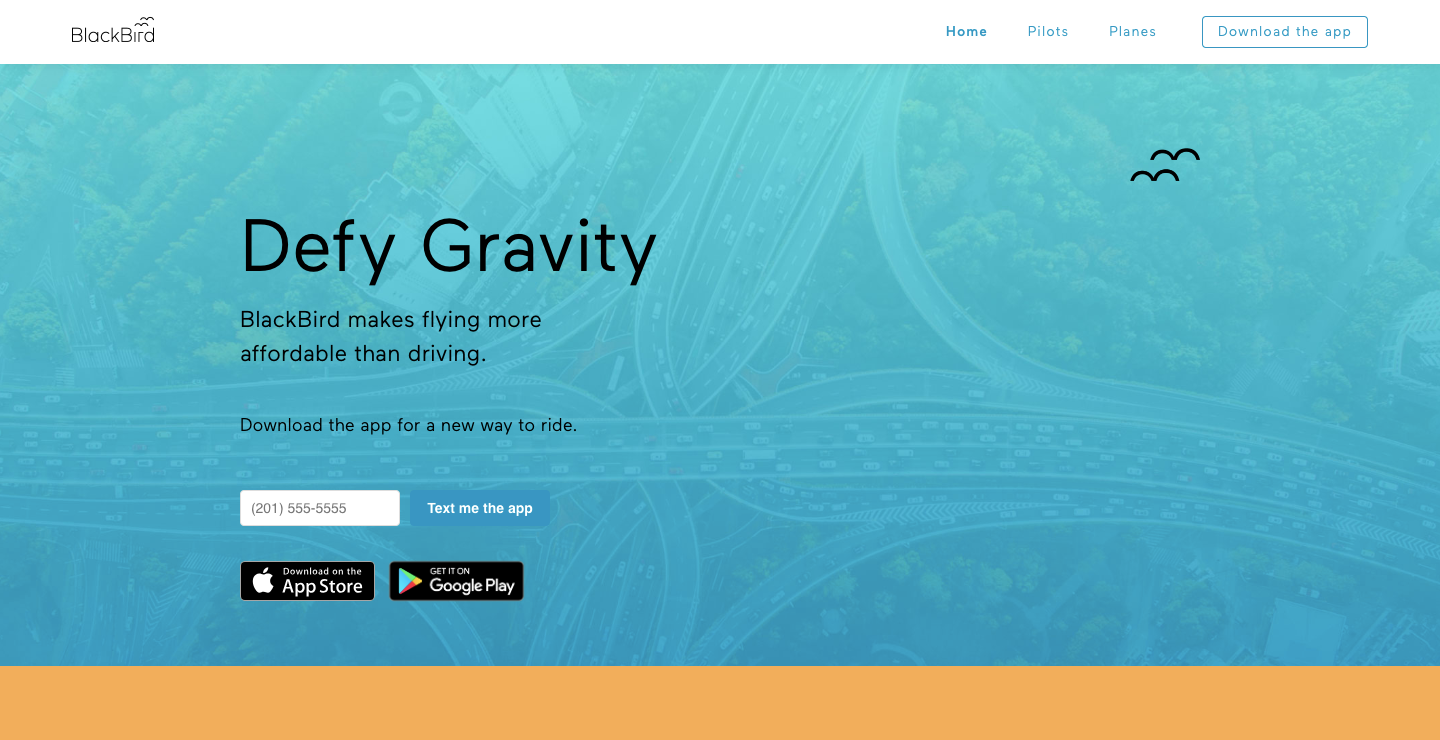
BlackBird claims to make flying more affordable than driving.
The site makes good use of space and huge swaths of color. This eye-pleasing design shows how their app works in a couple ways. A horizontal scroll leads us through the process, and a trip estimator compares the time and money you’d spend driving to the cost of flying.
Both sections are featured at the top of the design, giving visitors an immediate understanding of the app’s benefits. We can also download the app at the top and bottom of the design.
BlackBird does an excellent job of keeping things simple, showing how their app works, and making downloading it easy.
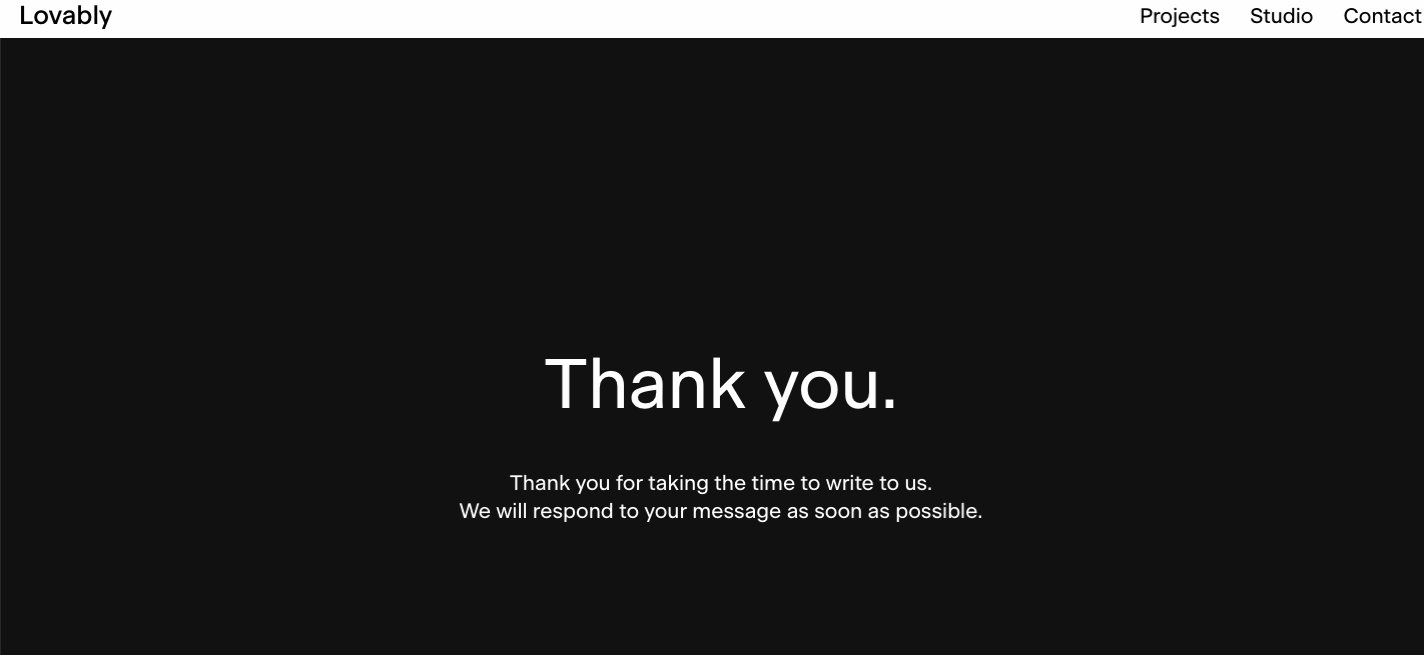
16. Lovably
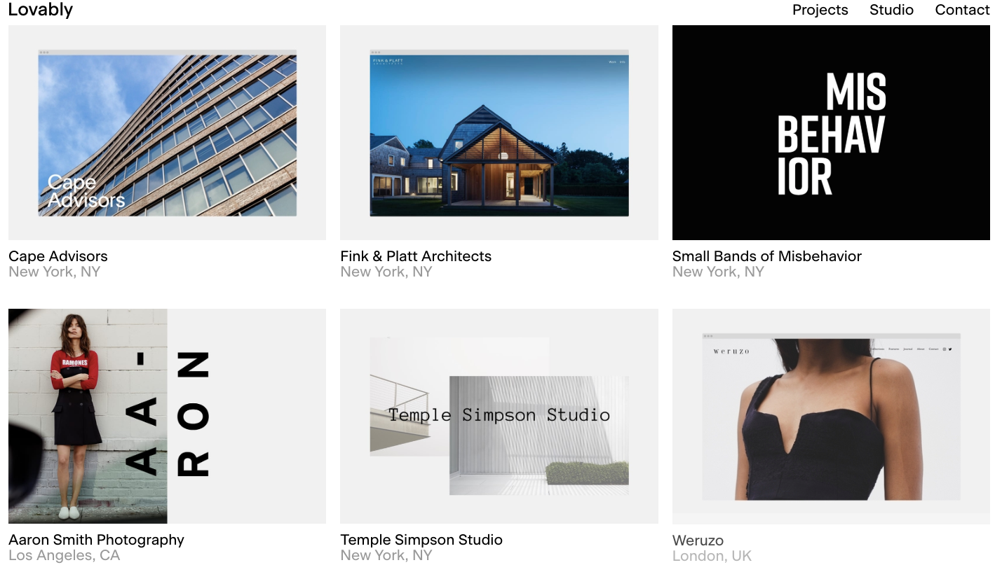
Behold another example of the power of grid! Grids never go out of style — it’s a simple way to organize content in a familiar layout.
The design studio Lovably uses the grid to show off their branding, print, and digital projects. They also use Webflow CMS to manage blocks of content. Well done!
Another neat feature is their sent-message screen — a simple paper-airplane animation adds personality and a touch of playfulness. This extra effort shows a thoughtfulness for the details, no matter how small.
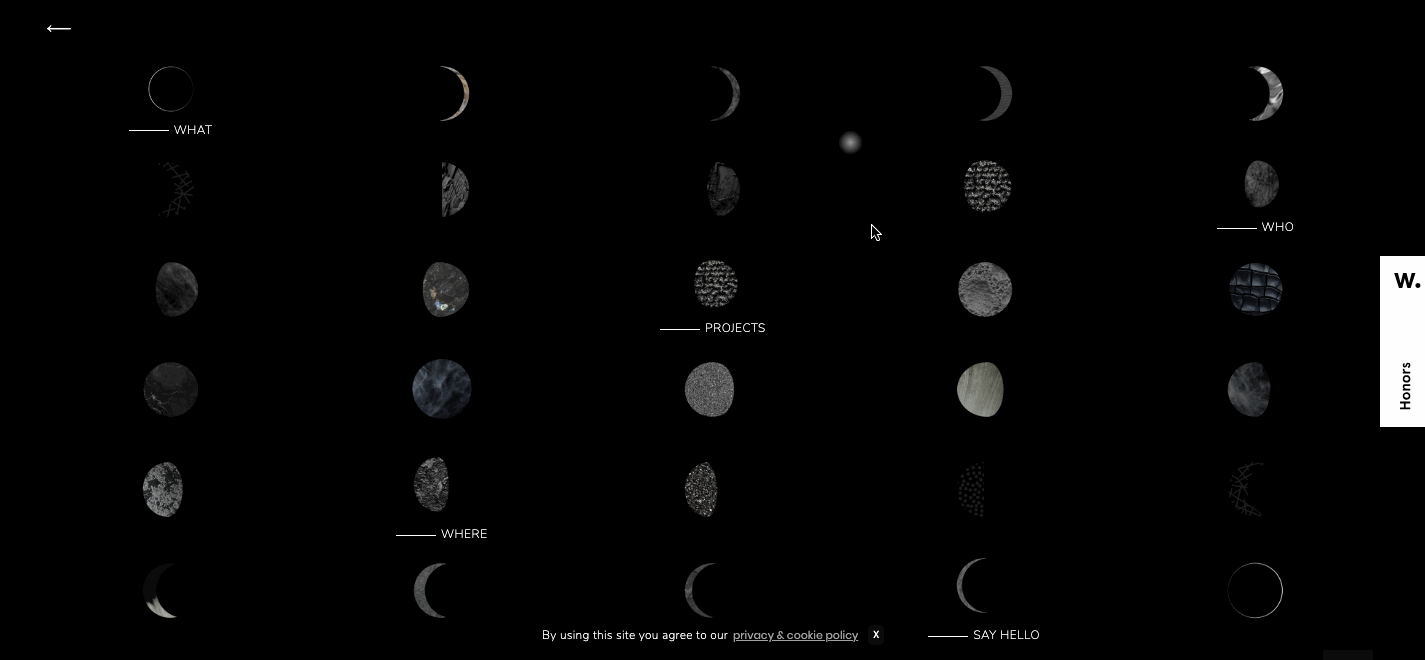
17. Eclipse
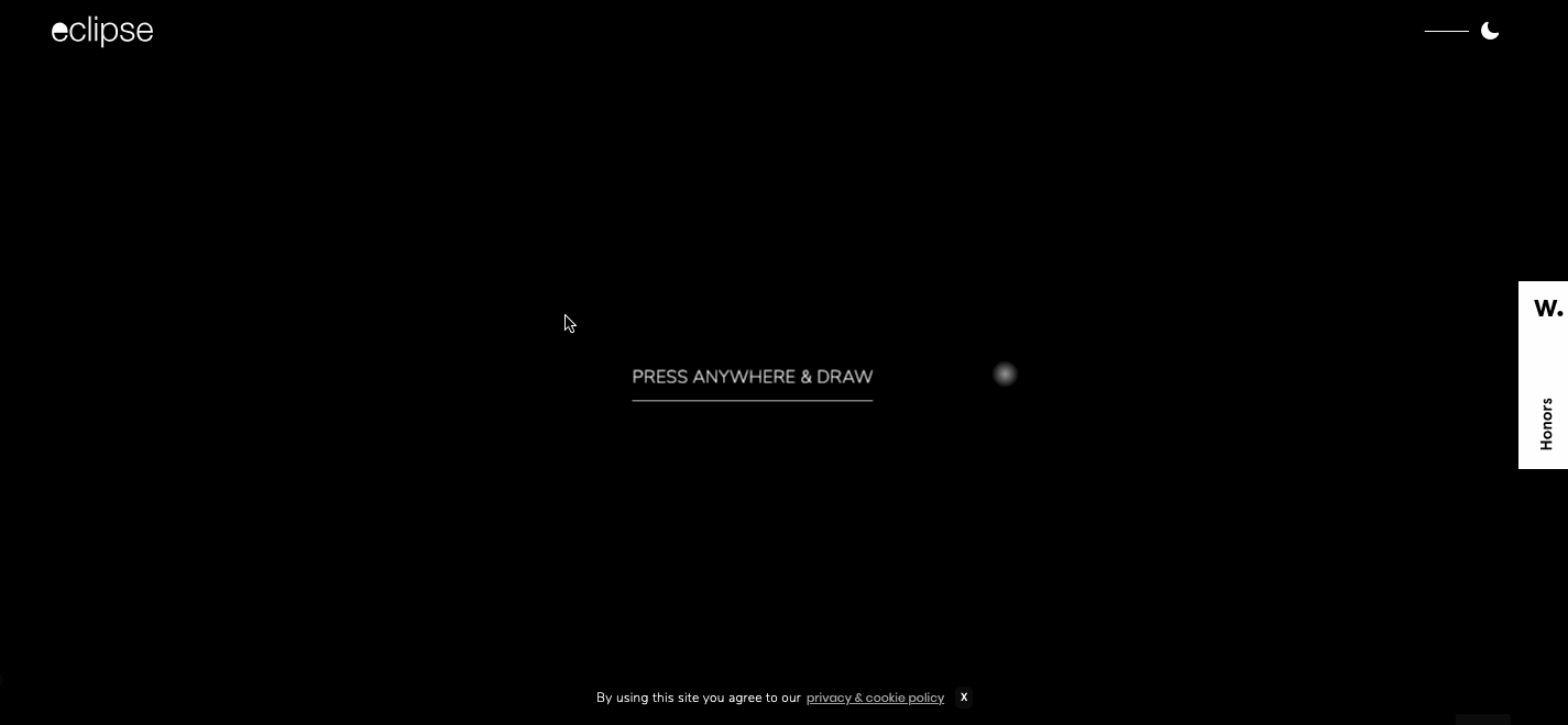
The site for design agency Eclipse greets us with an invitation to “press anywhere and draw.” Clicking, holding, and sweeping your cursor over the screen leaves a trail of text. It’s such an original, delightful way to get our attention and engage us in the design.
Eclipse’s flair for the creative doesn’t end here. One page features an array of celestial bodies — an animated hover interaction swirling each icon. Some of the icons lead to navigational options while others are static. But even the static ones have an animated effect, tempting us to click each one.
These microinteractions are fun to trigger and are just one of many interesting design features Eclipse uses to create a unique, engaging experience.
18. Josh Gonsalves
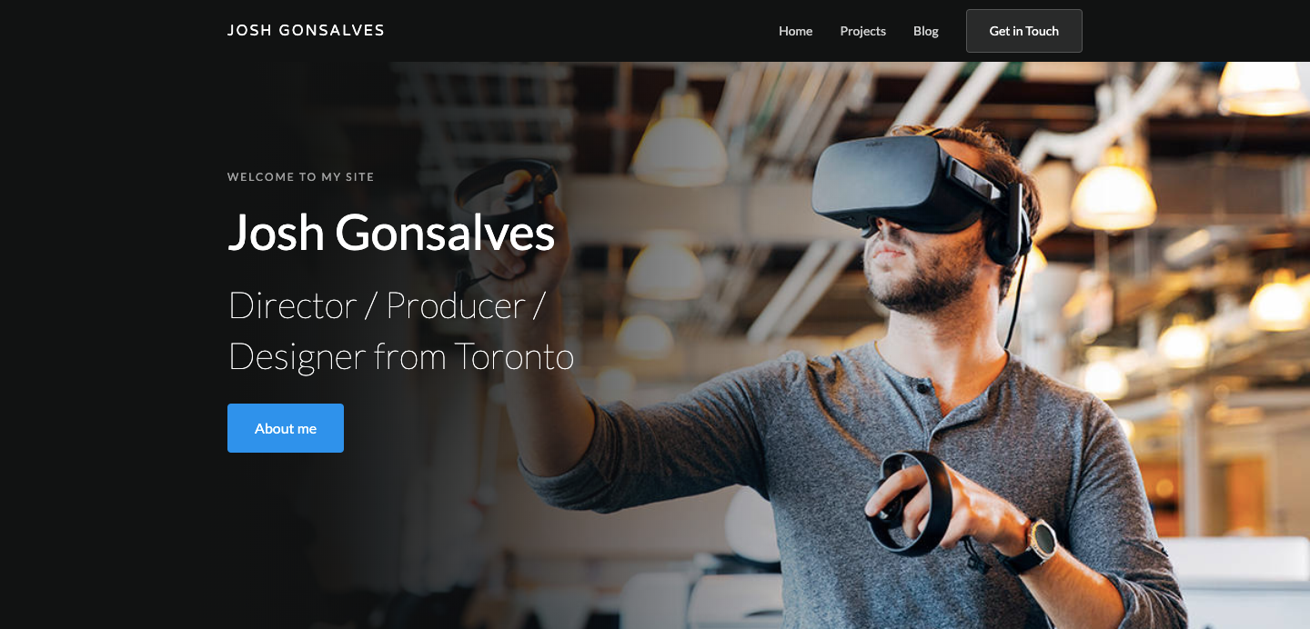
A lot of us have skill sets that extend across different mediums and areas of expertise. Josh Gonsalves is one such multi-talented individual. He’s a director, producer, and designer specializing in VR.
The design features plenty of videos and copy that showcases his work. His site gives us a good idea of his work ethic and approach to the creative process.
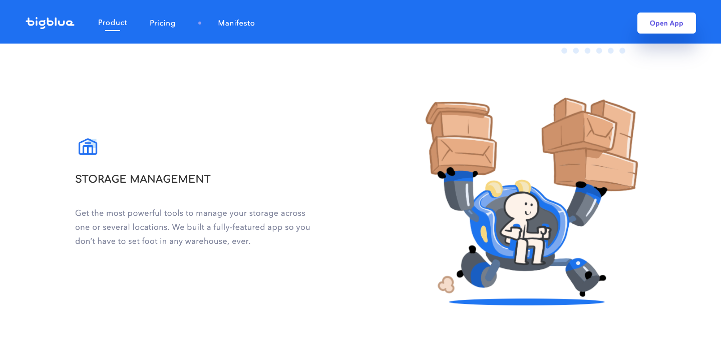
19. Bigblue
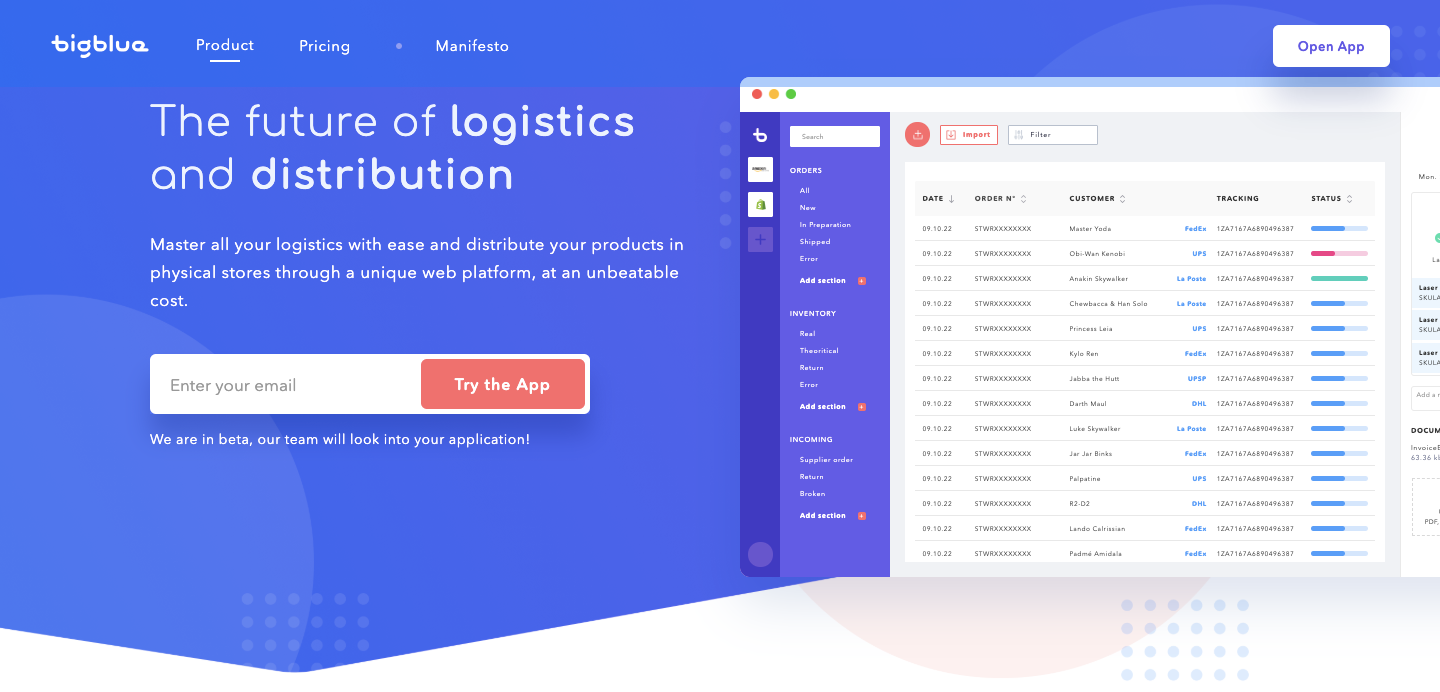
Bigblue manages product logistics, which is a data-heavy discipline.
There are plenty of nods to just how heavy it can get with lovingly designed tables of data throughout the layout. But custom illustrations keep things fun and prevent the design from feeling bogged down with too much technical information.
The site strikes a nice balance between informative and creative.
What Webflow designs inspire you?
We've already seen so many great designs built in Webflow this year. What sites have inspired and sparked your imagination? Share them in the comments below.
We look forward to more design goodness from our Webflow community. So if you’ve got something you’d like us to see, be sure to use the #MadeInWebflow hashtag, whether you’re sharing on Instagram, Twitter, or Facebook.