Every month we keep a lookout for designers who are creating great work with Webflow. We love seeing the different ways people use it to express their creativity. Here’s 15 websites, all designed in Webflow, that caught our eye. Enjoy!
1. Showcase Search
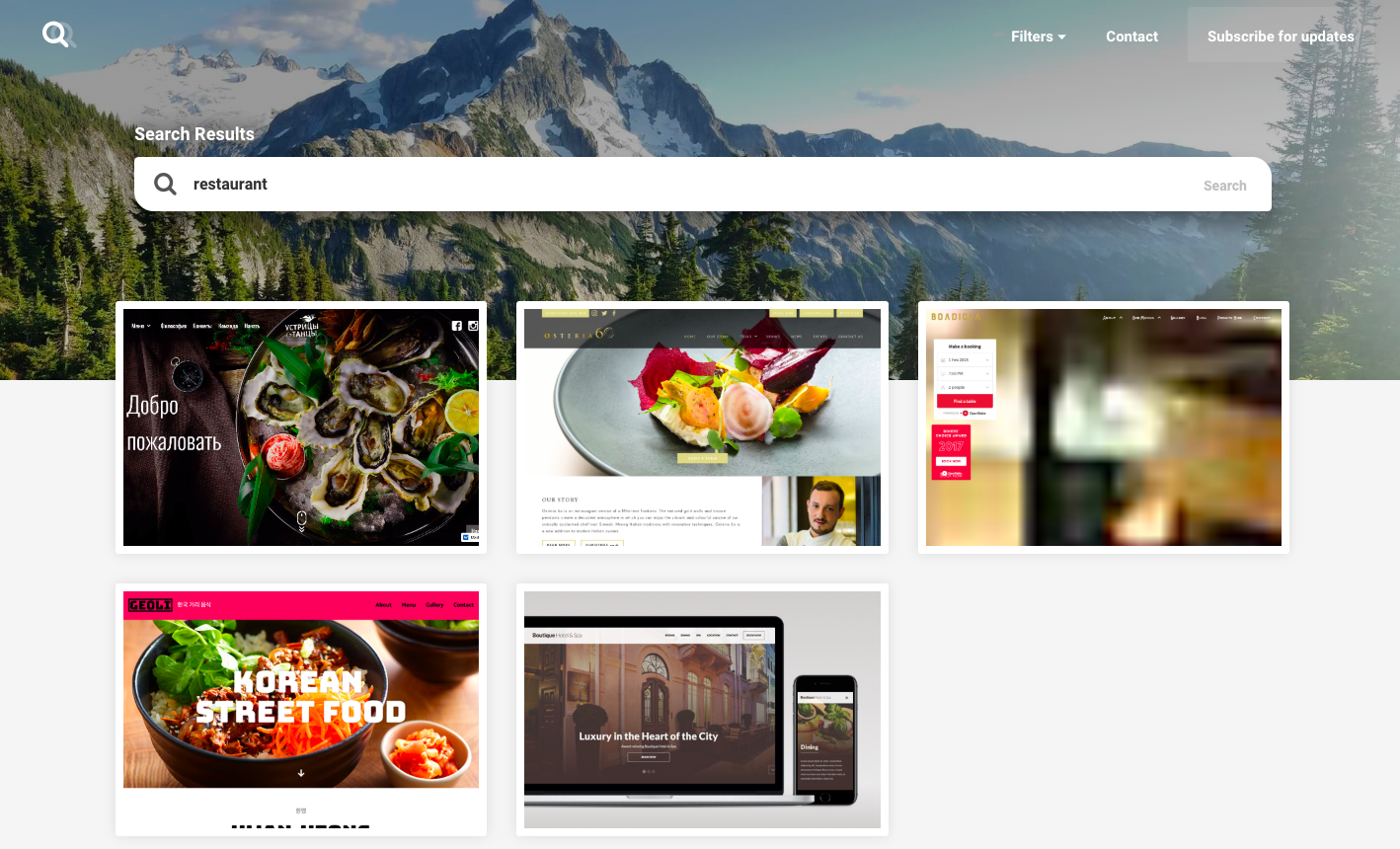
The Webflow showcase is a great place to find inspiration for your next project. From websites for hip-hop producers to photography studios, there’s always new work being posted by many fantastic designers.
And, we’ll admit it, with so much great design work on display, it isn’t always easy to find your way through it all (don’t worry, we’re working on it). Tyler and Duncan, the designers behind Showcase Search, have made finding what you’re looking for much easier. How could be we not give props to those helping us out? We appreciate it!
There’s filters for searching by most viewed, most cloned, most liked, and most recent. What’s really great is the keyword search, which makes it a snap to find specific types of websites. You can use it to search for examples of navbars, UI kits, or design practices like material design. If you’re looking for a different way to browse our showcase, this site is what you’re looking for.
2. Expedition Company
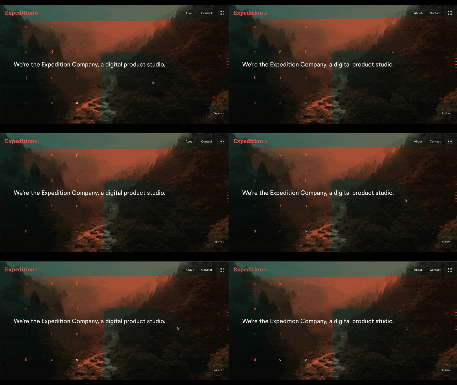
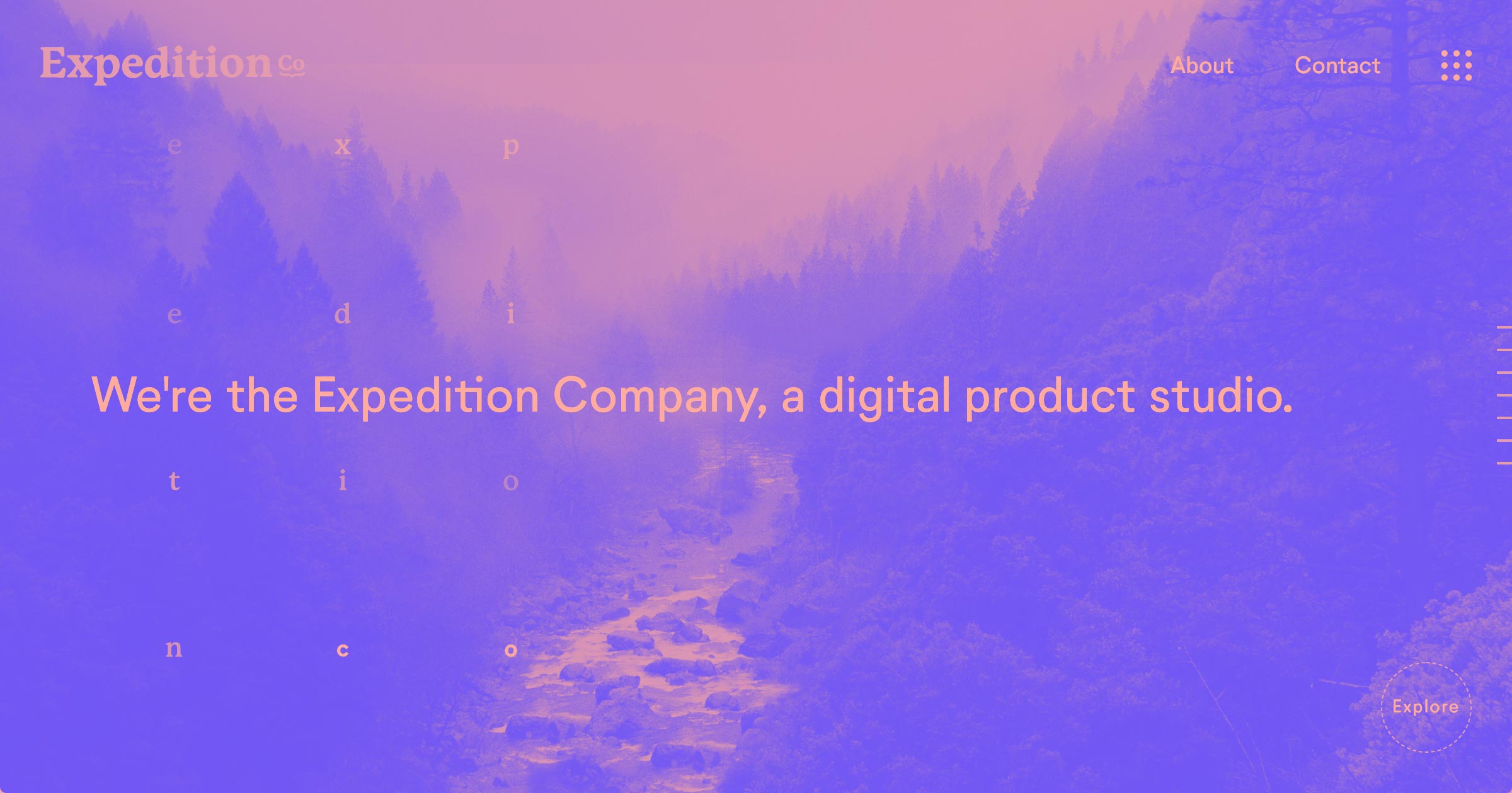
The Expedition Company is a digital product studio that employs a number of visual effects and animations to create a unique design experience. This creative approach starts right on their landing page, which tilts as you hover your mouse around the page. This design grabbed my attention and made me want to see what other cool elements were integrated into it. And luckily this creativity extended beyond this first page.
Their featured projects page uses a quick sliding animation to assemble the panels of each project into place when scrolling down the page. The rapid speed of this effect, compared to the slow, surreal feel of the landing page, really made these featured projects stand out. This design is a study in contrasts, which keep it visually interesting and fun to navigate.
Thinking of doing something like this in your own design? Kevin Haag, the design whiz behind the site, has a video tutorial showing you how to create it:
3. Webflow Responsive Flexbox Grid
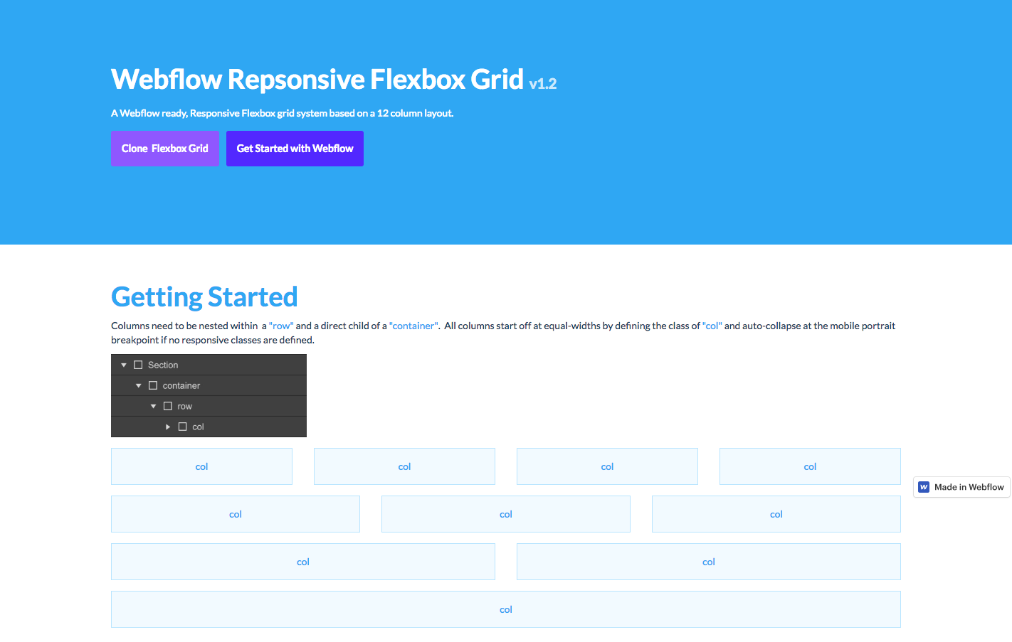
Here’s another example of a Webflow community member putting something out there to help other designers out. If you’ve been wanting to make a Flexbox grid, this tutorial will take you through how to do this in an easy-to-understand, logical progression. There’s even an option to clone it for your own use. For those wanting to do grid-based designs in Webflow, this is a super-helpful resource.
4. My Daily Song

We’re big fans of any website that helps people discover new tunes. My Daily Song was created by designer and music fan Marcus Reinecke to share what he’s been into via monthly Spotify playlists. It’s a love letter to music and also a great design showcasing his skills. As designers, it’s good to have passion projects like this, where you can merge something you love with your own artistry. Marcus’ appreciation for design and music come together in My Daily Song, which exists for no other reason than to share his musical interests with others, and we think that’s great.
5. Kevin Dunbar
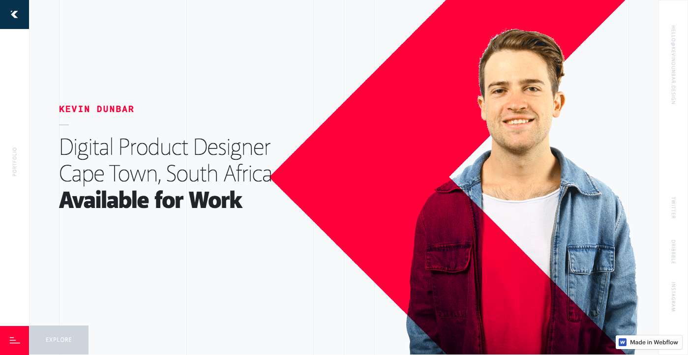
Kevin Dunbar is a digital product designer out of South Africa. His portfolio is full of strong geometry and use of negative space that makes all of the content easy to read and keeps things visually dynamic.
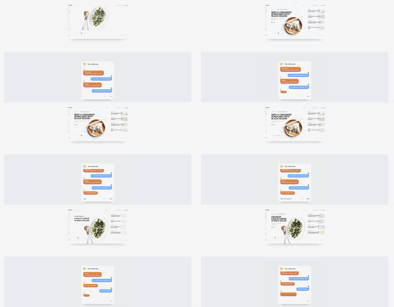
Instead of using a static image for each project in his select pieces of work section, he shows off how they appear when they’re in use. This is a smart move, and gives someone navigating through these projects a more immediate sense of what they’re all about.
This is a great portfolio that shows how a well-balanced layout can be visually engaging, without losing focus on the content.
6. Design Calendar
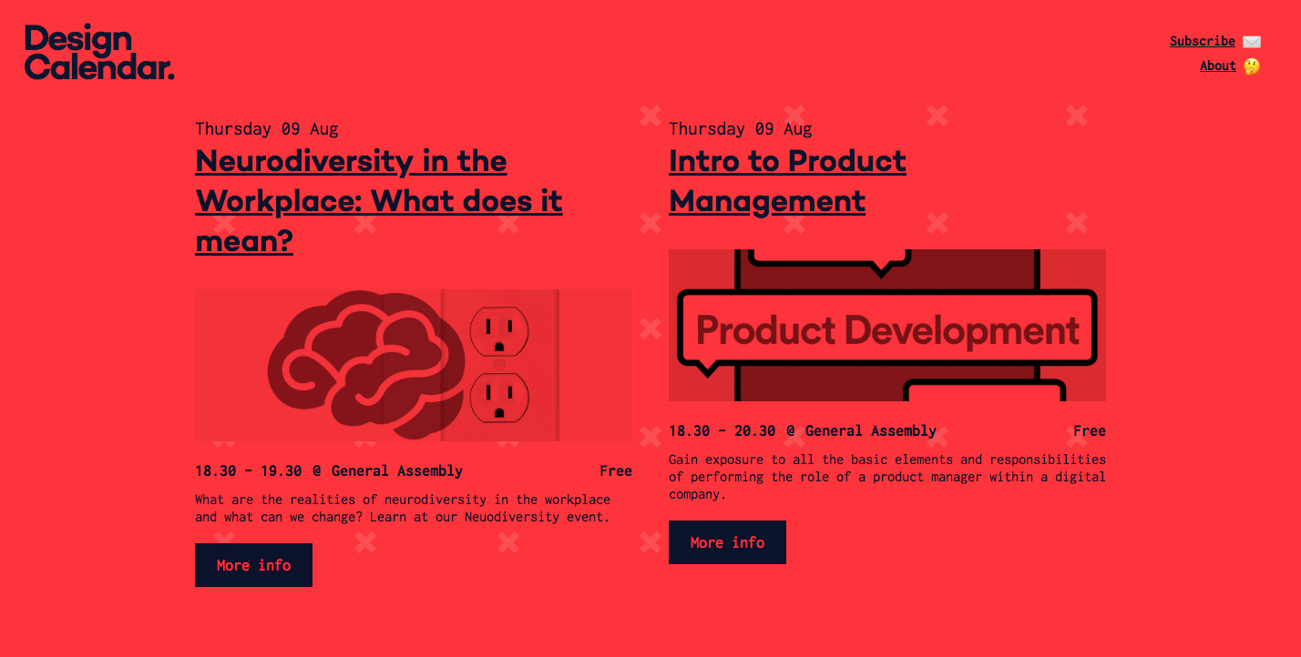
Design Calendar is another great example of designers helping designers. In this case, it’s a list of design-related events like conferences and workshops happening in London. In the hands of a lesser designer this could have been just a boring grid of events. But with a bold, monochromatic color palette and offset blocks of content it presents a lot of information without feeling crowded. All of these events are managed using Webflow’s CMS, making it easy to make changes and add new events to this collection of design events. What’s also great is that you can sign up to receive a print version of their calendar that you can tape up somewhere as a reminder of all the cool London design events happening.
7. Design Systems London
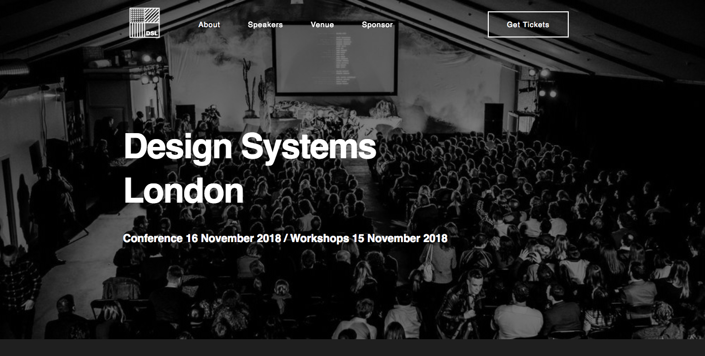
Design Systems London is a conference for designers and engineers who focus on building design systems. It's a single event, but this website goes beyond what could have been just a minimal design effort.
It’s a simple design of black and white with a variety of images and fine-tuned font sizes that create a clear and efficient hierarchy of information. All of the speakers are pictured, with info about who they work for and with links to their Twitter and personal websites. It’s a great way to get an idea of who’s going to be there and to become familiar with their work.
All of the important details about the speakers, venue, and workshops are here, presented in a well-organized way that captures the excitement and spirit of the event.
8. Star Wars UI
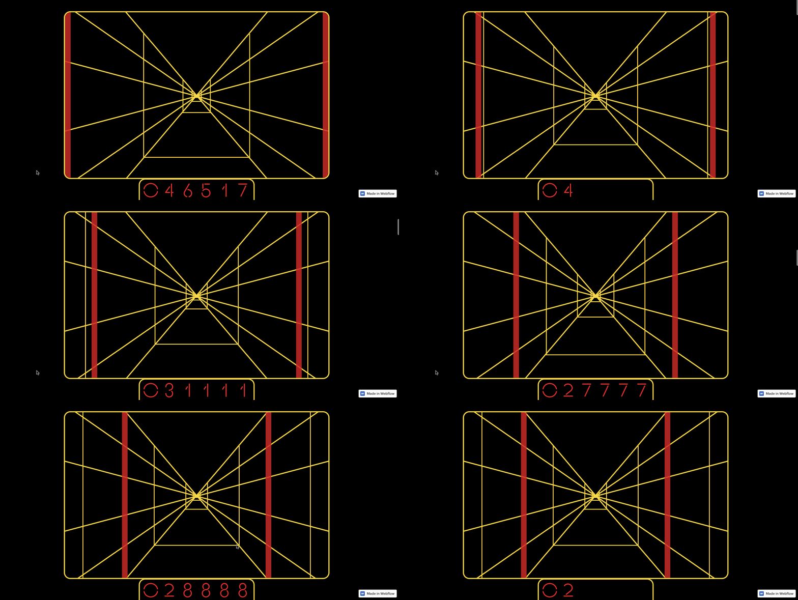
Sometimes you have to make something just for the sake of challenging yourself. This Star Wars UI scroll-based animation harkens back to the old vector style Star Wars arcade game from the 1980s. Scrolling brings you down the narrow corridor until you reach the target.
We love the fact that someone could use Weblfow’s animation capabilities to create a graphic like this. The force is strong with designer Tom Johnson, who’s written a great series on building agency websites for us!


The modern web design process
Discover the processes and tools behind high-performing websites in this free ebook.
9. The Second City Works

For those who are at least intermediate-level comedy nerds, Chicago’s Second City comedy theater needs no introduction. Not a comedy aficionado? Well, you’ve heard of Tina Fey, Amy Poehler, and Stephen Colbert, right? They’re all alumni of this comedy institution.
The Second City Works, built by the amazing folks at Heco, is an offshoot business of their theater. They offer licensed video content for businesses to use, but their main focus is in creating custom comedy sketches for businesses utilizing Second City actors who can inject humor and life into the most boring of company conferences and presentations.
The great thing about this website is the professionalism of the content. They’re not out to prove how funny they are, but to communicate the benefits of the services they offer. The tone of the content is conversational, but never wacky. Images show the actors with little explanation, but capturing the joy that they bring to the stage. They don’t need to tell us that they’re funny — their reputation precedes them.
There’s also a lot of interesting visual embellishments throughout the design. Scroll-triggered animations bring colorful shapes together in much the same way that sketch comedy brings together different ideas to make us laugh.
10. X2
We’ve all struggled with bad days. How many of us, feeling down in the dumps, have called upon Siri to help us through it? If you have, you’ve probably discovered that, though she’s great at telling us how to find the nearest coffee shop, Siri sadly abandons us when the times get tough.
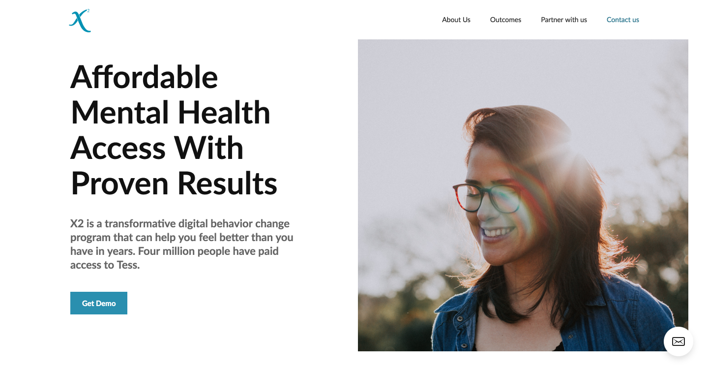
In all seriousness, we probably shouldn’t be calling on Siri for help with our mental health. But what if there was an app with an intelligent chatbot that could help you out when you’re feeling depressed, stressed, or anxious? X2 is in the business of making mental health more readily available, and their chatbot Tess can text you through your problems and offer solutions.
They use a simple design, with the focus being on the content that details how their app works and how it can help people. There are a few scroll-based animations, but they are subtle. There’s a gentleness and light quality to the design that fits very well with their goal of improving emotional well-being.
11. Marc Kris Modern Homes
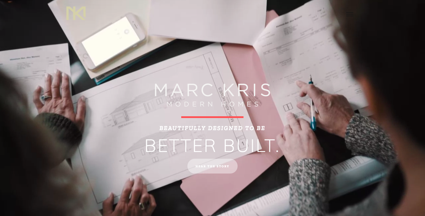
Marc Kris Modern Homes is all about creating custom homes for their clients. Instead of paragraphs packed with technical details, their website lets imagery tell their story. There's plenty of visuals showing off their process and the homes they've created. In fact, their main call to action on their landing page goes straight to a very well-produced video explaining their process.
They also never lose focus of the personal side of their business. Yes, we get to see the homes that they’ve built, but we also get to see who they are, as well as their clients. Their website captures the artistry of what they build as well as the essence of who they are.
12. ASCS
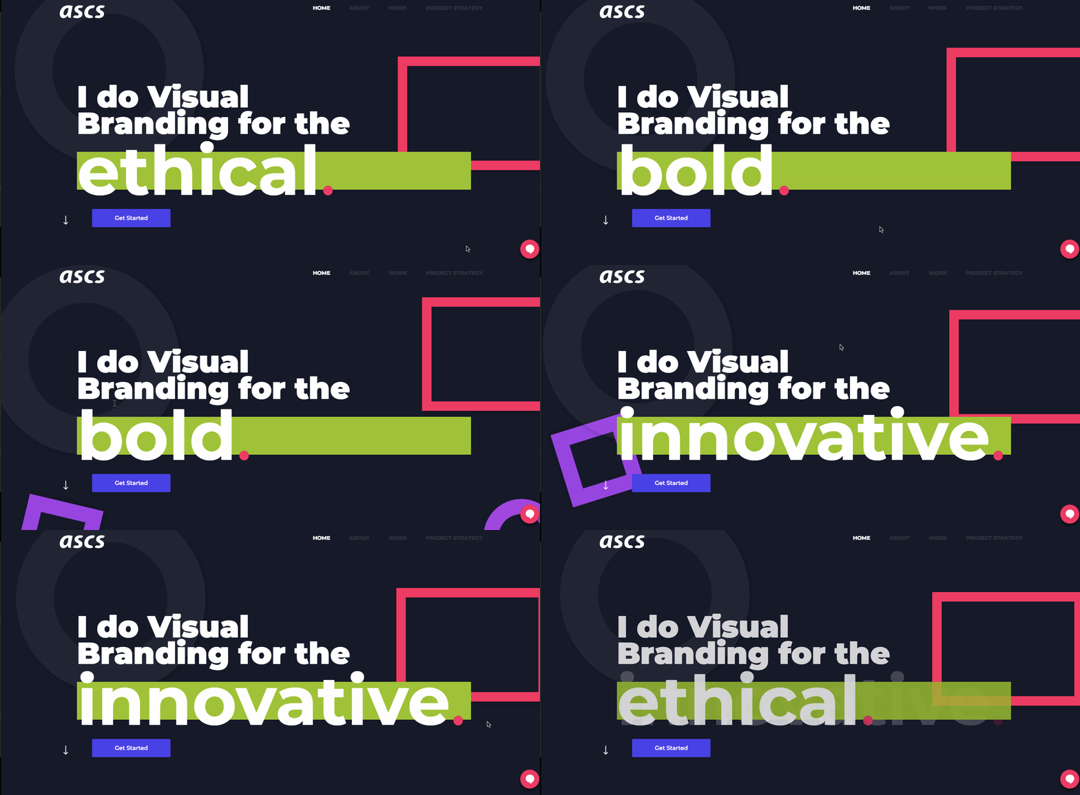
ASCS is a visual branding business headed by Andre Swaby. And there’s a lot of awesome visuals going on in this inventive design.
From the 360° scroll-triggered animations to the custom illustrations, this website doesn’t skimp on the design candy. It seems like almost every element has some sort of animation applied to it. But none of it seems monotonous. It only adds to the energy that bursts forth from this design.
It’s obvious that Andre spent a lot of time on this website, and that they pay attention to the tiniest of details. If you’re looking for someone to do your own visual branding, these are the qualities that you would expect from any good designer.
13. Pierrick Calvez Visual Designer
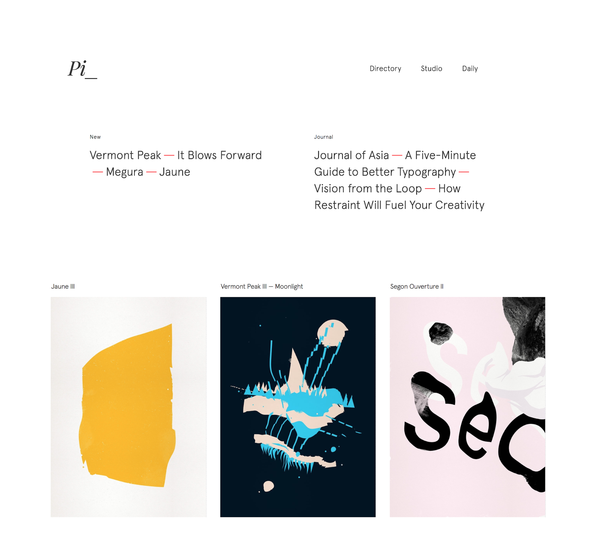
Pierrick Calvez is a visual designer in Shenzhen, China. Their multifaceted portfolio shows all of Pierrick’s creative pursuits in the visual arts, from monochromatic prints and photography to a five-minute guide on typography. Each piece offers a glimpse into Pierrick’s refined and sophisticated approach. This portfolio captures Pierrick’s varied interests and talents, providing both a well-rounded representation of who Pierrick as a person and artist, and offering useful content like a talk on how restraint will fuel your creativity.
14. Dot Health

Those who’ve had to request medical records know it can be a frustrating, drawn-out process. Dot Health offers an app that keeps all of your medical records secure, in a single place.
Health care websites tend to have a design aesthetic as sterile as an examination room. Dot Health fills their design full of bright and colorful illustrations that feel like they were hand painted. There’s also representations of many different types of people, humanizing what they do and who they aim to help.
Entering a medical records office can feel like stepping into a beige void of boredom. Dot Health brings color and creativity to a field that’s usually devoid of it.
15. Conservation Guide
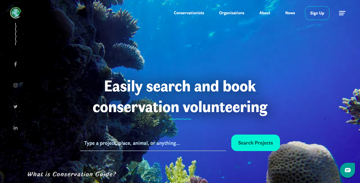
Looking to do something to help out the environment? Conservation Guide could be your gateway for doing a little ecological good.
With a palette of blues, images of nature, and scroll-triggered animations like a crab that scuttles across the screen, the site beautifully reflects the world it hopes to conserve. There’s a good balance between the visuals and content, with neither feeling overpowering but rather in symbiosis.
Note for the curious: while much of the site was built in and powered by Webflow, it looks like the more app-like element of project search and application was not.
Feeling inspired? Start designing!
Wow — we covered a lot of great designs this month. If you haven’t checked out Webflow, it gives you the tools you need to create this same sort of work in an intuitive design platform. Don’t know how to code? Not a problem. Start using Webflow to translate those design ideas rattling around your brain into actual websites — without writing a line of code. These 15 websites are just a few examples of what's possible.




.jpeg)
