From adventures in Norway to German falafel shops, we’ve once again found a variety of businesses and people using Webflow in very different ways. Here are twelve websites made in Webflow we’ve been loving.
1. Bauhem
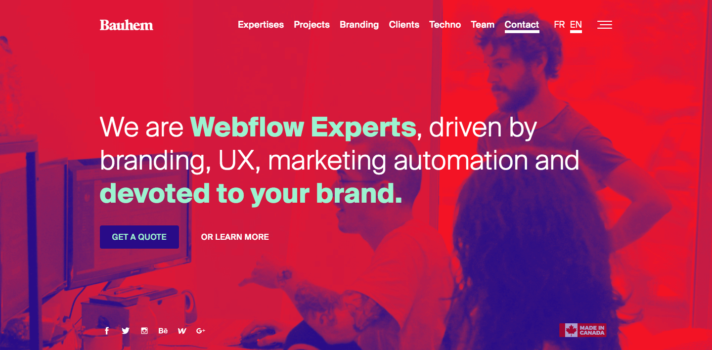
Bauhem is a marketing agency whose goal is to help out entrepreneurs and others with their branding and marketing. If your audience is all about about bringing new ideas to life, your website design can't be stuck in the past.
With a layout full of duotone images and contrasting colors, Bauhem has a modern feel. Palettes like this can be a little risky, but the clash of colors here never feels overwhelming, instead adding tons of energy to the design.
Scrolling triggers a nice delayed effect where the background image, headline and content all fade in at slightly different moments. This smooth animation does a great job shifting your focus from one block of content to the next. It’s a movement that adds action to the content, bringing it to life, rather than letting it all sit in a flat and static expanse.
2. Eleven Plants for Dum-Dums and Cool PPL
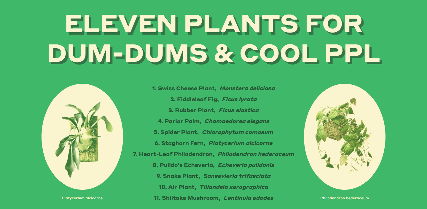
When I first landed on Eleven Plants for Dum-Dums & Cool PPL, being the cynic that I am, my first thought was, “It looks pretty, but what are they trying to sell me?” Without a single call to action to buy seeds, fertilizer, or pots, this website is all about celebrating our photosynthesizing friends — not selling them. And I was happy to know that I was a part of their intended audience as both a marginal dum-dum and a semi-cool person.
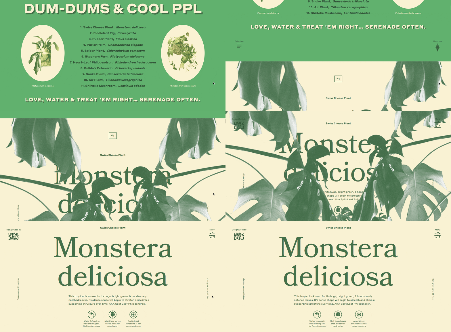
Eleven Plants for Dum-Dums & Cool PPL not only showcases plants, but also brings together a love for design and practical information. It features plenty of graphic embellishments that aren’t necessary, but add so much to the experience. Everything from the Monstera deliciosa leaves parting of to the gentle spiralling of Pulido's echeveria, it's full of design nuggets that keep things fun and engaging.
Let’s face it, reading about plants isn’t the most interesting of topics, but Eleven Plants for Dum-Dums & Cool PPL uses enough creativity and imagination to make one want to learn more.
Now who wants to try and grow some fiddleleaf figs?
3. Function of Beauty
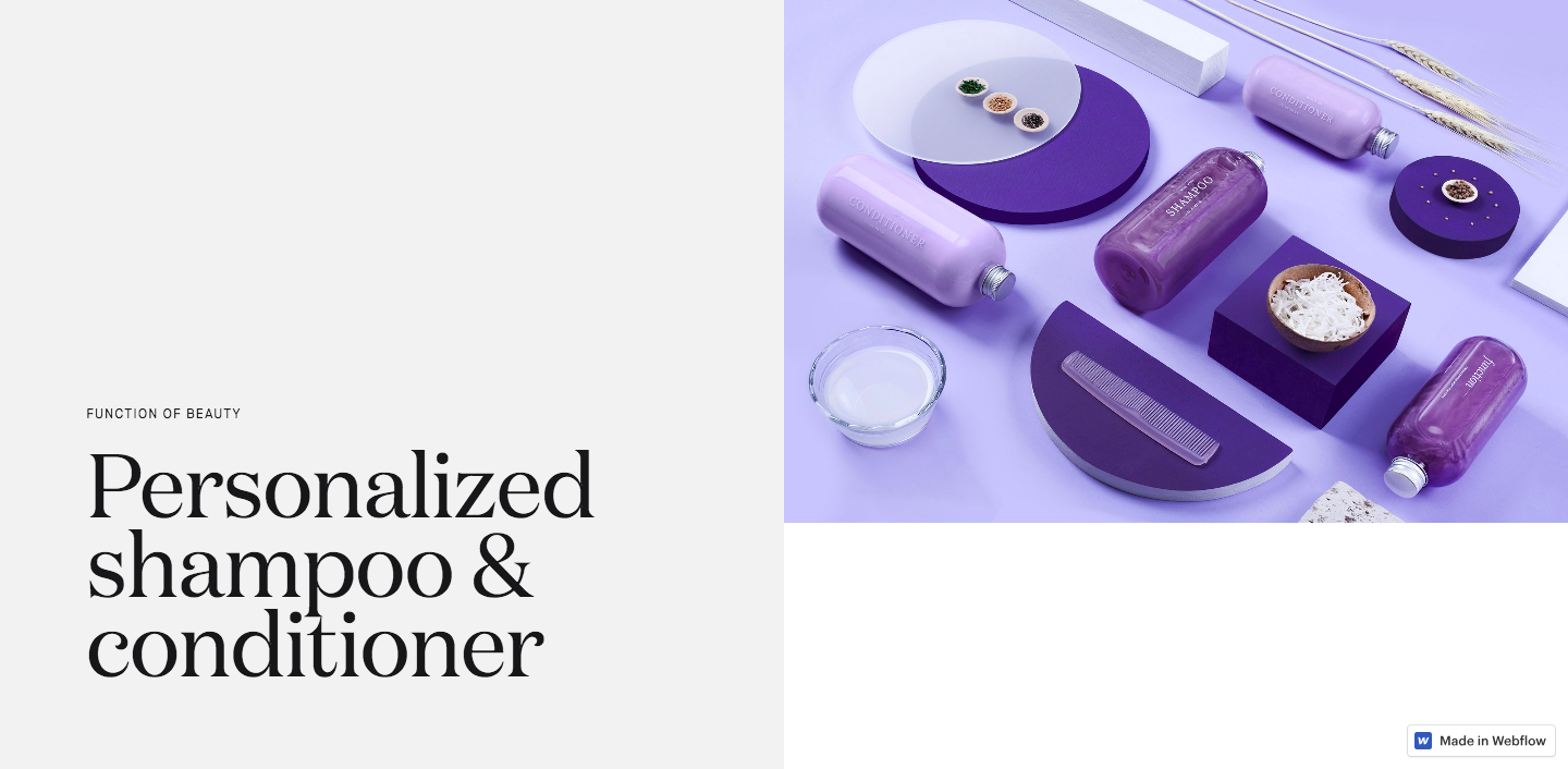
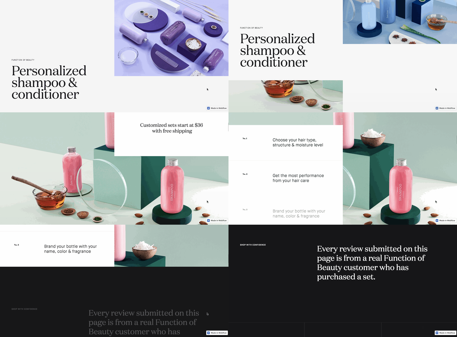
Though it’s not clear if this is going to be a new version of the Function of Beauty website, this design is full of bright colors, easy-to-read blocks of content, and enough movement to keep things interesting. It’s pleasing color combinations may even make you consider painting your bathroom to match their products. Function of Beauty leans on color heavily in their branding and this website is a rainbow of pleasing hues.
Shampoos and conditioners are laid out with other ingredients in well-composed shots. Most of the design’s color comes from these photos, which also occupy most of the design space. None of their products ever get lost in the text, with a constant visual presence throughout. With great photography combined with offset blocks of content and subtle animations, it makes for a colorful and easy way to navigate this showcase of their hair care products.
4. AV Gust Design
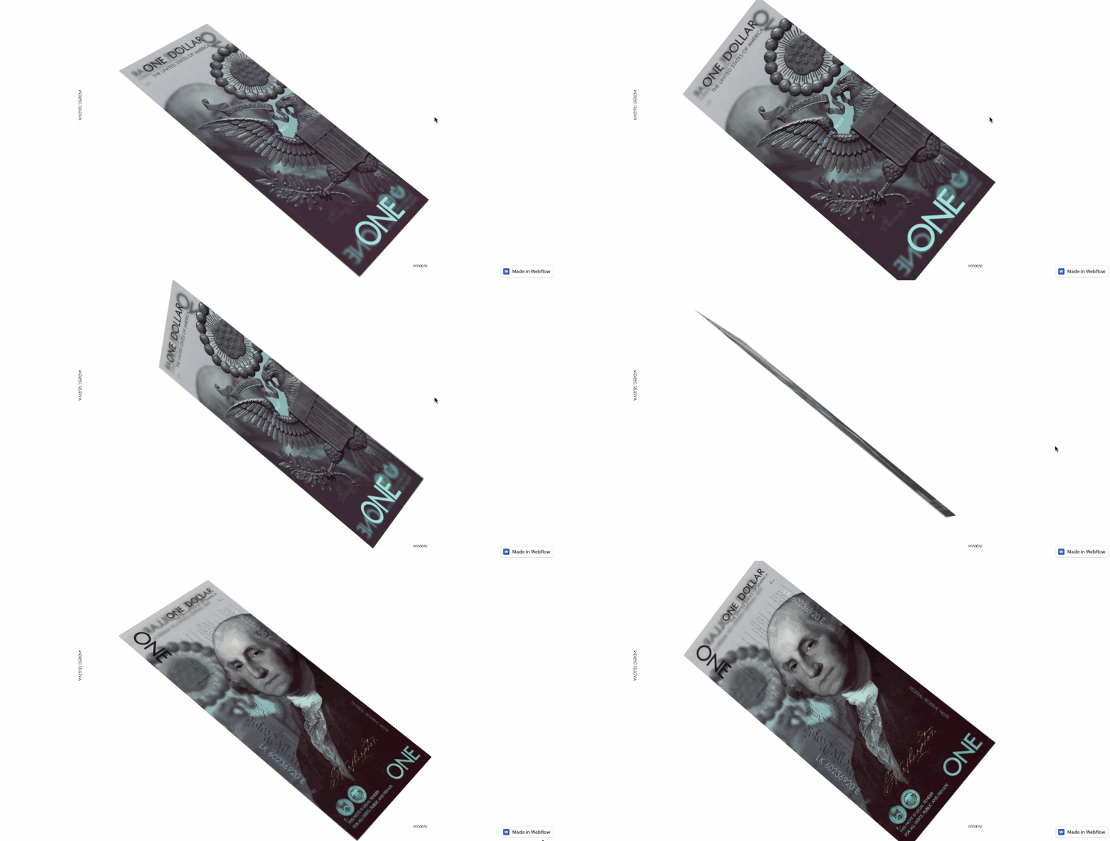
At first glance AV Gust Design is a confusing expanse of white. At second glance it may still leave you scratching your head, wondering just what the heck is going on here.
After staring into the void for a moment, you finally see the site’s tinily typeset navigation on the left hand side of the screen. Clicking on "US Dollar" makes a rotating dollar bill materialize, which upon further clicking brings you to a YouTube video showing this currency design. It's an impressive and smart-looking update. But there's no background information about this project — it would be great to know the context for this well-executed work.
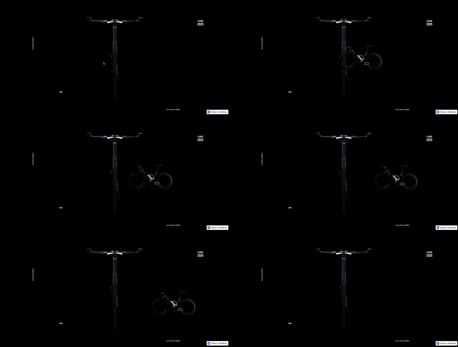
Clicking on the other navigational option, e.bike 2025, brings you to a black screen with a headlong view of a bike. My first instinct was to mouse over and try rotating it. Instead, a horizontal image of this bike pops up.
This design embraces a minimalist approach that breaks a few rules. But sometimes, it’s good to surprise people and ditch the protocols of navigation — it’s what makes this page memorable. We’re looking forward to seeing more modern takes on product design from this skilled and creative designer — and maybe just a bit more information about these projects.
5. Lysefjorden Adventure
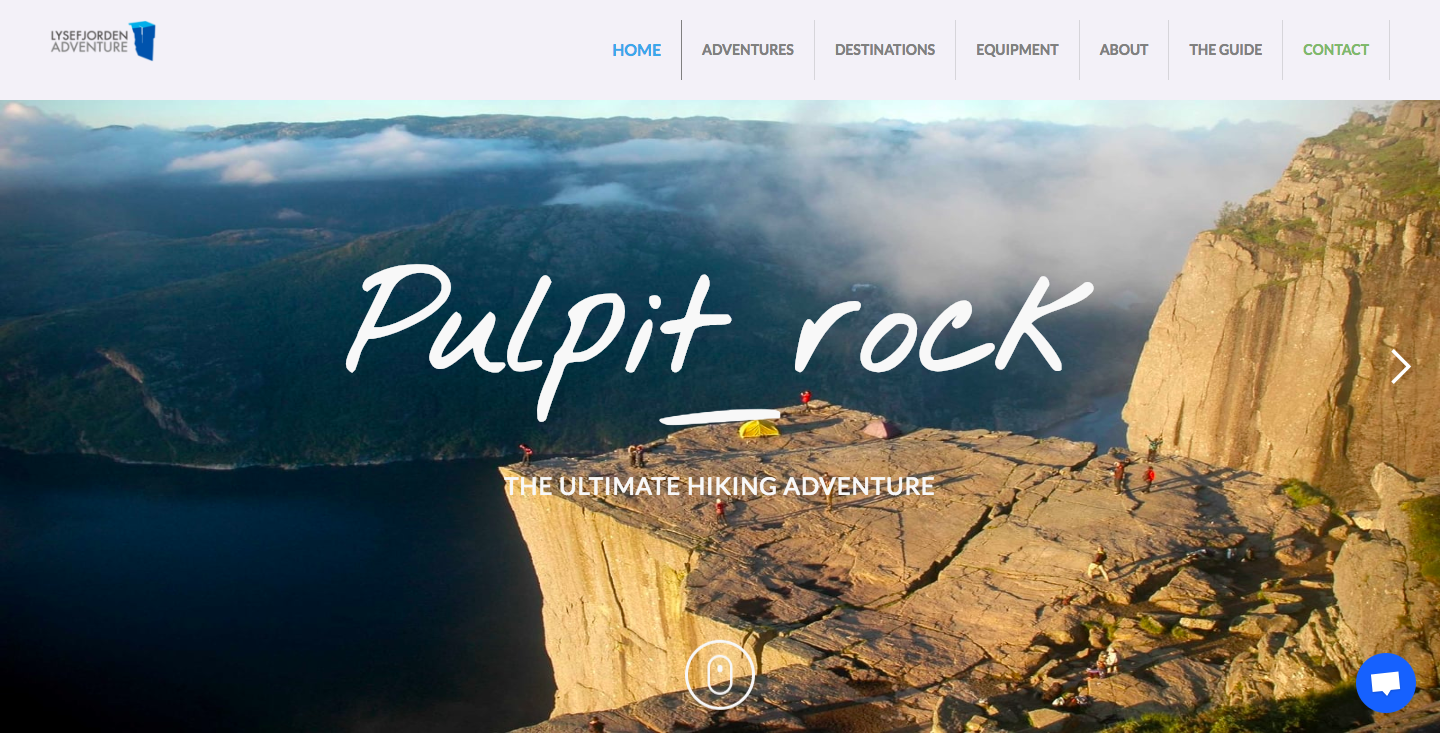
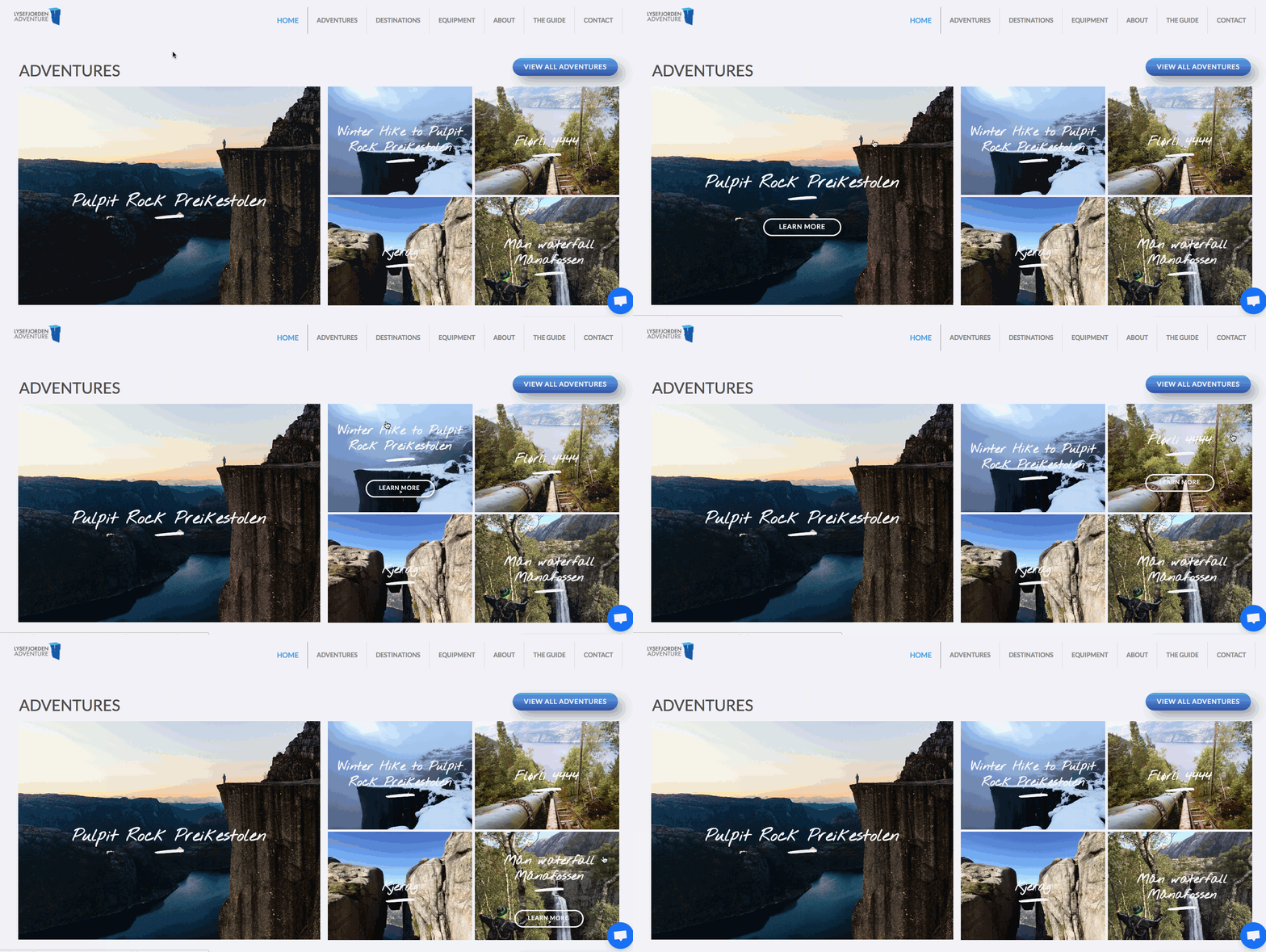
If you want to get out and see the beauty of Rogaland, Norway, Lysefjorden Adventure can set you up with a guide.
There’s plenty of stunning images of expansive rock and landscape you’ll have the chance check out. Words are kept to a minimum and used only to communicate adventure details.
What’s also cool here is the gallery of adventures. Each image represents a macro view of a potential destination. Hovering over a photo of picturesque Nordic scenery triggers a microinteraction that brings the landscape closer. It’s a movement that feels like taking one step towards a new journey. Clicking the option to Learn More will get you even closer to your Lysefjorden adventure.
6. TLH Sierre
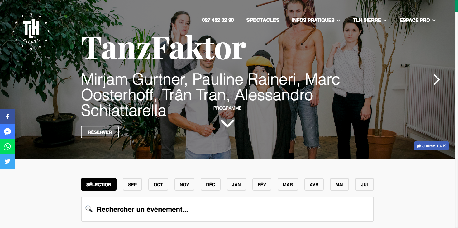
TLH Sierre is a French venue that hosts a multitude of cultural events like dance, music, and theater. Their site serves as a showcase for the performances they put on, as well as a place for potential audience members to get more information. A lot of effort has been put into the design of their calendar and it shows with easy navigation and all the important details.
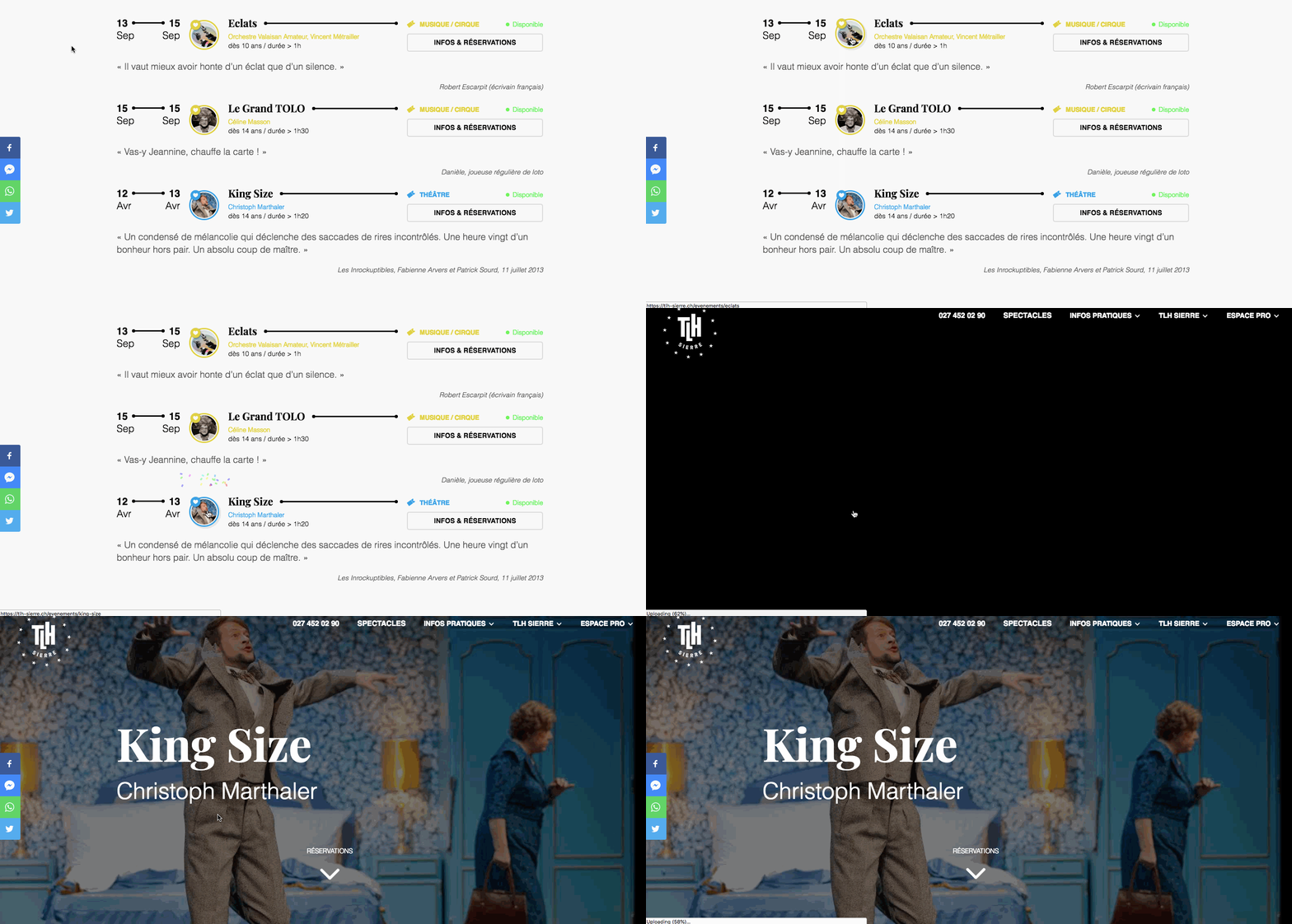
The calendar is laid out in a smart way that’s also interactive. A line stretches between dates to show the duration of a given show, followed by other important details and a button for more information and to make reservations. There’s also a cool microinteraction where mousing over a small circular image from the show releases a colorful burst of confetti.
The designers of this page put a lot of thought into constructing a calendar that’s helpful. As designers, one of the biggest challenges can be finding novel ways to organize large chunks of information. This design offers an efficient process to find the show you want to see, when you want to see it.


The modern web design process
Discover the processes and tools behind high-performing websites in this free ebook.
7. Visualizar
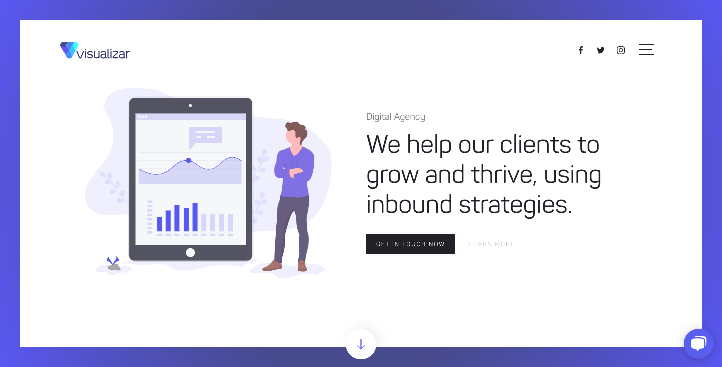
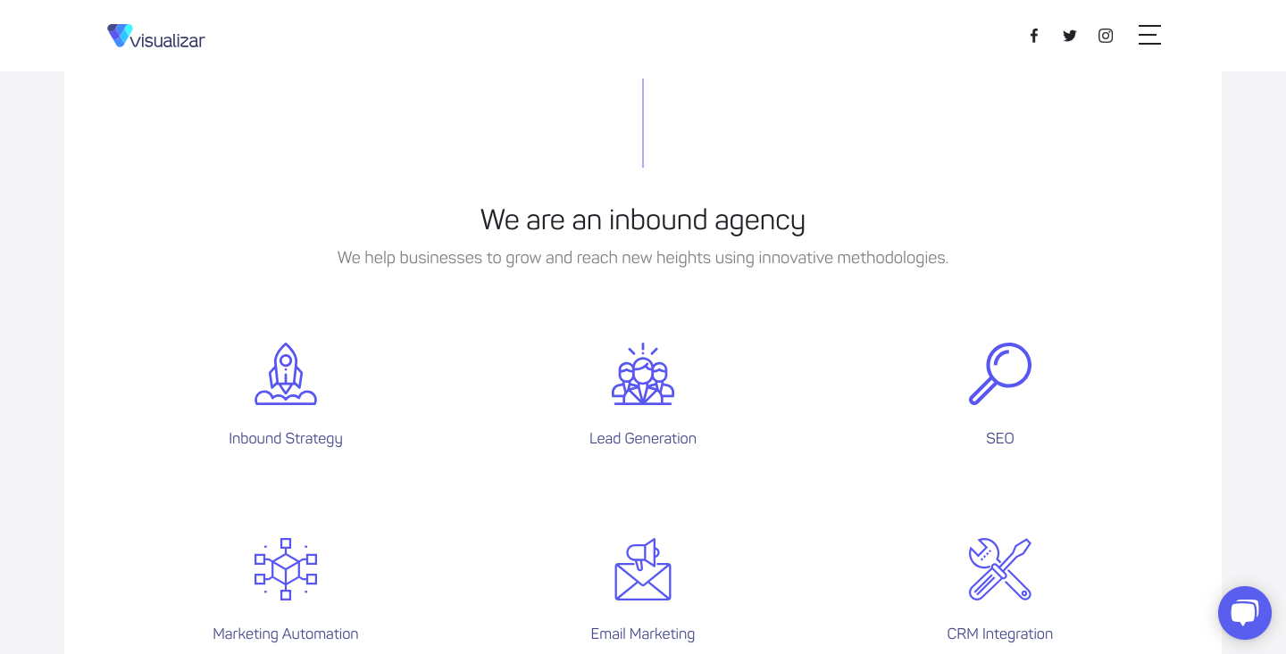
Visualizar is an inbound marketing agency that helps businesses with things like inbound strategy, lead generation, and email marketing. What really stands out in this design is their use of whitespace. Too much of it can leave content and graphics floating awkwardly with no interconnection. But finding the right balance can bring attention to these elements without getting lost in the bigger message that’s being communicated. Visualizar’s designers establish a nice equilibrium between negative space, custom illustrations, simple icons, and concise copy.
8. Jonny Belton portfolio
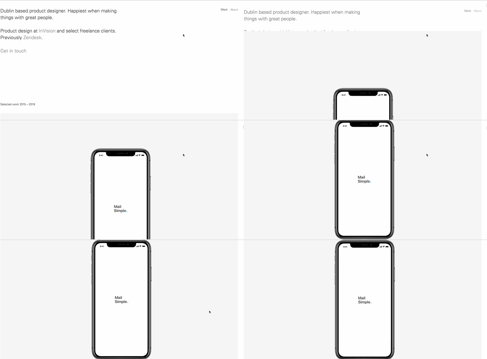
With a client list that includes InVision, Zendesk, and others, Jonny Belton is a product designer who has collaborated with some big-time companies. With most of his work created for mobile, he showcases projects as they actually appear on these screens.
The first few screens show work he’s done for Mail Simple. Each phone gently floats against a white background. It’s a crisp, clean layout that reflects his personal aesthetic.
I did try and click on a few of these hoping to get more details about the projects. My writer brain always needs more details. I was disappointed there wasn’t more. But, a portfolio doesn’t have to be full of lengthy explanations. Images can be a starting point for conversation.
This is the type of portfolio that would work well in a job interview, showing a potential employer what you’re capable of, acting as a voice for your work. Not everything has to be over-explained in a portfolio — this is a great example of keeping things simple.
9. Digital Design Tools
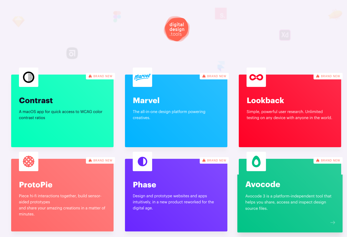
Digital Design Tools is not only a solid collection of digital tools to help you out as a designer, but also a great example of design itself. Best of all, this wasn’t put together by any single company, so there’s a ton of cool apps from unrelated companies.
It’s a simple grid layout of colorful squares for each application. Each square gets a microinteraction, expanding it to slightly break the grid on hover.
There’s no real organization outside of those tagged as new at the top. This is a good thing, because scrolling through, you’ll see many tools that you’re familiar with and many you aren’t. It allows for moments of discovery. It’s a great resource to no matter where you are in your design career.
10. Streak

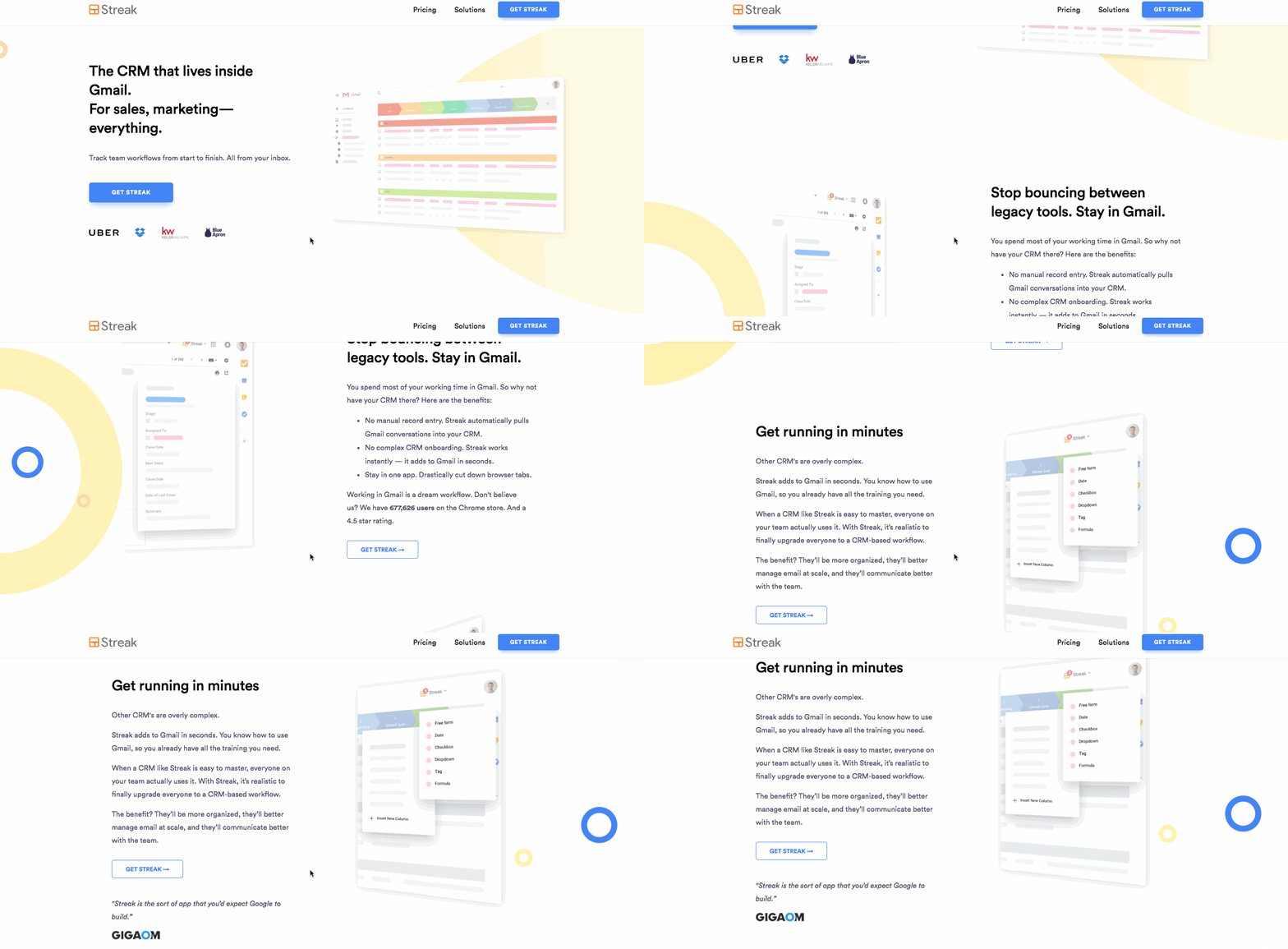
Streak is a CRM tool that integrates with Gmail. And it was surprising to me that the leader in CRM (who will remain nameless here) has a website that’s as visually exciting as a flyer left on your front door. But their reputation is so good they don’t need to put a lot of effort into their design. Streak stands out with a creative and modern design.
They’ve done a great job with a website that’s full of color and movement and communicates the benefits of their product. Especially cool are the scroll-anchored graphics that swing into position as you scroll down the page.
11. Sim Sim Falafel
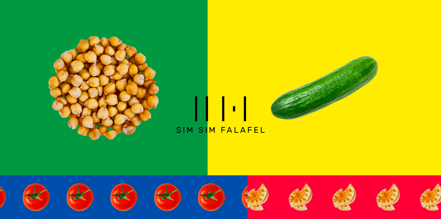
Falafel fans don't need a lot of marketing thrown at them — they know they’re delicious. What's amazing about Sim Sim Falafel is that they've gone way beyond what's necessary in their website design. It's artistic, showcasing the mastery of their given medium of chickpeas and pita bread. It's not just a great website for a place selling falafels, but an awesome website in general.
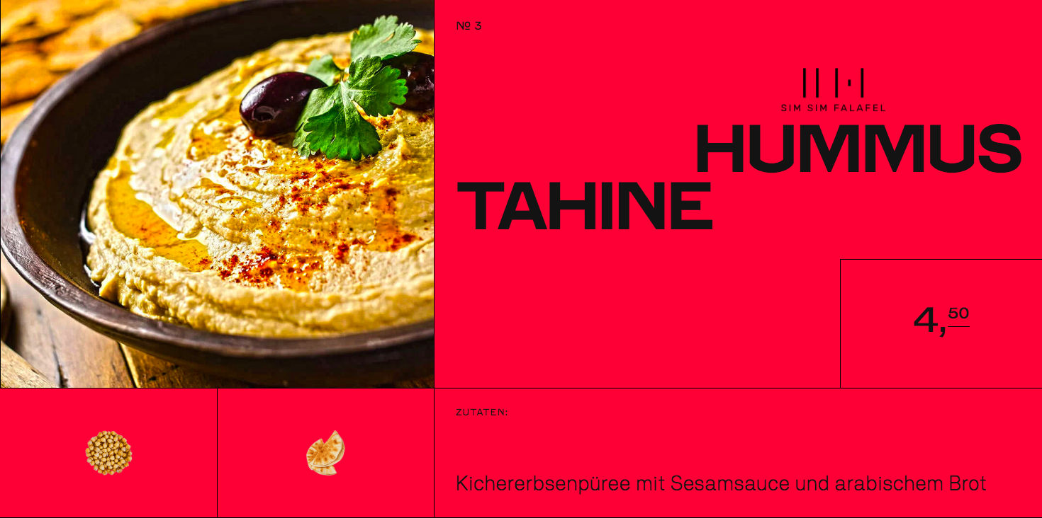
There’s bold typography, bright colors, and offset blocks all pieced together for each dish. The food photography makes everything look fresh and appetizing. And each dish includes a few small photos showcasing their ingredients.
Many restaurants throw up a quick website just to have something out there. Sim Sim Falafel has a website that’s thoughtful, full of creativity, and stands out.
12. Acte - festival de la collaboration
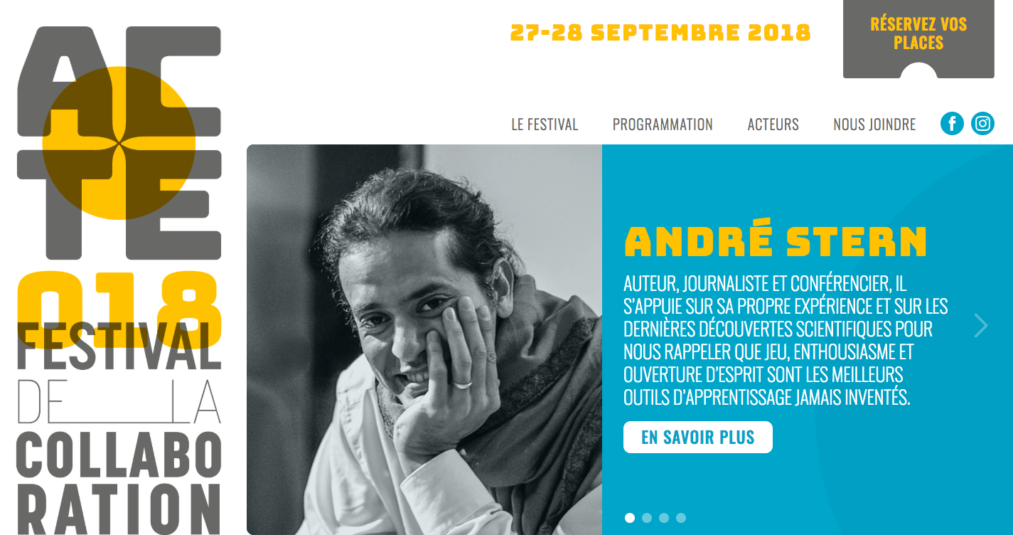
Unfortunately my proficiency of the French language is limited to asking directions to the swimming pool or ordering hot chocolate. So taking what I can from the Google translation of this page, Acte - festival de la collaboration is about education and the greater community.
The overall aesthetic feels like the flyer for a music festival. There are big blocks of color and stylized typography throughout. Instead of creating a buzz about bands, this website is all about creating excitement about different speakers and their focus.
This design could have been dry and academic — instead it takes a more artistic approach that reaches a bigger audience and hopefully inspires more people to attend.
What are you creating in Webflow?
As designers, we seek inspiration from many places and one of the most important is from our peers. Check out our showcase to see how other designers are using Webflow.
If you’ve already made something in Webflow, please share it with us on Twitter using the #MadeInWebflow hashtag — its’ the easiest way to bring your work to our attention. Even if it’s a first attempt, we’re thrilled to see your taking your first design steps in Webflow.


