Experimental web design lets us break free from constraints.
As designers, we often play it safe. We drag in a few layout elements and set up navigational options the same way we’ve done countless times before. And there’s nothing wrong with sticking to popular web page layouts — after all, they’ve been proven to work.
But design can be so much more. Let’s take a look at experimental web design and explore some examples that might inspire you to step out of your own comfort zone.
Experimentalism defies traditional layouts
Single column, z-pattern, split-screen, and other arrangements are plentiful because they’ve proven their functionality. We don’t have to think about how to navigate these layouts because we’re already accustomed to them.
Experimental web design takes away from the familiar. Distinct lines disappear, creating a somewhat jarring first impression. The perfection of grids is eschewed for a looser, more imaginative approach that makes for a very different user experience than what we’re used to.
Experimental UI design
Traditional UI design centers around familiar, intuitive navigation. Experimental web design intentionally disrupts this routine flow. At first, site visitors might be a little unsure of what to do, like when starting a puzzle. But once visitors get used to the logic behind an experimental user interface, they can explore all that the website has to offer.
Every day, we perform actions that are so routine that we barely register that we’re doing them. We don’t give any more thought to scrolling on a website than we do to pushing a button on an elevator. We go through the movements automatically. Experimental web design challenges us to work outside of those instincts.
A site with experimental design may ask us to scroll through its content horizontally. It may direct us to do something like hold down the space bar to explore the content or provide other unorthodox UI guidance. While these tactics can be employed playfully, it’s important to recognize they’ll make a website significantly less accessible. Building a website with accessibility and experimentation in mind can be a challenge, but it is possible. If you do upend traditional UI choices, make sure you provide direction on how to use or circumvent them, and that those directions are accessible to all of your site visitors.
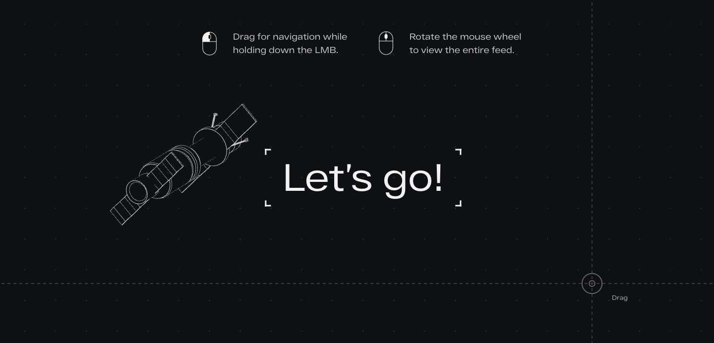
This space-themed website for Stykovka completely disregards navigational norms. Instead, it includes clear instructions for how to interact with the site. Experimentalism often works outside of the standards we’re used to, so the guidance from Stykovka is helpful and necessary.
Experimental design explores different ways to work with visuals
Traditional websites typically don’t shake things up in terms of their visual experiences. Experimental design is full of surprises. If web designs were sculptures, experimentalism is like the chisel that carves out spaces and forms that defy conventionality.
While experimentalism means user experiences and how ideas are communicated may take a radical departure from tradition, it’s important to remember to use it only when it’s additive to the message or form. You wouldn’t make a bank homepage experimental, but you might do so for an interactive landing page that’s designed to pull a visitor in.
Here are some implementations of effective experimental visual design.
Virtual reality offers surreal three-dimensional spaces

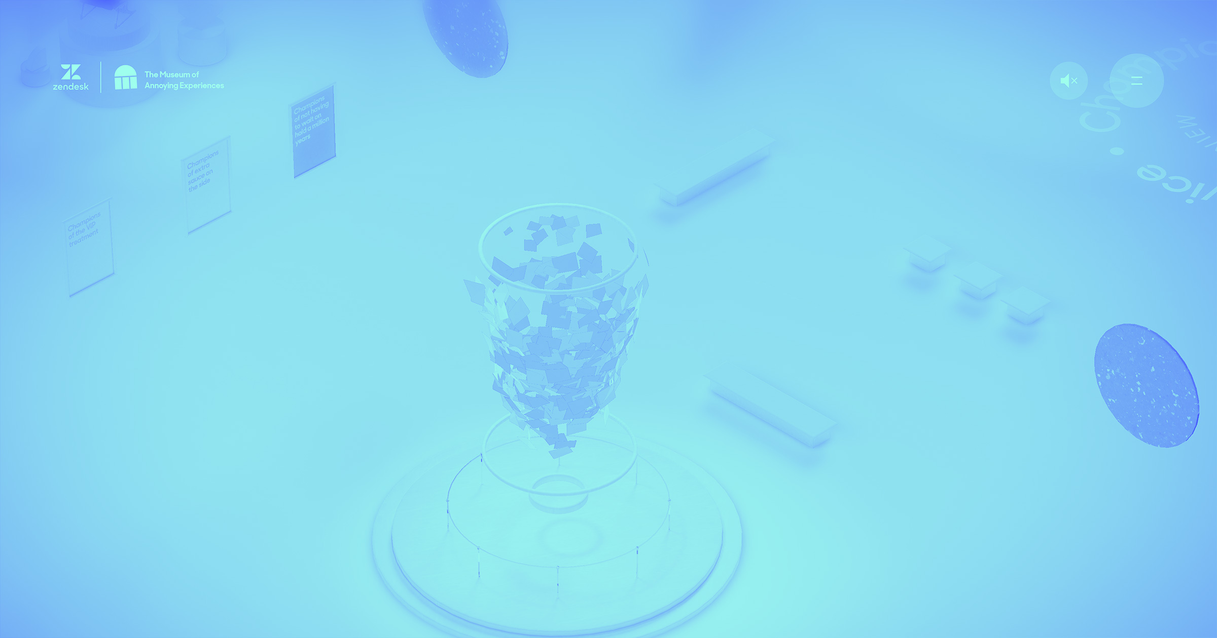
Zendesk’s Museum of Annoying Experiences offers a lighthearted virtual reality journey into the minor frustrations of modern life.
Web designers are breaking free from the conventions of grids, text, and static graphics by creating three-dimensional worlds begging to be explored. Virtual reality websites offer a sense of immediacy and interactivity not possible through traditional web design.
Data visualizations display data in creative ways
The web had opened up new realms in representing data. Data visualizations transform numbers and analytics by presenting them in ways that are more interesting and engaging.
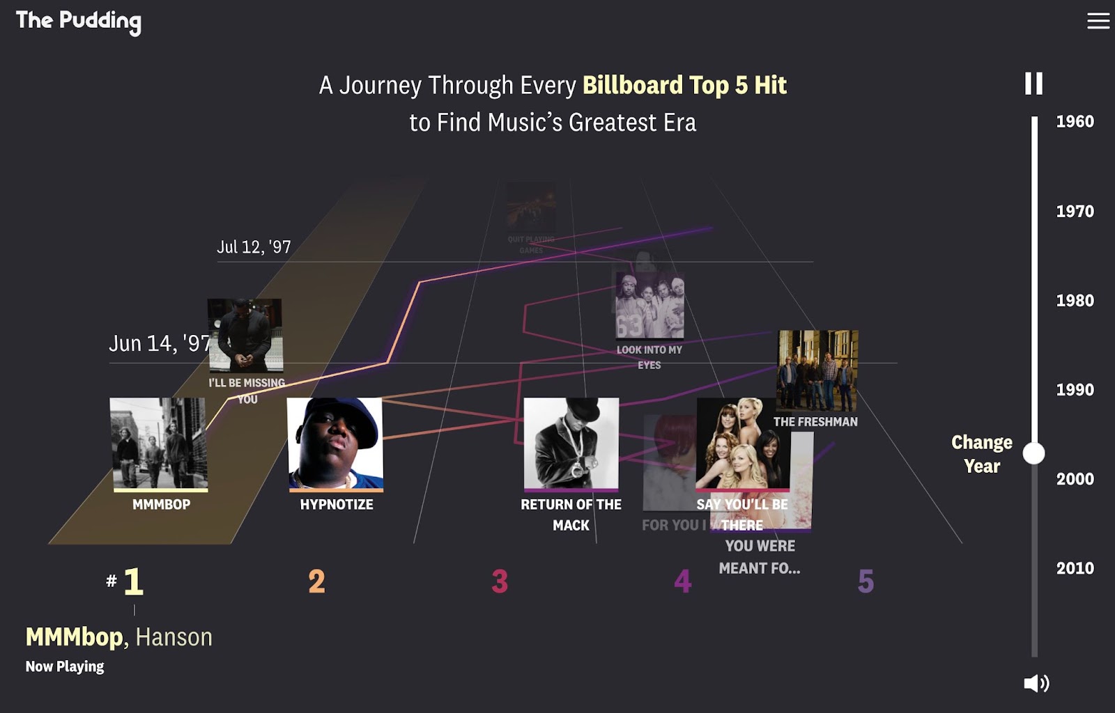
At digital publication The Pudding data visualization is the medium. They use engaging experimental visualization to cover topics that may span long periods of time, or large data sets.
Experimental web design often takes great liberties in its visualizations and shares data in new and imaginative ways.
Integrating new advances in tech in web design
New technologies have a long history of shaping design. Printing presses changed how books were made. Computers gave graphic designers more freedom to explore their craft. Advances and experimentation in technology are often linked to evolution in art and design.
Now that machine learning and artificial intelligence (AI) are becoming more accessible, designers are finding ways to apply these technologies to web development. Things like predictive UX can provide a more efficient and personalized experience. Machine learning can power algorithms for product recommendations.
AI and machine learning can also be harnessed to create a richer visual experience. Visual gesture recognition systems that track a visitor’s movements provide a novel way of interacting with a website, like this site that teaches ASL Fingerspelling.
Bitmoji-styled graphics give visitors a fun and personalized representation of themselves, generated in part by AI. We’re only at the beginning of seeing how artificial intelligence and machine learning can be used to add to the visual nature of web design.


The modern web design process
Discover the processes and tools behind high-performing websites in this free ebook.
Experimental web design opens up new possibilities
Now that we’ve discussed some of the principles of experimental web design, let’s take a more in-depth look at a few website designs that are anything but traditional. You’ll see that there’s no single flavor of experimentalism, with each of these websites taking vastly different approaches.
Project Turntable
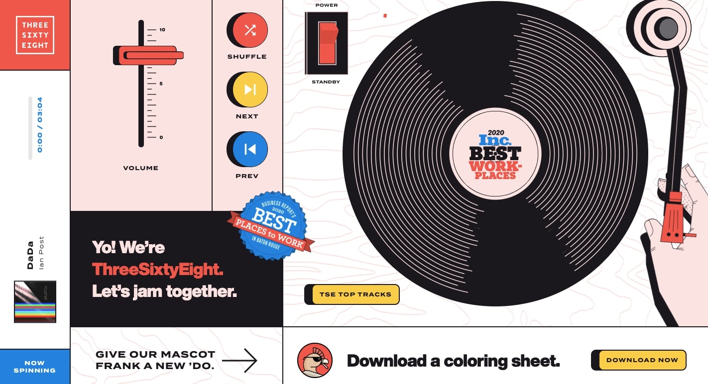
We’ve talked about the agency ThreeSixtyEight before when we shared how they transitioned from WordPress to Webflow. They’re a top-notch outfit full of imaginative and innovative design ideas.
This landing page, which exists in addition to their main website, offers a hi-fi inspired experience. At the top of the screen, an arrow directs visitors to the play/standby button. When the switch is flipped, the record starts spinning a 60s-inspired groove.
The interactive analog buttons and switches set this design apart. ThreeSixtyEight uses experimental web design to celebrate their creative sensibilities while giving their visitors something different from what other agencies are doing.
Reminiscence Movie
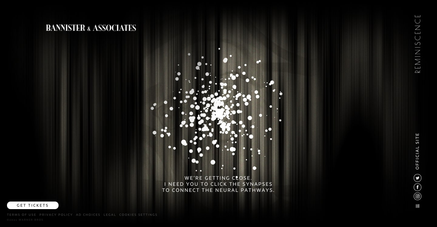
This website is for the fictional agency Bannister and Associates, which is part of the universe created in the sci-fi noir film Reminiscence. Even if you haven’t watched the film, this website is worth checking out.
The site uses AI to create “memories” for its visitors. Users are prompted to upload an image of themselves or of someone significant in their lives. Each step then takes them through the process of generating a memory.
At the final screen you see a floating formation of orbs and you’re prompted to connect the synapses. The image that you’ve uploaded is then shown to you, with the face brought to life with motion. It’s strange and unsettling, but a lot of fun.
This is a great example of how AI can be integrated into a website, giving visitors a unique and engaging visual experience not possible in more conventional designs.
The Pudding
We appreciate The Pudding (yes, we’ve mentioned them twice in this article, but we’re just SUCH big fans) for their flair for telling interesting and compelling stories through visuals. Whether they’re analyzing the comedy of Ali Wong, documenting wrestling masks, or putting together the definitive internet boy band database — they’re always finding novel ways to present information.
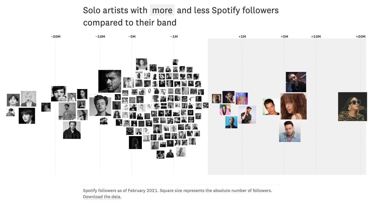
This chart shows musical artists who’ve gone solo, documenting their followers on Spotify compared to the bands they were formerly members of. This interactive chart is more appealing than a regular graph and makes the information immediately understandable.
Experimental web design offers new ways of presenting data. The Pudding excels at putting together data visualizations that not only communicate greater ideas but also do so in a visually engaging way.
Music Theater Showcase
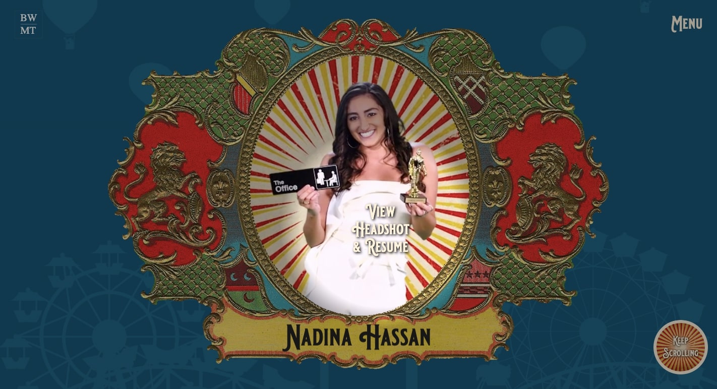
Built with Webflow, this website for Baldwin Wallace University’s theater department steps out of the confines of stuffy academic design to create a website that captures the essence of acting.
Navigation happens through a spotlight that guides us through the space, lighting up what’s ahead. We’re brought to the center stage, where we get to find out more about the students who have graduated from the program.
Instead of the same grids and columns we see again and again, this site takes us into the world of theater.
Krivitzky

When we scroll through Krivitzy, a Russian law firm’s website, we’re treated to graphics and animations that look like they’re straight out of an edgy comic book.
For the section on bankruptcy, we see a man tied to a diamond, who then rockets away via a jetpack. A demon appears on the page for tax disputes. A fiery dragon is transformed into a docile rabbit under the wand that represents the law firm. Many other odd visuals pop up as we navigate the site.
We don’t often associate the legal field with pushing creative boundaries. But experimental web design shows that whatever the field, there are ways to tell a brand’s story in unconventional ways.
Stonewall Forever
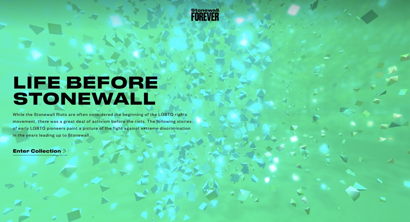
The Stonewall Riot is considered the flashpoint of the LGBTQ+ movement. This virtual reality journey tells its story through dazzling visuals.
Web designers once had a limited palette. Two-dimensional images, columns, rows, and text were all they had to communicate ideas or to tell a story. Virtual reality has opened up wide creative expanses, giving designers the power to communicate in ways that are more immediate and vibrant.
Black dog story
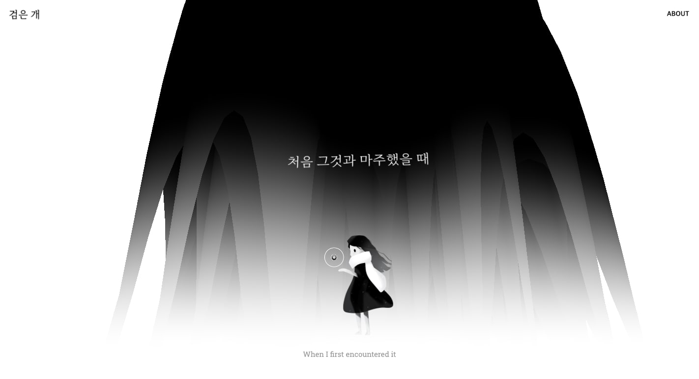
We often get caught up with the more commercial aspects of web design. But there’s much that can be done in this visual medium that doesn’t have to serve in marketing products or companies. Black Dog Story embraces all of the possibilities of web design, using interactions, animations, and other visuals to tell a story in a way that feels like fine art.
A pulsating ellipse beckons one to click through each frame of this story, rendered in beautiful blacks and greys. Shapes swirl and morph, and we’re taken along what feels like a beautiful dream.
Bivak

Where most architectural firms display a collection of projects they’ve worked on in a grid. Bivak takes an interesting side-scrolling approach. Instead of a classic carousel image slider, Bivak uses horizontal scrolling to take us to each project page.
Bivak could have stayed safe with standard top or navigational options. Instead, they’ve taken an experimental approach that relates to who they are as a modern architectural firm.
Webflow can set you free
We love seeing designers pushing their work in fresh and imaginative directions.
Often the barrier to creating something unique lies with the tools you have to work with. We’re happy to offer an intuitive visual design platform that can help you get your idea out there no matter how wild or experimental.
If you need any more inspiration, check out Made in Webflow, where designers are continually posting their latest projects. Or sign up for Webflow Inspo, our newsletter where we share the most incredible Webflow projects each week.

Get started for free
Create custom, scalable websites — without writing code. Start building in Webflow.


