


Whether you're building your first agency website or replacing a dated one with something fresh, a template is a great place to start. Here are 14 agency websites and templates — all free to clone. Mix and match, take what you want from different designs, and assemble them together to bring your own creative vision to life.
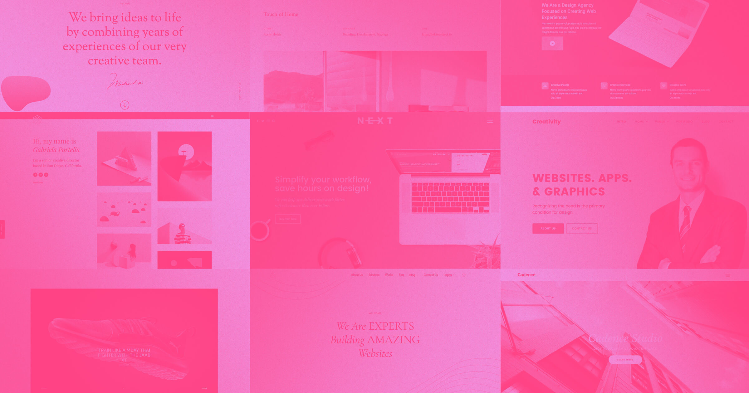
1. Mahalo Media
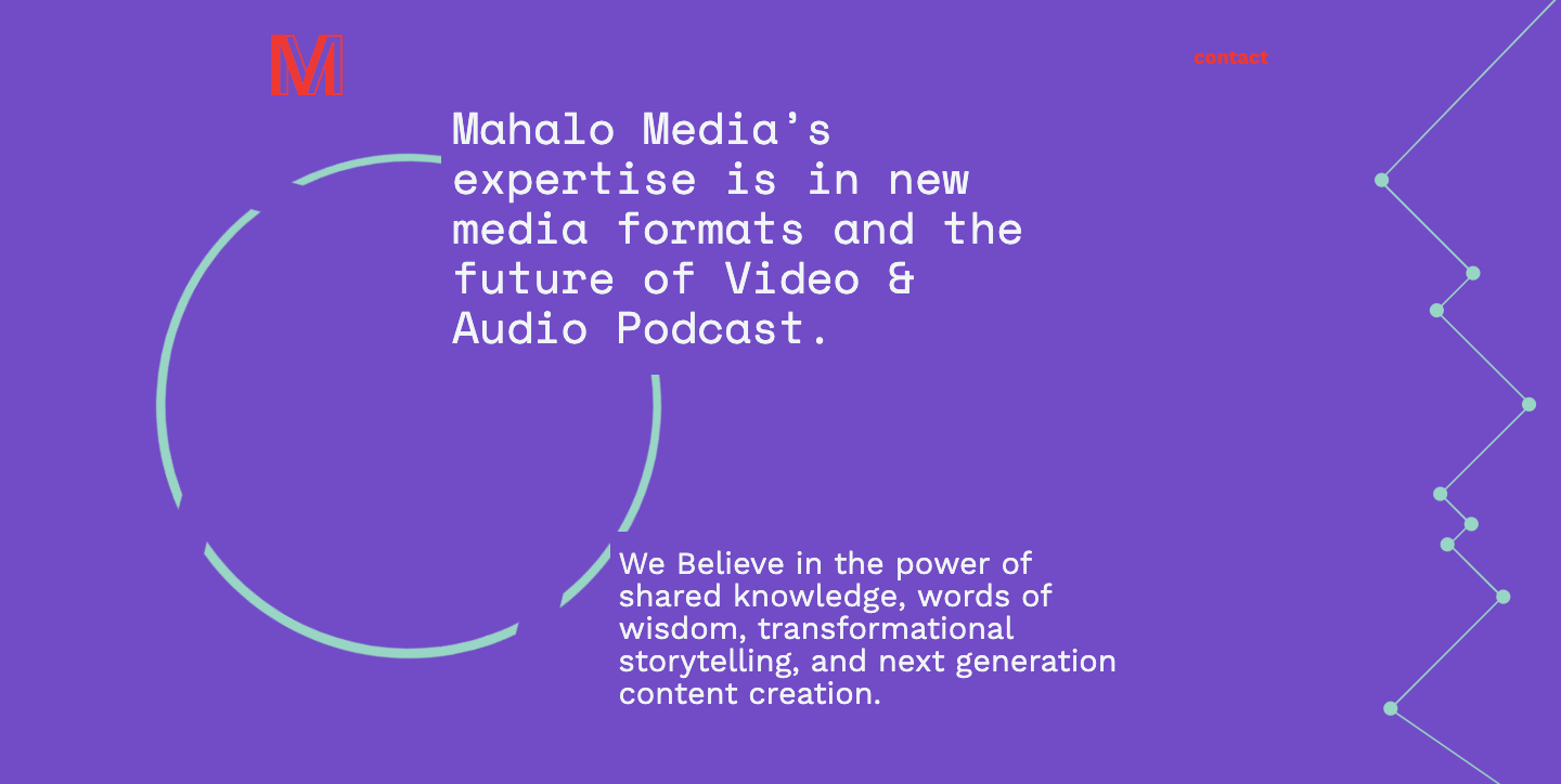
Mahalo Media is a design agency that creates audio and video media for clients. We’re guessing this is a new page since it doesn’t feature any of their work, but it’s a nice introduction to what they do.
It's such a generous thing when agencies like Mahalo share their designs for cloning. With this slightly offbeat layout, they put the resources into a your hands to create a unique website of your very own.
So … what’s special about this design?
There’s a staggered organization to the text, making it easy to read. It’s tightly put together, but kept loose with various shapes that fill out the design with geometric beauty. The scroll-triggered rotating circles are a gentle swirl of eye-catching action.
Maybe you’d like to clone Mahalo Media for your own project? Nothing is stopping you. Heck, we encourage it.
2. Creative Agency template

There's a reason people love one-page websites — they showcase what you have to offer in one place. But nobody wants an endless scroll. One-page designs have limitations, forcing you to include only what’s important. This aptly titled Creative Agency template is a stellar one-page layout that includes only what matters in a tidy design.
The template’s diagonal layout leaves room for content and big images. Along with robust visual elements, there are small touches of interactivity. Buttons outlined in a thin white line are filled in with solid grey. Featured projects have a fade-out effect and reveal project details when scrolled over. A single click opens a project in a new window, never taking anyone away from the page.
If you’re looking for a template that strikes the right balance between strong visuals and interactivity, clone Creative Agency for your own site design.
3. Krunch template

Krunch is another thoughtful, one-page template. This template takes things a bit further on the visual side of things, with a neat array of featured projects and a hover effect highlighting each.
Along with the well-designed visuals, the template includes a contact form. Remember, you're not tied to the architecture of this design — you can always build out separate pages for the contact form and other content. Templates are only a suggestion. A starting place to completely transform, bend, add, and remove elements to fit your own design goals.
Go ahead and clone Krunch for your own design agency site.

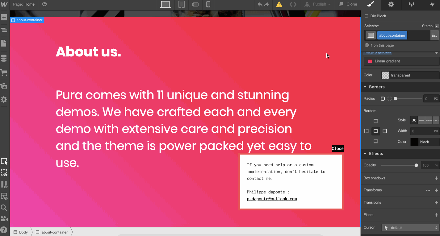
4. Pura
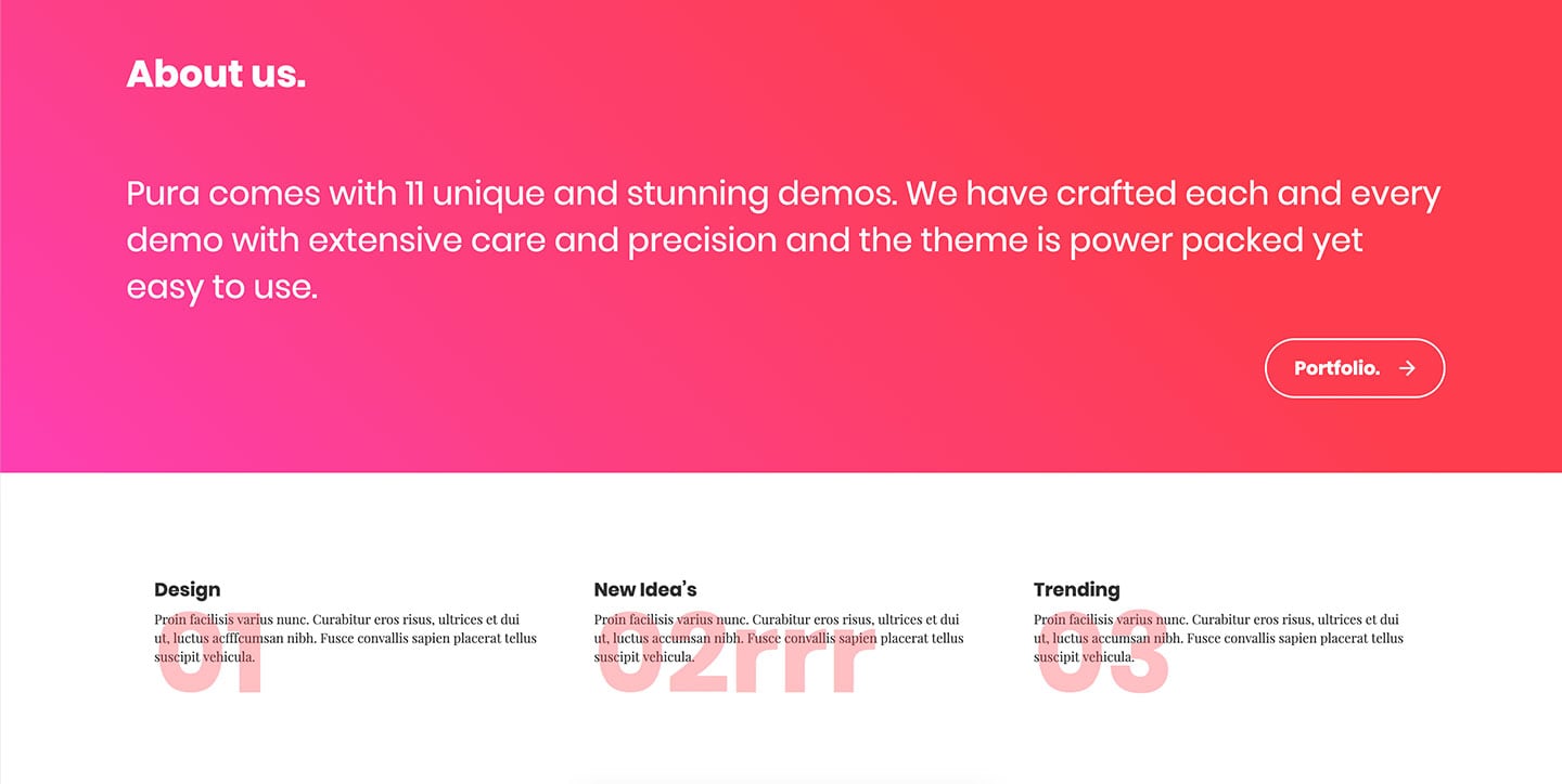
Cloning a design or using a template gives you a head start on launching a new website and providing inspiration for an original design. As you style elements, pick a color palette, and add your own content, you’ll watch your project transform from a barebones framework into something unique and functional.
Pura gives you everything you need to create a professional agency website. Big blocks of content produce a strong layout, and Pura has these set up with clear divisions between sections. All of this goodness is contained in a one-page design to make your content accessible.
Clone the Pura template for free.
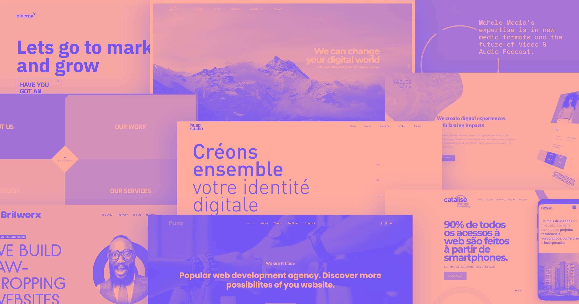
5. Catalise
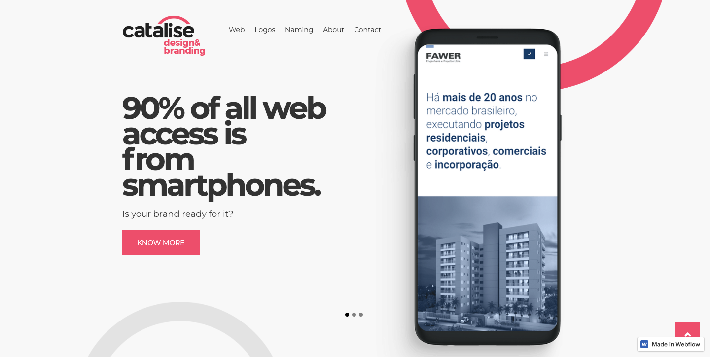
We love the generous Webflow community of people who so freely share ideas and knowledge. When agencies like catalise make their web designs available to clone, it fills us with happiness (for real).
With a minimal color palette of expansive grey and black, and touches of red, the catalise design embodies a tech aesthetic. There’s a lot of hate for image carousels, but this design tucks it into the top right so it’s a bit less obtrusive. The slight zoom on hover adds interest. Catalise’s design rises above cookie cutter templates that inspire frustration instead of imagination.
Maybe you’d rather have blue buttons, or a darker background? You can clone and tweak the catalise layout however you’d like.
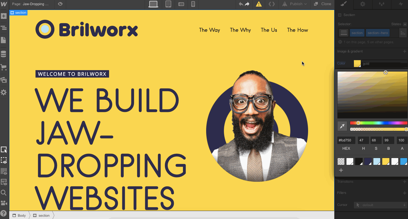
6. Brilworx

We’re so happy to see an agency from Ireland add their site to the mix of cloneable designs. Thanks, Brilworx!
This design relies on huge expanses of color. If you want to jump in and personalize it with your own branding, start by swapping out the background color and then add your own images and content. Imitation may be the finest form of flattery, but when cloning a project, be sure to change things up enough so it’s not a duplicate of the original design.
7. The Minimalists

We’ll admit it, this design is an exercise in the unorthodox. But that isn’t to say there isn’t good stuff to The Minimalists site.
Yes, that diamond logo is too small and the only way back to the main page is through an obscure arrow and big button at the bottom of each page. But what catches our attention about this design is how each individual page slides and rotates into place.
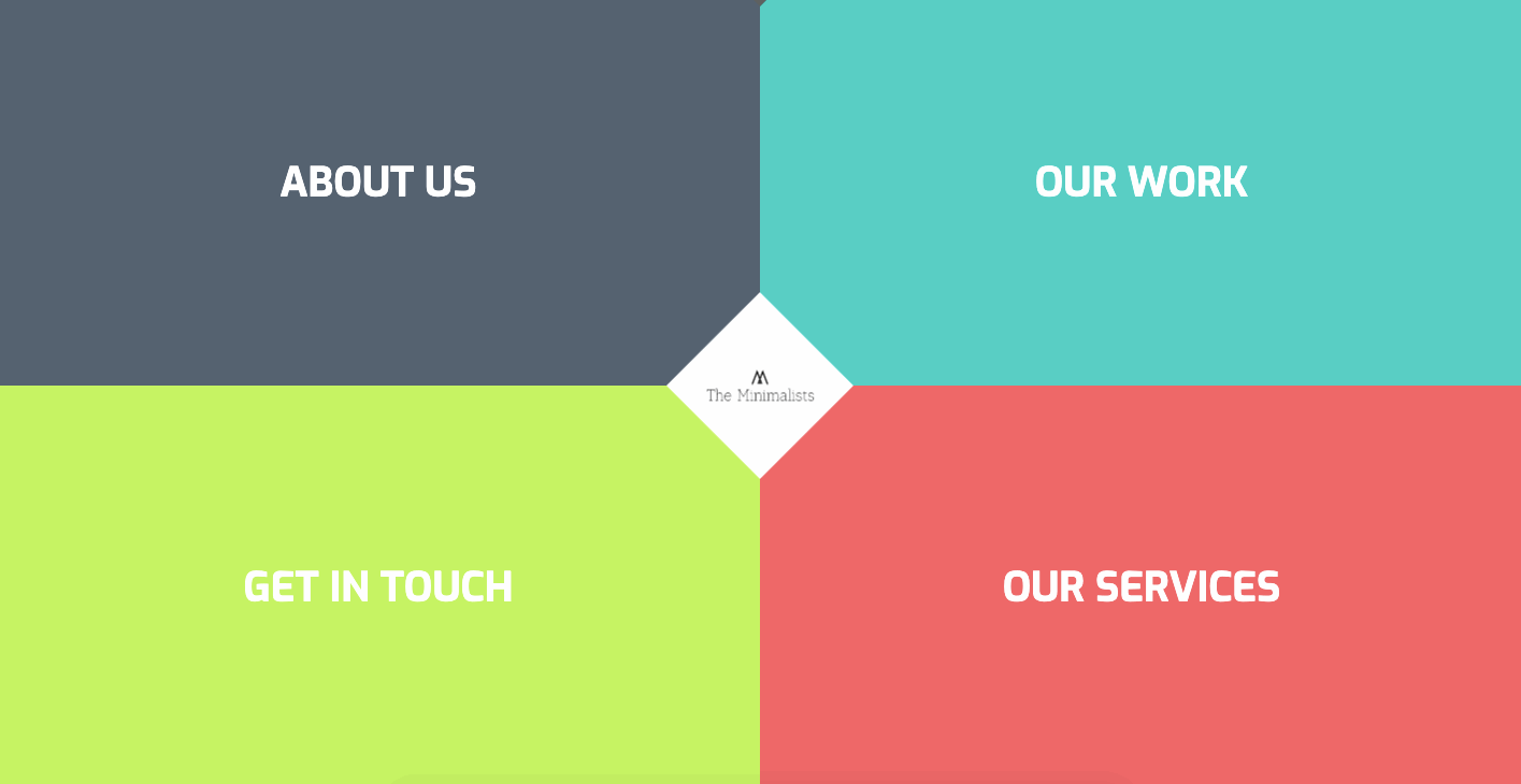
Webflow frees you from the constraints of code, making design experiments like The Minimalists possible for even the newest of web designers. With the barriers of learning code removed, Webflow makes it possible to transform even your most offbeat ideas into functioning designs.
Clone The Minimalists and play around to see how this eccentric design was put together.


Free ebook: Web design 101
Master the fundamental concepts of web design, including typography, color theory, visual design, and so much more.
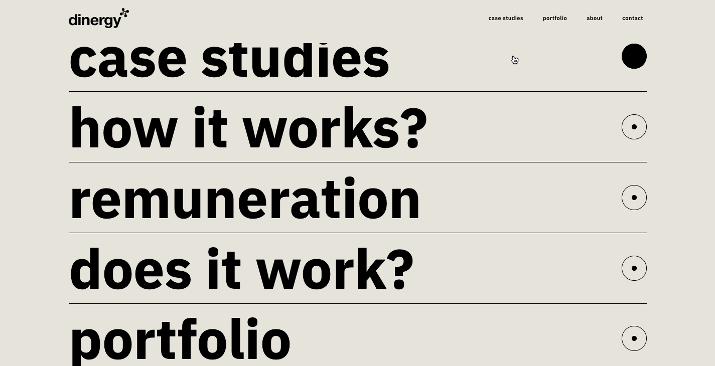
8. Dinergy

We're fans of minimalism. But let's face it, websites that go all in on this design philosophy can feel like a barren void. While this website from Dinergy is certainly informed by minimalism, it doesn’t overdo it.
The site’s live typing animation and rotund shapes that come together as you scroll add motion to break the design from the stuffy restraints of simplicity. It’s got zing!
Another thing that stands out is the double navigation — one set is anchored to the top bar and a short scroll down reveals the options again, this time in giant a list. A simple hover effect on both sets of navigation adds another splash of movement. It may seem redundant to include these navigational options twice, but it also makes it quick to find what you’re looking for.
9. Slick

Slick is a well-named template with a smart simplicity packing the right amount of visual sheen.
From the typography to the product pages, this design has a very contemporary feel. There’s room for images and project screenshots, but it doesn’t rely on visuals. Yes, you’ll need to put in your own, but you don’t have to worry about coming up with a lot of images at the beginning to fill it up the space.
The navigational elements are a bit light, with a hamburger menu occupying the top right of the page. But if you clone Slick for your own use, you can always change things up. That’s the beauty of templates, you can keep or ditch whatever you want. The template serves as the bones to build out your own design.
10. Foundation
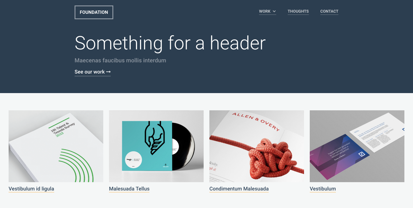
Foundation puts featured design projects right at the top, making it easy to showcase your work. Another great built-in feature is their blog powered by the Webflow CMS. If you have an agency, writing about your projects and about design shows off your industry knowledge and skills, and gives your page some organic SEO juice.
Take a closer look at Foundation — clone it and find out if it’s a good fit.

11. Huap Studio
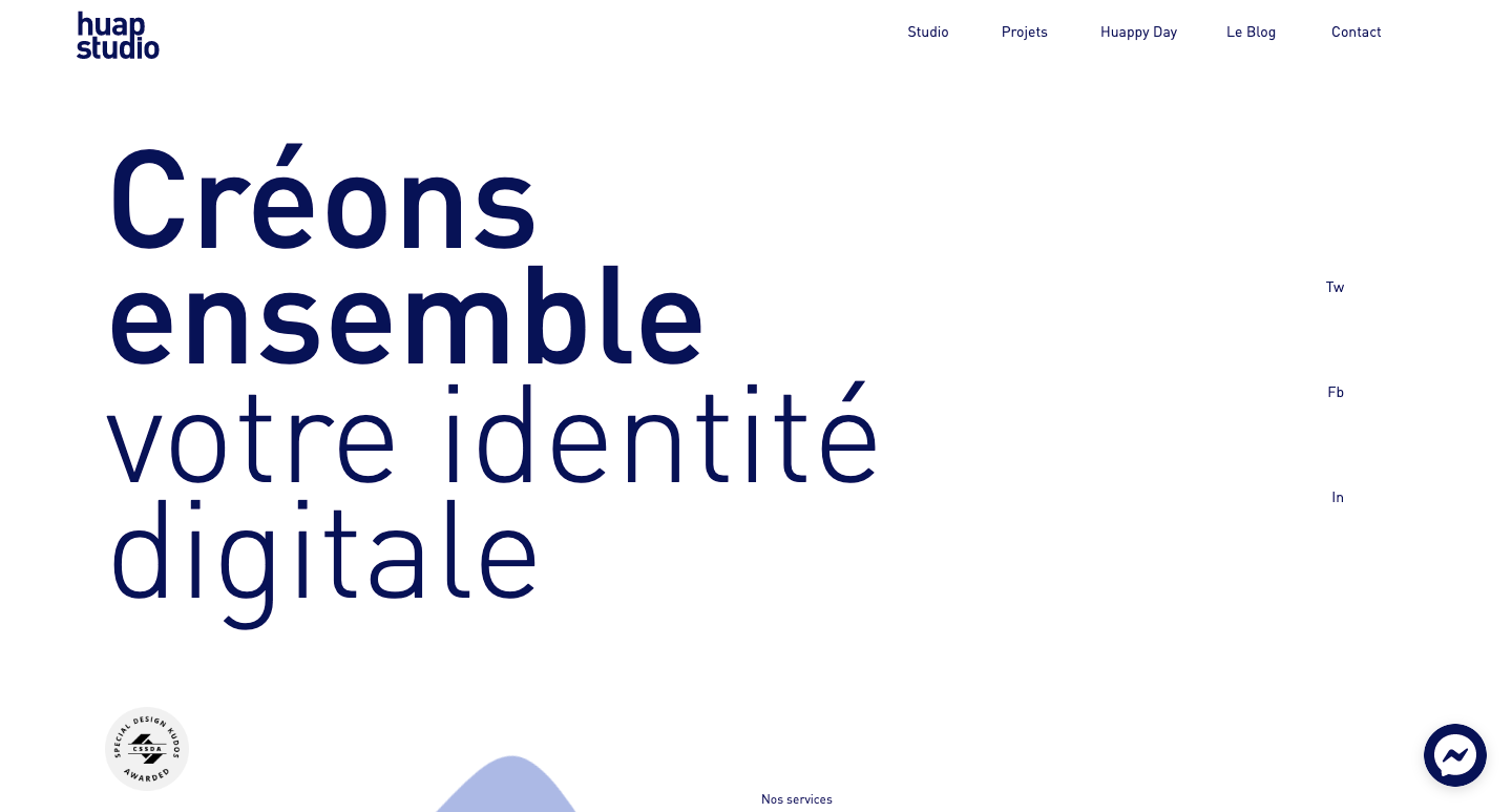
Huap Studio, a French agency, keeps things fresh and breezy with ample white space, blue accents, and gently floating non-geometrical shapes throughout.
If you’ve never built a page-triggered animation, the building blocks of this site will deconstruct how the animated shapes work. Having a peek at the guts of this site will get you started on creating a similar effect of your own.
Clone Huap Studio and dig deeper into how this design was put together.
12. MBDC
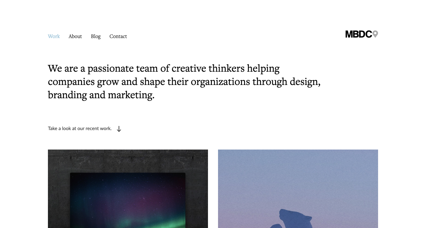
MBDC is a Canadian digital agency that’s put a lot of effort in crafting a design that looks smart and is easy to navigate. And it’s powered mostly by the Webflow CMS.
The featured projects are all tied to the CMS, which means that updating them requires minimal effort. They also used the Webflow CMS to set up a blog. Adding new dynamic content to your site can help with organic search results — the MBDC design makes it easy to update content in just a few easy steps.
Need some CMS for your own agency website? Clone MBDC and start filling it with your own content.
13. Stone

Stone is another free template you’ll find on Webflow — it has everything you need to build and launch your own agency website.
The muted color scheme and text overlay on the hero image gives this design a warm, approachable vibe. The rotating slides featuring case studies at the top are a nice touch — they show off your work and your creative process.
Anyone looking for a design agency wants to be confident in the team’s artistic and analytical skills. Case studies are a great place to give potential clients a closer look at what you can do for them.

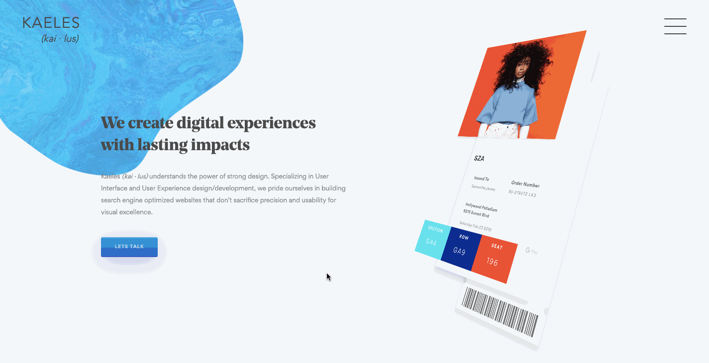
14. Kaeles

Want a clean user experience with eye-catching colorful transitions and smart scroll-triggered animations? With this design from the Brooklyn-based agency Kaeles, you get all of this and some creative dazzle. This is another template that gives you room to pop in case studies that show off your digital-marketing and design smarts.
Be your own client and knock your socks off
Agency sites offer a peek at what’s possible for clients hoping to boost their brands. Your site should show off your design skills with every pixel, scroll, and click. When potential clients see how well you market yourselves, they’ll want you to do the same for them.
Have you designed a design agency website with Webflow? We’d love to see your work in the comments below — and don’t forget to share it the Webflow showcase. If you’d like to make your design available to be cloned, we’d love that too!