Any web design project is a big deal. It means a client has trusted you to create an online presence for them that’s functional, attractive, and true to their brand. How you approach such a project sets the tone for both your own brand and future customers.
Starting with a blank canvas
Intimidating as they sometimes are, blank canvases are also the beginning of something beautiful — in this case, a memorable website.
A blend of creativity and practicality attracts users to your website and keeps them engaged. This combination creates the immersive user experience clients hope for — the kind that leaves a lasting impression.
Experiment with typography, striking colors, and interactive designs. Whether you’re in the process of creating a website from scratch or you already have one, this article will give you the guidance and inspiration to create a masterpiece.
Understand what they want
A company’s website is the digital equivalent of a business card. It’s their chance to make a good first impression so, of course, they want to make the most of it.
An appealing design attracts visitors, piques their interest, and makes them want to learn more about the company and its products and services.
We’ve put together a list of website designs that cover every niche — from e-commerce startups to SEO and digital marketing — so no matter which industry you’re working for, you’ll have no shortage of inspiration.
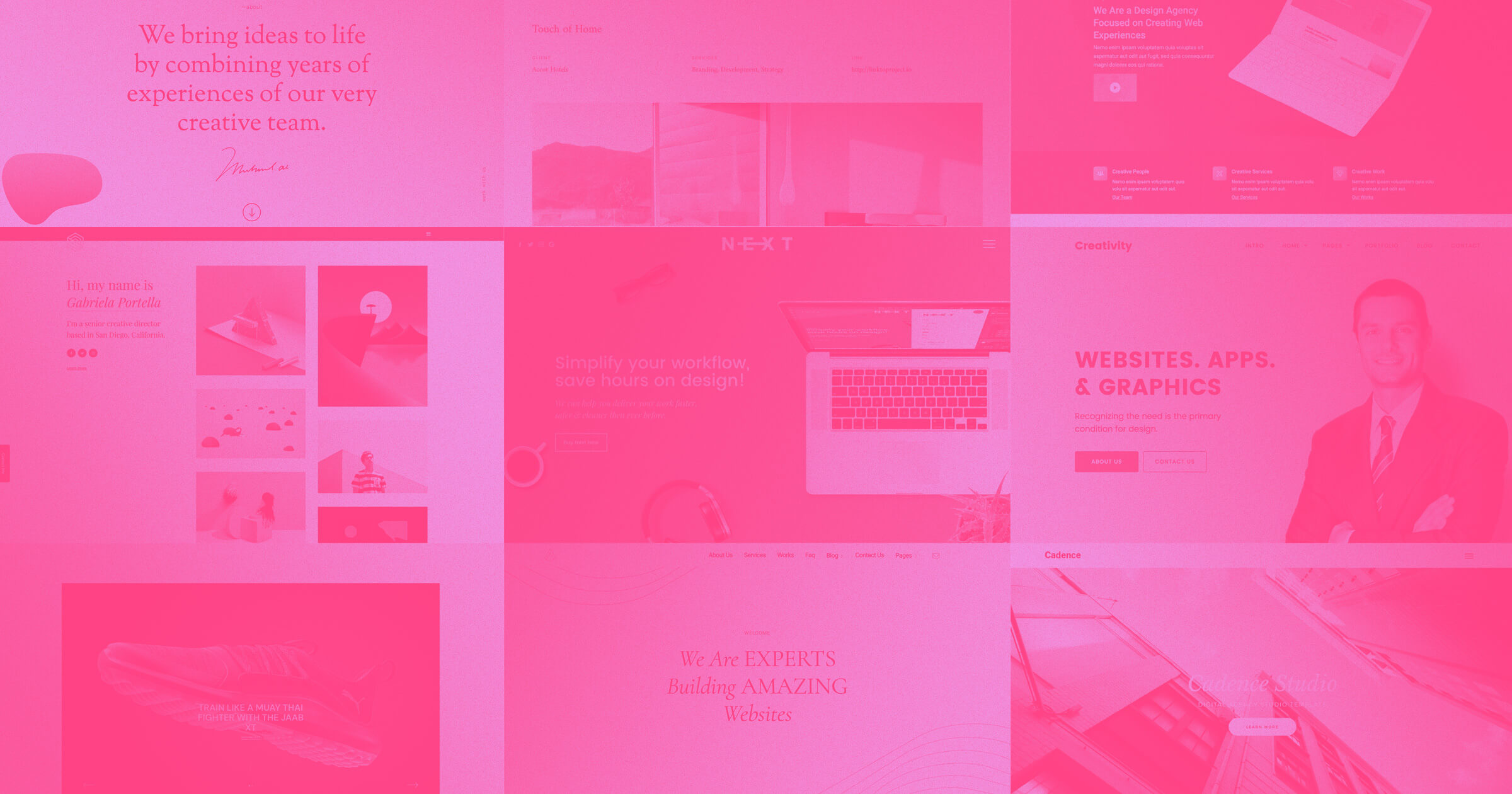
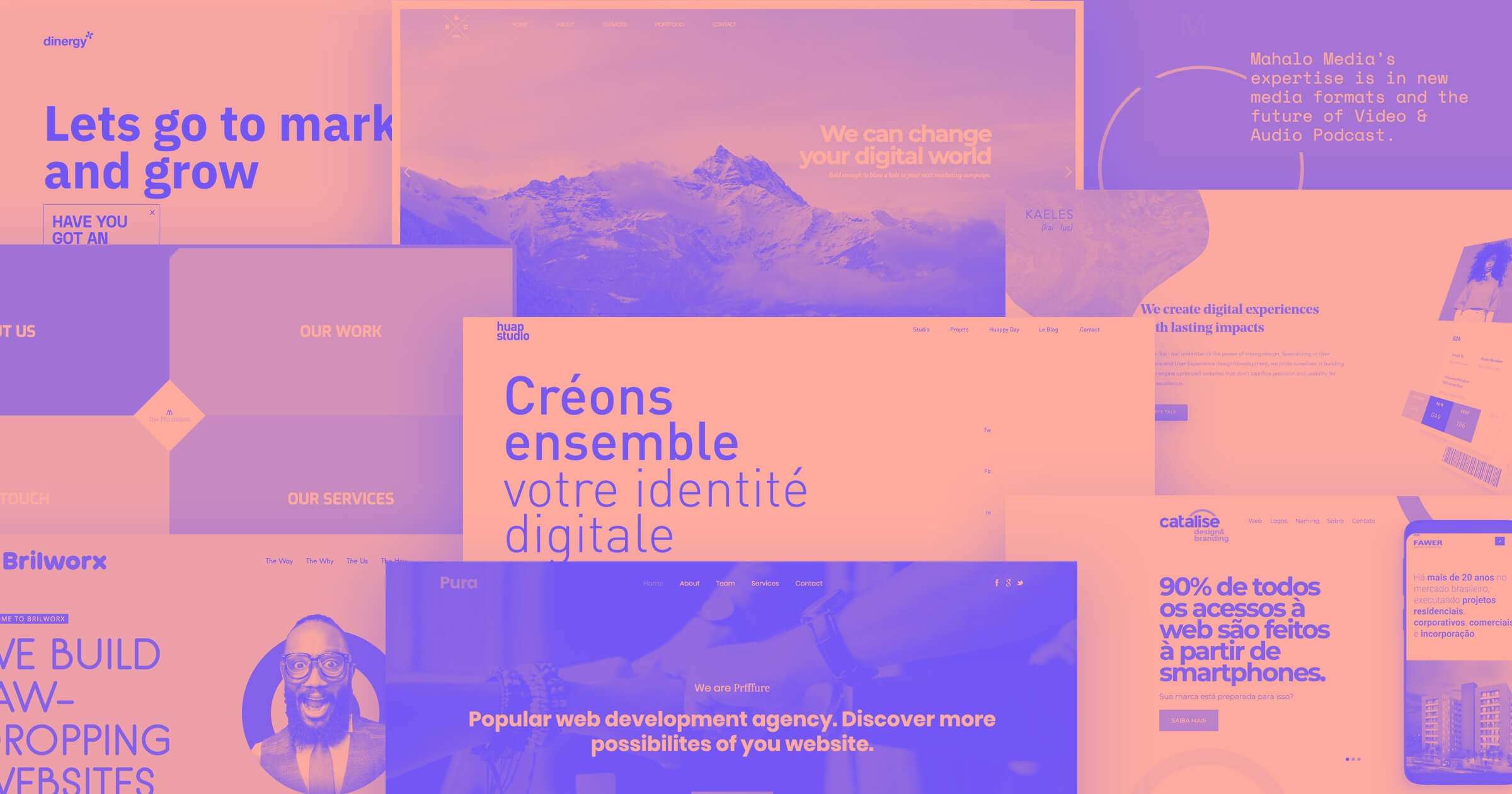
Corporate website designs to inspire you
From classy and minimal to loud and vibrant, websites must stand out to grab — and keep — customers’ attention. Here are five unique website designs to get you started.
1. Back to basics: Area
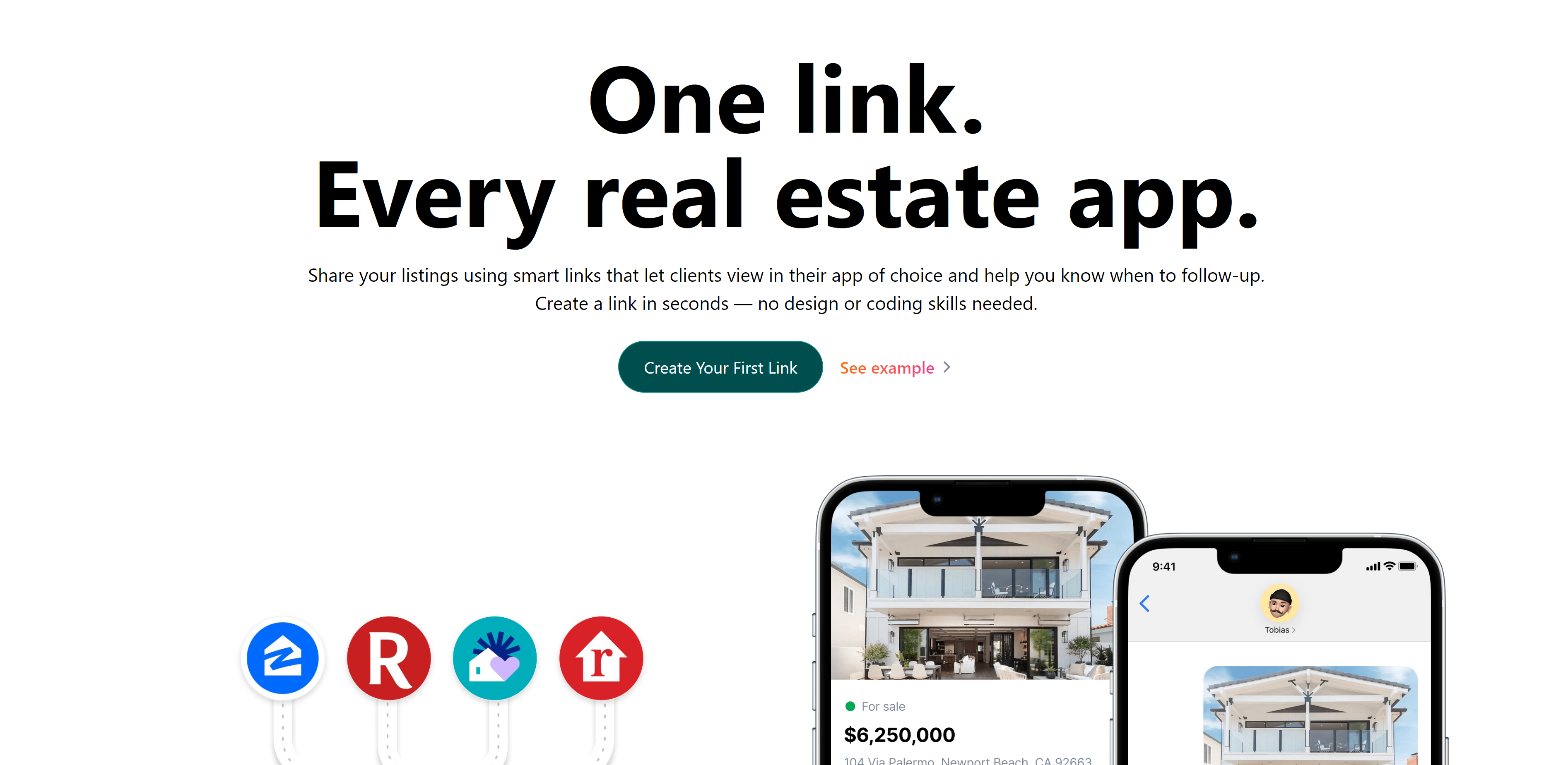
Area allows real estate agents to use "smart links" to share property listings with customers without requiring code or graphic design expertise.
The website design includes the essential elements, with simple buttons and clear calls-to-action (CTAs). It informs the user about the company, its services, and its achievements.
The website is primarily black and white, with an occasional splash of color. It looks professional, to the point, and includes testimonials from existing users.
This type of website design is ideal for tech companies or businesses with many data analyses to display on their landing pages. It’s creative but approachable and makes navigation and usability convenient for visitors.
2. Simple yet fun: James Baduor
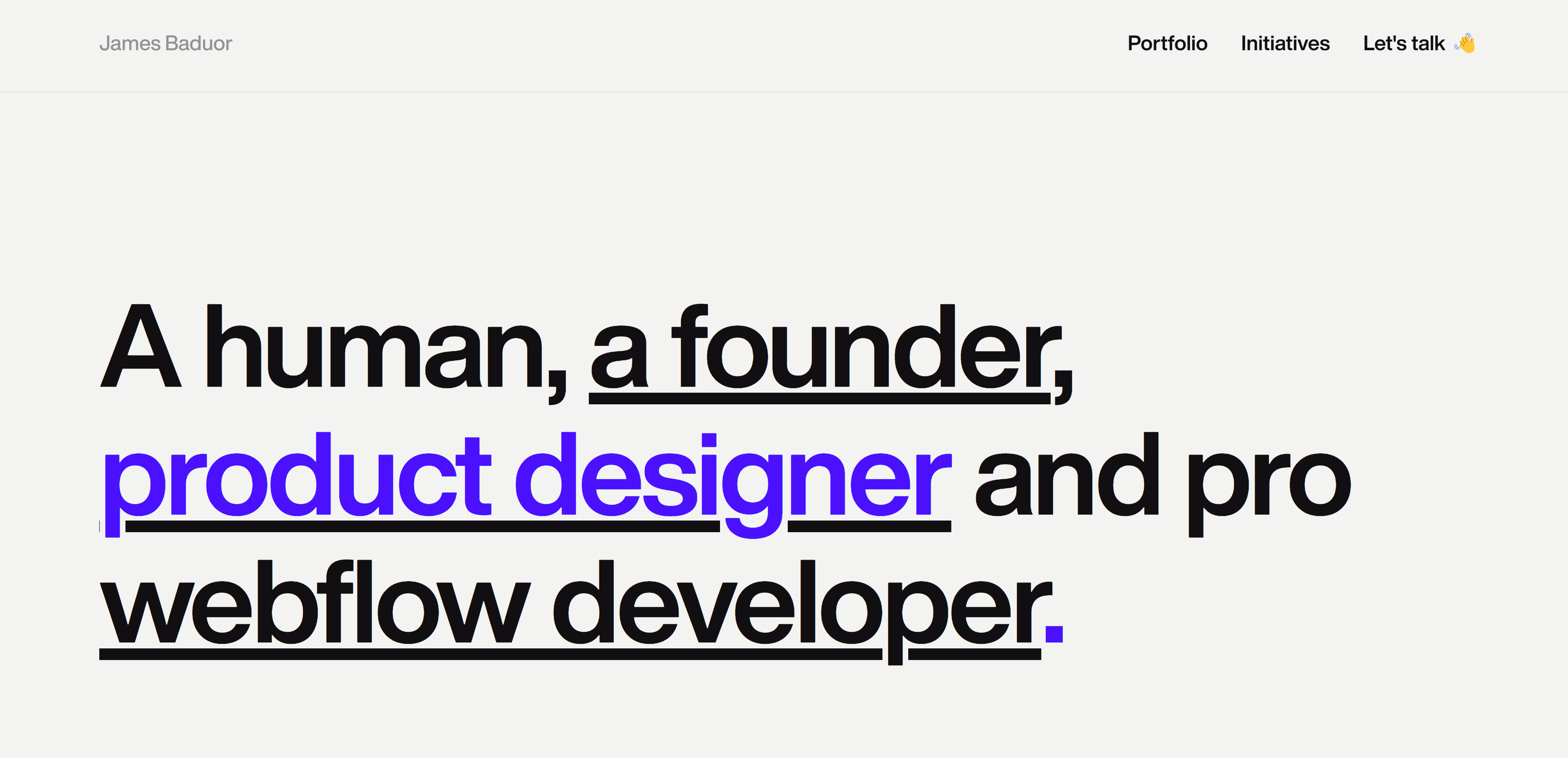
James Baduor’s website is a high-quality example of a clean portfolio. It clearly doesn’t need many elements to stand out. Instead, it plays with text, using a large sans serif font to make its point.
The website uses color with contrasting hues to guide the eye without overdoing it. Black and purple are the website's main colors, but it also uses hints of blue, green, orange, and pink. The site clearly showcases clients and case studies.
This website is an excellent source of inspiration for creative professionals and web design companies.
3. Dynamic and classy: Studio 1642
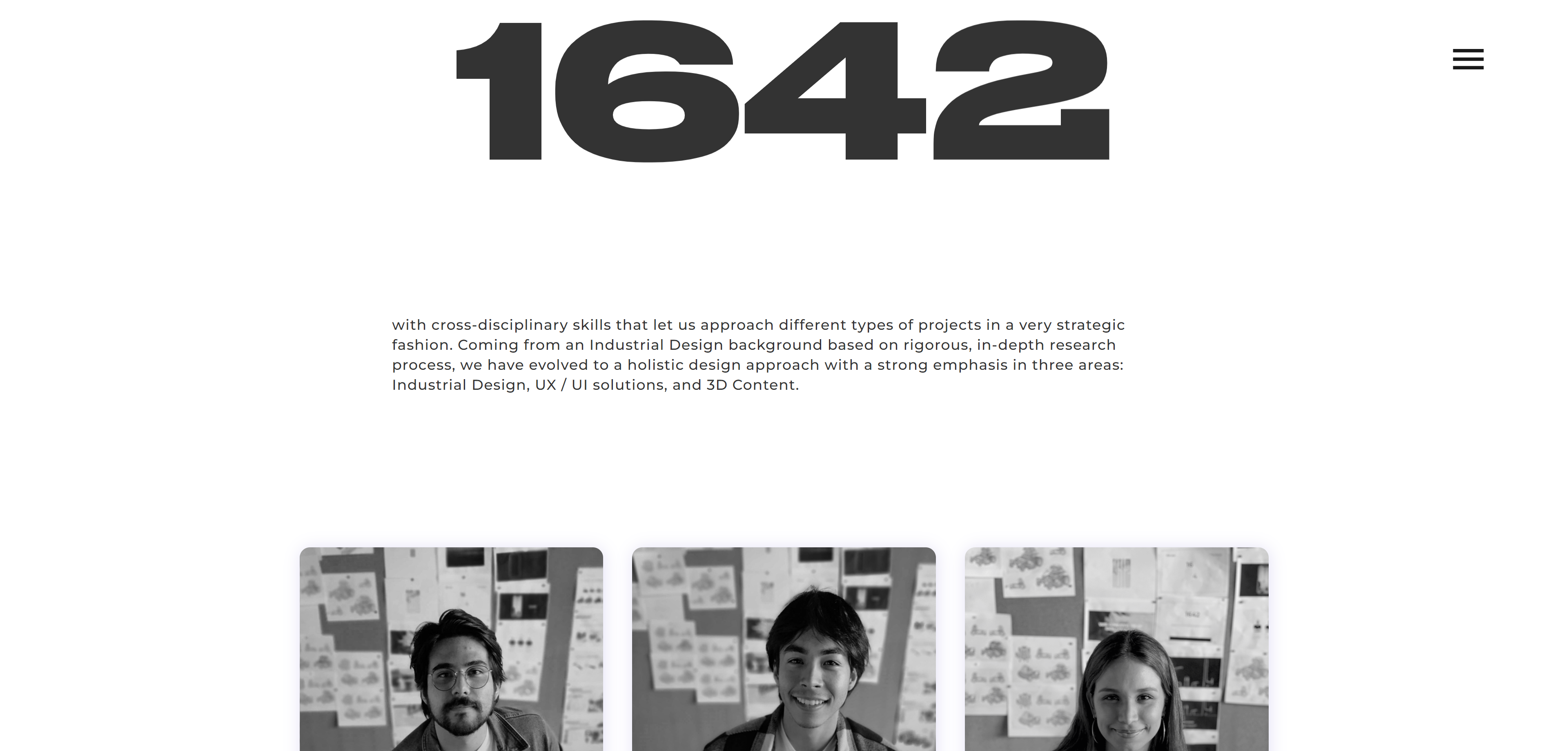
Studio 1642’s interactive aesthetic takes you through a journey of design and creativity with large text and dynamic motion.
The website slowly unravels as you scroll. It’s essentially one long webpage with a unique UI design and a distinctive color scheme.
Like Area, Studio 1642’s website uses neutral colors while providing the user with only the essential information. The scrolling ends with a simple CTA and social media links.
This is an ideal style and layout for marketing and other creative companies looking to stand out from the crowd with a unique and memorable website.
4. Minimalist: Homerun Style Guide
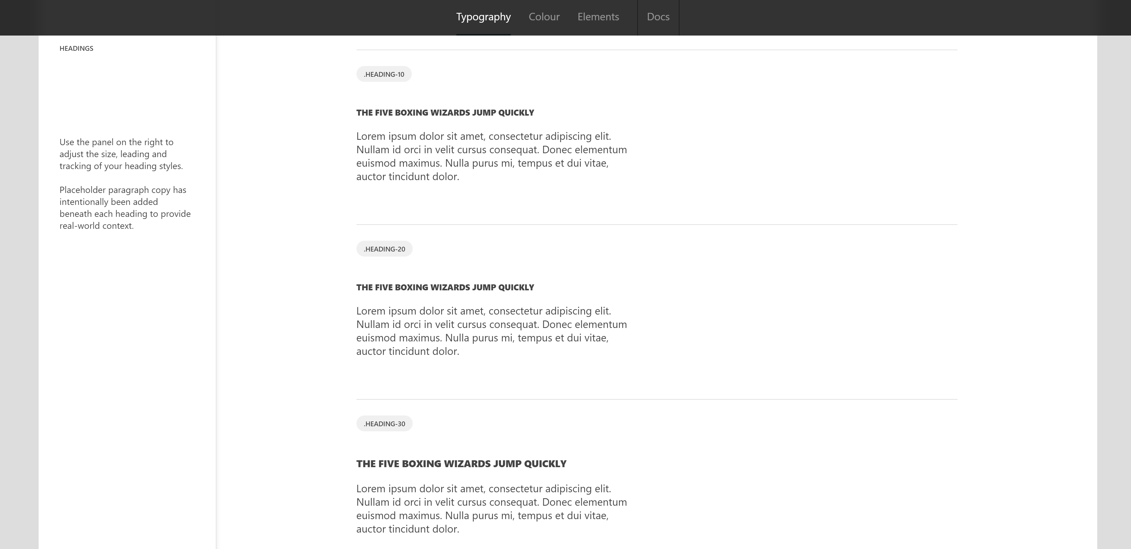
Homerun Style Guide’s website gets straight to the point. It tells the user only what they need to know.
The website is a style guide with different fonts, colors, design elements, and resources. All these come together to create a quintessential minimalist design that’s great to look at and easy to read.
Homerun Style Guide’s website is an excellent reference point for smaller companies that offer human resources, optimization solutions, or design services.
5. Striking multimedia: DAN MACE
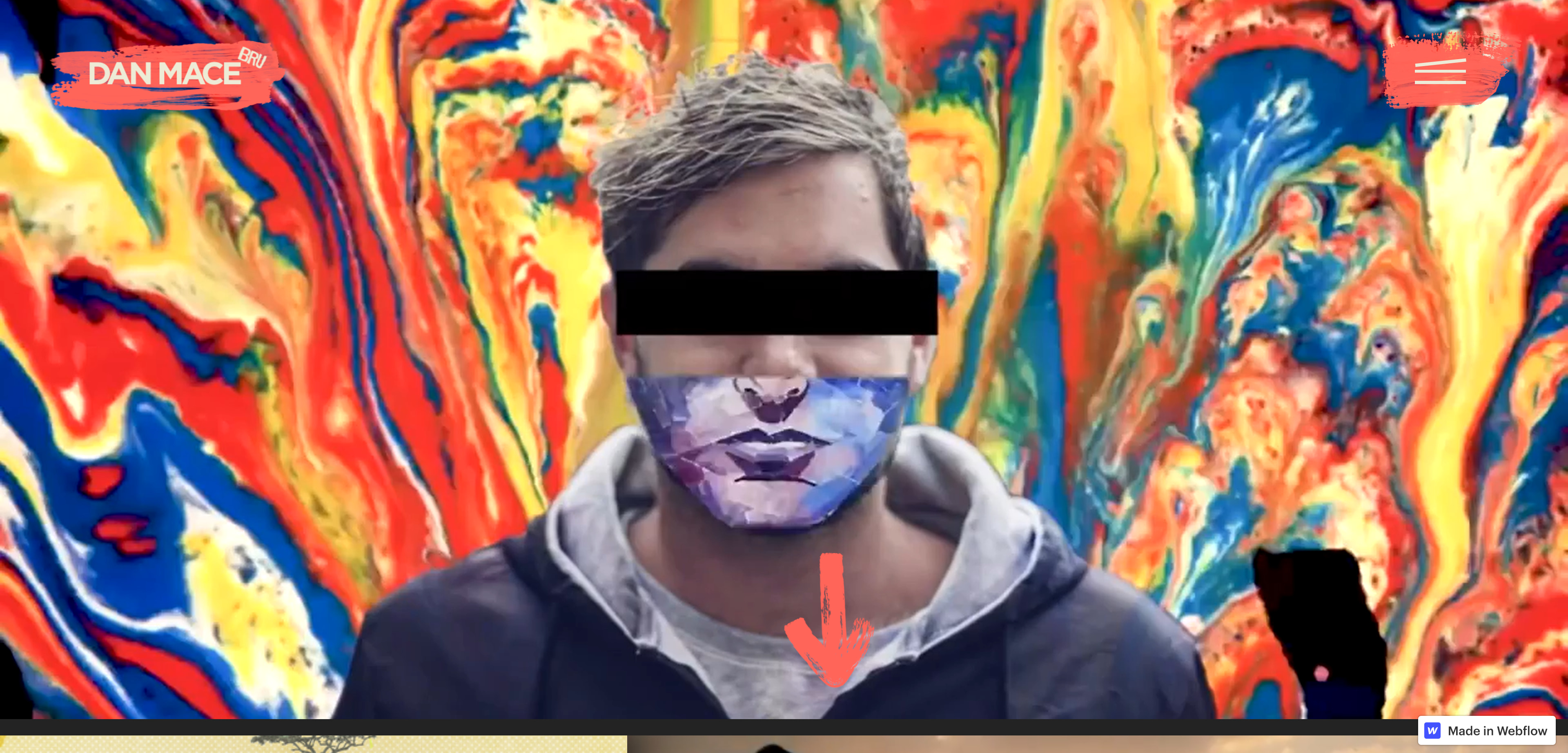
Photosensitivity warning: This website contains flashing images and motion upon load.
Dan Mace is a multimedia creative professional with a career spanning a decade. He has worked on advertisements, music videos, short films, and documentaries. His YouTube account has over 795,000 subscribers and more than 40 million views.
Dan’s website is a testimony to his creativity. Its primary focus is highlighting vibrant images and videos with interactive elements and visual effects.. It’s also well-organized and user-friendly, balancing design and functionality.
The website can inspire those looking to build a portfolio for their creative endeavors, whether they’re digital agencies, smaller studios, aspiring filmmakers, or photographers.


Build websites that get results.
Build visually, publish instantly, and scale safely and quickly — without writing a line of code. All with Webflow's website experience platform.
5 tips for designing a company website
Here are a few more quick tips to keep in mind when designing a company website:
- Be clear on what you’re offering: Base your website's design on the products and services the company offers, and tweak its interface based on the target audience.
- Think about the user’s journey: You can draw the target audience toward certain website sections if they want to learn more about a particular topic. It’s important to cater to the customer's needs and make it easy for them to find what they’re looking for.
- Know the principles of design: You must know design principles to create an appealing website for the company’s customer base. Fortunately, we have a guide to help you learn everything there is to know about building your website.
- Be creative, but don’t go over the top: Creativity can stand out, but overdoing it could overwhelm your user. Additionally, sites with many animations and videos might take longer to load, causing users to lose interest and leave.
- Stay updated on the latest trends: It’s essential to stay on top of recent design trends to know what’s hot and what’s not. Our guide on 2022’s essential web design trends is a great place to start.
Start building beautiful and functional websites
Remember that first-time users will judge your clients based on their company's website design. It's one of the most crucial elements in capturing a potential customer’s attention.
It’s also important to remember that a good website design doesn't have to be complex. Keep it relevant to the company, its services and products, and the target audience they’re trying to reach.
If you’re excited to begin, get a head start on your design with a business website template.