Whether you're looking to land new photography clients or showcase your photos, having an online portfolio makes your work accessible to many. We’ve put together a handful of portfolio sites designed specifically for showcasing your amazing work.
As a photographer, it’s important to get the visuals right while establishing your online presence. Having a unique and professional portfolio will make you stand out to potential clients. The only problem? Most website builders out there offer cookie-cutter options — making lots of portfolios look the same.
That’s where a platform like Webflow comes to play. With Webflow you can either design and build an online portfolio from the ground up (without writing code) or start with a template that you can customize every aspect of. From unique animations and interactions to web app-like features, you have the opportunity to make your photography portfolio site stand out from the rest.
So, we put together a few photography portfolio websites that you can use yourself — whether you want to keep them the way they are or completely customize them to your liking.
12 photography portfolio websites to showcase your work
Here are 12 photography portfolio templates you can use with Webflow to create your own personal platform for showing off your work.
1. Jasmine
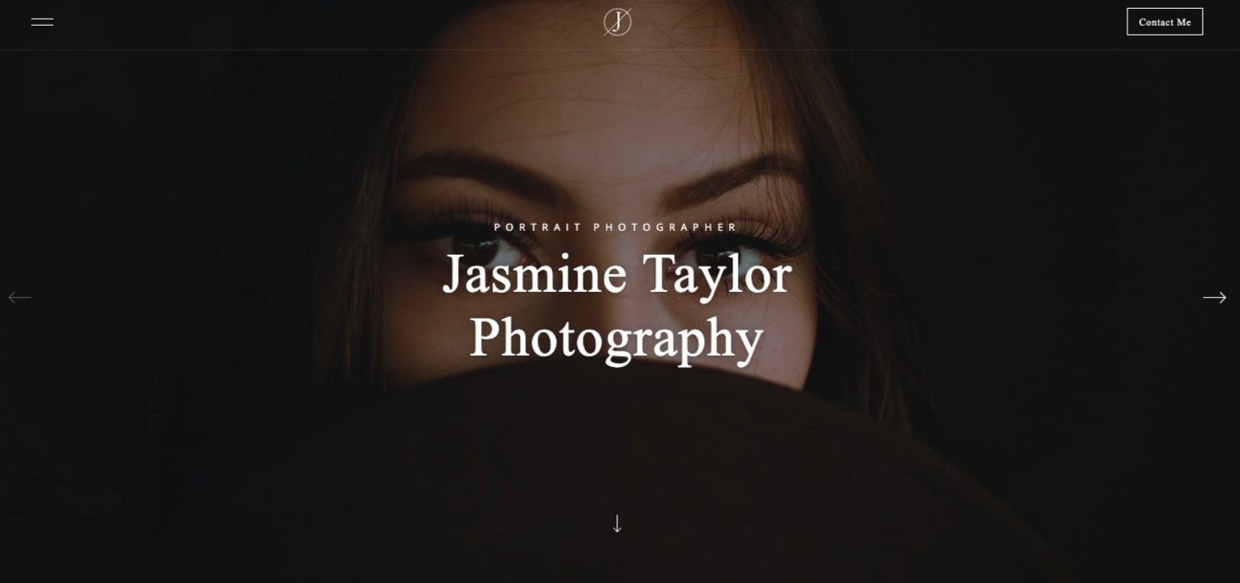
The hero section of your online photography portfolio needs to wow someone who lands on it. Jasmine succeeds with a huge hero that lets you put an example of your best work in front of someone right away. From here, clicking on the downward arrow brings you to the next section with ease, as text and images fade in and slide into place. This isn’t the only movement in the design, with a number of cool and tasteful interactions scattered throughout. The visual effects are never jarring or points of distractions. Instead they add subtle movement that guides one to explore the design further.
Often project galleries are a simple grid of photos. There’s nothing wrong with a linear arrangement, but Jasmine staggers their photo project gallery. This simple staggering of images creates a nice visual juxtaposition, making it a bit more interesting than a standard layout.
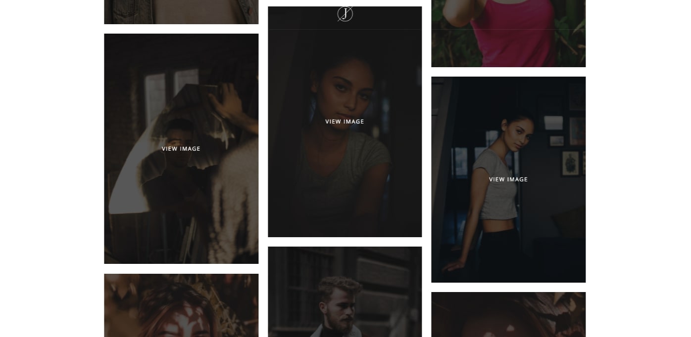
Whether you’re a fashion, wedding, or travel photographer, or even a digital photographer who shoots for fun on the weekends, Jasmine provides a solid framework to showcase your work all in a responsive design.
2. Prisma
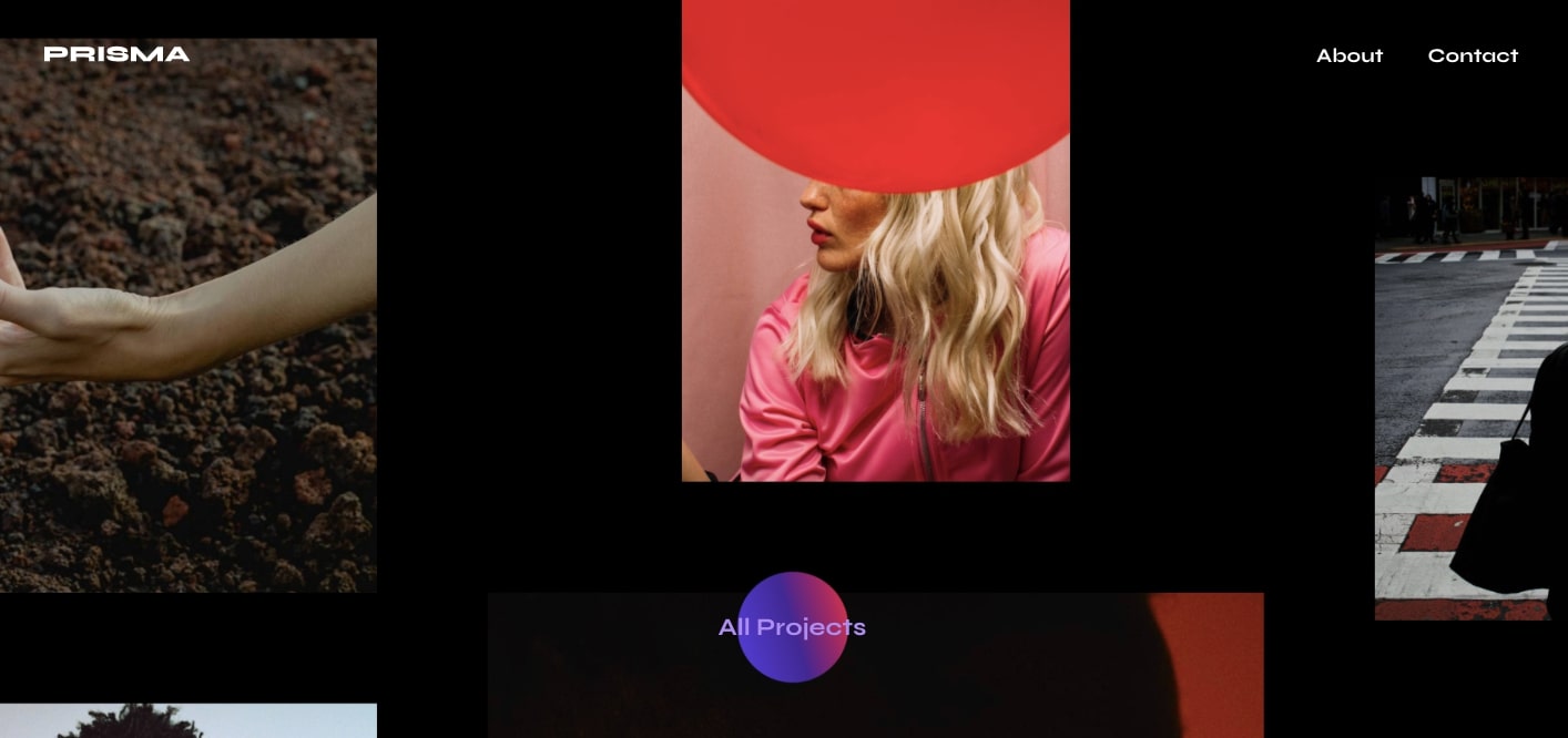
If you want to make a big splash with potential clients with only minimal effort, the Prisma photography template gives you everything you need for a hip layout with plenty of visual dazzle. With a multitude of scroll triggered effects, moving text, and other stylized elements, this web design has a wealth of action to catch someone’s eye.
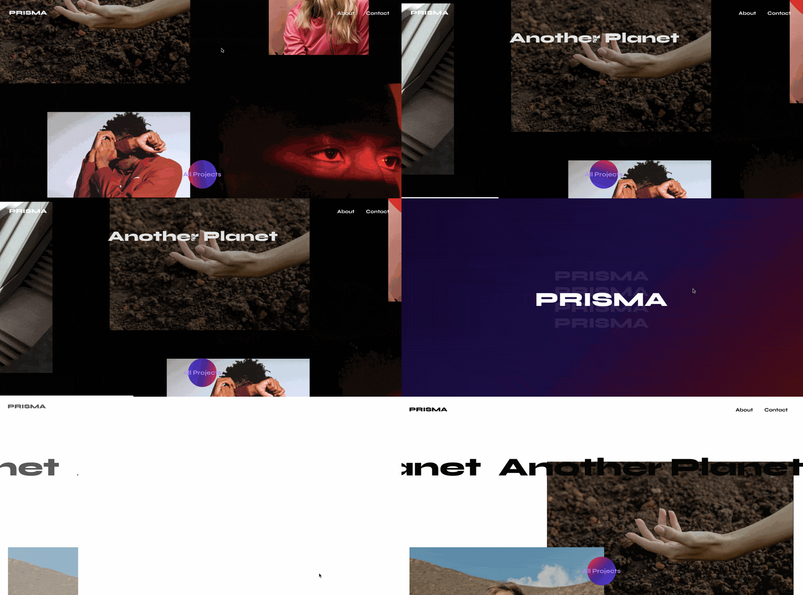
Prisma’s dynamic photography portfolio website is a fully realized web design but still allows for full customization like any other Webflow template. Along with a host of slick elements, it also comes with a style guide. Having all of your CSS styles in one place lets you see how elements like different fonts work together. It gives you the power to experiment and make sitewide changes directly from one page. Those tweaks or changes are much easier to implement when you have a CSS style guide page already set up for you.
With plenty of space to show off your own beautiful photography and a smart contemporary look, Prisma lets you build an online portfolio that’s unique and engaging.
3. Photographos
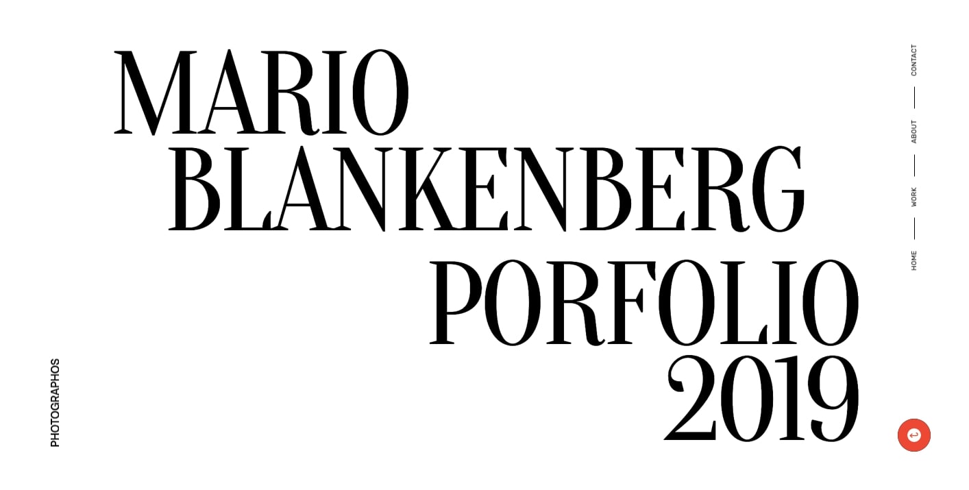
It’s good to have options. Photographos provides 3 versions of their photography portfolio template, and each has a touch of elegance. You can use the one that showcases your work the best.
There’s a nice push and pull between the more traditional-looking elements like the typography with the more stylized features like the animated effects and interactions. Practicality and suave sophistication come together for a user experience a cut above standard portfolio website designs.

If you’re running a photography business, you want to show people the work that you do — and it needs to be in a professional-looking design. Photographos gives you plenty of space to display your images, in a web layout that communicates to potential clients that you take your work seriously. With a high-class feel, Photographos is perfect for wedding photography, fashion photography, and other professional photographers.
4. Shots
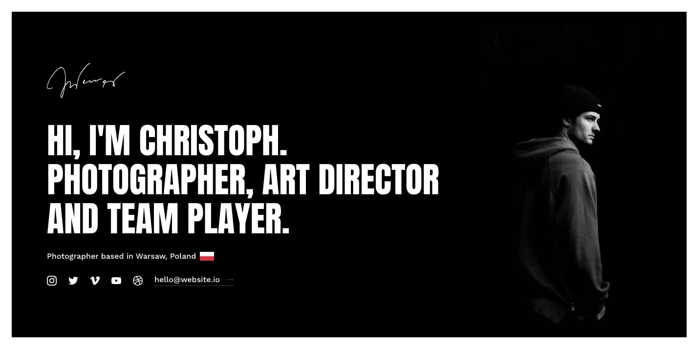
Shots gives you a number of layout options, letting you mix and match whatever you’d like for your own web design. The design offers 2 options for the personal intro section, 4 for the projects page, and 2 choices for additional parts of the design like inner pages and even a photography blog.
All of the options have a minimalist feel, with dark grays, big typography, thick borders, and opportunities to plug your social media accounts. The aesthetic of this web design may be sparse, but it doesn’t feel empty. This stripped-down design removes distractions, making your photography the center of attention.
Another great part of Shots is the use of Webflow’s CMS. Updating your projects can be done through the CMS rather than having to make changes directly on the layout. Making major blocks of your design controllable through Webflow’s CMS is so much easier than messing with them directly on the page. When you don’t have to go in and change the arrangement and spacing of these elements one by one, it saves you time.
And of course there’s the blog. Having dynamic content like a photography blog may also give your website a bit of an SEO boost. Blogging gives you an opportunity to further show potential clients the expertise you have in your craft. And if your creativity also includes writing, it’s a great opportunity to go in and write about something that you’re passionate about.
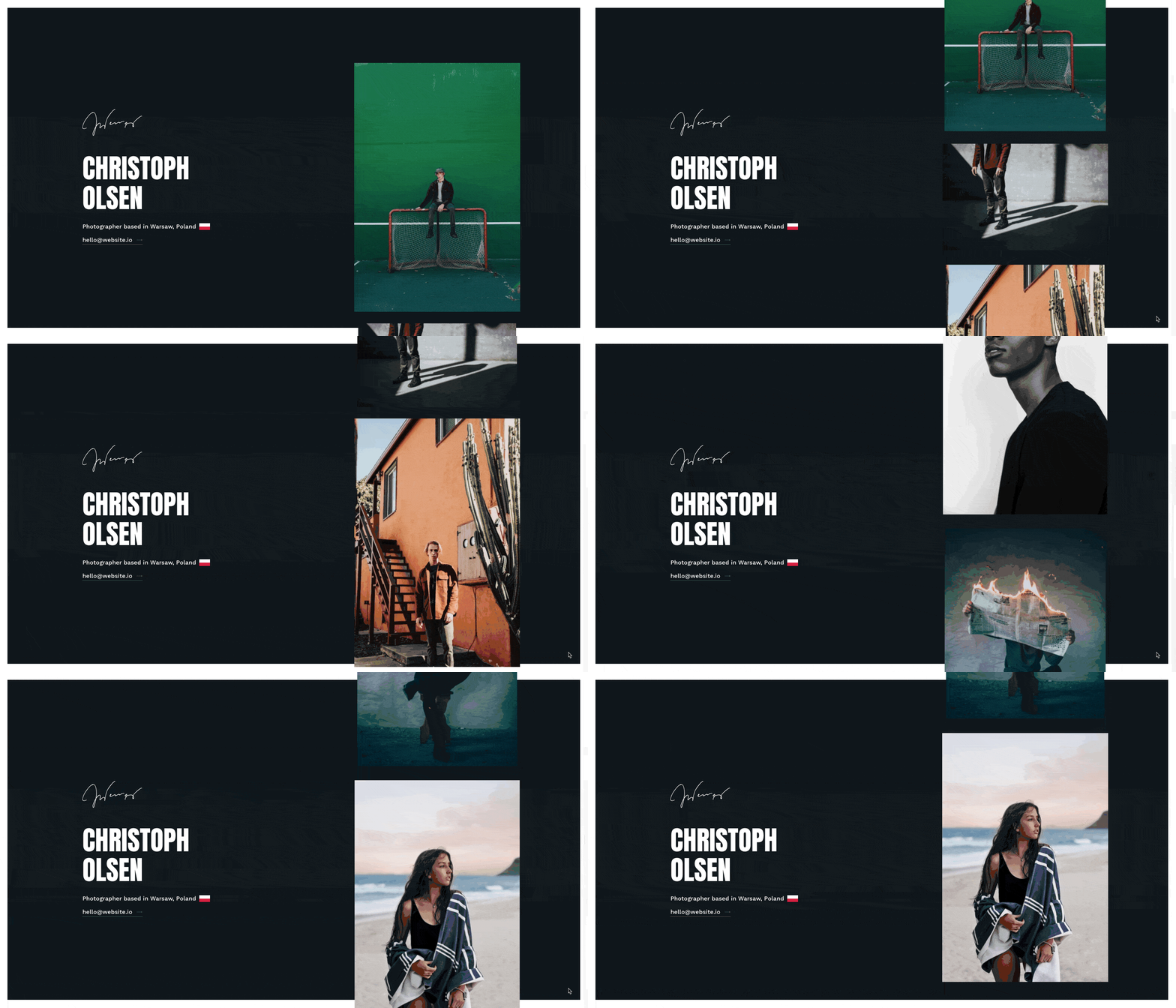
If you want a no-frills and easy to navigate photography portfolio, Shots strips away the excess, making for a straightforward and practical web design.
5. Capture
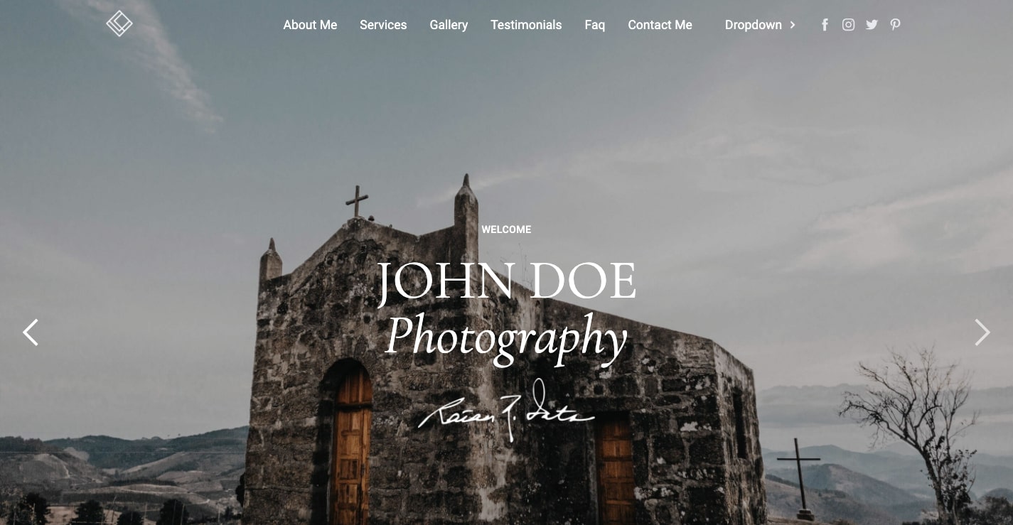
Capture opens with a soft fade as one photo gives way to the next. This feature gives you the opportunity to catch the attention of potential clients right away. It’s great for wedding photographers and those who shoot landscapes.
The sectional layout of this design offers a nice structure to fill with your own images and text. With blocks and columns, it’s organized and easy on the eyes to scroll through.
All of the elements come together in a single-page layout, making it easy to get to each section via the top navigation. Users are never taken to another page. Making your content accessible in the least number of steps keeps people’s attention.
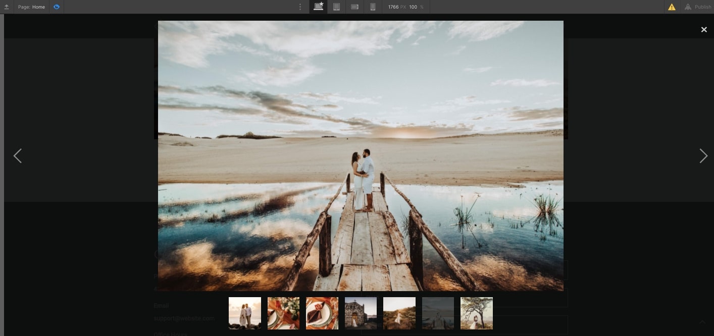
Many photographers, web designers, and creatives love the simple elegance of a one-page web design. Capture lets you create the best photography website possible without making things complicated.
6. Frame
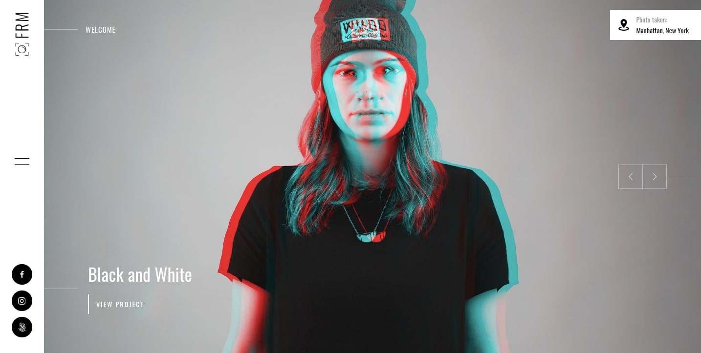
With 8 different homepage options and an artiness that permeates throughout every layout, Frame makes for a great online portfolio no matter what type of photographer you are. It’s tasteful, never pushing things too far, but stylized enough for a photography portfolio website that will stand out from those less inspired.
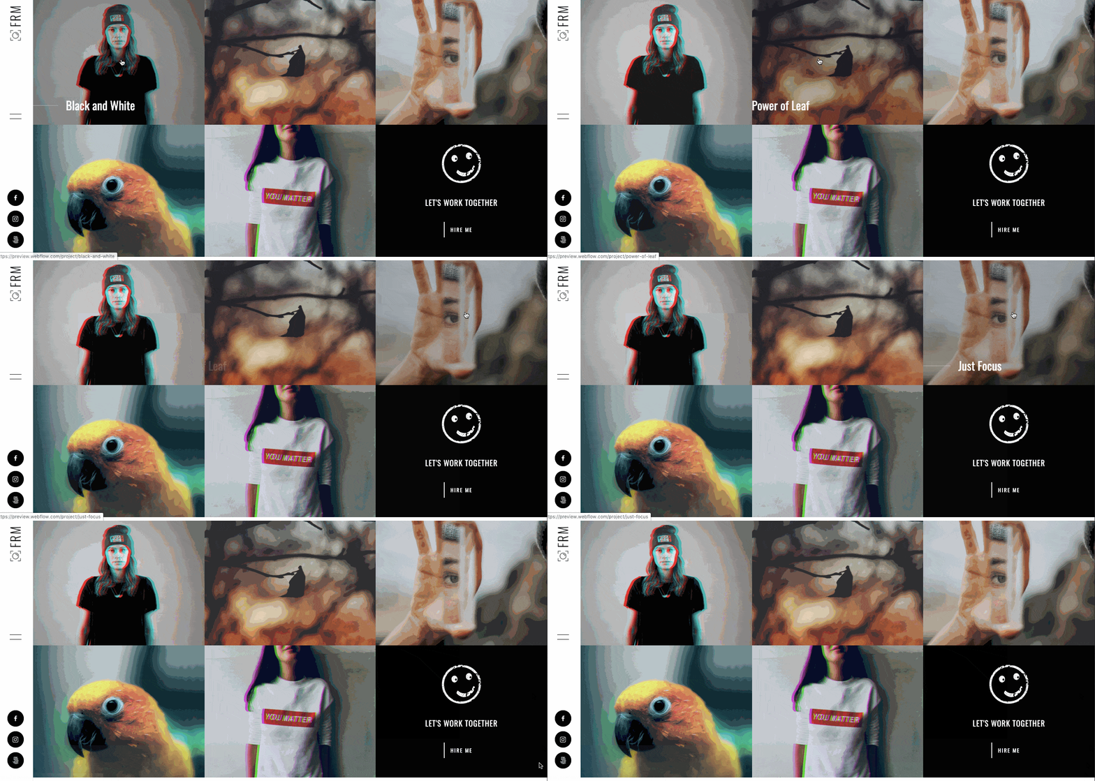
Frame allows you to highlight your beautiful photography and manage it all with Webflow’s CMS. You’ll have control of this content, including ecommerce options for an online store, and the web design also comes with a CMS-driven photography blog built in.
With a long list of features, page layout options, and a hip aesthetic, Frame gives creatives a fully customizable website template to show off their own artistry.


Build your online portfolio
Build and visually design a full portfolio website in just 21 days — with our free online course.
7. Marlin
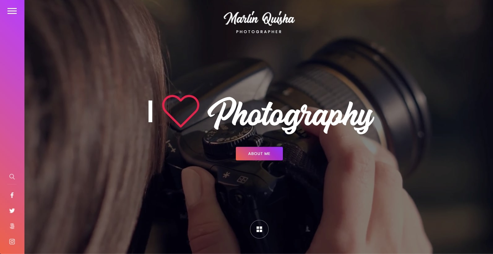
Marlin gives photographers a website template that uses space in a smart way. The organization of the images and content is logical, with plenty of breathing room in the layout.
Though simple, this design transcends being a static assemblage of elements. The stacked card layout gives a hint of depth, and the gradients and the bold call-to-action buttons add enough variety to keep it from being just your run-of-the-mill photography portfolio.
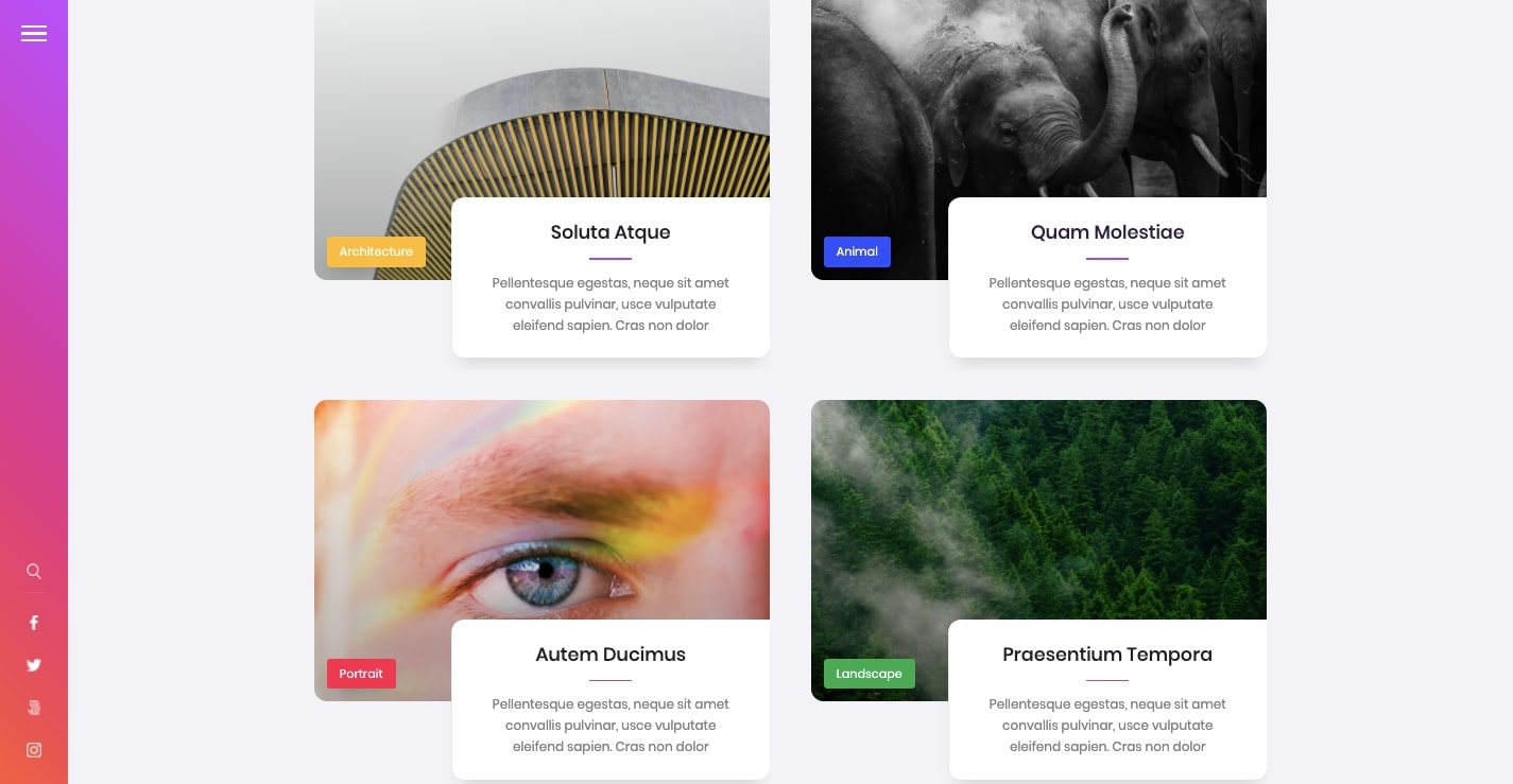
Marlin not only gives you a visually engaging layout, but much of it is under the control of Webflow’s CMS. It includes a few options for setting up your photography project CMS entries, as well as a blog template that makes maintaining all of this content simple.
8. Photo
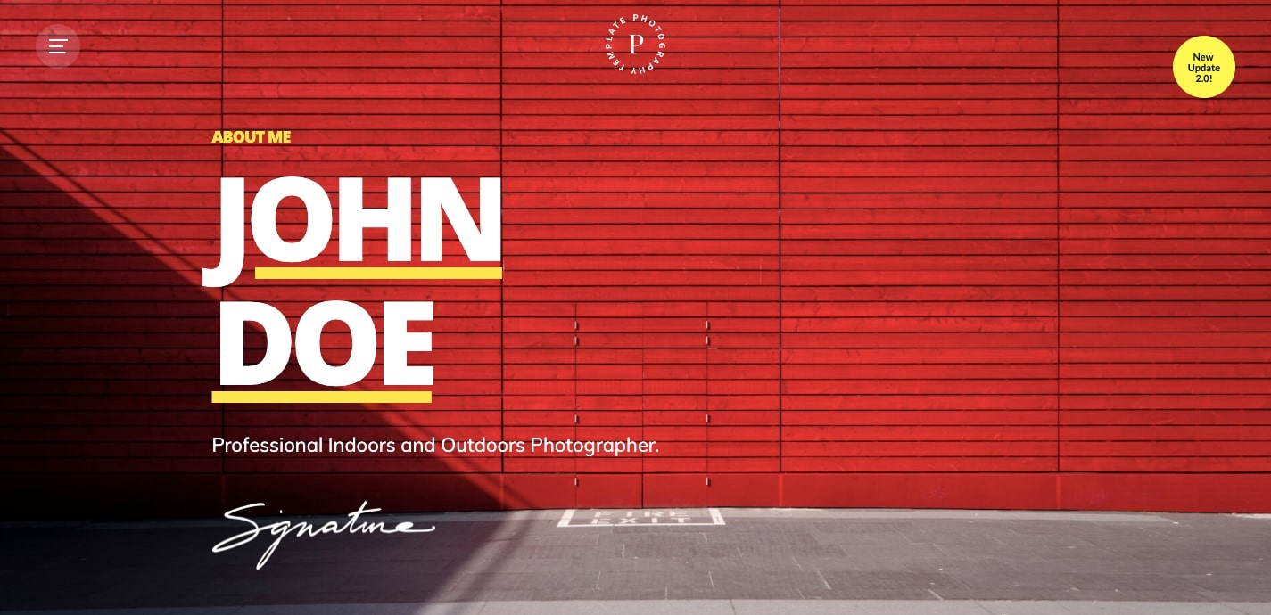
Here’s the thing. A photography portfolio can be as simple or sophisticated as you’d like. There are no universal guidelines. It all depends on how much time and effort you want to spend building it.
What makes Photo great is that it lets you put your own portfolio website together in a short amount of time. You aren’t bombarded with too many options, and you have the choice between a multipage or single-page layout. Just pick the one that suits your needs and start popping in your own images and content.
9. Carrete
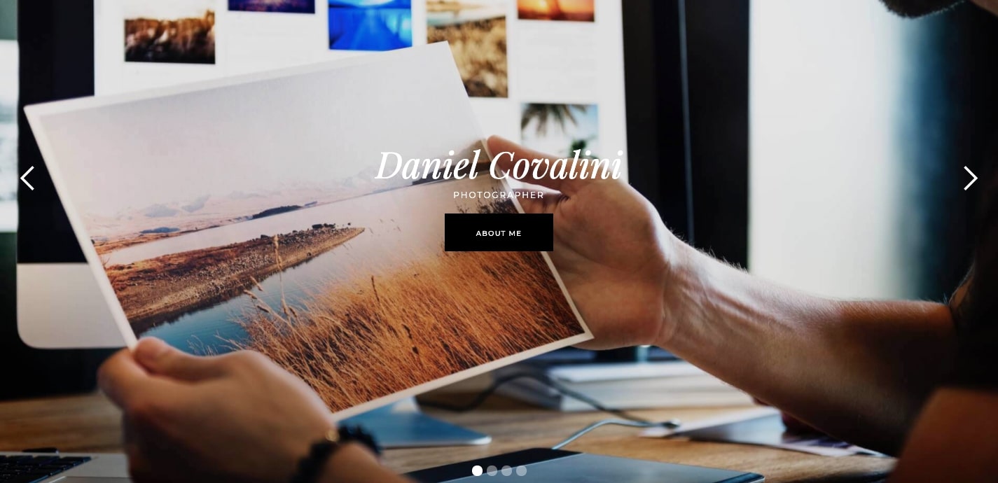
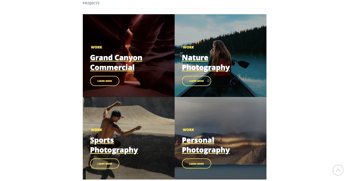
With a quick jump down from the landing page, you’re brought to a grid of projects. Carrete wastes no time in presenting visitors with a display of photographic works.
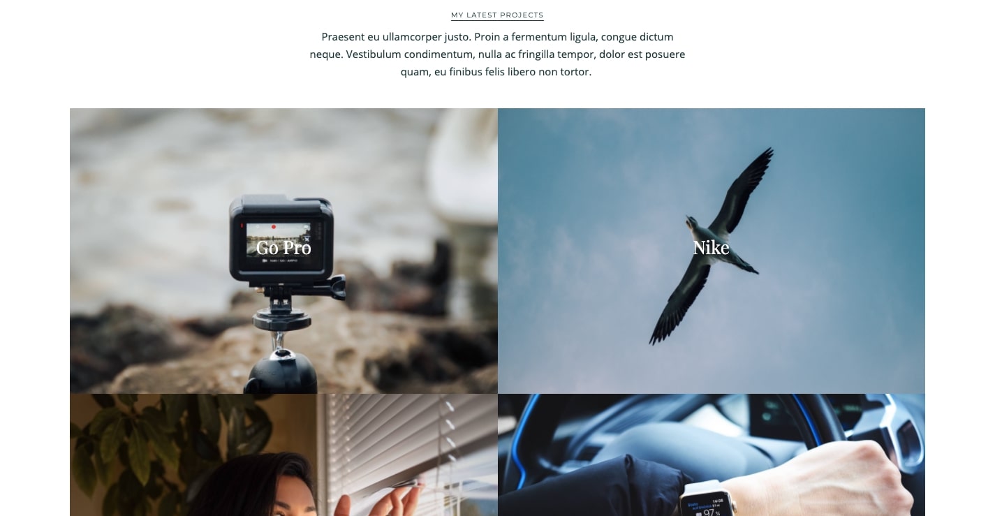
With a gallery, portfolio, about page, services page, and more, Carrete provides a multitude of pages to choose from. You can make your own online portfolio as expansive or compact as you’d like with the layouts provided.
Carrete is another photography portfolio driven by Webflow’s CMS. From individual project pages to the blog, the CMS can be used to update a variety of content, making for an easy way to keep track of and maintain all of your work.
10. Dynamic Studios
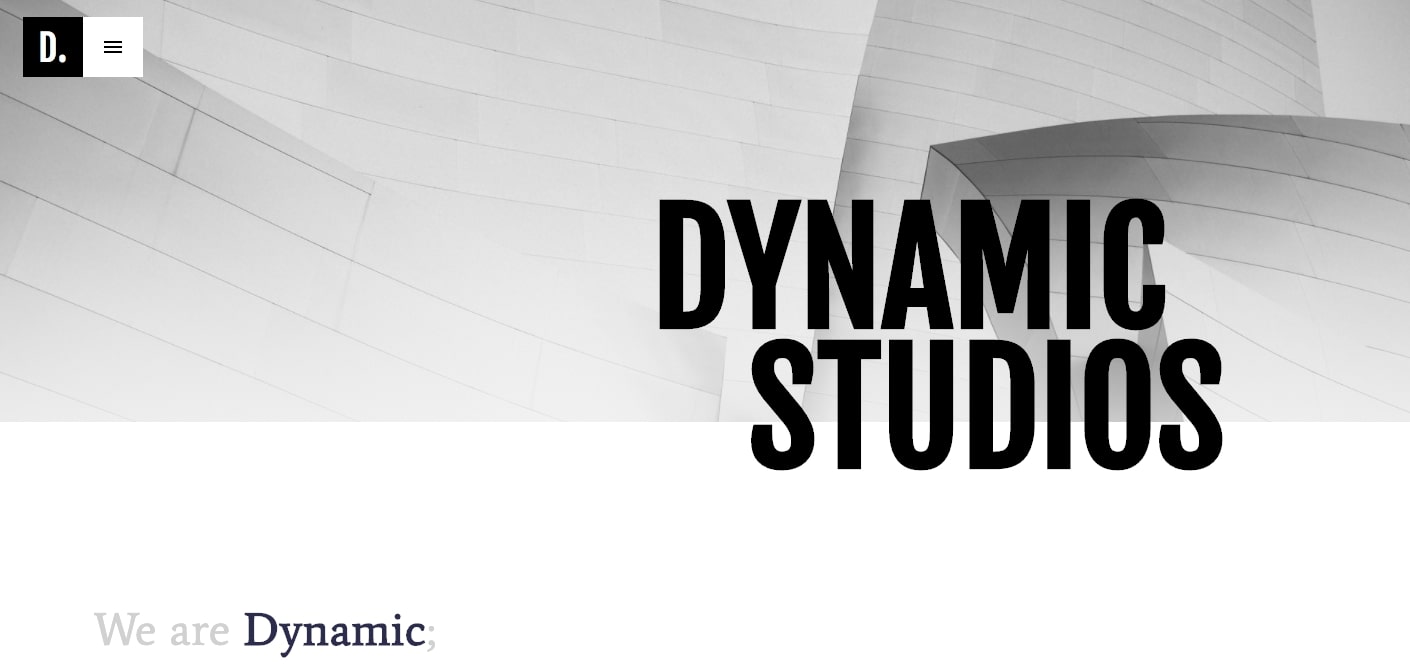
Dynamic Studios offers a portfolio website that goes beyond a good-looking design. Along with its clean lines and sharp layout, it’s full of wonderful interactions and effects, giving this design a vibrancy and an energy.
The hero text stays fixed in place as you scroll down, only to disappear as the next block of content moves into place, while various text and images subtly shift and fade. And let’s not forget the parallax layering of elements as you zip through it.

The template organizes the projects by collections in the left-hand navigation, which leads to specific pages with images grouped together. This works great if your work spans different types of photography or if you explore different themes. The collections keep the photography organized and easy to access rather than having it spread across the design.
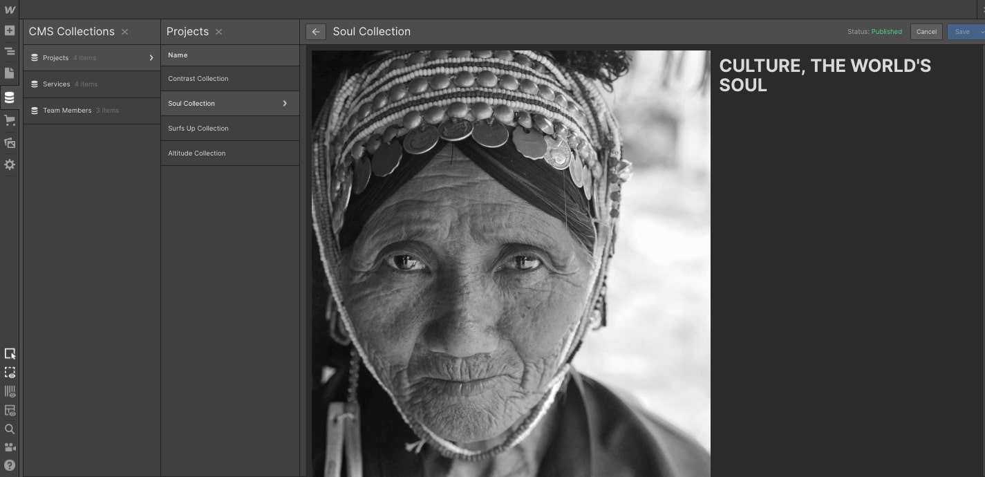
All of these collection pages are directly controlled by Webflow’s CMS, which saves you from having to rebuild your layout every time you want to add or delete something.
11. Polaris
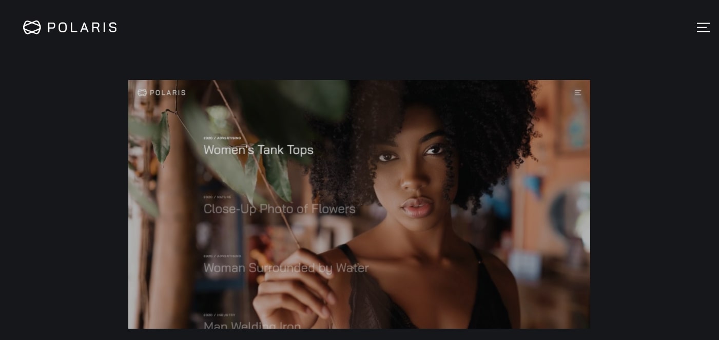
If you want a design that doesn’t look like everyone else's, you may not have to look any further than the Polaris photography portfolio website template. It stands out with an unorthodox style without sacrificing the user’s experience. This website design demonstrates that you’re not bound to the traditions of unmoving grids of photo galleries. Some of the best websites break free from the confines of what’s expected.

When you first land on the homepage, you see left-aligned text against a gray background. Moving the mouse reveals the background image. This hero image stays fixed in place as you scroll down all of the project entries, with this photo swapping out with another one as you scroll down more.
Like the shutter of a camera clicking away, the website template has a snappy and quick feel to it. There’s never a lull when looking through the content, with plenty of action to keep your attention engaged.
12. Newport
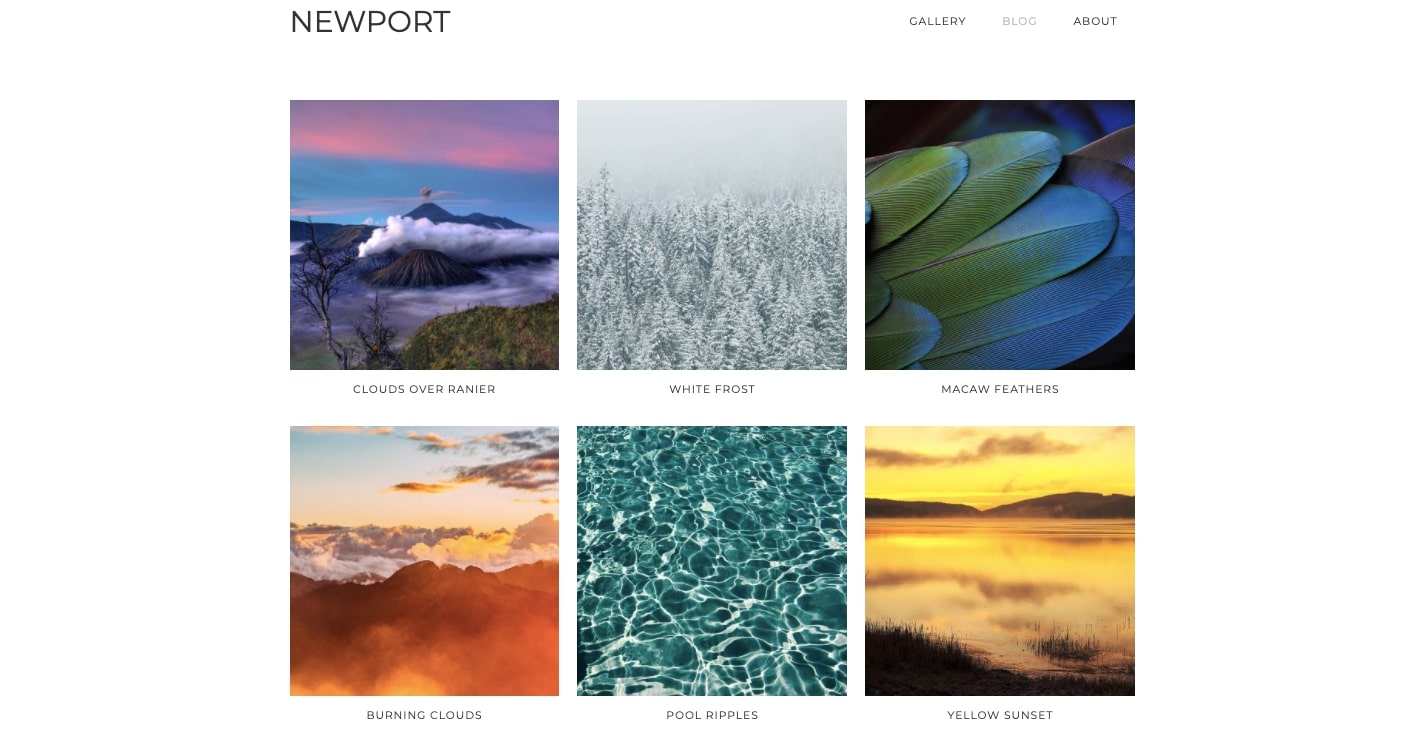
Let’s face it: Not everyone needs a super fancy portfolio website. If you have the confidence that your photos alone are enough to communicate all that you do, a more minimal layout may be a better choice. Newport gives you a bare bones design: Its homepage is a 9-block grid of projects. There’s no wading through complex dropdowns or long blocks of text. It’s all there right there.
All of these featured projects have been set up in Webflow’s CMS. We can’t stress enough how much you’ll appreciate being able to work on your website using Webflow’s CMS rather than having to go in and make changes directly.
If you want to sit down for a couple hours and end up with a solid portfolio, Newport gives you everything you need to get your work out there.
The importance of having a photography portfolio
Wherever you’re at in your pursuit of photography, you need an online portfolio. Sending examples of your work through email attachments isn’t going to cut it. A portfolio shows that you’re a professional, gives potential clients quick access to your work, and lets them return to check it out it whenever they want.
A photography portfolio is never finished — and that’s a good thing. As you get better at the craft of photography, you’re going to want to swap out your old photos with new ones. Webflow makes it easy to make changes to your website so that it will always feature the best examples of your work.
Your photography deserves an audience. If you’ve been putting off creating your own portfolio website, let Webflow put into your hands all of the tools you need to make it happen.
We've created an 8-part tutorial on how to create a custom portfolio in Webflow. Check it out here.


.jpeg)


