Cups don’t usually make history — but the 90s jazz cup just hit different.
You saw it in the hands of the field trip mom serving you a cup of warm Kool Aid. It showed up at a slumber party, in the guest bathroom rinse cup dispenser. And there it was again, casually held by a character on your favorite sitcom.
Some designs made history by gracing billboards, runways, or magazines. Their legacies were built on the reputations of famous designers. These ideas were meant to stand out and leave their mark on the world.
The jazz design was never supposed to do any of those things. It wasn’t created with the goal of making history. But, somehow, a paper cup design became iconic.
So, where did those teal and purple crayon scribbles come from? How did they end up on disposable cups? And why — decades later — has the 90s jazz cup design become a symbol of the era?
To find the answers, we’ll need a dash of history, a heaping helping of internet beef, and a whole lot of nostalgia.
It started with a simple cup design
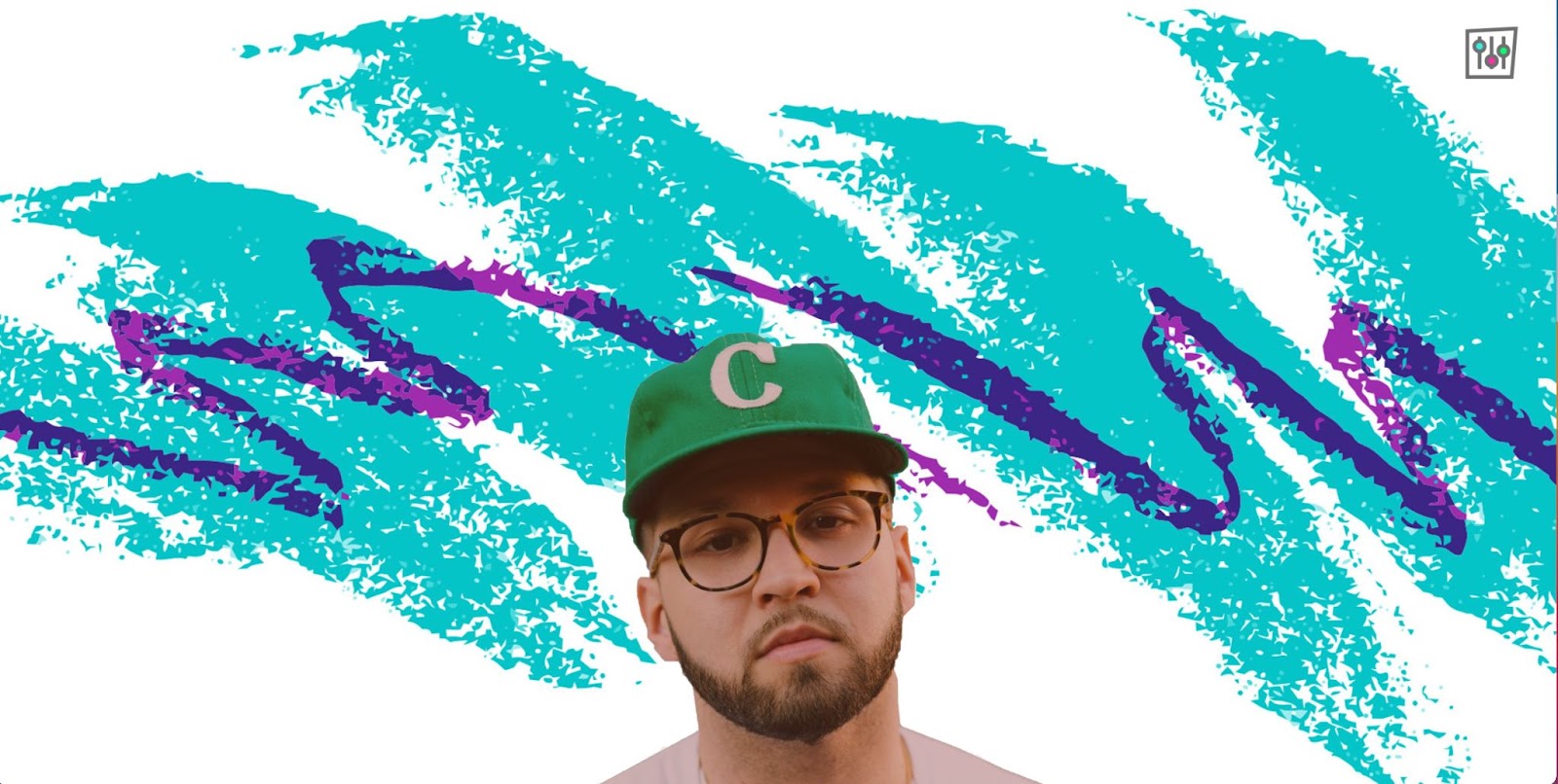
Those now-famous teal and purple scribbles were introduced in 1992 as a disposable cup design by the Sweetheart Cup Company.
After working with external design agencies, Sweetheart Cup Company realized the agencies didn’t understand the printing process — their designs were too complicated to reliably print onto cups. So, the company announced an internal design contest with the goal of finding a design that would print well and appeal to the masses.
The winning design — then simply called “jazz” — used only two colors and was intentionally messy. This allowed the printers to move quickly without worrying about the crispness of the image or whether or not the crayon-like squiggles aligned.
By 2002, the jazz design was Sweetheart Cup Company’s top-grossing design of all time. And when the Solo Cup Company bought out Sweetheart in 2004 — they continued to use the design. Because of the buyout, the jazz design is sometimes known as “Solo Jazz.”
The jazz cup epitomized 90s culture
Originally, the 90s jazz scribbles were meant to be aesthetically pleasing in a neutral way — a straightforward design for paper cups, plates, and bowls. But both the design style and the design itself have become beloved representations of the 90s.
While the actual inspiration is unclear — more on that later — the jazz cup design clearly matches the 90s design aesthetic with its vibrant color combinations and graffiti-like scribbles. Both aspects are characteristic of 90s maximalism, which embraces absurdity, loud color schemes, and conflicting patterns and textures.
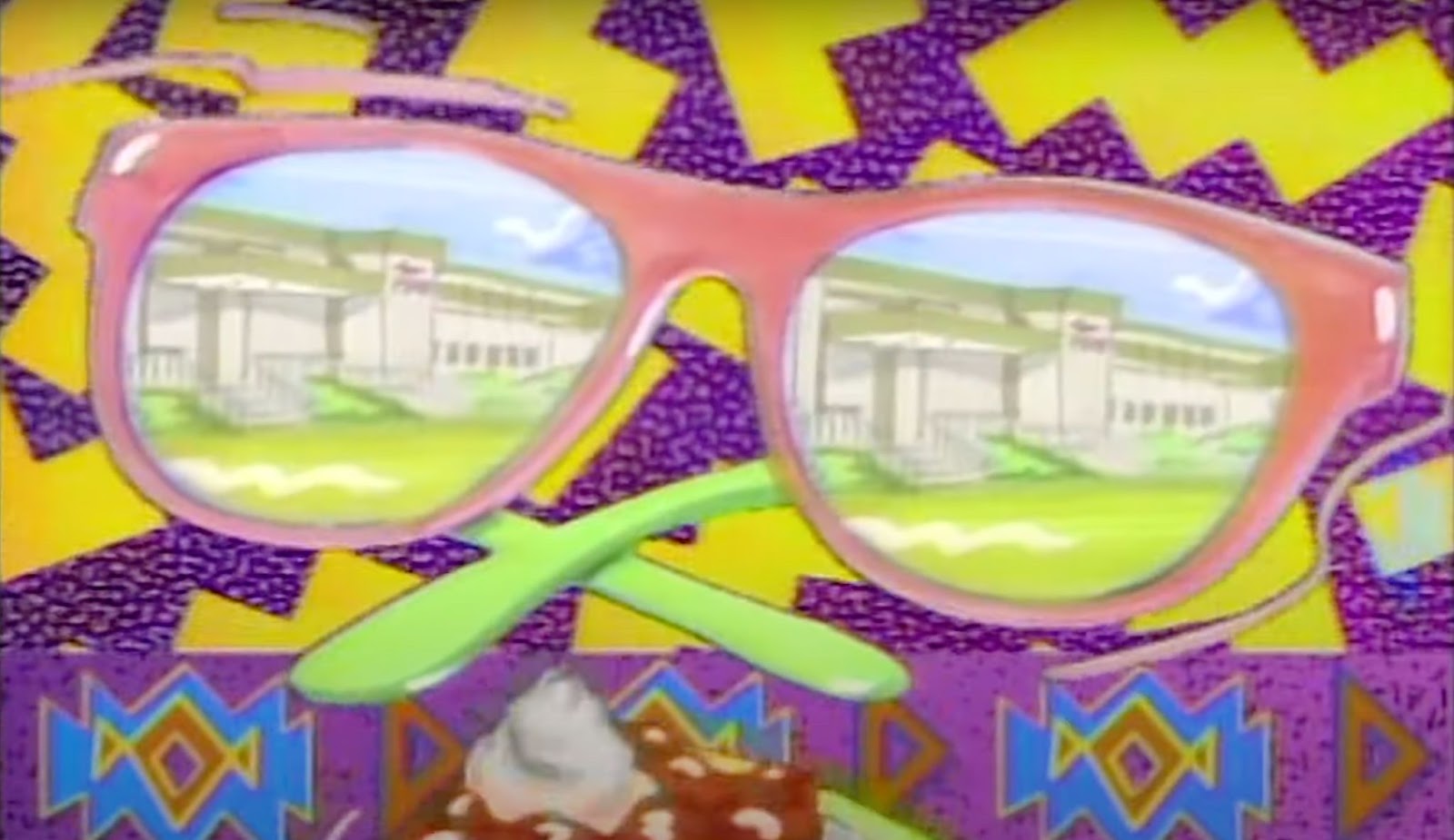
The jazz cup design fits right in with 90s pop culture. Just look at the opening credits for popular TV shows from the era, like Saved by the Bell, Fresh Prince, and Hangin’ with Mr. Cooper. All of them feature funky and slightly chaotic animations full of zig zags and clashing patterns.

Eclectic shapes, neon colors, and busy illustrations were quintessential aspects of 90s web, fashion, and graphic design. Clearly, the jazz cup was a product of its time.
But while everyone has their own taste in TV shows, clothes, and websites, most people aren’t picky about the disposable cups they use. Thanks to the wide distribution of the cup, this simple design became a shared experience for anyone who grew up in the 90s.
Nostalgia & internet drama put the jazz design back into the spotlight
Although Gina Ekiss, formerly of the Sweetheart Cup Company, is credited as the creator of the 90s jazz design — that credit is not uncontested.
A couple decades after the jazz cup was released, a question on Reddit about the graphic designer behind it sparked controversy. Designer Stephanie Miller responded, claiming she created the original design in the late ‘80s while working for Imperial Bondware — a Sweetheart Cup Company competitor.
Both Stephanie and Gina claim that they created the design for an internal contest at their respective companies. However, Stephanie is adamant that her design came first and speculates that it was stolen, brought to Sweetheart Cup Company, and traced or adapted by Gina.
All this controversy led to internet sleuthing and caught the attention of a few investigative journalists. Unfortunately, since the design changed hands from Sweetheart Cup Company to Solo Cup Company and then again to Dart Container Corporation in 2012, the history is murky. Dart Container Corporation explained that most historical information has been lost, but their best assumption is that Gina is the original creator.
Journalist Thomas Gounley wasn’t satisfied with that answer, so he tracked down Gina, who retired in Aurora, Missouri. Gina confirmed that she created the design while working at Sweetheart Cup Company and showed Thomas her original charcoal drawings of the famous squiggles. Most people took this as proof and the internet embraced Gina as the jazz cup creator.
But Stephanie holds strong with her story, adding that the original design was created with paint, not charcoal — pointing to a teal-crusted paintbrush she still has to back up her claim.
So…who actually created it? We’re not here to take sides. And 90s jazz fans seem to care a lot more about the nostalgia that the design sparks than whoever made it. Not only does “Solo Jazz Pattern” hold “Confirmed Meme” status (an actual thing), it also shows up in more than 500 Etsy listings. Decades after its creation, the teal and purple squiggles still show up on stickers, clothes, and even modern websites.

At this point, it’s impossible to separate the actual design from the hazy history, internet beef, and childhood memories. The 90s jazz design isn’t revered because it’s the perfect design, it’s cherished because it’s the perfect representation of the 90s kids’ shared experience.
You never know which creations will earn a spot in design history
Gina, Stephanie, and the people of the internet might not agree on the details, but we can all agree on one thing — no one expected a teal and purple doodle on a paper cup to be a hot topic of conversation decades after its creation.
Design trends and pop culture are unpredictable. And that’s what makes them so exciting. You never know when a napkin doodle — or maybe a charcoal drawing or swipe of a paint brush — might make history.


Get started for free
Create custom, scalable websites — without writing code. Start building in Webflow.


