What can you learn from studying the homepage of an iconic brand?
There’s perhaps been no brand more influential on modern design as a whole than Apple. Whether it’s through the use of their hardware (like MacBooks, iPhones, iPads), their software (iMovie, Keynote), or their marketing (I’m a Mac, I’m a PC) — Apple has had an impact on everything from graphic design to hardware to web. By looking at their homepage iterations over some of the most formative moments in the company’s history, we’ll see how Apple has expressed their brand and pushed web design and development to new heights.
Before we dive in, we have to give an immeasurable shoutout to The Internet Archive — the web’s literal time machine — because without their Wayback Machine, we would not have been able to find any of these images.
Apple.com in the 1990s
Don’t get us wrong, we love 90s style web design. But we won’t be focusing too much on this era of Apple’s designs as it’s before most of their defining products came to light. This homepage is from early 1997, around the time Steve Jobs had returned to the company as an advisor through the NeXT Computer acquisition

If you can remember the internet in the mid to late 90s, this should look pretty familiar. Vertically stacked navigation was pretty common for sites during this time. The 1997 homepage included three separate GIFs in the hero and a two column layout that stretches down the page. This layout and aesthetic didn’t last for much longer — simplicity and focus were on the way.
Let’s jump ahead to 1999.
Power Mac and a simpler, hero-driven homepage
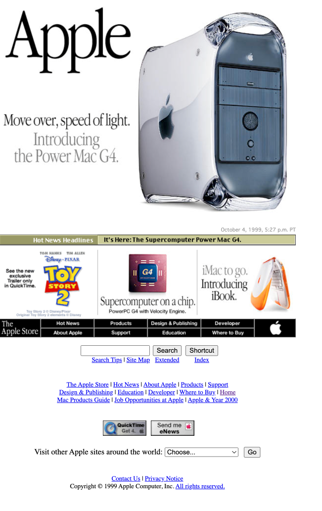
This homepage (October 1999) comes to us two years into Steve Jobs’ return to the CEO position. You can see more focus here in what the site is highlighting. The navigation from the left is gone and content is centered and kept concise. The hero image has a clear focus: the Power Mac. The smaller secondary boxes draw attention to other products or features that are designed to help sell the power of Macs and what you could do on them (remember the days of downloading trailers?). The “Hot News Headlines” ticker section was the only motion on the page, and headlines would appear one word at a time.
Apple.com in the 2000s
iMac and tabbed navigation
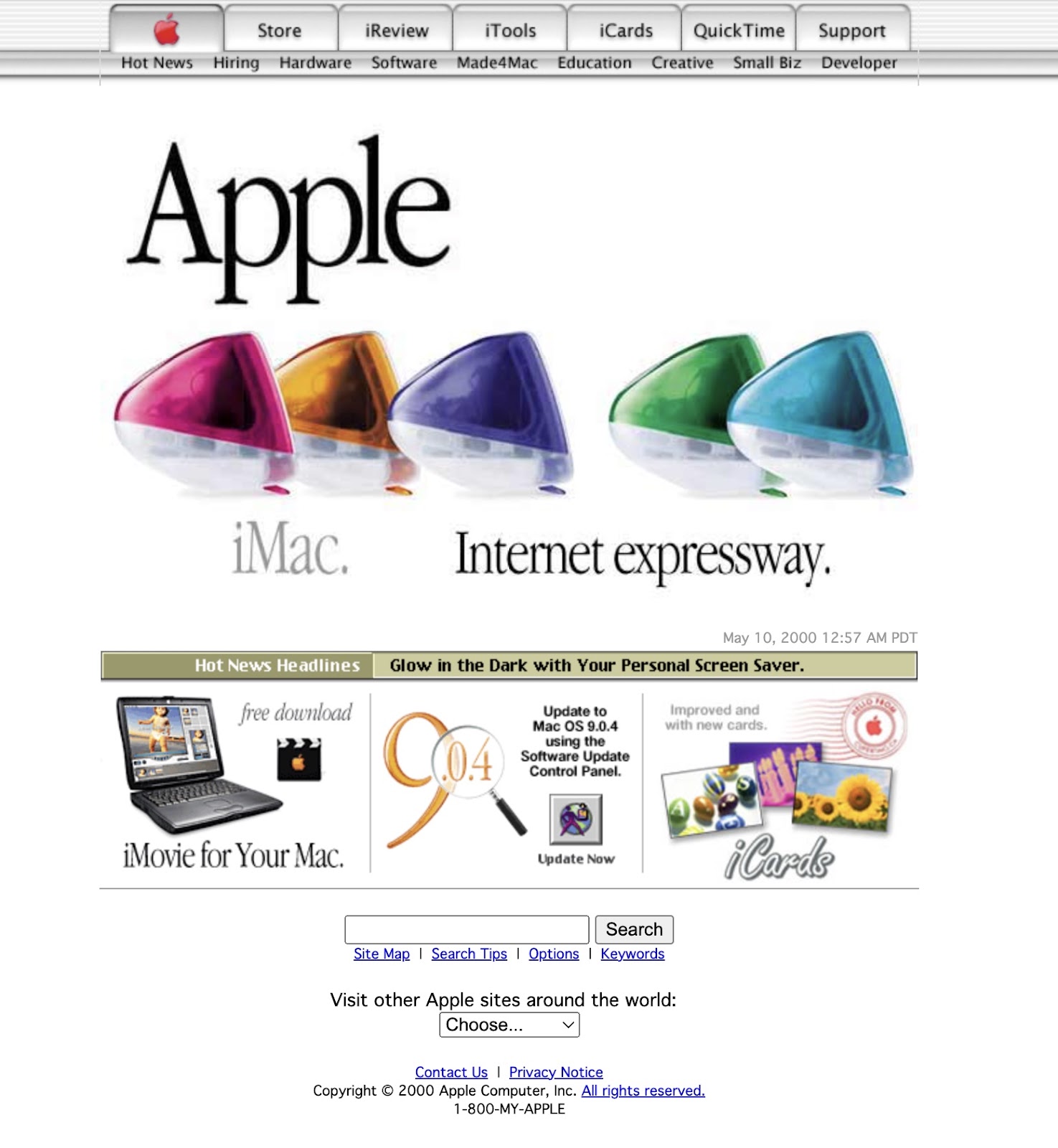
The homepage above is from May of 2000, featuring colorful, translucent iMac desktops. As you can see, many of the hallmarks of the last design remain: content is centered and “Hot News'' is still rotating in.
But there’s a new navigation bar at the top of the page. The arrival of tabbed navigation — a navigation bar that mimics physical folder tabs — was huge because it influenced so many other websites during the early 2000s. And while the tabs didn’t last past the 2010s, the top navigation position is still extremely common in website design, and remains the navigation position Apple uses to this day.
It’s worth pointing out that through the 2010s, the hero images on Apple’s homepage were usually rasterized — text baked into the image — and not friendly to web accessibility. But using alt text for images (which Apple did do) was a way to make this content more accessible.
iPod and design system consistency
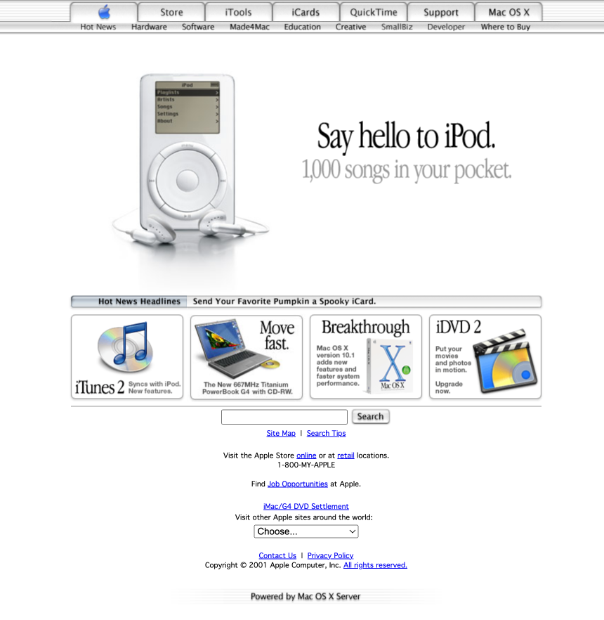
When the iPod launched in November 2001, Apple’s influence on modern design really started to gain traction. Colorful commercials with silhouettes dancing and pithy copywriting made Apple stand out in the advertising world. Another notable thing about this era of Apple’s homepage is that the presence of their design system was palpable. The search button and “Hot News” bar matched the style of the navigation menu.
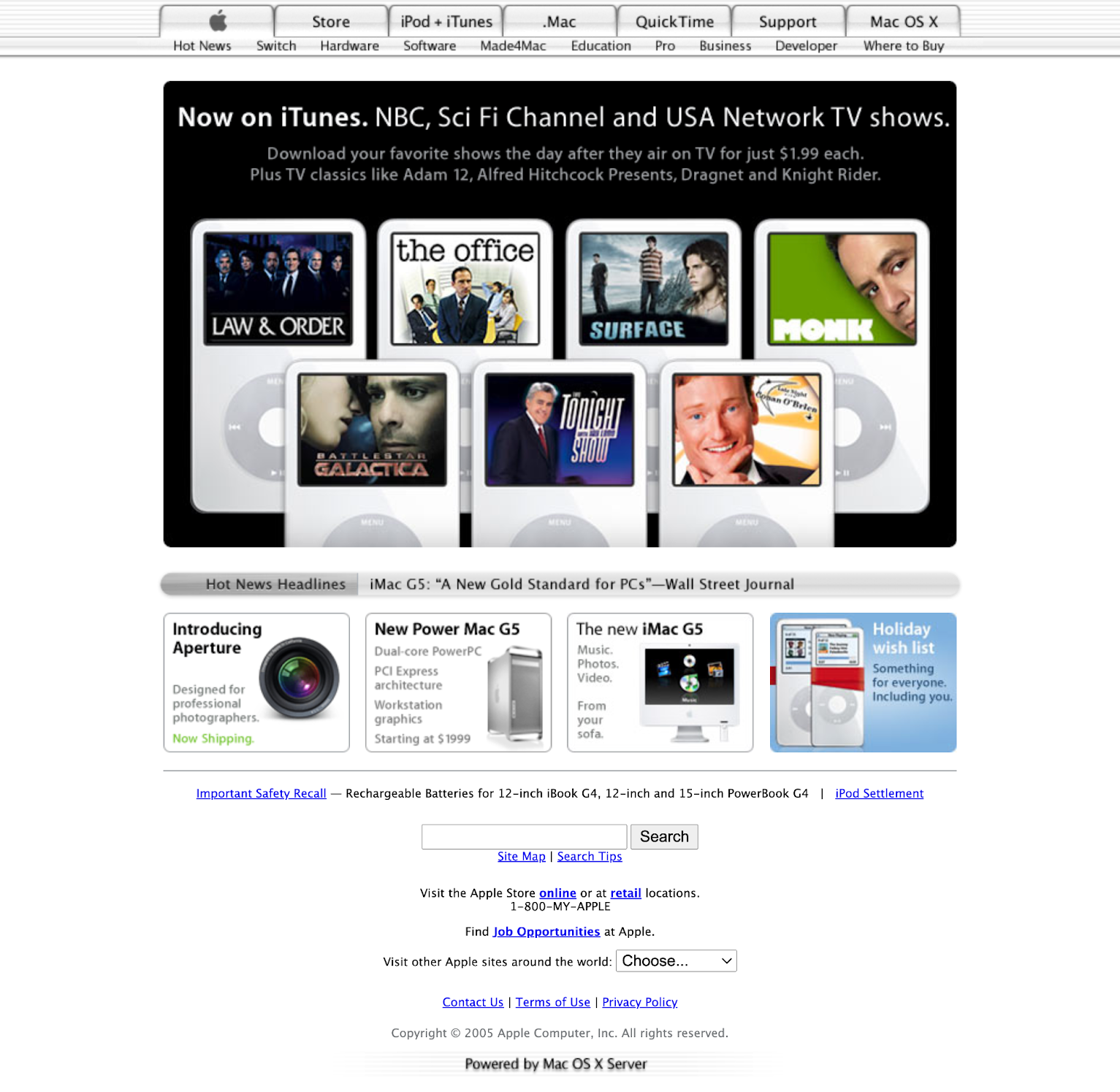
The end of 2005 marks the beginning of the end for “Hot News Headlines” consistently being on the homepage — it’s sunsetted starting in 2006 (but gets added back for a bit towards the end of the early aughts). By this point, people didn’t need media headlines to convince them how amazing Apple products were. Apple had established its presence in the design and tech worlds.
iPhone, OS X Leopard, and a new navigation style
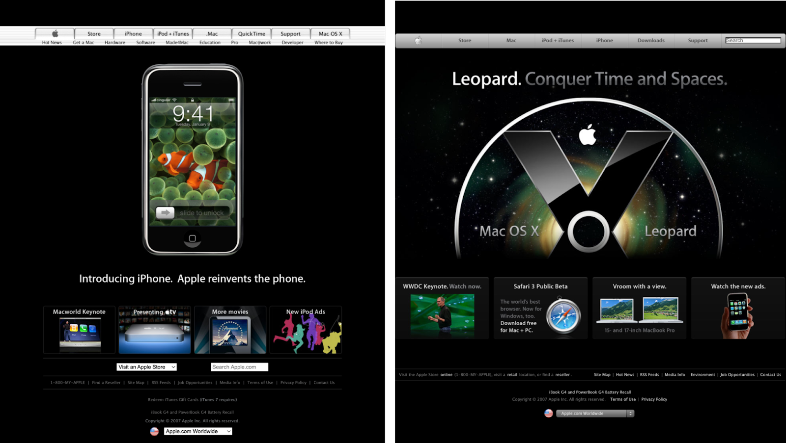
When the iPhone was introduced at Worldwide Developers Conference (WWDC) in early 2007 (the homepage on the left), Apple.com used a dark background for the announcement. The dramatic color shift forced you to focus on the iPhone at the center of the screen.
But notice how the white navigation sticks out in contrast with the rest of the page. By the time Mac OS X Leopard came out in June 2007 (the homepage on the right), the navigation had gone gray and icons were more skeuomorphic — where interfaces are intended to mirror real life objects. This began a great era in Apple’s design history, with icons like Safari’s becoming a realistic-looking compass, or iMovie’s looking like a camera slate.


Need creative inspiration, like, every week?
Join more than 800,000 people getting the best, coolest, and latest in design and no-code each week.
MacBook Air and CTAs in the hero
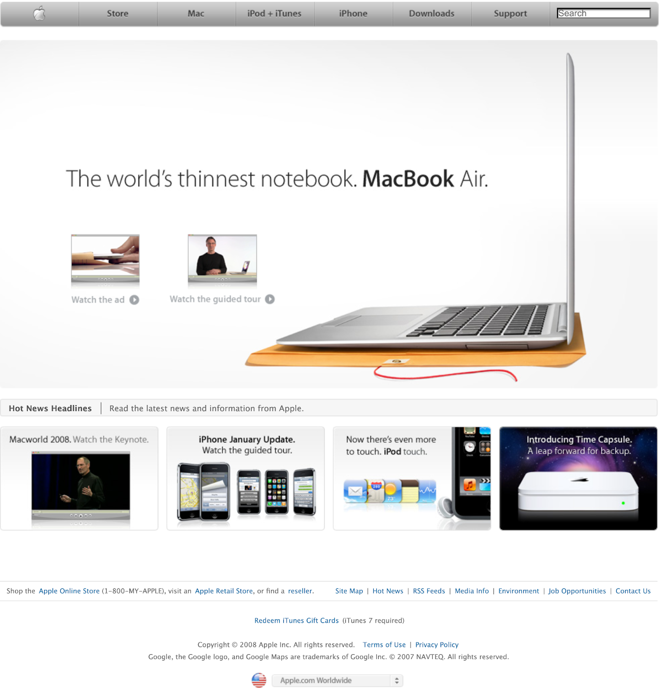
At the beginning of 2008, Apple introduced the Macbook Air, and with it, one of our favorite commercials they’ve ever produced. But notice how this homepage uses a practice Apple had been doing for quite some time in their heroes up to this point: the dual calls-to-action (CTA). These links point you to watch the commercial or to follow the guided tour, and sometimes clicking the actual image in the hero would take you to another page entirely — like a product overview page. It’s a strategy designed to get a lot of mileage out of limited screen real estate and one that Apple does superbly well to this day. The page doesn’t feel crowded, but the website visitor has a lot of options to explore.
Apple.com in the 2010s
iPad’s dramatic entrance
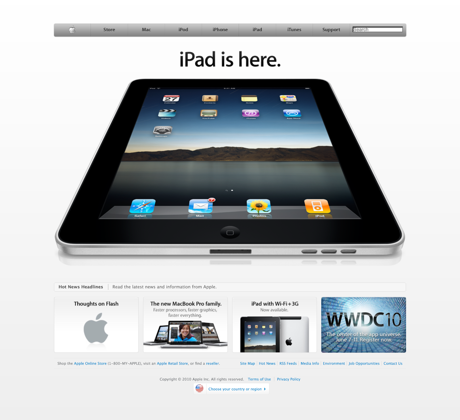
The announcement of the iPad in April of 2010 was a dramatic moment for the company — cementing its new product category of tablets. Opening the homepage with this perspective shot only enhanced the intrigue. Apple’s hero wasn’t confined to a specific size, so they could show the iPad at an angle, showing visitors that it was clearly larger than an iPhone.
The death of Steve Jobs
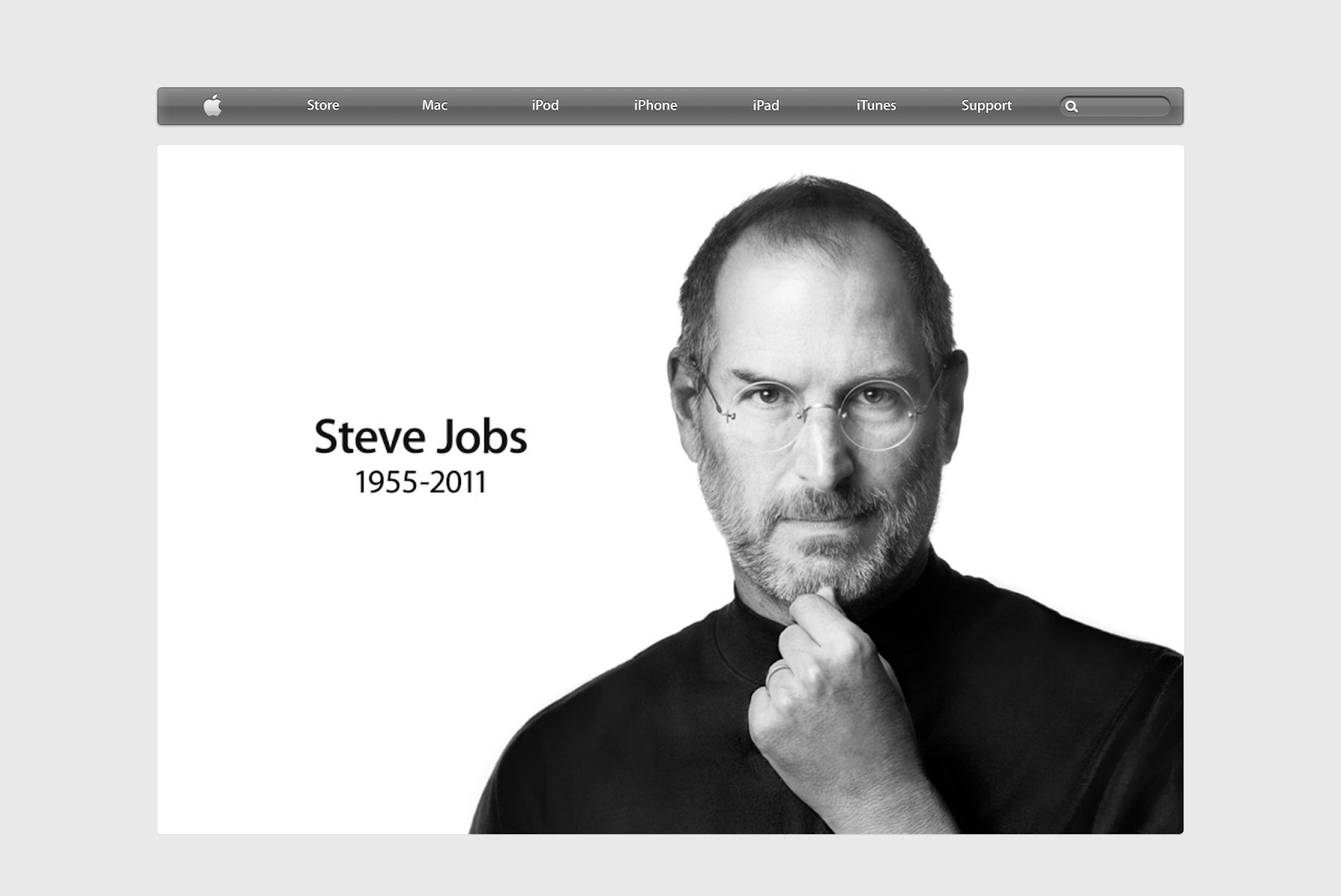
When Steve Jobs passed away in October 2011, many organizations and people put out tributes — but none were as simple and impactful as Apple’s. This iconic photograph was the only image on the page and it linked to this memorial site, which features messages from people who were inspired by him and his work.
Flat design enters the chat with iOS 7
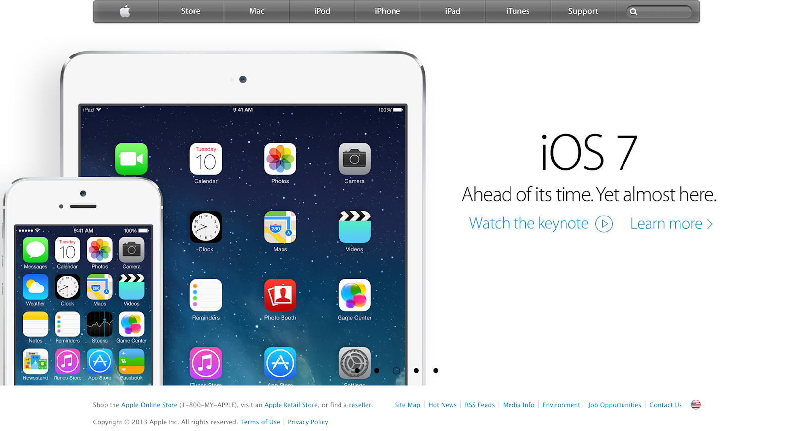
With the arrival of iOS 7 in September 2013, Apple took several new directions with their homepage. First up: a flatter design that was more minimalist and a slightly abstracted take on skeuomorphism. Flat design is distinctly two-dimensional and tends to feature bright colors that grab your attention. This design shift was a precursor to the short-lived neumorphism trend, which is essentially a hybrid of skeuomorphism and flat design.
Secondly, there was a change in typography to Helvetica, which would be replaced by Apple’s own San Francisco typeface just three years later after people complained about thin Helvetica fonts.
Lastly, the whole page was a carousel, which auto advanced through several full-page experiences. While it may not have been the most accessible practice to use only a carousel, it gave every announcement the chance to have center stage. This wasn’t a layout Apple used often on their homepage, so while they abandoned it soon after, they still use carousels as smaller components on occasion.
Flat nav, thin gutters
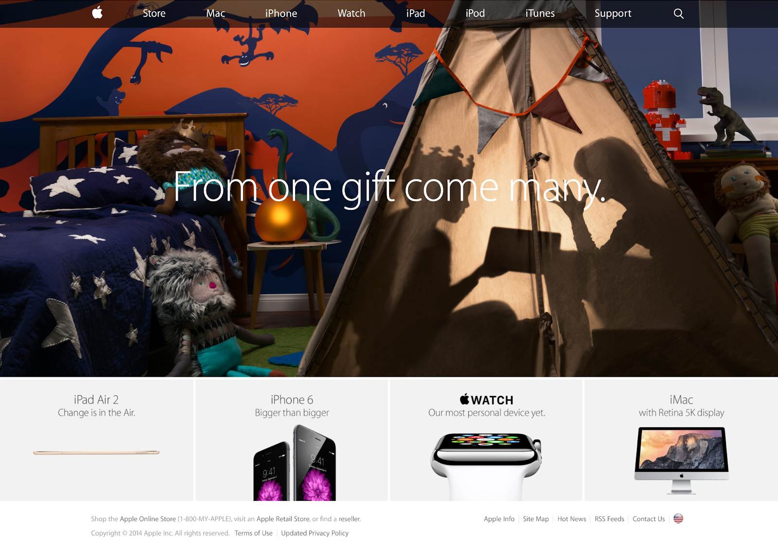
By 2014, the navigation on Apple.com had gone fully flat. Here, we can also see a time when they played with navigation transparency so you can still see the rich image behind it. The sub sections were expanded and the gutters between were reduced to a thin width. With busy photography, this could have felt chaotic, but with Apple’s restrained approach, the effect is one of elegance and order.
iPhone X changes the game
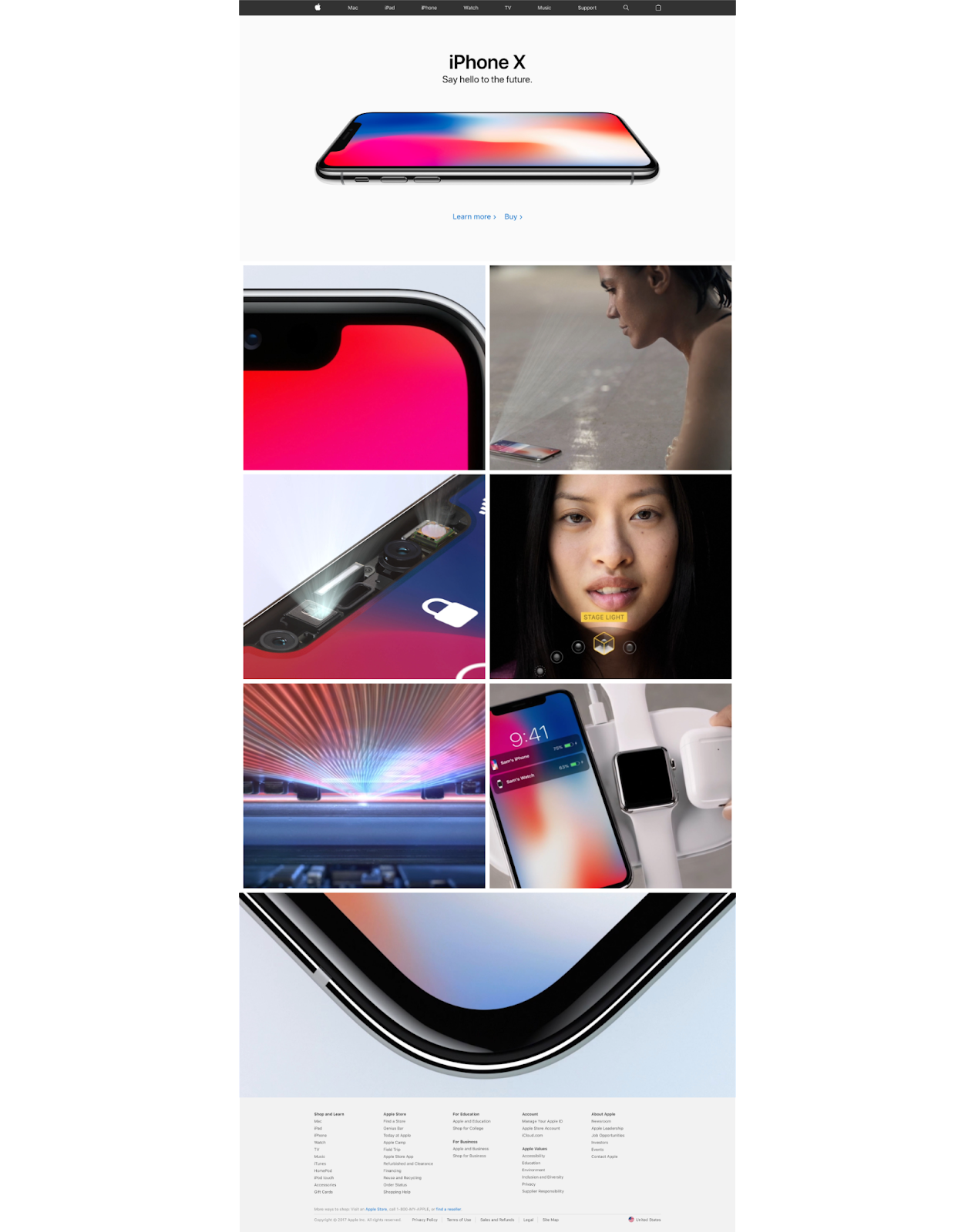
When the iPhone X entered the arena in November 2017, Apple tried something very different. That pattern of a hero and three to four tiles below it? Gone. The whole page was devoted to the iPhone X and product photography. The hero had one shot, a heading, a subheading, and two links.
The page was elongated and contained boxes that spotlighted distinct iPhone features. Hovering over the boxes revealed the feature names and the boxes worked as jump links to specific sections on the product overview page. The shot of the beveled edge at the bottom of the page was actually a video that played upon hover or allowed you to click to watch the fully guided video.
Apple.com in the 2020s
The war in Ukraine
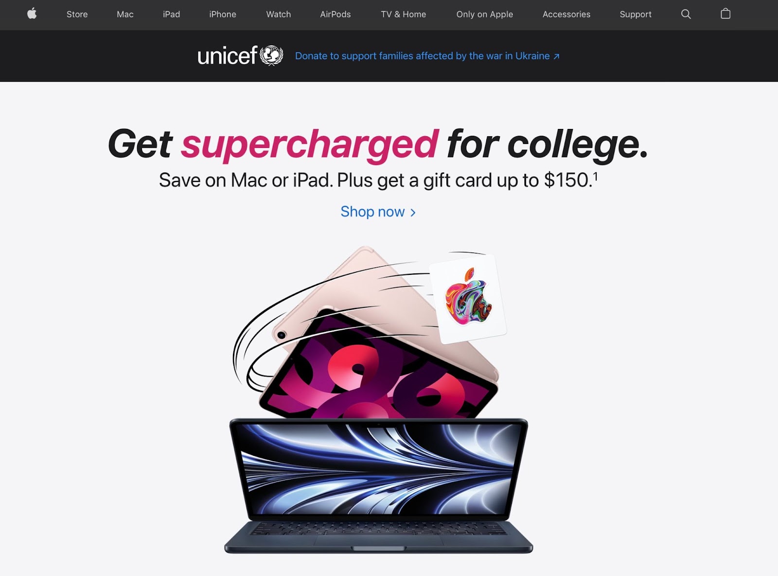
Today, the Apple.com homepage features a navigation full of Apple’s most popular products — from phones and computers to the Apple Watch and AirPods. The heroes often mirror campaigns running on TV and in an Apple store — like this one featuring a back to school campaign.
In March 2022, they began showing a banner right below the navigation menus that asked folks to donate to Unicef to support families affected by the war in Ukraine. This came right as CEO Tim Cook also encouraged the company’s employees to make donations that he would then match.
Below the hero are the now familiar tiles as the page extends. At the bottom, a carousel rotates through Apple TV+ originals (we personally can’t wait for the next season of Severance).

iPhone 14
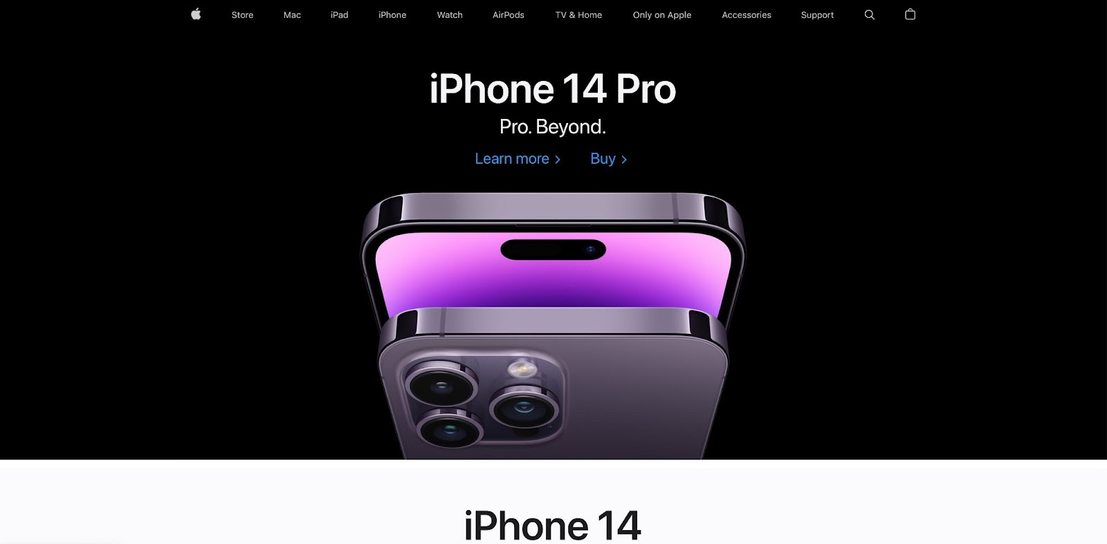
When the iPhone 14 was released in September 2022, a dark purple device with shiny edges took over the above-the-fold section of the Apple homepage.
The “learn more” page for the iPhone 14 matches the homepage’s energy with up-close images of the sleek new device, smooth animations showing off the functionality, and scroll-triggered gradient effects that change the color of text or the background.
The last time the latest iPhone took up this much homepage real estate was back in 2017 with the release of the iPhone X. For three generations of iPhones, the focus was on refinement and improvement rather than major changes. But iPhone 14 marks the beginning of a new era with major upgrades including camera improvements, advanced safety features, and Dynamic Island.
Apple describes Dynamic Island as “a truly Apple innovation that’s hardware and software and something in between.” This upgrade enables users to see apps, notifications, music, and more all in a small fixed widget at the top of the home screen — explaining why Apple introduced Dynamic Island as “the new face of iPhone.”
Apple excels at setting trends
Whether you’re an Apple enthusiast or not, there’s no denying this brand’s influence in the design world. From the physical storefronts to the online homepage, Apple is meticulous about its visual appeal. And anyone who’s seen the text bubbles in group chat turn green after the addition of a new member knows — aesthetics matter.


