The best 404 pages make the most of an unfortunate error.
Rather than sticking to the standard “page not found” messaging, savvy web designers use 404 error pages to showcase a bit of the brand’s personality, deliver a laugh, or even entertain us with a mini video game.
Thoughtfully designing a page that only shows up when things go wrong may seem pointless, but it’s actually a chance to keep visitors engaged. So before you add a basic “oops, page not found” message, take a look at some of the more imaginative examples I’ve stumbled upon.
Funny 404 pages
These lighthearted and playful 404 pages soften the blow of clicking on a broken link by charming lost visitors with a touch of humor.
Thomas Bosc
Content manager Thomas Bosc has a thoughtfully designed site with scroll-triggered animations, gorgeous visuals, and past projects that showcase their web design skills. Perhaps that’s why landing on this basic page with a childhood photo of a hopeful wizard made me truly laugh out loud.

This 404 page has a little surprise, too. When clicked, young Thomas flies away to reveal text “404” and a link back to the homepage.
Polo Garcia
Designer Polo Garcia catches us off guard by taking us from a clean, contemporary site design to a grainy animation of a waterskiing squirrel on his 404 page.

Even the squirrel eventually turns to look at the screen as if it’s asking site visitors — what are you doing here? Polo delivers a laugh but keeps the user experience fluid by including an obvious “take me back home” button.
Shalom Osahon
Product designer and Webflow developer Shalom Osahon reminds you not to panic and likens a 404 page to a fire drill.

The accompanying gif is a compilation of hectic scenes from an episode of The Office, providing a good laugh (and example of what not to do) before directing you back to the homepage.
404 Errventure
Beyond Agency turns a page error into an adventure — or as they call it, an “errventure.”
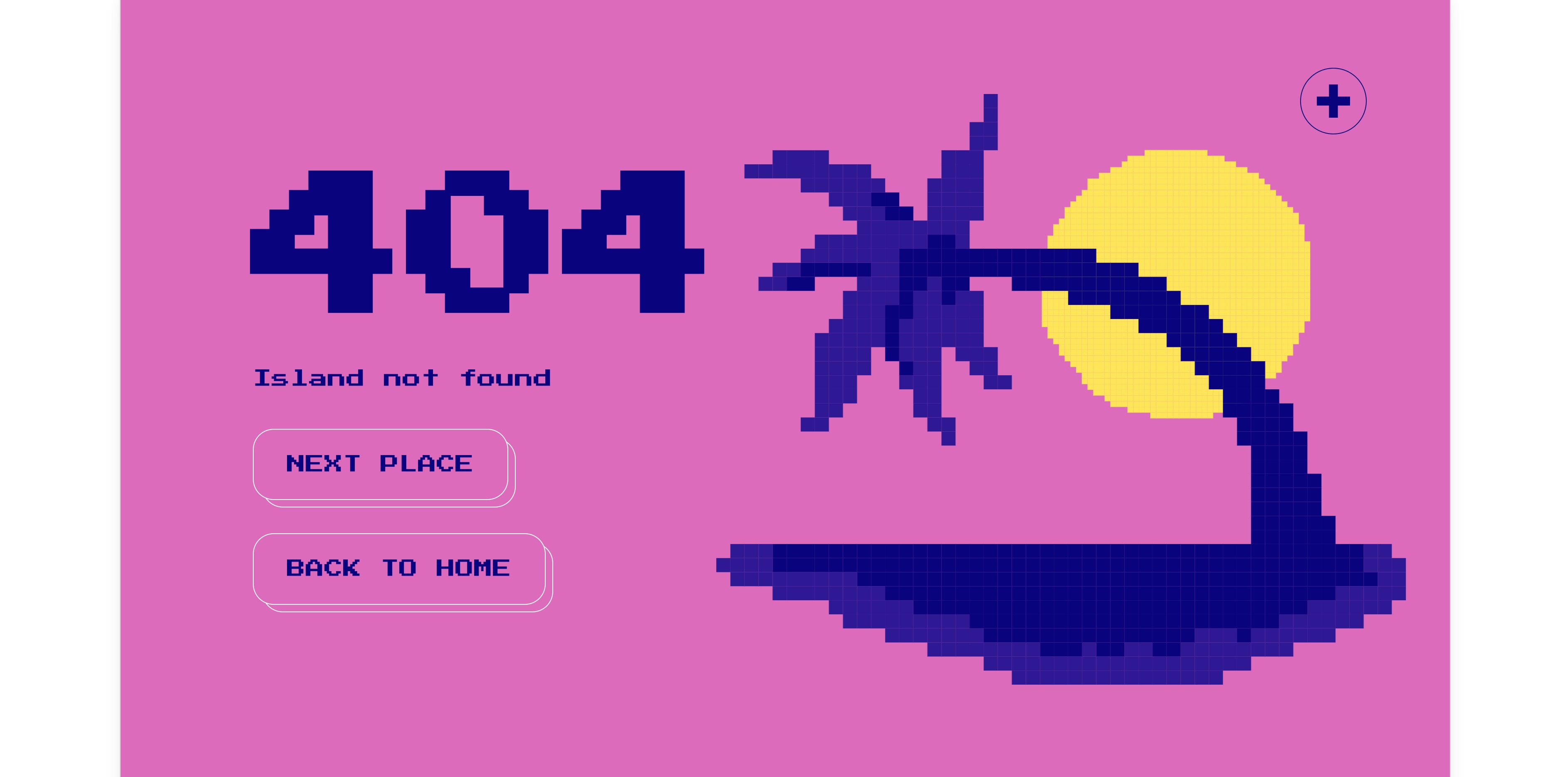
This design leans into the joke by providing a “next place” button in addition to the link back home. Each time you click on “next place,” you’ll see a new retro design with a pixelated illustration and the option to go home or continue on your “errventure.” You’ll cycle through error messages like “Island not found” next to a palm tree, “We can’t seem to find the page you’re looking for” in a dark forest with moving eyes, and “ba ba ba something went wrong” with bouncing sheep.
Creative 404 pages
Who said 404 page design had to be boring? These error pages stand out with more imaginative designs.
Textio
If we get lost on Textio’s website, we’re greeted by the Unicorn of Missing Pages.

Seeing as Textio is an augmented writing tool, it’s nice to see them play around with words on their 404 page. Bonus points for working the link back to the homepage into some philosophical advice from the unicorn.
Dribbble
Dribbble makes clever use of their 404 page by nudging us towards designs categorized by color rather than sending us straight to the homepage.

Dribbble exists to showcase design work, so it’s cool to see them embody that mission with their 404 page. From here, we can either select a color we’re interested in or use the search box to look for a specific design or designer. Both options put the focus on eye-catching design rather than Dribbble as a brand.
DFY
Rather than “page not found,” DFY’s 404 page pairs “design not found” with an astronaut who is slowly floating away.

DFY adds to the drama by telling us not to let go as a timer counts down from 10 seconds before automatically navigating back to the homepage.
On-brand 404 pages
Generic 404 pages can be jarring because they feel like the brand is breaking character, taking us out of the site experience. If your brand is all about maximalism and your error page uses minimalist design, you’ll further confuse your lost visitorsThese 404 page examples showcase brands that extended their signature voice and style to their error messages.
D&D Beyond
D&D Beyond speaks directly to their Dungeons and Dragons-loving audience with an error message that claims a halfling may have stolen whatever website visitors are looking for and hid it in another realm.

Both the illustration and accompanying message keep us in the D&D world. We may have stumbled onto a missing page, but we have clues and tools to work past this obstacle. In this case, those tools are page features such as the menu and search bar along with footer links.
Spotify
Spotify hits us with an error message that sounds like a playlist, “404s and heartbreaks,” next to a spinning record.

Spotify keeps the main navigation bar at the top of the page and includes links to helpful resources in the error message. No one aims to land on a 404 page — unless you’re collecting them for an article, of course — so pointing people to FAQs is a nice touch. It’s the difference between hitting a roadblock and seeing signs for a detour — one is a deadend while the other is an alternate route.
OK Micah
If we get a little lost on OK Micah’s site, “the hot man” will gently guide us back home.

OK Micah keeps their voice and style consistent with quippy copy and a sassy dude wagging his finger at us. This landing page also maintains the top navigation bar and footer, wrapping the error page in a familiar frame.
Color of the year
Pantone’s color of the year web page keeps the theme going with their error page by using Pantone 404 C as the background color.

It’s a simple error page for a straightforward website. There aren’t extra page features cluttering the landing page either — just a small circle cursor that expands to highlight the “main” button when we hover over it.
Build completely custom, production-ready websites — or ultra-high-fidelity prototypes — without writing a line of code. Only with Webflow.
Build completely custom, production-ready websites — or ultra-high-fidelity prototypes — without writing a line of code. Only with Webflow.
Interactive 404 pages
While many 404 pages focus on getting lost visitors back to the homepage, these landing pages use engaging website design to invite you to stick around.
Kualo
Kualo delights us with a branded version of the old school video game, Space Invader.

Instead of using the immediate call to action (CTA) to send us back home, Kualo challenges us to take revenge on pixelated space invaders that spell out “kualo.” This fully functional game is an entertaining surprise. We can keep playing until we run out of lives, at which point a “you lost!” message appears. But once again, Kualo reels us back in — promising a discount on their hosting for anyone who can score over 1,000.
Nouvelle
Nouvelle also serves up throwback with a grainy control console with a thick blinking cursor on their 404 error page.

The control console prompts us to use the “help” command, then offers four additional options. We don’t want to spoil the surprises, so just trust when we say that trying out the “trex” command is worth it. It’s clear that the web designer behind this error page loves memes, easter eggs, and general silliness. Try some unscripted commands in the control console and you’ll see what we mean.
Feldman Studio
Before you click, you might want to prepare yourself — Feldman Studio’s 404 error page gives you just 3 seconds to get ready to play.

After the countdown, the page design comes to life as an old school game of snake. The line below 404 becomes the snake that chases the period. Each time you gobble up a dot, the 404 counts down. If you want to see what happens when it hits zero you’ll just have to eat 404 little dots without mistakes — good luck!
MAD
Anyone who loves popping bubble wrap will enjoy MAD’s 404 page. Instead of bubbles to pop, this error page spells out 404 in with toggles we can flip on and off to either erase the number or spell out our own message.

It’s a simple but enjoyable user experience. We can choose to interact or use the menu at the bottom of the page to navigate to other parts of the website.
Kffein
Kffein’s 404 page design serves up “I can haz cheeseburger” internet cat vibes with a shower of cats in bubbles falling and bouncing around.

The interactive aspect comes in after the cat bubbles settle into the bottom of the page. From there, we can click and grab the bubbles to toss them around. Each time you click, a recording of a human imitating a cat plays and if you fling a cat off the page, it eventually falls back down.
Cloneable 404 pages
If Webflow is your website builder of choice, get a head start on your error page design with these cloneable 404 page templates.
The Asset
The Asset by NoCodeMachine features a 3D cube made of rainbow-colored 404s.

The cube shifts as it follows our mouse cursor and the big, white 404 bounces slowly up and down. This template also includes a basic menu at the bottom with spots for social media accounts and a homepage.
Playing around with animation
Benjamin Le Goff’s 404 page template announces we are lost in space with the message, “oops, the spaceship left without you…The page you requested could not be found.”

Ben includes a surprise scroll-triggered animation — when we scroll down the message disappears and the stars rearrange to form a 404 constellation.
404 Splash Games
Limeknight shares a cloneable 404 page design that includes two classic games — breakout and snake.

The “404 not found” sign shakes as if the door it's hanging on was just slammed shut. It’s an uncomplicated but charming design with a single link pointing us back home. And thanks to the plain design, this 404 template would work well on a variety of websites.
Don’t neglect your 404 page
No one aims to drive traffic to missing pages, but site visitors are bound to encounter a 404 error eventually. Think twice before grabbing a standard “page not found” template, because a well-designed 404 page can be the difference between a frustrating user experience and an engaging one.