Designing an original website helps you stand out from the competition — but it’s easier said than done.
Your homepage is the first thing site visitors encounter, so it needs to make a good first impression — but following modern design trends while keeping the user experience familiar and intuitive can be challenging.
Striking a successful balance between originality and reliability is a testament to a truly innovative website design. Learn how to push the envelope and use creativity for both functionality and flair with these sources of creative website inspiration.
What makes a website creative?
Creative websites try to incorporate new elements that other websites don’t have or add unexpected details to traditional elements. A lot goes into building a memorable website — unique typography, a consistent color palette, and the practical use of whitespace, for instance. Balancing all of those things with functionality requires ingenuity and an eye for detail.
Thinking outside the box is great, but a creative website won’t be effective if it doesn’t serve a purpose — or if it’s not accessible to the widest audience possible. So, use your imagination to create an engaging yet practical website.


Build websites that get results.
Build visually, publish instantly, and scale safely and quickly — without writing a line of code. All with Webflow's website experience platform.
5 creative websites to inspire you
Whether you're the owner of an e-commerce website, a budding freelancer making a portfolio, or a design agency hoping to add something new to your next project, one of the best ways to find web design inspiration is by exploring existing sites.
Luckily, you don't have to spend hours scrolling through Behance or Dribbble for ideas — we've compiled five creative website designs to help spark some ideas.
1. Shadow Creative Studios

Design agency Shadow Creative Studios’ website is full of elements that direct the viewer's attention to relevant calls to action (CTAs). It elevates popular design with a modern style for a minimal yet creative website.
What really stands out is how the hollow circle cursor interacts with the user interface (UI). It changes color as you scroll over photos and fills with a solid color when you hover over links. The circle also turns transparent when hovering over text to avoid obscuring information.
Shadow Creative Studios also mixes font styles to add variety and emphasize meaning. Some words are bold, while others have a colorful shadow to draw attention. The site also takes its audiovisuals to the next level with gifs and animated thumbnails to add visual interest.
This website combines lots of smaller elements for a smooth design that’s both creative and functional.
2. N8BM Wien

Vienna-based social initiative Nachtbürgermeister Wien, stylized as N8BM, has a colorful and interactive web design with a dark-mode UI, meaning that web page design uses light-colored text on a dark background.
The website’s white header, “N8BM,” uses a unique display font that changes color as your cursor hovers over each letter. You’ll find the same colors — shades of red, green, blue, and purple — in decorative squares, crosses, circles, and triangles across the website to show off the color palette and decorate the dark background. As you scroll through the site, hovering over text boxes causes them to animate, whether that’s adding a border or revealing more text underneath. This prevents the site from overwhelming a user with information but means visitors can read more without leaving the homepage.
N8BM’s website pairs minimal style with subtle movement to catch your attention and entice you to interact with each element, almost as if playing a game. This navigation style offers some really creative elements worth drawing from for your next project.
3. Appart Agency
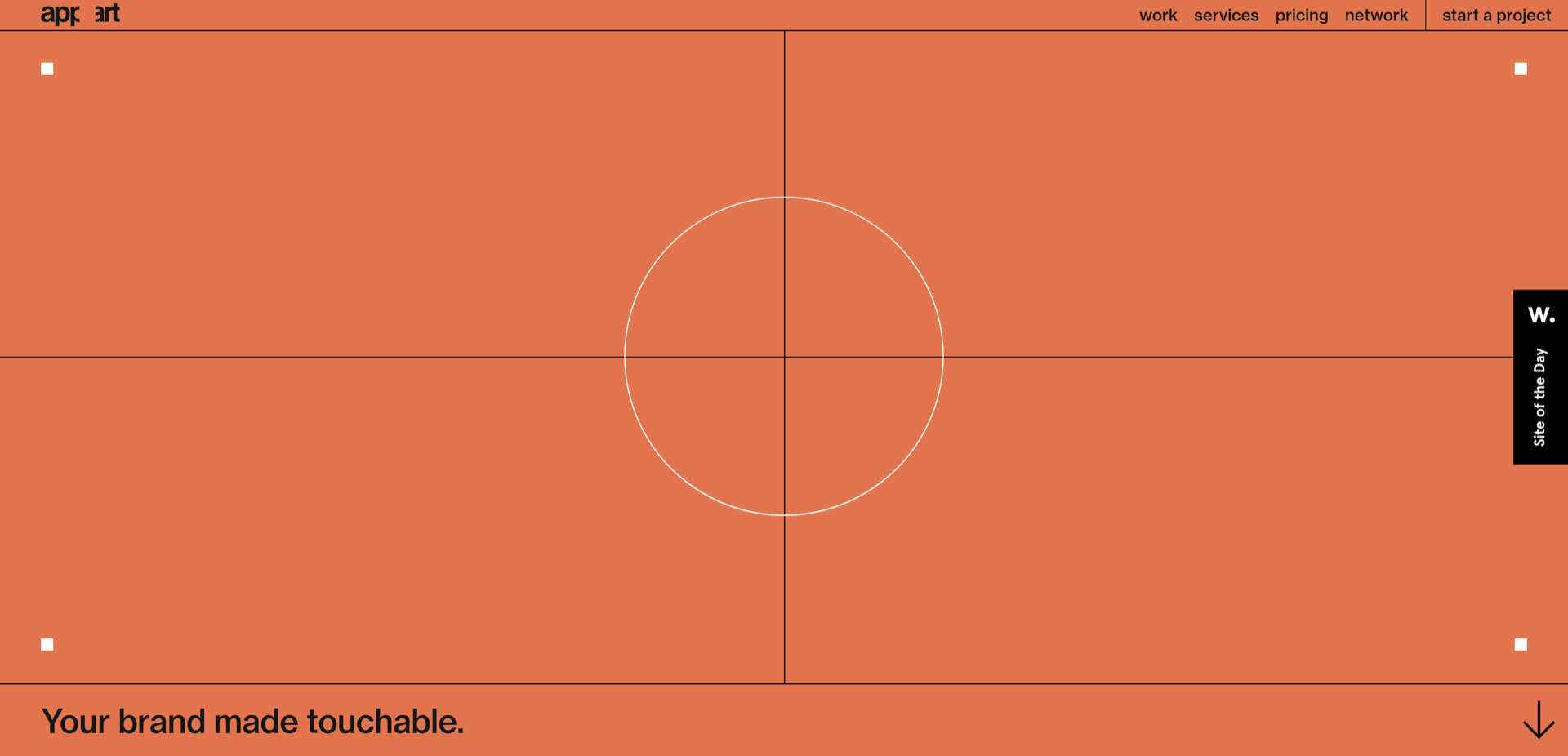
The website for Belgian web design agency Appart greets you with an animation of five centered circles that react to your cursor, animating the background as you click from page to page.
Appart’s website is divided into four main sections: work, services, pricing, and network. As you move between the sections, the navigation text in the top right corner changes colors. The highlight effect is a subtle but effective way to indicate which section you’re looking at without distracting from the content.
Throughout the site, you’ll find creative website header inspiration such as oversized typography introducing sections and animated headers that mimic the loading animation. We also love the contrasting shapes in the site design. Each section is split into rectangles, while the background animations and cursor remain circular. These elements guide visitors through the site without complicating the experience. Rectangles are static and circles are dynamic, creating a cohesive and intriguing experience.
4. Yes Yes
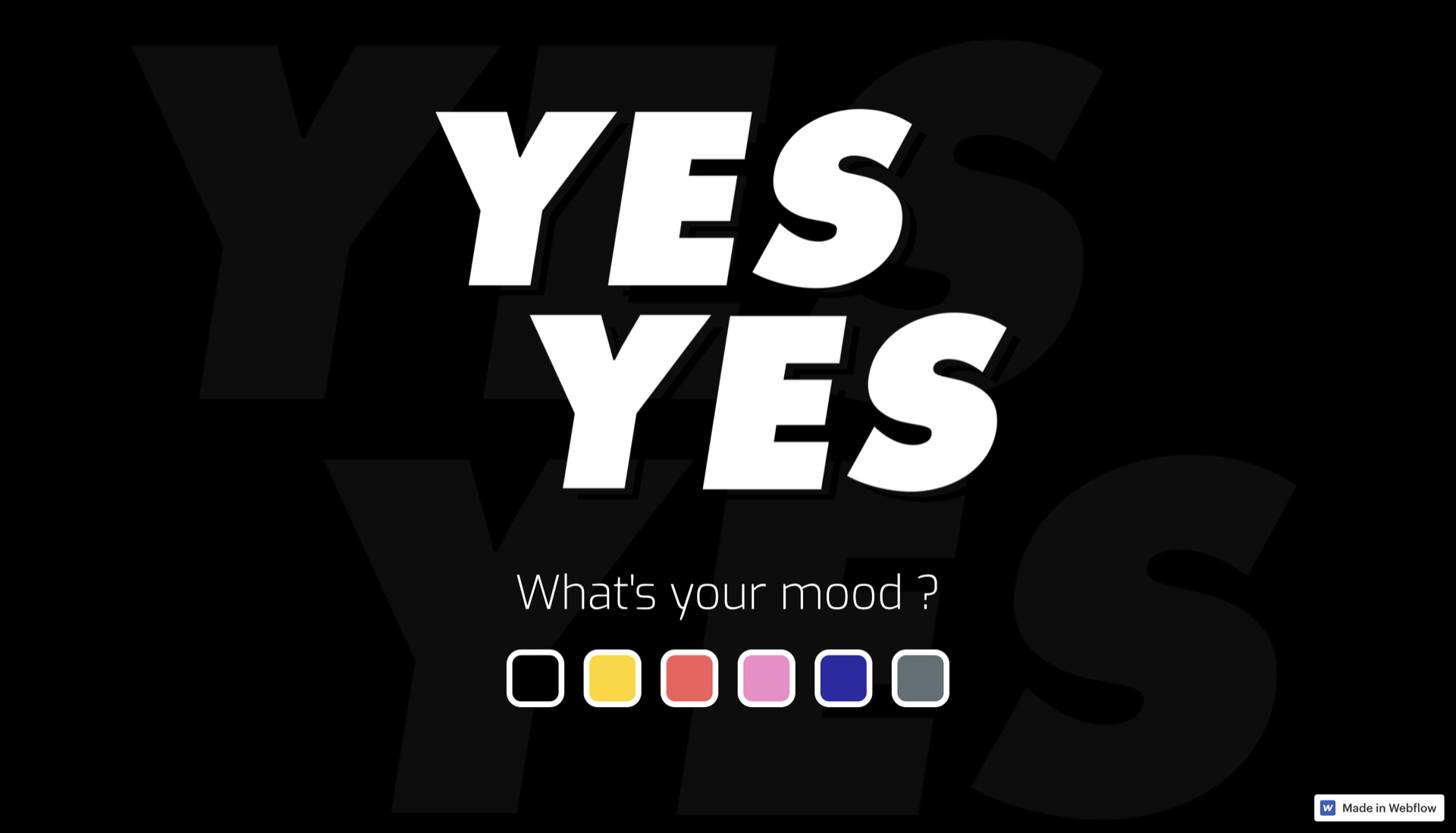
Yes Yes sets its creative tone with a question: What’s your mood? On the landing page, you can choose one of six colors. Each brings a different theme as you scroll through the portfolio.
Black, the automatic website color, follows a minimal aesthetic with a grayscale color theme. Yellow maintains the same design in more vibrant colors. Red offers a little more humor with an interactive version of the “Batman slaps Robin” meme.
Choosing pink starts a love-themed user experience, complete with hearts and a handwritten love letter. Blue, in contrast, brings bolder typography with the words “DA BA DEE” to reference the famous Eiffel 65 song, “Blue.”
Finally, Yes Yes’ creativity blossoms with the gray theme, where a rain animation makes the site feel gloomy and dull. Scroll and the website says: “Life should be colorful. Go back and save the day.” A clickable “Be an optimist” button starts a quick game — when you win, the website adopts a rainbow gradient.
We love how Yes Yes uses color, humor, witty throwbacks, and interactivity to evoke human emotions. The website is fun and engaging, with an excellent combination of functional portfolio pieces and creative elements.
5. Juancho Jack
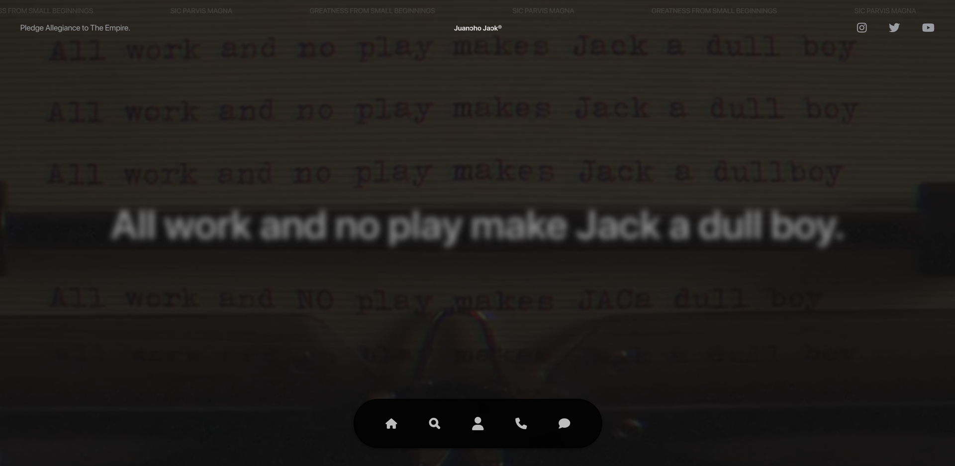
Juan of Juancho Jack is an executive producer, music video director, and web designer. His creativity shines through on his website, starting with a looping video and quote from The Shining, “All work and no play make Jack a dull boy.”
The opening animation combines Juan’s cinema and web design specialties to show his interests and talents. The rest of the website follows a minimalist approach with solid-colored backgrounds and sans-serif fonts. The film clip adds a boost of creativity to set this simplistic website apart.
With a one-page website, Juan includes a portfolio, a list of skills, and contact information with a cinematic twist. Mixing work and play in this portfolio shows Juan’s design abilities are anything but dull.
Conquer your creative block with more design inspiration
With so many creative websites out there, building something unique is challenging. You have to keep it functional and in line with your brand, all while attempting to stand out from competitors. If you’re still feeling stuck, check out our tips for overcoming creative blocks or browse more designs Made in Webflow.


