

Contact page design should be a priority, not something you throw together at the end of the design process.
Contact pages are where site visitors go when they’re ready to take the next step, but webpage developers often overlook contact page design. In some cases, this leads to dull, off-brand designs that don’t match the rest of the website. Other times, creators overwhelm site visitors by leaning too far into modern design trends like custom typefaces, enthralling animations, and immersive interactions.
The best contact page designs follow the branding and style of the rest of the website and make it easy for visitors to get in touch with the business.
Let’s take a look at a few contact pages and explore what makes the designs effective.
5 contact page designs to inspire you
Every business website needs a contact page that groups key information in one place.
These pages give site visitors an avenue to ask questions, request information, and follow the company’s social media accounts. For some businesses, contact pages may also include physical addresses, live chat, or an option to sign up for a newsletter.
The goal is to create a page that aligns with your business. A contact page for a restaurant with multiple locations might point people to the address and phone numbers for each location. A contact page for a portfolio site, on the other hand, would likely prioritize an email or contact form over an address and phone number.
We’ve compiled a few examples to provide some contact page design inspiration for your website.
1. fryux
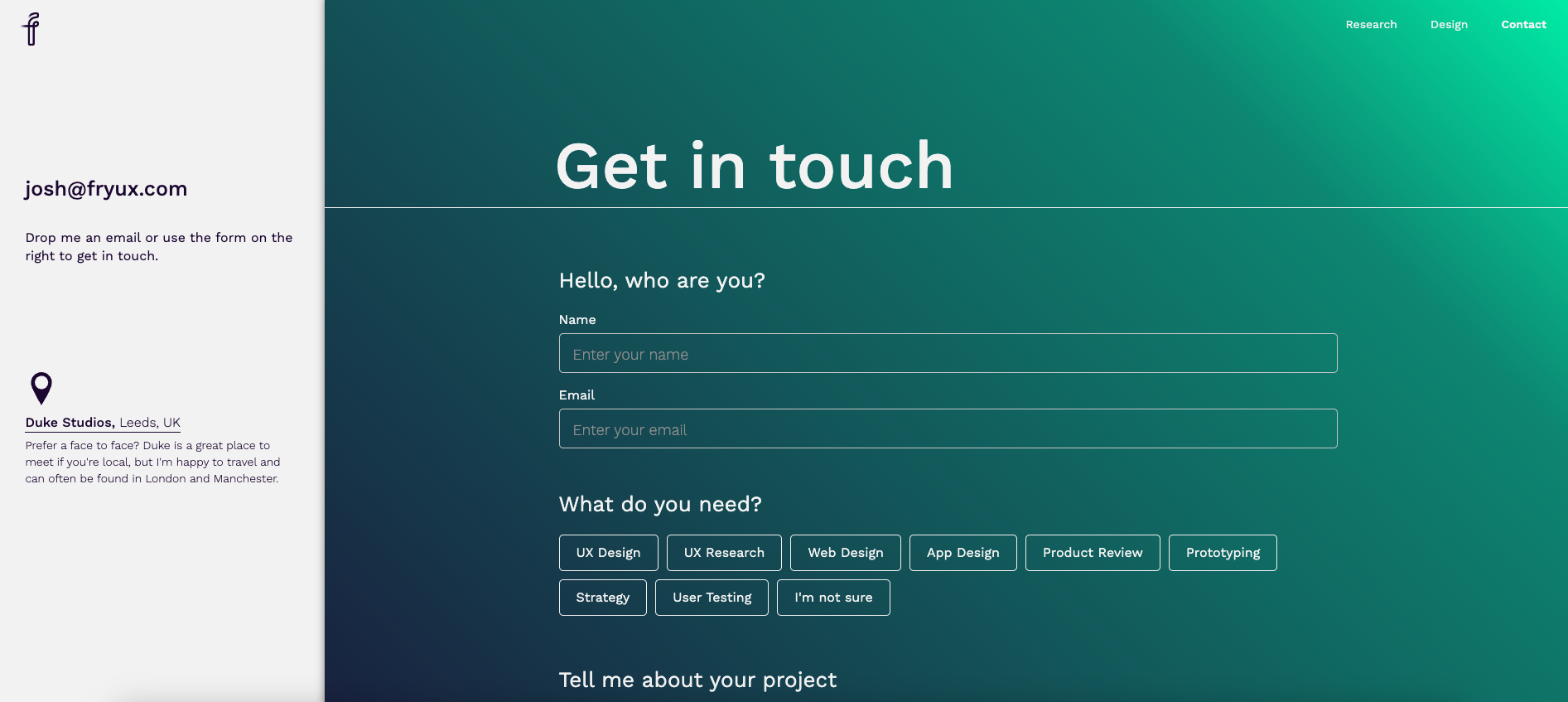
Joshua Fry of fryux offers freelance research and website design services. His contact page is split-screen, with an off-white background on the left and a cool-colored gradient on the right. We like this interface because it divides the page into two categories: the left side talks about fryux, and the right asks about the visitor.
Let’s start with the left. Joshua puts his email at the top of the section, with a brief call-to-action (CTA) asking visitors to get in touch. Clicking the address opens an email draft directly to Joshua’s email address and automatically populates the subject line, “hello.” The design aligns with Joshua’s welcoming brand identity while offering visitors a convenient line straight to his inbox.
Below this, Joshua offers the option to meet face-to-face at his coworking studio in the UK with a link to the office’s location in Google Maps. Offering in-person consultations adds a personal touch and shows Josh’s commitment to his craft. And by using an external link, Josh doesn’t interrupt his web design with a large map. The small location pin icon is enough to lead visitors right to it.
On the right side of the screen, a standard contact form asks visitors to fill in their name and email address. However, Joshua adds sections to encourage those reaching out to share more in their message: “What do you need?” and “Tell me about your project.” The former provides nine options in clean, organized boxes with predetermined topics like “Web Design” or “Strategy” to answer these questions. Everything is in front of visitors — all they have to do is choose.
2. SOSA Eyewear

The SOSA Eyewear website, designed by Oracle Studios, uses a minimalist interface for its Contact Us page design. A single font dominates the page text and navigation bar, and whitespace on either side of the contact form draws attention to the contact fields in the center. It becomes the dominant design element, letting visitors focus on what they want to say.
This contact page has a straightforward design, with a Contact Us heading and a “send” button. The clean lines, negative space, and rounded corner elements follow the principle of symmetry, adding balance and cohesion.
With a minimalist approach, simple color scheme, and symmetrical organization, this contact page offers a no-fuss way to get in touch.


Build websites that get results.
Build visually, publish instantly, and scale safely and quickly — without writing a line of code. All with Webflow's website experience platform.
3. Yummygum

Amsterdam-based digital agency Yummygum uses a hamburger menu that remains in the upper right corner of all pages within the site. From there, visitors can navigate to the colorful contact page that includes photos of the team and office as well as hover-based interactions on buttons and form fields.
The contact form is highlighted in a bright teal to draw potential clients. The heading — “We’re here to help you level up” — is in big, bold lettering, and a short paragraph with playful copy encourages visitors to talk with the Yummygum team.
Below the form, a short letter and smiling headshot from one of the company’s founders, Vince, introduces Yummygum’s services and tells clients they can email him directly. Introducing Vince puts a face to the company’s name, making the contact page more personable. There’s also a button to download the company deck, offering more context to the company’s history and function. This clever plugin lets visitors learn about Yummygum without cluttering the on-page design.
At the bottom of the page, Yummygum offers advice about something other than design: the agency's hometown, Amsterdam. A stylized map shows the company’s location in context with Amsterdam’s museums and parks. It also mentions Yummygum’s open-door policy — another way to contact the team. With personal recommendations for the city and a friendly, approachable tone, Yummygum’s contact page makes us want to send an email — or maybe book a flight!
4. Punch I.T.
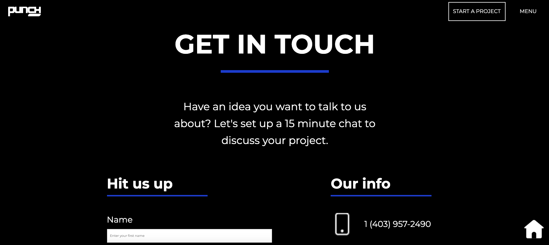
The “Start a project” button on Punch I.T.’s homepage takes you to the contact page. This is a great example of catering to your audience — “start a project” wouldn’t make sense for every business, but it suits a web design agency.
Founder Curtis Lipper invites visitors to use the embedded contact form to set up a 15-minute chat to discuss their project ideas. Curtis also includes a phone number and email address, providing visitors with multiple options.
Everything visitors need is above the fold, but Curtis includes something extra below the contact form. Scrolling down reveals an illustration of a paper plane by the “send” button, a quote from Curtis about his views on website design, and links to Punch I.T.’s social media accounts.
5. Ski Big Bear
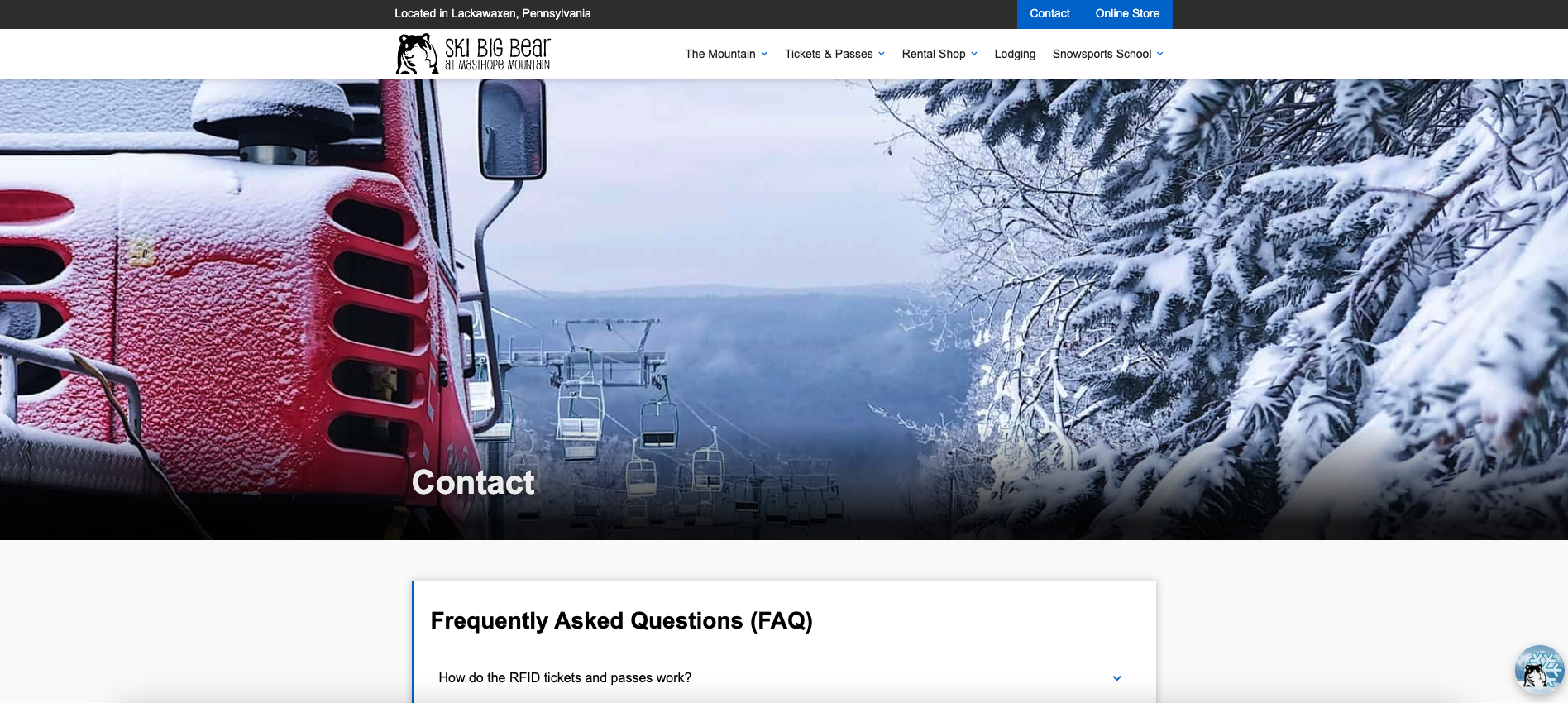
Ski Big Bear organizes winter activities at Pennsylvania’s Masthope Mountain. The contact page features a hero image of snow-covered trees and a gondola, which is a nice reference to the services.
On the contact page, Ski Big Bear puts a list of frequently asked questions (FAQs) above the contact form. Although this an unconventional approach — especially considering the FAQs also appear on a separate page — it’s a smart move for Ski Big Bear.
Addressing common questions like “How do I reserve a lesson?” and “Do I need to purchase a lift ticket?” before sharing the contact form is a great way to support visitors and avoid filling Ski Big Bear’s inbox with the same questions.
Build a contact page that fills your inbox
Contact page design is just as important as the rest of your website design. Try contact form templates and choose one that works for you, or seek design inspiration for your whole site.