

We’re used to the practicality of minimalism but not every design needs calm and order. When you want to be loud, maximalism is here to express your creativity.
Maximalism lets designers go wild with their imaginations. This design style is all about splitting from conventionality, ignoring boundaries, and indulging in creative excesses. While minimalism often provides safe and well-trodden paths through neutral web spaces, maximalism takes visitors on a wild ride through the unfamiliar and exciting. It embraces discord and incongruity to provide unique user experiences.
But how did maximalist design come to be in recent years? And how are different designers using maximalism? Let’s explore.
Skeuomorphism kept things (too) real
In the mid-1990s, much of web design focused on emulating tactile experiences with elements such as radio buttons and simulated textures like plastic, metal, and wood — connecting to users through their sense of physicality. This style of design is known as skeuomorphism.
The screenshot below shows what Jade Tree’s website looked like back in 1998. The independent record label’s website had all the hallmarks of skeuomorphism with its 1940s aesthetic. The site used shadows and vintage '40s typeface to give the illusion of a real-life Bakelite radio. The clunky interface may look strange to us today, but '90s web designers wanted to give visitors an experience that felt familiar.
We still see skeuomorphism in the 21st century. The clock icon on your iPhone, with its round face and sweeping seconds hand, is an example of skeuomorphism. Audio editing software like Pro Tools and Audacity pack their user interfaces with skeuomorphic sliders, faders, and VU meters to replicate much of what one would find in an actual recording studio. Skeuomorphism never disappeared — it evolved and became more refined.

We still see skeuomorphism in the 21st century. The clock icon on your iPhone, with its round face and sweeping seconds hand, is an example of skeuomorphism. Audio editing software like Pro Tools and Audacity pack their user interfaces with skeuomorphic sliders, faders, and VU meters to replicate much of what one would find in an actual recording studio. Skeuomorphism never disappeared — it evolved and became more refined.
Minimalism: the counterpoint to skeuomorphism
In the early aughts, minimalism came along to counter skeuomorphism’s overly complicated approach to web design. Instead of simulating lifelike textures, minimalism leaned into clean lines, simple shapes, neutral color palettes, and smooth textures. While skeuomorphism bombarded our eyes with overbaked visuals, minimalism provided a refreshing sense of lightness and balance.
Minimalism is about stripping things down to the most fundamental components and providing a simplified user experience. Straight lines, ample negative space, grids, and unadorned typefaces evoke a strong sense of cohesion.

Maximalism versus minimalism
Minimalism pays obsessive attention to every pixel. Every image and piece of content in a layout has its place and purpose. There are no extraneous visuals or anything else to distract us from the user journey laid out before us.
Maximalism breaks free from the restraints of minimalism and leaves room for spontaneity. While minimalism speaks to us in serious and hushed tones, maximalism shouts from a loud and raucous party.
Examples of maximalism in art and graphic design
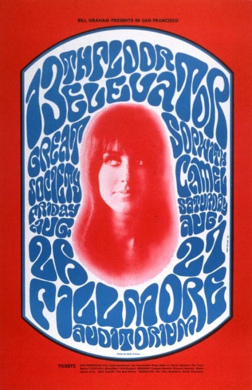
Designer Wes Wilson embraced maximalism when creating the 1960s poster art for the band, 13th Floor Elevators. The poster exemplifies psychedelic maximalism with its vibrating colors and dreamlike typography.
Paula Scher also used maximalism in her poster art, breaking from the stiffness of traditional design. She created posters for The Public Theater in New York during the '90s and '00s.

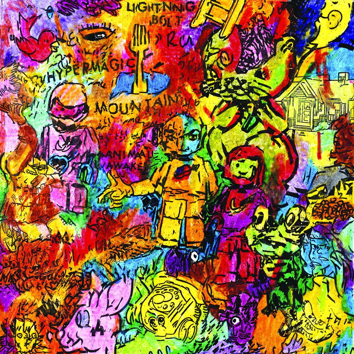
Rock duo, Lightning Bolt, offers another great example with their Hypermagic Mountain album art. Drummer Brian Chippendale filled the album cover with frenetic colors, scribbled drawings, and scrawled lettering.
Maximalism also shows up in graphic design for books and packaging. Esteemed visual designer Keeli McCarthy used maximalist design for the cover of the Eisner-nominated all-women comics anthology, Wimmen’s Comix. The maximalist design of the cover encourages boldness. It shouts from the bookshelves with its boisterous mashup of blue and red while the hypnotic collage of illustrations entices us to take a closer look.
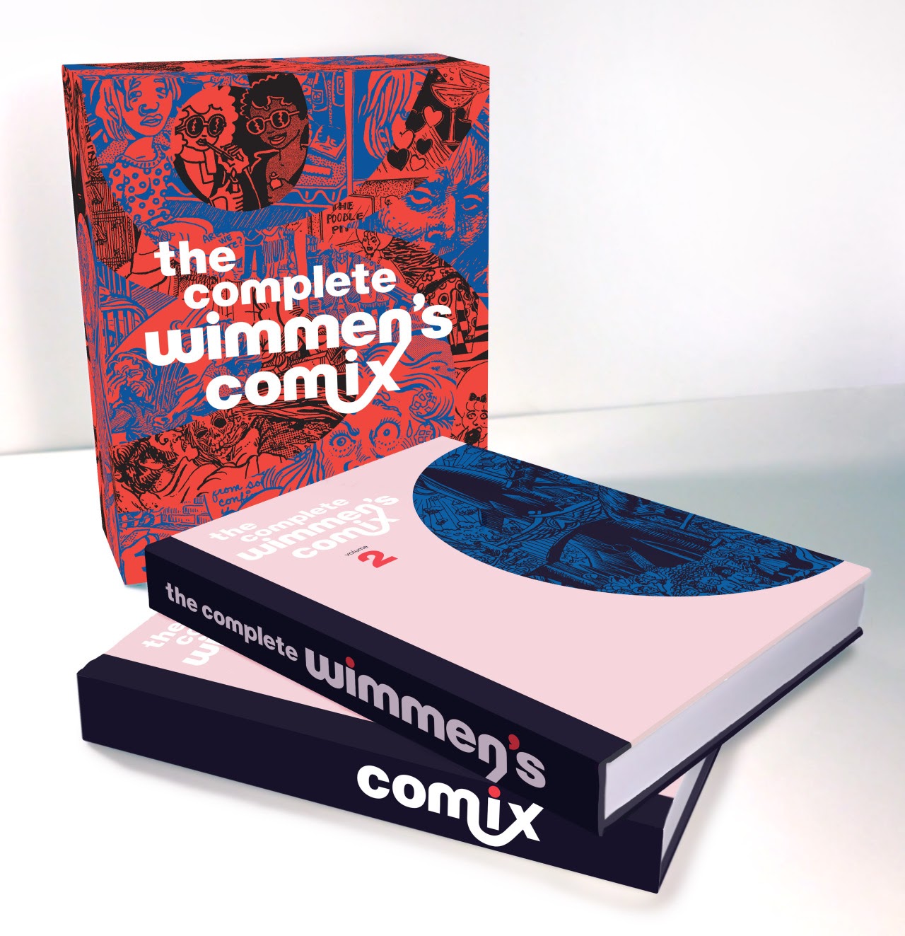
"There is tension between chaos and order, patterns within patterns, and clashing colors. Maximalism can be aggressive, off-putting, and polarizing. One reviewer called this "rather ugly," and another said it was one of the most beautiful books they’d ever seen. People either loved it or thought it was hideous. You have to be aware of that."
- Keeli McCarthy, Visual Designer, Fantagraphics
Maximalism isn’t for every audience. For this book, Keeli brilliantly counters the swirling background of illustrations and pulsating colors with clear typography. For books and websites alike, maximalism works well when paired with minimalist elements that strike a sense of balance.
Elements of maximalism
Absurdity
Annoying emojis, quirky illustrations, pointless animations, meta jokes, pop culture references, easter eggs, and other silliness can all be found in maximalist web designs. When you’re not bound by serious design, there are plenty of opportunities to catch your audience off guard and get them to LOL.
Daring color schemes
Contrasting colors, oversaturation, and breaking the rules of color theory are all a part of the maximalist approach.
Conflicting themes, textures, and patterns
While minimalism is about smoothness and uniformity, maximalism is about jarring the senses. Maximalism sets irregular textures and opposing patterns against each other for a compelling sense of disorder.
By using digital tools, you can come up with patterns that don’t exist in the "real world" because they’re based on digital algorithms, not nature. Go into Photoshop or Illustrator. Experiment with the filters and textures. Push that slider all the way over to 100 and see what happens. Don’t be afraid to break the rules.
- Keeli McCarthy, Visual Designer, Fantagraphics
Minimalism takes a measured approach. Maximalism opens things up for experimentation.
Repetition
Maximalism repeats elements to create larger patterns across their wider expanses.
Fill up every space
Negative space may provide a sense of calm and order in minimalism. But in maximalism, negative space is just more blank canvas to be adorned. Margins are pushed to the brink and busyness is a virtue.
Layers, layers, and more layers!
Minimalism may align its components on a single plane, but maximalism revels in a dense and pleasing stratification of visuals.
Go retro
Old school video game graphics, groovy pulp '70s typography, and '80s camp all find their ways into maximalist designs.
Use multiple fonts
Minimalists may seek the cold embrace of Helvetica, but maximalists aren’t afraid to play with the myriads of typefaces out there or combine multiple and sometimes incongruous fonts.
Create visual discordance
Maximalists experiment with perspective, dimensionality, and scale to create off-balance and strange web designs.


Get started for free
Create custom, scalable websites — without writing code. Start building in Webflow.
Maximalism in web design
Now that we’ve covered what it’s all about, let’s take a look at some website examples that revel in maximalism’s over-the-top spirit.
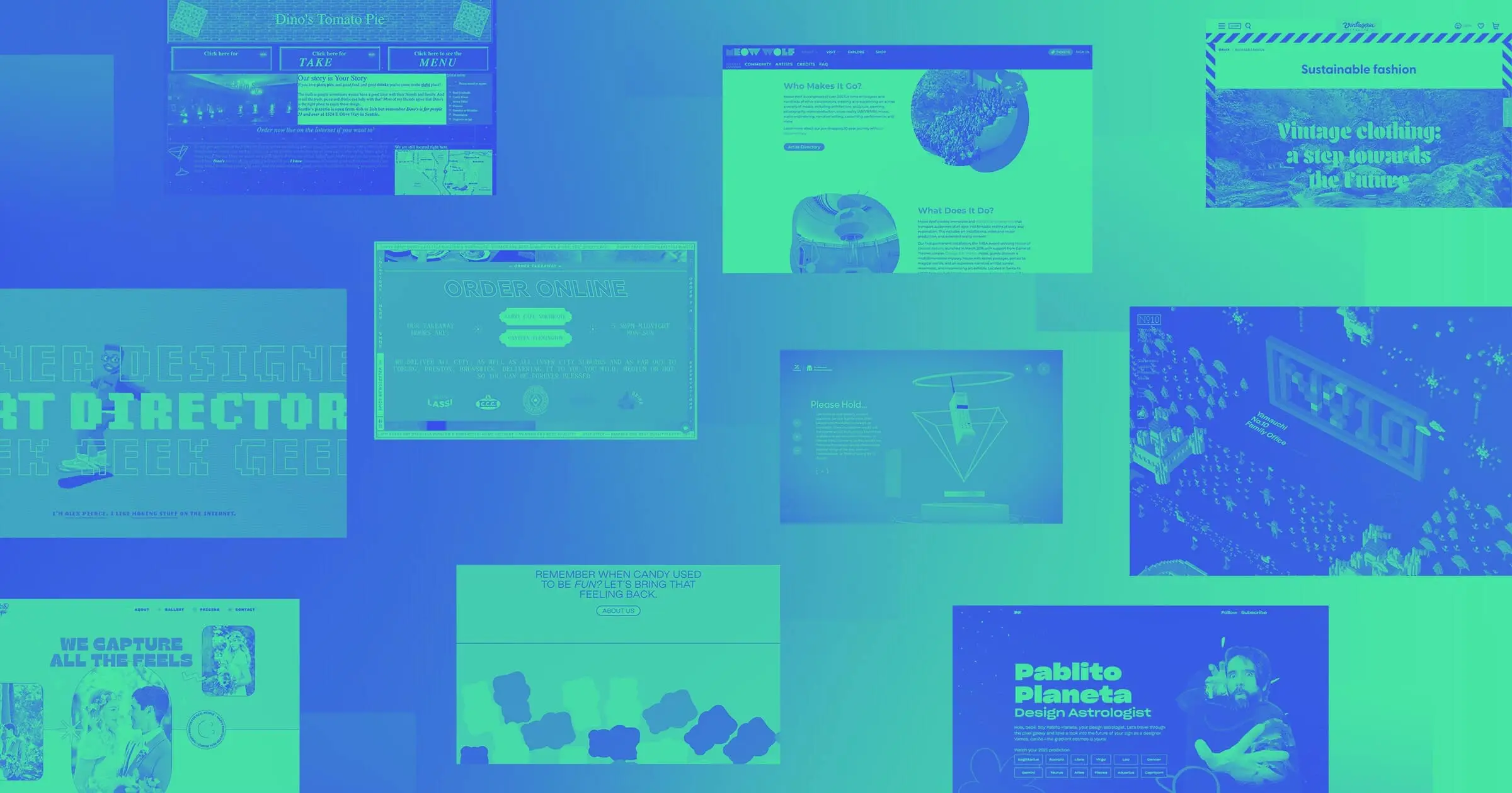
Meow Wolf
If you haven’t heard of Meow Wolf, they exemplify all that is maximalism. From their cheeky take on consumerism with their Las Vegas Omega Mart, to their mind-bending and immersive art installations, there isn’t anything about them that’s subdued.
Their web design, built with Webflow, reflects their eccentricities with plenty of garish colors, splashy animations, and other eye-catching visuals.

Their website, built with Webflow, reflects their eccentricities with plenty of garish colors, splashy animations, and other eye-catching visuals.
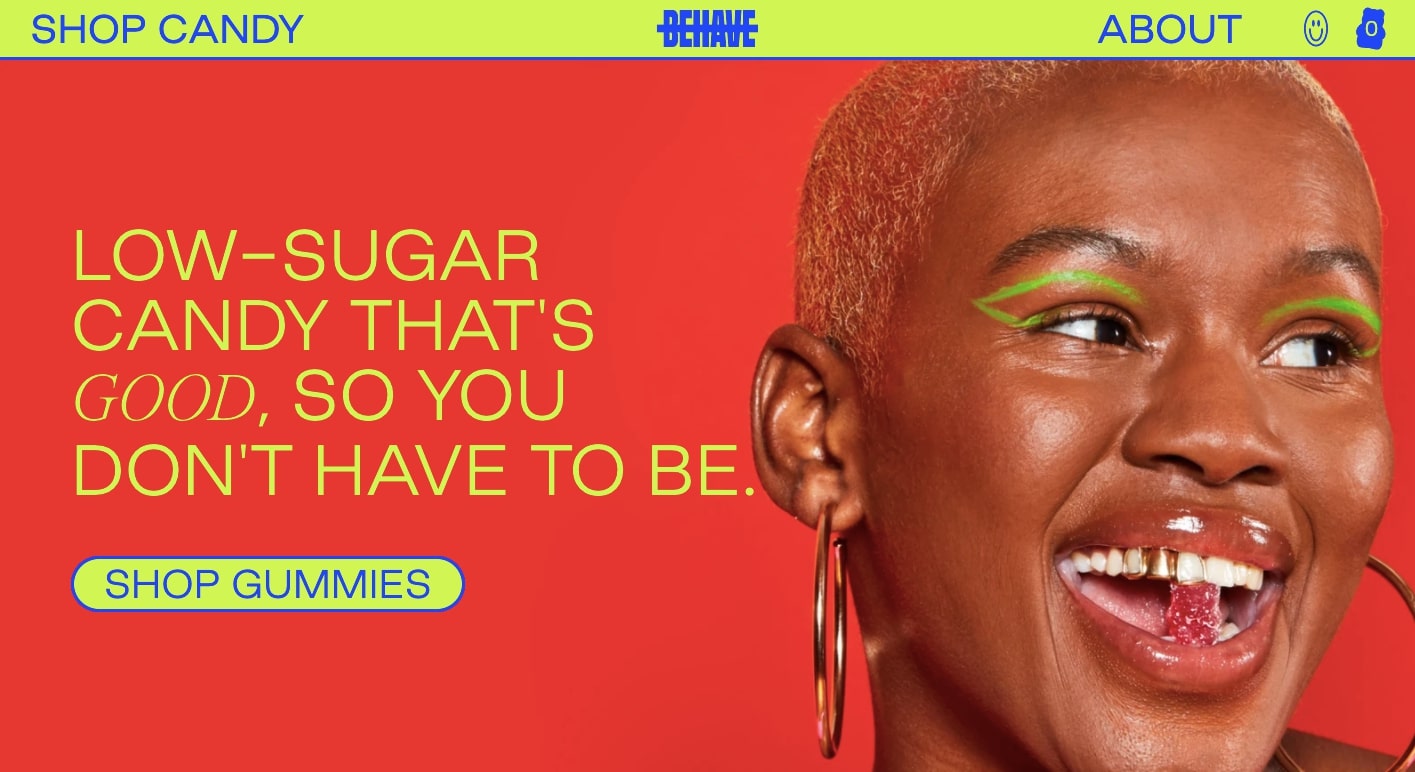
BEHAVE
Like bins of treats in a candy store, BEHAVE’s web design offers a selection of sweet and tantalizing colors. Blues, reds, greens, purples, and other fruity hues come together in this wonderful celebration of sweets.
Pablito Planeta
Built with Webflow, this is the website for design astrologist Pablito Planeta, the alter ego of accomplished Webflow designer Pablo Stanley. This design has maximalist drawings of planets and flowers, as well as the pulsing hypnotic stare of one Pablito.
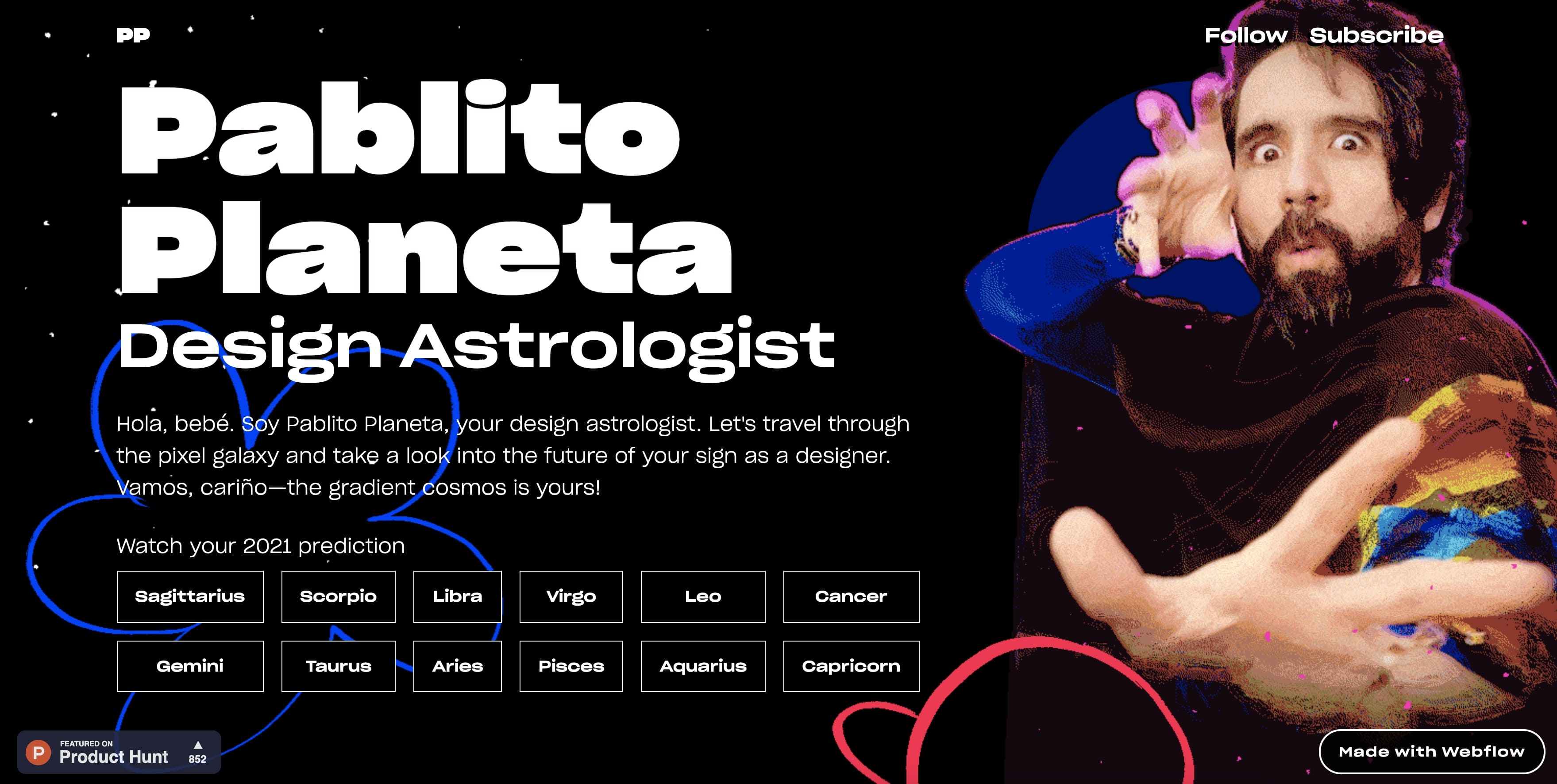
Maximalism often embraces absurdity and Pablito Planeta is an over-the-top character. Decked out in a shiny jacket, multiple scarves, and dispensing design advice like, “your color is spicy mustard,” his humor is quirky and off-the-wall. We love seeing the intersection of comedy and design along with maximalism’s capacity for allowing us to not take ourselves too seriously.
Y-N10
One of the tenets of maximalism is filling every inch of a design with something. Take a look at the website for Y-N10, a Japan-based organization founded by family members of Nintendo's founder. The site goes full blast with this chunky and retro video game-inspired design.

An off-kilter diagonal scroll brings one through a pixelated landscape dotted with trees, ghosts, dancing skeletons, advancing cubes, and other 8-bit styled characters. Maximalism allows designers to create alternate realities and this website feels like an entire world generated within the dusty circuitry of a primitive video gaming console.
Mack and Pouya Photography
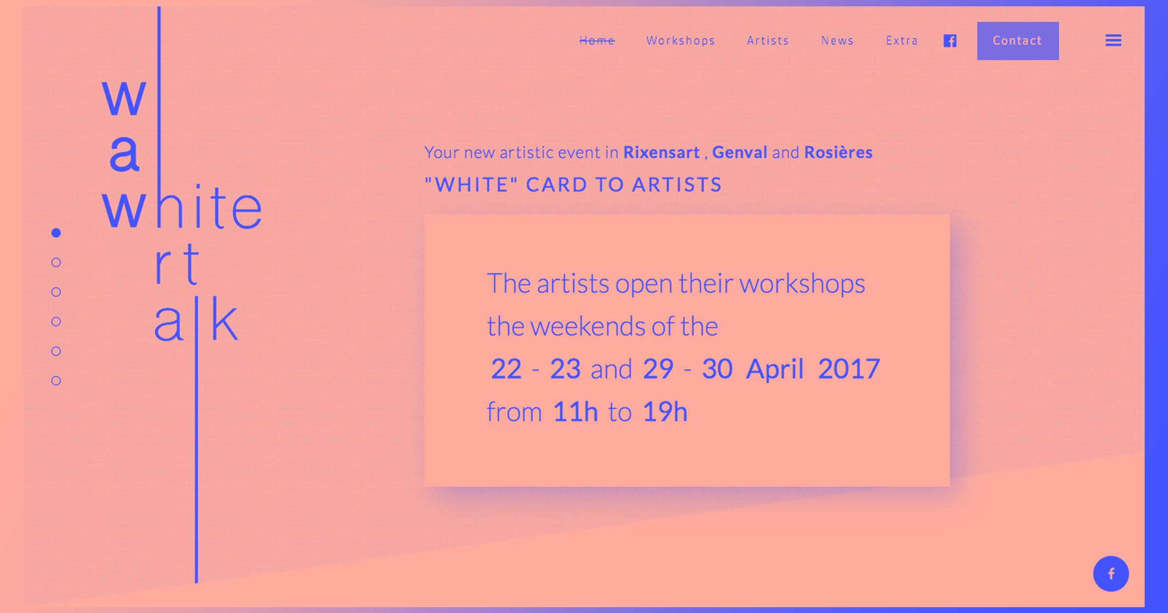
We’ve gushed about this design built with Webflow before, but how could we not include Mack and Pouya’s Wedding Photography website in a post about maximalism? Most photography businesses have minimalist designs, but this website takes a more daring approach. We especially love the gorgeous commingling of pink, yellow, and blue.

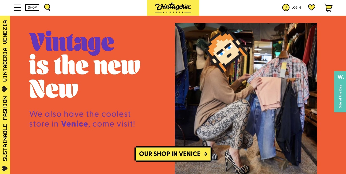
Vintageria
Vintageria, an eCommerce fashion site aimed at Gen-Z, provides “Cool sh*t for cool people.” This website is the exact opposite of most online stores that opt for more reserved designs. Instead, Vintageria uses plenty of striking color combinations, 8-bit graphics, animations, and models decked out in quirky animal masks.
There’s also an offbeat mash-up of fonts — from retro computer text to '70s style typography — which is a badge of maximalism.
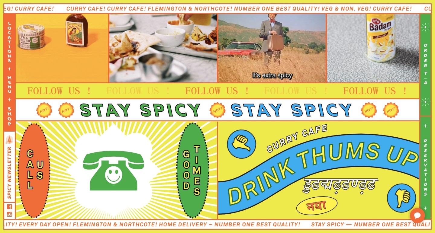
Curry Cafe
Melbourne-based restaurant Curry Cafe fills every bit of its website with bold colors, shapes, images, animations, and repeating calls to action. Curry Cafe goes well beyond standard restaurant websites with an engaging user experience spiced with heaping amounts of maximalism.
Dino’s Tomato Pie
With a Geocities design approach featuring a starry background, unnecessary animations, and a wild visitor counter, Dino’s Tomato Pie decks their website out with all of the maximalist toppings. Call to actions blink like strobe lights, pizzas dance, and there’s no logic to its color scheme. Instead of turning us away with its randomness, it delights us with its absurdly primitive web design.

Alex Pierce The Geek Designer
Alex Pierce’s portfolio feels like something from an old school Nintendo Game. With retro graphics, vintage gaming typography, and clashing colors — this is another design that pushes maximalism to its limits.

Step outside of conventional design
There’s so much more that can be done in web design that won’t work within the tidy confines of minimalism. Maximalism breaks through constraints and implores designers to be playful and adventurous in their work.
Maximalism isn’t about making everyone happy and it’s not for every designer. But for those who enjoy it, maximalism is the approach to take when you want to make a strong brand statement.