B2B websites must build trust with a highly specific target audience, so optimizing your B2B website’s user experience is essential.
Business-to-business (B2B) brands market their products and services to hyper-specific buyers and industries, and to resonate with those audiences, they must refine their web design to create a tailored user experience. There are some elements that all great B2B websites share, like testimonials, SEO-optimized homepages, and intuitive navigation.
The B2B website examples below check all these boxes and go a step further with authoritative content and unique design elements. These added features build additional credibility with buyers, which can make all the difference in generating leads and getting conversions.
B2B website design explained
Designing a B2B website requires unique optimizations. B2B businesses sell their products and services to other companies within specific industries, like software development or construction, so their websites must contain targeted information.
For example, executives at a software development company might prioritize cybersecurity or analytics. Knowing this, B2B companies like HubSpot put that information in headlines and throughout their layouts.
B2B vs. B2C website design
Business-to-consumer (B2C) websites cast a wide net, aiming to generate leads with individual buyers. Conversely, the B2B marketplace is filled with organizations hoping to develop a business partnership or sell a large quantity of their products and services to each other.
While a B2C website usually funnels visitors toward making a purchase or subscription, B2B conversions aren’t so simple. To sell products and services to an organization, you typically need to meet to discuss the deal, so B2B websites lead visitors to a contact form or appointment scheduler instead. To convince an enterprise audience to do that, the website must build trust and credibility, which requires more time and targeted content.
B2B website design best practices
Below are several well-established best practices that make for the most engaging, high-converting B2B website designs. As you read through them, consider how your design ideas can deliver an optimized user experience for website visitors.
Clear value proposition
Every product needs a value proposition that identifies and addresses a need, like “Launch high-performing web experiences faster” or “Scale your sites with confidence.” Whatever your unique value proposition is, your B2B website should keep it clear and present. You may adapt it to suit specific target audiences, but the central theme should remain consistent throughout.
User-centric navigation
The first thing you want visitors to do on your B2B website is scan through the homepage, open the navigation menu, and find the content for their specific use case. That puts them in the proper funnel, where you’ll have content prepared to speak to their unique needs. Many B2B web designs do this with a “Solutions” tab in their navigation menu that directs visitors to pages like “Marketing,” “Enterprise,” or “Startups.”
Strong CTAs
Your calls to action should clearly describe the next steps visitors need to take. Plainly spell out the intended user journey with buttons labeled “Schedule a demo” or “Contact sales.” All your content should build trust that drives visitors toward those CTAs, and the CTAs themselves must set clear expectations about what comes next.
Trust-building elements
Showcase your best work, testimonials, and awards every chance you get to generate credibility with your audience. Then, strategically vary these highlights to cover many different angles. For example, include client testimonials from executives, managers, and general staff to show how buyers at all levels resonate with your product.
Optimized content
Build a blog, create authoritative content, and craft your homepage with technical and editorial SEO in mind. Then, establish a regular cadence for performing SEO audits, analyzing your competition, and checking for gaps in current and upcoming content. These tactics will help you stay at the top of the search engine results page, so you can drive more traffic to your site.
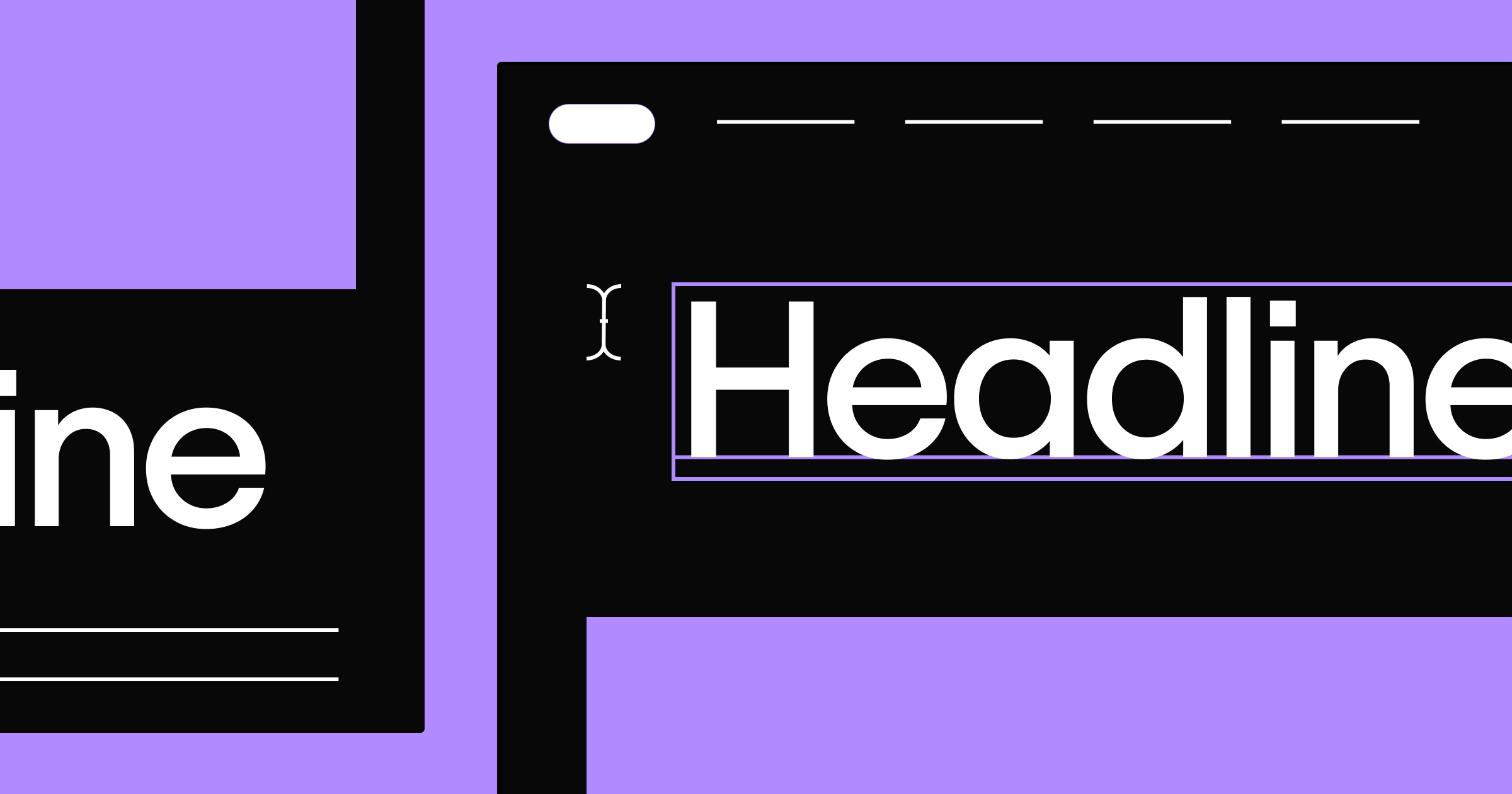
High-quality visuals
Put your best public speakers front and center by visually demonstrating how your product works, and include relevant photos and graphics. Take regular opportunities to replace words with pictures to visually direct your users toward your end goal.
15 successful B2B website design examples
Below are 15 website examples that establish credibility, build trust, and help generate leads for their B2B companies. As you browse them, pay particular attention to how they showcase intuitive user experiences and clear calls to action that guide you through their content.
1. Anrok
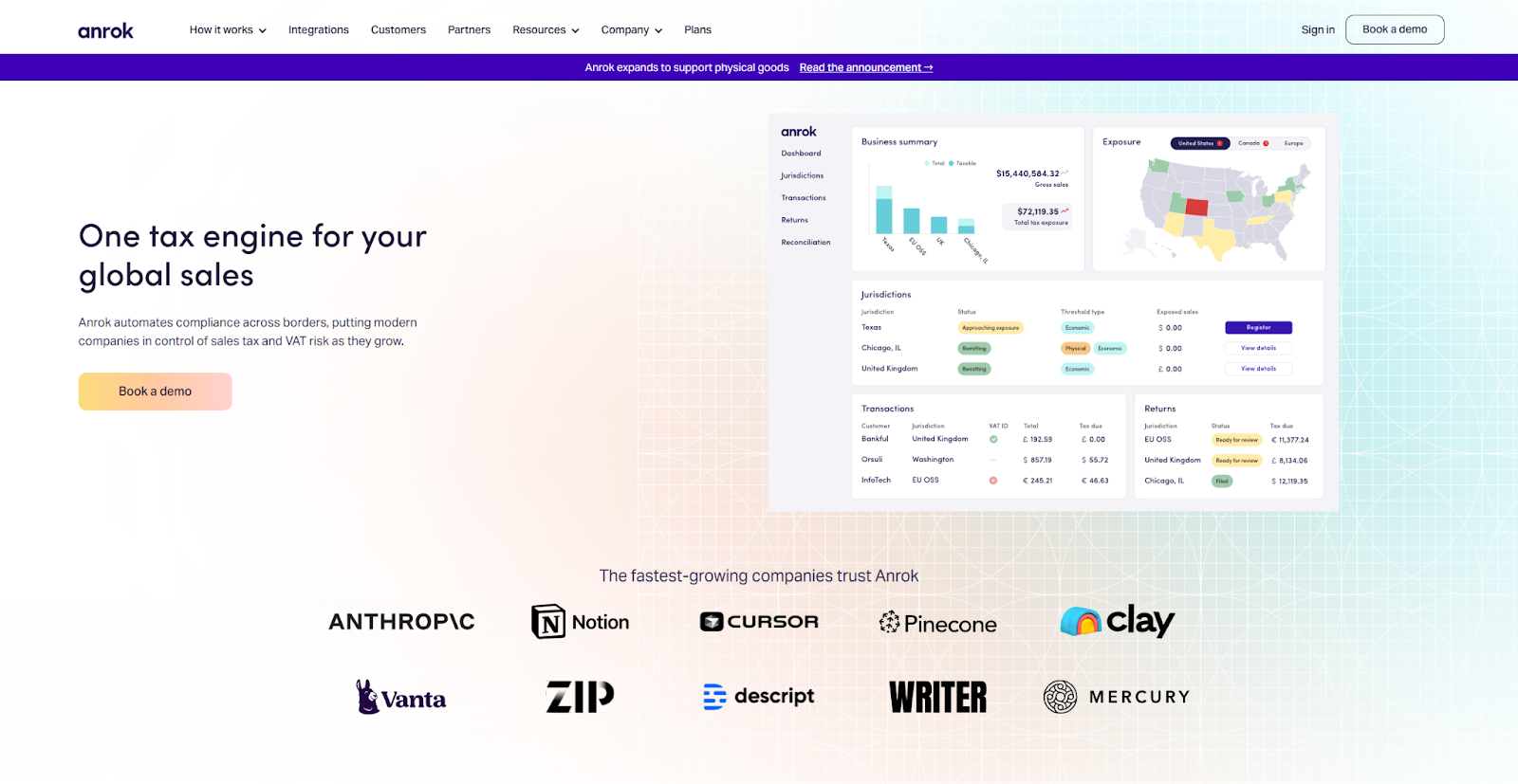
Anrok is an automation tool that helps businesses meet compliance goals. The web design they created follows a very standard pattern, but it does so expertly. All the best practices are here, from high-quality data visualization and approachable content to intuitive navigation and several glowing testimonials. Everything funnels visitors to strong CTAs like “Book a demo” or “Tour the product.” All of the above makes this example an excellent template for any B2B website to follow.
2. Unmind
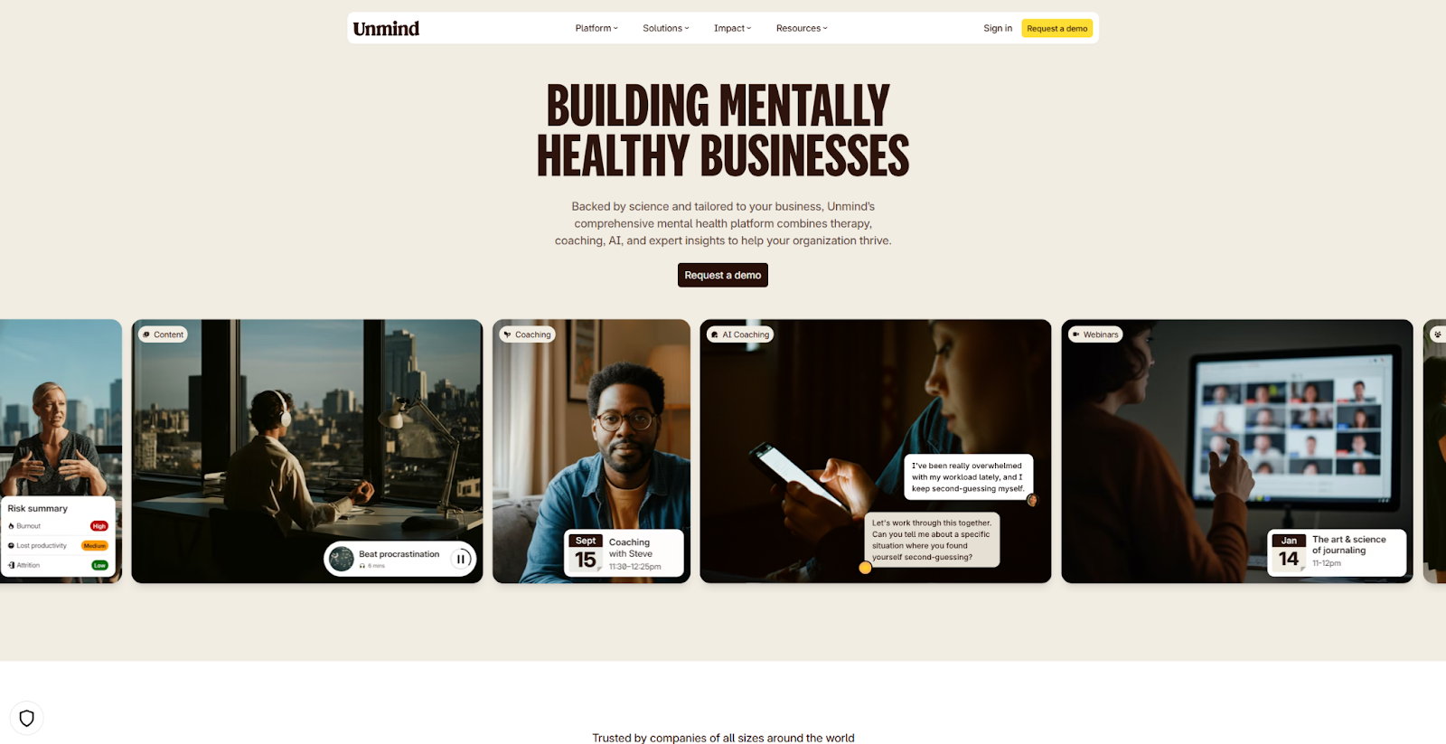
Unmind provides mental health services for businesses and their employees to help them thrive. It’s a very niche service, so they devote a lot of content to describing why it’s so impactful, using graphs, statistics, and transparent studies to show clear and actionable results. If your service is similarly niche, follow their example by building credibility early and often.
3. Nas Studios
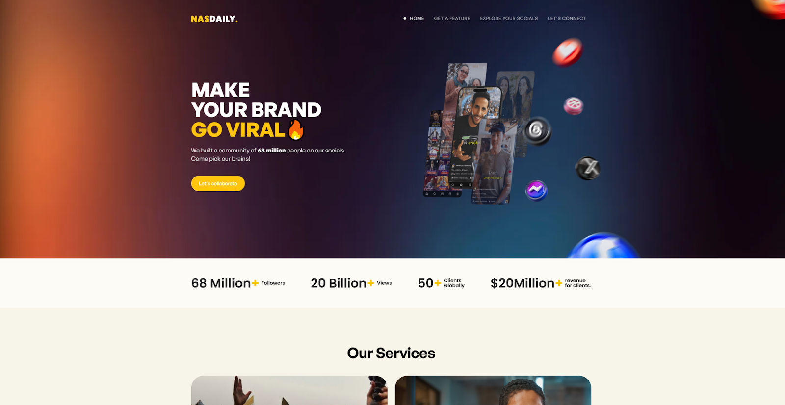
The Nas Studios site, designed by Diego Toda de Oliveira, promotes branding services, so social media is front and center in their web design. The majority of the text describes their impact on social media brands, and every image includes an icon or emoji from a popular platform. That continuity makes exploring the site more approachable and helps their target audience understand the company’s expertise.
4. UpGuard
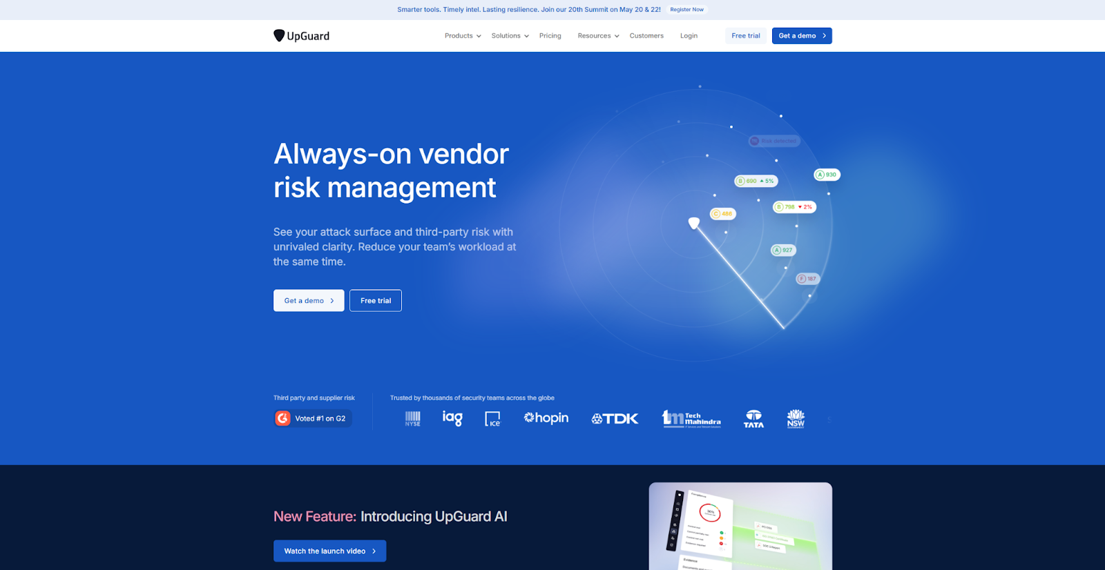
UpGuard provides cybersecurity risk assessment services. The website they created in Webflow devotes a lot of space and data to showcasing UpGuard’s standout features, including a radar imaging animation that charts risk management, and several testimonials from clients that use the service. That dedication lets their product speak for itself, and amplifies how the site builds trust with its audience.
If your product is as comprehensive as UpGuard, you can follow their example by taking every opportunity to highlight your unique services.
5. Sendlane

The Sendlane site engages visitors with user-friendly navigation and a colorful homepage. It features a multitude of client testimonials and feature highlights, and continuously encourages the visitor to try the product with recurring “Request a Demo” CTAs. These CTAs make the intended user journey clear, just as it should be in your website design.
6. Cubbi

Cubbi provides workforces with nutritious, filling meals for their lunch breaks. Its website is sleek and fun, with several high-quality images, modern typography, and testimonials from excited customers. The various animations effectively showcase how their service works. All of these elements give the site a professional but welcoming appeal. It’s a relatively small website that provides an excellent example for other web designs that need to stay similarly compact.
7. Dinergy Marketing Solutions
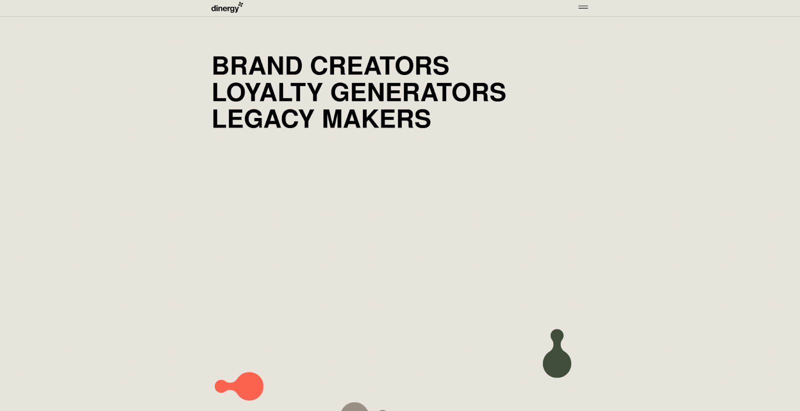
The Dinergy site from Bien Studio showcases this creative agency with an equally creative website. Numerous unique design elements, like rotating widgets and expanding text animations, make exploring every page a fun journey that draws the audience in. It still has all the features a great B2B web design needs, like testimonials and industry-specific feature highlights, but it’s all wrapped in a playful, creative site. Let it remind you that B2B websites need not be boring.
8. Pocus
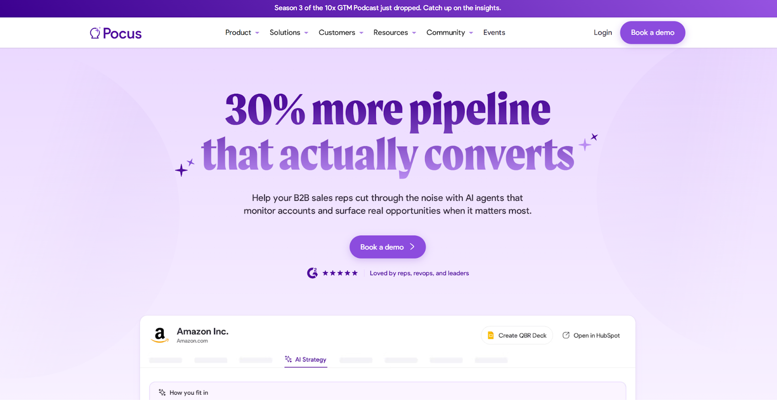
Pocus is an AI-assisted marketing tool that helps sales reps find new opportunities to close their deals. It’s a strictly B2B business that relies on its clients’ success, so most of every page layout is taken up by testimonials and statistics showing how users benefit from it. If your B2B service is similarly dependent on quantifiable goals like increasing conversions or generating leads, this is an example you’ll want to consider.


Turning traffic into revenue
In this webinar, hear from experts from HubSpot, Clay, Zapier, and Webflow on the future of customer acquisition and marketing automation.
9. RemotePass
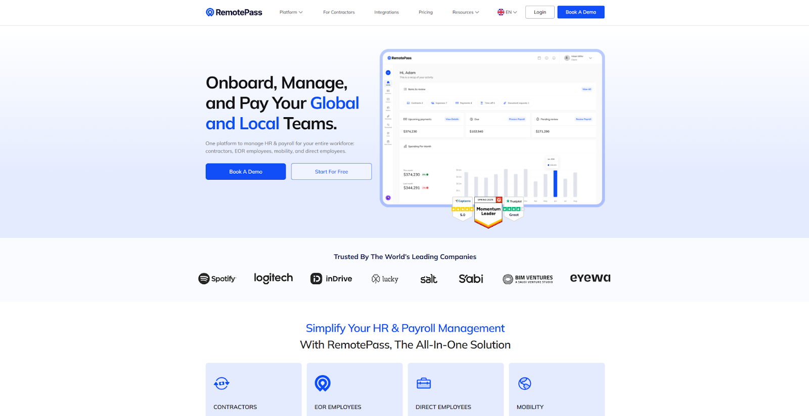
RemotePass is an HR and payroll tool marketed toward large agencies and international companies. You can tell from their constant use of language like “entire workforce” and “global” that they’re aiming to attract large, global businesses. They use words like “seamless” and “automate” to describe how their product reduces overhead and workload. If you use one or two main messages in your product explanation, the RemotePass website is a great template to inform your design decisions.
10. Dropbox Dash
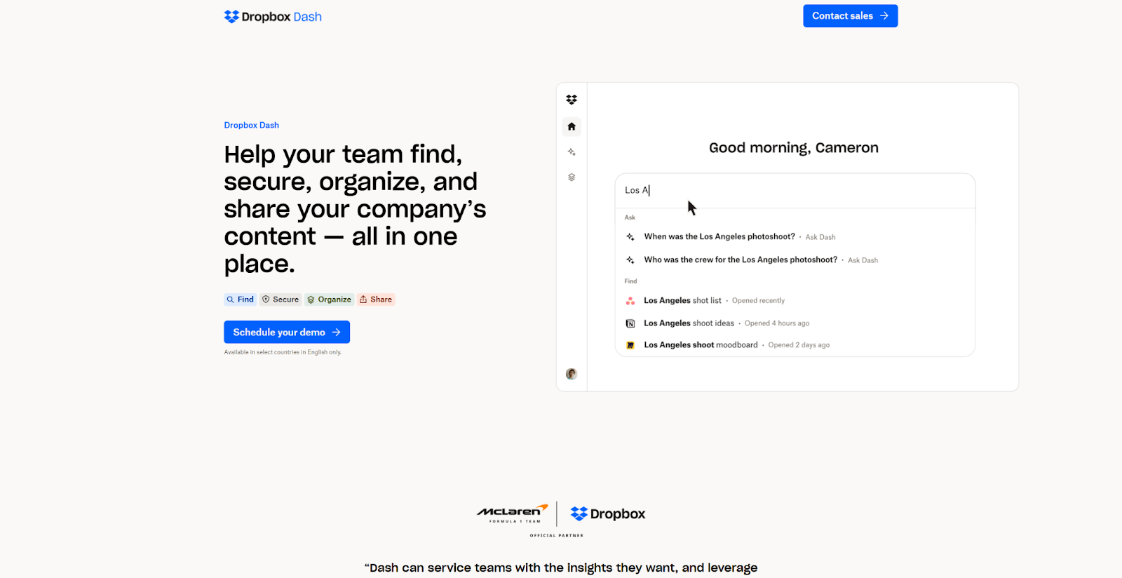
Dropbox Dash is an enterprise feature from Dropbox that helps companies manage their files and digital assets. Their streamlined B2B page is light on content but features strong CTAs like “Schedule your demo” and “Contact Sales.” These CTAs clarify the next step for buyers, and the several “Learn more about…” CTAs invite them to explore further if they aren’t yet convinced. It’s a strong example to follow if you want a fast, direct approach.
11. Bucket
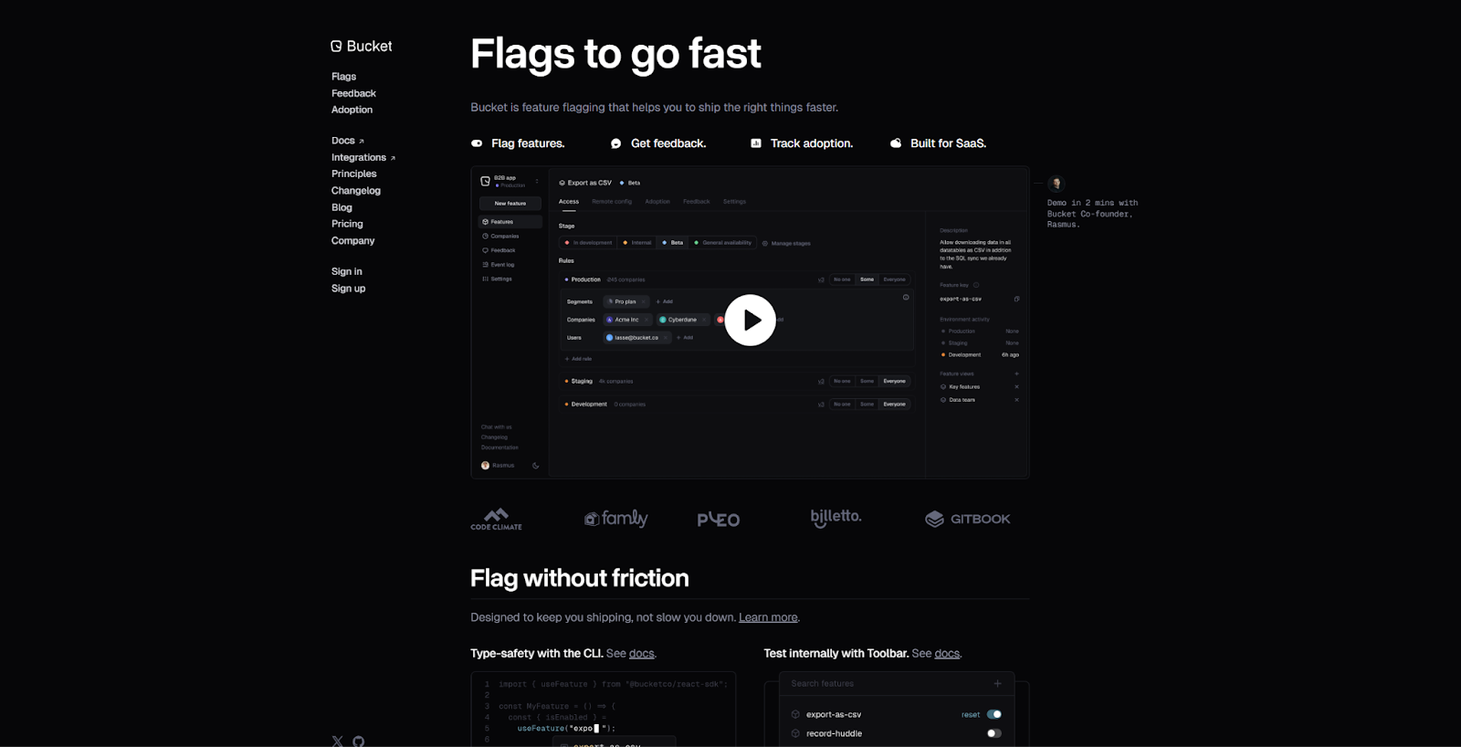
Bucket offers a feature flagging tool that developers can use to streamline software development and test new features. The website design they made in Webflow resembles that of GitHub or Stack Overflow, making it a familiar landing place for software developers. It also offers everything else a B2B website should have, such as a product demonstration and several feature highlights. If your audience is in an industry accustomed to certain layouts, try emulating them in your website design to create a familiar effect.
12. Raft AI
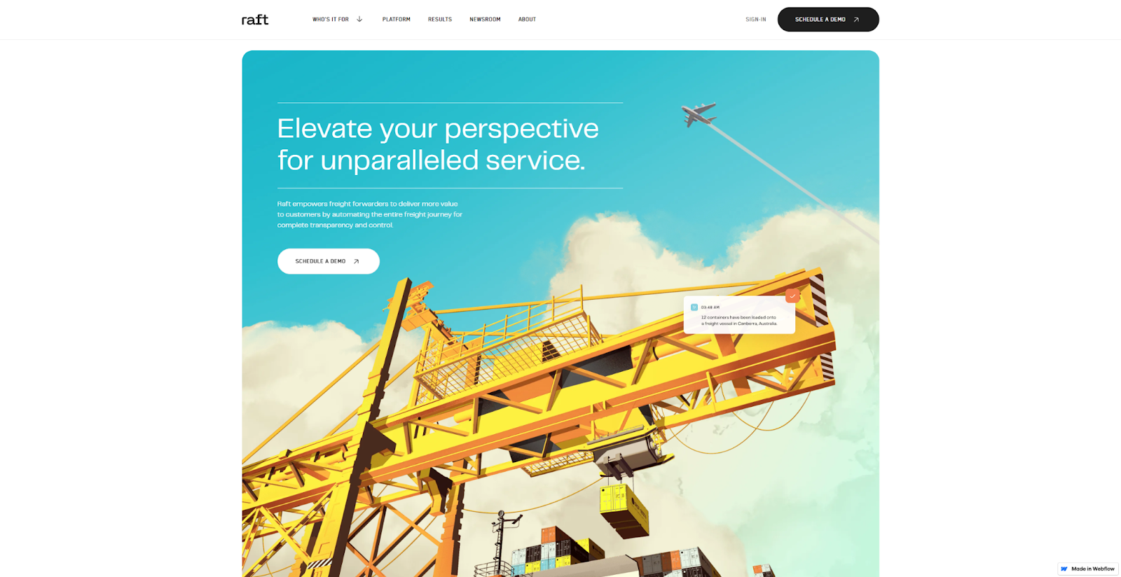
Raft AI is a logistics platform that leverages AI to help freight companies manage their business. The website, designed by Cory Runnells, uses bold, skyward visuals to immediately grab visitors’ attention and several well-timed elements, like a scrolling background and bright, eye-catching colors, to keep them engaged. It’s a great example for designers who don't shy away from technical flourishes and big visuals.
13. Float
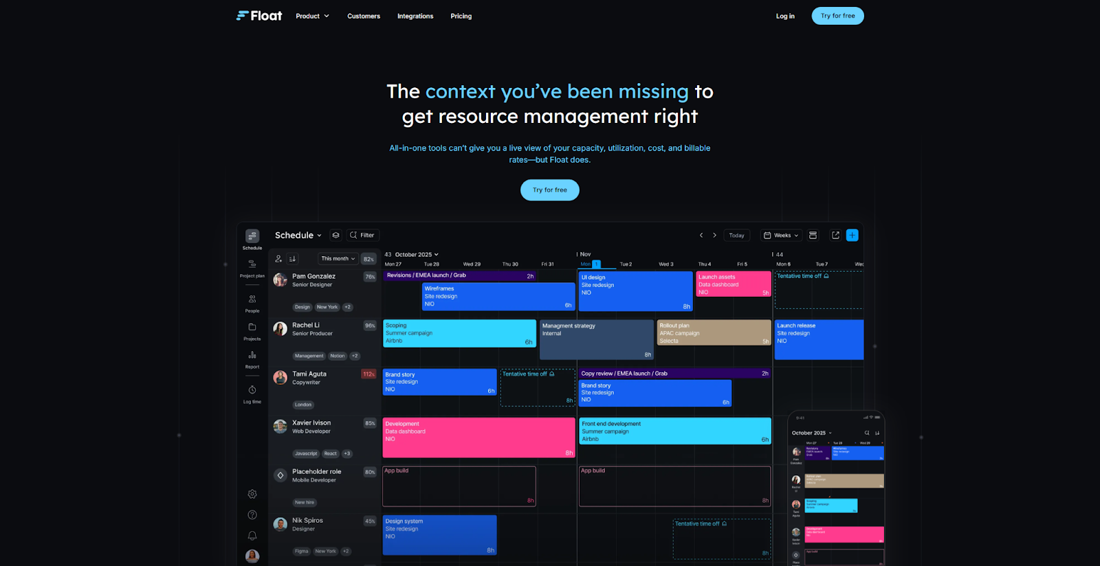
Float is a project management tool that helps agencies assign projects, manage clients, and plan deliverables. The tool is all about efficiency and time management, so the site also makes smart use of its visitors’ time. It quickly describes how the product works and the benefits it offers, inviting users to “Try it for free.” Plus, the colorful visuals and clear value propositions make for a quick read. It’s a great example of how websites should reflect the usefulness of the product they’re advertising.
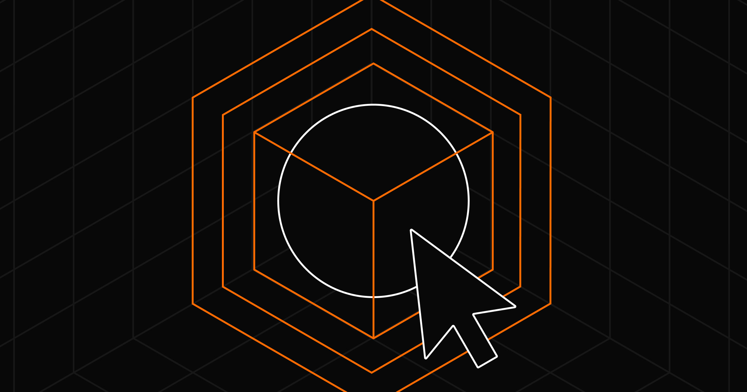
14. Codex

The Codex website by Jordan Gilroy makes bold promises about how their blockchain data API saves valuable time and resources. The equally bold website design uses several flashy animations and color contrasts, which makes scrolling through it a memorable experience. Strong interactions and visuals, like a spinning cube that connects users to various points of information, keep the website engaging and user-friendly while providing all the information B2B decision-makers need.
This website example should encourage you to make a statement with your web design and not to shy away from big promises, as long as you can keep them.
15. Capchase
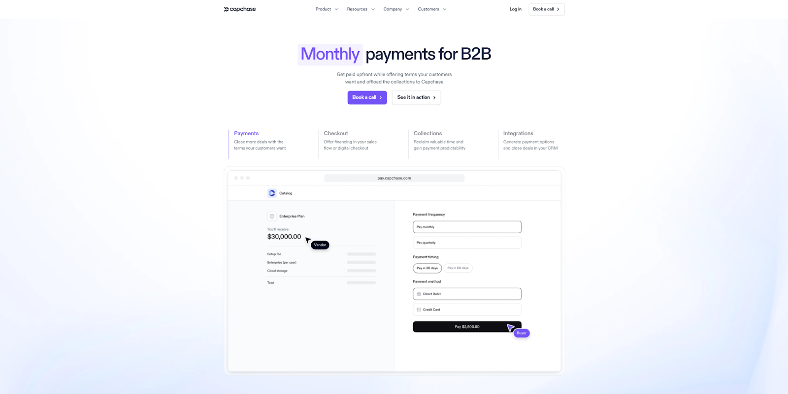
The Capchase website uses modern fonts and clear visuals that prioritize function over form. It isn’t a particularly exciting site to explore, but it is highly informative — if you scroll, you can discover how the product works, core benefits, and various use cases perfectly suited to the tool.
As you scroll, the header stays at the top of the screen so you never lose sight of the “Book a call” CTA. Meanwhile, the continuity in the graphics, color palette, and font choices makes the site feel cohesive and intuitive to explore.
Build B2B websites that convert with Webflow
There are many ways to engage your visitors, drive enterprise-grade conversions, and design an excellent B2B website. The only thing limiting you is the tools at your disposal. Webflow's website experience platform provides a powerful foundation for performance-focused design, while its seamless integrations with your existing marketing stack — from analytics apps to CRM systems and marketing automation tools — ensure your insights translate directly into actionable improvements.
Get started with Webflow to deliver exceptional user experiences.
Build websites that get results.
Build visually, publish instantly, and scale safely and quickly — without writing a line of code. All with Webflow's website experience platform.


.jpeg)