As first-time buyers navigate the challenges of making informed decisions, they seek more than just promotional promises. Testimonials can provide assurance, but their impact hinges on authenticity and strategic presentation.
Consumers crave endorsements from previous buyers before making a purchase or visiting a business. According to one study, 95% of consumers rely on online reviews from prior customers before buying a product.
Clearly, testimonials aren’t just decorative website elements — they’re integral to building trust. Testimonials not only boost conversion rates by 58% but also elevate revenue per website visitor by 62%.
By adding testimonials directly on your website, you not only bridge this trust gap for potential buyers but also boost engagement and revenue. Here’s how to effectively curate and present testimonials on your website, along with eight exemplary examples.
How to gather and present website testimonials: the basics
An untouched testimonial space can overshadow the shine and polish of any new business website. Here’s how you can populate that space with authentic, beautifully presented testimonials.
Start by determining which types of testimonials you’d like to include. While the traditional written testimonials are a favorite, video testimonials can increase purchases. For a design portfolio or business-to-business (B2B) site, consider featuring detailed case studies of previous projects.
Gathering client testimonials
Approaching people for testimonials might seem challenging, but they’re often pleased to share their experiences. To collect testimonials, consider the following strategies:
- Reach out via email to satisfied customers. People who’ve previously praised your business privately, such as during a meeting or phone call, might be open to publicizing their comments.
- Reach out via email to all previous customers. If the business has an email list, the owner or a marketer could send a polite email requesting testimonials. Adding an incentive, such as a discount code or a gift, can entice customers to leave feedback.
- Check social media pages and review sites. Comb the business’s social media pages for customer comments or use a social listening tool to monitor what people say about the business. You can also check review sites like Google Maps, Yelp, Tripadvisor, and Trustpilot. When sourcing reviews from external platforms, avoid directly copy-pasting them to your page to avoid copyright infringement. Instead, use a widget that fetches these reviews directly from the site, or seek the reviewer’s permission for a unique testimonial.
- Use pre-existing testimonials for individual team members. If the business is in its infancy and doesn’t have many — or any — previous clients, testimonials specific to team members or individuals can bridge the gap, for example, “I worked with Ciara on X project…”
- Pay a previous customer, celebrity, or influencer to provide an endorsement. This option isn’t for every business but may offer certain brands a valuable initial push. Remember, any compensation or incentives, including discounts on future purchases, should accompany the testimonial for transparency.
- Integrate testimonial requests into the service process. Consider incorporating feedback requests after every service rendered or in follow-up communications.
Fabricating testimonials is illegal, and most consumers are savvy enough to identify made-up reviews. When selecting testimonials, prioritize uniqueness and authenticity, and pay special attention to reviews that mention common pain points, such as delayed service, product durability, or lack of customer support. These insights highlight areas for improvement and showcase your brand’s commitment to addressing and resolving common concerns.
Presenting reviews and testimonials
Consider both the presentation of individual testimonials and the overall testimonial page design. Here are some presentation tips:
- Be concise. Show only the essential content. If necessary, trim the testimonials, but always get the original author’s approval before publishing.
- Use a clear, readable font size. Ensure your testimonials are distinct and legible to engage audiences effectively.
- Embrace negative space. An uncluttered design with ample white space around each testimonial enhances readability.
- Refine grammar and preserve the essence. While cleaning up typos and spelling mistakes, ensure the original voice remains intact for authenticity, and remember to ask the author for approval before publishing it.
- Share reviewer details as appropriate. For B2B platforms, adding full names, job titles, and company logos boosts credibility. On other sites, strive for a full name and a photo (with their consent) to authenticate the testimonial. Reviewers may prefer partial names or complete anonymity in sensitive sectors like healthcare.
- Personalize with signatures or handwriting fonts. Authentic signatures and handwriting fonts add a personalized touch, further enhancing authenticity. Always get permission before using a real signature or a font resembling a customer’s handwriting.
Where should you put testimonials on a website?
Testimonials offer flexible placement options, so you can experiment with different locations for them and see what works best. Here are some positioning ideas:
- Showcase them prominently in a testimonial section on the site’s homepage or a dedicated landing page, ensuring immediate visibility to visitors.
- Create a dedicated testimonial page, especially if you have an extensive collection to display.
- Integrate them on the about us page, complementing the brand narrative with voices from satisfied clientele.
- Amplify product pages by embedding reviews, potentially boosting conversion rates by 270% with at least five reviews.
- Distribute testimonials across the site to create a sense of ongoing conversation with satisfied customers. They can be especially effective on checkout pages to spur final purchase decisions.


8 websites with highly effective testimonials
These client testimonial examples span various industries and styles, so you’re sure to find inspiration for yours.
1. Petal
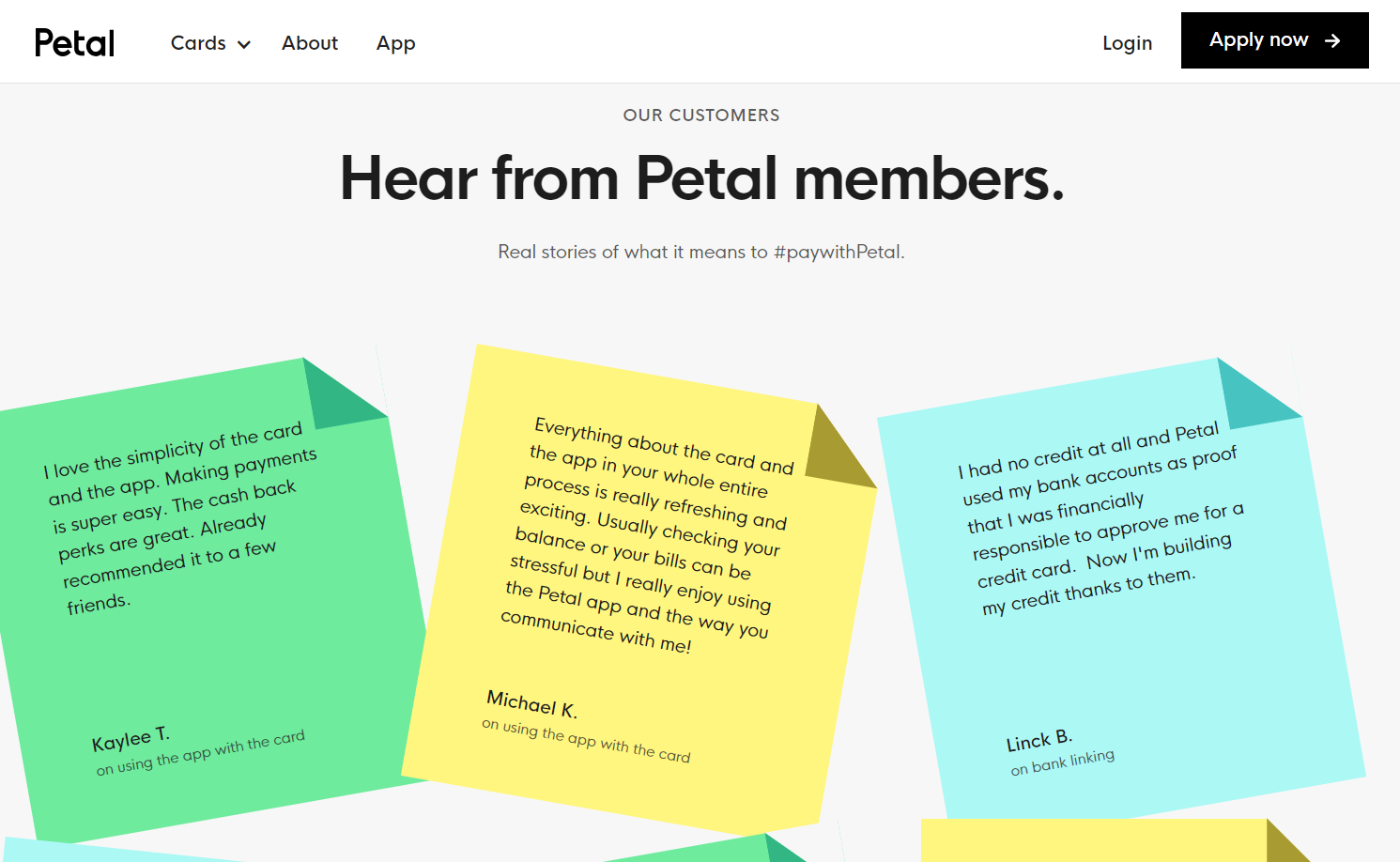
Petal offers credit cards to individuals who struggle to get approved by other financial institutions, empowering them to build their credit responsibly. Devin Fountain’s playful testimonial page displays each review on a colored sticky note, cleverly breaking up the text for readers. Using only the first name and an initial, Devin underscores Petal’s commitment to reviewer privacy, considering the topic’s sensitivity. Directly beneath the author’s name, Devin highlights the central theme of each testimonial, helping potential clients find specific insights into the credit card’s functionality.
2. Moris Design
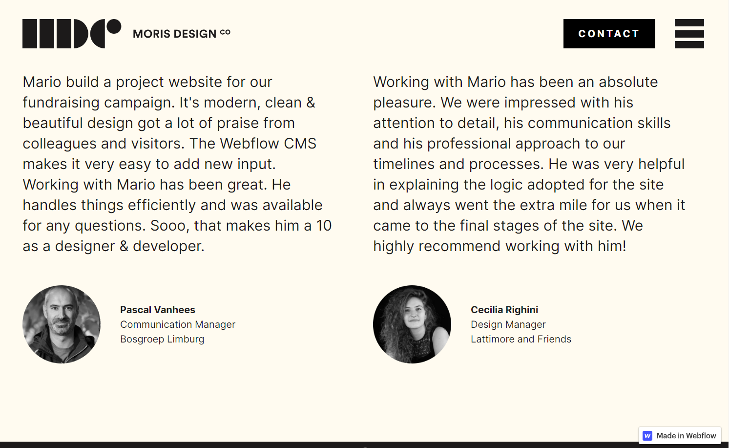
Moris Design Co.’s testimonials focus less on Mario Morris' end product and more on the collaborative experience of working with him. This approach adeptly markets their service, catering to prospects who want to know who they’re doing business with. Including both clients’ photos, full names, job titles, and companies speaks to the testimonial’s authenticity, providing a channel for potential clients to get in touch and learn more.
3. Valo Motion
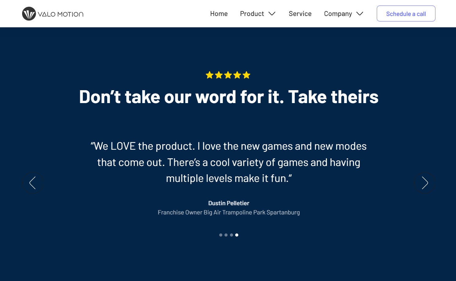
Félix Meens’ design for Valo Motion’s homepage, a business specializing in augmented reality trampoline and climbing experiences, features full-screen testimonials in a carousel format. These testimonials originate from their core demographic: amusement park and entertainment center operators. With concise, impactful text paired with a large, readable font, each of the four testimonials sheds light on a unique facet of Valo Motion’s services — customer service, mission, the nature of the product, and operational simplicity.
4. OpenPhone
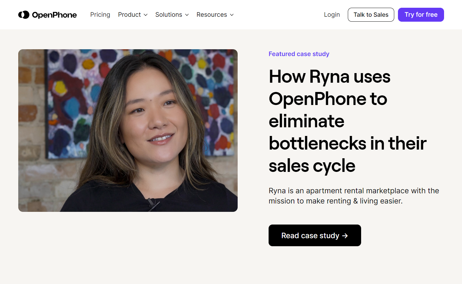
Beqi’s website design for the phone management system OpenPhone emphasizes in-depth case studies over short review snippets. Providing case studies is especially valuable for B2B companies, where purchasing decisions stem from detailed evaluation rather than impulsive choices. Each case study from OpenPhone follows a structured format — the challenge, the solution, and the impact — and includes an overview of the business and key quotes from senior executives. The featured case study boosts engagement with a short video and screenshots of the OpenPhone dashboard, giving visitors a glimpse of the product at work.
5. Everything Design
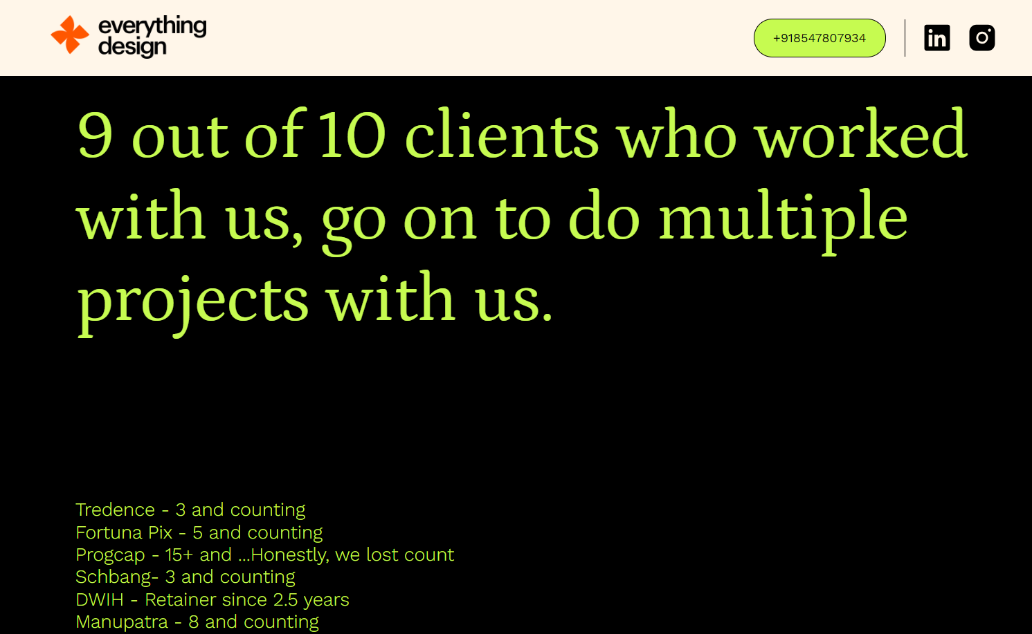
Bangalore-based design business Everything Design highlights repeat business, a clear indication of customer satisfaction, on its homepage. This B2B firm’s strategy highlights its dedication to quality work and fosters enduring client partnerships. Site visitors also encounter diverse forms of social proof; video testimonials coupled with highlighted quotes, written endorsements, and a dynamic display of partner company logos further add credibility to the firm’s reputation.
6. YouthLogic
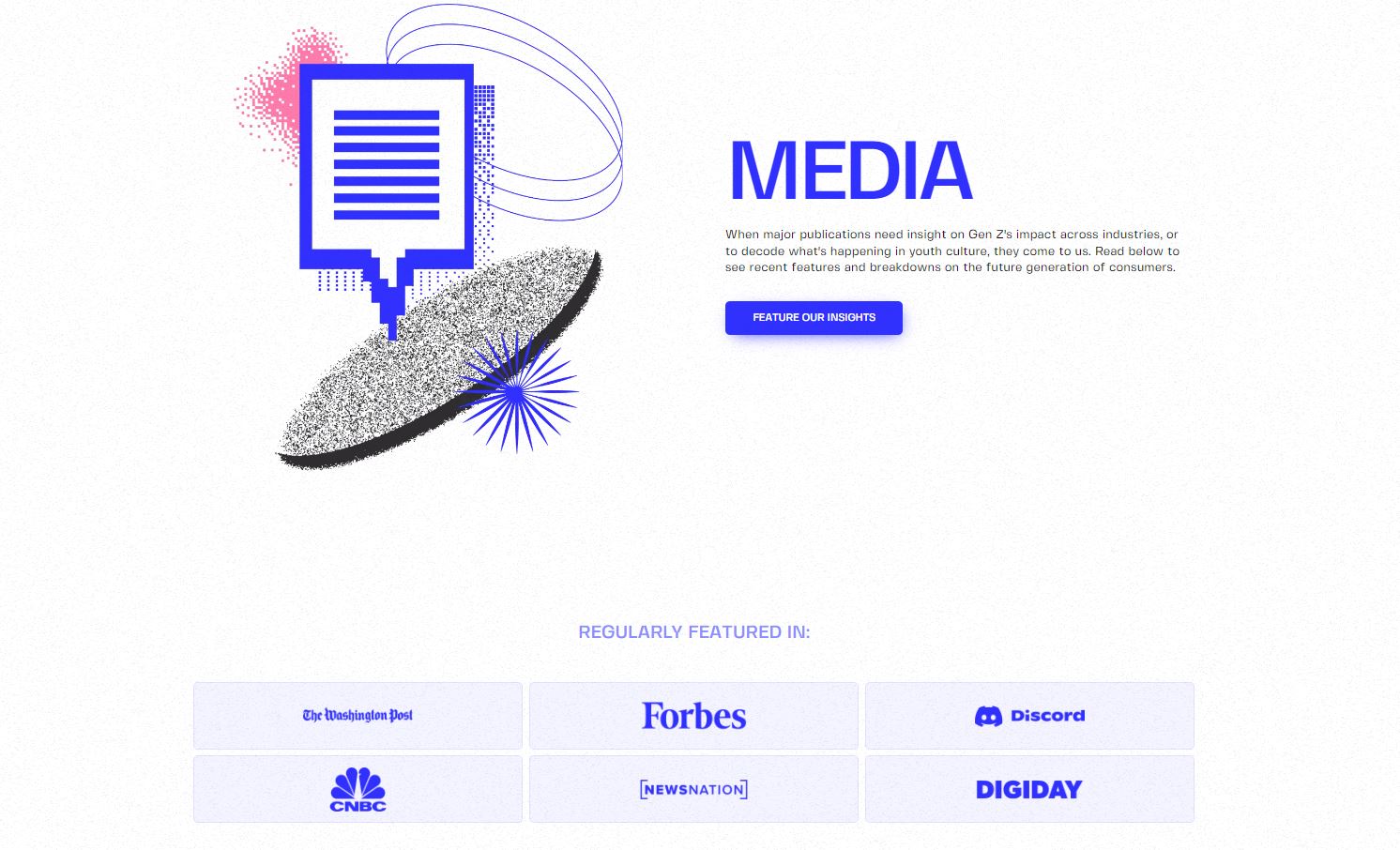
Marketing company YouthLogic and their CEO Connor Blakley boast mentions in several prestigious media platforms like The Washington Post, Forbes, and CNBC. Fra Mauro’s media page provides links to these features, enhancing the company’s status as an industry authority. The “feature our insights” CTA directs journalists and visitors to a contact form, leading to potential media collaborations.
7. Vale Tudo Training
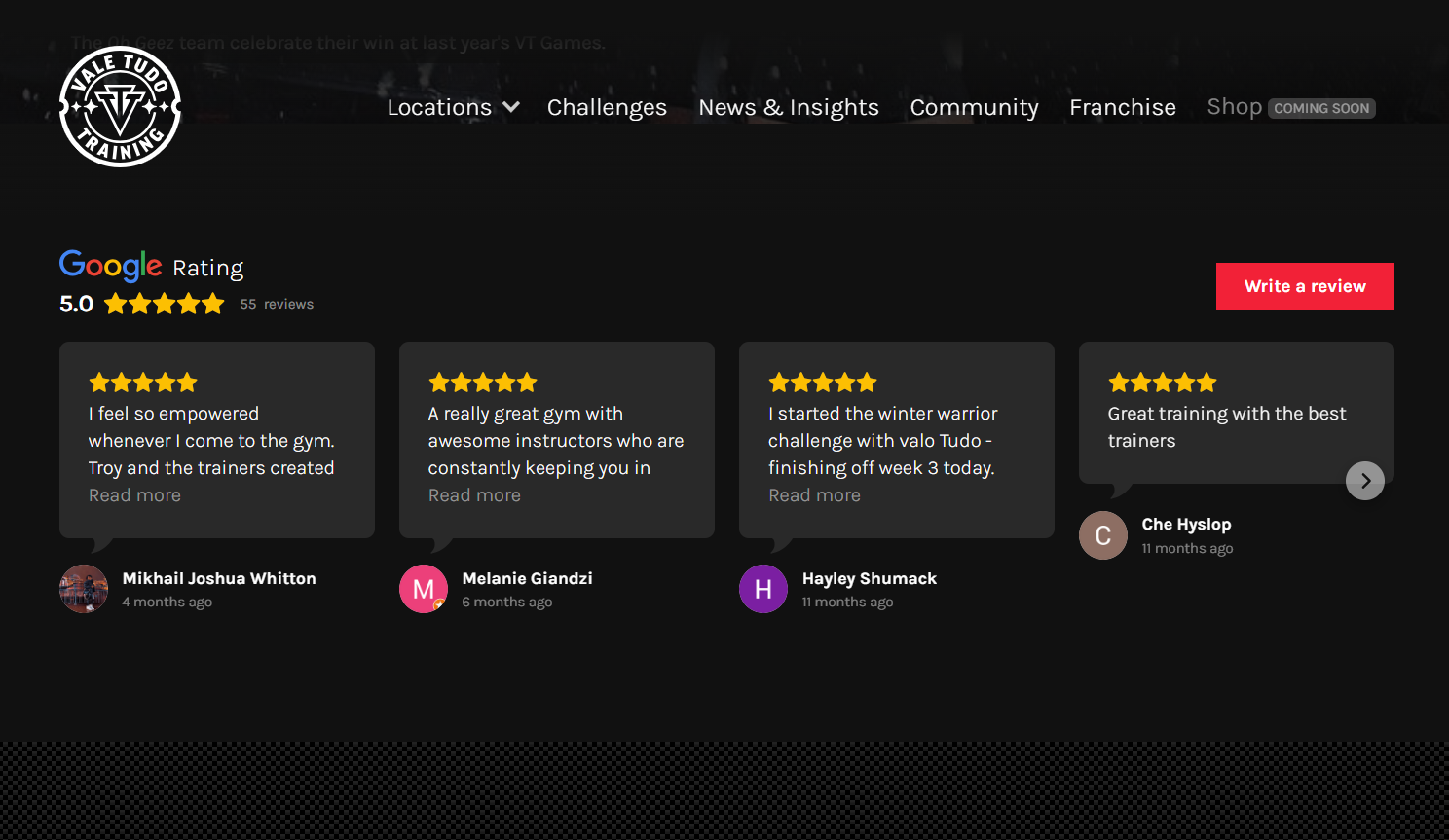
Vale Tudo, a training gym drawing inspiration from MMA (mixed martial arts), operates across multiple Sydney locations. Richard Lam’s design for the gym uses a Google reviews integration that pulls customer reviews for each venue directly from Google Maps. Such unbiased and transparent endorsements significantly foster trust and assuage doubts, making these testimonials difficult for businesses to manipulate. Monitoring these reviews and addressing complaints is essential, however, as ratings averaging 4.2 or lower might harm the brand’s image.
8. Model Living
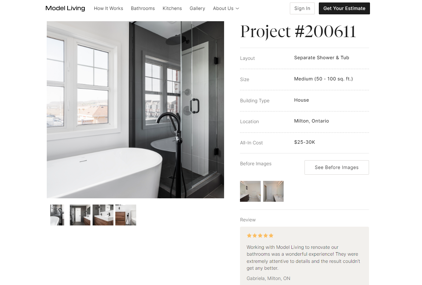
Designed by The Digital Panda, modern renovation company Model Living’s website seamlessly combines testimonials with illustrative case studies.Their project pages outline each renovation’s specifics — cost, location, and type. Showcasing transformative before-and-after images within testimonials bolsters credibility and provides compelling visual proof. This strategy particularly resonates with audiences interested in tangible results, making it highly effective for sectors such as skin care, fitness, and renovation services.
Present beautiful, effective testimonials with Webflow
Whether you’re putting testimonials on your freelance portfolio to attract more clients or working with an existing client on their endorsements area, Webflow can help you create a striking testimonial section. Our website platform allows you to visually experiment with different layouts, presentation strategies, locations, and widgets.

Build websites that get results.
Build visually, publish instantly, and scale safely and quickly — without writing a line of code. All with Webflow's website experience platform.


