

The fitness industry shows no signs of slowing down, and competition is only getting fiercer. Here’s how to make a fitness website stand out from the crowd.
The value of the global fitness industry is set to more than double over the next five years, which means a surge in the demand for designers who can build great fitness websites. Having one or more fitness sites in your portfolio is a smart investment in your future as a web designer.
Here are five tips to help you build outstanding fitness websites, plus 10 websites that provide examples of those tips in practice.
How to create a fitness website: 5 tips
The first step in designing a website for a gym, personal trainer, or other fitness business is determining the type of website you need to build. The website for a personal trainer working alone, for example, might look more like a personal website, while a local fitness center will need a small business site.
At a minimum, fitness sites need:
- An appealing landing page with a compelling call-to-action (CTA) button
- Details of the services available and their prices
- A page titled “About us, “Our story,” or “Why train with us?” to make a clear value proposition
- A contact page
Those are the basics. But the best fitness websites do more. Here are five tips to help your site go the extra mile:
Prioritize the user experience (UX)
People browsing the web don’t always have patience. If your site is hard to navigate, you’ll lose potential clients. Most people browse on mobile devices, so make sure the site has great mobile functionality and clear navigation to improve the user flow.
Capture the feeling of training at the gym or with the fitness professional
Include images or videos of clients having fun and achieving their goals and a testimonial section where visitors can hear from happy clients. Consider including a workout video to give visitors a preview of the classes. Anything that helps people visiting the site understand what this business offers — whether it’s accountability from a personal trainer or a warm, welcoming class atmosphere — is worth including.
Find subtle ways to highlight the brand’s identity
If you follow a structured design process, you’ll start by talking with the client in detail about their goals, audience, competitors, and offering. To create a unique website design based on that information, carefully consider the color palette, typeface, and layout.
Use different colors’ physical and psychological effects to your advantage. For example, red and yellow increase people’s heart rates (and wearing a red uniform can even give athletes an edge in close contests), while cool colors may increase purchase intention. Decide which colors best communicate what the client sells.
Think carefully about the site’s structure
Structure the site to highlight the most important content. Including an online class timetable and a way to book consultations or training sessions is a good idea. These features encourage potential customers to think about how they’ll fit the sessions into their schedules — or actually book a session. Setting these functions up through Webflow’s calendar and scheduling integrations is straightforward. And 98% of people read online reviews for local businesses, so consider including a Google Reviews integration to help convert customers.
Experiment with creative image presentation
Use high-quality images and play around with other design elements to showcase the workouts in action and make visitors want to jump in. Pop-out photo effects, filters with color gradients, image hover effects, or opacity changes can give your site a unique visual experience that engages visitors.


Build websites that get results.
Build visually, publish instantly, and scale safely and quickly — without writing a line of code. All with Webflow's website experience platform.
10 fitness websites featuring great design
Here are 10 fitness websites that will inspire you to put the above tips into practice.
1. Planet Fitness: Walk people through how to join

Planet Fitness’ large yellow “Join us” button on their homepage and navigation menu links directly to a location finder, allowing visitors to type in their location to find the nearest Planet Fitness gym. Meeting potential customers where they are by showing them how close your business is encourages them to convert. This location finder is the first stage in a five-step process — shown using a progress bar — that lets prospective customers review the available Planet Fitness plans, enter their personal information, and sign up for a membership on the spot.
2. Sweat FXBG: Highlight the value proposition and call to action
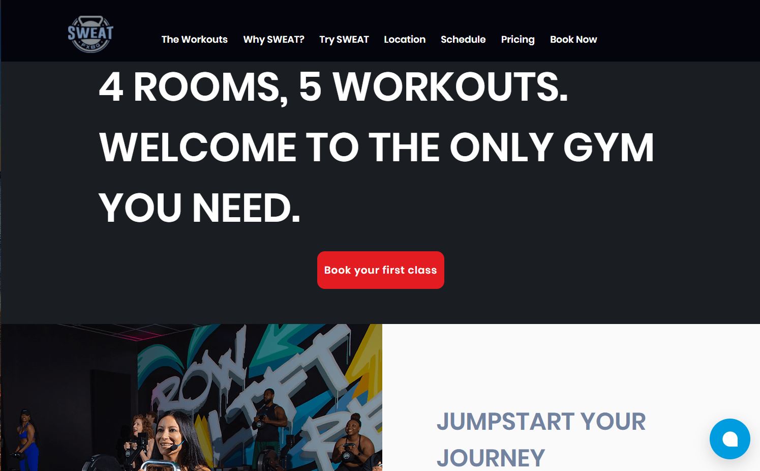
Visitors who land on Sweat FXBG’s page for the first time know exactly what the fitness club offers them and what to do next. The value proposition is impossible to miss: “4 rooms, 5 workouts. Welcome to the only gym you need” appears in large white capital letters at the top of the screen, contrasting against the solid black background. No need for other gym memberships or fitness classes when Sweat FXBG meets all your fitness needs.
The CTA button encouraging you to book your first class stands out and matches the CTA links that connect to the inviting copy below, colored in bright red atop the white or black backgrounds. This fitness website uses enticing slogans, high-resolution images of people working out, and eye-catching CTAs to capture visitors’ attention.
3. Gramz Fitness: Capture the experience using background video

The landing page of Gramz Fitness features a background video made of video clips that show a man in a hoodie (the owner of the gym, Adam McBride, though first-time visitors don’t know that yet) walking along the street and entering the facility. Adam then leads classes and trains clients, taking site visitors on a virtual tour of the gym, making it feel like a familiar place even before they set foot inside. Showcasing video of the workouts, trainers, and gym space lets interested customers know what to expect from a visit to Gramz Fitness, building trust in the brand and business.
4. Ali About Fitness: Show off workout classes with photos

Scrolling down the homepage of personal trainer Alison Bull’s website, Ali About Fitness, designed by Wesley Lyne, reveals a clickable button for each class type offered. The image below the buttons changes depending on which button you press to show the class in action, as well as the timetable and prices. The event training photo, for example, shows a trio of muddy and tired but happy clients celebrating outdoors, suggesting to potential customers that they could have this experience if they register for the class.
5. KG Fitness: Use color to support the brand

The KG Fitness website, designed by Phunk Creative, defies the common high-impact and high-intensity black-and-white color scheme for fitness websites and instead opts for a soft salmon color gradient. With its modern feminine connotations, pink is a perfect color for communicating personal trainer Katie Gawthorp’s goal of empowering women through a sustainable, science-based approach to health and fitness. The color choice clearly sets KG Fitness’ brand apart from other fitness sites, which shows potential clients exactly what the brand is all about and encourages them to get in touch.
6. Sean Alexander: Use copy to support the brand

Created by Eikon Labs, this fitness coaching website clearly communicates Sean Alexander’s approach to exercise, which focuses on triumphing over your own physical and mental weaknesses. The site uses inspirational copy such as “rise above,” “become the person you’re meant to be,” and “strengthen your mindset and reconstruct your habits” to reflect Sean’s philosophy that building muscle happens on both a physical and a mental level.
Many men’s fitness websites feature this kind of openly challenging copy, as it helps prospective clients feel they can work to solve broader life problems by starting an exercise program. The value offered by Sean’s training is clear: With fitness, you can exceed your previous limits to improve your life.
7. Koreball: Start the user experience with a simple choice

Koreball’s unusual landing page design intrigues visitors and invites them to interact with the site right from the start.
Tapping “Koreball” takes visitors to a page where they can buy a Koreball (a piece of workout equipment), learn how it works, and read the story of its invention. Tapping “workouts” takes visitors through a sequence that allows them to choose the intensity and duration of the workout they want to do with their Koreball and then access the corresponding workout plan. This web design means that beginners and seasoned Koreball users can quickly find the information they need on the site. We love this organization of information for fitness products: It empowers users to learn how to use the Koreball, inspiring trust and encouraging them to make a purchase.
8. Rebel Fitness: Include an ecommerce store

Some fitness clients include an ecommerce store as a revenue stream and sell merchandise, supplements, or gear online. On Rebel Fitness’ site, designed by Red Shark Digital, visitors access the gym’s online store from the menu in the top right corner. After selecting a piece of gear, clicking “Add to cart” takes you to a product page where you can select the size you need.
The shopping cart appears as a pop-up whenever an item is added and invites the customer to proceed to the checkout page — an approach that works well for small stores where people are likely to buy only one or two items.
9. Blue Blairy Fitness: Experiment with image opacity

The contact form design on Blair Wyatt’s webpage Blue Blairy Fitness, by Raul Flores, is transparent and overlaid on a background image of barbells, giving it a striking and inviting look that encourages visitors to get in touch. The opacity softens the intensity of the metal plates and loaded barbell to create a welcoming atmosphere — like Blair’s contact form, urging visitors to get in touch to find what will work best for them.
10. Day One Fitness: Use pop-out image effects

As the Day One Fitness website by Martin Cris shows, pop-out photo effects can add dynamism to your site and give it a 3D appearance. Day One Fitness trainer Sharail offers supportive personal training focused on building self-love through changes in eating and exercise habits, and the photo supports this by presenting Sharail as friendly and approachable.
Pop-out effects are a great addition to fitness websites because they capture a strong sense of movement — just like customers who convert on these sites.
Now get people working out
Once you’ve built your website, it’s time to get people in the door. There’s no point designing a gorgeous site if nobody sees it — so use SEO tools to give the website the best chance of ranking in search results.
You can also offer to team up with the fitness client in social media and other online marketing campaigns or run ongoing website performance tests to keep both you and your client at the top of your game.