The best landing pages inform visitors about your product or service and encourage them to convert.
A good landing page turns website traffic into qualified leads. It grabs a visitor’s attention, engages them while conveying important information, and directs them toward a desired action.
To achieve that, you’ll need to carefully design your layout, headlines, graphics, and calls to action (CTAs). Fortunately, you don’t have to start from scratch. In this article, we’ll showcase dozens of the best landing pages to inspire your process.
26 landing pages that offer inspiration and layout examples
The following landing pages feature high-quality visuals, interactive user experiences, and engaging CTAs that can serve as inspiration for your own designs.
1. Nightwatch Rank Tracker
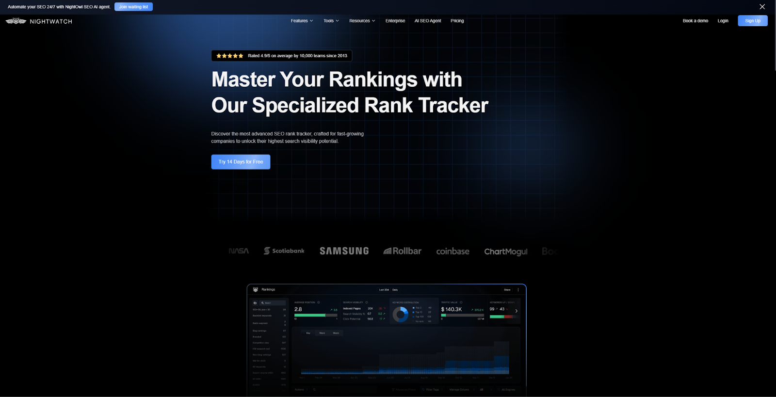
Nightwatch’s Rank Tracker landing page conveys authority with carefully chosen wording. Phrases like “Master Your Rankings with Our Specialized Rank Tracker” imply that Nightwatch is an authority in search engine optimization, and that their tool lets users benefit from that expertise.
Each section also contains an interactive element, which draws the eye and promotes engagement. For example, the blue CTA buttons have subtly animated gradient backgrounds, encouraging people to click through. The moving blue outline on the Rankings dashboard screenshot also pulls visitors in to learn about the tool’s features. This landing page design ultimately provides a persuasive experience that engages, informs, and then directs the audience to take action.
2. Proof Pulse
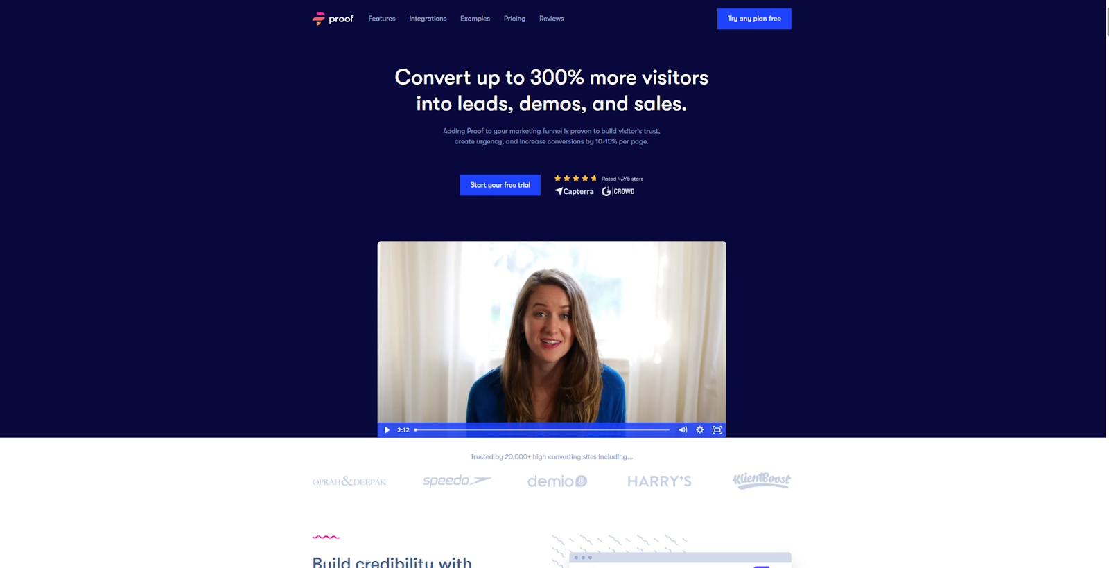
Proof makes a tool called Pulse, which is designed to build visitor trust and increase urgency. The Pulse landing page focuses on concrete data, with a subheading that claims this product can “increase conversions by 10–15% per page.” A client testimonial video immediately backs this up, describing how one user increased webinar signups by 35%.
Before visitors even scroll, they’re already primed to see this service as credible and authoritative. If they choose to, they can click on the “Try any plan free” CTA to take immediate action. If they still need convincing, the following list of features, highlights, and reviews should help them decide. As long as you can support your claims with accurate numbers and social proof, don’t be afraid to go for the sale immediately as shown in this example.
3. Gemnote Sourcing and Production

Gemnote is a merch and packaging brand that manages products from design to shipping. Their Sourcing and Production landing page is a good example of minimalist design, with readable fonts and plenty of whitespace. Additionally, their readable format reflects Gemnote’s overall message of simplicity.
The website for Gemnote is quite neutral, featuring a light tan and black primary color palette. Merch photos are the only elements with bright colors, drawing attention to the products. This landing page focuses on using real items to position Gemnote as a quality production company. It’s a great example to follow on how to use simplicity to highlight your visually appealing products.
4. AngelList India
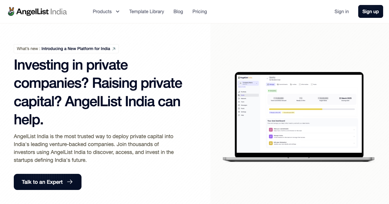
The AngelList India landing page by Envizn Labs follows a familiar landing page template. It starts with a persuasive headline, showcases a few key features, and ends with a clear CTA. This simple core formula is supported with high-quality visuals and attention-grabbing animations, such as a scrolling client logo section.
This company clearly understands their target audience well. The minimalist format allows them to make the selling point — raising capital and investing in private companies — clear, then immediately push for conversion with multiple CTA buttons. If you know your target audience extremely well, you might use this landing page as an example for how to streamline your content.
5. Pocus AI
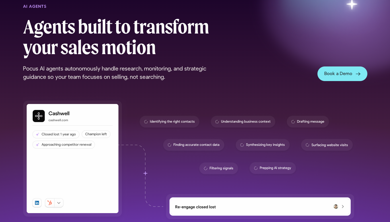
Pocus is a play on the term “Hocus Pocus.” This company promotes their AI as helping sales agents so well that it’s like magic. Every part of the Pocus AI landing page design, including the purple color scheme and mystical graphics, embodies that message and playful spirit.
These whimsical elements are balanced with clear, professional copy. Both the product’s features and how they can benefit visitors are explained immediately, with clear subheadings such as “Pocus AI agents autonomously handle research, monitoring, and strategic guidance so your team focuses on selling, not searching.” The rest of the page breaks down these features with short phrases and simple language. The website strikes a nice balance between creativity and practicality, which may be worth emulating.
6. RemotePass Integrations
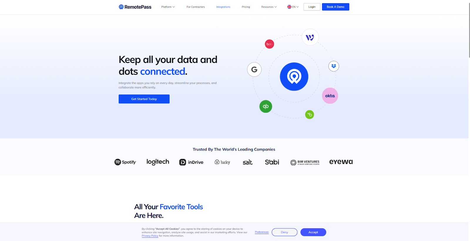
RemotePass integrates tech stacks into one platform. Their Integrations landing page illustrates how this works, with visuals that draw connecting lines between icons for popular platforms like Google, WordPress, and Dropbox. This imagery explains the product’s primary function at a glance, without the need for excessive text.
Since RemotePass understands that anyone checking their service out will want to know if it supports their favorite platforms, these logos highlight in-demand tools front clearly and immediately. The rest of the page continues to focus on this element, showcasing exactly how each integration saves time, reduces errors, improves efficiency, or reduces costs. It’s a strong template for using visitors’ investment in related tools to make a case for your own product’s benefits.
7. Tento Business Credit Monitoring
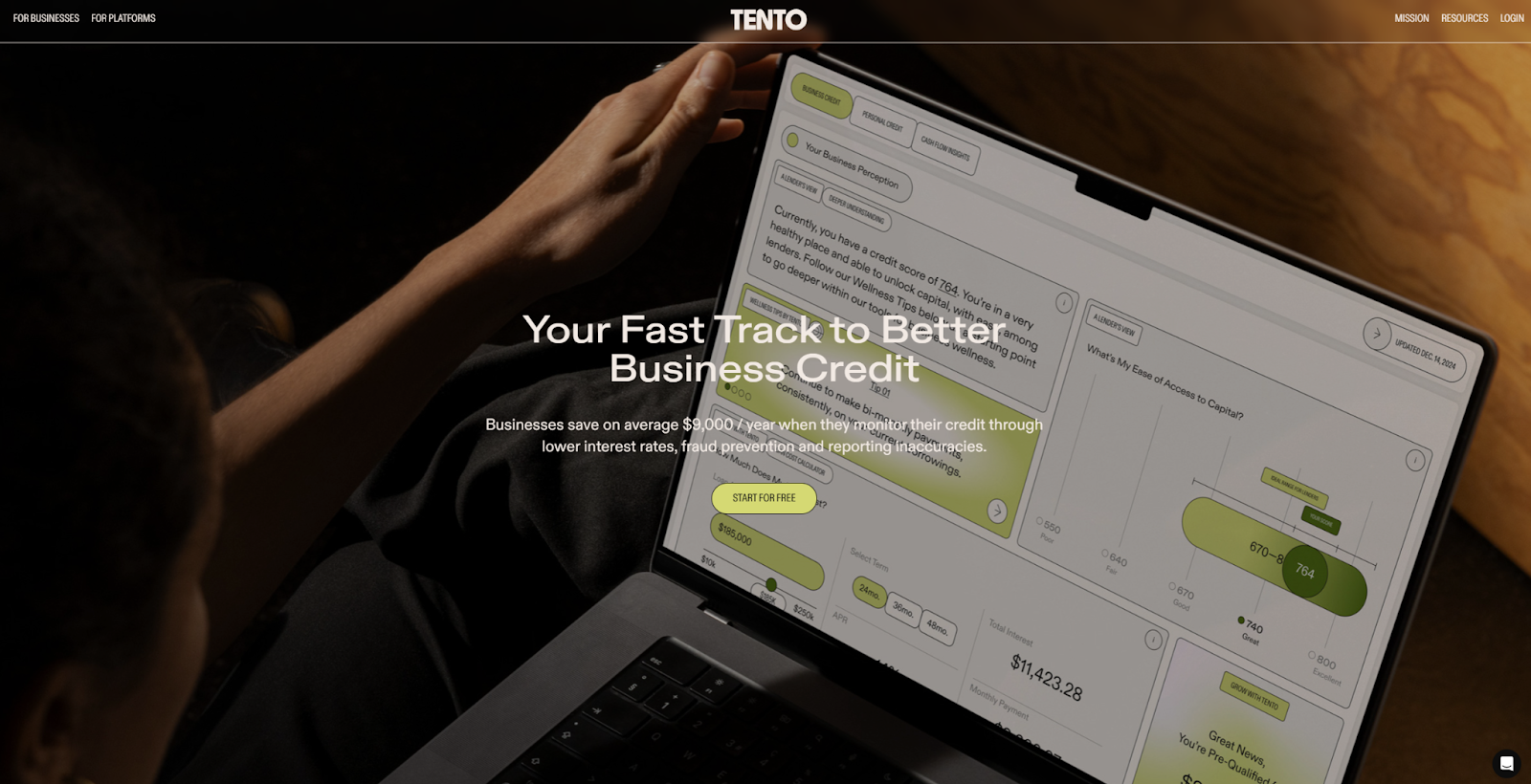
Tento’s Business Credit Monitoring landing page design opens with a full-screen image, then transitions into a more simplistic layout with plenty of whitespace. This approach captures attention quickly, yet keeps the majority of the layout orderly and accessible.
The use of a lime-green color palette differentiates this page from competitors that use similar layouts. While the color choice is atypical, it is balanced with black text, whitespace, and transitional gradients. This example demonstrates how you can use a bold color palette judiciously to attract attention, while keeping your landing page professional.
8. Pave Market Data Launch
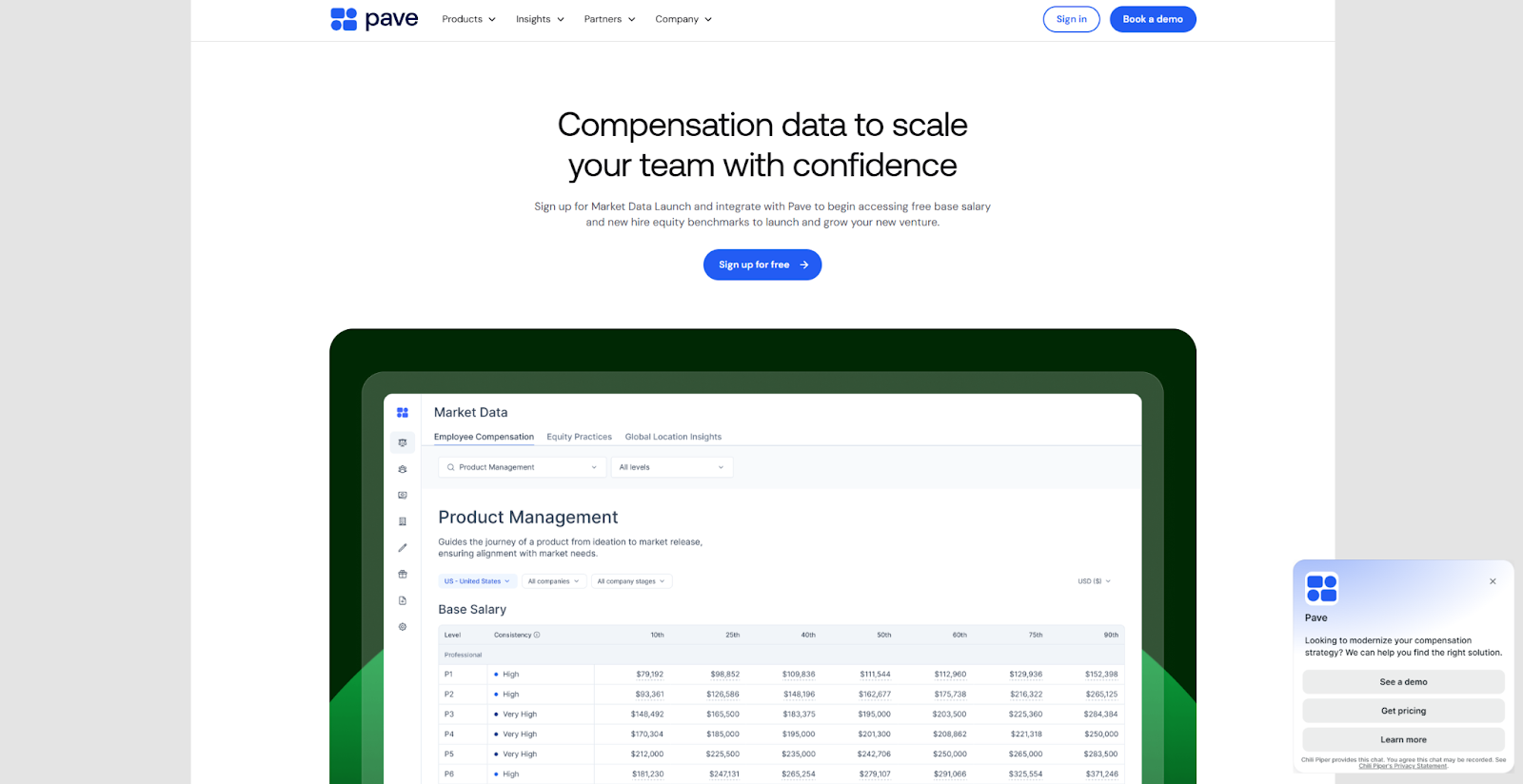
The landing page for Pave’s Market Data Launch is simple and formulaic. It follows a fairly recognizable template, with clearly divided sections for images, feature highlights, social proof, and CTAs. It mostly adheres to a Z-pattern layout, which imitates the way visitors naturally scan a page and makes the content easy to understand.
However, there is one section with a different layout. The platform’s features are explained via an F-pattern design, which both grabs attention and provides more room to explain the platform’s functionality. This introduces a touch of unpredictability which can draw visitors toward the most important information and CTAs, especially when paired with a largely familiar layout.
9. Community Messaging
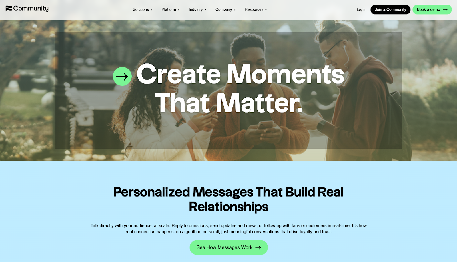
Community’s Messaging landing page is very minimal, with small images, short phrases, and clear section dividers. It’s been well-optimized for mobile devices, as these streamlined elements are comprehensible even on a small screen.
This landing page prioritizes the basics. A straightforward heading and subheading lead into one-line benefit and feature descriptions, punctuated by CTA buttons. This landing page design indicates respect for the visitor’s time, and provides a streamlined experience regardless of device size and type. If your audience primarily consists of mobile users, Community is a good resource.
10. Mezzi Tax-Loss Harvesting
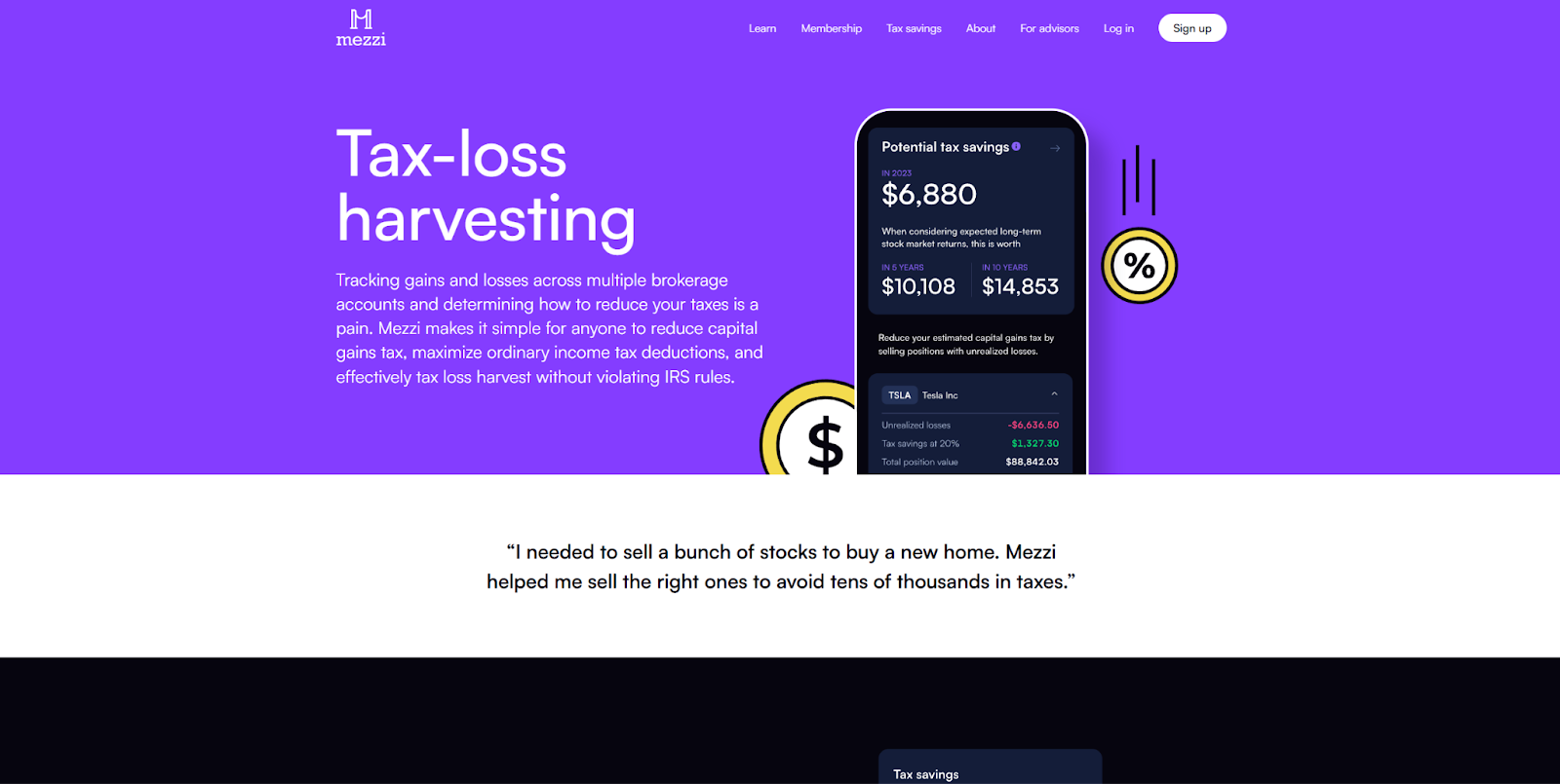
Mezzi’s Tax-Loss Harvesting tool helps users navigate the complex world of tax policies. This landing page breaks down this service in a way that is easy to understand for the viewer. The visuals display large numbers and jargon; however, that information is presented in small pieces, and is supported by text that uses plain language and focuses on the end benefits.
If your product handles technical, financial, or otherwise complex tasks, this page demonstrates how to describe that solution to both veteran and novice users. Small amounts of jargon and technical content convey authority, and tell veterans how your tool can simplify the workflows they care about. You also assure novice users that you can help them understand and navigate complicated functions.
11. Glyphic Sales Leaders
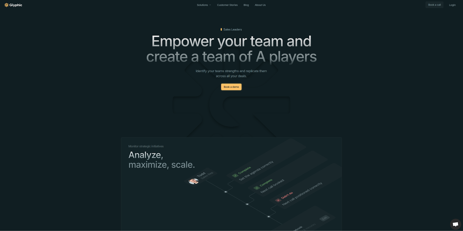
On the Glyphic Sales Leaders landing page, each image is purposeful. Rather than delving into every one of the platform’s features with overwhelming detail, only a few key aspects are highlighted. The accompanying text is brief and action-oriented, making use of words like “Automate,” “Leverage,” and “Monitor.” There’s also a lot of separation between each row, giving direct focus to each specific feature.
If your product is complex, it’s important not to overwhelm visitors. That being said, when building your landing page, consider following Glyphic’s example by choosing a few elements and showing how important they are with large sections and prominent graphics. Then you can refine the copy to make it active and focused on understandable benefits. Your landing page is the first introduction a viewer has to your brand, so it is important to make things as simple and clear as possible.
12. Float Project Planning
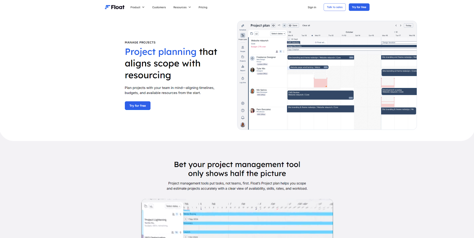
The Float Project Planning landing page by Candid Leap focuses on teaching visitors how their product works. As you scroll down the page, you’ll see each core feature independently, with a concise explanation and supporting visual. These are presented in a logical manner that builds on previous information, so by the end you have a clear understanding of the product’s capabilities.
This page also uses a consistent color palette in varying shades of blue. According to color theory, blue conveys security and reliability. Their landing page design thus illustrates how you can pair concrete information with unconscious symbols of authority to make a compelling case for your product’s effectiveness.
13. OpusClip Calendar

OpusClip’s Calendar helps content creators schedule and automate posts to multiple platforms. This landing page design offers plenty of useful information about how the product works. The page also spotlights a free demo at the top of the page. The page invites visitors to immediately upload a video and schedule it for posting, allowing them to try the service out rather than just reading about it.
Offering visitors immediate value in this way encourages them to take the next step in your sales funnel with a low-commitment interaction. It’s also a great way to accommodate visual and hands-on learners. The rest of the page provides the expected screenshots and copy, detailing features and answering common questions. The demo element doesn’t replace anything visitors expect, instead giving them a new way to engage directly with the product.
14. Homebase Employee Scheduling
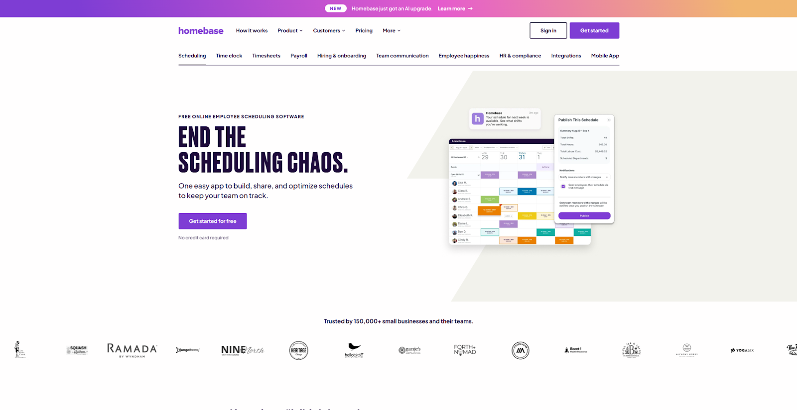
Every element of Homebase’s Employee Scheduling page is informed by the target audience’s needs — to save time and reduce confusion. The headline at the top, “End the Scheduling Chaos,” makes a bold promise that addresses a common pain point. Other above-the-fold terms like “free” and “easy” emphasize how this product solves problems easily.
Scrolling down reveals headers, graphics, and content that elaborate on how this service optimizes the project tracking process. The page focuses on the reader’s needs, with phrases like “Never hear ‘I didn’t know I was working’ again” and “Put your schedule on cruise control.” There’s also an FAQ near the bottom with concise, optimistic answers. This consistent message is worth emulating if your product is all about making life easier for customers.


.jpeg)
9 B2B website optimization ideas that work
In this ebook, learn strategies to increase B2B website conversions
15. Clay Signals

Clay Signals helps companies track metrics and user activity, then trigger automated workflows based on specific signals. This is a complex service, the landing page simply and clearly explains the core benefits well. Rather than hyperfocusing on the exact details of the product, the graphics, copy, and animated demos are all designed to help visitors understand how Clay can give them a competitive edge.
For example, the section “Track career movement” doesn’t explain how the tracking is implemented. Instead, it talks about the end result: “Trigger automations when people change jobs or get promoted…create more relevant messaging than your competitors.” Too much technical information can overwhelm or discourage visitors. If you have a complex product, this landing page design illustrates how to introduce that product based on its benefits and results, not its architecture.
16. Appcues How It Works
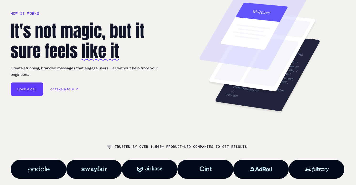
Appcues is a workflow automation tool that helps users drive organic growth. The How it Works landing page demonstrates how to set up the tool with concise, step-by-step instructions. It’s an unusual approach because this information is typically found in documentation, not sales copy. Here, it lowers the barrier to entry by showing potential users how easy it is to get started.
A high-quality but simple image accompanies every step in the process. This keeps the psychological cognitive load low, and makes each stage easy to understand. By doing this, Appcues maximizes the chance that visitors will reach the bottom of the page without getting overwhelmed. It's a good reminder to give people just enough information to answer their immediate questions, and empower them to imagine what using your product will actually be like.
17. Audienceful Email Newsletter
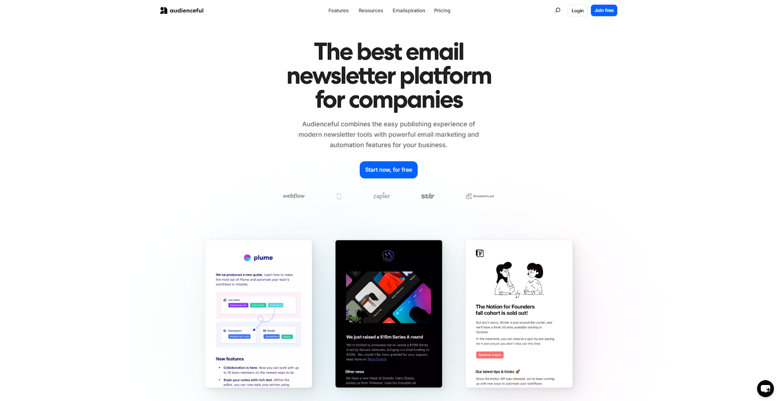
This Audienceful Email Newsletter landing page is straightforward and engaging. Its headlines and content use large text sizes and readable fonts, and the graphics and backgrounds leverage black-and-white contrast to create clear structure. The CTAs are simple and action-oriented, with phrasing like “Start now, for free.”
These elements make it easy for the reader to follow the flow of information, and keep their focus on the product. This is a perfect example of how you can accomplish a lot by focusing on a straightforward layout, persuasive copy, and large high-quality visuals. If the content is strong, you don’t need animations and detailed designs to make your landing page effective.
18. Aura How It Works

This Aura How It Works landing page commits to an unusual but engaging design. There are parallax scroll effects and interactive elements throughout, making the page feel less like a sales tool and more like a demo. Each scroll downward uncovers new content, giving visitors a sense of agency and discovery.
Along with its chic appearance, Aura’s page carefully teaches readers about the product through concise descriptions and illustrative charts and graphs. There are plenty of CTAs, so each visitor can decide when they’ve seen enough and are ready to give the product a try. Using this landing page as a model will help you maintain a balance between fun interactive elements and educational content.
19. Folk Dashboards
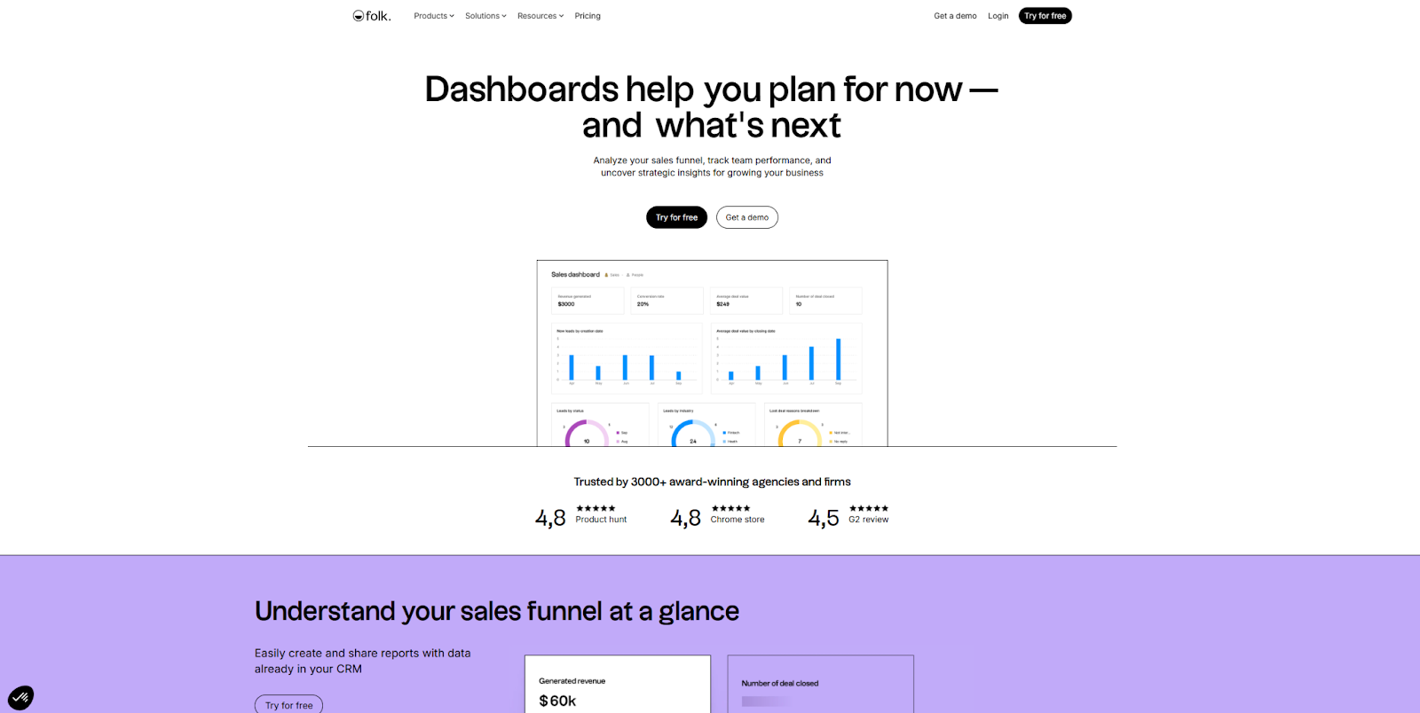
The Folk Dashboards landing page is optimized for engagement. It describes the company’s comprehensive service with concise snippets of content and lots of colorful visuals. User reviews offer social proof, and CTAs like “Try for free” are simple and action-oriented.
This page demonstrates how you can appeal to a wide audience by using a little bit of everything — descriptions, imagery, reviews, and FAQs. You can also follow Folk’s template by adding a CTA in every section, so you can capture the “yes” moment whenever it happens.
20. HockeyStack Performance Marketing

This HockeyStack Performance Marketing landing page demonstrates how modest visuals can create a welcoming experience. Everything about this page represents a light-touch approach to design, from the pastel color palette to the simple graphics. While there’s plenty of information on the page, the structured navigation and use of whitespace keep each element highlighted and easy to understand.
This strategy supports a complex product by hinting that there’s more beneath the surface. Visitors are provided with a concise summary of each feature, then encouraged to check out more information based on what interests them. To achieve a similar effect, make sure to restrict your landing page content to the basics. Also be sure to provide plenty of CTAs that point to more details and lead further into your sales funnel.
21. allwhere Procurement and Onboarding
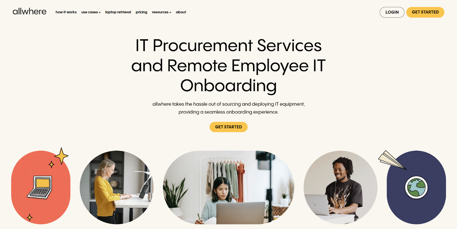
This allwhere Procurement and Onboarding landing page design is heavily stylized, promoting a technical product with bright colors and cartoonish visuals. This both grabs the visitor’s attention and leads them through some potentially dry material with fun supporting imagery.
The final CTA is especially well done. It can be easy to overlook the CTA at the end of a landing page, simply because the reader has already seen so much information. This particular CTA draws the eye with a cartoon cityscape with a looping animation of a box with legs running through a tunnel. Overall, this is a good example of how to retain attention throughout a long, scrolling page, and how to make sure your CTAs aren’t missed.
22. Guidde Create
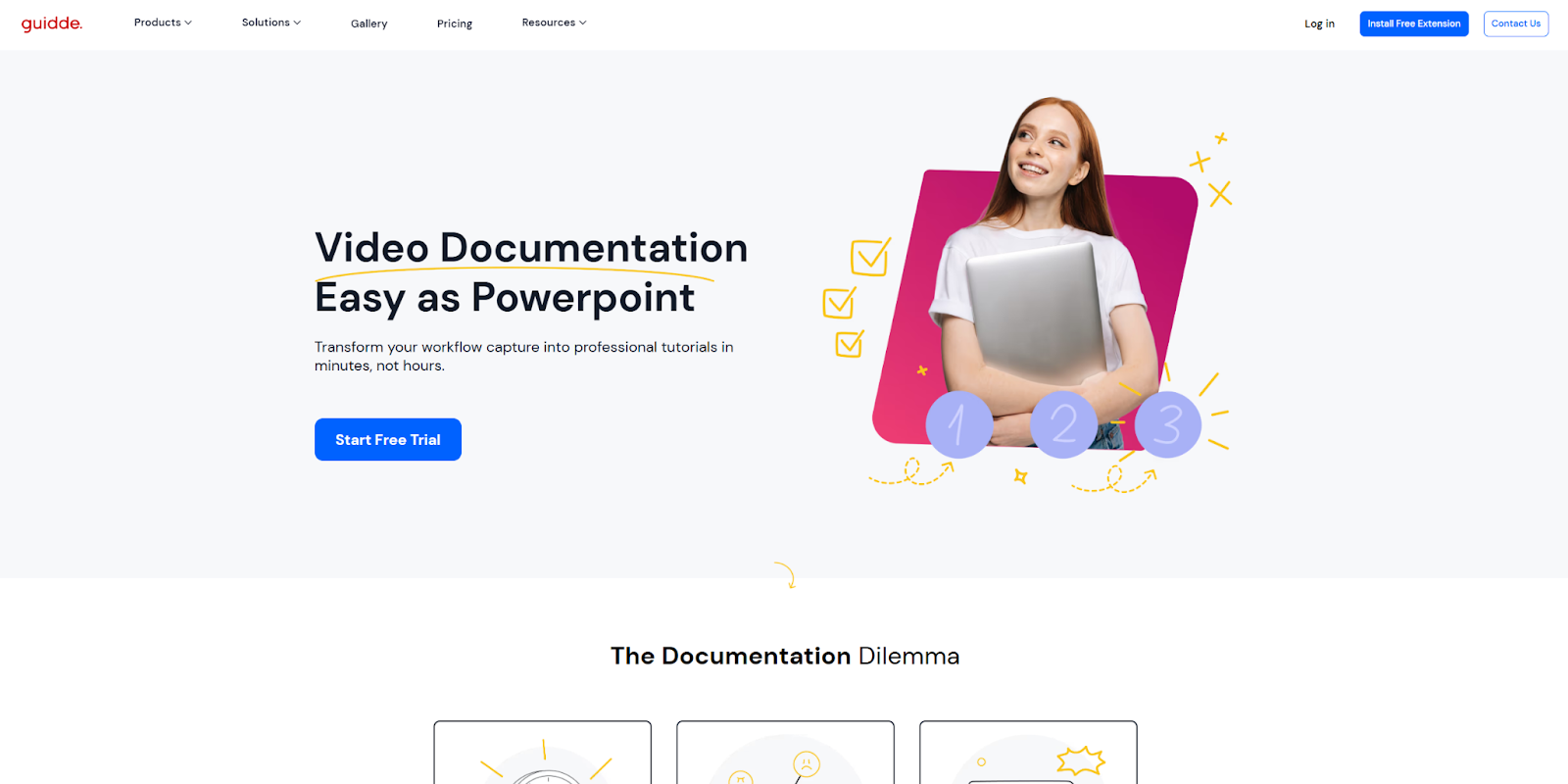
The Guidde Create landing page showcases the company’s commitment to making video documentation simpler. From top to bottom, the focus is on how their tool saves time and ensures consistent quality. The opening “1-2-3” visual implies a quick and simple process, which is immediately reinforced by subheadings that are paired with pleasant, easy-to-follow graphics.
Despite how focused it is, there’s a lot of information on this brief landing page. It covers a variety of features like automated translations, AI-generated descriptions, and smart editing tools. Still, the emphasis is on how each of these tools simplifies common tasks. This type of clear and cohesive narrative brings a landing page together, explaining the product clearly while also being entertaining.
23. Trendtracker AI Analyst
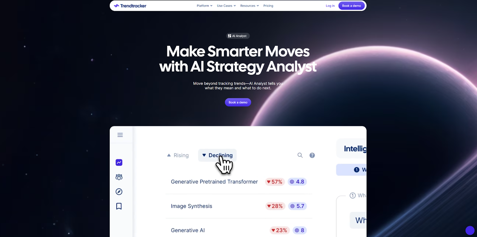
Trendtracker AI Analyst takes a more detailed, comprehensive approach to their landing page. The video demo at the top of the page and the content below go into a lot of detail about how the tool works, along with its various use cases. The FAQ at the bottom aims to cover any remaining visitor questions, including links to related blog posts.
This approach might overwhelm some visitors, so it’s important to break up the content with graphics and videos. Trendtracker does this well, using large images and video demos that separate the text and illustrate the various features. This landing page also uses a small and conservative color palette, keeping the visual experience simple to avoid overwhelming visitors.
24. Lindy Sales

The Lindy Sales landing page offers a CTA at the top that invites visitors to try out the product, followed by a simple walkthrough of the service in action. Continuing down the page, you’ll notice plenty of feature highlights, which are accompanied by simple but informative animated visuals.
If you want to create a user-friendly experience that still values detail, it is important to strike a balance between content, space, and visuals. The key to finding the right mix is timing. You’ll notice in this example that, as you scroll down the page, the animations are timed to start slowly. This leaves readers with plenty of time to read the section above before moving on. Gradual timing helps you offer enough content to interest readers in your product without making them feel rushed.
25. Modular Chatbots
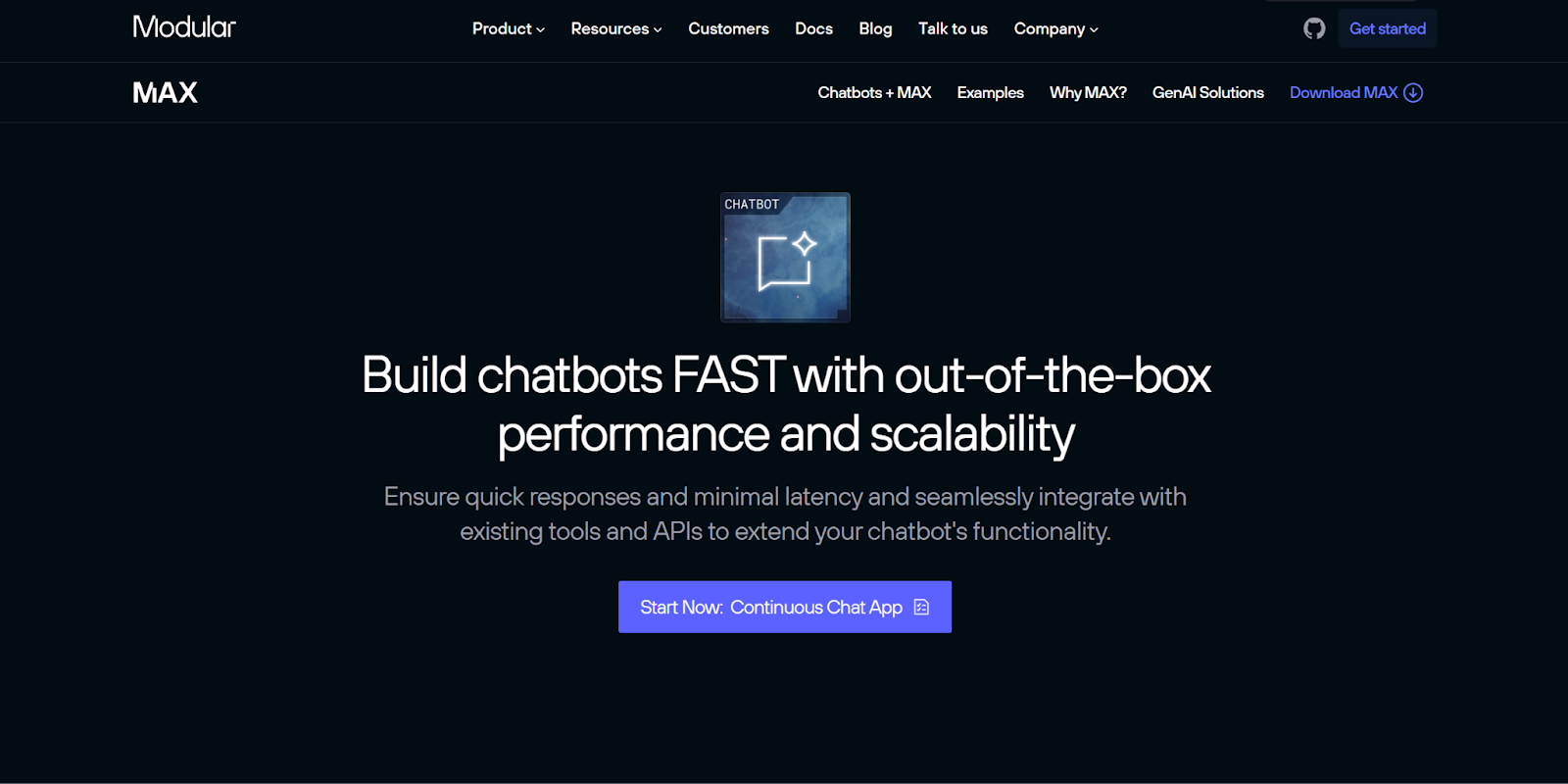
The Modular Chatbots landing page uses a design that closely resembles GitHub. It puts its own spin on the graphics and layout, but the fonts, features, and CTA buttons all evoke landing pages like GitHub Copilot. There’s also a black background and recognizable icons for compatible services.
Lightly referencing another brand’s design can be a useful tactic when developing your own brand identity. Using a familiar format can help viewers with navigation and subconsciously increase credibility. Just be careful not to directly copy your competitors too closely as you want to represent your specific brand and not theirs.
26. Flow for Leaders
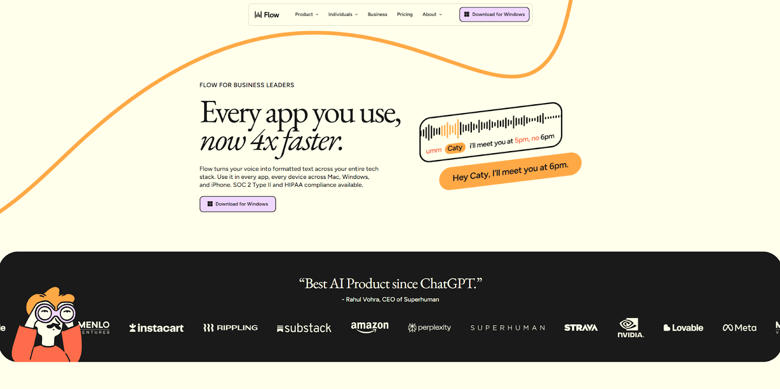
Flow is an AI-powered tool that uses natural language processing to let users input text with speech. Because the functionality relies on compatibility with other platforms and websites, the Flow for Leaders landing page highlights the tools Flow specifically works with. This provides credibility and increases interest for the viewer.
But this landing page’s standout feature is how well it resonates with the brand name: Flow. The visual style focuses on organic shapes, and both section dividers and graphics have rounded corners that suggest motion. The landing page successfully conveys the overall theme of the product, which is a useful branding strategy to consider.
Turn clicks into customers with designs that convert
The most successful factor behind each of these examples is their visual appeal. The way the best landing pages look matters just as much as their content — possibly more. Humans are visual creatures, and a unique color scheme or playful animation can pull visitors’ attention toward you and your brand.
Crafting a compelling digital experience takes time and experience, and you’ll need a landing page builder that supports your creativity. That’s why Webflow’s visual design platform gives you a wide range of tools. You can start with a cloneable template from the Made in Webflow marketplace, then modify that template to suit your needs. You can also build your landing page from scratch and add whatever page structures, components, advanced styling, 3D animations, and interactive elements you want.
Either way, you’ll have everything you need from day one. Webflow is here to support your designs, empowering you to build landing pages that compel and convert.

Build with Webflow
Break free from the constraints of traditional platforms. Migrate your site to visual-first platform that combines design flexibility with powerful CMS capabilities.


