Not every project needs a full website, and not every website needs a landing page.
If you’re building sites for clients, knowing the difference between a website and a landing page can mean the difference between just finishing the job and absolutely nailing it.
A website is a (often) multipage experience where visitors navigate different sections like the homepage, blog, and contact page. It connects content, structure, and design into one cohesive experience that encourages deeper exploration.
A landing page, on the other hand, focuses on a single goal, like collecting email sign-ups or promoting a new product. It uses limited space to highlight one offer, message, or call to action (CTA).
Clients may not know the difference between websites and landing pages, and that’s OK. But as a service provider, understanding when to use one or the other allows you to design smarter and deliver exactly what your clients — and their audiences — expect.
Read on to learn more about landing pages versus websites and when each works best.
Websites: An overview
A website is a collection of interconnected pages under a single domain. While every site is unique — in content, design, and purpose — the intent is typically the same. Websites give visitors a comprehensive overview of who or what they represent, what they offer, and how to take action, whether it’s for a brand, an organization, or an individual.
Most websites share certain components, including the following:
- Homepages are the front door to the site. Homepages introduce a client’s brand and offering and encourage visitors to explore other pages by previewing key sections, like services or blog posts, or through bold visuals, thoughtful design, and a navigation menu that signals where to go next.
- About pages tell the story behind the business. They often share values, team details, or a vision statement to build trust and authenticity.
- Navigation menus help visitors move between pages quickly and easily. Many navigation bars (navbars) and menus also include a search bar — a field where people can enter keywords or questions to find specific content within the website.
- Services or product pages clarify what the business offers. They guide visitors toward taking action like signing up, booking, or making a purchase.
- Blogs or resource hubs offer educational content or updates. They’re ideal for establishing authority in a specific field and improving search engine optimization (SEO) over time.
- Testimonials or case studies highlight real experiences, whether they’re customer reviews or measurable outcomes. They build trust, create social proof, and help persuade visitors to take the next step.
- Frequently asked questions (FAQs) address common questions upfront. FAQ pages reduce the back-and-forth between client and customer and give hesitant visitors the insight they need to move forward.
- Contact pages are a key component for converting interest into action. They give visitors a direct line of communication with your clients and often make the difference between casual interest and real engagement.
Landing pages explained
A landing page is a standalone webpage with a specific purpose: to convert a target audience into leads, customers, or sign-ups. Unlike full websites, landing pages are visually clean and lack elements like navbars or multiple links. Instead, they direct the user’s attention to a specific message.
Landing pages are especially useful for marketing campaigns, product launches, and ad-driven traffic from search engines and other platforms. Here are a few key components of landing pages:
- Headlines and subheadlines quickly communicate the value of the offer. A strong headline grabs attention, while the subheadline adds clarity or urgency.
- CTAs are the main conversion trigger — short, direct prompts like “Book a demo!” or “Download the guide.” CTAs often appear as buttons or forms in contrasting colors and repeat down the page to encourage action.
- Hero sections are the above-the-fold area and are usually the first thing visitors see. They typically include a striking image, short copy, and an immediate engagement prompt, like a button or form tied to the page’s purpose.
- Supporting visuals are images or short videos explaining your client’s offering and unique value proposition. These give the page more visual appeal and reinforce the benefit of taking action.
- Brief descriptions or benefits lists explain what the visitor will get and why it matters. These focus on outcomes, not just features.
- Social proof like testimonials, case studies, collaborations, infographics, media publications, or stats build credibility, boosting your client’s reputation.
- Minimal navigation is a common feature of landing pages. Most avoid full navbars and limit internal or external links to keep visitors on a single path and less likely to click away.
The key differences between websites and landing pages
Before you start wireframing, you need to know what you’re designing: a website or a landing page. Understanding how they differ shapes everything — from how users move through the content to how effectively it supports your clients’ goals.
Here’s how websites and landing pages compare across four core areas.
Purpose
Websites serve multiple purposes. Depending on the client’s needs, a site might educate, build brand awareness, and nurture leads from potential customers. It invites users to explore, which is especially valuable for audiences arriving from channels like social media, search, and email — each with different expectations and levels of familiarity. A website lets visitors pick their own path and engage at their own pace.
By contrast, landing pages aim for a single outcome. Every element on the page works toward one action, whether that’s collecting emails, promoting a limited-time offer, or encouraging visitors to book. For example, if a client is launching a new product and running ads to support it, they may not need a full site — just a landing page designed to capture interest and drive early demand.
Navigation
Websites have a full set of navigational elements, including a header menu, footer links, a search bar, and internal paths between pages. Visitors use these features to move between content areas as they discover more about the brand.
Landing pages intentionally reduce navigation or remove it altogether. There’s no top menu or footers — just a direct path to the CTA. With fewer distractions, visitors are less likely to click away. Conversion rates are more likely to be higher, too.
Content
Websites are content-rich. They include various types of information, like the company’s background, blog posts, case studies, product catalogs, service descriptions, and FAQs. Every word and image in each section educates and engages visitors throughout their journey.
Landing pages are content-specific. Instead of nice-to-know details, there’s need-to-know content. For example, instead of sharing a company’s full story, a landing page might showcase one customer pain point and how the product solves it.
Design
Websites are built for responsive design that works seamlessly across devices and screen sizes. They often use multiple templates for different page types, with consistent brand styling throughout. They’re also scalable — ready to support more traffic, content, and functionality over time.
Landing page designs are all about focus and flow. Most follow a single-scroll layout with bold headlines, short copy, a hero image or video, and repeating CTAs. Rather than inform or entertain, the design continuously persuades the visitor to act.
3 reasons to differentiate between websites and landing pages
Here are three reasons why knowing the distinction between websites and landing pages makes a difference in clients, conversions, and your own workflow.
1. Meet client needs and expectations
Every client has different objectives. Some want to establish a long-term brand presence, while others need quick results from a specific campaign. Understanding the difference between a full site and a landing page gives you the expertise to recommend the better option for your clients’ needs.
Why it’s important
Sometimes, clients ask for a landing page when their goals call for a full website, or vice versa. They might want to educate users, showcase an entire product line, or build long-term brand awareness, and they assume a single page can do the job. As the designer, you know when that format won’t support their goals. But if you start with the wrong page type, the whole project can go sideways, and you risk scope creep, missed deadlines, and a final product that doesn’t deliver.
Best practices
During kickoff, ask questions like: “Are we supporting an ongoing business strategy or a one-time campaign?” If a client is releasing a new program, a dedicated landing page with a form and testimonials might do the job. But if they’re building an online presence from the ground up, a website with blog content, service pages, and a contact form makes more sense.
2. Optimize conversion rates
Websites serve many functions, but landing pages have one motive: conversion — whether it’s a sign-up, a download, or a purchase.
Why it’s important
Removing navigation links, unrelated content, and other visual distractions keeps people moving toward the intended action. And that can dramatically improve return on investment (ROI) all around.
Best practices
Let’s say a client is running Google Ads for a new service they’ve added to their offering. Instead of linking to the homepage, build a landing page that mirrors the ad copy and nudges visitors toward the next step.
3. Streamline design and development
Designing a new website takes time — you manage sitemaps, templates, page layouts, and an extensive amount of content. Landing page design is faster because it’s single-purpose and follows a simpler structure.
Why it’s important
Knowing what you’re building helps you scope projects accurately, avoid unnecessary complexity, and deliver on time. It also gives you space to focus your creative energy where it counts.
Best practices
Use prebuilt landing page frameworks or repeatable design patterns for fast-turnaround projects. For example, if a client needs a lead magnet page for an upcoming webinar, reuse a proven layout with a headline, benefit list, image, and form — and go live faster without reinventing the wheel.
When do you need a website?
With a website, your clients have room to grow relationships over time and support a variety of visitor needs. That flexibility makes a full site the better fit in situations where the goal is to inform, engage, or scale.
Here are five scenarios where choosing a website over a landing page is the smarter move.
Building a brand presence
A brand’s online presence is more than just a logo or tagline — it’s the full digital expression of who the client is and what they stand for. A website serves as their home base by offering space to share their stories, showcase their values, and build long-term trust with audiences.
For designers and developers, it also creates an opportunity to build a unified brand experience. Every element — layout, language, color, and structure — comes together to reflect the brand’s personality and purpose.
Showcasing a portfolio
Portfolios highlight your clients’ skills, experience, and the kind of results they deliver. For service-based businesses — like designers, developers, and photographers — it’s not just about what they offer but how they approach their work.
A strong portfolio builds credibility by showing real-world examples. A dedicated work or case studies section might include project summaries, visuals, testimonials, and measurable outcomes. For instance, a web design studio might feature five or six past projects, each with imagery and a short narrative that explains the thinking behind the design and what it achieved.
Running an ecommerce store
An ecommerce website lets people browse, learn about, and purchase products directly online. If your client sells multiple items or manages inventory, they’ll need more than a single sales page. A full site supports product categories, filters, customer accounts, and a smooth checkout experience — all things a landing page isn’t built to handle.
A web store might include product listing pages in a grid or list format, with each item linking to a detailed product page featuring descriptions, pricing, and specifications. It should also include a shopping cart and checkout flow that’s secure, intuitive, and easy to complete.
Depending on the products the client offers, they may need supporting content as well. For example, a small fashion brand might rely on product photos, sizing charts, and seasonal lookbooks to tell a richer story.
Providing resources or blog content
Resource hubs and blogs are ideal for sharing ongoing content like articles, guides, and downloads. For example, a financial consultant might use a blog to publish weekly tips and market insights that keep visitors coming back.
Consistently publishing helpful content positions your clients as a trusted voice in their field — and improves SEO. Over time, steady organic traffic signals to search engines like Google that the site is a credible source, helping it rank higher for relevant searches.
To make updates easier after the project wraps, many websites use a blog template or content management system (CMS) structure that allows clients to add and manage content themselves.
Offering multiple products or services
Most businesses sell more than one offering. A website gives each product or service room to stand on its own — something a single landing page often can’t do. With dedicated pages, visitors can dig deeper and choose what suits their needs.
Straightforward structure and accessible navigation matter. Without them, visitors may get lost, miss key content, or leave before finding what they need. Well-organized sites often include service-specific pages linked from a central services hub, each with a tailored CTA button that directs users to the right place. For example, a business coach might have one page for one-on-one sessions, another for corporate training, and a third for an on-demand course library.
When do you need a landing page?
Depending on the situation, a dedicated landing page can outperform a full website by steering visitors toward a single, specific outcome. Even larger websites often include dedicated landing pages — sharp, standalone sections designed to drive action around a single offer or message.
Here are five scenarios where a landing page might be the better fit for your clients.
Launching a new product or service
When clients release a new product, feature, or service, a landing page helps focus attention on just that one offering. Instead of sending visitors to a full website with multiple pages and competing links, a landing page guides them through a single, purpose-built experience that supports one obvious goal.
A strong hero section with bold text and a visual element — such as an image, video, or animation — grabs attention right away. Below that, concise copy explains the product’s benefits, paired with a direct CTA like “Join the waitlist” or “Try now.”
To keep the content digestible, the page can follow a simple scroll-friendly structure: Start with an introduction and then outline key benefits, add a few real-world testimonials, and close with a sign-up form. With the right visual hierarchy, visitors move effortlessly from first impression to action — all on a single page.
Running a paid ad campaign
Paid ads work best when the landing experience feels like a natural next step. Instead of sending traffic to a homepage, which might dilute the message and lower conversions, a targeted landing page reinforces the ad’s promise with matching copy, visuals, and a cohesive user experience. It’s a seamless transition between platforms like Google, Facebook, and Instagram and the next stage of the visitor’s journey.
For example, if your client is running Facebook ads for a free design audit, the landing page should center on that specific promotion. The messaging, tone, and colors should mirror the ad, with a strong headline, a CTA, and no unnecessary navigation. The layout draws attention to what matters: the value of the offer. With fewer choices on the page, visitors are more likely to complete the intended action.
Capturing leads for an email list
Email lists give your clients a way to stay connected and nurture leads over time. A well-structured landing page shows what the visitor gets, why it matters, and how to sign up with minimal effort. When the value is easy to understand, people are more likely to share their email in exchange for a resource, discount, or exclusive content, giving your clients a steady stream of qualified leads.
The most effective landing pages feature a headline that communicates the benefit and a short sign-up form that’s quick to complete. For example, a wellness coach might use a landing page to promote a “7-Day Home Workout Plan” in exchange for the visitor’s contact details, with a layout that makes the offer easy to understand and act on.
Promoting a limited-time offer
A landing page is a smart way to highlight time-sensitive offers. Whether it’s a holiday discount, early access, or a flash sale, a standalone page keeps the spotlight on the offer and removes distractions. For example, an online course creator might use a landing page for a Black Friday promotion — just enough content to explain the offer and prompt visitors to act before the deal ends.
Urgency often comes from thoughtful design choices, like a countdown timer, an attention-grabbing headline, and a CTA like “Claim your discount!” Elements like testimonials and product demos reinforce the value of the offer, making visitors more likely to act before time runs out.
Validating an idea or an MVP
Clients often come to the table with big ideas, but before diving into a full build, what they often need is validation. In many cases, a landing page can be a good way to test concepts, gather feedback, and measure real-world interest — serving as a minimum viable product (MVP).
An MVP is the simplest version of a product or service released to early users. It includes just enough to learn what resonates without investing in full development. In web design, that might mean starting with a single-page MVP site — a fast, low-risk way to gauge demand. This lean approach positions you not just as a designer but also as a strategic partner who helps clients make smarter, more informed decisions. It’s especially useful for startups, experimental ideas, or those working with limited budgets.
For example, a client might want to promote their artificial intelligence (AI)-powered résumé builder. Rather than building a full site, a simple landing page could introduce the concept, show a mockup of the product, and include a call to action like “Join the waitlist” or “Get early access.” Tracking sign-ups and engagement helps validate the idea and gives you real data to guide future design decisions.


Ultimate web design
From 101 to advanced, learn how to build sites in Webflow with over 100 lessons — including the basics of HTML and CSS.
3 examples of effective websites and landing pages
Here’s a closer look at real-world examples of websites and landing pages, their differences, and what makes them effective.
1. Attentive
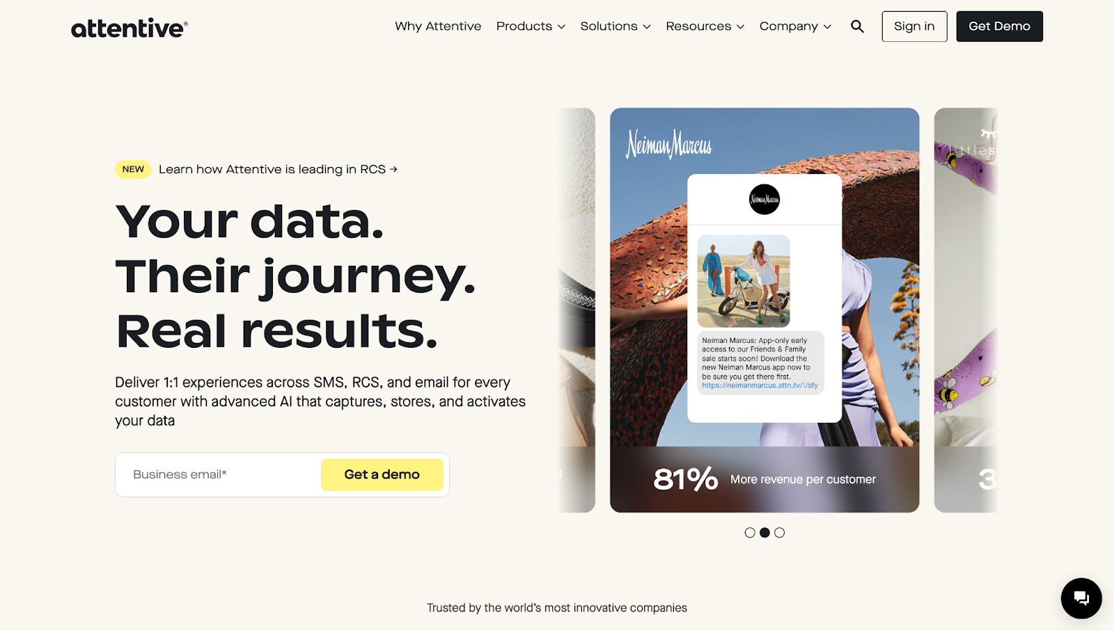
Attentive is a strong example of when a full website — not a single-purpose landing page — is the way to go. As a software-as-a-service (SaaS) platform with multiple product lines and customer types, Attentive needs to help different users learn about the product, weigh their options, and find what fits their needs.
The homepage introduces Attentive’s core value proposition as an AI-powered SMS and email marketing platform. From there, visitors can follow self-directed paths through product pages, industry-specific solutions, customer testimonials, and a deep resource hub that includes blogs, guides, case studies, and even a revenue calculator.
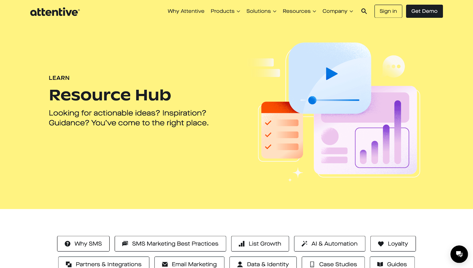
Even if visitors don’t arrive through the homepage, they can quickly find their way around and jump between sections. A top navigation menu links to every major page, while a link-rich footer appears across the site. This structure works well for a complex SaaS product and accommodates different types of visitors — marketers, developers, and partners — each with distinct needs that Attentive addresses.
As a website, Attentive succeeds by guiding you through layered content at your own pace rather than pushing a single outcome. That’s what makes it effective — it meets people where they are, whether they’re browsing, comparing, or ready to purchase.
2. Heva Health
Heva Health’s website
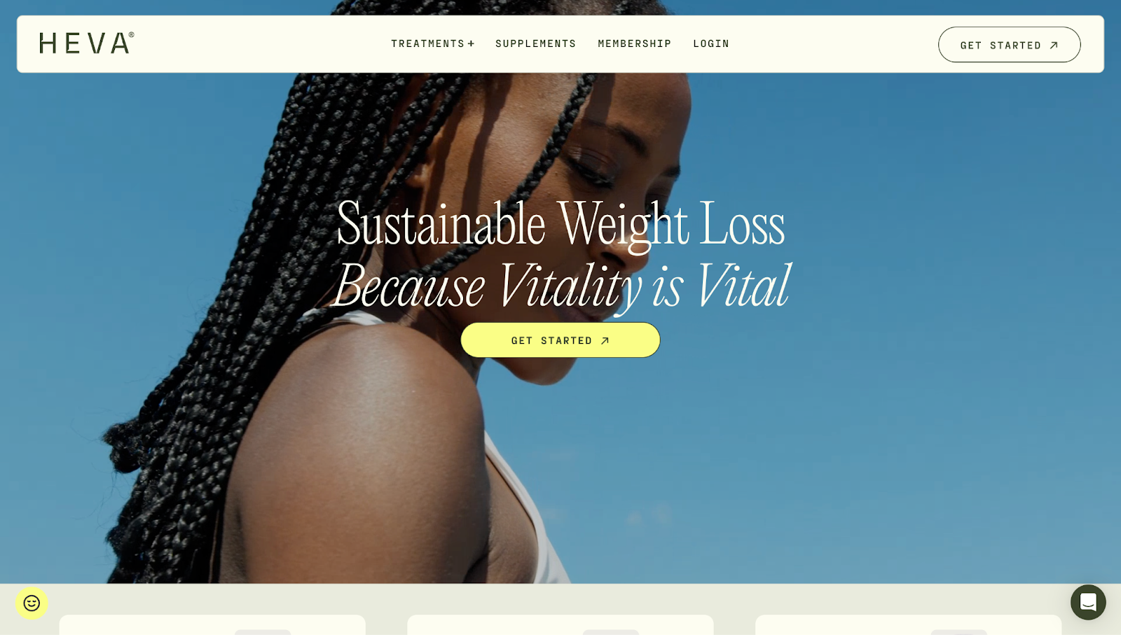
Heva Health’s website, designed by Carter Ogunsola, features a homepage, dropdown navigation, linked treatment and supplement pages, a blog, FAQs, and a detailed footer. Together, these elements educate visitors about Heva Health’s products and support user journeys across various needs, like weight loss, hormone care, and lab testing. Persistent navigation ensures that the site is easy to browse, while testimonials paired with bold, colorful visuals create a content-rich experience.
Heva Health’s semaglutide landing page

In contrast, take a look at the landing page for one of Heva Health’s products, semaglutide. It introduces the product, explains its benefits, and addresses common concerns — all in a single scroll.
The CTA button “Get Started” appears throughout the page, with soft conversion cues like “Free and discreet shipping” and “No insurance required.” Whether as an entry point or ad destination, the page guides visitors toward one action with no competing links or distractions.
3. Meau

Every element on Meau’s standalone landing page feels like an open invitation to try their skin care line. Designed by SAYU. STUDIO, the visuals are striking, and the storytelling is fresh and direct. The tone resonates with a younger audience by using large product shots, bold typography, and casually confident taglines to create a look that’s both elevated and Instagrammable.
There’s no clutter and no need to click through multiple pages. Instead, a smooth scroll blends brand and product, nudging visitors to learn more and ultimately buy. As a landing page, Meau succeeds with a fine-tuned focus on selling with style.
Landing page or full website? Choose wisely
Deciding between a landing page and a full website isn’t always easy — especially when clients aren’t sure which one fits their needs. If the goal is to drive one specific action, a landing page keeps things sharp and simple. But if they need to showcase multiple products or build a fuller brand experience, a website provides the structure and space to do it well.
Knowing when to use a landing page versus a full website is what intentional design’s all about. And with Webflow, you’re not locked into one approach — you can build high-converting landing pages, scalable multipage sites, or anything in between, all within the same flexible platform.
Start creating sites that connect and convert with Webflow.
Build websites that get results.
Build visually, publish instantly, and scale safely and quickly — without writing a line of code. All with Webflow's website experience platform.