When a user clicks on a link in an email, social media post, or digital ad, where they wind up can make or break the success of your marketing campaign.
This location, called a landing page, is a standalone web page designed to host a call to action (CTA) that promotes a specific conversion, like signing up for a mailing list or purchasing a product. Landing pages — sometimes referred to as “destination pages” — typically promote just one action, such as filling out a contact form for that mailing list. The narrow focus is what makes destination pages so effective; with one choice to make, visitors are more likely to convert.
It’s paramount to design this destination with precision and intent. After all, the efficacy of your CTA is directly linked to the appeal of the landing page. Keep in mind that the ideal landing page is engaging, persuasive, and on-brand — a tall order, particularly if you’re new to web design.
Fortunately, a stellar landing page is well within reach, regardless of your experience. With the right tips and tools, you can compel visitors to click and fulfill your goals. Let’s explore the nitty-gritty of exactly what a landing page is and how to harness yours to drive conversions.
What is the difference between a landing page and homepage?
When we think of a landing page, our minds often gravitate toward a successful website's homepage, such as Netflix’s.
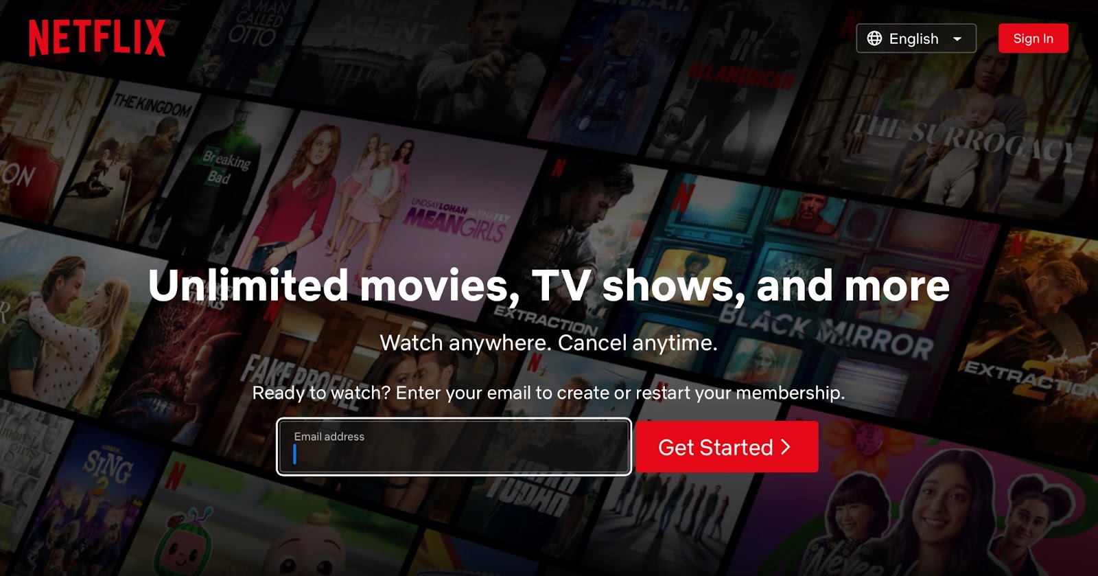
It's important to recognize, however, that landing pages serve a distinct purpose and differ from homepages in several key ways. While a homepage acts as the main entry point to a website — providing a comprehensive overview of the brand, its offerings, and navigation to different sections — a landing page is designed to captivate and convert visitors for a specific marketing campaign or promotion.
Website landing pages have a singular focus and aim to guide visitors toward a specific CTA, such as making a purchase, signing up for a newsletter, or downloading a resource. The goal is to convert potential customers, also known as leads, into actual customers. To achieve this goal, landing pages employ focused and concise content to avoid overwhelming visitors, reduce abandonment rates, and increase the likelihood of capturing new customers.
An effective landing page strategically incorporates a clear CTA that prompts visitors to complete a specific task. The nature of this task varies depending on the market and the goal of the marketing campaign. For instance, in an e-commerce context, the task might involve completing a checkout process. In other cases, the desired action may be less direct, such as encouraging users to sign up for an email list, allowing businesses to continue marketing their products over time.
Types of landing pages
It is crucial to determine the purpose of your landing page before entering the development process.
Understanding your destination page's ultimate goal and desired outcome sets the foundation for a successful design strategy. So, before delving into the intricate details of design, ask yourself: what exactly am I promoting, and how can I captivate visitors effectively?
There are a variety of types of landing pages, each tailored to serve a specific action-oriented purpose. Choose the category that best suits your needs and ensure the design has the necessary elements to support your CTA. Let's delve into three commonly used types:
Click-through landing pages
A click-through landing page serves as a bridge between your marketing campaign and the desired destination. Its primary purpose is to entice visitors to click through to another page or website where they can take further action. Click-through pages often provide additional information about a product, service, or offer, arousing curiosity and encouraging visitors to explore in greater depth. Nationwide offers a good example of a click-through landing page for users to get a quote.
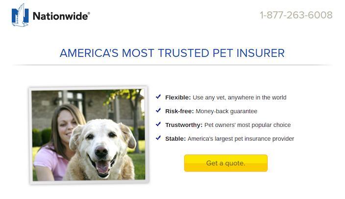
By strategically presenting compelling content and a clear CTA, click-through pages prompt visitors to the next step in the sales funnel. These landing pages are particularly valuable for businesses seeking to generate leads or increase conversions, such as e-commerce stores, service providers, and SaaS companies.
Click-through pages are designed to pique visitors' interest and provide them with the necessary information to make an informed decision about taking the next step with your brand.. For example, SaaS companies may lead people to a product demo, while e-commerce sites link out to a checkout page. Positive user ratings are also frequently included on these pages. With the intention of quick sales, highlighting real people with positive experiences instills confidence in prospective customers.
Lead generation landing page
Lead generation landing pages — also known as lead capture pages — capture valuable information from visitors. You offer something of value in exchange for the visitor's contact details, such as name, email address, or phone number. The user value could be in the form of exclusive content, special offers, informative resources, or access to a webinar or event. Below is an example of a lead generation landing page from Chobani where visitors can sign up for their newsletter.
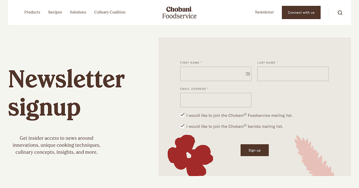
A lead capture form on the landing page allows you to collect vital information about potential customers, which you can use to follow up with targeted marketing efforts. These pages are instrumental in building an email list, nurturing relationships with your target audience, and guiding prospects through the sales funnel. By providing a seamless form submission process and offering enticing incentives, this type of landing page converts visitors into leads, opening up opportunities for further engagement and conversion.
Sales landing page
A sales page landing page promotes and sells a product or service. You can tailor this platform to showcase the key features, benefits, and unique selling points of your offering. These pages often incorporate persuasive copy, captivating visuals, customer testimonials, and clear pricing information to compel visitors to make a purchase.

Behave’s landing page leverages concise copy to get its unique selling proposition (USP) across quickly while utilizing bright colors, large images, and clear CTA buttons to drive visual interest.
An effective sales landing page addresses potential customer pain points, emphasizes the value proposition, and creates a sense of urgency to drive purchases. A combination of compelling copywriting techniques and optimized design can significantly enhance your chances of converting visitors into paying customers. A sales-driven page is particularly valuable if you aim to inspire immediate sales or capture the attention of prospects already in the buying mindset.


Build websites that get results.
Build visually, publish instantly, and scale safely and quickly — without writing a line of code. All with Webflow's website experience platform.
The importance of a strong landing page
A well-crafted landing page holds immense potential to ignite a chain reaction of positive transformations within your business. Let's take a closer look at a few key benefits that demonstrate the true power of landing pages throughout the sales funnel:
Increases conversion rate
The core of any marketing strategy is to increase sales and foster business growth. A compelling landing page serves as a catalyst for this success by prominently displaying CTA buttons and effectively transforming visitors into customers. The result? More visitors, more sales, and, ultimately, a thriving bottom line.
Improves user experience
When visiting a new website, no one wants to be bombarded with overwhelming information. Landing pages act as a remedy to this common issue by providing a focused and streamlined experience for potential customers. By presenting concise and relevant content, a well-crafted landing page not only improves user satisfaction but also encourages repeat visits. This improvement, in turn, sets the stage for potential future purchases and a loyal customer base.
Gathers valuable data
Landing pages — particularly lead generation pages — serve as a platform to collect useful information about potential customers. A well-structured lead capture form provides a wealth of data that empowers your business to develop and refine marketing strategies with precision. Understanding your audience on a deeper level allows for tailored messaging, personalized outreach, and the ability to attract a larger and more engaged customer pool over time.
Designing effective landing page: 5 best practices
Whether you already have a destination page that isn't delivering results or you're looking to create a new one, landing page optimization is crucial for achieving high conversion rates. Let's explore a few essential tips to help you design the best landing page possible and drive conversion rates to new heights:
1. Keep it simple
On landing pages, brevity is key. Your target audience should be able to quickly grasp the message of your page. Focus on highlighting the value proposition of your offer; in other words, tell them what they’ll get out of it. By keeping your content focused and concise, you capture visitors’ attention so you can convey the benefits of taking the desired action.
2. Use a visual hierarchy
Establish a clear visual hierarchy to guide visitors' attention toward the most important elements of your landing page. Emphasize key components such as the headline, copy, and a prominent CTA button. Direct visitors' focus toward converting by strategically arranging these elements with visual cues such as text color, location, and size.
3. Optimize for search
When crafting copy for your landing pages, it's important to take search engine optimization (SEO) into account. Ensure your headlines are clear and incorporate relevant keywords to improve your page's visibility and ranking on search engine results pages (SERPs). Optimizing your landing page's copy for search engines attracts more organic traffic and increases your chances of reaching the target audience.
4. Optimize for speed
A seamless user experience is non-negotiable. A significant factor that contributes to a positive experience is the loading speed of your landing page. A page that loads quickly and smoothly not only enhances user satisfaction but also reduces bounce rates. Make sure to optimize your landing page for speed by minimizing page elements, reducing image sizes, and leveraging caching techniques.
5. Test and refine
A/B testing is an invaluable tool for identifying the most effective elements of your landing page and continuously improving its performance over time. Experiment with different variations of headlines, visuals, CTA placement, or copy to pinpoint what resonates best with your audience. By testing and refining your landing pages based on real user data and feedback, you can increase conversion rates and maximize the effectiveness of your marketing efforts.
Looking for inspiration? Take a moment to explore these excellent examples of well-designed landing pages for ideas to incorporate into your own creations.
Create a responsive landing page with Webflow
If you're ready to create a captivating landing page but need help getting started, we have a solution. Webflow’s landing page builder and page templates simplify the design process and provide the tools to craft an excellent addition to your marketing campaigns.

Get started for free
Create custom, scalable websites — without writing code. Start building in Webflow.


